
Groom and groomsmen attire should look connected without turning every person into a copy of the next. Start with the groom’s suit, choose one repeatable colour or material rule for the party, and check the palette against the venue, season, and real fabric swatches. This guide focuses on wedding suit colours, proportion, light, and coordination rather than short-lived trend labels.
How to coordinate groom and groomsmen attire
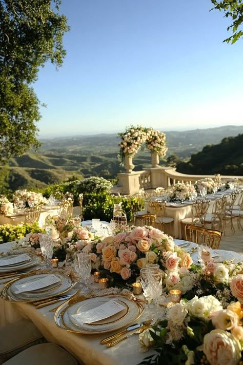
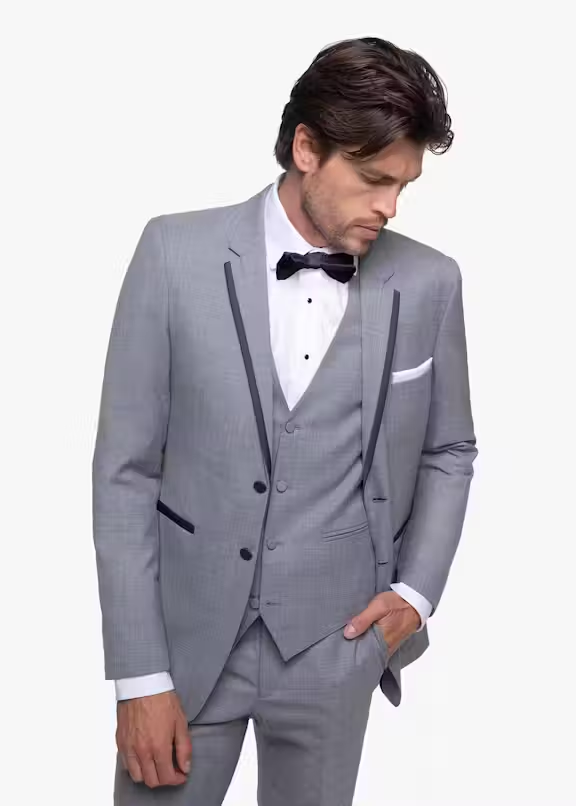
Groom and groomsmen attire looks coordinated when the group follows one clear visual rule instead of wearing identical outfits. Choose the groom’s suit first, then repeat one element across the party: the same colour family, fabric weight, tie tone, or boutonniere. Match the palette to the setting. Light grey, tan, and slate blue suit daytime or warm-weather weddings; olive, burgundy, and brown suit autumn; charcoal, midnight blue, and deep plum work well for formal winter events. Beach ceremonies need breathable linen or lightweight wool, while velvet and heavier wool belong in cooler venues. Test every swatch beside the bridesmaid colours and venue materials, then photograph it in daylight and warm indoor light. Keep the groom distinct with a darker shade, different lapel, waistcoat, or accessory rather than an unrelated colour. Fit remains the final filter: a simple, well-altered suit will look more intentional than a dramatic colour with poor proportions.
| Setting | Reliable suit colours | Fabric direction | Coordination note |
|---|---|---|---|
| Spring garden | Light grey, slate blue, sage | Lightweight wool | Repeat one floral or tie colour |
| Summer beach | Sand, tan, soft blue | Linen or linen blend | Keep shoes and belts equally relaxed |
| Autumn estate | Olive, burgundy, brown | Textured wool | Use warm accents in small doses |
| Winter ballroom | Charcoal, midnight blue, black | Wool or velvet details | Let the groom carry the deepest tone |
| Modern city | Navy, graphite, cream | Crisp worsted wool | Vary lapels or accessories, not every element |
Choose the colour family before the exact shade
Colour names are vague. One brand’s slate blue can look cool and grey; another can lean bright and saturated. Begin with a family such as blue, green, brown, or neutral, then compare physical swatches beside the bridesmaid fabric, flowers, and venue surfaces. A colour that looks polished on a white website background can behave very differently beside warm brick, green foliage, or a dark ballroom wall.
For warm-weather tailoring, use the fabric and proportion advice in this guide to summer style for men. If the wedding palette is soft, the examples in pastel outfit ideas can help separate muted colour from a washed-out look. Broader fashion colour trends are useful as inspiration, but the venue and skin tone should make the final decision.
If you want to browse rental options after setting the palette, compare the available colours in this tuxedos and suits collection. Treat the product page as a swatch source, then confirm the cloth in person before committing the whole wedding party.
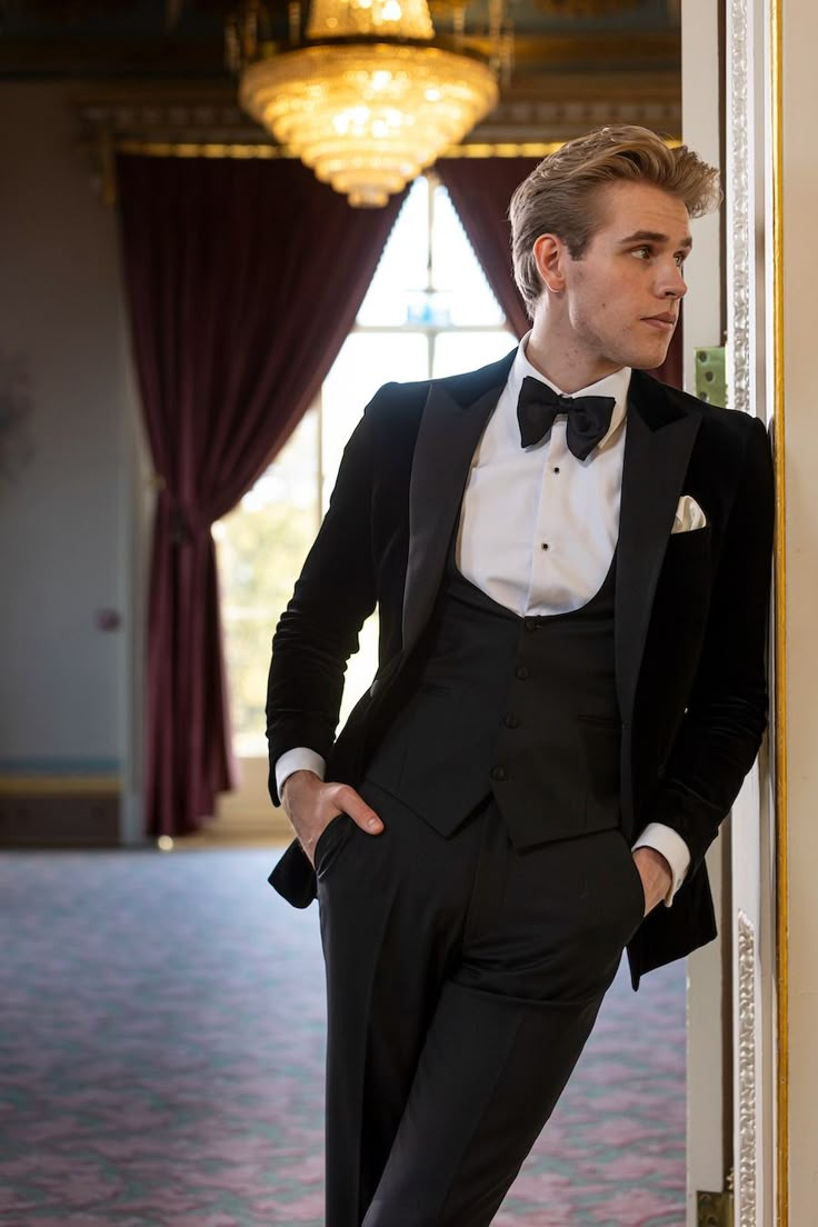
Wedding suit colours by season and venue
Spring and summer: keep contrast soft but visible
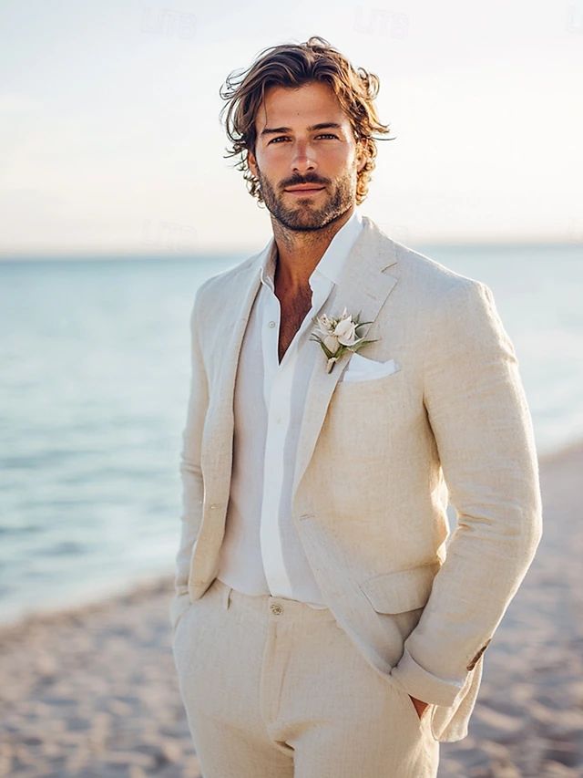
Light grey, tan, muted blue, and soft green suit bright ceremonies because they reflect rather than absorb strong daylight. The important part is contrast: a pale suit needs enough separation from the shirt, flowers, and backdrop to keep the silhouette readable. For a beach ceremony, relaxed cloth and simple shoes are more convincing than a formal tuxedo in a tropical setting.
Autumn: use depth instead of adding more colours
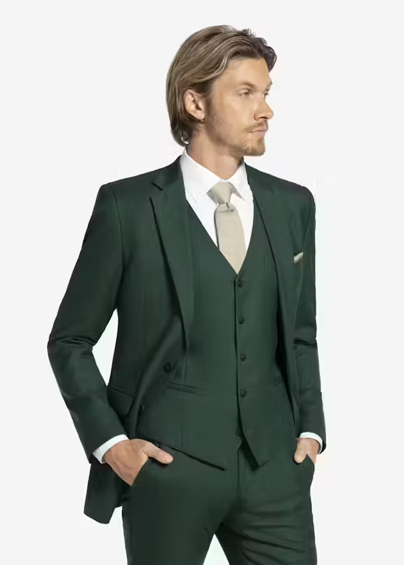
Olive, burgundy, rust, and chocolate brown work because they echo autumn materials, but using all of them at once makes the party look themed. Choose one deep suit colour, one neutral, and one accent. A burgundy tie can support an olive suit; it does not require matching socks, pocket square, boutonniere, and suspenders.
Winter: let texture do part of the work
Charcoal, midnight blue, black, and deep plum hold up in low winter light. Add interest through a velvet lapel, brushed wool, or a restrained waistcoat instead of pushing every accessory darker. If the ceremony and reception use different lighting, photograph the suit under both conditions before approving it.
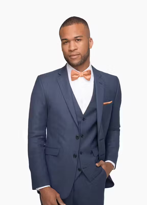
Slate blue can bridge several seasons when the cloth has enough depth. This slate blue suit example shows the colour direction, but use a real swatch to judge how it photographs beside blush, burgundy, or green.
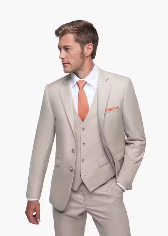
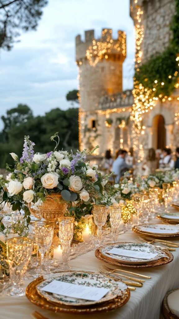
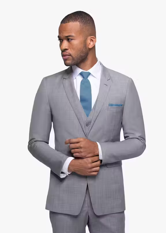
Make the groom distinct without breaking the palette
The groom needs one visual priority, not five. Keep the group in the same colour family and change the groom’s shade, waistcoat, lapel treatment, tie, or boutonniere. From a visual-design standpoint, the distinction should still be obvious when the group photo is reduced to a small thumbnail. If it disappears, increase tonal contrast. If it dominates the whole frame, remove one competing detail.
| Group approach | Groom | Groomsmen | Why it works |
|---|---|---|---|
| Same family | Slate blue | Navy | Clear hierarchy without a colour clash |
| Same suit | Waistcoat + distinct tie | Two-piece suit + shared tie | Simple for rentals and sizing |
| Neutral base | Charcoal + burgundy accent | Charcoal + muted neutral accent | The groom leads through one controlled colour |
| Tonal mix | Deep olive | Mid olive and sage details | Variation feels intentional in outdoor settings |
Plan the palette alongside the wider celebration rather than in isolation. The wedding planning guide connects attire with venue, flowers, and timing, while these wedding guest outfit ideas help set a dress-code direction that does not compete with the wedding party.
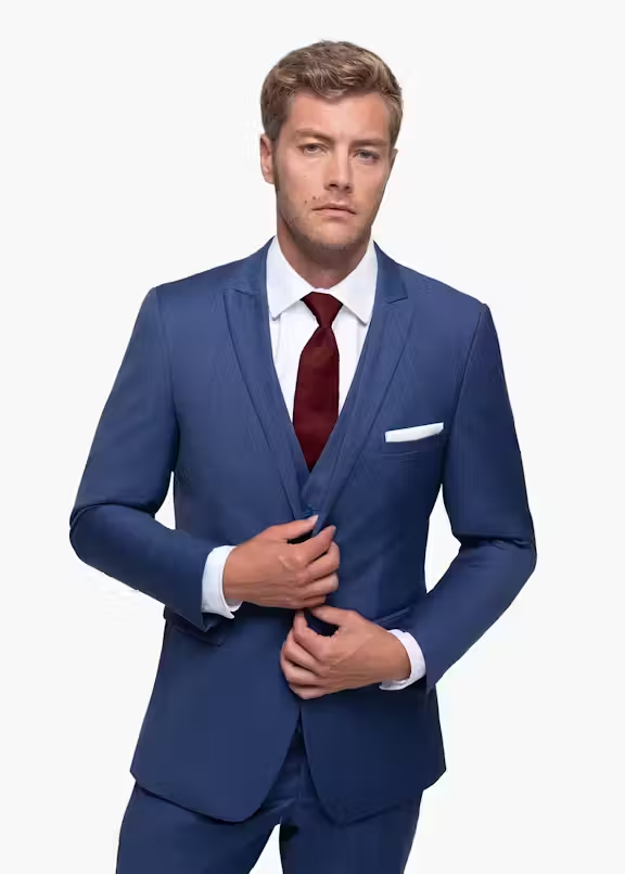
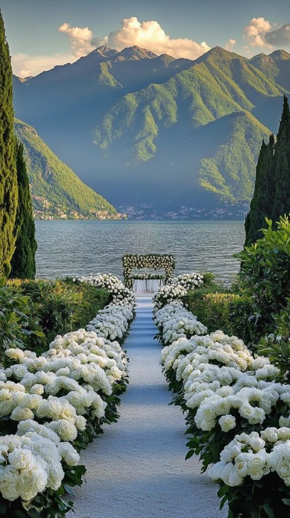

Photo-test the complete wedding palette
Do not approve a palette from digital colour chips alone. Place the actual suit swatch beside the dress fabric, tie, flowers, and any dominant venue material. Photograph the set in open shade, direct sun, and warm indoor light. Then view the image small. This reveals whether navy reads as black, pale tan disappears into the background, or several accent colours compete for attention.
Use these wedding photo ideas to plan group arrangements and lighting, then check the general guidance on outfits for a photoshoot before the final fitting. The camera records contrast and texture more bluntly than the eye, especially under mixed lighting.
Common groom and groomsmen attire mistakes
- Choosing colour before confirming the venue, ceremony time, and dress code.
- Using heavy velvet for a hot outdoor ceremony or casual linen for a formal winter ballroom.
- Making every accessory a statement instead of selecting one focal detail.
- Ordering the whole party from screen colours without checking a physical swatch.
- Treating alterations as optional; sleeve, trouser, and jacket proportions decide whether the colour looks polished.
If the outfit still feels busy, remove one accent and check the silhouette again. This list of fashion mistakes to avoid is a useful final review for fit, proportion, colour balance, and accessories.
Build one connected wedding style
The strongest wedding palette repeats a small number of choices with discipline. Once the suits are settled, coordinate rather than duplicate the other looks. These guides to styling silk dresses for weddings and the broader Sky Rye Design fashion archive can help carry the same colour logic through fabric, accessories, and occasion dressing.
Before ordering, run four checks: venue, weather, swatch, and fit. If the colour works in the actual light, the fabric suits the temperature, and the groom remains visually distinct without clashing, the palette is ready.
Groom and groomsmen attire FAQ
Should the groom and groomsmen wear the same suit?
They can, but they do not have to. A more flexible approach is to keep the same colour family or fabric and give the groom one clear distinction, such as a darker shade, waistcoat, lapel finish, tie, or boutonniere. The group will still read as coordinated in photographs without making the groom disappear into the line-up.
What suit colours work best for a beach wedding?
Light tan, sand, stone, soft grey, and muted blue are reliable beach-wedding colours because they suit bright natural light and relaxed settings. Pair the colour with linen, a linen blend, or lightweight wool. Avoid very heavy cloth and test pale suits against the actual sand and ceremony backdrop so the outfit does not wash out in photos.
How do you choose groom suit colours by season?
Use the season as a practical filter, not a rigid rule. Spring and summer suit lighter greys, tan, slate blue, and soft green. Autumn supports olive, burgundy, rust, and chocolate brown. Winter suits charcoal, midnight blue, black, and deep plum. Fabric weight, venue lighting, and the wedding's formality matter as much as the colour name.
Should the groom wear a different colour from the groomsmen?
A different shade is often enough. For example, the groom can wear slate blue while the groomsmen wear navy, or a deep olive suit with softer sage accessories across the party. If every suit is identical, distinguish the groom through the waistcoat, lapel, tie, pocket square, or boutonniere instead of introducing a colour that fights the palette.
How early should wedding-party suits be selected?
Start several months before the wedding so there is time to compare swatches, confirm sizes, arrange alterations, and replace anything that does not fit. The larger the wedding party, the more buffer you need. Make the final colour decision only after checking the venue, bridesmaid palette, ceremony time, and expected weather.
How can you test wedding suit colours for photos?
Photograph the real fabric swatch beside the other wedding colours in open shade, direct sun, and warm indoor light. Then reduce the image to a small thumbnail. If the groom still reads clearly and the party remains cohesive, the contrast is working. This quick test catches muddy dark tones, washed-out pale suits, and accessories that compete for attention.
- 58shares
- Facebook0
- Pinterest58
- Twitter0
- Reddit0