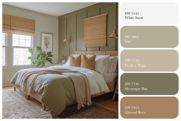
Pantone bedroom color schemes are useful when you want a room to feel intentional, not just pretty in one photo. The trick is to treat Pantone as a color reference, then test the closest paint, fabric, and decor samples in your actual bedroom light.
I usually start with three decisions: the wall color, the textile color, and one darker anchor for contrast. If those three work together in daylight and under bedside lamps, the rest of the room becomes much easier to edit.
This guide focuses on bedroom color palettes that feel calm enough for sleep but still designed: soft neutrals, blush, sage, blue, terracotta, warm yellow, deep accents, and the lighting checks that keep them from shifting in the wrong direction.
Key takeaways
- Use Pantone as the reference, then test real paint and fabric samples before buying everything.
- The strongest bedroom color palettes usually keep walls calmer and move bolder color into textiles, art, or one accent area.
- Lighting changes color more than most people expect, so check every palette in morning light, afternoon shade, and evening lamps.
What are Pantone bedroom color schemes?
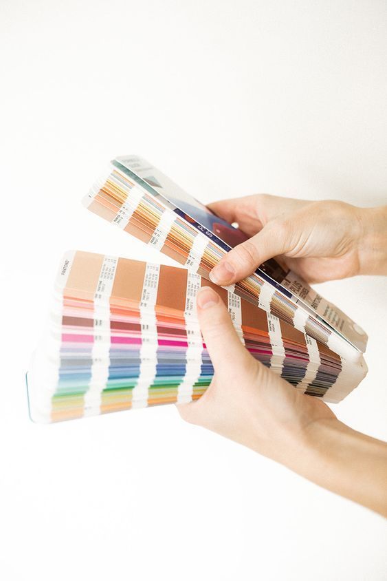
Pantone bedroom color schemes are palettes inspired by Pantone’s standardized color language and adapted for interior design. The value is not that a paint brand will always match a Pantone chip perfectly. The value is that you can name a color direction clearly before choosing wall paint, curtains, bedding, rugs, and decor. A dusty blue bedroom, for example, needs different supporting whites than a buttery yellow one. A clay accent wall needs quieter bedding than a sage green room. Use Pantone references to control hue, undertone, and mood, then use physical samples to make the final call.
| Bedroom goal | Pantone-inspired direction | Design note |
|---|---|---|
| Calm and airy | Warm white, pale blue, soft sage | Keep contrast low and repeat texture through bedding and curtains. |
| Romantic but not sugary | Dusty rose, taupe, ivory, wine accent | Use the deeper color sparingly so the room still feels restful. |
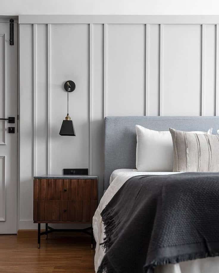
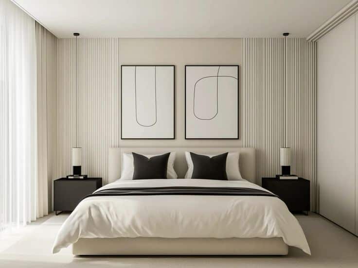
| Modern and grounded | Greige, charcoal, warm brown, cream | Add one dark anchor through lighting, art, or furniture. |
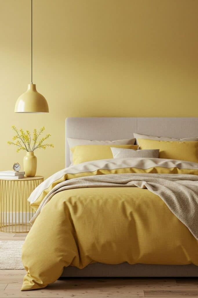
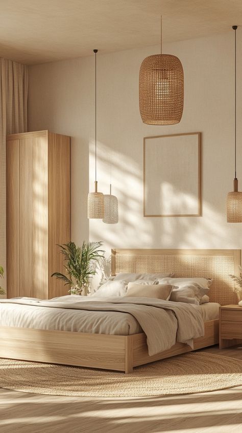
| Sunny and soft | Butter yellow, honey wood, warm white | Choose creamy yellows, not sharp lemon tones. |
| Moody and restful | Navy, forest green, cocoa, muted teal | Balance dark walls with pale textiles and warm lamps. |
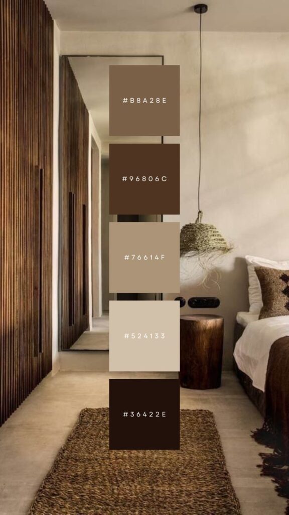
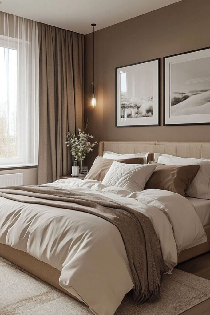
How to choose a bedroom color palette
Start with the room’s fixed colors: floor, wardrobe, headboard, window frames, and any furniture you will not replace. These pieces decide the undertone before the paint chip gets a vote. A warm oak floor can make a cool gray wall look thin, while a dark walnut bed can make pale blush feel more mature.
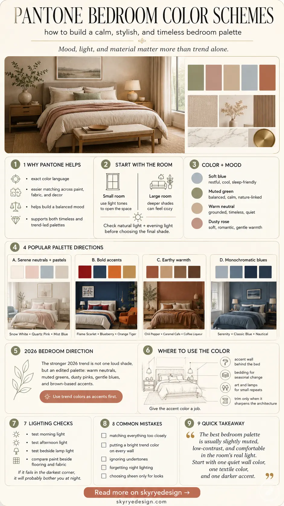
For a more technical look at how designers use the system, see Sky Rye Design’s guide to interior designers using Pantone. For the official color reference side, the Pantone color palettes guide and Pantone Fashion, Home + Interiors system are useful background sources.
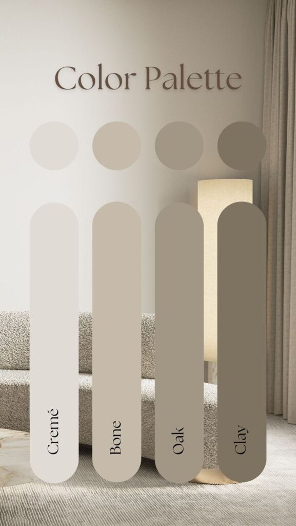
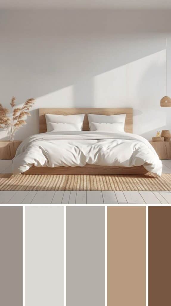
Test undertones before you choose paint
Undertone is where many bedroom palettes go wrong. Beige can lean pink, yellow, gray, or green. White can feel creamy or clinical. Blue can turn sharp under cool LEDs. Paint a sample large enough to see from the bed, not a tiny square near the switch plate, and check it beside the bedding you actually plan to use.
Use the 60-30-10 rule loosely
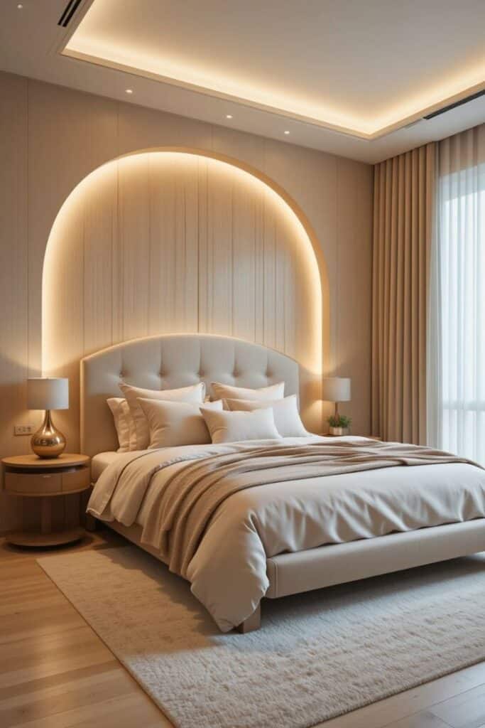
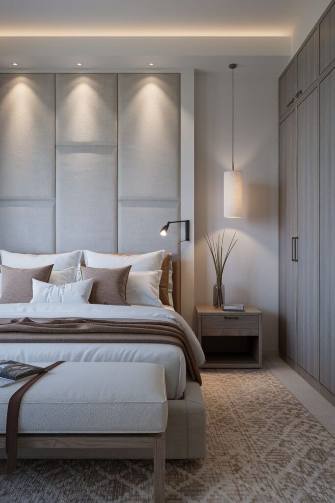
The 60-30-10 rule is still helpful, as long as you do not treat it like a math problem. Let the quiet base take most of the room, give textiles or furniture the supporting color, and reserve the strongest Pantone-inspired shade for small moments: a cushion, artwork, trim, lamp, or painted nightstand.
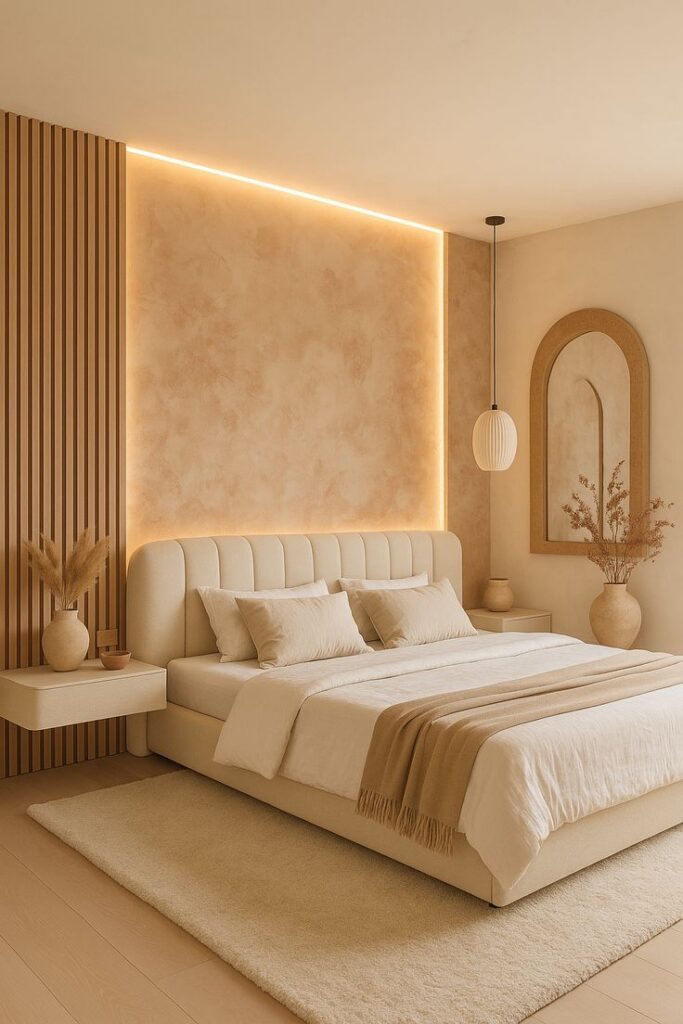
Pantone bedroom color palettes that work
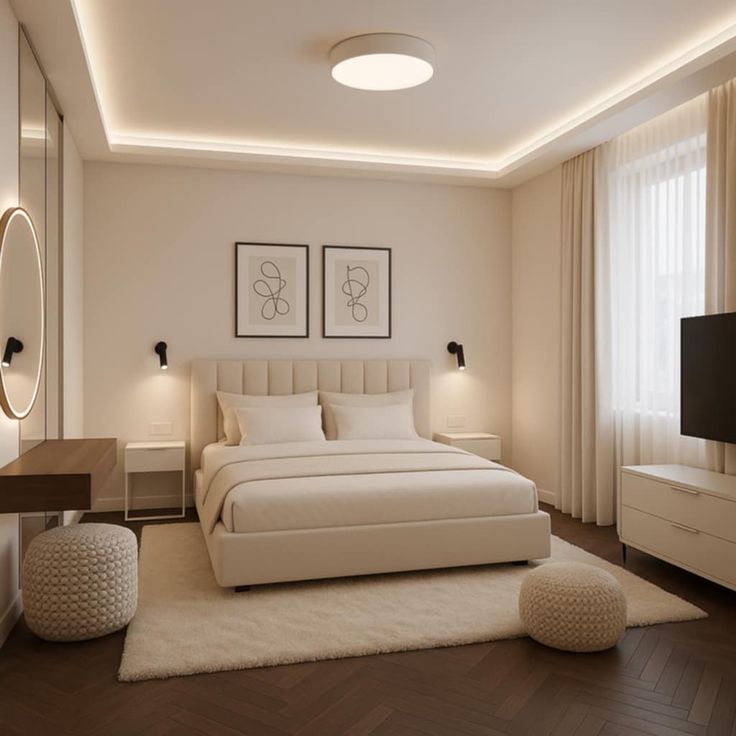
The best bedroom color ideas are usually edited. A palette with five interesting colors may look great on a board, but bedrooms need slower color. Choose one dominant mood, then let the smaller pieces create variation.
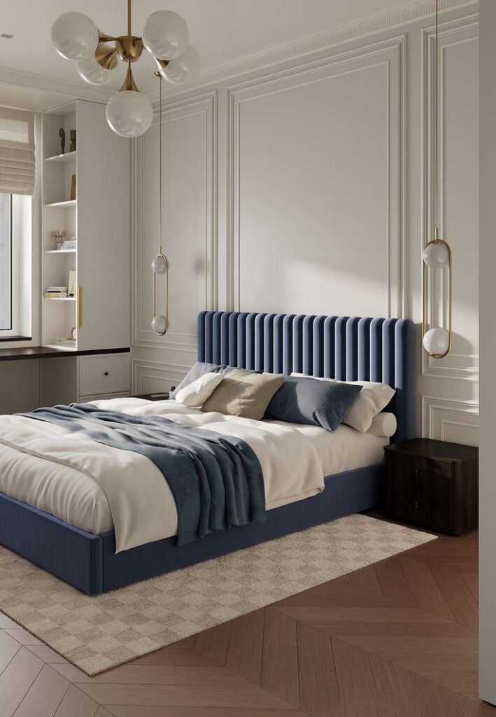
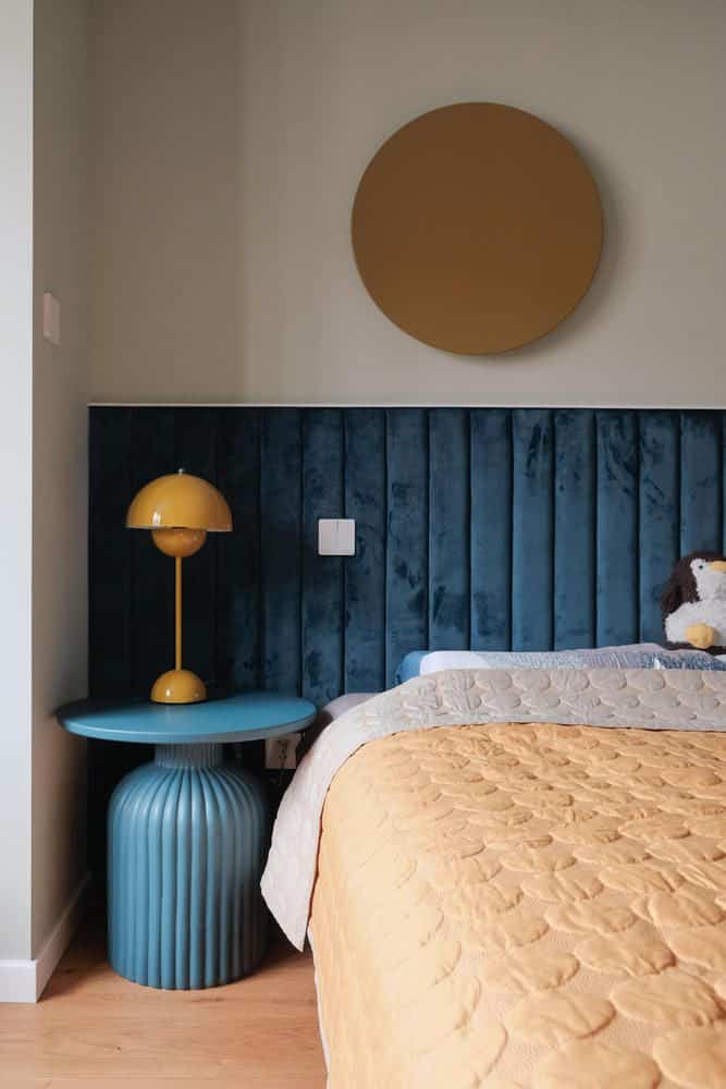
Soft neutral and beige bedroom palettes
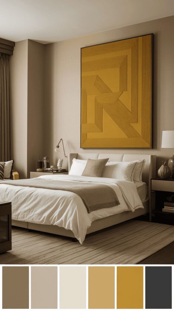
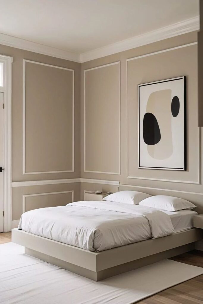
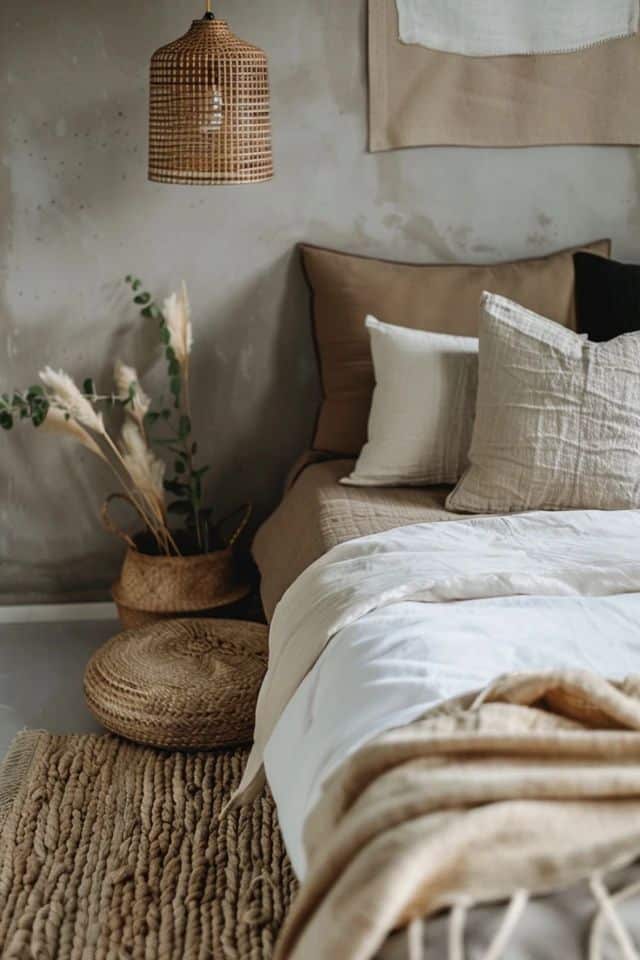
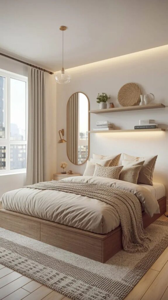
Soft neutral bedrooms work when the palette has depth: ivory walls, taupe textiles, pale wood, a slightly darker rug, and one warm metal or ceramic detail. If beige interiors are your starting point, the beige interior design guide is a useful supporting read near the middle of the planning process.
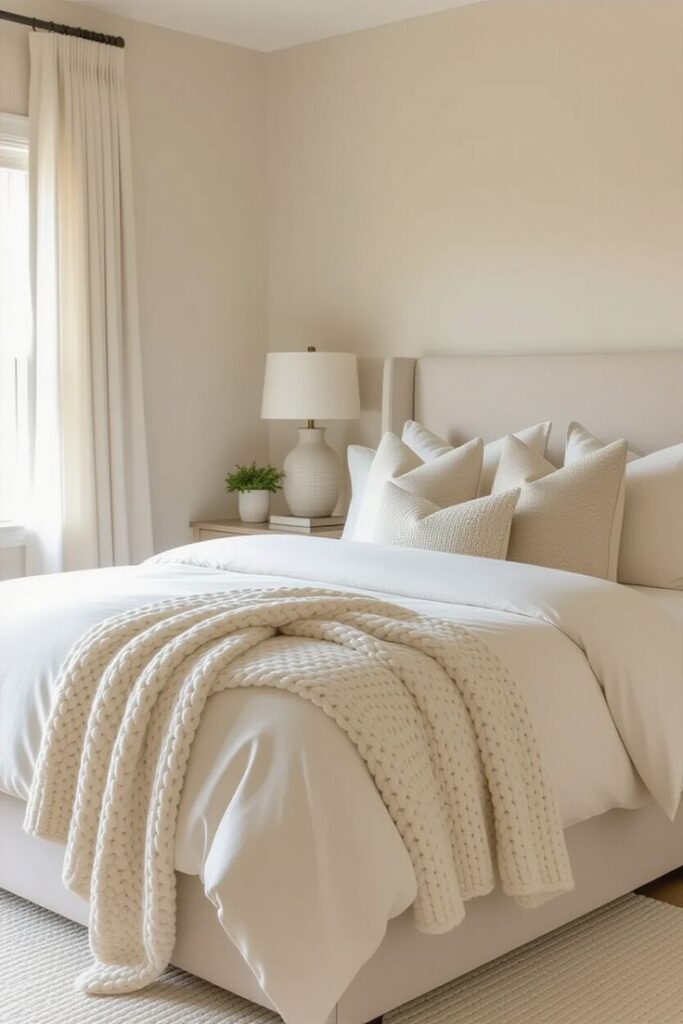
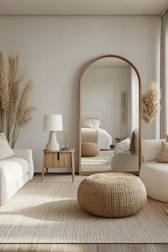
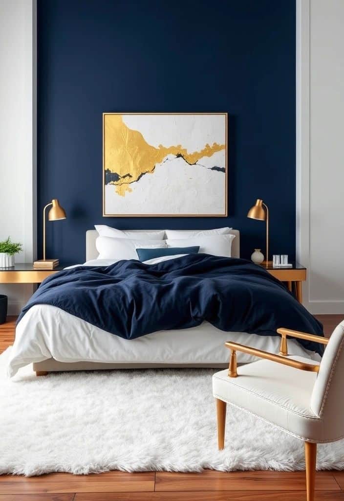
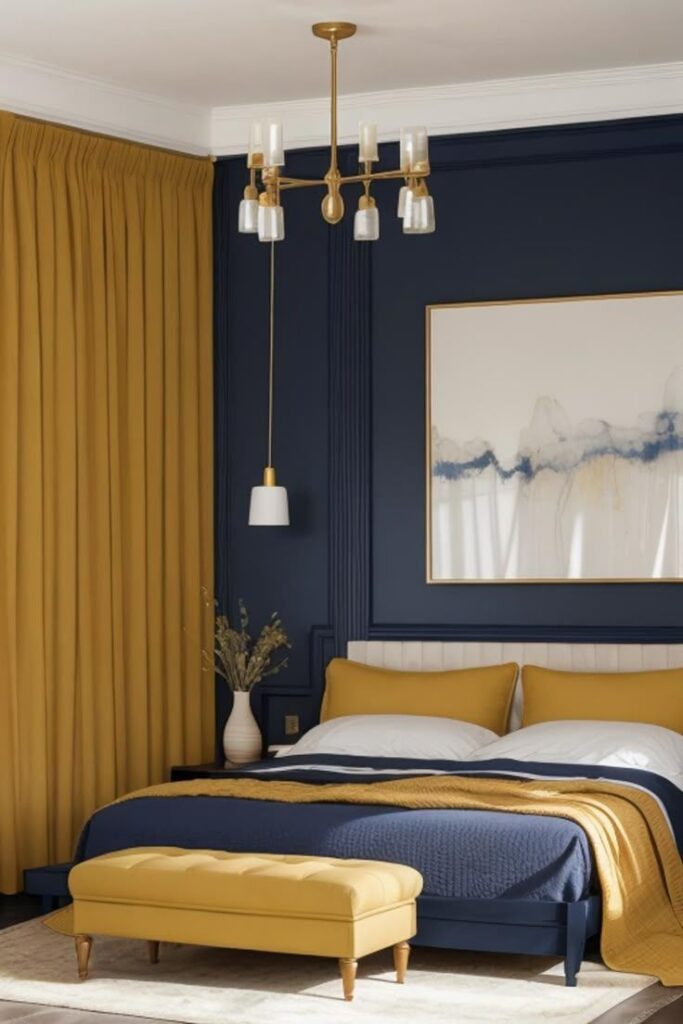
Blue and green bedroom palettes
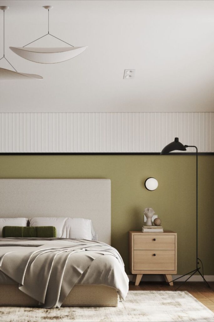
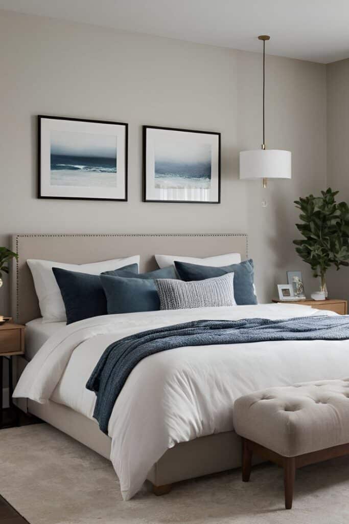
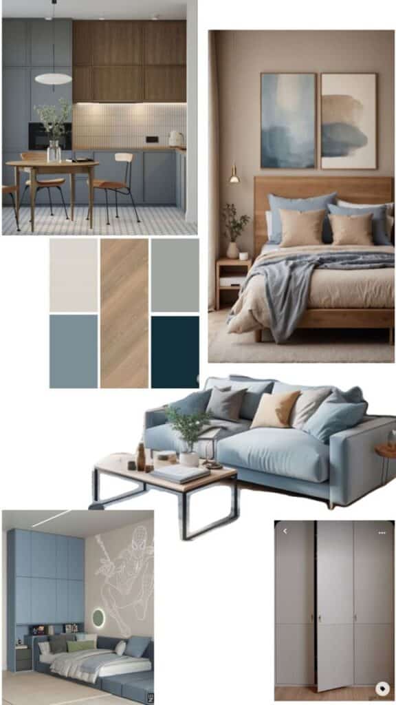
Blue and green both suit bedrooms because they can feel quiet without disappearing. Pale blue opens a small room, slate blue adds structure, sage green softens sharp furniture, and forest green creates a more enveloping mood. The key is to choose muted versions rather than fully saturated color-chip blues and greens.
For more on how color affects room mood, connect this page with Pantone color psychology for interior design. It supports the cluster without forcing the same exact keyword into every paragraph.
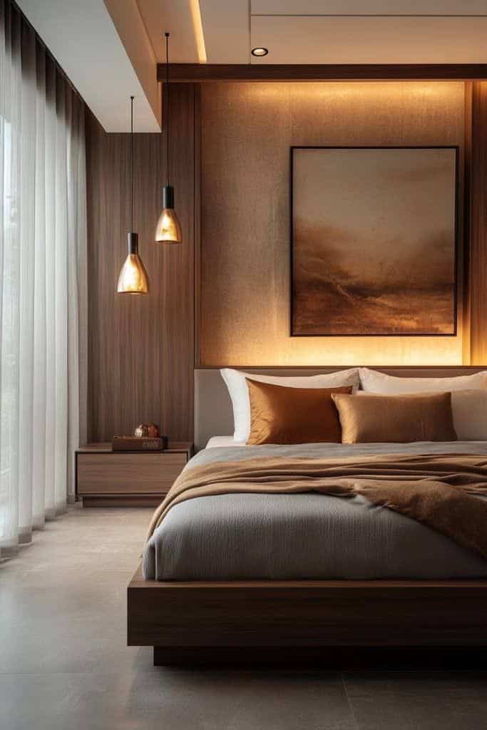
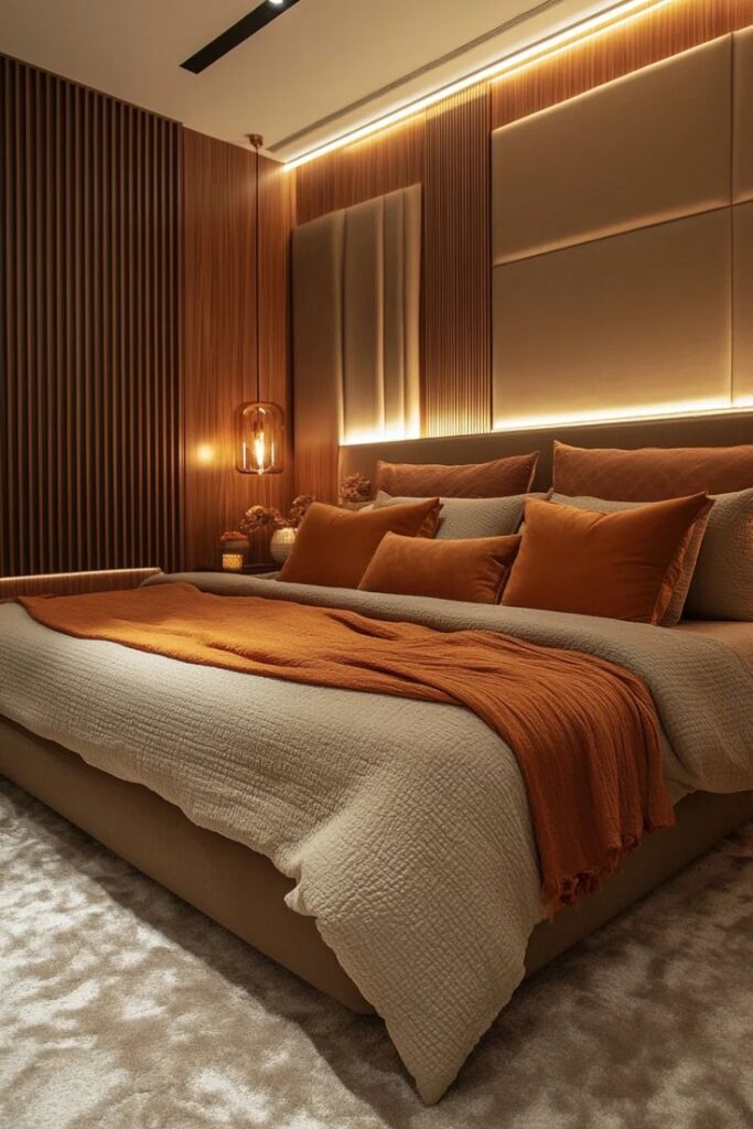
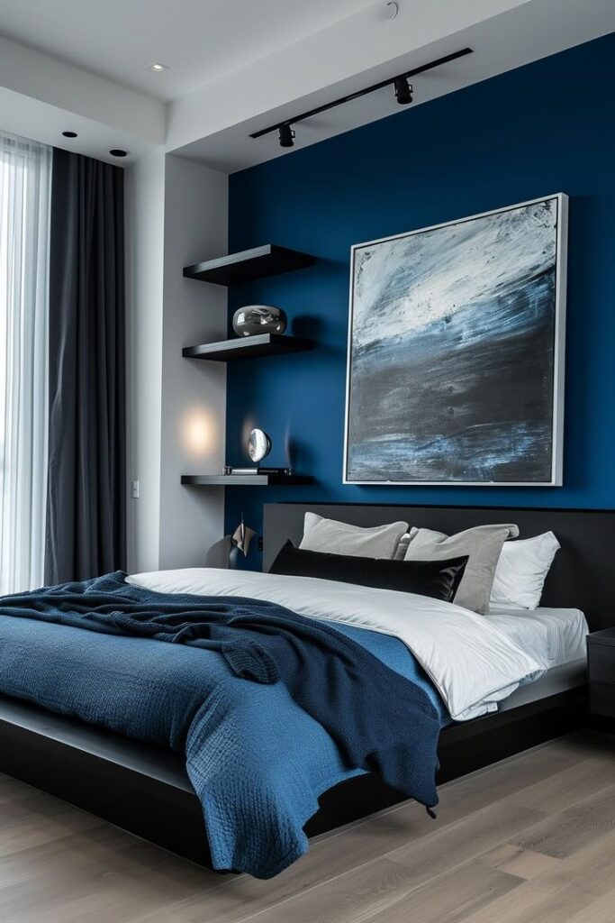
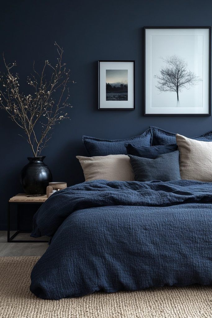
Blush, rose, and romantic bedroom colors
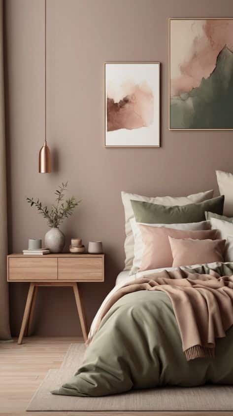
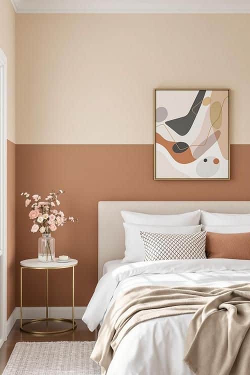
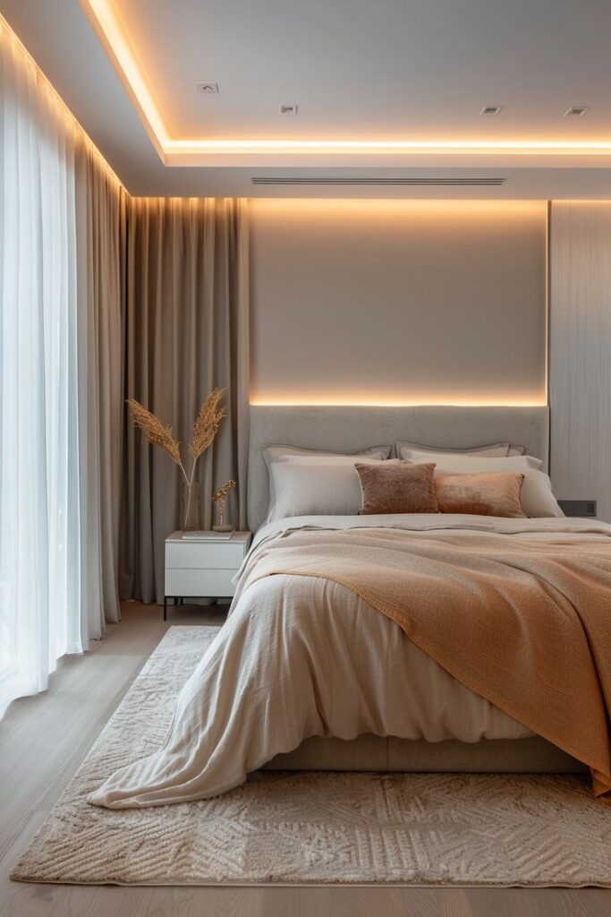
Romantic bedroom colors work best when they are softened. Dusty rose, warm taupe, ivory, mauve, and muted wine feel more livable than bright pink or red walls. Put the strongest romantic tone into a headboard, throw, art print, or lampshade first. If the room still feels calm at night, then consider a larger painted area.
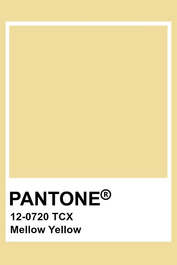
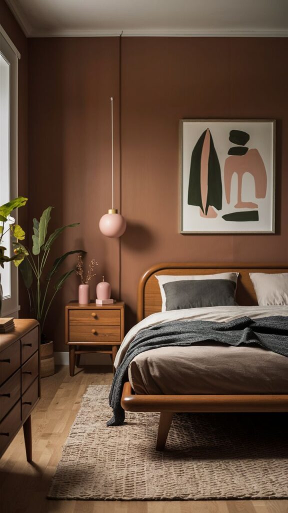
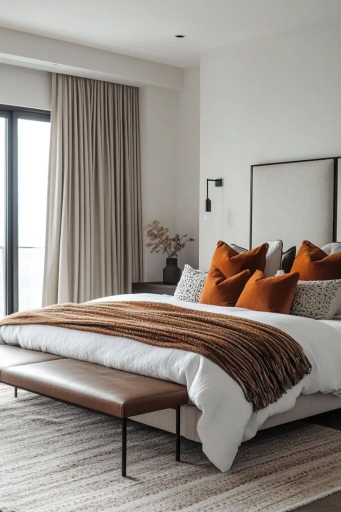
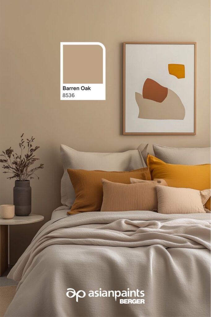
Yellow, clay, and earthy warm palettes
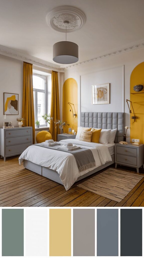
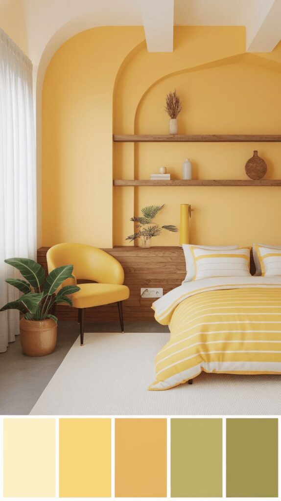
Warm palettes are cheerful, but bedrooms need restraint. Butter yellow, clay, terracotta, honey, cocoa, and cream all work when the saturation is low. If yellow is the accent you are considering, compare it with these yellow bedroom design ideas before committing to a full wall.
Pantone Color of the Year and 2026 bedroom trends
Pantone’s Color of the Year can be a good starting point, but it should not overrule the room. Treat it as an accent idea first: a cushion, painted frame, throw, artwork, or bedside object. The official Pantone Color of the Year page is useful for trend context, while Sky Rye Design’s interior design color trends article helps place the trend inside the wider home palette.
For 2026, the more useful bedroom direction is softer than a single headline shade: warm neutrals, colored whites, muted greens, dusty pinks, gentle blues, and brown-based accents. These palettes photograph well, but more importantly, they still feel calm when the room is messy, half-lit, and lived in.
When to ignore the trend color
Ignore the trend color if it fights your floor, makes your skin look tired in mirror light, or only works with decor you do not actually own. A bedroom is not a showroom. The palette has to support sleep, dressing, cleaning, storage, and the morning routine.
Accent walls, trim, bedding, and decor
Accent color is strongest when it has a job. Behind the bed, it can frame the headboard. On trim, it can sharpen architecture. In bedding, it can be changed seasonally. In art or lamps, it can repeat a color without making the walls too intense.
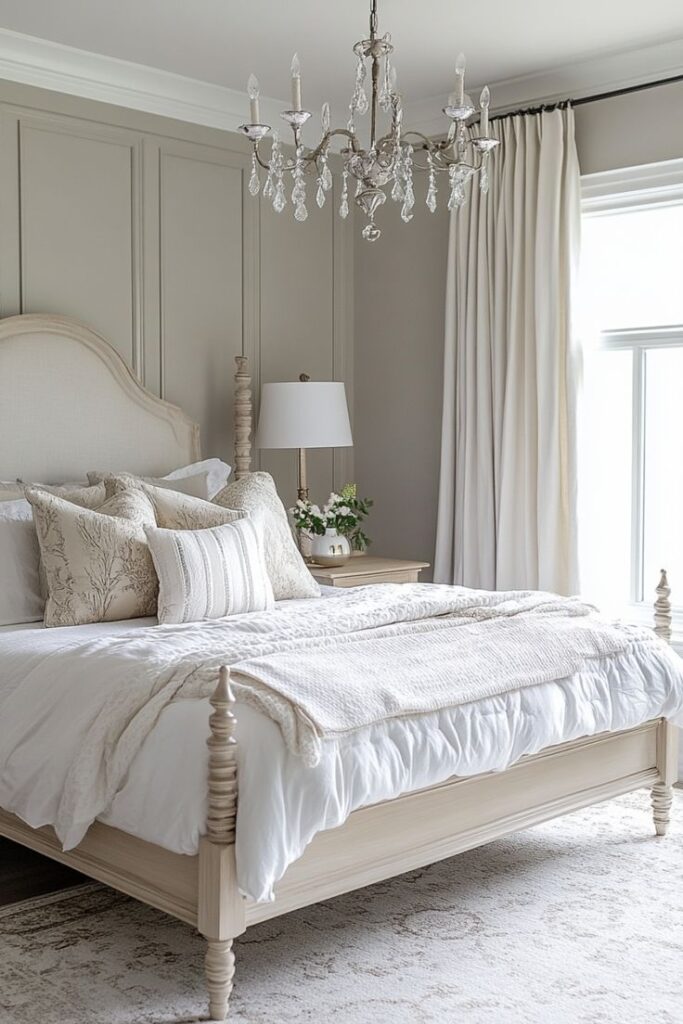
Use an accent wall only when the room has a natural focal point
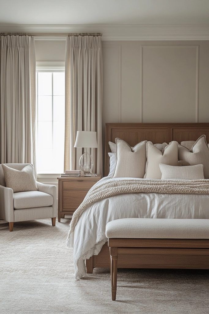
The bed wall is usually the safest accent wall because the darker or richer color supports the room’s main piece of furniture. Random side walls often look like leftover paint. If the wall has a window, sloped ceiling, awkward door, or split surface, test whether color improves the geometry or makes the break more obvious.
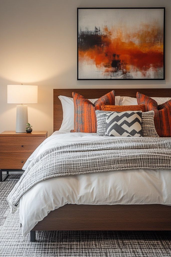
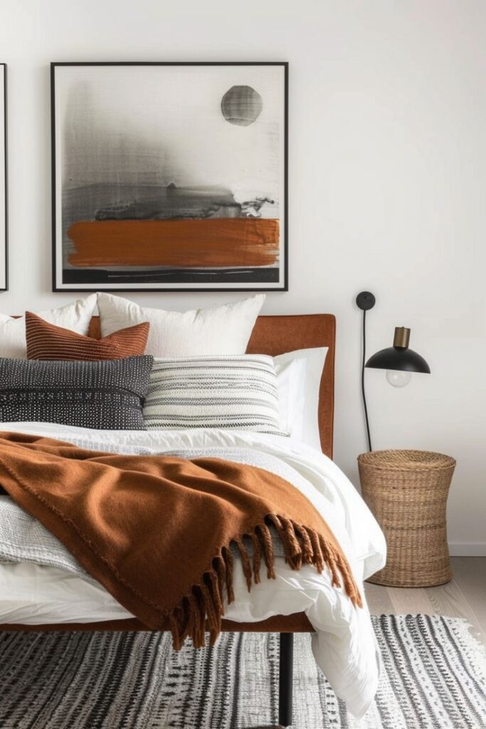
Let bedding carry the seasonal color
Bedding is the easiest place to test a strong Pantone-inspired shade. A clay duvet, sage throw, dusty rose pillow, or navy quilt can shift the whole room without making repainting the first move. This is also where texture matters: linen, cotton, velvet, and boucle can make the same color read completely differently.
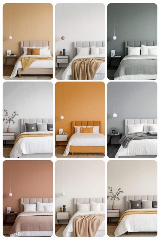
Lighting checks for bedroom paint colors
Lighting decides whether bedroom paint colors feel calm, flat, romantic, or muddy. Daylight shows undertone, while bulbs can push a wall warmer, cooler, greener, or more yellow. Before buying paint, compare your sample under the bulbs you use every night. The ENERGY STAR light bulb guide is a practical reference for color temperature basics.
Paint brands also organize bedroom color ideas around finish, room mood, and common palettes. The Sherwin-Williams bedroom paint colors page and Benjamin Moore bedroom paint colors page are useful comparison points after you have chosen the Pantone-inspired direction.
Check morning, afternoon, and bedside light
A color that looks perfect at noon can feel dull at 8 p.m. Put samples near the bed, near the window, and in the darkest corner. If the color fails in the darkest corner, it will probably bother you more than the beautiful daytime version helps you.
Common mistakes with Pantone bedroom color schemes
| Mistake | Why it hurts the room | Better move |
|---|---|---|
| Matching everything too closely | The bedroom looks flat and catalog-like. | Repeat color families, not identical shades. |
| Using a bright trend color on every wall | The room feels active when it should slow down. | Use the bold color as an accent first. |
| Ignoring undertones | Paint, curtains, and bedding fight each other. | Compare samples beside fixed furniture and flooring. |
| Forgetting night lighting | A pretty daytime color turns muddy or cold. | Test under the bulbs you actually use. |
| Choosing sheen only for looks | Glare or wall texture becomes distracting. | Use calmer finishes where the wall catches lamp light. |
Sleep comfort is also part of the design brief. The Sleep Foundation bedroom environment guide is worth reading when color, light, temperature, and noise all affect how restful the room feels.
Related color and bedroom guides
For more color planning, continue with 2026 luxury interior colors, cozy bedroom ideas, and Pantone colors for living rooms. Those guides are close enough to support this bedroom palette cluster without repeating the same advice.
A final practical note: do not choose the bedroom palette from a phone screen alone. Screens make color look cleaner than painted walls, especially with beige, blush, sage, and warm white. Order samples, place them beside fabric, and give yourself one evening with the lights on before deciding.
Pantone bedroom color schemes FAQ
What are Pantone bedroom color schemes?
Pantone bedroom color schemes are room palettes built around Pantone-style color references, then adapted for walls, bedding, trim, furniture, and lighting. The useful part is precision: you can describe a blush, blue, sage, beige, or terracotta tone more clearly before matching it to paint, fabric, or decor samples.
What is the best color scheme for a bedroom?
The best bedroom color scheme is usually low contrast, slightly muted, and comfortable in the room’s actual light. Soft blues, warm whites, sage greens, taupes, blush tones, and earthy neutrals are easier to sleep with than very bright colors. Start with one quiet wall color, one textile color, and one darker accent.
What are the top three bedroom colors?
The safest top three bedroom color families are soft blue, warm neutral, and muted green. Blue gives a calm, cool feeling, warm neutrals make the room feel settled, and green connects the space to nature. The exact Pantone-inspired shade should still be tested beside your floor, curtains, and bedding.
What colors are trending for bedrooms in 2026?
Bedroom color trends for 2026 lean toward warm neutrals, muddy pastels, soft greens, clay, butter yellow, dusty rose, and deeper accents used in small doses. The stronger trend is not one single color, but a more edited palette: restful walls, tactile textiles, and one accent with personality.
How do I choose a Pantone bedroom palette for a small room?
For a small bedroom, choose a pale or mid-light Pantone-inspired base and keep the contrast controlled. Off-white, warm gray, sage, powder blue, or soft beige can make the room feel calmer. Put stronger color on bedding, art, or one narrow accent area so the walls do not visually close in.
Are Pantone colors the same as paint colors?
Pantone colors are color standards, while paint colors are formulas made by paint brands. They are related, but not identical. Use Pantone as the design reference, then compare physical paint chips or sample pots in the room. Wall texture, sheen, daylight, and bulbs can all shift how close the match feels.
What Pantone colors work for a romantic bedroom?
A romantic bedroom usually works best with muted rose, warm taupe, ivory, dusty mauve, soft terracotta, deep wine, or warm beige. Avoid making every surface pink or red. Keep the wall color calmer, then add romance through bedding, curtain weight, bedside lighting, artwork, and one deeper accent.
More Pantone bedroom palette references
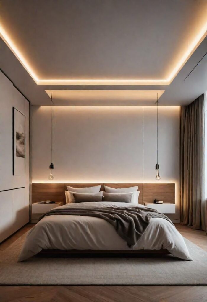
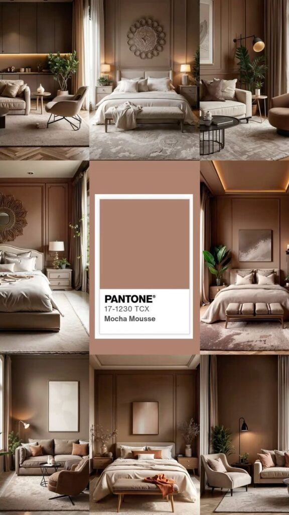
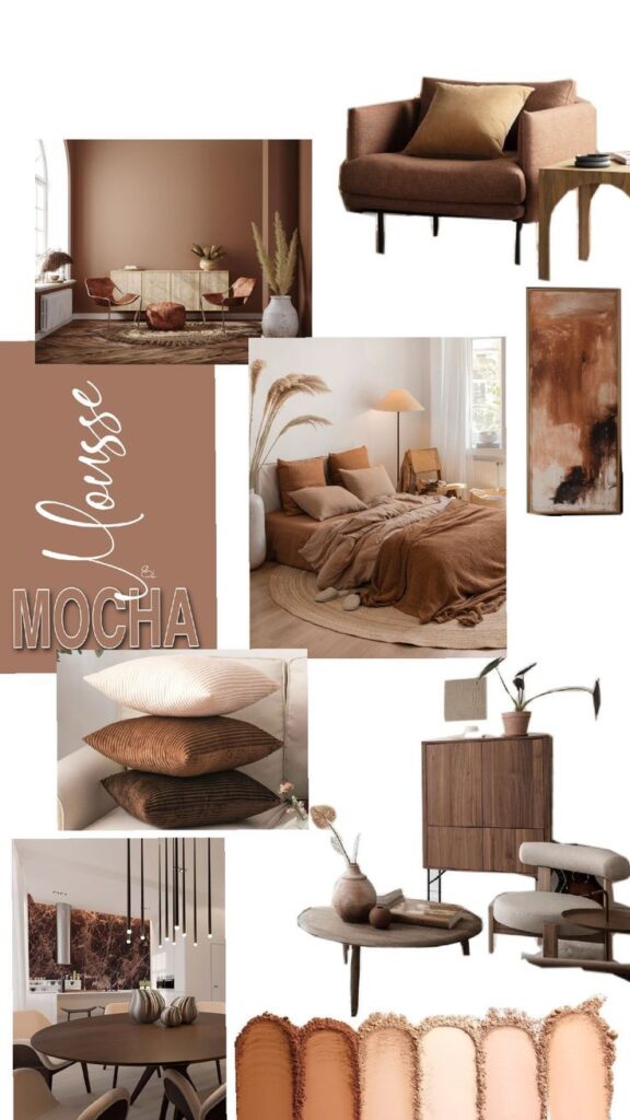
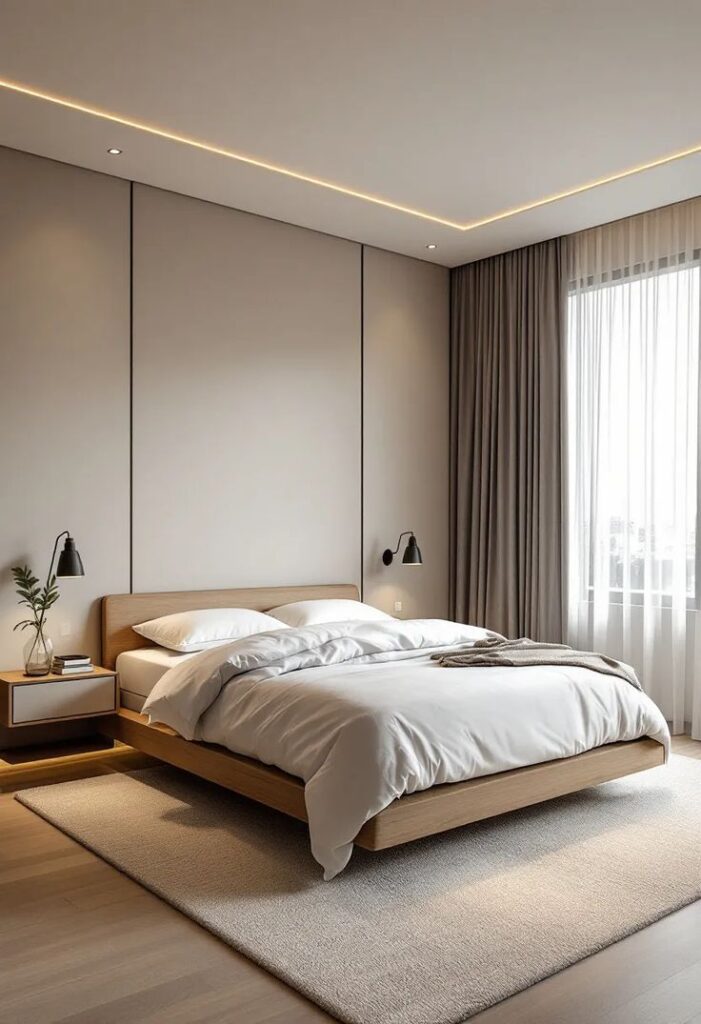
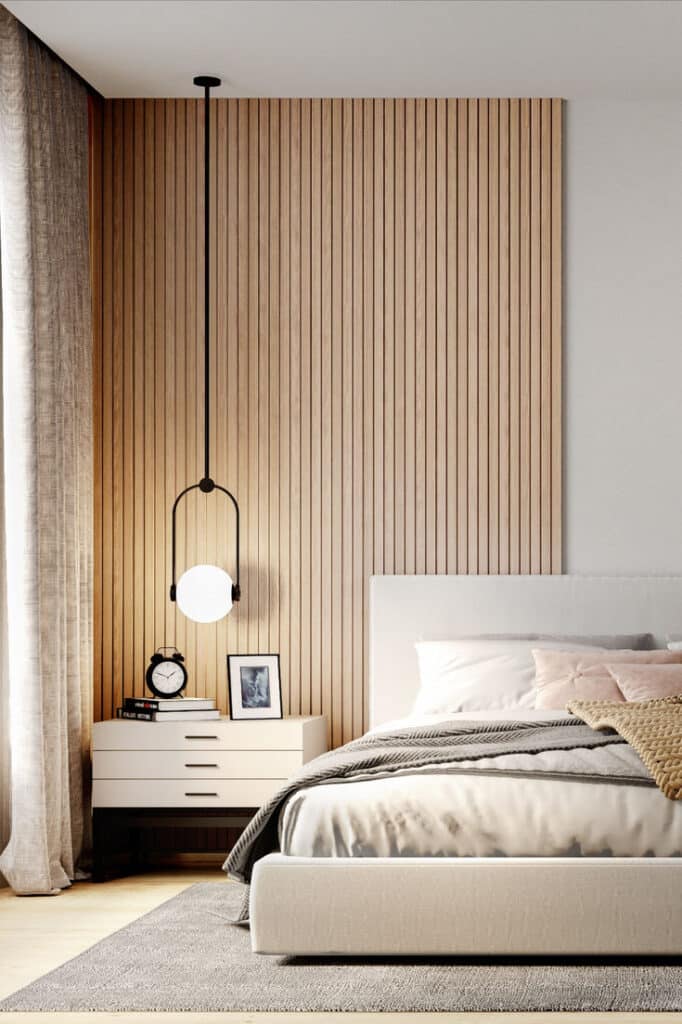
Use the remaining images as quick palette references. Look at the wall value first, then the bedding, then the darkest accent. That order makes it easier to understand why a room feels calm, warm, romantic, or too heavy.
- 3.8Kshares
- Facebook0
- Pinterest3.8K
- Twitter0
- Reddit0