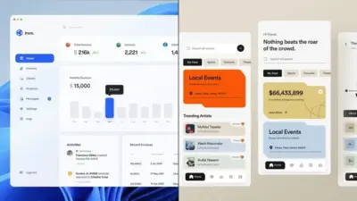
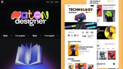
Modern web development demands interfaces that capture attention while maintaining functionality and performance. Vibrant UI represents a comprehensive collection of reusable, production-ready components built with TypeScript, React, and modern frameworks that enable developers to create visually stunning interfaces efficiently. This component library eliminates the need for extensive planning phases by providing pre-built solutions that work across both web and native environments.
You can leverage these animated, ready-to-use components to accelerate your development workflow and focus on core business logic rather than rebuilding common interface elements. The library integrates seamlessly with popular tools like Shadcn-ui and Framer Motion, offering over 1,500 smart components and extensive customization options.
Whether you’re building landing pages, complex applications, or mobile interfaces, understanding how to implement and customize these vibrant components can significantly impact your project’s visual appeal and user engagement. The following exploration will guide you through the essential concepts, implementation strategies, and best practices for maximizing this powerful UI toolkit.
Key Takeaways
- Vibrant UI provides production-ready components that accelerate development by eliminating the need to build common interface elements from scratch
- The component library supports both web and native environments with TypeScript integration and modern animation frameworks
- Proper implementation focuses on modular design patterns and customization strategies that enhance user experience without sacrificing performance
Understanding Vibrant UI
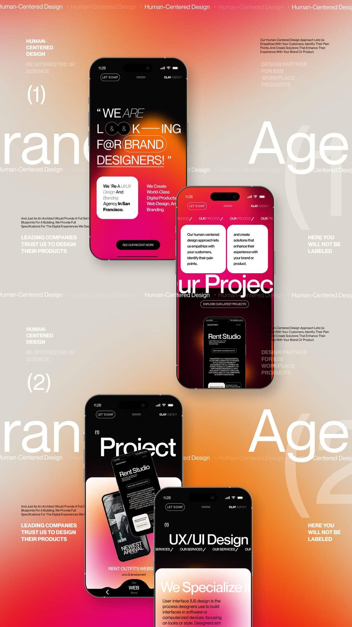
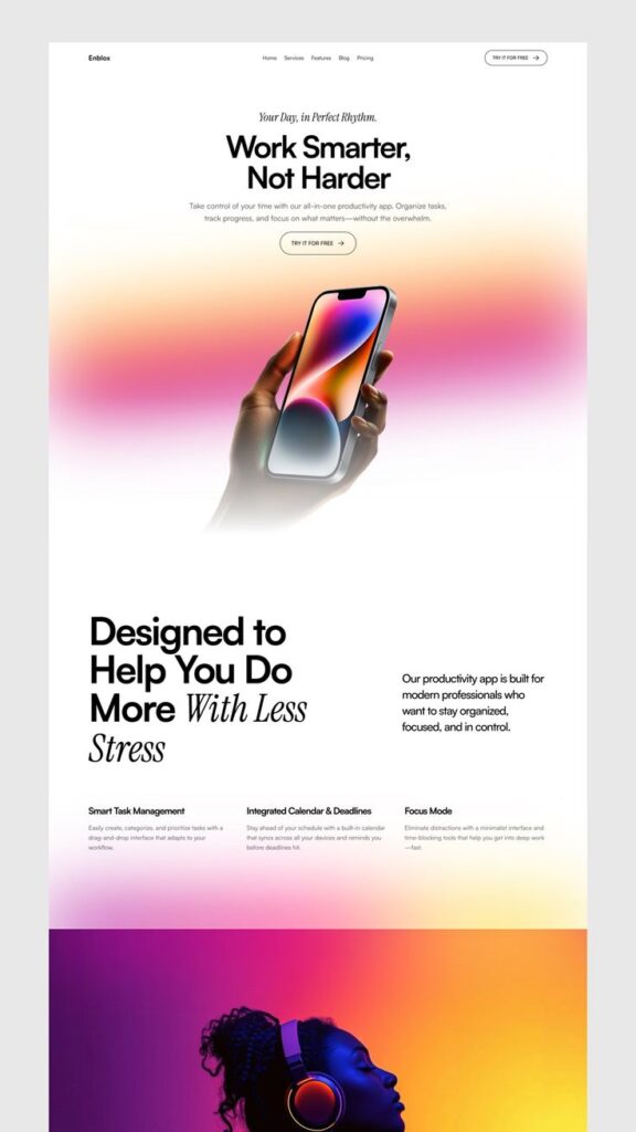
Vibrant UI combines modern design principles with advanced development tools to create production-ready components that accelerate interface development. Design engineers play a central role in bridging the gap between design and development while teams benefit from faster shipping cycles and consistent visual standards.
Core Principles of Vibrant UI
Vibrant UI operates on the foundation of reusable, production-ready components built with TypeScript, React, and modern animation libraries. These components eliminate the need to start from scratch for each project.
The system emphasizes consistency across all user interfaces. You can copy and paste pre-built components that maintain uniform styling and behavior patterns throughout your application.
Animation and interactivity form core elements of the approach. Components integrate Framer Motion to provide smooth transitions and engaging user experiences without requiring extensive animation knowledge.
The architecture prioritizes modularity through component-based design. Each element serves a specific purpose and can be combined with others to create complex interfaces efficiently.
TypeScript integration ensures type safety and better developer experience. You receive immediate feedback about component props and potential errors during development.
Role of the Design Engineer
Design engineers serve as the bridge between traditional design and frontend development in Vibrant UI workflows. They possess deep understanding of both UI/UX principles and technical implementation requirements.
These professionals create the pre-built components that other team members utilize. Their expertise ensures components meet both design standards and performance requirements.
Design engineers focus on front-of-the-frontend development, which involves creating the visual and interactive layers users experience directly. They optimize components for usability and visual appeal.
Their responsibilities include:
- Building reusable component libraries
- Implementing animation and interaction patterns
- Ensuring responsive design compatibility
- Maintaining design system consistency
Technical skills required include proficiency in React, TypeScript, CSS-in-JS solutions, and animation libraries. They must also understand design tools like Figma for component specification.
Benefits for Development Teams
Development teams experience significant time savings when implementing Vibrant UI approaches. You skip the planning phase for common interface elements and focus on unique application features.
Faster shipping cycles result from using pre-built components. Teams can prototype and deploy user interfaces more quickly without compromising quality or consistency.
Reduced decision fatigue occurs when standardized components handle common UI patterns. You spend less time debating styling choices and more time solving business problems.
Quality improvements emerge through battle-tested components. Pre-built elements have undergone testing and refinement, reducing bugs in production applications.
Scalability benefits appear as projects grow. Consistent component usage creates maintainable codebases that new team members can understand and contribute to effectively.
The approach supports design-development alignment by providing shared vocabulary and tools. Designers and developers work with the same component specifications, reducing miscommunication.
Key Technologies and Architecture
Vibrant UI components are built using a modern technology stack that combines React’s component-based architecture with TypeScript’s type safety and Framer Motion’s animation capabilities. This foundation enables developers to create production-ready interfaces with enhanced performance and maintainability.
Using React for User Interfaces
React serves as the core framework for building Vibrant UI components. The library leverages React’s component-based architecture to create reusable interface elements.
You can integrate these components directly into your existing React applications. Each component follows React best practices for state management and lifecycle methods.
The component library provides pre-built elements that you can customize according to your project requirements. These components are designed to work seamlessly with React’s virtual DOM system.
React’s declarative nature allows you to compose complex interfaces by combining multiple Vibrant UI components. This approach reduces development time and ensures consistent behavior across your application.
TypeScript Integration
TypeScript provides type safety and enhanced developer experience throughout the component library. All Vibrant UI components include comprehensive type definitions.
You receive intellisense support and compile-time error checking when using these components. This reduces runtime errors and improves code quality in your projects.
The TypeScript integration includes proper typing for component props, event handlers, and return values. You can leverage these types to build more robust applications.
Type definitions also improve code documentation and make it easier for teams to understand component APIs. This leads to faster development cycles and fewer bugs.
Animation with Framer Motion
Framer Motion powers the animation system within Vibrant UI components. This library provides smooth, performant animations that enhance user experience.
You can customize animation properties such as duration, easing, and timing through component props. The animations are optimized for both desktop and mobile devices.
Common animation patterns include hover effects, page transitions, and micro-interactions. These animations are implemented using Framer Motion’s declarative API.
The animation system supports complex motion sequences and gesture-based interactions. You can extend these animations or create custom motion components using the same underlying framework.
Reusable and Modular Components
Reusable components form the backbone of efficient UI development by eliminating code duplication and ensuring consistency across applications. Building these components with shadcn-ui and incorporating proper feedback mechanisms creates a robust foundation for scalable design systems.
What Makes a Component Reusable
A reusable component must be self-contained and independent of its implementation context. You need to design components that accept props for customization while maintaining their core functionality across different use cases.
Key characteristics include:
- Clean, well-defined interfaces through props
- Minimal external dependencies
- Consistent naming conventions
- Proper TypeScript definitions
Your components should handle their own state management internally. This prevents conflicts when the same component appears multiple times on a page.
Flexibility comes from customizable styling options. You can achieve this through CSS variables, theme tokens, or style props that allow visual adaptation without breaking functionality.
Documentation plays a crucial role in reusability. Each component needs clear usage examples and prop descriptions to help other developers implement them correctly.
Building with shadcn-ui
shadcn-ui provides a foundation of pre-built components that you can copy and modify for your specific needs. This approach gives you full control over the component code while maintaining design consistency.
The library uses Radix UI primitives underneath, which handle accessibility and behavior patterns. You get robust functionality without writing complex interaction logic from scratch.
Installation involves copying individual components into your project rather than importing from a package. This method allows you to customize styling and behavior directly in your codebase.
Benefits of this approach:
- Complete ownership of component code
- Easy customization without version conflicts
- Built-in accessibility features
- TypeScript support out of the box
You can modify the styling system to match your brand requirements. The components use Tailwind CSS classes, making it simple to adjust colors, spacing, and typography.
Optimizing Feedback in UI Components
Feedback mechanisms guide users through interactions and communicate system states effectively. Your components need to provide clear visual and functional responses to user actions.
Loading states should appear immediately when users trigger actions. You can implement skeleton screens, spinners, or progress indicators depending on the expected wait time.
Error handling requires both visual indicators and helpful messaging. Your components should display validation errors near the relevant input fields with specific instructions for resolution.
Success feedback confirms completed actions through subtle animations, color changes, or brief messages. This reassures users that their interactions were processed correctly.
Interactive feedback types:
- Hover states for clickable elements
- Focus indicators for keyboard navigation
- Disabled states for unavailable actions
- Active states during user interaction
Timing plays a critical role in feedback effectiveness. Immediate responses feel more responsive, while delayed feedback can create uncertainty about whether actions were registered.
Getting Started with Vibrant UI
Vibrant UI provides a comprehensive library of reusable components that work across both web and native environments. The installation process involves setting up the library and creating the proper folder structure for your chosen development platform.
Installation Process
You can install all components in the Vibrant UI library using a single command. The installation provides access to the complete collection of animated and interactive components.
Create a folder called vibrant in your project directory. Inside this folder, create individual files named after each component you want to use.
The setup follows a copy-and-paste approach rather than traditional package management. You simply copy the component code into your newly created files.
This method gives you direct control over the components in your project. You can modify and customize each component according to your specific requirements without dependency concerns.
Setting Up for Web Environments
Web environments use React DOM as the primary framework for Vibrant UI components. The library integrates seamlessly with modern React applications and development workflows.
For Next.js applications, Vibrant UI offers specific setup instructions. You configure the components within your Next.js project structure following the established patterns.
The web setup focuses on creating modern, visually stunning interfaces. Components are designed to enhance user interaction through animations and responsive design elements.
You develop with standard React patterns and hooks. The components maintain compatibility with existing React ecosystems and popular development tools.
Configuring for React Native
React Native environments support the full Vibrant UI component library. The same components that work in web browsers function in mobile applications without modification.
The native configuration maintains the same folder structure as web setups. You create the vibrant folder and add component files using identical naming conventions.
Mobile-specific considerations include touch interactions and platform differences. The components adapt automatically to iOS and Android interface guidelines.
React Native developers can leverage the same animated and interactive features available in web versions. The library handles platform-specific rendering while maintaining consistent functionality across devices.
Design Best Practices and Future Directions
Effective vibrant UI implementation requires strategic consistency across visual elements and streamlined development processes. Modern design engineer workflows emphasize collaborative approaches that balance creative expression with technical performance requirements.
Consistency in Visual Design
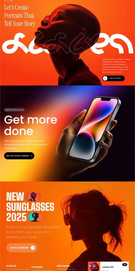
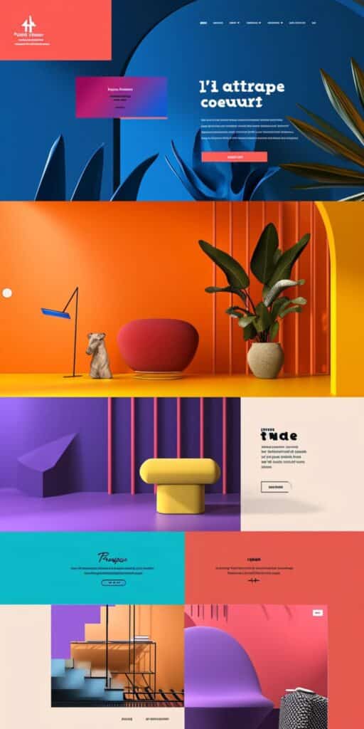
Vibrant user interfaces demand systematic color management and component standardization. Your color palette should maintain consistent hue relationships across all interface elements.
Create a structured color system with primary, secondary, and accent colors that work harmoniously. Document specific hex values, opacity levels, and usage guidelines for each color variant.
Component Library Structure:
- Buttons: Define hover states, active states, and disabled variations
- Typography: Establish hierarchy with consistent color applications
- Icons: Maintain uniform stroke weights and color treatments
- Cards: Standardize shadow depths and border treatments
Your design tokens should include semantic color names rather than literal descriptions. Use names like “primary-action” instead of “bright-blue” to maintain flexibility.
Typography contrast ratios become critical with vibrant backgrounds. Test all text combinations against WCAG accessibility standards to ensure readability remains optimal.
Speed and Efficiency in UI Development
Modern development frameworks enable rapid vibrant UI implementation through optimized CSS methodologies. Your stylesheet organization directly impacts rendering performance and maintenance efficiency.
Implement CSS custom properties for dynamic color management. This approach allows real-time theme switching without performance penalties.
:root {
  --primary-vibrant: #ff6b35;
  --secondary-vibrant: #4ecdc4;
  --accent-vibrant: #ffe66d;
}
Leverage CSS Grid and Flexbox for responsive layouts that adapt vibrant elements smoothly. These properties reduce code complexity while maintaining visual consistency.
Pre-compiled design systems accelerate development cycles. Tools like Tailwind CSS or custom utility classes streamline vibrant color application across components.
Collaborative Workflows for Designers and Developers
Design engineer collaboration requires shared toolsets and communication protocols for vibrant UI projects. Your handoff process should include detailed color specifications and interaction guidelines.
Use design systems platforms like Figma or Adobe XD with developer-friendly export options. These tools generate accurate CSS values and maintain version control across team members.
Essential Handoff Documentation:
- Color values in multiple formats (hex, RGB, HSL)
- Animation timing and easing functions
- Responsive breakpoint behaviors
- Interactive state specifications
Version control systems should track both design files and code implementations. This dual tracking prevents inconsistencies between designed and developed interfaces.
Regular design reviews ensure vibrant elements maintain brand consistency while meeting technical constraints. Schedule weekly sync meetings between design and development teams.
Prototype testing validates vibrant UI performance across devices and browsers. Your testing protocol should include color accuracy checks on different screen types and lighting conditions.
- 2.8Kshares
- Facebook0
- Pinterest2.8K
- Twitter4
- Reddit0


