Typography plays a crucial role in determining how professional and visually appealing your designs appear. The fonts you choose and how you combine them can either enhance or undermine your entire project, whether you’re creating a website, presentation, or marketing materials.
Good font pairing is essential because it directly impacts how readable, professional, and aesthetically pleasing your design looks to viewers. When you make the wrong combination of fonts, your design suffers and fails to communicate effectively with your audience.
This guide will walk you through the fundamental principles of typography and show you practical methods for choosing fonts that work harmoniously together. You’ll discover how to create typographic connections between different typefaces, explore effective font combinations, and learn to use helpful tools that make the pairing process easier.
Key Takeaways
- Typography fundamentals and font categories form the foundation for successful font pairing decisions
- Complementary fonts with balanced contrast and hierarchy create visually appealing and functional designs
- Font pairing tools and generators help you test combinations and preview how fonts work together
Understanding Typography Basics
Typography forms the foundation of effective visual communication, involving the arrangement and appearance of text. Understanding typefaces, font categories, and readability principles allows you to create designs that communicate clearly and engage your audience.
What Is Typography?
Typography is the art and science of arranging text to make written language legible, readable, and visually appealing. It encompasses everything from selecting typefaces to determining spacing between letters and lines.
Typography goes beyond simply choosing fonts that look good. You control how readers experience your message through careful consideration of text arrangement and styling.
The practice involves making deliberate choices about font family, font size, spacing, and layout. These decisions directly impact how your audience perceives and processes information.
Good typography guides the reader’s eye naturally through your content. It establishes hierarchy, creates emphasis, and supports your overall design goals.
Key Typographic Terms
Understanding essential typography vocabulary helps you communicate design decisions effectively and work with fonts more precisely.
A typeface refers to the overall design of letter forms, such as Helvetica or Times New Roman. A font is a specific version of that typeface, including weight and style variations.
Font family describes the complete set of fonts sharing the same typeface design. This includes regular, bold, italic, and other variations within the same design system.
Font size determines the height of characters, typically measured in points or pixels. Larger font sizes improve readability but require more space.
Kerning controls spacing between individual letter pairs. Tracking adjusts spacing across entire words or paragraphs uniformly.
Leading refers to vertical spacing between lines of text. Proper leading prevents text from appearing cramped or too spread out.
Font Categories Explained
Font categories help you understand different typeface styles and their appropriate uses in design projects.
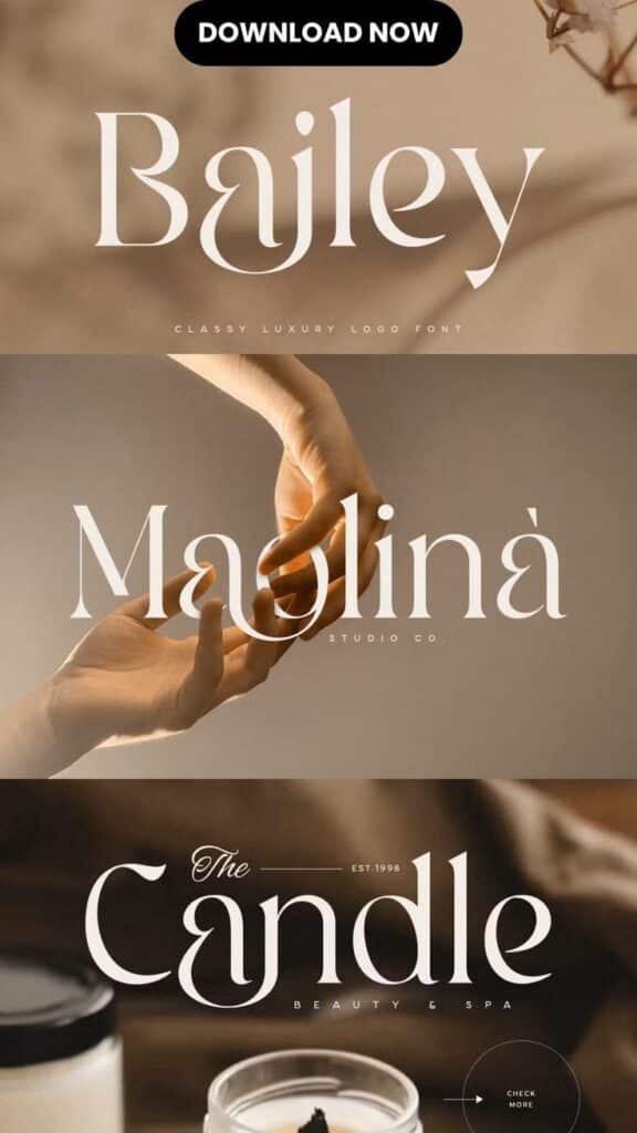
Serif fonts feature small decorative strokes extending from letter forms. These fonts traditionally work well for printed materials and long-form reading.
Popular serif fonts include Times New Roman, Georgia, and Garamond. They convey formality and tradition in design applications.
Sans-serif fonts lack decorative strokes, creating cleaner, more modern appearances. They perform exceptionally well on digital screens and in user interfaces.
Common sans-serif options include Arial, Helvetica, and Roboto. These fonts communicate simplicity and contemporary aesthetics.
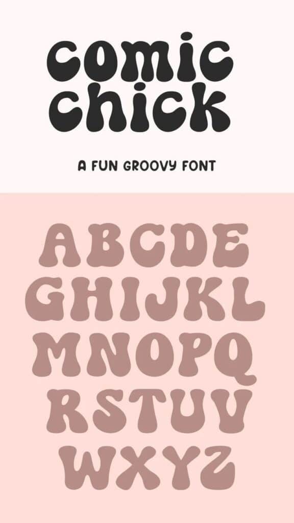
Script fonts mimic handwritten or calligraphic styles. Use them sparingly for decorative purposes or to add personality to specific design elements.
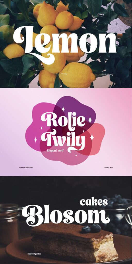
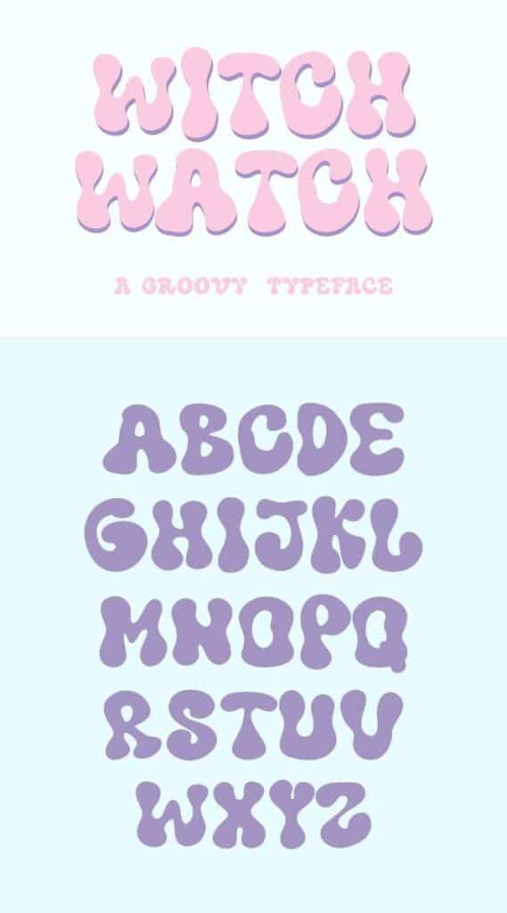
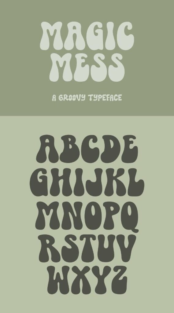
Display fonts are designed for headlines and large text applications. They often feature unique characteristics that make them unsuitable for body text.
The Role of Readability and Legibility
Readability and legibility are fundamental considerations that determine how effectively your typography communicates with readers.
Legibility refers to how easily individual characters can be distinguished from one another. Clear letter forms and adequate spacing improve legibility significantly.
Readability encompasses how easily people can read and comprehend entire blocks of text. Factors include font choice, size, line spacing, and contrast.
Font size plays a crucial role in both readability and legibility. Text that’s too small strains readers’ eyes, while oversized text can disrupt reading flow.
Consider your audience and medium when making typography decisions. Older readers may need larger font sizes, while mobile users require fonts that remain clear on smaller screens.
High contrast between text and background colors enhances readability. Dark text on light backgrounds typically provides optimal reading conditions.
Principles of Combining Fonts
Successful font combinations rely on creating harmony between different typefaces while maintaining clear visual hierarchy. The key lies in balancing complementary fonts with varied weights and styles to guide readers through your design.
Font Harmony and Contrast
Font pairing works best when you combine typefaces that complement each other without competing for attention. Complementary fonts share similar characteristics like x-height or overall proportions while offering distinct personalities.
The most effective approach involves pairing fonts from different categories. Combine a serif font with a sans-serif for classic contrast. Use a script font with a clean sans-serif for elegant variety.
Character and mood play crucial roles in font harmony. Match fonts that share similar emotional qualities:
- Playful designs: Pair rounded sans-serif with casual script
- Professional layouts: Combine traditional serif with modern sans-serif
- Creative projects: Mix display fonts with neutral body text
Avoid pairing fonts that are too similar, as they create confusion rather than harmony. Two sans-serif fonts with identical characteristics will look like a mistake rather than an intentional choice.
Visual Hierarchy in Typography
Visual hierarchy guides readers through your content by establishing clear importance levels. Font combinations should create distinct layers that organize information effectively.
Start with your most important element using the boldest or most distinctive font. Headlines typically use display fonts or heavy weights to grab attention first.
Create hierarchy through these font characteristics:
| Element | Font Treatment |
|---|---|
| Headlines | Large, bold, display fonts |
| Subheadings | Medium weight, slightly smaller |
| Body text | Regular weight, readable font |
| Captions | Small, light weight |
Font weight variations within the same family create subtle hierarchy. Use bold for emphasis, regular for body text, and light for secondary information.
Size relationships matter more than actual measurements. Maintain consistent ratios between heading levels and body text to create predictable navigation paths.
Balancing Font Weights and Styles
Font weight balance prevents any single element from overwhelming your design. Heavy fonts need lighter companions to create visual breathing room.
When combining fonts, consider the optical weight rather than just the numerical weight. Some fonts appear heavier or lighter than their designated weight suggests.
Font styles like italic, bold, and condensed add variety without introducing new typefaces. Use these variations strategically:
- Italic for emphasis or quotes
- Bold for important keywords
- Condensed for space-saving headers
Limit yourself to two or three font weights maximum. Too many weights create visual chaos and weaken your message hierarchy.
Test your font combinations at different sizes to ensure they work across all applications. What looks balanced at large sizes might feel uneven in smaller text blocks.
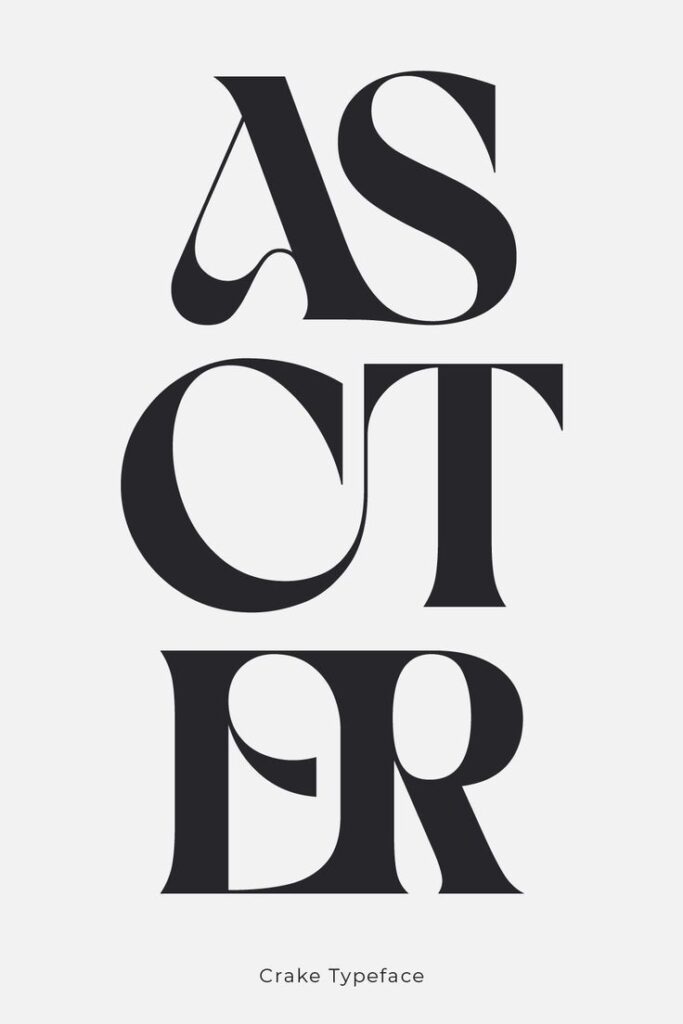
Practical Strategies for Font Pairing
Successful font pairing requires balancing contrast with harmony while considering font families, sizes, and spacing. The key is choosing complementary typefaces that create visual hierarchy without competing for attention.
Choosing Complementary Typefaces
Font choice becomes easier when you understand how different typefaces work together. Serif fonts pair naturally with sans-serif fonts because they offer contrast without conflict.
High-contrast combinations work well for creating emphasis. Try pairing a bold serif font for headlines with a clean sans-serif for body text. This combination provides visual interest while maintaining readability.
Similar-weight pairings create subtle harmony. You can combine two sans-serif fonts from different families if they share similar stroke weights and proportions.
Consider the mood of your typefaces when making font combinations. A playful script font clashes with a serious corporate serif, but it complements a casual sans-serif beautifully.
Avoid pairing fonts that are too similar. Two serif fonts from the same era or style often look like a mistake rather than an intentional choice.
Limit yourself to 2-3 fonts maximum in any design. More font combinations create visual chaos and dilute your message.
Matching Font Sizes and Spacing
Font sizes establish clear hierarchy in your design. Your headline should be at least 2-3 times larger than your body text to create proper contrast.
Line spacing affects readability dramatically. Set your leading (line height) to 120-150% of your font size for optimal reading comfort. Tighter spacing works for headlines, while body text needs more breathing room.
Tracking adjustments help balance your font combinations. Increase letter spacing for all-caps text or decorative fonts. Decrease it slightly for large headlines to improve visual cohesion.
Scale your font sizes proportionally using a type scale. Common ratios include 1.2, 1.333, or 1.5, which create harmonious size relationships between different text elements.
Maintain consistent spacing across your font family choices. If you use generous line spacing for one font, apply similar spacing principles to your secondary fonts.
Balancing Serif, Sans-Serif, and Script Fonts
Understanding when to use each font category helps create balanced designs. Serif fonts work best for long-form reading and traditional contexts.
Sans-serif fonts excel in digital environments and modern designs. They remain legible at small sizes and work well for user interfaces and mobile applications.
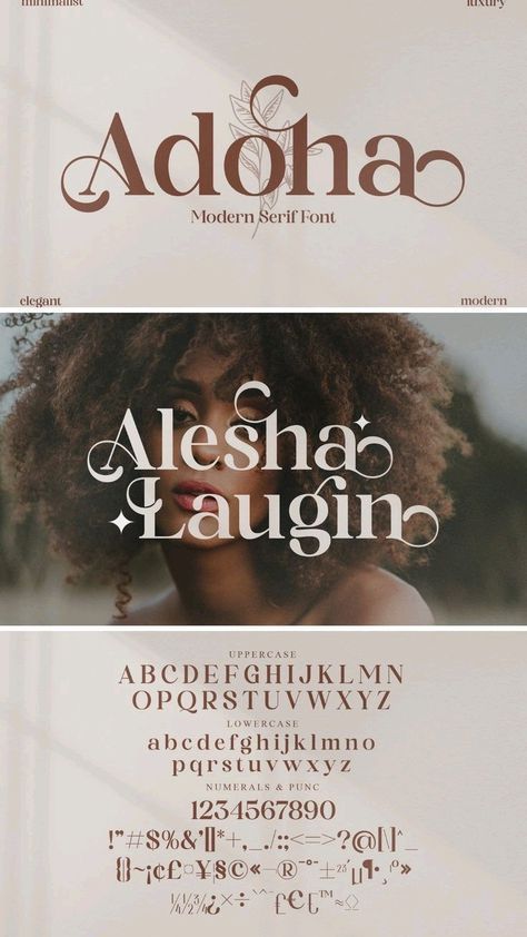
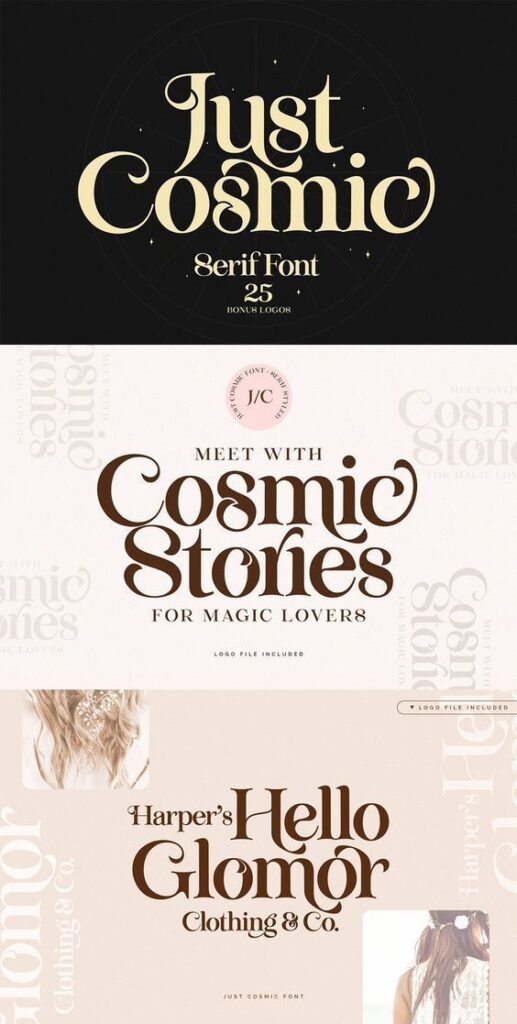
Script fonts should be used sparingly as accent elements. They work perfectly for logos, short headlines, or decorative elements but become unreadable in body text.
Create hierarchy by assigning specific roles to each font type. Use serif fonts for headlines, sans-serif for body text, and script fonts for special emphasis or branding elements.
Avoid mixing multiple scripts in one design unless you’re creating a very specific artistic effect. One script font per project maintains sophistication.
Test your font combinations at different sizes to ensure they work across all applications. What looks good at poster size might fail at business card dimensions.
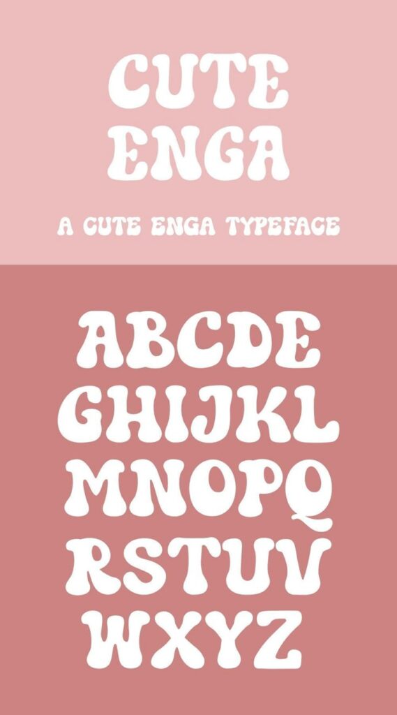
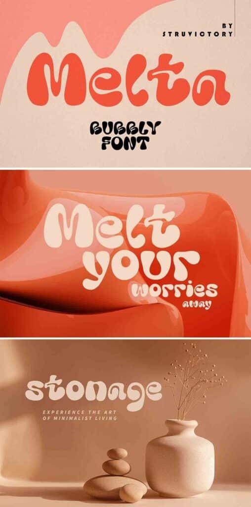
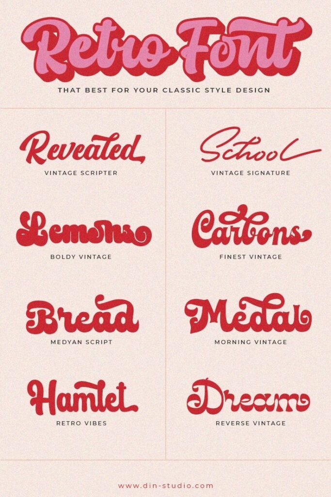
Effective Font Combinations and Examples
The most successful font combinations balance contrast with harmony, creating visual interest while maintaining readability. These proven pairings work across both digital and print applications, offering reliable starting points for your design projects.
Timeless Serif and Sans-Serif Pairs
Combining serif and sans-serif fonts creates natural contrast that guides readers through your content. The serif font typically handles body text while the sans-serif manages headings.
Garamond pairs beautifully with clean sans-serif fonts like Helvetica or Arial. This combination works exceptionally well for editorial designs and professional documents.
For web projects, try Archivo Narrow as your heading font with Georgia for body text. This pairing offers excellent screen readability while maintaining sophistication.
Popular serif and sans-serif combinations:
- Times New Roman + Futura
- Minion Pro + Myriad Pro
- Crimson Text + Open Sans
These complementary fonts create hierarchy without competing for attention. The serif provides warmth and tradition while the sans-serif delivers modern clarity.
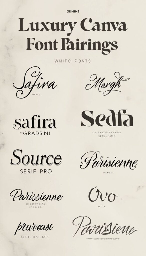
Modern Script and Display Font Combos
Script fonts add personality but require careful pairing to avoid overwhelming your design. Yellowtail works well with structured fonts like Lato or Montserrat for contemporary projects.
Limit script fonts to headlines, logos, or accent text. Pair them with neutral sans-serif fonts for body copy to ensure readability.
Display font combinations that work:
- Playfair Display + Source Sans Pro
- Oswald + Merriweather
- Bebas Neue + Lora
Roboto Condensed serves as an excellent support font for decorative typefaces. Its compact structure provides breathing room while maintaining strong readability.
Sample Font Pairings for Web and Print
Google Fonts offers tested combinations through their pairing suggestions. Popular web combinations include Raleway with Lora, and Poppins with Source Serif Pro.
Adobe Fonts provides professional font families designed to work together. Their font pair recommendations ensure consistency across different weights and styles.
Web-optimized pairings:
- Nunito + Crimson Pro
- Inter + Spectral
- Work Sans + Inconsolata
Print-friendly combinations:
- Caslon + Gill Sans
- Baskerville + Avenir
- Sabon + Univers
Test your chosen font families at different sizes and weights. What works for headlines might not function well for body text, so adjust accordingly.
Tools, Resources, and Advanced Tips
Modern font pairing relies heavily on digital tools and staying current with design trends. Effective testing methods and reliable resources can transform your typography from basic to professional-level design work.
Using Online Font Pairing Tools
Google Fonts offers one of the most comprehensive free font libraries with built-in pairing suggestions. You can preview combinations directly in your browser and see how fonts look together in real-time.
The platform provides filtering options by style, weight, and language support. You can also view popular pairings that other designers have successfully used in their projects.
Typ.io specializes in showcasing real-world font combinations from actual websites. This tool lets you see how professional designers implement font pairing in live web design projects.
Fonts in Use serves as a visual archive of typography across different media. You can browse by typeface, designer, or project type to find inspiration for your own combinations.
Adobe Fonts integrates seamlessly with Creative Suite applications. The service includes filtering tools that help you find fonts with similar characteristics or complementary styles.
Testing Font Combinations Effectively
Start by creating a simple test document with your chosen fonts at different sizes. Include headings, subheadings, body text, and captions to see how the combination performs across all hierarchy levels.
Test your font pairs in their actual context. Web design projects should be tested in browsers, while print materials need physical proofs to assess readability and visual impact.
Consider these key testing scenarios:
- Different screen sizes for digital projects
- Various lighting conditions for print materials
- Long-form reading to check comfort and legibility
- Accessibility requirements including contrast and screen readers
Use placeholder text in multiple languages if your project targets diverse audiences. Some font combinations work well in English but fail with accented characters or different writing systems.
Staying Updated with Typography Trends
Follow design blogs and typography-focused publications that regularly feature new font releases and pairing techniques. Many foundries announce new typefaces monthly with suggested companion fonts.
Social media platforms like Instagram and Pinterest showcase current typography trends through design portfolios. Search hashtags like #typography and #fontpairing to discover fresh combinations.
Typography conferences and workshops provide hands-on learning opportunities. Many events now offer virtual attendance options, making professional development more accessible.
Subscribe to newsletters from major type foundries. These often include exclusive previews, pairing guides, and case studies from successful design projects.
Consider joining online communities where designers share font discoveries and pairing experiments. These forums often discuss both free and premium options for different project types.
- 4.3Kshares
- Facebook0
- Pinterest4.3K
- Twitter0
- Reddit0


