I’ve spent enough years reviewing clay models and surfacing sheet metal to develop a habit: I look at objects as engineering decisions before I look at them as products. So when TUDOR quietly rebuilt the Royal for 2026 — new case sizes, a redrawn dial, a longer power reserve — I didn’t read it as a marketing refresh. I read it as a set of design choices someone had to defend in a room.
- Reading the Case as a Product Designer
- Proportion — What 30mm, 36mm, and 40mm Actually Mean on a Wrist
- Materials and Finishing — the Jewelry Logic Behind Steel and Gold
- What's Actually Different Under the Dial in 2026
- Heritage Details That Still Do Real Work
- From Object to Wardrobe Anchor
- Ten Looks Built Around the TUDOR Royal
- Conclusion
- FAQ
- What sizes does the 2026 TUDOR Royal come in?
- What changed in the 2026 TUDOR Royal redesign?
- Is the TUDOR Royal a good watch for daily wear?
- Steel or two-tone — which TUDOR Royal is more versatile?
- Can a TUDOR Royal work with a black-tie outfit?
- How do I choose the right TUDOR Royal case size for my wrist?
- Is the notched bezel on the TUDOR Royal just decorative?
Most coverage of the update has been specs-first: 30mm, 36mm, 40mm, 70 hours of reserve, COSC certification. Fair enough, but specs don’t tell you why the notched bezel still grips your fingers the way a dive tool would, or why the bracelet disappears into the case shoulder without a visible seam. Those are proportion and surfacing decisions, and they’re the reason the watch reads as one object instead of a dial bolted to a strap.
This isn’t a buying guide. It’s a walk through what actually changed, seen the way I’d review a design — case, materials, mechanics, then how it holds up against real clothes.
Reading the Case as a Product Designer
The Notched Bezel as a Tactile Detail, Not Decoration
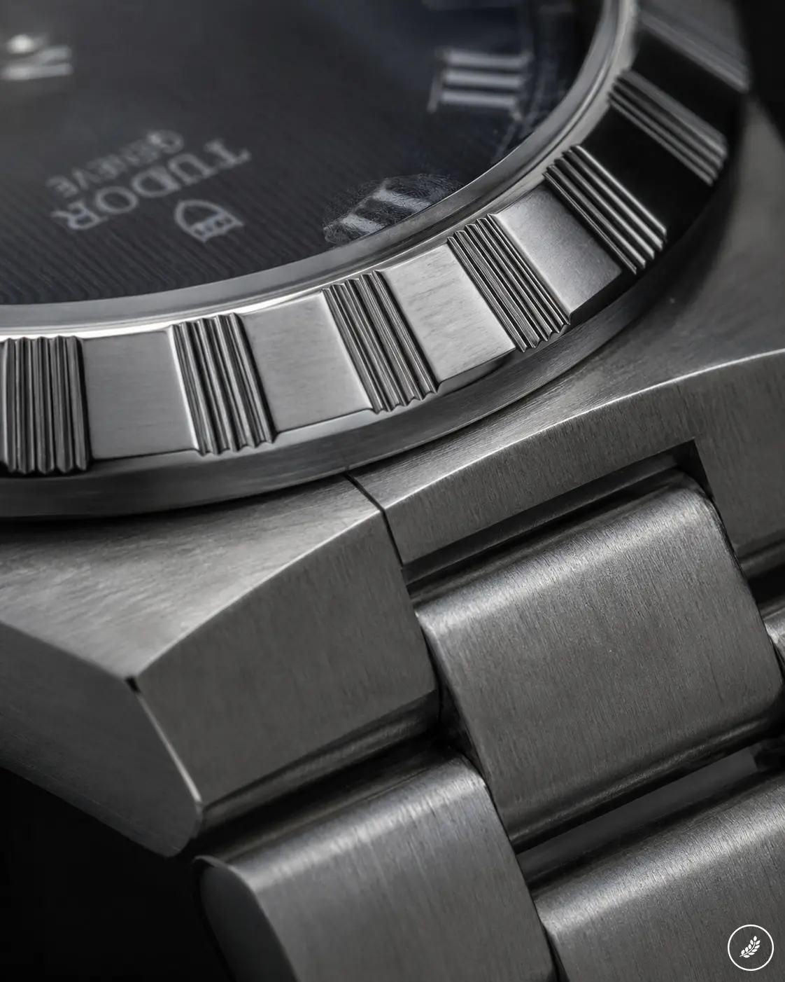
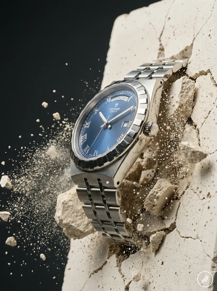
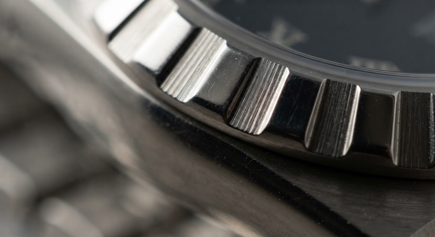
Run a finger around the Royal’s bezel and you’ll feel ridges, not a smooth edge. That’s not styling for styling’s sake. Knurling like this shows up on tools you’re meant to grip under pressure — camera dials, machine controls, anything you adjust without looking. On a watch that will likely never see a dive computer or a wetsuit, it still earns its place: it gives your eye a rhythm to follow around the case, and it gives your fingers something to catch when you’re setting the date at a stoplight.
A plain polished bezel would do the job. It just wouldn’t do it as well, and it wouldn’t photograph the same way under raking light.
Where the Bracelet Meets the Case
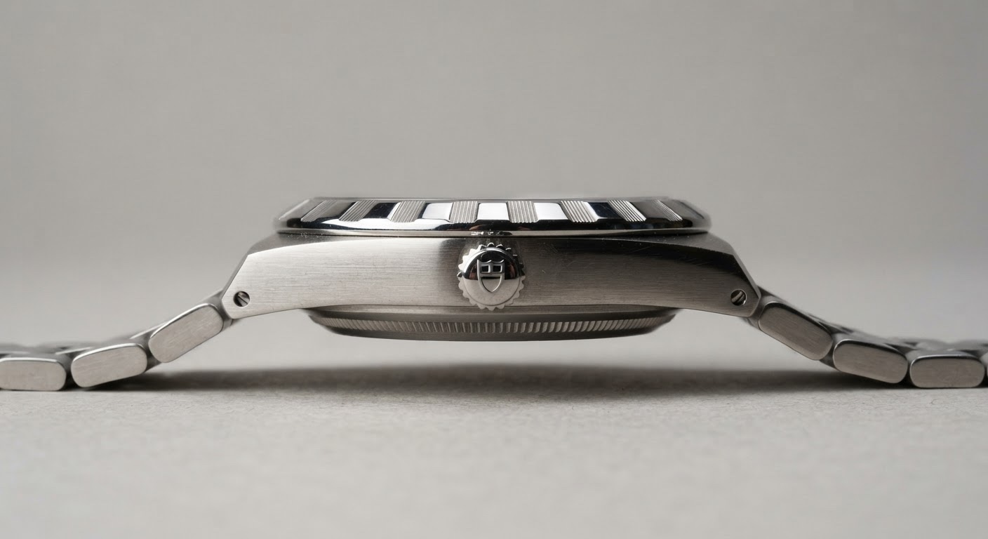
The harder trick is the seam — or the lack of one. The first bracelet link picks up the exact width and curve of the case shoulder, so there’s no visible break where “case” ends and “strap” begins. I’ve spent enough time managing panel gaps on a car body to know what that costs in tolerance. You’re not hiding a seam across sheet metal here; you’re hiding it across a curved surface a few millimeters wide, in steel, at production scale.
Proportion — What 30mm, 36mm, and 40mm Actually Mean on a Wrist
Measuring Case Against Wrist Width, Not Just Diameter
Case diameter on a spec sheet lies to you a little. What actually matters is how the case reads against your wrist width, not just its number in millimeters. A 40mm case wants at least a 7-inch wrist to sit with proper breathing room on either side; anything narrower and the lugs start to overhang. I only trusted this once I compared the three sizes in hand, since product photos flatten the difference between them.
That’s worth doing before you commit. It’s thirty seconds against a spec sheet, and it’s worth trying the sizes in hand — browse TUDOR Royal watches from Kee Hing Hung Singapore lets you compare the 30mm, 36mm, and 40mm range in person before deciding.
How the Two-Tone Ratio Shifts With Case Size
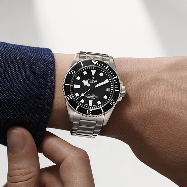
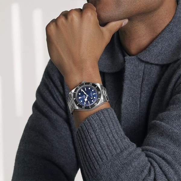
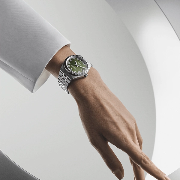
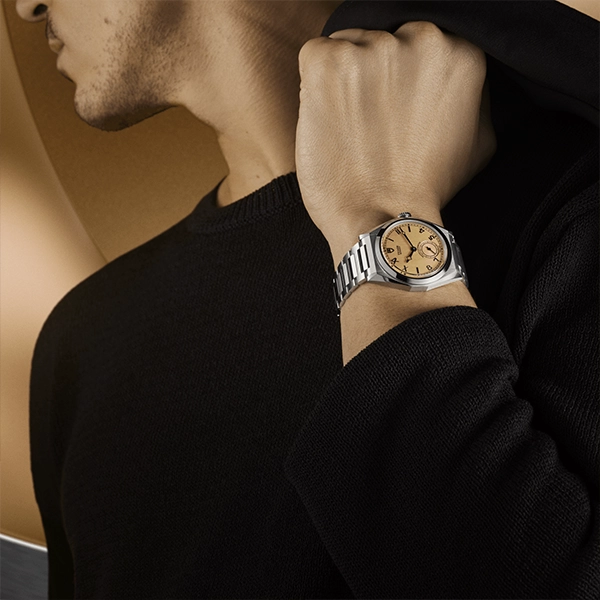
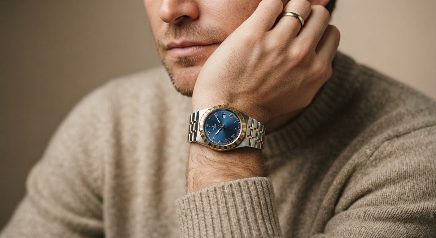
The two-tone models complicate the math further. Gold sits on the bezel notches, the center bracelet links, sometimes the crown, with steel everywhere else, and that ratio shifts as the case grows. A 30mm two-tone reads restrained, almost jewelry-adjacent. A 40mm leans harder into the gold, closer to a statement piece than a daily-wear one.
Materials and Finishing — the Jewelry Logic Behind Steel and Gold
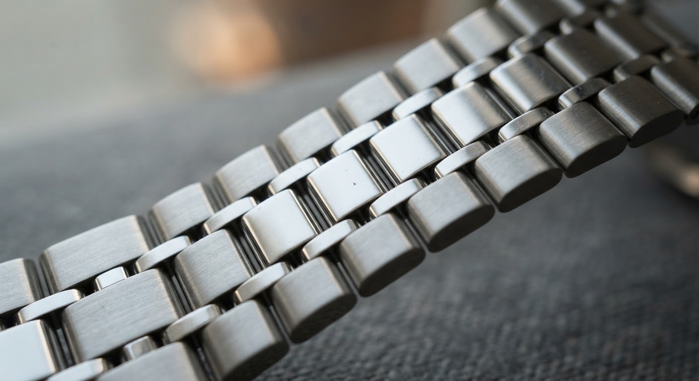
Why the Bracelet Alternates Brushed and Polished Link by Link
I spent a few years in jewelry design before moving into product and automotive work, and material transitions are where most pieces fall apart — literally and visually. The Royal’s bracelet alternates brushed and polished surfaces link by link, and that choice does two things at once. It creates depth as light moves across your wrist, and the brushed sections hide the micro-scratching that steel picks up in daily wear far better than an all-polished finish would.
A fully polished bracelet looks sharper in a product shot. It looks tired after three months on a wrist.
Gold Placement as Restraint, Not Excess
The two-tone models use 18kt gold with real discipline — bezel notches, center links, sometimes the crown, steel holding down everything else. That’s the difference between two-tone that reads considered and two-tone that reads like a rental counter. Gold as accent, not as coverage. In my experience, the steel-only versions actually wear more versatile day to day than the two-tone gets credit for; a two-tone case wants at least one other warm-toned element nearby — a belt, a cufflink — to feel like it belongs.
What’s Actually Different Under the Dial in 2026
The COSC Movement and the New 70-Hour Reserve
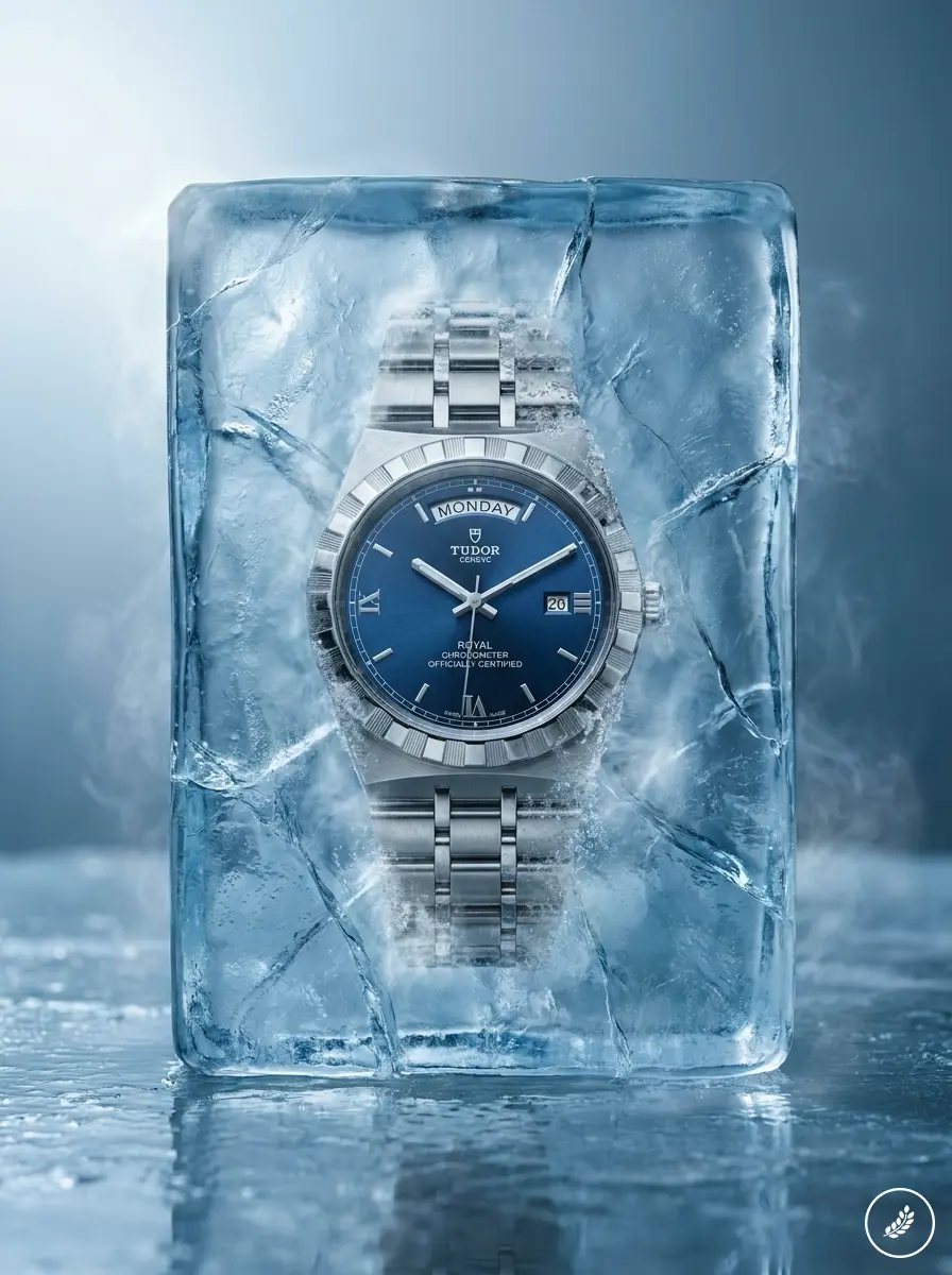
This is where the 2026 update earns its keep. The redesigned Royal runs on a COSC-certified self-winding movement with a 70-hour power reserve — nearly double the roughly 38 hours older Royal calibers offered. Leave it on your dresser Friday night and it’s still running Monday morning. That’s not a marketing number; it’s a real change in how the watch fits a routine where you don’t wear the same piece every day.
The dial got redrawn too, with cleaner stick markers replacing the busier index from earlier generations. It’s a small change on paper that does a lot of work in photos — more legible, less cluttered, closer in spirit to a Datejust than to the original Royal’s fussier face.
How Movement Architecture Shapes Case Thickness
None of this happens without consequence. A movement built for a longer reserve needs more room — a larger mainspring barrel, thicker components — and that pushes case thickness up slightly. I’ve sat through enough clay reviews to know thickness decisions ripple outward: they affect how a case catches light at the edge, how it sits under a cuff, how substantial it feels on the wrist. Here, the added heft reads as intent, not compromise.
Heritage Details That Still Do Real Work
The Bezel Notching’s Dive-Watch Origin
The notched bezel isn’t a Royal invention — it’s borrowed language from old dive watches, where ridged edges gave you grip to turn a bezel or set a crown with gloves on. The Royal will never see saltwater. It doesn’t need that grip to survive a dive. But TUDOR kept the detail anyway, and the reason it still works is that it reads as an inherited function, not a decorative flourish tacked on for nostalgia.
That’s the more honest version of a heritage story. Not “timeless elegance” copy, but a functional detail from a working tool watch, reinterpreted for a case that will spend its life under a shirt cuff instead of a wetsuit.
Design Language That Outlives Its Original Function
I see the same pattern in automotive design constantly — a vent or a crease that started as airflow management ends up as a styling cue two generations later, long after the function that justified it is gone. It only survives if it still does something: gives the eye a place to land, gives the hand something to register. The bezel notching passes that test. Plenty of “heritage” details on other watches don’t.
From Object to Wardrobe Anchor
Every design review eventually asks the same question: does this object hold up outside the studio, under real light, next to things it wasn’t designed in isolation with? A watch answers that question every day, whether you’re paying attention or not.
The Royal’s restraint is what makes it flexible here. Nothing about the case, the dial, or the bracelet is loud enough to fight with what you’re wearing — which means the watch can anchor a look instead of competing with one. A busier design would demand you build an outfit around it. This one just sits at the wrist and does its job, the way a well-placed vent line does its job on a car without asking to be noticed.
That’s a harder thing to design than it sounds. Restraint that still reads as intentional — not absent, not accidental — takes more discipline than adding another detail would.
What follows are ten real scenarios, not studio pairings: office days, weekend errands, one black-tie exception. In each, the case finish, dial color, and bracelet stay fixed; only the context around the wrist changes. That’s the actual test of whether an object’s design choices were right — not how it photographs alone, but how it holds up against everything else in the room.
Ten Looks Built Around the TUDOR Royal
These aren’t studio pairings built for a lookbook. They’re the outfits an object actually has to survive — office mornings, weekend errands, one evening you didn’t plan to dress up for. The watch stays fixed in each: same case, same bracelet, same dial. Only the context changes.
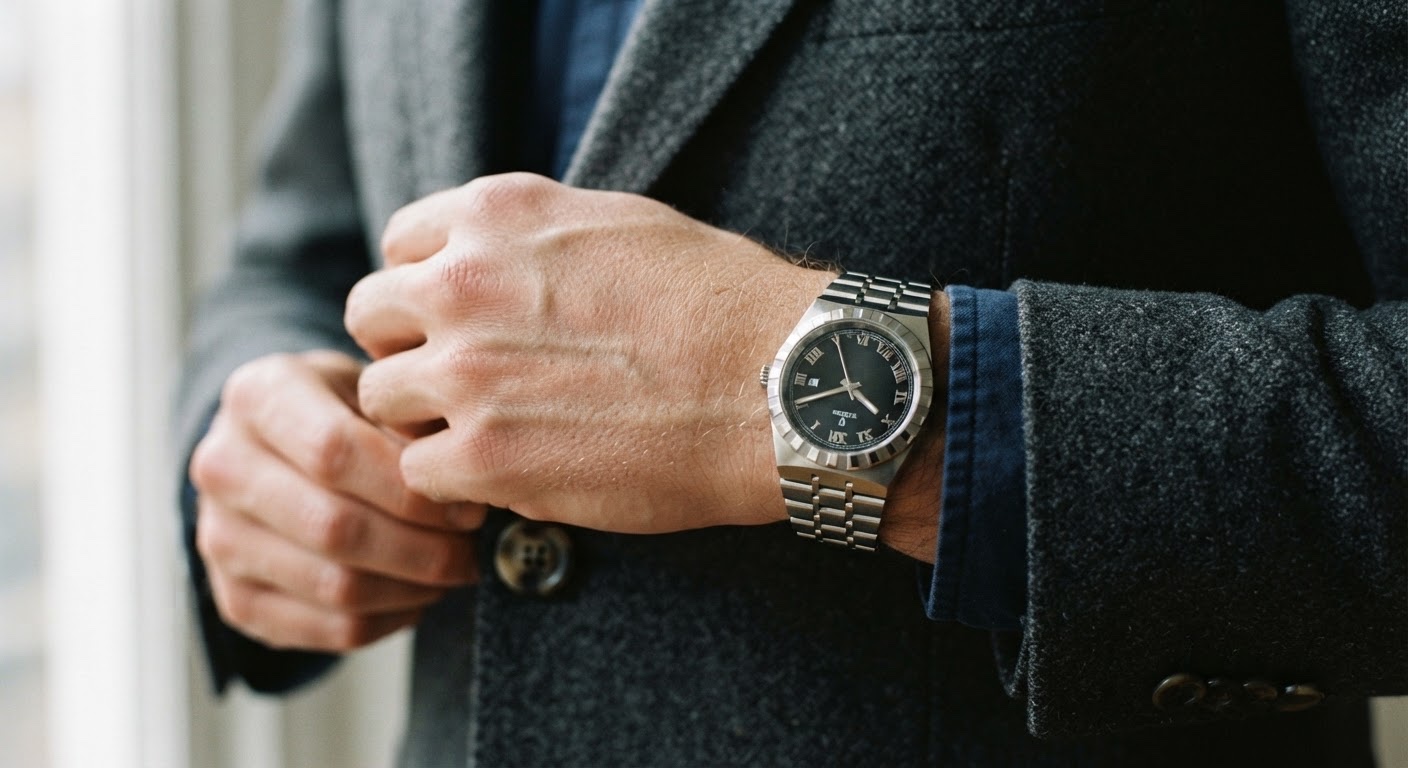
1. Grey Suit, Boardroom Days
A steel-bracelet Royal in 36mm disappears under a tailored cuff the way a good watch should — visible when your arm moves, gone when it doesn’t. Keep the sleeve length short enough that a half-inch of case peeks out; that’s the detail that reads as intentional rather than borrowed from your father’s closet.
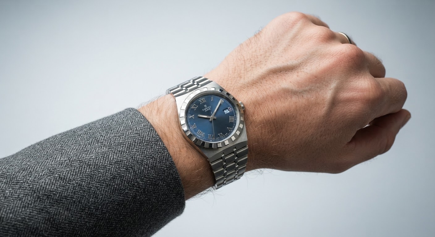
2. Unstructured Friday, No Tie
Swap the structured jacket for something unlined, drop the tie, open the collar. A two-tone Royal earns its place here — the gold pulls warmth from suede shoes or a leather belt without adding another layer to think about. Soft wool against brushed steel does more visual work than a second dress shirt ever would.
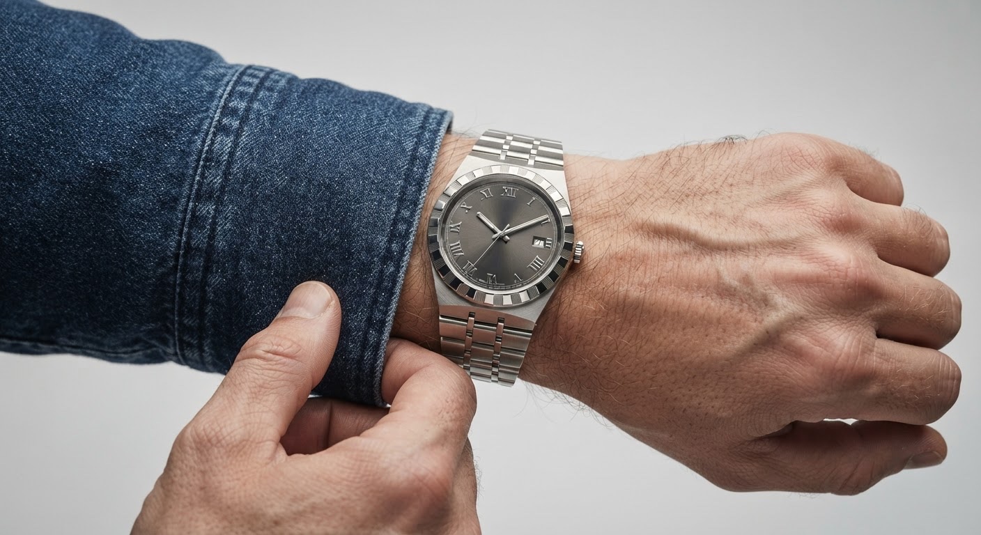
3. Weekend Errands, Raw Denim
Indigo denim and a canvas overshirt have texture the same way brushed steel does — neither is trying too hard, and they sit well together. This is also where the notched bezel stops being decorative and starts being functional: you’re actually adjusting it more on a Saturday than you are at a desk.
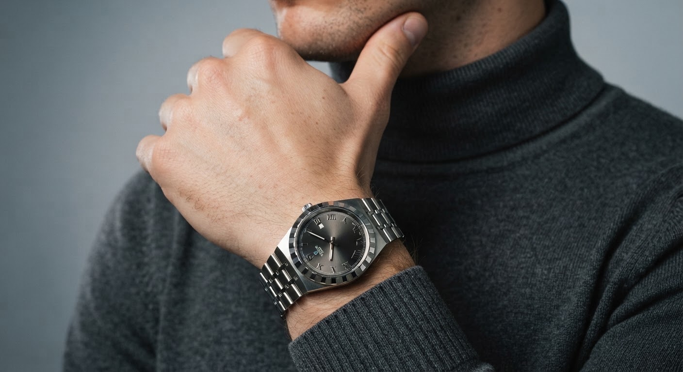
4. Minimalist Turtleneck, Monochrome
Charcoal or black wool, a dark-dial Royal, nothing else competing for attention. The only visual interest left is light catching the bracelet links against an otherwise flat palette — which is exactly the point.
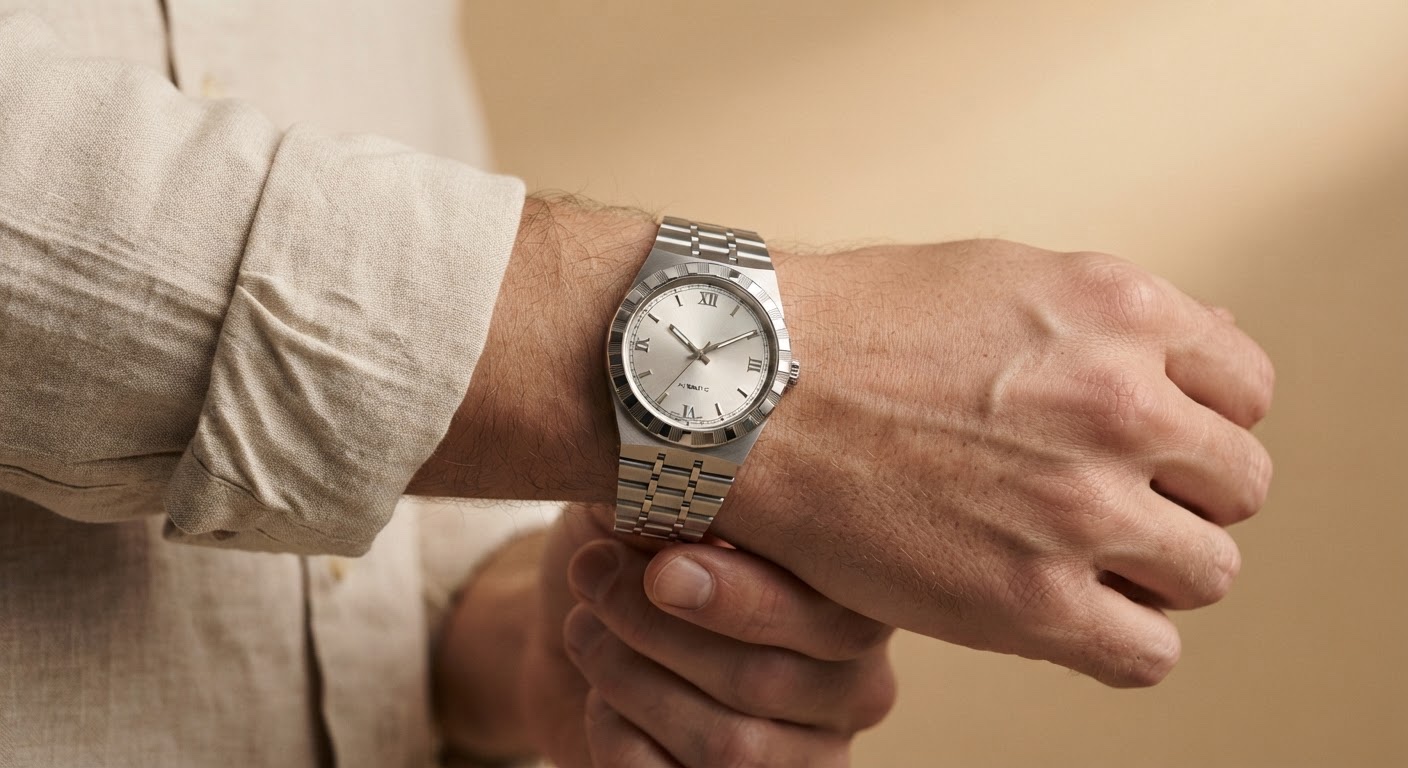
5. Resort Linen, Warm Weather
A lighter dial — silver or pale blue sunray — sits better against linen’s wrinkle than anything too formal would. The steel bracelet reads cooler here too, which matters when everything else in the outfit is already loose and pale.
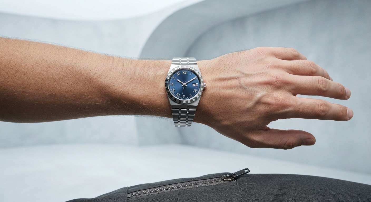
6. Technical Athleisure
A mechanical watch either looks deliberate here or forgotten before a workout — there’s no in-between. The fix is structure: a shell with a real collar, tapered trousers instead of joggers, so the Royal reads as contrast rather than mismatch. I keep the dial simple; there’s already enough visual noise in the zippers and seaming.
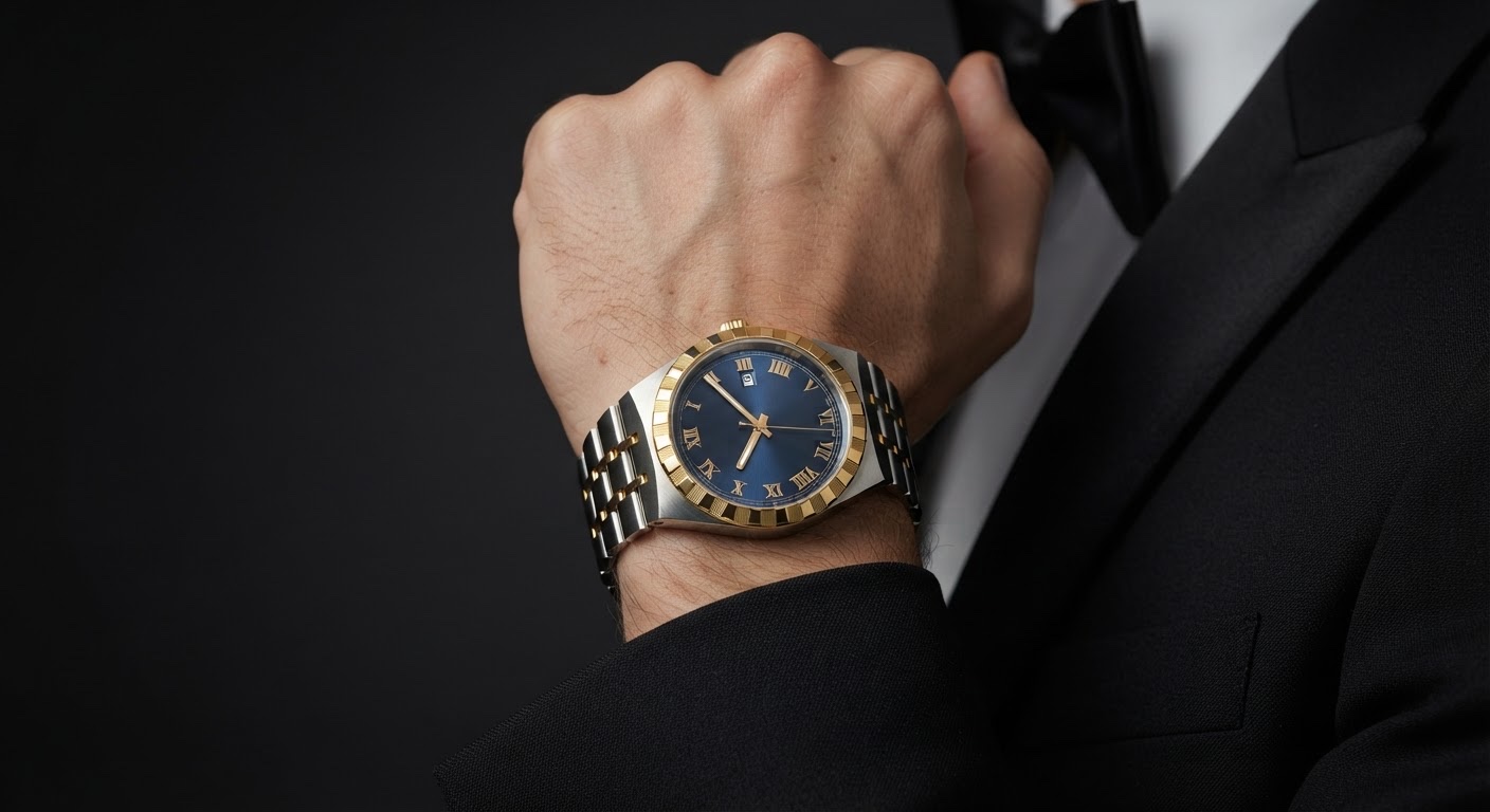
7. Black-Tie, One Exception
Conventional wisdom says a metal bracelet has no business at a formal event. A two-tone Royal breaks that rule in a way that actually works — the gold picks up warmth from cufflinks or a pocket square, and at an event with room for personality, like a wedding, a bracelet catching evening light does more for a tuxedo than another matte strap.
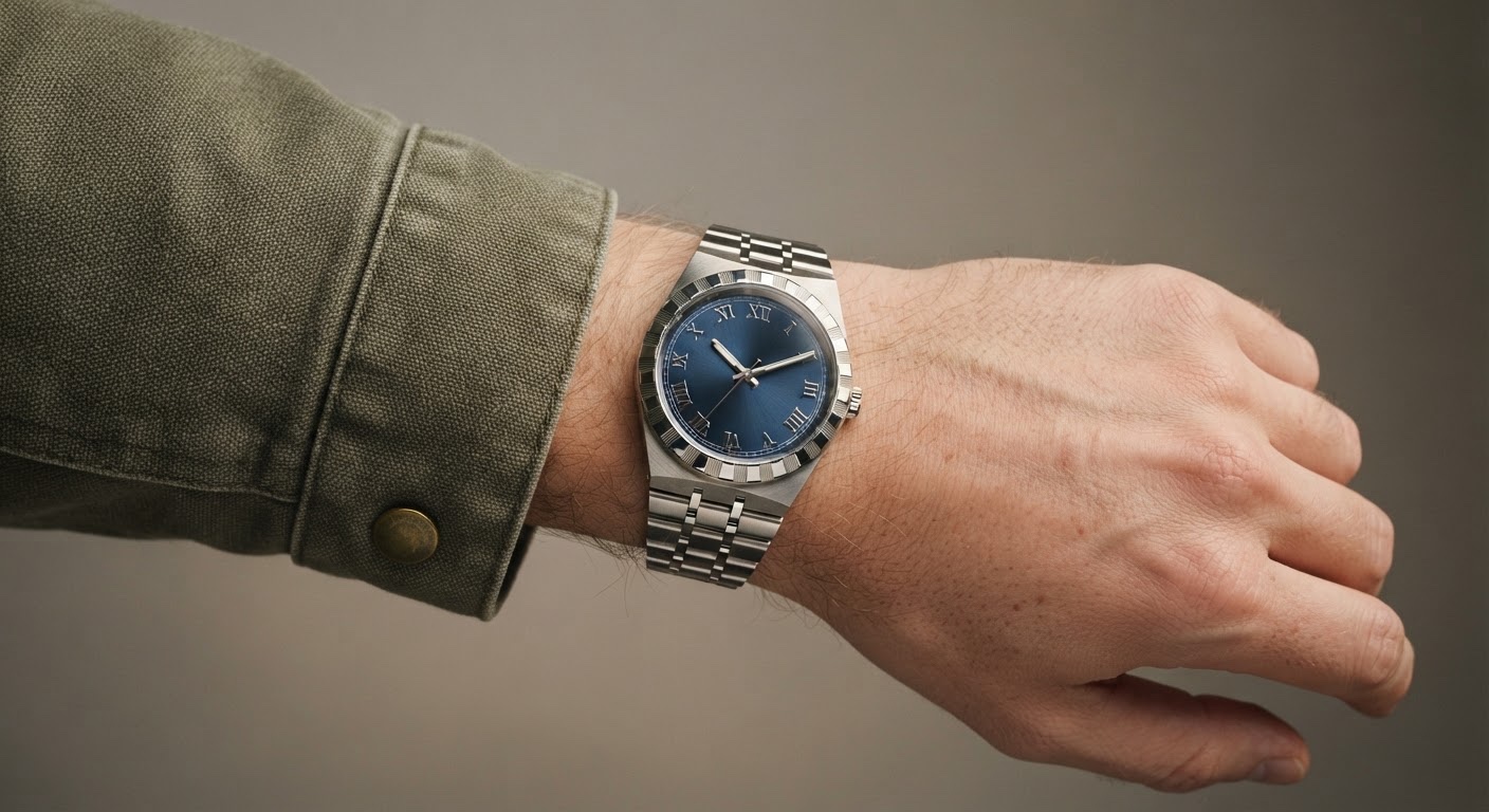
8. Utility Workwear
Brushed steel holds its own against hardware and pockets without adding noise the way something shinier would. This is the outfit for a studio or a workshop, where the watch needs to handle actual use — and where the bezel notching registers as a detail instead of demanding attention.
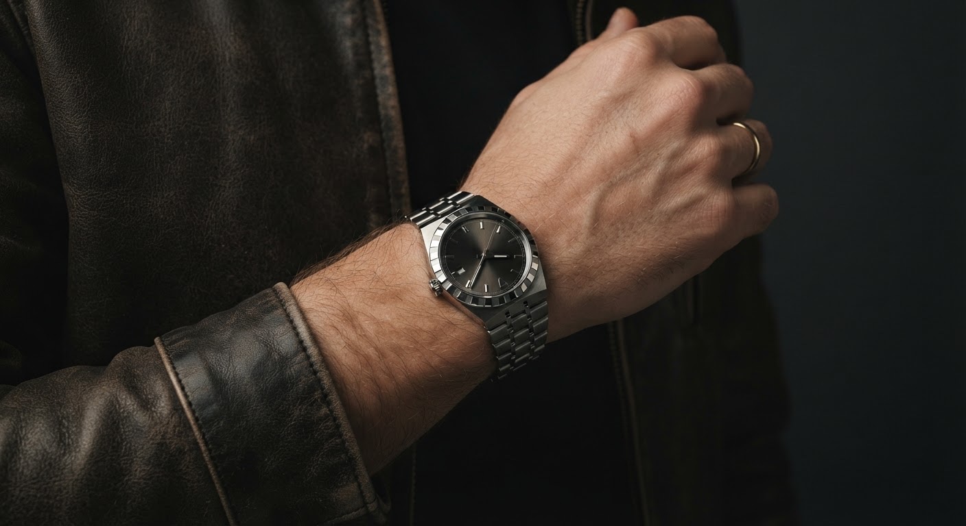
9. Leather Jacket, Dark Denim
The outfit here is close to a uniform, so the watch becomes the one variable you’re actually choosing. Steel keeps things cooler and closer to the jacket’s hardware; I lean steel over two-tone because the brushed bracelet catches light the same way worn leather does — two textures doing the same job instead of competing.
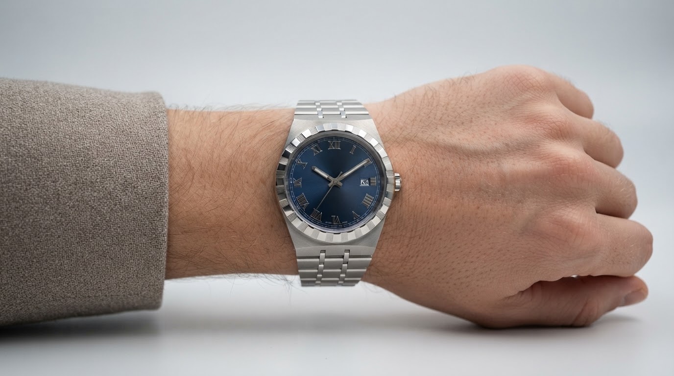
10. Monochrome Neutral Capsule
Stone, sand, grey — a design exercise more than an outfit. With no color to lean on, the watch becomes the only real anchor point, which makes it the honest test: does it hold up when there’s nowhere else for the eye to go.
Conclusion
Good object design doesn’t announce itself. It just keeps working across contexts you didn’t originally design it for — a boardroom, a workshop, a wedding you didn’t plan to dress up for. That’s the real test of the Royal’s 2026 update: not whether the spec sheet reads well, but whether the proportion, materials, and mechanical choices hold up once you take the watch off the product page and put it next to actual clothes.
The redesign gets the fundamentals right — sizing that finally covers a real range of wrists, a movement that stops asking you to think about it daily, a dial that reads clean instead of busy. None of that shows up in a press release the way it shows up on a wrist across a normal week.
If you’re deciding between sizes or finishes, trying them on beats reading about them every time.
FAQ
What sizes does the 2026 TUDOR Royal come in?
Three cases: 30mm, 36mm, and 40mm. That’s a real range now — the 30mm sits close and understated on a narrower wrist, while the 40mm has enough presence to hold its own under a jacket cuff. Try more than one size in hand before deciding; photos flatten the difference more than you’d expect.
What changed in the 2026 TUDOR Royal redesign?
The biggest shift is under the dial — a COSC-certified movement with a 70-hour power reserve, up from roughly 38 hours on earlier calibers. The dial also got redrawn with cleaner stick markers, and the case lineup moved to 30/36/40mm. Small changes on paper, noticeable ones on the wrist.
Is the TUDOR Royal a good watch for daily wear?
The integrated bracelet and notched bezel were built for exactly that — no sharp edges catching on cuffs, brushed sections that hide daily scratching better than an all-polished finish would. The longer power reserve also means it’s forgiving if you don’t wear it every single day.
Steel or two-tone — which TUDOR Royal is more versatile?
Steel, in my experience. It sits invisibly under a work shirt and still reads intentionally with a t-shirt on the weekend. Two-tone looks sharper in photos, but it wants at least one other warm-toned element nearby — a belt, cufflinks — to feel cohesive rather than mismatched.
Can a TUDOR Royal work with a black-tie outfit?
It can, though it breaks a rule most people assume is fixed. A two-tone Royal at an event with some room for personality — a wedding, say — picks up warmth from cufflinks or a pocket square in a way a plain black strap can’t. It’s not the safe choice, but it works.
How do I choose the right TUDOR Royal case size for my wrist?
Measure wrist width, not just case diameter. A 40mm case wants roughly a 7-inch wrist to sit with proper breathing room on either side; go narrower than that and the lugs start to overhang. Thirty seconds trying one on beats any spec sheet comparison.
Is the notched bezel on the TUDOR Royal just decorative?
No — it’s borrowed from dive-watch design, where ridged bezels gave you grip to adjust settings with gloves on. The Royal will never need that for diving, but the detail earns its place anyway: it gives your fingers something to catch and your eye a rhythm around the case.
- 52shares
- Facebook0
- Pinterest52
- Twitter0
- Reddit0