Building an effective design system is one of the best steps you can take to create consistency, speed up your design process, and improve collaboration across your team. A well-designed system provides a shared language for designers and developers, along with a library of reusable components that make your workflow faster and the user experience more predictable. Instead of reinventing the wheel every project, you develop a solid foundation that everyone can use and trust.
You don’t need to be part of a huge company to benefit from a design system—teams of any size can see productivity gains and better results by documenting design decisions, organizing core elements like colors and typography, and focusing on reusability. By formalizing how your team communicates and builds products, you create space to focus more energy on solving real problems for your users.
Key Takeaways
- An effective design system creates consistency and efficiency.
- Start with strong planning and reusable design elements.
- Ongoing collaboration and updates help your system succeed.
Understanding Design Systems
A design system helps you create unified, efficient digital products by providing clear standards and building blocks. It can simplify design processes, speed up development, and maintain consistency across all user interfaces.
What Is a Design System?
A design system is a comprehensive toolkit that includes guidelines, UI patterns, reusable components, and documentation. It acts as a single source of truth for product teams, ensuring everyone works with the same standards and components.
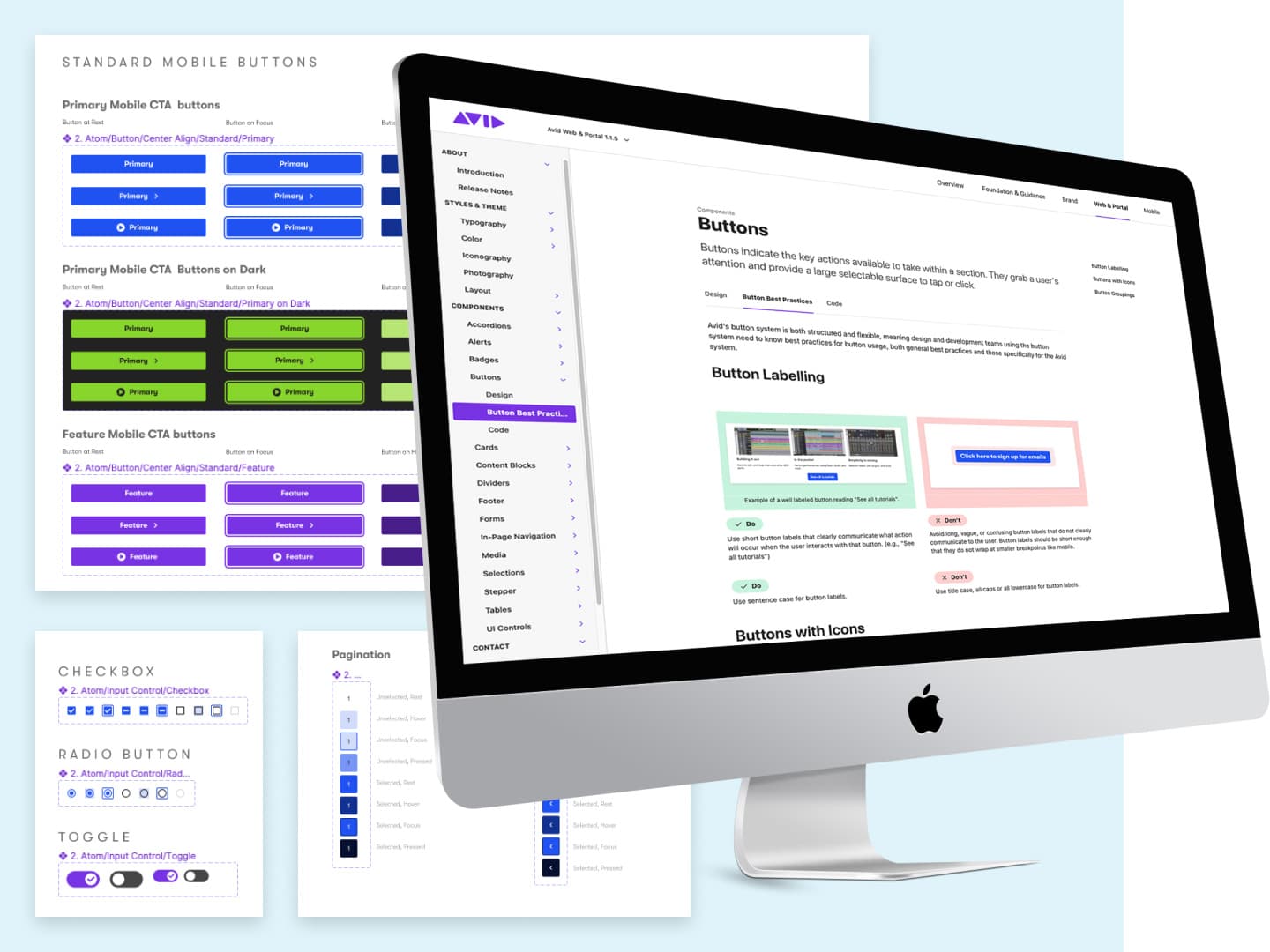
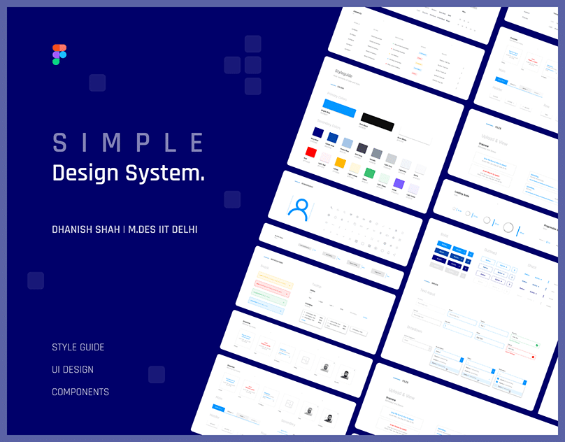
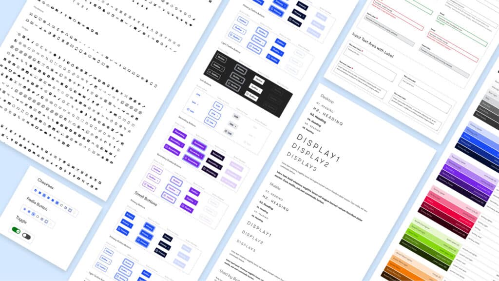
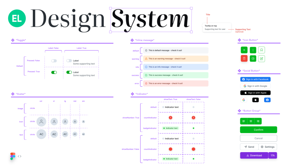
Inside a design system, you’ll typically find items like a style guide (defining typography, colors, spacing, and imagery), a component library (interactive and visual UI components like buttons or input fields), and usage guidelines for different platforms. Design systems also capture branding principles, accessibility standards, and best practices.
Unlike a simple style guide, a full design system is living documentation. This means it evolves with your product and team needs. Common examples include systems like Material Design, Salesforce Lightning, and IBM Carbon Design System.
Core Benefits of a Design System
Consistency: By using a shared library of UI components and standards, your products maintain a uniform look and feel. You reduce visual and functional discrepancies across screens and features.
Efficiency: Designers and developers spend less time reinventing solutions. Reusable components mean faster builds and iterations. You can onboard new team members quicker because documentation and processes are clear.
Scalability: Design systems support growth by making it easier to scale products and manage multiple projects. When rules for buttons, colors, or layouts already exist, teams can focus on new features instead of basic design decisions.
Better User Experience: Consistent interfaces lead to more predictable interactions for users. By emphasizing accessibility and usability within your system, you improve overall user satisfaction.
Design System Examples
Several leading design systems show how teams can achieve scalability and efficiency. Material Design from Google provides a robust component library, clear motion guidelines, and color palettes. It’s widely used for Android apps and web projects.
Salesforce Lightning Design System offers a vast set of UI patterns and detailed documentation for building Salesforce apps. IBM’s Carbon Design System focuses on enterprise needs, including data visualizations and accessibility.
Here’s a comparison table of notable design systems:
| Name | Key Features | Focus Area |
|---|---|---|
| Material Design | Component library, motion, guidelines | Mobile & web |
| Salesforce Lightning | UI patterns, accessibility, tokens | Business applications |
| Carbon Design System | Data-heavy interfaces, theming, usability | Enterprise platforms |
You can explore public examples to inspire your own design system’s structure and approach.

Laying the Foundation: Principles and Planning
Success with a design system begins with clear principles, purposeful planning, and a strong understanding of your current assets and workflows. Setting these building blocks early improves consistency and saves time as your system grows.
Establishing Design Principles
Design principles serve as the backbone of your system, guiding every decision from typography to interaction patterns. Make your principles explicit and easy to reference, so everyone—from designers to developers—can align their work.
Start by identifying what your brand stands for. Ask your product team questions like: Should your digital experiences feel innovative, friendly, or authoritative? Document three to five core principles that reflect your product’s purpose and audience. If you use tools like Figma or Sketch, embed these principles as part of your foundational documentation.
Keep these principles highly visible in your shared resources. Incorporate them into onboarding materials, design files, and your style guide. When uncertain, encourage your team to revisit these principles to keep the system cohesive and on-brand.
Defining Project Scope and Vision
Clarity around scope and vision sets expectations and prevents unnecessary work. Before gathering assets or drafting components, decide what your design system must achieve in the short and long term.
Define your project goals with the product and development teams. For example, your immediate aim might be to create a consistent UI across mobile and web, while your future goal could be supporting multiple brands. Write a short project vision statement and note which platforms or features the first release will cover.
List constraints and dependencies up front. Does your system need to support accessibility standards, localizations, or legacy code? Tracking these details helps avoid surprises down the road and guides your documentation and process planning.
Auditing Existing Assets
A thorough audit gives you a clear snapshot of your current resources and gaps. Gather all design files—such as Figma libraries, legacy Sketch files, and any existing style guides or documentation.
Work with your design and development teams to catalog common components, patterns, and styles already in use. Create a table or checklist to note redundancies, inconsistencies, and opportunities for standardization. Example checklist:
| Asset | Location | Duplicates | Issues |
|---|---|---|---|
| Button component | Figma Library | 4 | Inconsistent states |
| Color palette | Style Guide | 2 | Branding mismatch |
| Typography | Sketch files | 3 | Missing variants |
Share audit findings with your product team to get feedback and prioritize fixes. This process gives you a solid foundation to start building and ensures nothing important gets overlooked as your system evolves.
Building Core Elements
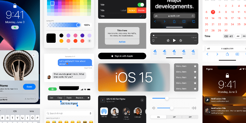
A strong design system relies on a clear set of building blocks. These essentials ensure all your products look cohesive, work smoothly, and remain easy to maintain as your needs grow.
Constructing Design Tokens
Design tokens are named values used throughout your system for things like color codes, font sizes, and spacing units. They let you change foundational attributes in one place, updating components everywhere automatically.
Key benefits:
- Quick updates across your product
- Promotes consistency
- Simplifies collaboration between design and development
A good token set might include variables such as:
| Token Name | Example Value | Description |
|---|---|---|
color-primary | #0057FF | Main brand color |
font-size-lg | 1.5rem | Large text size |
spacing-md | 16px | Medium spacing between items |
Use a structured naming system and organize tokens in categories. This helps everyone find and apply the right value quickly.
Creating Typography and Color Foundations
Typography forms your visual voice. It’s best to pick 1–2 primary typefaces and define a clear set of font weights and sizes for headings, paragraphs, and labels.
For typography, specify:
- Typeface choices (e.g. sans-serif or serif)
- Font weights (regular, bold, etc.)
- Line heights and letter spacing for readability
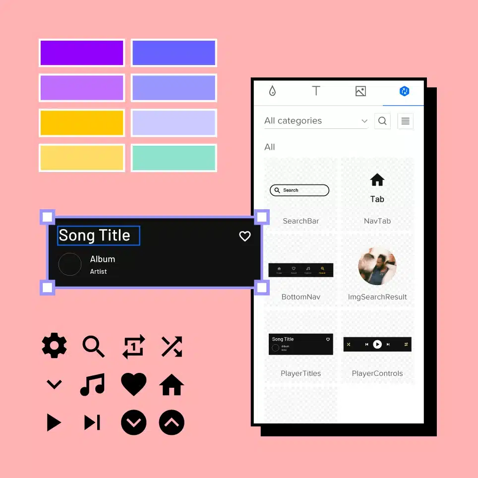
Consistent color palettes drive visual unity. Define your brand’s primary, secondary, and accent colors, as well as neutrals for backgrounds and borders.
Best practices:
- Maintain high contrast for accessibility
- Describe use cases in your documentation (e.g., “Primary buttons use
color-primary”) - List codes for all colors chosen
Include a chart or swatches to visualize your color options at a glance.
Defining Spacing, Layouts, and Iconography
Consistent spacing ensures readable, comfortable interfaces. Create a scale (such as 4, 8, 16, 32px) and apply it to padding, margins, and grid layouts.
For layout:
- Define grid units and column counts
- Document common patterns (e.g., card spacing, sidebar widths)
- Recommend responsive breakpoints for different devices
Iconography should be simple, clear, and match the visual style of your typography. Develop a set of core icons (e.g., home, search, close) in SVG format, maintaining consistent stroke widths and sizes.
Keep all icons accessible by providing descriptive labels. Store them in an easily sharable library for your team.
Developing Reusable Components and UI Patterns
Reusable components and effective UI patterns are essential for achieving design consistency and speeding up interface development. By focusing on library structure and standardized practices, you can ensure your system scales and stays maintainable.
Designing Component Libraries
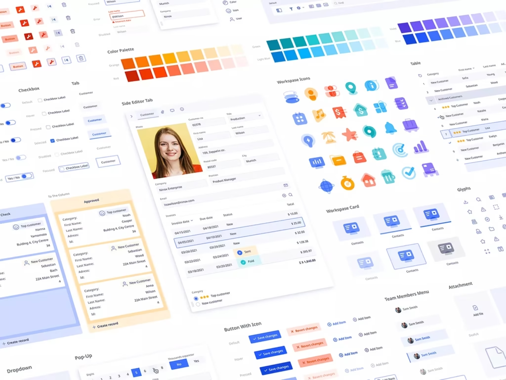
When building a component library, begin by identifying the fundamental UI elements your team uses most often. Start with essentials like buttons, input fields, typography, and modals. Each component should be built to be self-contained, easy to reuse, and customizable through props or configuration options.
Use tools such as Storybook to visualize, document, and test your components in isolation. This helps prevent design drift and allows your team to review changes before integrating them. Maintain a clear folder structure so you can find and update components quickly.
Consider breaking complex components into smaller ones to support modularity. For example, rather than having a single “form” component, split it into input, label, helper text, and error message components. This improves testability and reusability.
Focus on accessibility and responsive design from the beginning. Adhering to standards like WCAG and ensuring keyboard navigation will help your library serve a wider audience. Update your documentation whenever you make changes to a component, making sure designers and developers stay in sync.
Standardizing UI Components
Standardization starts with defining clear guidelines for colors, spacing, typography, and interactive states. Document these choices in a central place, and enforce them through your component APIs. Consistent tokens for spacing, colors, and font sizes help enforce your visual language across all design components.
Use UI patterns—like cards, lists, navigation, and alerts—to ensure common design solutions are recognizable and functionally consistent. List out available patterns in your documentation, providing do’s and don’ts to guide implementation.
Employ a versioning system for your component library, so teams know when breaking changes occur and how to upgrade. Establish a review process for new components, requiring a checklist that includes visual review, usage examples, and accessibility compliance.
Encourage collaboration among designers and developers. A shared repository and regular design reviews help spot inconsistencies early. Standardization reduces duplicated work, makes onboarding easier, and keeps your product interface coherent as it evolves.
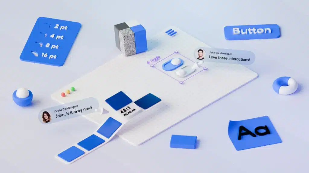
Implementation, Collaboration, and Documentation
To make a design system successful, you’ll need close teamwork, strong tools integration, and clear documentation. These elements help align developers and product teams, reduce friction during implementation, and speed up your time to market.
Effective Collaboration Across Teams
Collaboration starts with involving designers, developers, and product stakeholders early in the process. A cross-functional team shapes the direction of your system, ensuring practical solutions that fit everyone’s needs.
Set up regular check-ins and open feedback channels using tools like Slack, Jira, or Trello. Encourage shared ownership by breaking down silos and adopting clear communication guidelines.
Document team expectations, workflows, and common terminology. This shared language avoids misunderstandings and keeps your project moving forward. Allow room for feedback and iteration to keep your system flexible as requirements change.
Integrating with Development Tools
Integrating your design system with tools like Git and Storybook brings the system into developers’ daily workflows. Store your UI components in a version-controlled repo for transparency and easy updates.
Storybook is a popular choice for visually testing and demonstrating components. It lets you showcase each component’s states, making it easy for both designers and developers to reference up-to-date implementations.
Automate style guide generation, code snippets, and changelogs using CI/CD pipelines. This reduces manual work and keeps your design system in sync with production code, shortening your time to market.
Comprehensive System Documentation
Good documentation covers guidelines for using components, design tokens, contribution processes, and best practices. Use clear headings, code examples, and visual references so documentation is accessible to all team members.
Maintain an open feedback loop to update documentation as your system evolves. Consider using documentation platforms that support versioning and collaboration, such as Notion, Confluence, or GitHub Pages.
Make your documentation the single source of truth. This supports onboarding for new team members and ensures consistency as your design system scales across products and platforms.
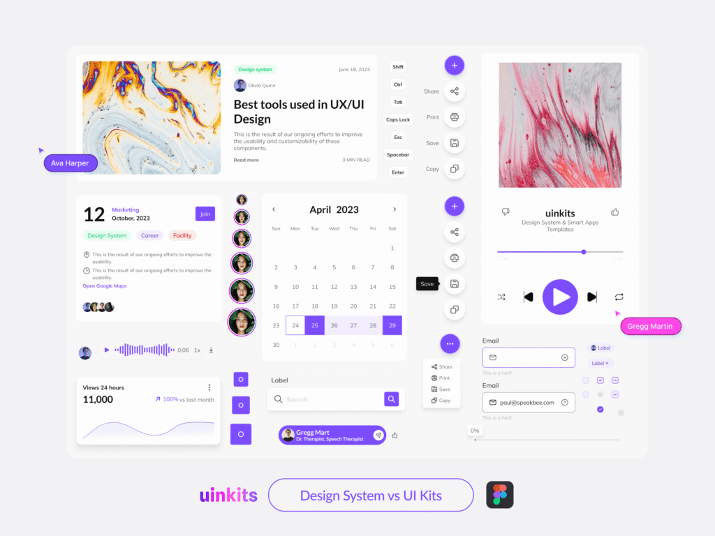
Maintaining and Evolving Your Design System
Keeping your design system successful means making sure it’s actually used, updated, and grows with your teams over time. Consistent maintenance improves team adoption, while thoughtful updates help your system scale as the product changes and expands.
Fostering Adoption and Feedback
Invite people from your product teams to contribute early and often. By involving designers and developers across roles, you encourage buy-in and spot usability issues before they spread.
Offer clear, up-to-date documentation that shows exactly how components and patterns work. Keep channels open for feedback using surveys, review sessions, or a dedicated chat group.
Consider office hours where users can ask questions or suggest improvements. This creates a feedback loop that builds trust and enables you to catch problems before they become widespread. The more you act on feedback, the more invested teams become in maintaining your design system.
Key Adoption Tools
| Tool/Method | Purpose |
|---|---|
| Documentation | Guides use and reduces confusion |
| Office Hours | Direct Q&A and support |
| Feedback Channels | Collect suggestions and bug reports |
| Design Reviews | Encourage collaboration |
Ensuring Scalability and Continuous Improvement
Design systems must grow as your products and users grow. Structure your system to support modularity—break elements into reusable components that can be adopted by different product teams with minimal friction.
Plan periodic audits to review components, identify redundancies, and remove outdated assets. Use version control and changelogs so everyone can track updates across teams. Regular updates help keep your system compatible with evolving technologies and user needs.
Create guidelines for adding or retiring components, and make sure changes are well-documented. This supports scalability and keeps your design system manageable even as it expands across multiple products and platforms.
- 11shares
- Facebook0
- Pinterest11
- Twitter0
- Reddit0

