AI in digital art works best as a controlled production tool, not as a substitute for an artist’s decisions. It can generate variations, repair missing areas, test colour directions, mock up an exhibition, or prepare a concept for a screen. The artist still has to decide what the work is about, which image deserves attention, what should be removed, and when the result is finished.
This guide shows a practical workflow for moving from a human brief to a finished digital artwork or exhibition concept. It also covers the parts an image generator cannot solve for you: authorship, consistency, display constraints, accessibility, and a clear record of how the work was made.

What does AI change in digital art?
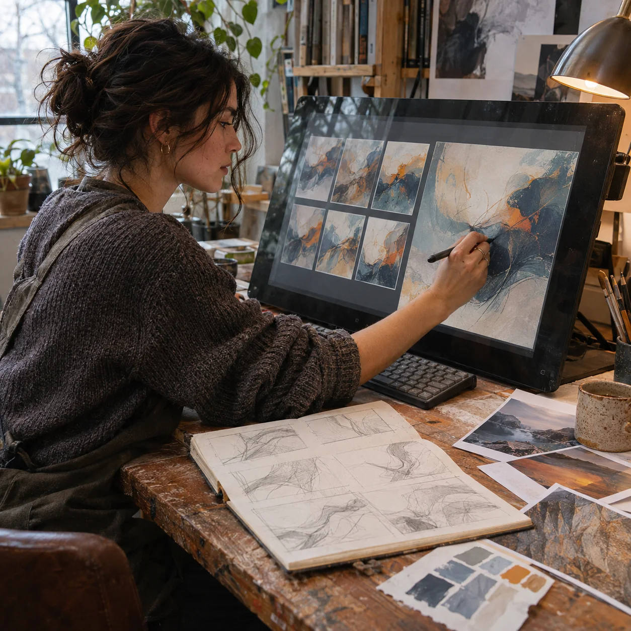
AI changes the speed and range of visual iteration. An artist can test several compositions, lighting conditions, textures, or installation layouts before committing time to a final piece. It can also extend a canvas, remove an unwanted object, generate a temporary background, or produce a rough spatial mock-up. That does not make the output self-directing. A useful result still depends on a human choosing the concept, references, framing, value structure, colour relationship, and final edit. For galleries, the same tools can help preview screen placement, visitor flow, projection scale, and alternate versions of a virtual room. The strongest workflow keeps those decisions visible: start from an authored brief, generate only what the brief needs, compare variants against fixed criteria, edit the selected material, and document what came from the artist versus the model. AI provides options. The artist provides intent, judgment, and responsibility.

A practical AI digital art workflow
The useful question is not “Which generator makes the prettiest image?” It is “Which stage of this project needs faster exploration?” Keep the model on a short leash. Define the visual problem first, then decide whether generation, inpainting, upscaling, or a conventional drawing tool is the right response.
1. Write the human brief before the prompt
Start with one paragraph that names the subject, audience, format, mood, focal point, and practical limits. For an exhibition mock-up, include the room proportions, viewing distance, screen or projection format, ambient light, and intended movement through the space. For a standalone image, define the final crop, dominant value pattern, and the detail that must remain recognisable at thumbnail size.
When I art-direct an image, I settle the silhouette and value structure before chasing texture. If the subject does not read in a small greyscale thumbnail, more generated detail usually makes the problem harder to see. The same discipline applies whether the next tool is a pencil, Photoshop, Blender, or an image model.
2. Build a reference board you can defend
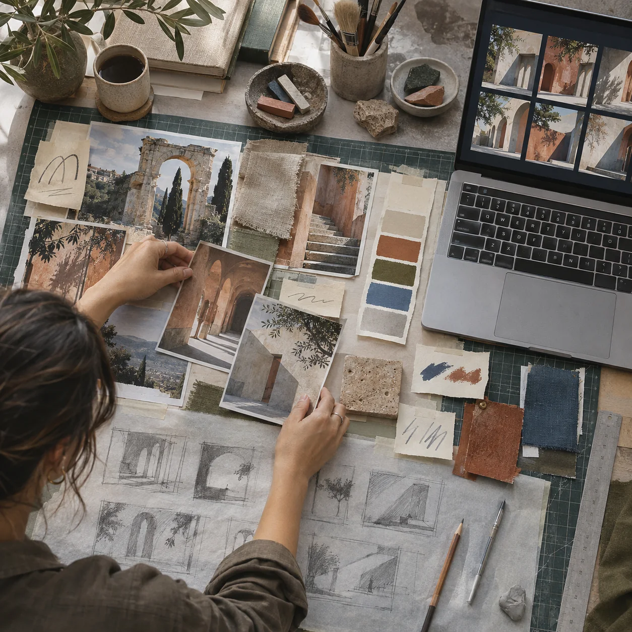
Collect references for composition, light, material, period, and display context, but record where each image came from. Separate material you own or have permission to use from work that is only there for analysis. Avoid asking for a living artist’s exact style. Describe the visual properties you need instead: restrained line weight, flat geometric shapes, low-contrast colour, hard side light, or a wide cinematic frame.
If you are still choosing a platform, compare how different tools handle revision, control, and repeatability in our long-term AI image generator comparison. A spectacular first result matters less than being able to reproduce a character, product, palette, or camera angle across a series.
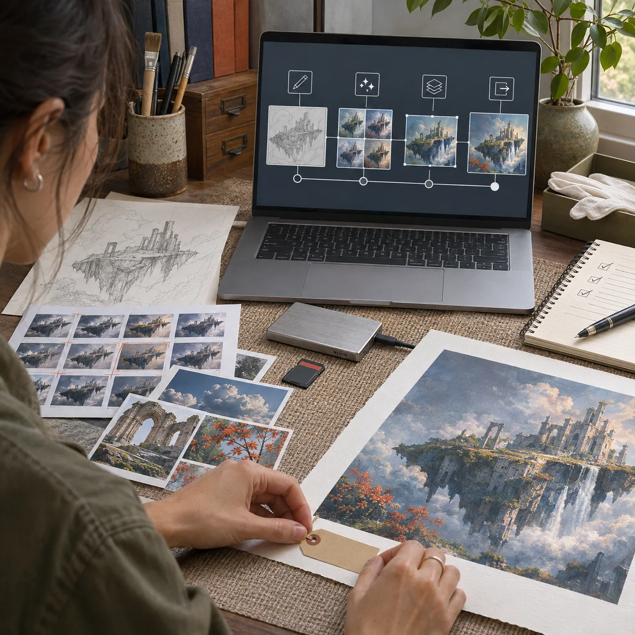
3. Generate variations, not finished art
Use the first generation pass to answer one question at a time. Test composition before surface detail. Test the lighting direction before colour grading. If every prompt changes the subject, camera, palette, and atmosphere at once, you will not know which decision improved the image.
- Keep the aspect ratio and camera position fixed while comparing compositions.
- Change one variable per round, such as background depth or key-light direction.
- Save rejected versions with short notes; they show why the selected direction is stronger.

4. Art-direct, composite, and redraw
Do not accept the generated frame as a finished composition. Check anatomy, repeated objects, perspective, reflections, text, edge quality, and whether the lighting agrees across the scene. Rebuild weak areas with drawing, masking, photobashing, 3D blocking, inpainting, or colour correction. Our guide to drawing with AI tools explains where generated material can support sketching without replacing the structure of the drawing.
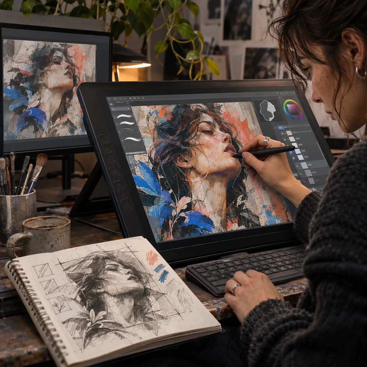
The editing stage is where authorship becomes visible. Selective changes reveal priorities: a quieter background, a clearer gesture, a stronger focal edge, or a material that reacts correctly to light. Keep layers and intermediate files when the project may need a client review, exhibition statement, or rights assessment later.
5. Prepare the artwork for its real display
A gallery wall, phone screen, projection, LED panel, and VR room do not ask the same thing from an image. Confirm pixel dimensions, aspect ratio, colour space, compression, brightness, loop duration, and the viewing distance before exporting. Upscaling can add plausible detail, but it cannot recover information that was never present. Inspect faces, lettering, fine contours, and repeating patterns at 100 percent.
For conventional digital technique alongside generated assets, use the exercises in our digital art lessons and the shape-building advice in the vector illustration guide. Both help turn a generated idea into a cleaner, editable final file.
6. Record provenance and disclosure
Save the source sketch, selected prompt, model or tool name, generation date, major edits, licensed assets, and final export. This does not need to become a long public statement. A compact production record is enough to answer practical questions about authorship, revisions, and asset origin.
| Task | Useful role for AI | Human check before approval |
|---|---|---|
| Concept exploration | Fast visual variants | Is the idea clear without novelty effects? |
| Composition | Alternate crops and spatial layouts | Does the focal point read at thumbnail size? |
| Editing | Inpainting, expansion, cleanup | Are anatomy, perspective, texture, and light consistent? |
| Exhibition planning | Room and screen mock-ups | Are scale, sightlines, access, and visitor flow plausible? |
| Production | Resizing and variation | Does the export meet the actual display specification? |
| Publishing | Metadata assistance | Are credits, permissions, and AI disclosure accurate? |

How AI supports digital art spaces and exhibitions
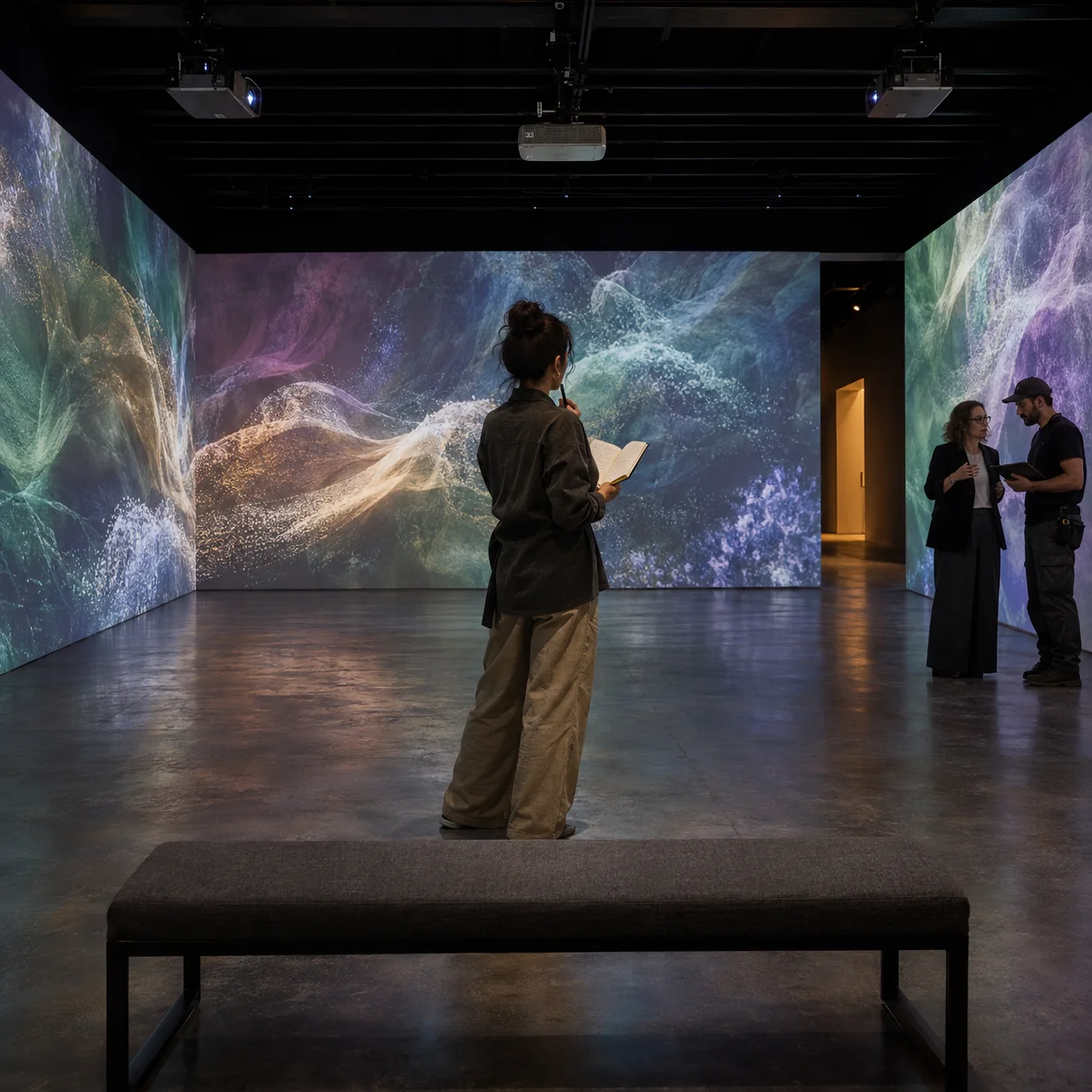
AI can help design the space around an artwork as well as the image itself. A curator can test a sequence of screens, compare projection scales, preview sightlines, or build a rough virtual gallery before committing to production. An artist can prototype reactive imagery, generate a family of related assets, or explore how one work changes across physical and online formats.
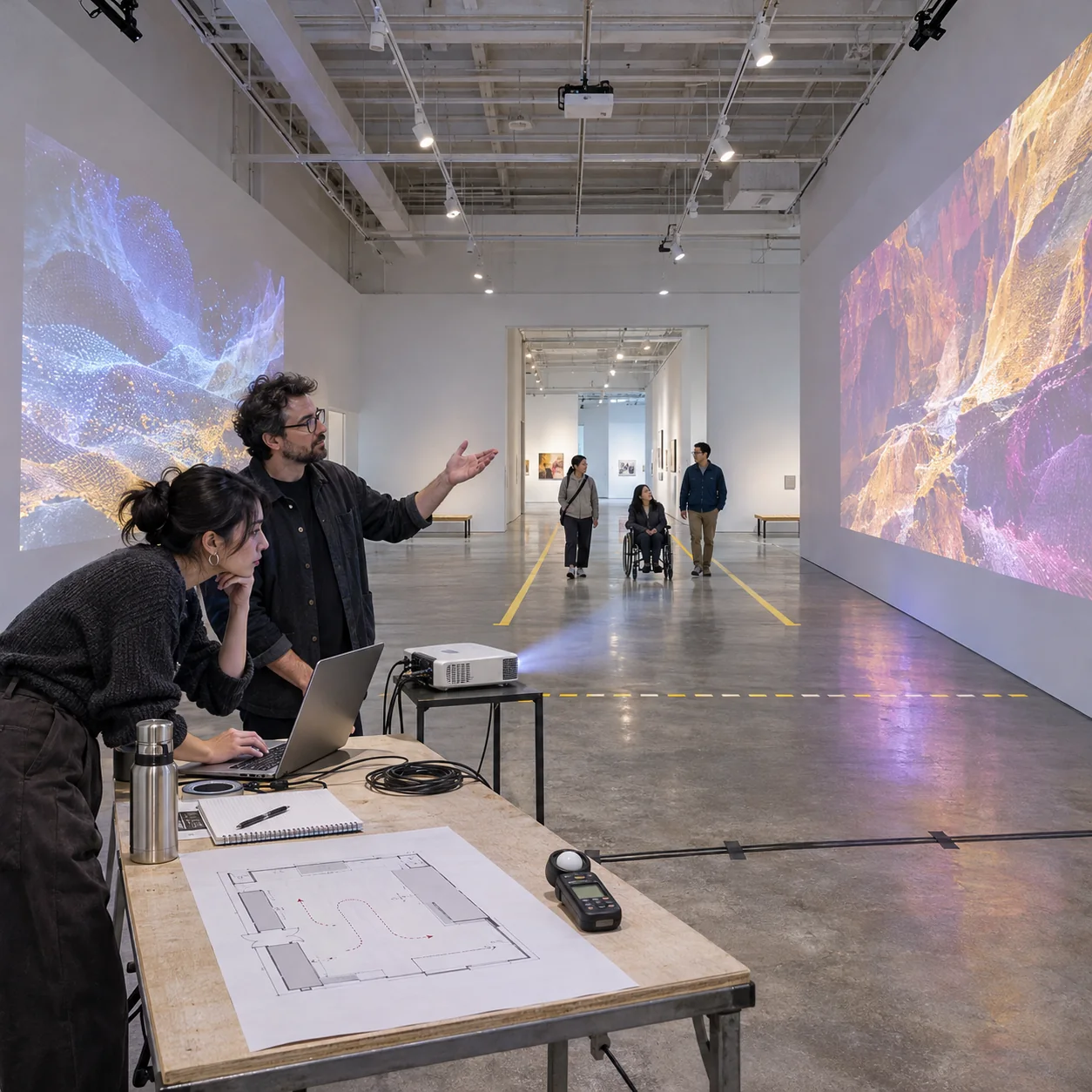
The display concept still needs ordinary design discipline. A room requires a visual hierarchy, breathing space, clear circulation, readable labels, controlled sound spill, and an accessible route. A virtual environment needs orientation cues, predictable controls, readable contrast, and an alternative for visitors who cannot use motion-heavy or immersive features. AI can accelerate a mock-up, but it cannot decide whether the experience is comfortable or meaningful.
There are already museum projects that treat AI as part of a participatory system rather than a one-click image effect. The Madison Museum of Contemporary Art describes Diffuse Control as an installation in which visitor input, collection imagery, the artist, and the machine all affect the evolving work. The useful lesson is structural: interaction needs rules, authorship needs context, and the audience should understand what its participation changes.

Common mistakes in AI-assisted digital art
Letting the prompt replace the concept
A detailed prompt can describe a scene and still say nothing. Before generating, write the idea in one plain sentence. If the sentence only names a style, mood, or spectacle, the work needs a stronger premise. The same problem appears in architecture and product design, where a polished rendering can hide an unresolved function. Our article on artificial intelligence in architecture uses the same rule: let the tool test a decision, not pretend to make it.
Changing too many variables at once
Prompt drift makes a series look like unrelated experiments. Fix the elements that define the project: subject proportions, camera height, lens feel, palette, light direction, and material vocabulary. Then vary one controlled feature. A contact sheet of twelve comparable frames is more useful than twelve dramatic images that answer different briefs.
Confusing resolution with quality
A larger file can still contain invented hands, broken lettering, inconsistent reflections, and noisy edges. Review the image in three views: thumbnail for composition, fit-to-screen for overall balance, and 100 percent for defects. If an image fails at thumbnail size, do not upscale it yet. Fix the structure first.
Building an inaccessible immersive experience
Fast motion, intense flashes, low-contrast labels, tiny interface targets, and spatial audio without captions can exclude visitors. Provide a calmer viewing mode, keyboard or controller alternatives, captions, clear exits, and a conventional way to see the work outside the headset. Accessibility should shape the concept early, not arrive as a patch after the installation is complete.

Copyright, training data, and content provenance
Copyright rules vary by country and continue to develop, so treat this as a production checklist rather than legal advice. In the United States, the Copyright Office’s Copyright and Artificial Intelligence initiative distinguishes human-authored expression and creative modifications from material produced without sufficient human control. That makes documentation useful: retain sketches, selections, edits, layer files, and notes that show the human contribution.
Tool choice matters too. Read the provider’s current terms, commercial-use rules, privacy settings, and explanation of training data. For example, Adobe states that its Firefly models are trained on licensed sources such as Adobe Stock and on public-domain content; review the provider’s generative AI approach rather than assuming every platform follows the same policy.
For published files, provenance systems can carry information about how an asset was created and edited. The C2PA specifications define the technical basis used by Content Credentials. Provenance is not a quality score and does not prove that an image is true; it gives viewers and production teams a tamper-evident record they can inspect.
Keep the public disclosure proportionate. A short note such as “AI-assisted concept generation; composition, drawing, compositing, and colour grade by the artist” is more useful than a vague “made with AI” label. It tells the audience which decisions belonged to the artist.
Keep the artist’s visual language in control
Your style becomes clearer when you repeat decisions, not when you repeat a prompt. Use the same proportion system, edge hierarchy, colour logic, and approach to detail across the series. If a generated element does not fit those rules, redraw it or remove it. The work should feel as though it passed through one pair of eyes.
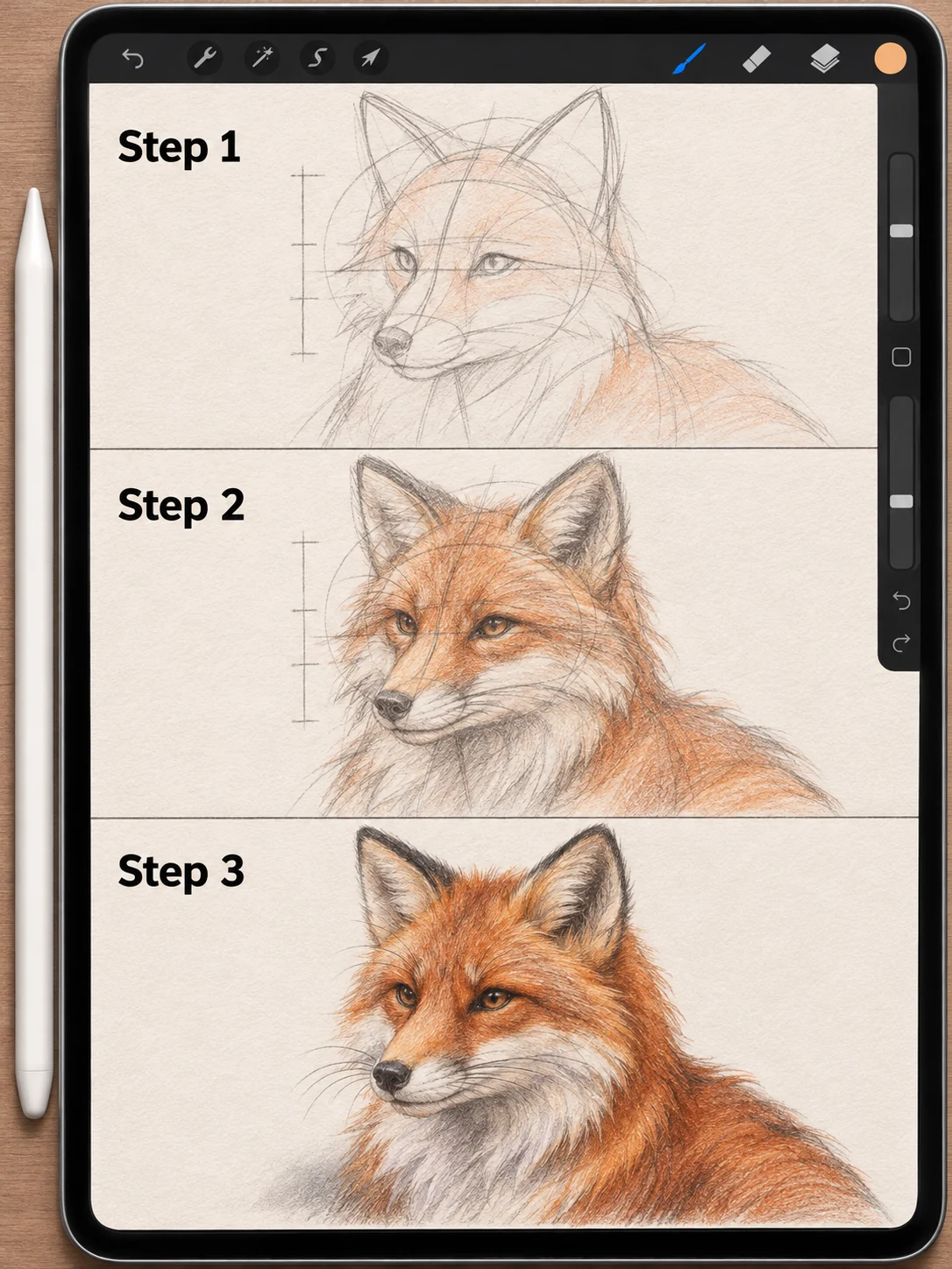
For a broader foundation, revisit the core principles of graphic design. Balance, contrast, hierarchy, rhythm, and negative space remain useful even when the raw material comes from a model. You can also compare practical platforms in our guide to free AI tools for artists, then return to the brief and choose the smallest toolset that can do the job.

The final decision still belongs to the artist
Use AI in digital art where it creates useful options: early composition tests, controlled variations, cleanup, spatial mock-ups, and production support. Keep the concept, selection, editing, display specification, and disclosure under human control. That division of labour produces work that is easier to defend, easier to revise, and more likely to feel intentional after the novelty of the tool wears off.
For more practical visual workflows, browse the Sky Rye Design archive.
- 8shares
- Facebook0
- Pinterest8
- Twitter0
- Reddit0