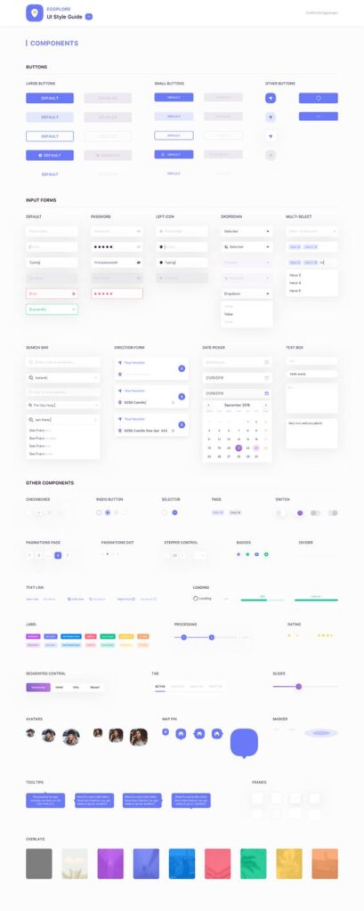
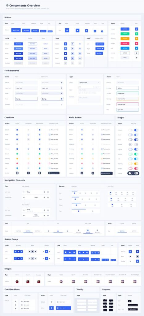
Creating a scalable UI design system is key to maintaining consistency and efficiency in software development. When a design system scales well, it allows teams to build interfaces swiftly without sacrificing quality or uniformity. By implementing a robust design system, companies can reduce design debt and streamline their workflow.
Scalable UI systems should be adaptable. They need to evolve to meet the growing needs of products and teams. A good design system provides a shared language and unified visual elements that help create intuitive user experiences.
Investing in a solid design framework early on saves time and resources in the long run. As products grow, a scalable UI system ensures the design remains cohesive across various platforms and devices.
Fundamentals of Design Systems
Design systems provide a solid foundation for building user interfaces that are consistent, scalable, and easy to maintain. They are crucial for creating efficient, seamless user experiences across various platforms.
Defining Design Systems
A design system is a collection of reusable components and guidelines that help in building digital products faster and with consistency. It’s not just about code snippets or design files. Instead, it includes design principles, color palettes, typography, and even voice and tone guidelines. A well-organized design system enables teams to collaborate effectively, maintaining uniformity across different projects. By having a centralized resource, teams avoid repetitive tasks and ensure scalable design that can grow with the product.
Importance of Consistency
Consistency in design systems is key to offering users a predictable and intuitive interaction. When buttons, fonts, and layout structures remain constant, users can navigate products effortlessly. This reduces cognitive load as users don’t need to learn new patterns over and over. It also boosts a brand’s identity, as consistent elements create a visual and interactive language unique to that brand. By emphasizing consistency, design systems help maintain quality while speeding up the design process. Developers and designers can build and update features more efficiently, ensuring all user-facing parts adhere to the same standards.
Principles of Scalable Design Systems
Scalable design systems are built with flexibility and growth in mind. They are designed to adapt to new requirements and changes without losing integrity. Core principles include modularity, where components can be rearranged or resized without rewriting code. Reusability is another principle, enabling different teams to use the same components across various projects. By centering on these principles, organizations ensure their products can evolve continuously, minimizing the need for overhauls. Documentation also plays a vital role in scalability, providing clear instructions and use cases for each component, ensuring anyone in the team can use and adapt the system efficiently.
The Architecture of Design Systems
Design systems form the backbone of efficient user interfaces. They combine atomic design and modular design to create reusable and consistent components. Understanding both methodologies is key for optimizing UI structures.
Atomic Design Methodology
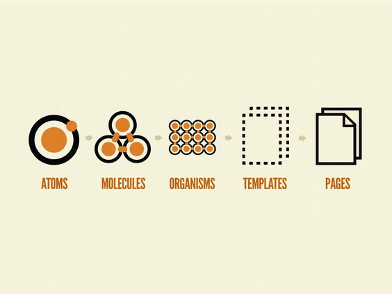
Atomic design breaks down user interfaces into smaller, reusable elements. It starts with atoms—basic building blocks like buttons and inputs. These atoms combine to form molecules, simple groups such as a search bar with a button. Molecules then form organisms, which are more complex components like navigation bars.
Using this methodology, designers create interfaces that scale easily. They build a hierarchy where each level enhances the previous one. It ensures consistency as everything follows defined rules. At the same time, it allows for flexibility. Teams can update parts without overhauling the whole design.
Modular Design and Reusability
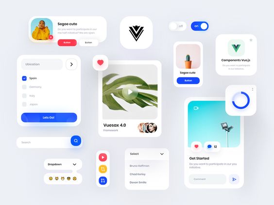
Modular design emphasizes creating reusable components. Like atoms in atomic design, these components function independently. Each module serves a specific purpose and can be used in various contexts. This reduces design effort and speeds up development.
By creating a collection of reusable elements, teams ensure consistency across products. It allows designers to focus on bigger picture tasks instead of repetitive work. In practice, libraries often store these components. It ensures easy access and implementation.
Modularity also supports adaptability. Designers can tweak one module to fit different needs without starting from scratch each time. It makes maintaining and scaling systems more efficient and reliable.
System Design Considerations
When designing a system, several factors play crucial roles. Scalability and flexibility are pivotal. They ensure the system grows and adapts without losing performance. It’s important to anticipate future needs when choosing components and setting rules.
Collaboration is another key consideration. A well-documented system promotes teamwork. It allows various team members to contribute, knowing everyone follows the same guidelines. Having clear documentation helps new members understand and integrate quickly.
Designers also need to balance originality with practicality. While creativity is important, sticking to known design patterns can save time and reduce user friction. Keeping these considerations in mind leads to efficient and robust design systems.
Design Systems to Developer Handoff
Building a scalable UI design system requires effective coordination between designers and developers, clear governance, and thorough documentation. These components ensure that the handoff process is smooth and efficient.
Collaboration Between Designers and Developers
Collaboration between designers and developers is essential in the handoff process. Designers create visuals and components while developers bring these designs to life with code. It’s important for both teams to communicate effectively. Regular meetings help align their goals and expectations.
Design systems include tools like component libraries and style guides. These tools ensure that everyone works with the same design elements. By using shared platforms, teams can work together, reducing discrepancies and ensuring consistency.
Clear communication tools like Slack or Microsoft Teams aid in quick exchanges, while tools like Figma and Zeplin bridge design and development by providing interactive designs and specifications. By using these, both designers and developers can efficiently share their insights and feedback.
Version Control and Governance
Version control plays a crucial role in managing design systems. It helps track changes over time and ensures everyone uses the latest design components. Git is a popular tool for version control, enabling teams to revert back to previous versions if needed.
Governance involves setting up rules and guidelines for the design system. It ensures that every update is tracked and approved by the relevant team members. Having a governance process means that changes to the system are rolled out smoothly without disrupting work processes.
By establishing a clear governance structure, organizations can maintain the integrity and consistency of their design system across all teams and projects.
Documentation for Scalability
Thorough documentation is necessary for a design system’s scalability. Documenting design components, usage guidelines, and technical specifications helps new team members easily get on board.
A well-documented system includes clear instructions on how to implement design elements and describes their purposes. Use tables and illustrations within documentation to make information more accessible and engaging.
Online documentation platforms like Confluence or Notion can be used to organize this information. Keeping documentation up to date is key to ensuring that it reflects current practices and system updates, reducing confusion and improving efficiency.
Core Elements of UI Design Systems
A strong UI design system includes essential components like color palettes, typography, UI components, and guidelines for voice and tone. These core elements ensure that the design remains consistent and scalable.
Color Palette and Typography
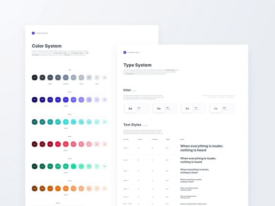
Color palettes and typography set the visual tone for any UI design system. They help connect visually and establish brand identity. An effective color palette is typically limited to a few primary colors. These colors should be carefully chosen to suit the brand message and ensure readability. Design tokens often represent these colors to maintain consistency across various designs.
Typography involves selecting fonts that enhance readability and complement the color palette. A good typography system usually includes a few font weights and sizes, which should be used consistently. Bold and italic styles are typically reserved for specific uses like emphasis or highlighting headers.
UI Components and Iconography
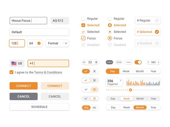
UI components and iconography ensure that interfaces are functional and user-friendly. Components like buttons, sliders, and forms should have a unified look and feel. They must be modular, allowing for easy reuse across different parts of a product. Component libraries help achieve this and are often accompanied by documentation to guide their use.
Iconography provides visual cues while identifying actions and content quickly. These icons should align in style and size to enhance the user interface. Consistent design throughout icons ensures that they are intuitive and easily recognizable to users.
Voice and Tone Guidelines
Voice and tone guidelines define how a brand communicates with its users. The voice remains constant, representing the brand’s personality. It could be formal, playful, or instructive based on brand identity. The tone can shift depending on the user’s context or emotion, such as being more supportive during a problem-solving scenario.
These guidelines ensure that written content is approachable and relatable. Clarity and empathy are key, as users should feel understood and guided. Documentation should provide examples to illustrate how to adjust tone without deviating from the brand voice.
Tools and Software for UI Design Systems
Creating a scalable UI design system requires using tools that offer robust features for design and component management. Figma, Sketch, Storybook, and Bit are popular choices for UI development and design asset organization.
Figma and Sketch
Figma is widely used for its real-time collaboration capabilities. Designers can work together on a project simultaneously from different locations, which speeds up the workflow. Figma’s browser-based platform makes it accessible and easy to manage without needing extensive software installations.
Sketch is another favorite tool, renowned for its strong plugin ecosystem. These plugins extend its functionality, allowing designers to streamline their work. Sketch’s focus on UI design makes it particularly suitable for creating high-fidelity prototypes and design assets.
Both tools support design systems by allowing users to create reusable components. This helps maintain consistency across projects. Figma and Sketch prioritize user-friendly interfaces, making them accessible for both individual designers and large teams.
Storybook and Bit
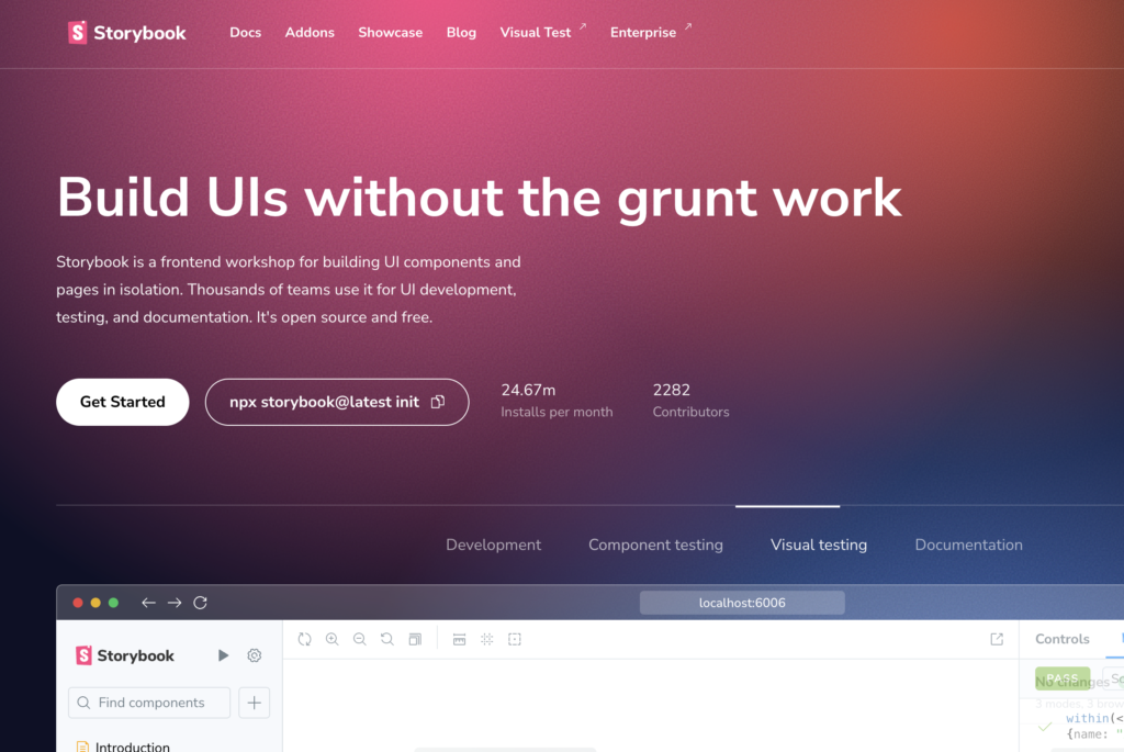
Storybook is a tool for developing UI components in isolation. This means developers can focus on building a single component without worrying about the rest of the application. It supports popular frameworks like React, Vue, and Angular. Storybook provides an interactive playground where developers can test and refine components.
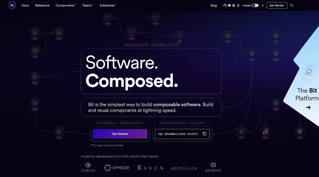
Bit offers component-driven development, emphasizing modular design. It allows teams to share and collaborate on components across projects. Bit’s Component Hub serves as a marketplace for components, encouraging reuse and consistency.
These tools facilitate the integration of UI components into larger applications, which is crucial for scalable systems. Both Storybook and Bit enhance component visibility and reusability, leading to more efficient development processes.
Best Practices for Building Design Systems
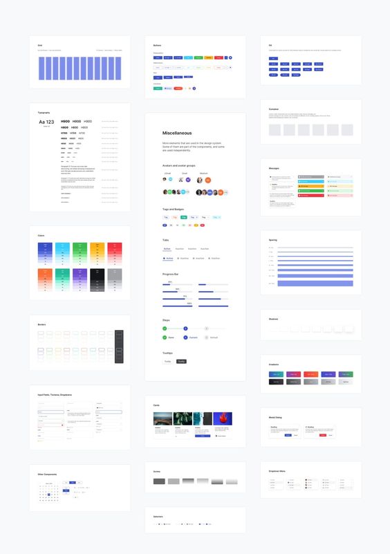
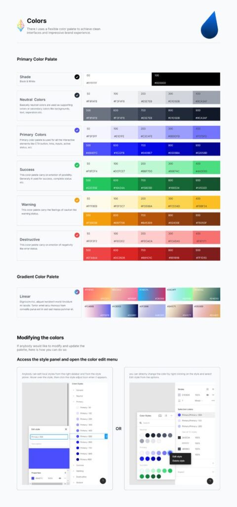
Creating a design system requires careful planning and execution. It involves focusing on reuse and efficiency, designing with accessibility and usability in mind, and maintaining a consistent visual language.
Building for Reuse and Efficiency
Efficient design systems emphasize creating reusable components. This approach speeds up development and ensures consistent UI. Designers and developers should work together to identify common UI elements that can be standardized.
Design tokens play a crucial role in this process. Tokens standardize colors, fonts, and other design aspects across different platforms. This consistency enhances the user experience and simplifies updates.
Version control is also important. By using tools like Git, teams can manage and track changes effectively. This ensures that everyone stays on the same page, reducing errors and conflicts.
Designing for Accessibility and Usability
Incorporating accessibility from the start is crucial. It ensures that all users, including those with disabilities, can use a product without barriers. Key practices include using semantic HTML and ensuring proper contrast in colors.
Usability testing is another vital element. Regular testing with real users helps identify issues early. It’s important to gather diverse feedback to cover different perspectives and needs.
Guidance should be provided for using UI components correctly. This can include detailed documentation and examples. A clear set of guidelines ensures components are used consistently, making the interface intuitive for users.
Maintaining Visual Language
Consistency in visual language creates a cohesive user experience. This includes maintaining uniform typography, colors, and style across all components.
Design libraries help in achieving uniformity. By having a centralized library, designers and developers have a clear reference for building UI elements. This reduces the chance of variations and discrepancies.
Regular audits of the design system are essential. Audits ensure that the system aligns with evolving brand standards and user needs. They also help identify outdated components or aspects that require improvement.
Integrating Design Systems into Digital Products
Integrating a design system into digital products helps in creating consistent user experiences and simplifies the development process. It involves strategic adoption by product teams and ongoing refinement through feedback.
Adoption Strategies
Adopting a design system requires clear communication and training. Product teams should start by understanding the core components and guidelines of the system. This can be done through workshops or documentation.
Key steps include:
- Pilot Projects: Use small projects to test the design system’s effectiveness.
- Cross-Department Collaboration: Engage designers, developers, and stakeholders.
- Customization: Adapt the design system to fit specific product needs, ensuring relevance.
Creating support channels, like forums or Q&A sessions, can also help in addressing challenges during adoption. Regular check-ins can keep the teams engaged and informed about any changes.
Continuous Improvement and Feedback
Keeping the design system effective requires continuous improvement. This is achieved through a structured feedback loop. Designers and developers should regularly review design components and share their experiences.
Feedback from design reviews and user testing is vital. It provides insights into how components perform and guides necessary adjustments.
Integrating a system for logging and tracking feedback ensures no valuable insights are missed. Encouraging open communication helps maintain a design system that evolves with user needs and technological advancements.
Advanced Topics in UI Design Systems
Creating a scalable UI design system involves understanding advanced concepts such as responsiveness and component libraries. Designers must consider technical aspects to ensure systems perform well at large scales.
Scalability and Responsiveness
Scalability in UI design refers to the system’s ability to grow and handle more components or users. Responsive design ensures that interfaces look good on all devices. Designers aim for layouts that adjust seamlessly to different screen sizes, enhancing user experience.
Implementing a scalable UI often involves frameworks like React. It helps manage complex UIs efficiently. The system adapts by reusing components, which saves time and maintains consistency.
Attention to brand identity throughout the scaling process ensures cohesive design. Consistent colors, typography, and styles represent the brand correctly across all platforms. Using a design kit supports this by providing a set of guidelines and tools to maintain uniformity.
Advanced Component Libraries
Component libraries are collections of reusable UI elements, crucial for speeding up development. They ensure design consistency and simplify maintenance efforts. Libraries like Material-UI or Bootstrap offer a wide range of pre-made components.
Having a robust component library is essential for creating large-scale design systems. Developers can quickly assemble interfaces, reducing repetitive coding tasks. It also ensures the UI matches brand identity and design standards.
Customizing these libraries to fit specific project needs is critical. It allows for the incorporation of unique brand elements while maintaining the flexibility to update and scale the system. Advanced libraries might also include responsive components that automatically adjust to various devices.
Technical Considerations for Large Scale Systems
When building large-scale systems, technical details become crucial. Choosing the right tools and technologies impacts performance and scalability. For UI design systems, using modern frameworks like React is common. These frameworks support efficient rendering and management of complex interfaces.
Performance optimization is essential to avoid slow load times. Techniques such as lazy loading and code splitting help manage this by only delivering necessary components.
Developers also focus on maintaining a clean codebase. This includes using modular code, adhering to coding standards, and conducting regular code reviews. All these practices contribute to a robust, scalable design system capable of growing with the company’s needs.
Case Studies and Real-World Examples
Examining real-world examples helps show how successful design systems function. These systems often utilize interaction patterns, layout grids, and color palettes to maintain consistency and scalability.
Successful Design Systems
Design System A: This system employs a structured layout grid that adapts to different screens. It offers clear interaction patterns making it user-friendly and easy to navigate. Its color palette, with shades of blue and gray, enhances readability and consistency across the platform.
Design System B: Known for its vibrant color palette and flexible components, Design System B has enhanced scalability. It simplifies complex tasks through intuitive interaction patterns. A well-defined layout grid supports various screen resolutions, ensuring a consistent experience for all users.
Concluding Thoughts on UI Design Systems
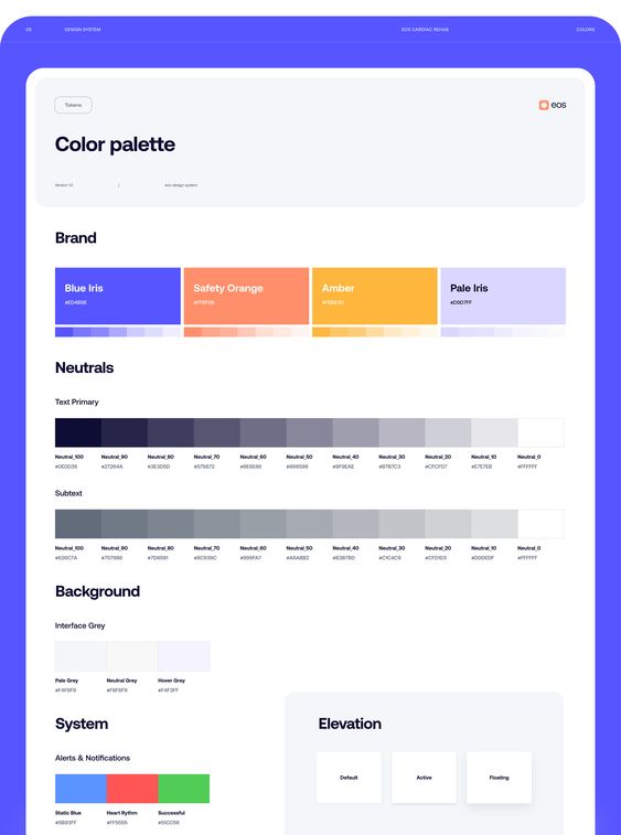
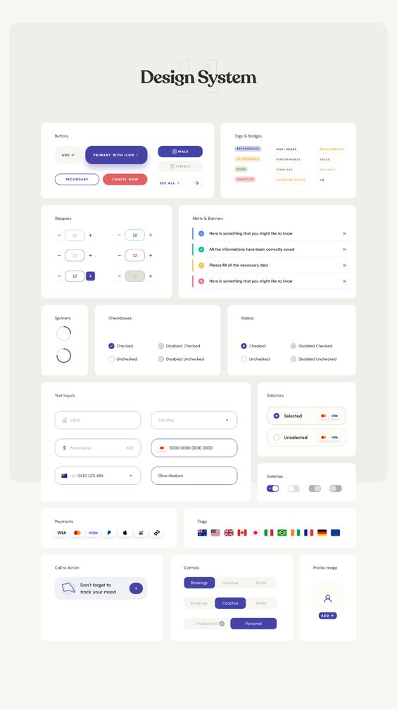
Building a scalable UI design system revolves around consistency and efficiency. It helps teams keep a clear design language with shared style guides. This makes collaboration easier, as everyone follows the same rules.
A strong UI design system focuses on visual elements, like color schemes and typography. These elements should be aligned with the brand’s identity. Consistent visuals ensure that the user experience (UX) feels cohesive across platforms.
Integrating feedback from users into the design process is crucial. By listening to user feedback, designers can make informed adjustments. This leads to a more user-friendly interface.
Creating a design system isn’t a one-time task. It requires ongoing updates to stay relevant. Technology evolves, and so should the design system. Keeping the style guide current ensures that the design feels modern and effective.
A well-structured UI design system benefits both designers and developers. It streamlines communication, reducing misunderstandings. This leads to quicker development times and a smoother workflow.
Designing with scalability in mind means considering future growth. As projects or companies expand, a scalable design system can adapt. This flexibility helps maintain visual consistency, even with larger teams.
In UX design, the ultimate goal is to provide a satisfying user experience. A thoughtful UI design system plays a significant role in achieving this. With tools and strategies in place, teams can create visually appealing and efficient designs.
Frequently Asked Questions
Building a scalable UI design system involves organizing components, ensuring key elements are documented, and maintaining consistency. Strategies include adopting atomic design and integrating the system into existing workflows while addressing challenges.
How do you structure components in a scalable design system?
A scalable design system structures components into categories. This often includes foundational elements like buttons and typography. Components are grouped based on their complexity and usage. They ensure reusable parts can adapt to different needs effectively.
What are the key elements to include when documenting a design system for multiple platforms?
Key elements in documentation should include component descriptions, design guidelines, and usage examples. It is important to cover specifications for different platforms. This approach helps designers and developers maintain uniformity.
What strategies are used to ensure consistency across a large product suite within a design system?
Consistency is achieved by establishing shared design principles and component libraries. Regular audits and collaboration between teams help maintain alignment. Using a central source of truth is crucial for consistency across products.
What role does atomic design play in the creation of scalable user interfaces?
Atomic design helps create scalable interfaces by breaking down UI elements into smaller parts. These parts, known as atoms, form the basic building blocks. Molecules and organisms derived from these atoms promote consistency and reusability.
How can a design system be effectively transitioned into a company’s workflow?
Transitioning into a company’s workflow involves training and ongoing support. Integrating design tools and fostering collaboration between teams is essential. A phased approach can ease adoption, allowing for gradual adjustments.
What are common challenges when scaling design systems, and how can they be overcome?
Common challenges include managing updates and ensuring team collaboration. These can be overcome by regular communication, using tools for version control, and setting up a feedback loop. Clear documentation and guidelines are also beneficial.
- 87shares
- Facebook0
- Pinterest87
- Twitter0
- Reddit0


