I first paid real attention to how a bubble actually looks during a life-drawing session that had nothing to do with bubbles at all. A glass of water sat on the still-life table, and the light from the studio window was doing something strange on its surface: not one highlight, but two, and a faint, upside-down version of the window itself curving across the glass. That’s the same optical trick a soap bubble performs constantly, and almost nobody draws it correctly, because almost nobody has actually looked at it that closely.
Search “how to draw bubbles” and you’ll get a wall of kids’-craft tutorials: trace a circle, add a crescent-shaped highlight, maybe soften it with a wet marker. Fine for a classroom project. Useless if you actually want a bubble to read as round, wet, and transparent instead of a flat circle with a white smudge on it. The difference between those two results comes down to understanding what light is doing on a bubble’s surface, not finding a cleverer way to draw a circle.
- Why most bubble tutorials stop at the wrong place
- What a bubble is actually doing to light
- Shade the sphere correctly before you touch a highlight
- Draw the double reflection that makes a bubble look wet
- Rendering the rainbow sheen without making it look random
- Materials and technique: pencil, marker, watercolor, and digital
- Common mistakes that flatten a bubble drawing
- Practice exercises that build the skill fast
- FAQ
This is a technical drawing guide, not a craft tutorial. It covers what a bubble actually is optically, how to shade the underlying sphere correctly before you touch a highlight, how to draw the double reflection that makes a bubble look wet and dimensional, and how the faint rainbow sheen on a soap bubble’s surface actually works, so you can render it convincingly instead of guessing at random color splotches.

None of this requires expensive materials or advanced technique. It requires slowing down and actually looking at reflective, translucent surfaces the way an observational drawing practice trains you to, which is the same skill this whole approach is really teaching, bubbles are just an unusually good, unusually demanding subject to practice it on.
Why most bubble tutorials stop at the wrong place
Almost every widely shared bubble tutorial follows the same four steps: draw a circle, add a crescent moon shape for the highlight, maybe a second smaller highlight, done. That gets you a recognizable symbol for a bubble. It doesn’t get you a bubble that looks like it exists in three dimensions, holds water tension, or reflects the room around it, because none of those things come from a highlight shape alone.
A bubble is one of the more demanding things you can draw precisely because it’s almost entirely optical effect and almost no local color. There’s no material surface pattern to lean on the way there is with skin, fabric, or wood grain. Every visual cue that makes a bubble read as round, wet, and transparent comes from how it handles light, which means the drawing lives or dies on your understanding of reflection and refraction, not on rendering technique alone.
That’s also exactly why bubbles make such a good training subject once you approach them properly. Almost nothing else forces you to think this precisely about light behavior with so little else to distract from it, no texture, no local color variation, no material grain. Get comfortable with a bubble’s optics and reflections on far more complex subjects, chrome, glass, water, polished metal, start making a lot more sense.
What a bubble is actually doing to light
A soap bubble is a very thin film of soapy water holding a pocket of air, and that thin film does three separate optical jobs at once: it reflects like a mirror, it refracts like a lens, and it produces color through thin-film interference, the same phenomenon that puts rainbow colors in an oil slick. Understanding these as three distinct effects, rather than one vague “shiny round thing,” is the single biggest shift that improves a bubble drawing.
Reflection: the whole environment shows up, mirrored and curved
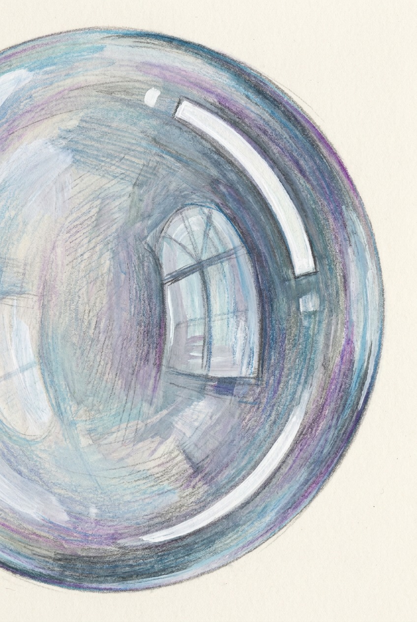
Because a bubble’s surface is curved and reflective, it doesn’t just catch one highlight from one light source, it reflects the entire visible environment around it, compressed and curved to follow the sphere’s surface. A window, a lamp, another object in the room, all of it can appear on the bubble’s surface as a distorted, miniature reflection, not just a single bright dot. Most tutorials render only the brightest highlight and ignore this fuller environmental reflection entirely, which is exactly why so many bubble drawings read as flat circles with one white mark rather than convincing spheres.
This is the same principle a photographer relies on when using a chrome or mirrored ball to capture a full 360-degree reference of a room, and it’s worth understanding at that level of literalness. Everything in front of the bubble, and a fair amount of what’s behind and around it, is theoretically visible somewhere on its curved surface, compressed toward the edges the way a fisheye lens compresses a wide view. You don’t need to render all of it, but knowing it’s there changes what you choose to suggest.
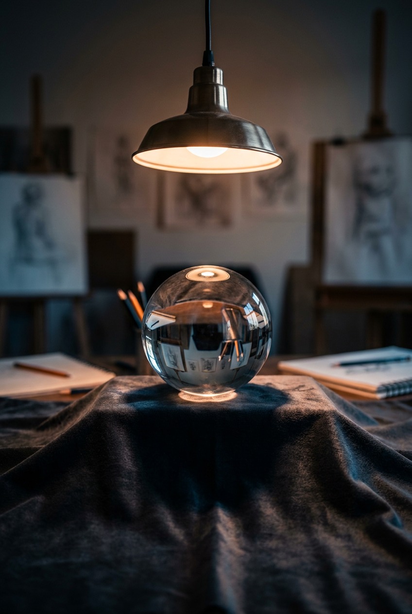
Refraction: what shows up through the bubble, bent and shifted
Refraction is a separate effect from reflection, and it’s the one most tutorials skip entirely. Some light passes through the thin film rather than bouncing off it, and that light bends as it enters and exits the curved surface, which can shift and distort whatever’s visible through or behind the bubble. On a soap bubble this effect is subtle since the film is so thin, but it’s the reason the world behind a bubble sometimes looks faintly warped rather than perfectly clear, and it’s worth understanding even at a simplified level, since ignoring it entirely is what makes a bubble read as an opaque ball instead of a translucent one.
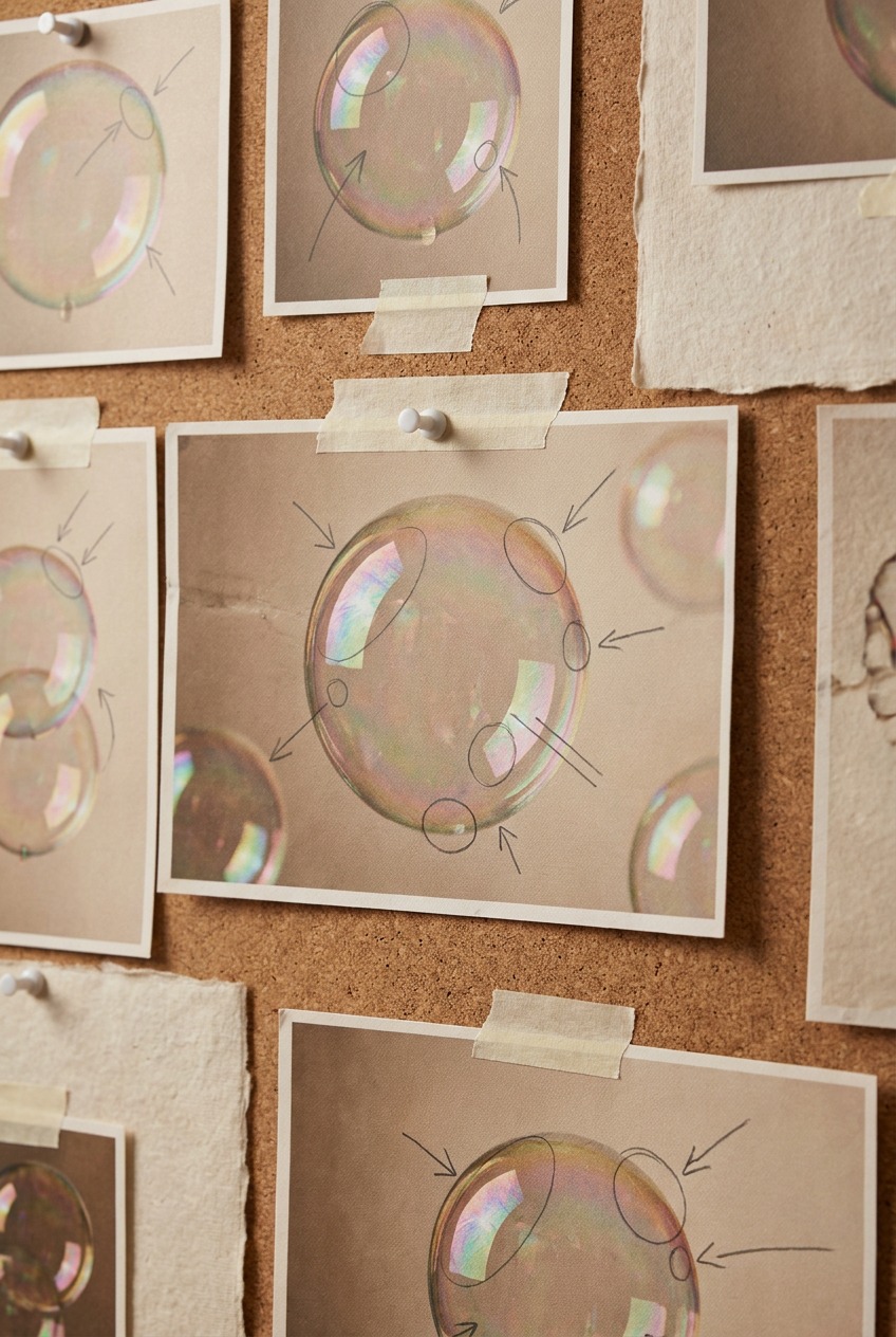
Shade the sphere correctly before you touch a highlight
Every bubble drawing should start exactly the way any sphere study starts, because a bubble is a sphere first and a bubble second. Skip this step and no amount of highlight detail will save the drawing.
Establish one light source and commit to it
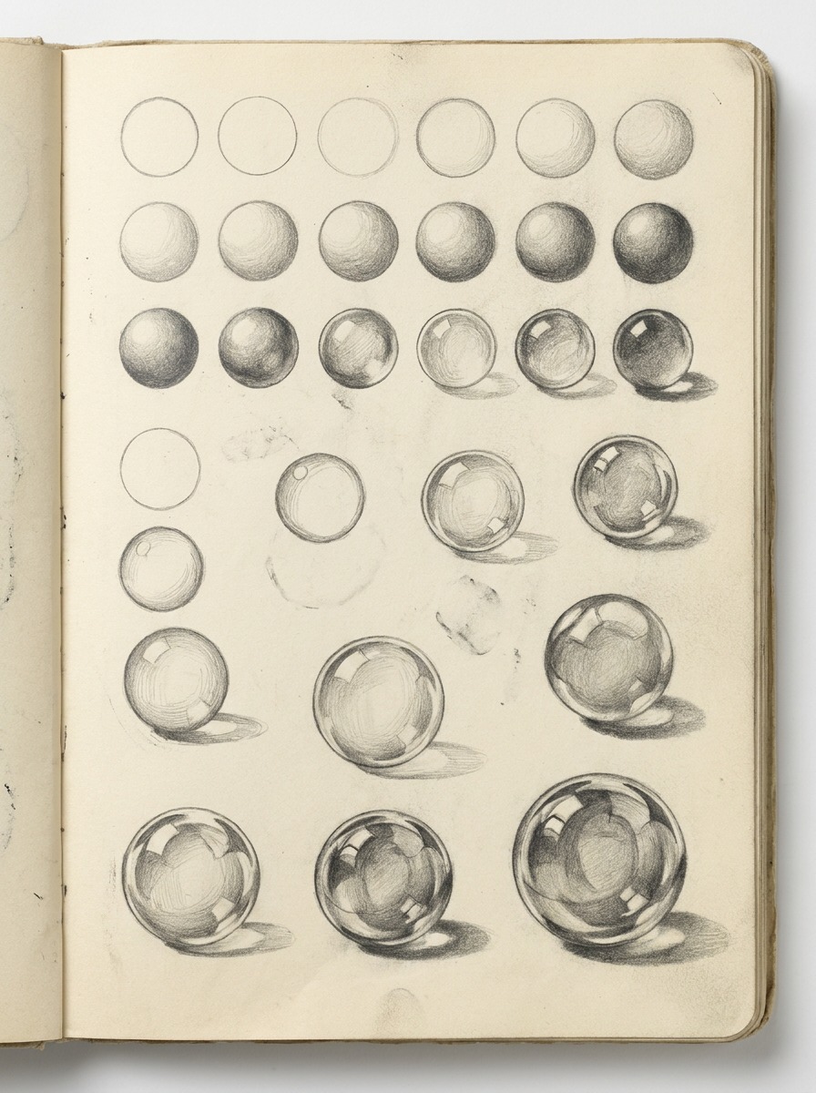
Pick a single dominant light direction before drawing anything else, and keep every value decision consistent with it. A sphere lit from one source has a predictable value structure: a highlight nearest the light, a mid-tone wrapping around the form, a core shadow band where the surface turns away from the light most steeply, and a reflected light bounce along the shadow edge, subtler and cooler than the highlight, caused by light bouncing off nearby surfaces back into the shadow side.
This structure applies to a bubble exactly as it applies to a billiard ball or an egg. The difference is that a bubble adds reflection and refraction effects on top of this base structure, not instead of it. Skipping the underlying sphere shading and jumping straight to a highlight crescent is why so many bubble drawings look like flat decals rather than three-dimensional forms.
Value studies are worth doing entirely without color first, even if the final piece will use one. A grayscale sphere study forces you to solve the light logic before color choices can hide a weak underlying structure. Once the values genuinely hold up on their own, color and surface effects become additions rather than a rescue attempt.
Keep the core shadow soft, not sharp
A bubble’s surface is thin and semi-transparent, which means its core shadow reads as considerably softer and more diffused than the core shadow on an opaque object like a ceramic sphere. A hard, dark shadow band makes a bubble look like solid plastic. A soft, faintly graduated shadow, sometimes barely darker than the surrounding mid-tone, preserves the sense of thinness and transparency that separates a bubble from a marble.
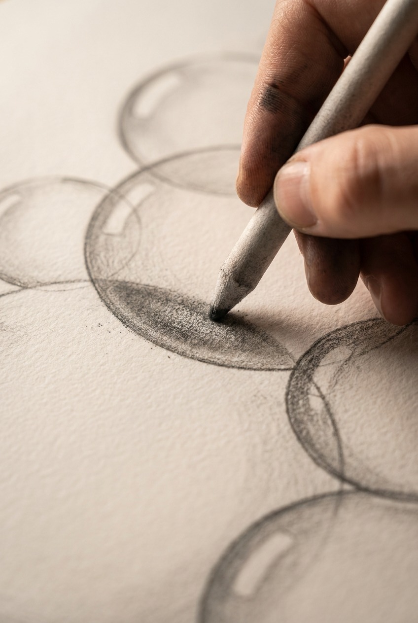
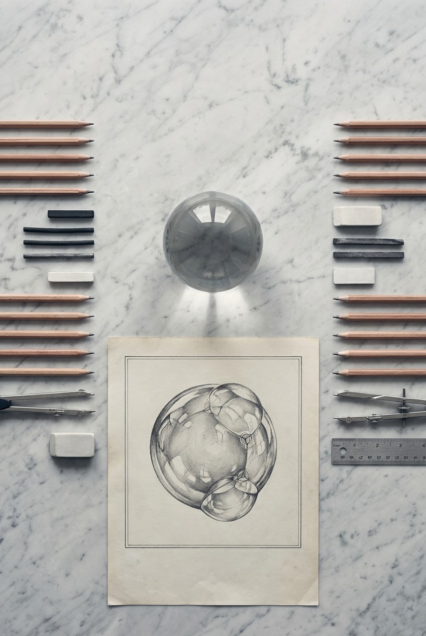
Photograph or find reference of an actual glass marble or a clear glass ornament under a single lamp before attempting a bubble from imagination. The reflection and highlight logic is nearly identical, and a solid glass sphere holds still long enough to actually study, which a real soap bubble never does.
Draw the double reflection that makes a bubble look wet
This is the single most overlooked technique in bubble drawing, and it’s the one that does the most work once you get it right.
Two highlights, not one, positioned as mirror opposites
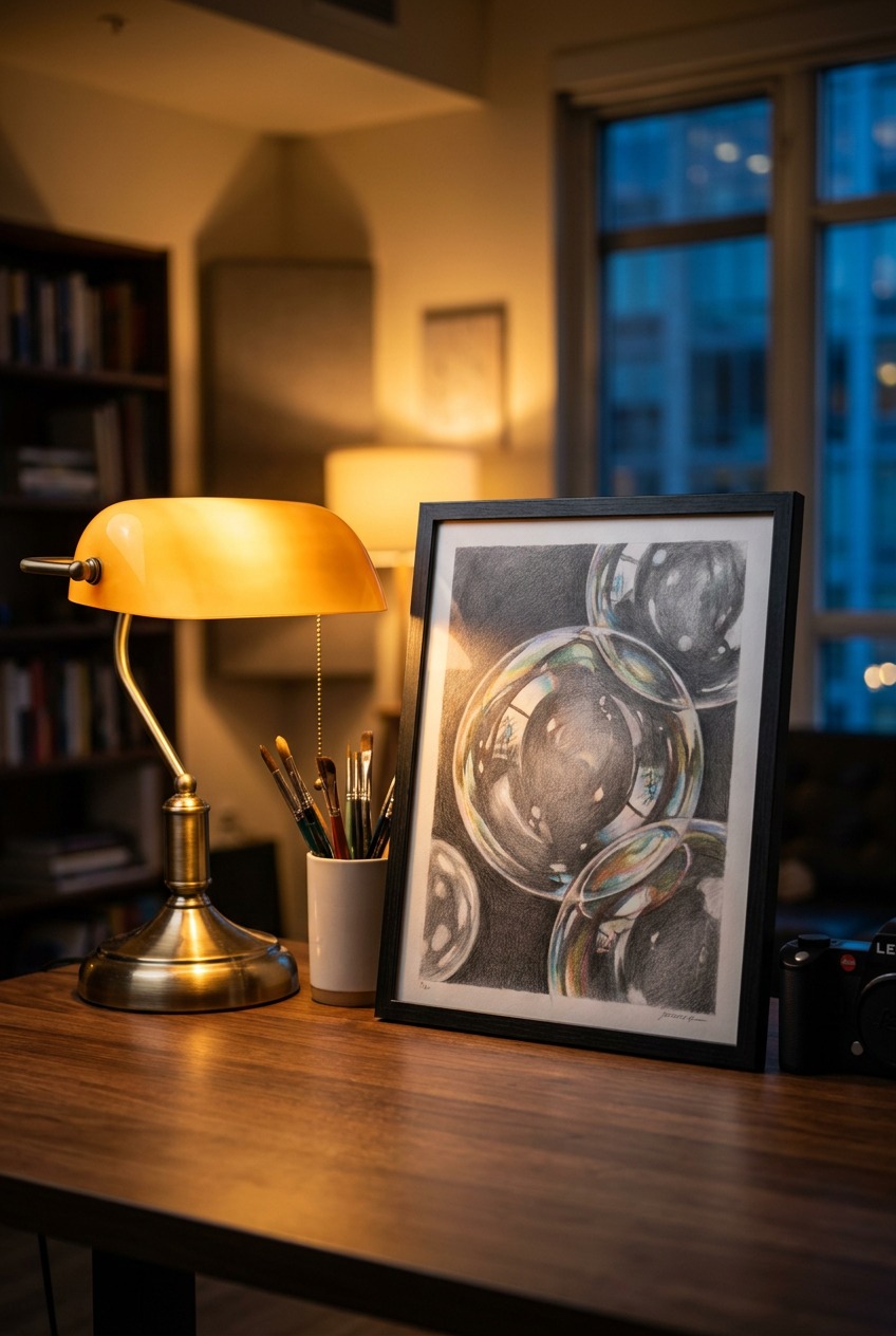
A convincing bubble typically needs at least two distinct highlight shapes rather than one: a larger, softer highlight where the primary light source reflects, and a smaller, sharper highlight elsewhere on the surface, often positioned roughly opposite or offset from the first. This isn’t arbitrary; it comes from the bubble’s surface reflecting light from more than one source or angle simultaneously, the main light plus ambient bounce light from the surrounding environment.
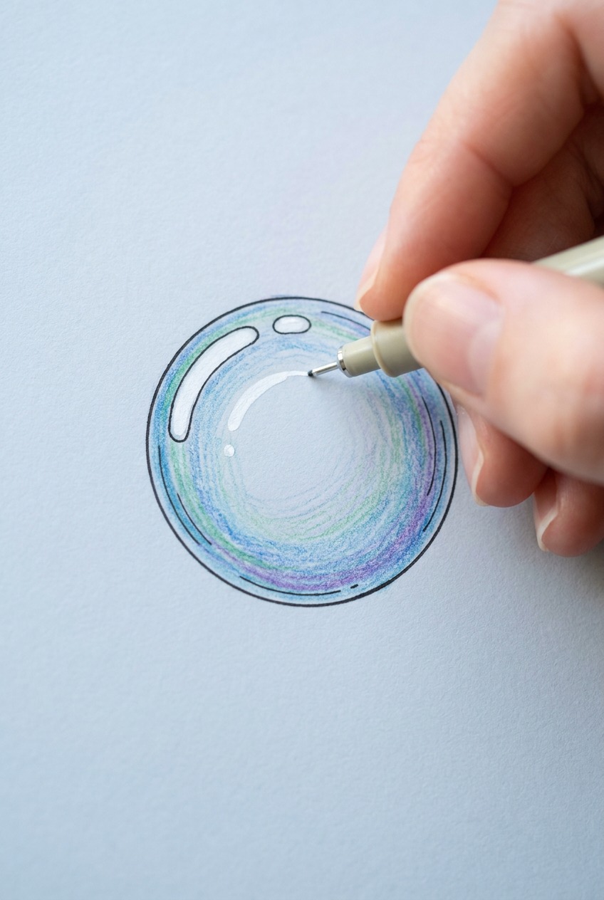
Treat the bubble’s surface as though it’s mentally divided into two halves that mirror each other, both horizontally and vertically, the way a photographed soap bubble often does. Highlights and faint reflected shapes tend to echo across this mirrored structure rather than appearing randomly, and building the drawing with that structure in mind produces a far more convincing result than placing highlights by eye alone.
This mirrored logic also explains why copying a bubble drawing you’ve seen elsewhere, rather than working from actual reference or from the optical principle itself, so often looks subtly wrong. The specific highlight placement in someone else’s drawing was correct for their specific light setup and viewing angle. Applied to a different composition without understanding why it was placed there, it stops making optical sense even if the shapes themselves look similar.
Let a hint of the environment curve across the surface
Beyond the two highlights, a faint, curved suggestion of the surrounding environment, a window shape, a horizon line, the edge of a nearby object, bent to follow the sphere’s curvature, sells the reflection far more convincingly than highlights alone. This doesn’t need to be detailed or literal. Even a soft, simplified curved shape reads as “reflected environment” to the eye, and that reading is what separates a glassy, wet-looking bubble from a plain shaded ball.
Rendering the rainbow sheen without making it look random
The faint rainbow color that shifts across a real soap bubble’s surface comes from thin-film interference: light waves reflecting off the front and back of the impossibly thin soap film interfere with each other, reinforcing some wavelengths and cancelling others depending on the film’s exact thickness at that point. Since the film’s thickness varies slightly across the bubble’s curved surface, and changes constantly as the bubble drains and thins under gravity, the resulting color bands shift and swirl rather than sitting in fixed rings.
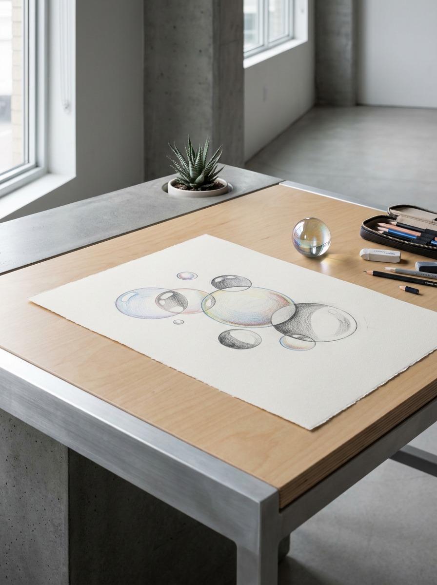
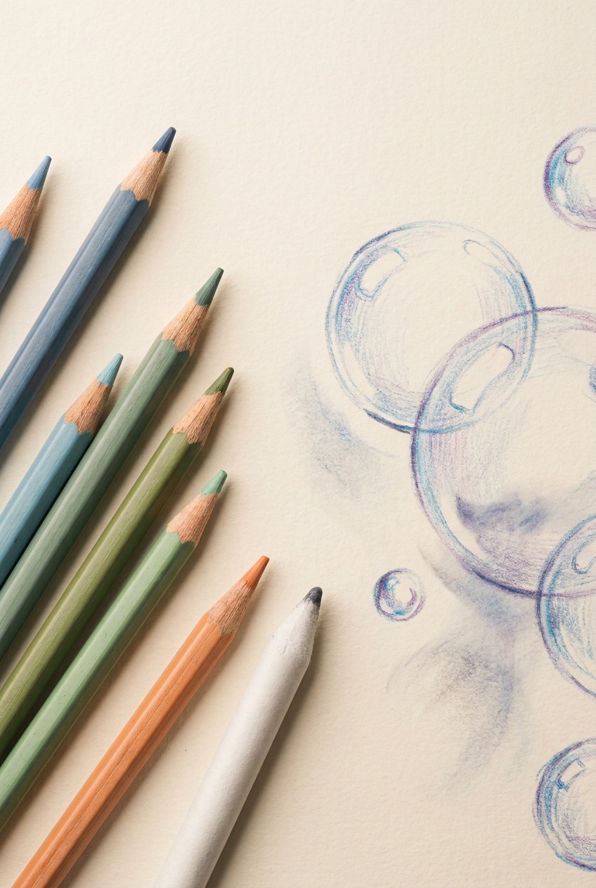
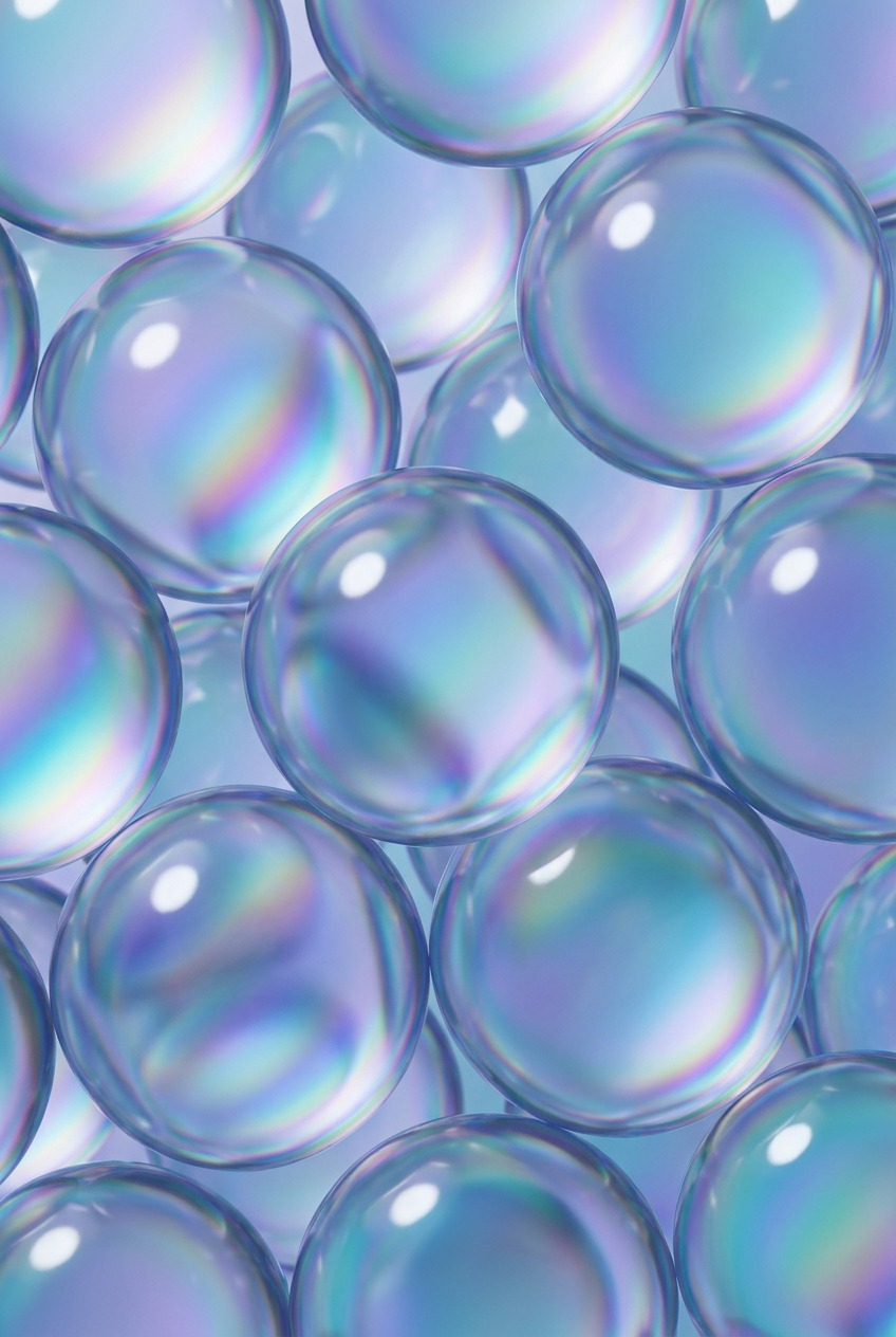
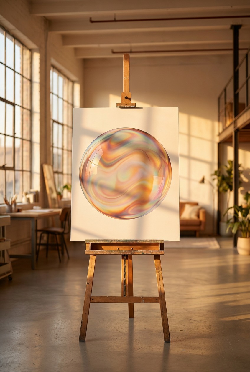
For drawing purposes, the practical takeaway is simpler than the physics: the color bands should follow the curvature of the surface in soft, flowing streaks, not scattered as random confetti-like dots, and they tend to concentrate more toward the upper portion of a bubble, where the film is thinnest, thinning further right before the bubble pops. A useful approach is to lay in the base sphere shading first, fully resolved in grayscale or a neutral tone, then glaze thin, low-opacity streaks of color, blues, pinks, faint yellow-greens, along the surface’s curved contour lines, letting the underlying value structure show through rather than covering it.
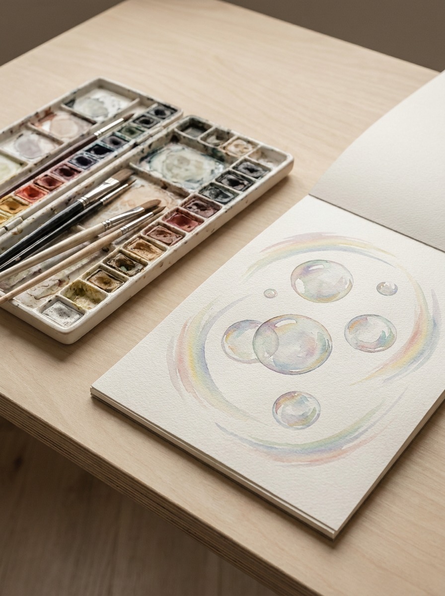
It’s worth noticing, if you ever get the chance to actually watch a real bubble for a few seconds before it pops, how the color pattern drifts slowly downward and thins near the top as gravity pulls the soap film toward the bottom of the sphere. You don’t need to replicate this motion in a static drawing, but understanding that the color pattern has a physical cause and a directional logic, rather than being decorative, is what lets you place it convincingly instead of guessing.
Materials and technique: pencil, marker, watercolor, and digital
The optical logic above holds regardless of medium; what changes is how you achieve soft transitions and thin color glazes in each one.
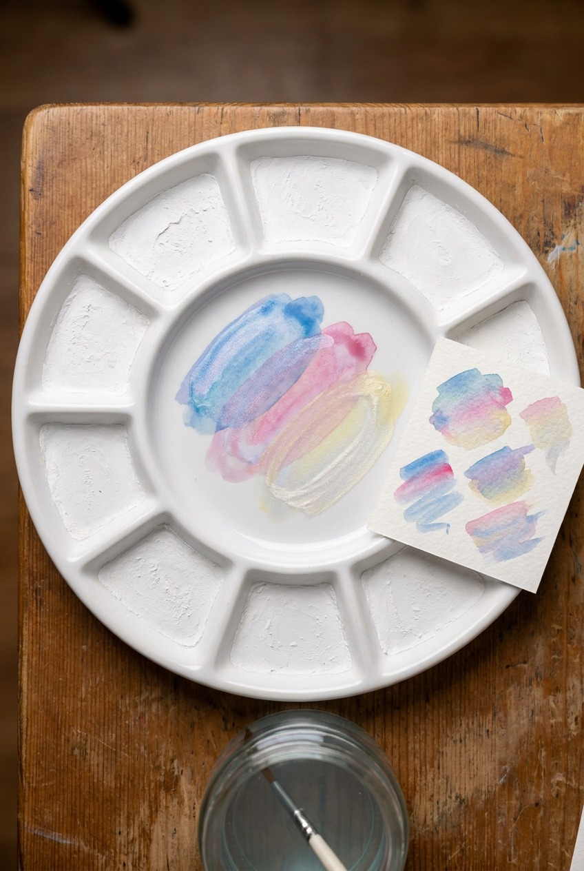
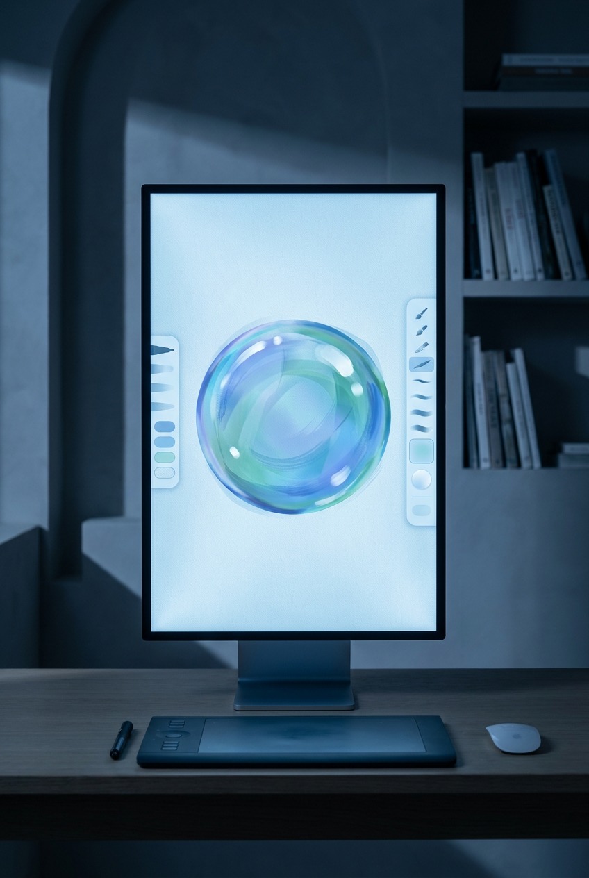
Graphite and colored pencil reward a light touch and patient layering, building the core shadow gradually rather than committing to a dark value early, since a bubble’s soft shadow edge is much easier to lighten than to darken back down once it’s overworked. Watercolor and the marker-plus-water technique common in kids’ tutorials actually suit the thin-film color glazing step surprisingly well, since diluted color naturally produces the soft, blended streaks the rainbow sheen needs, though the underlying sphere shading still has to be resolved first for the result to read as three-dimensional rather than a colorful blob. Digital painting offers the most direct control: block in the base sphere shading on one layer, then add highlights and the color sheen on separate layers set to a low-opacity blend mode, which makes it easy to adjust the balance between the underlying form and the surface color effects without redoing the whole drawing.
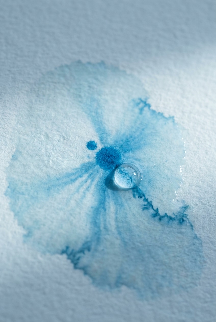
Gouache sits in an interesting middle ground worth mentioning separately. Its opacity lets you build the sphere shading with real control the way pencil does, while still allowing thin, diluted glazes for the color sheen the way watercolor does, which makes it a strong choice if you want the full range of effects in one traditional medium rather than switching between pencil and paint.
Common mistakes that flatten a bubble drawing
A short list of the errors that show up constantly, and that a beginner can fix immediately once they know to look for them.
One highlight and nothing else
A single crescent highlight on an otherwise flat, evenly colored circle is the single most common mistake, and it’s the direct result of skipping the underlying sphere shading covered earlier. Fix the value structure first; the highlight is the last five percent of the drawing, not the whole technique.
A hard, dark outline around the whole shape
Bubbles don’t have a solid outline in reality, their edge is defined by a thin rim of concentrated reflection and refraction, often brighter or more saturated than the interior, not a uniform dark line. A heavy outline is one of the fastest ways to make a bubble read as a flat sticker rather than a three-dimensional, transparent object.
Random confetti-dot rainbow color
Scattering small dots or blotches of rainbow color across the surface without following the sphere’s curvature reads as decoration rather than an actual optical effect. Keep the color in soft, flowing streaks that wrap around the form the same way the value shading does, and the color will read as surface phenomenon rather than random pattern.
Practice exercises that build the skill fast
The fastest way to internalize all of this is to isolate each skill before combining them, the same approach that works for any observational drawing fundamental.
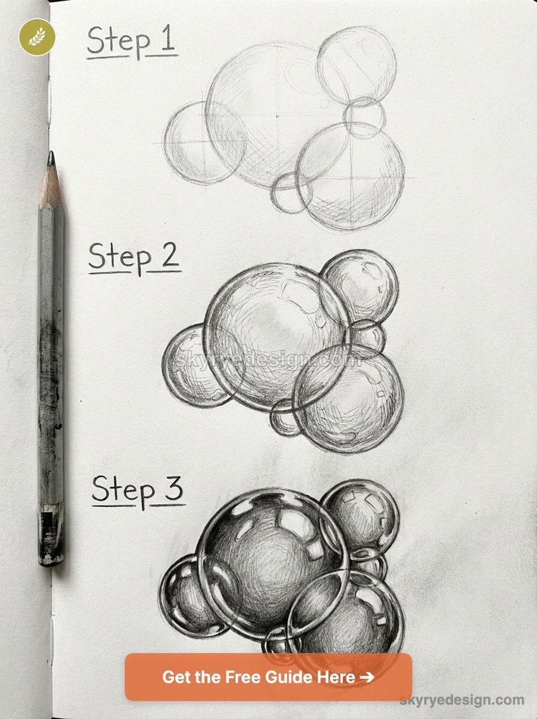
Start with plain sphere shading studies using a single light source and no color at all, just to lock in the value structure covered earlier. Move to studying a solid glass marble or a clear glass ornament from life or from photo reference, focusing purely on where the highlights and reflections sit, since a still object gives you time to actually study the pattern a real bubble never allows. Only after both of those feel automatic should you combine sphere shading, double highlights, and a thin color glaze into an actual bubble drawing. Rushing straight to the finished technique without these intermediate steps is why the skill feels harder than it needs to be.
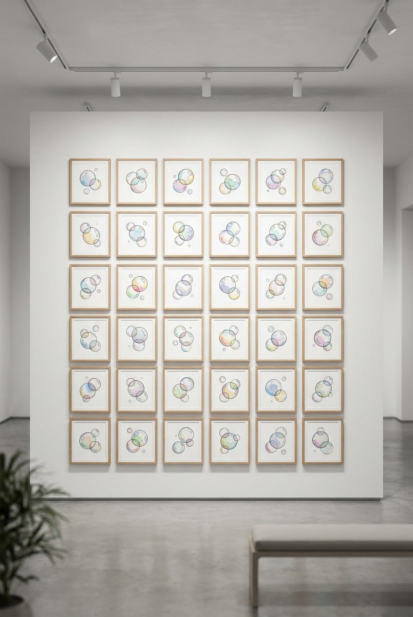
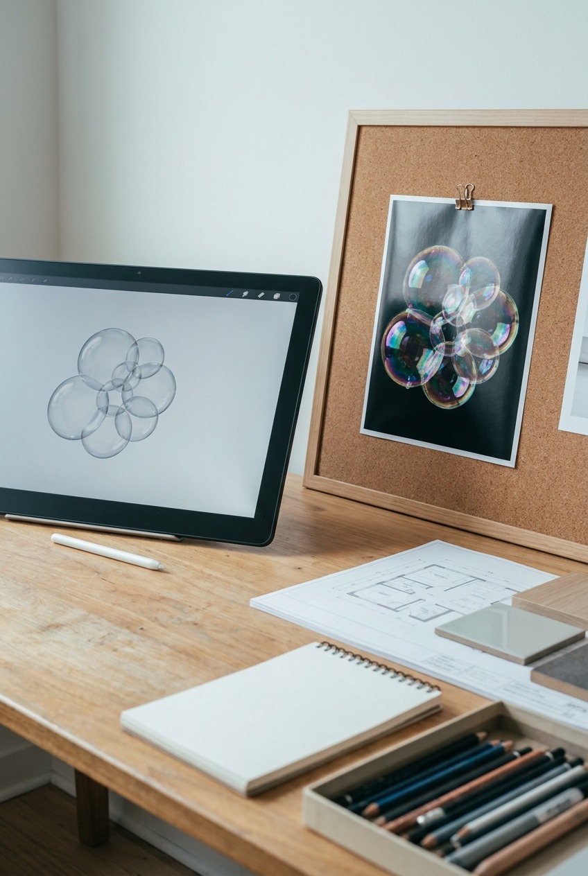
A useful final exercise once the individual pieces feel solid: draw a small cluster of overlapping bubbles rather than a single isolated one. Overlapping bubbles interact optically, one bubble’s surface can reflect a neighboring bubble, and the thin membrane where two bubbles meet forms a flat, slightly different plane worth observing separately. This is a genuinely harder composition than a single bubble, and it’s the exercise that tends to reveal whether the underlying principles have actually become intuitive or are still being consciously worked out step by step.
FAQ
Why do my bubble drawings look flat?
Almost always because the underlying sphere shading was skipped in favor of jumping straight to a highlight shape. A bubble needs the same value structure as any shaded sphere, a highlight, mid-tone, soft core shadow, and reflected light, before any bubble-specific detail gets added on top. Fix the base sphere first.
How many highlights should a bubble have?
Most convincing bubble drawings use at least two highlights rather than one: a larger, softer highlight from the main light source, and a smaller, sharper secondary highlight positioned elsewhere on the surface. This mirrors how a bubble’s curved, reflective surface actually catches light from more than one direction at once.
Why does a bubble show rainbow colors?
The colors come from thin-film interference: light reflecting off the front and back of the extremely thin soap film reinforces or cancels certain wavelengths depending on the film’s exact thickness at each point. Because thickness varies across the curved, draining film, the colors shift and swirl in soft streaks rather than sitting in fixed patterns.
Should I outline a bubble drawing?
Avoid a hard, uniform outline. A real bubble’s edge is defined by a thin rim of concentrated reflection and refraction rather than a solid dark line, and adding one flattens the form. If you need an edge, keep it broken, varied in value, and brightest where the surface catches the most light.
What is the easiest way to practice drawing bubbles?
Isolate the skills before combining them. Practice plain sphere shading with one light source and no color first, then study a solid glass object like a marble or ornament for highlight and reflection placement, and only then combine sphere shading, double highlights, and a thin color glaze into a full bubble drawing.
- 1.4Kshares
- Facebook0
- Pinterest1.4K
- Twitter3
- Reddit0