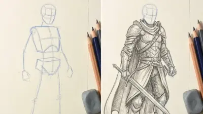
Marker drawing is a versatile and accessible art form that allows you to create vibrant, bold images quickly. Whether you’re a beginner or an experienced artist, markers offer a wide range of possibilities for expression, from simple sketches to detailed illustrations. Using the right techniques and understanding the unique properties of markers can significantly improve your art and help you achieve professional-looking results.
You’ll find that markers can produce smooth gradients, rich colors, and striking effects that traditional tools sometimes struggle to match. Learning how to blend, layer, and choose colors effectively will open up new creative paths and make your work stand out. Marker drawing can be both fun and rewarding, giving you confidence as you develop your skills and try new ideas.
With practice, you can master various techniques, from bold outlines to subtle shading, and even experiment with mixed media for added texture and depth. This guide will help you explore those techniques and inspire you to create your own unique marker art.
Key Takeways
- Mastering basic techniques improves the quality of your marker drawings.
- Effective blending and color choices enhance visual impact.
- Exploring different styles expands your creative options.
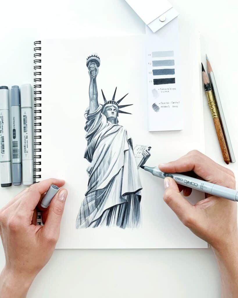
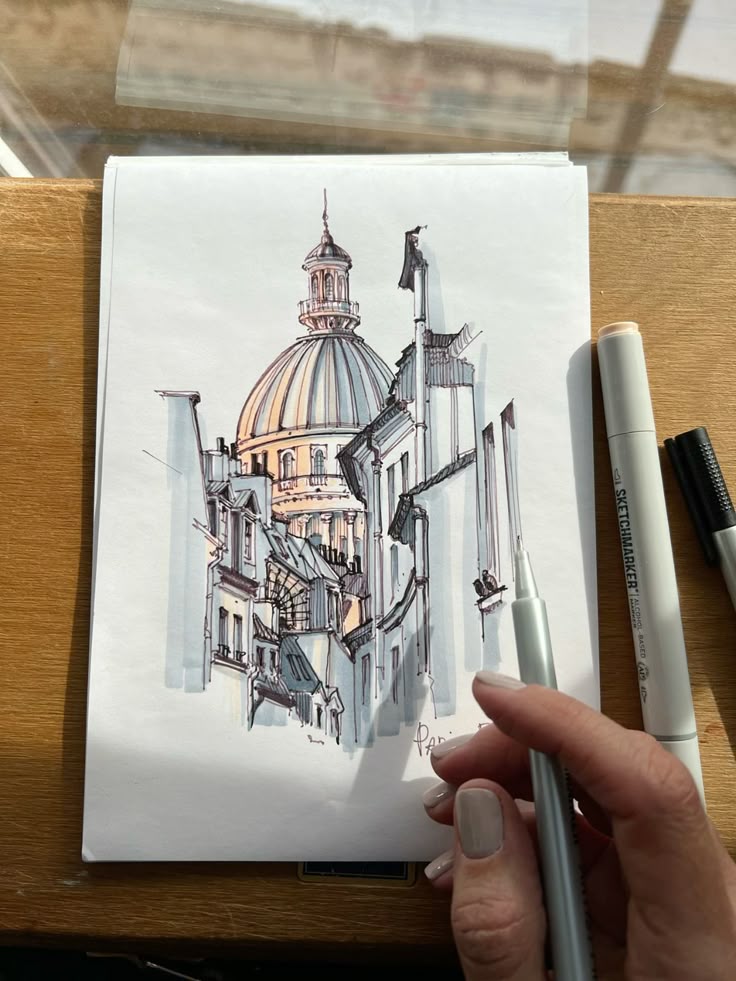
Fundamentals of Marker Drawing
To draw effectively with markers, you need to choose the right tools, understand different types of markers, and master essential techniques. These elements work together to help you create clean, vibrant artwork with control and precision.
Essential Tools and Materials
You will need quality markers designed for art, suitable paper, and basic accessories. Alcohol-based markers are popular for their smooth blending and vibrant colors. They dry quickly and layer well but require marker-friendly, bleed-proof paper to prevent ink from soaking through.
Water-based markers are less permanent and easier to blend on regular paper but may not offer the same vibrancy or layering ability.
Other helpful tools include a colorless blender marker for smooth transitions, fineliners for precise outlines, and a marker palette for testing colors. Always keep scrap paper handy to test your strokes and avoid unwanted marks on your artwork.
Types of Markers
Markers come primarily in two categories: alcohol-based and water-based. Alcohol-based markers use alcohol solvents, enabling fast drying and seamless color blending. They work best on smooth, thick marker paper to avoid bleed.
Water-based markers use water as the solvent, making them less toxic and easier to clean up. These markers tend to dry slower and are suitable for more casual work or beginners. They often have less saturated colors and less blending capacity.
Tip shapes vary too: chisel tips cover broad areas, brush tips provide flexibility similar to paintbrushes, and fine tips allow detailed lines. Choose your marker type and tip style based on your drawing needs and technique.
Key Marker Drawing Techniques
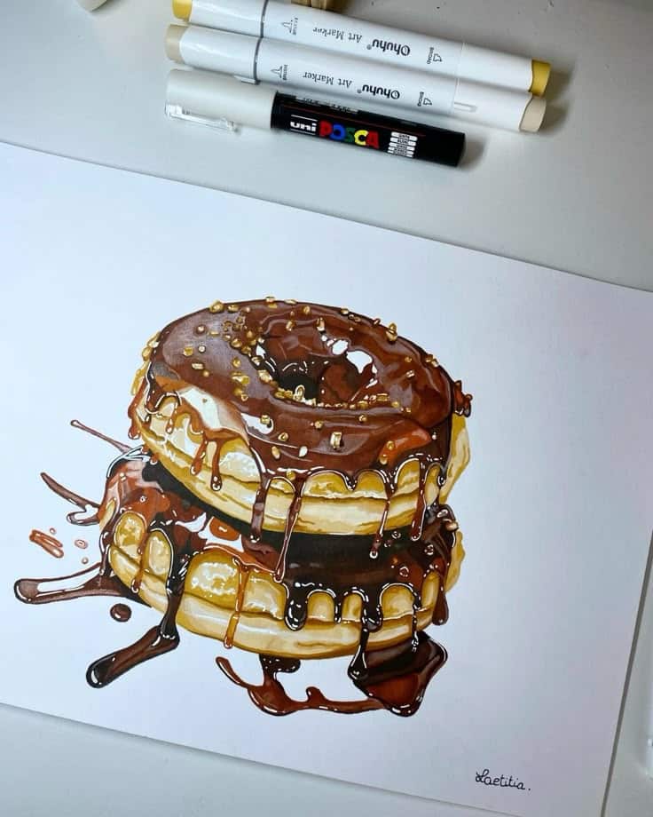
When drawing with markers, layering colors is the foundation. Start with light colors and gradually add darker tones to build depth and shadows. Use short, even strokes to avoid streaks and maintain consistency.
Blending is another crucial skill. For alcohol-based markers, use a colorless blender or blend two shades by overlapping strokes while the ink is wet. Water-based markers blend differently, often needing water or blending tools to soften edges.
Textures can be created by varying stroke direction or using stippling techniques. Controlling ink flow avoids bleeding, especially when working near detailed line art. Allow layers to dry before applying more to prevent unwanted mixing.
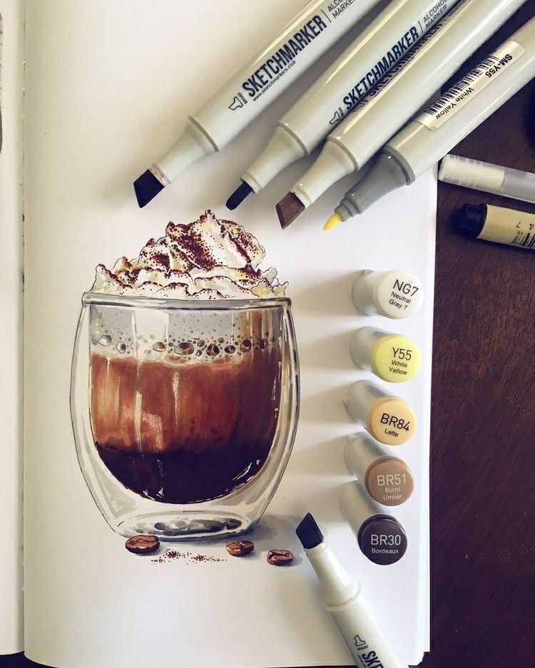
Blending and Shading Methods
Mastering blending and shading is essential to enhance your marker drawings with smooth transitions and realistic depth. Using the right techniques helps you control color flow and layer tones effectively, creating vivid and dynamic images.
How to Blend Colors Effectively
To blend colors with markers, start by selecting shades that are close in hue or value. Apply the lighter color first, then layer the darker shade while the ink is still wet. This allows the pigments to mix naturally on the paper.
You can use a colorless blender marker to smooth edges between colors and create seamless transitions. Light, overlapping strokes help avoid streaks and harsh lines.
Work quickly, as most markers dry fast. Blending works best on smooth, marker-friendly paper that allows the ink to move. Practice layering colors in small circles or feathered strokes for better control.
Techniques for Smooth Gradients
Creating smooth gradients involves gradual shifts from one color to another. Begin by laying down the lightest color, then add mid-tones and finally the darkest color towards the area where you want the depth.
Use a back-and-forth motion while blending, overlapping colors slightly to avoid sudden changes. You can also apply a blender marker over the entire gradient to even out the tones.
Work in small sections to maintain wet ink areas for blending. Adjust pressure on your marker to vary color intensity and prevent saturating the paper.
Adding Depth Through Shading
Shading adds volume and dimension to your drawings by emphasizing light and shadow. Identify your light source and apply darker markers where shadows would naturally fall.
Use layering to build darker shades by applying multiple passes, gradually increasing contrast. Flat shading with consistent color can work, but blending helps soften edges and creates a more lifelike effect.
Incorporate complementary color combinations for shadows instead of just grays or blacks. This gives your drawing richness and vibrancy, making your shading stand out.
Advanced Techniques and Effects
You can enhance your marker drawings by applying specific methods that build depth, texture, and dimension. These approaches involve careful line work, strategic layering, and controlled use of light and shadow.
Hatching and Crosshatching
Hatching involves drawing closely spaced parallel lines to represent shading or texture. You control darkness by adjusting line density and thickness. For softer shading, use lighter strokes; increase pressure and line closeness for darker areas.
Crosshatching uses overlapping sets of parallel lines in multiple directions, such as vertical and diagonal, to deepen shadows. This technique is effective for adding volume and detail without smudging.
Both methods rely on consistent line work and planning. Practice varying angles and line spacing to achieve smooth gradients and dynamic shading effects in your marker art.
Layering and Textures
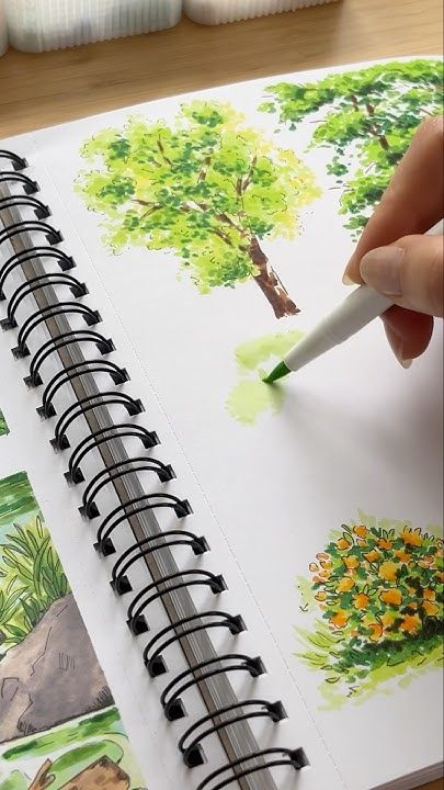
Layering colors allows you to blend shades and create richer tones. Start with light colors, then add darker shades gradually to build depth. Use markers with brush nibs for smoother transitions and blending.
You can create different textures through varying your stroke direction, intensity, and overlapping patterns. For example, short, quick strokes simulate rough surfaces, while long, even strokes produce smooth finishes.
Experiment with combining markers and other media, like colored pencils, to enhance texture and detail. Layering also helps prevent streaking and adds dimension to your work.
Creating Highlights and Shadows
To depict realistic light and form, integrate highlights and shadows carefully. Preserve highlights by avoiding coloring over those areas or by using a white gel pen to add reflective spots after coloring.
Shadows require layering darker, cooler tones along edges or areas opposite the light source. Apply medium pressure and build up intensity gradually to avoid harsh lines.
Using gradients from dark to light creates a three-dimensional effect. Remember, the balance between highlights and shadows shapes the perception of volume in your drawing.
Creative Marker Drawing Ideas
You can explore a range of themes and techniques with markers to make your drawings vibrant and engaging. Working on different subjects sharpens your skills in blending, layering, and using bold colors effectively.
Portraits and Figures
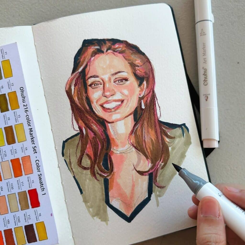
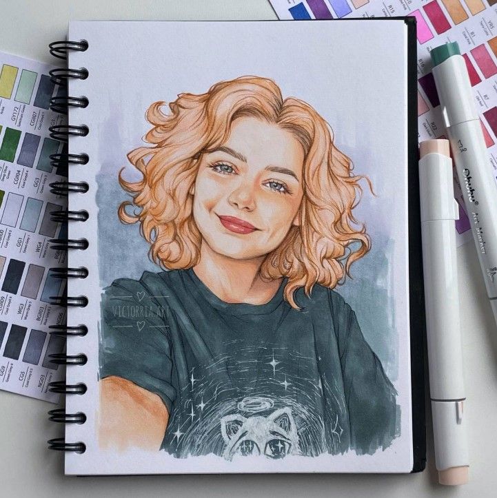
When drawing portraits or figures with markers, focus on capturing facial features and expressions clearly. Use light layers to build skin tones, gradually adding shadows for depth. Blending markers or using brush-tip markers helps create smooth gradients.
Pay attention to details like hair texture and clothing folds. Using a marker with a fine tip can help outline features sharply, while broad tips fill larger areas smoothly. Try experimenting with limited color palettes to maintain balance and avoid overwhelming the portrait.
Landscapes and Nature Scenes
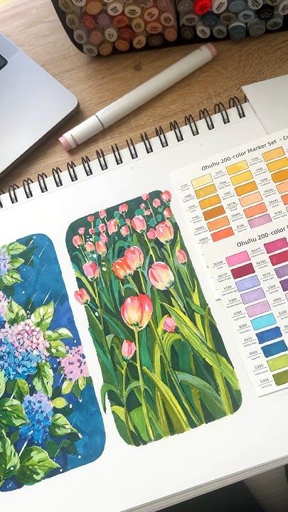
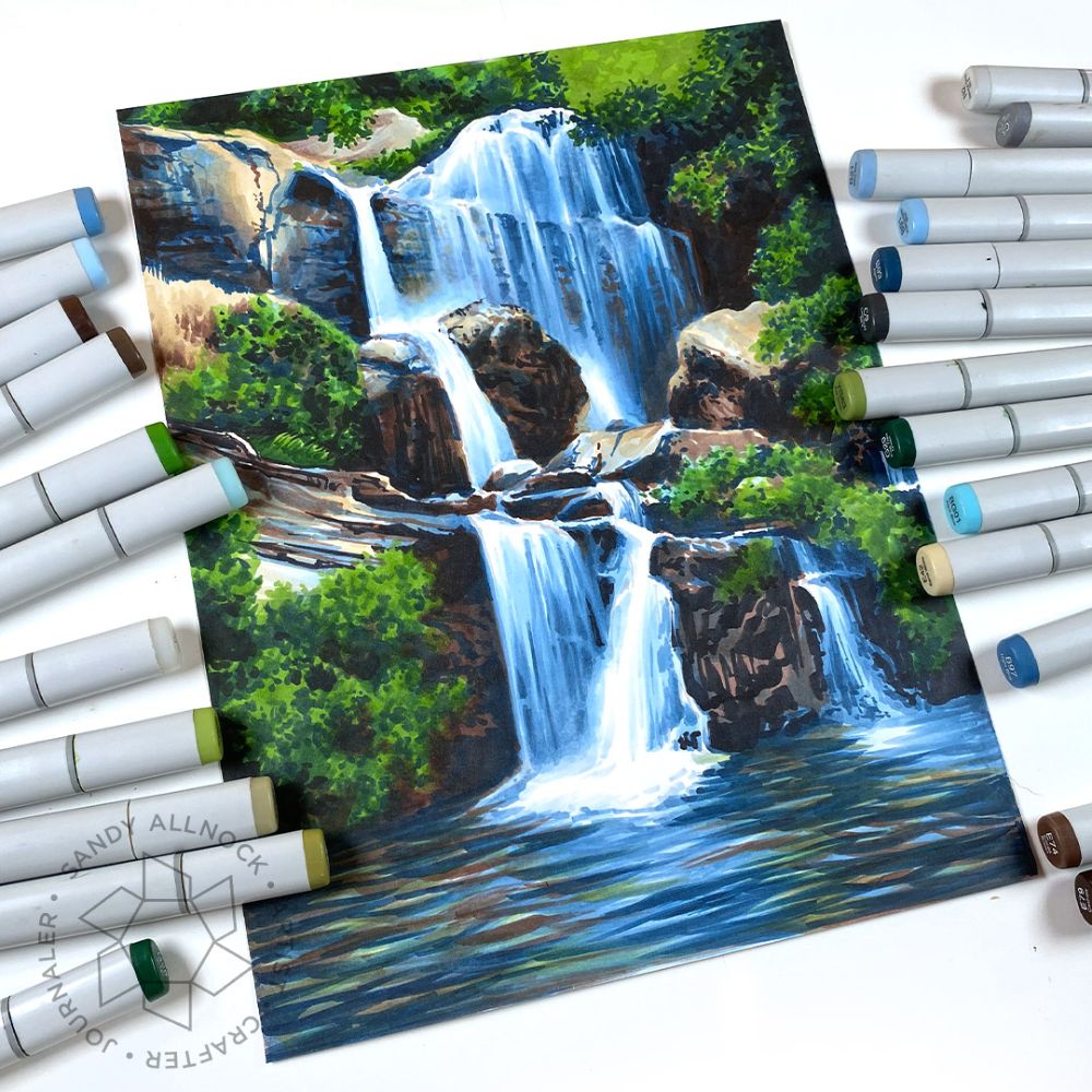
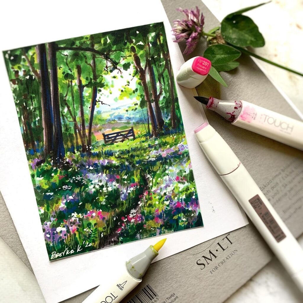
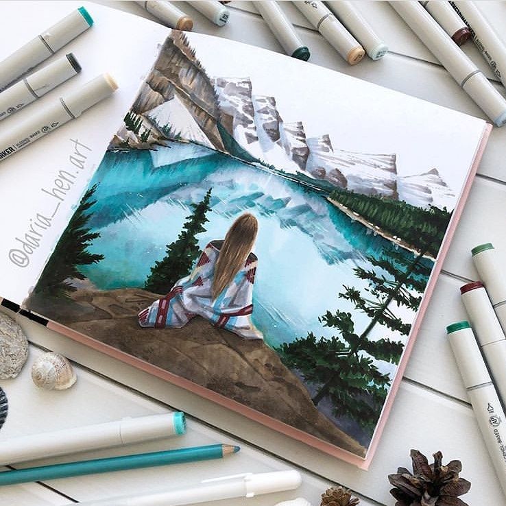
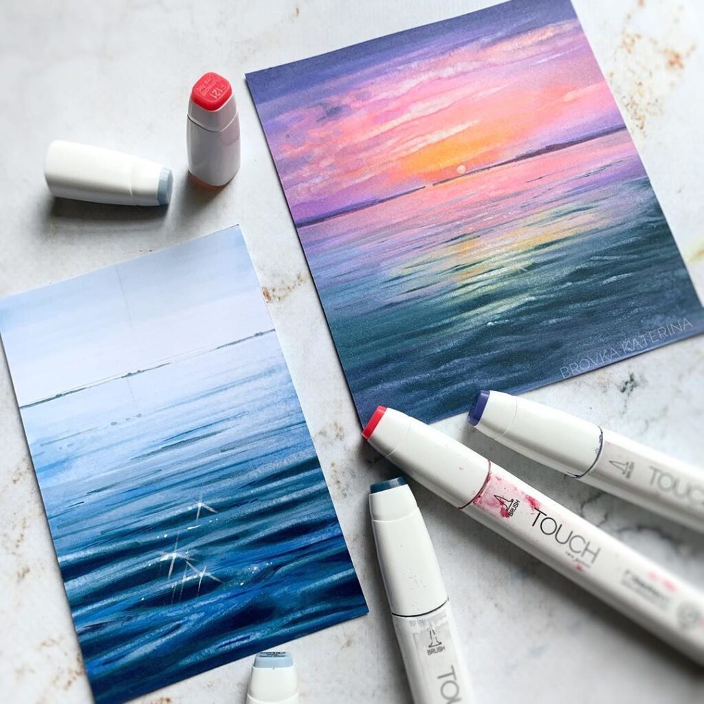
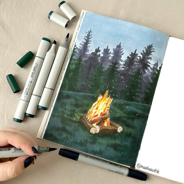
Marker drawing works well for landscapes, allowing you to emphasize contrasts and vibrant colors in nature. Start with basic shapes like hills, trees, or water bodies. Use layering techniques to create textures, such as stippling for grass or cross-hatching for bark.
You can combine different markers for skies, foliage, and reflections. To simulate light and shadow, apply darker hues strategically. Experiment with blending between colors on the page or layer transparent colors for a richer effect. Keep your strokes consistent to reflect natural textures.
Pattern and Abstract Designs
Creating patterns and abstracts with markers lets you focus on repetition, symmetry, and color harmony. Use geometric shapes, lines, and dots to design visually appealing forms. Change marker tip sizes for varied line thickness, enhancing the dynamic feel of your work.
Try mixing complementary colors to generate contrast or selecting analogous colors for smoother transitions. With abstract art, layering markers at different opacities can build intricate depths. Repetitive motifs like circles, triangles, or waves work well to establish rhythm in your design.
Pop Art and Comic Inspirations
Markers are ideal for pop art and comic styles because of their bright, bold appearance. Use solid, vivid colors and thick outlines to achieve this look. Halftone dots and speech bubbles are common elements you can incorporate easily with markers.
Focus on clear contrasts and flat color areas rather than intricate shading. Use black markers to define edges sharply, lending a graphic quality to your drawing. Try simple compositions with exaggerated expressions or actions to capture the energetic feel of comic art.
Choosing and Combining Colors
Selecting and combining colors effectively impacts the depth and vibrancy of your marker drawings. Understanding foundational principles, creating palettes that work harmoniously, and using contrasts strategically will enhance your artwork with alcohol-based markers.
Understanding Color Theory
Color theory gives you a framework for mixing and pairing colors. You should familiarize yourself with key concepts like the color wheel, which organizes hues into primary, secondary, and tertiary groups. This structure helps you predict how colors will interact.
Learn about traditional color relationships such as:
- Monochromatic: Variations in lightness and saturation of one hue.
- Analogous: Colors next to each other on the wheel, creating smooth blends.
- Complementary: Colors opposite each other, offering high contrast.
You can use these relationships to create balanced or dynamic looks. Understanding warm and cool colors also guides emotional tone and focus in your drawing.
Building Harmonious Palettes
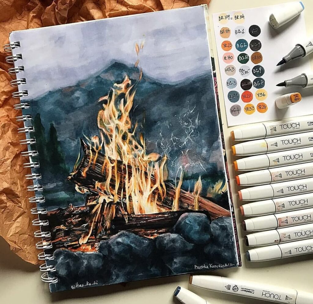
To build palettes that work well together, start by choosing a base color suited to your subject. Then, select additional colors based on the color relationships mentioned earlier. Harmonious palettes reduce visual conflict and make your artwork feel cohesive.
You can organize your palette using simple steps:
| Step | Action |
|---|---|
| 1 | Pick a dominant marker color |
| 2 | Add 1-2 analogous colors for shading or gradients |
| 3 | Include 1 complementary color for highlights or accents |
When working with alcohol-based markers, layering these colors will create smooth blends and texture variation. Limit your palette size to avoid clutter and maintain clarity.
Experimenting With Contrasts
Contrast introduces visual interest and guides the viewer’s eye. Beyond complementary colors, contrast can arise from differences in saturation, value (light vs. dark), and temperature (warm vs. cool).
To use contrasts effectively:
- Use darker marker tones to emphasize shadows or depth.
- Apply brighter, saturated colors for highlights or focal points.
- Mix warm and cool hues to create spatial separation or mood shifts.
Experiment with layering different marker intensities and combining them with colored pencils to add subtle texture. Contrast techniques will help your drawings appear more three-dimensional and vibrant without overwhelming the viewer.
- 448shares
- Facebook0
- Pinterest448
- Twitter0
- Reddit0


