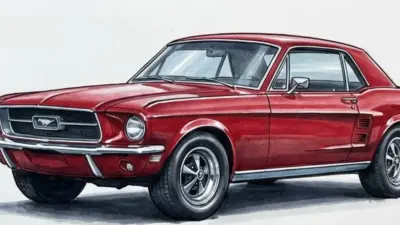
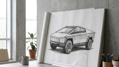
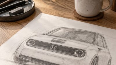
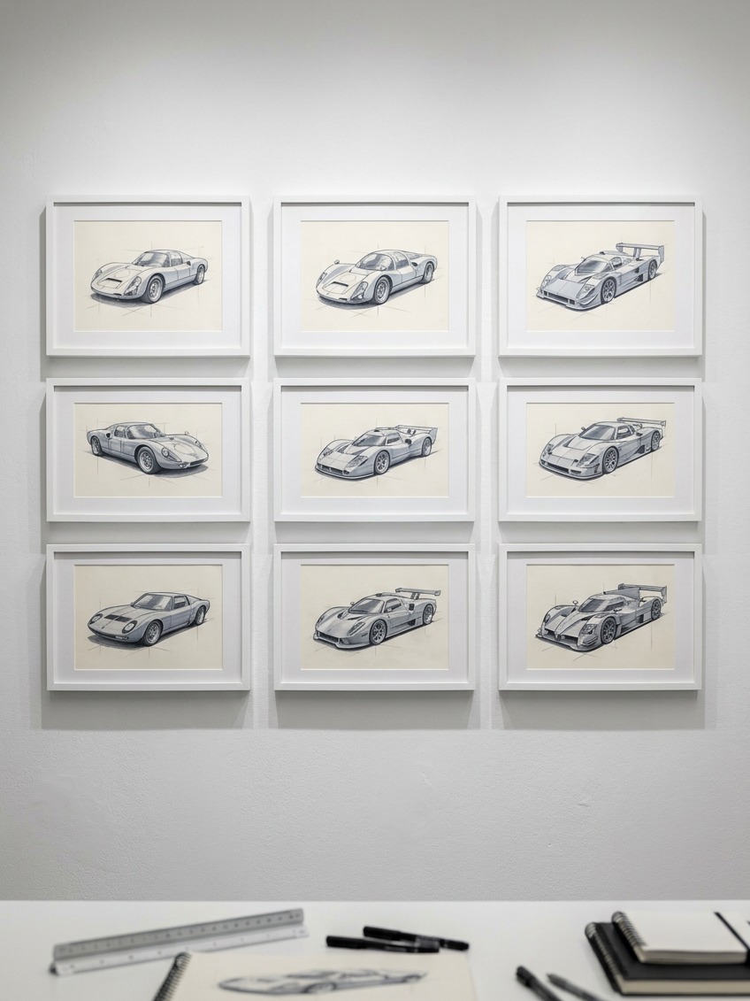
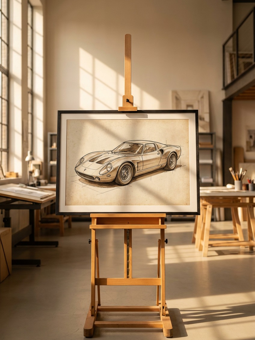
The first race car I ever drew that actually looked fast wasn’t the one with the most detail. It was the one where I got the stance right before I drew a single panel line, wheels pushed out wide, the body sitting low and heavy between them, the whole silhouette leaning slightly forward like it wanted to leave the page. Everything I added after that, the intakes, the wing, the highlights, just confirmed what the stance had already promised. Get the stance wrong, and no amount of detail rescues the drawing.
Search “how to draw a race car” and you’ll find the same tutorial structure repeated dozens of times: a flat side-view outline, two circles for wheels, a coat of bright color. Fine for a first attempt with a six-year-old. It won’t get you a car that reads as fast, low, and three-dimensional, because none of the actual visual cues that signal speed come from a flat silhouette or a symmetrical wheel circle.
- Why most race car tutorials never look fast
- Start with a three-quarter view, not a side view
- Get the stance and proportion right before any detail
- Draw wheels as ellipses, not circles
- Build the body from big volumes, not outlines
- Highlights and reflections that make painted metal look fast
- Common mistakes that flatten a race car drawing
- A practice sequence that builds the skill fast
- FAQ
This is a practitioner’s guide, not a kids’ craft tutorial. It covers the three-quarter perspective that makes a car read as an object in space rather than a cardboard cutout, how to actually draw a wheel as an ellipse instead of a circle, why stance and track width do more for a race car’s presence than any amount of surface detail, and how highlights and shadow work together to make painted metal look like it’s moving even sitting still on the page.
None of this requires being able to draw a photorealistic car from memory. It requires understanding a handful of specific visual principles well enough to apply them deliberately, the same shift that separates a competent gesture drawing from a flat copy of a reference photo in any subject.
I spent years doing production surfacing work on real cars before I ever taught anyone to draw one, and the two skills turned out to be closer than I expected. A surfacer checking a digital body panel under simulated studio light is asking exactly the same question a sketch artist should be asking on paper: does this line read as confident, or does it wobble the moment you actually look at it critically. The tools are different. The eye you’re training is the same.
Why most race car tutorials never look fast
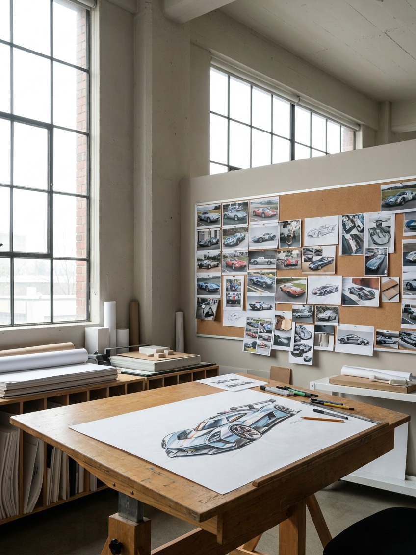
Almost every widely shared race car tutorial follows the same sequence: draw a rough outline from directly the side, add two circles for wheels, block in windows and a spoiler, color it in. That produces a recognizable symbol for a race car. It doesn’t produce a drawing that reads as fast, because a flat side view has no depth cue at all, the same silhouette could belong to a toy, a sticker, or a real 200mph machine, and the drawing can’t tell the difference.
A race car is one of the more demanding vehicles to draw specifically because so much of what makes it look fast is about proportion and spatial position rather than surface detail. The wheels sit wider than the body above them. The whole car sits low enough that the ground plane and the shadow beneath it matter as much as the bodywork itself. None of that survives a flat, straight-on side view, which is exactly why the kids’-tutorial format keeps producing cars that look like toys no matter how many racing stripes get added afterward.
There’s a reason this pattern is so persistent, and it’s worth naming honestly: a flat side view is genuinely easier to draw, which is exactly why it dominates content aimed at young beginners. The trade-off is real, though, and worth understanding clearly. Easier to draw and convincing to look at are two different goals, and this guide is aimed at the second one.
Start with a three-quarter view, not a side view
A side-view elevation is useful for a technical diagram. It’s close to useless for a drawing meant to feel dynamic, because it flattens the car’s actual three-dimensional form into a single silhouette with zero depth information.
Why a flat silhouette reads as a toy
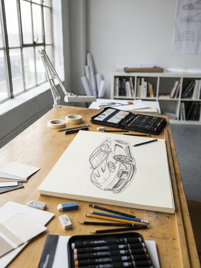
Without a visible front or rear plane, foreshortened and angled toward the viewer, the eye has nothing to judge the car’s actual volume against. A side view shows you the car’s length and height accurately, but tells you nothing about its width, and width, specifically how much wider the car is than it is tall, is one of the strongest visual cues for a low, aggressive stance. A three-quarter view, showing the front or rear corner along with the side, gives the eye that missing volume information immediately.
This is the same reason a product photographer almost never shoots a car, a shoe, or a phone dead-on from the side for a hero image. The angle that actually sells an object’s form and presence is nearly always some version of a three-quarter view, because it’s the angle that shows the object occupying real space rather than existing as a flat cutout.
Setting up a simple vanishing point for a car sketch
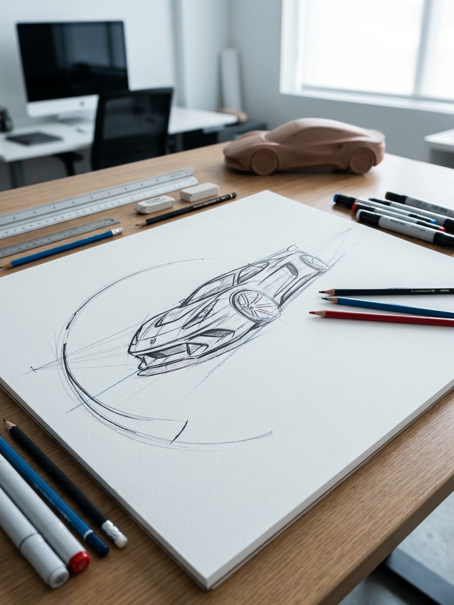
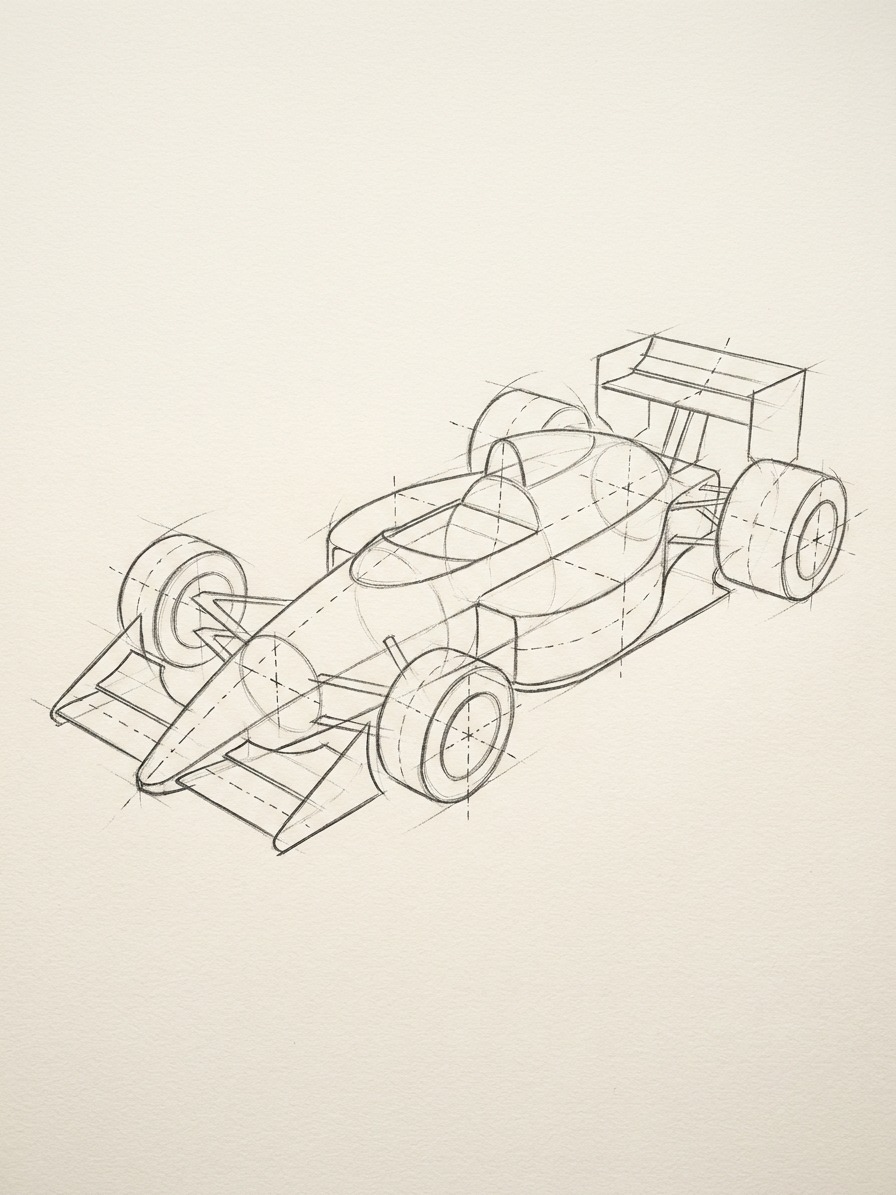
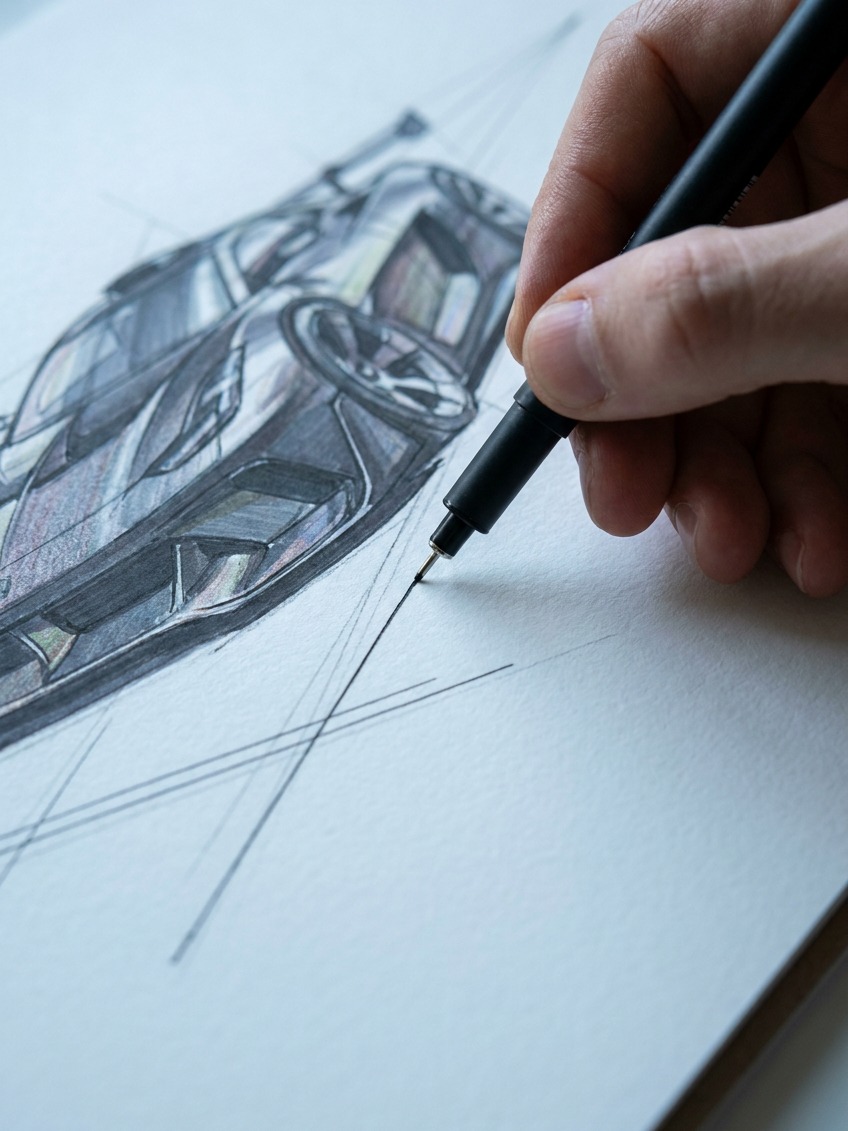
You don’t need formal two-point perspective mastery to get a convincing three-quarter car sketch. Start with a single, fairly distant vanishing point on the horizon line, then let the car’s major horizontal edges, the beltline, the hood’s rear edge, the sill line, converge gently toward it. The convergence should be subtle for a car-length object viewed from a normal distance, sharp perspective distortion belongs to a wide-angle photo taken inches from the bumper, not a natural three-quarter gesture sketch.
It helps to physically mark the vanishing point on the page, even if you plan to erase the guideline later, rather than trying to judge convergence purely by eye. A light construction line drawn from that single point through each major horizontal edge keeps the whole drawing internally consistent, which matters more for believability than any individual line being perfectly rendered.
Get the stance and proportion right before any detail
Stance, how the car’s wheels and body sit relative to each other and to the ground, does more work toward making a drawing look fast than every panel line and vent combined.
Wide track, low ride height, and why they matter visually
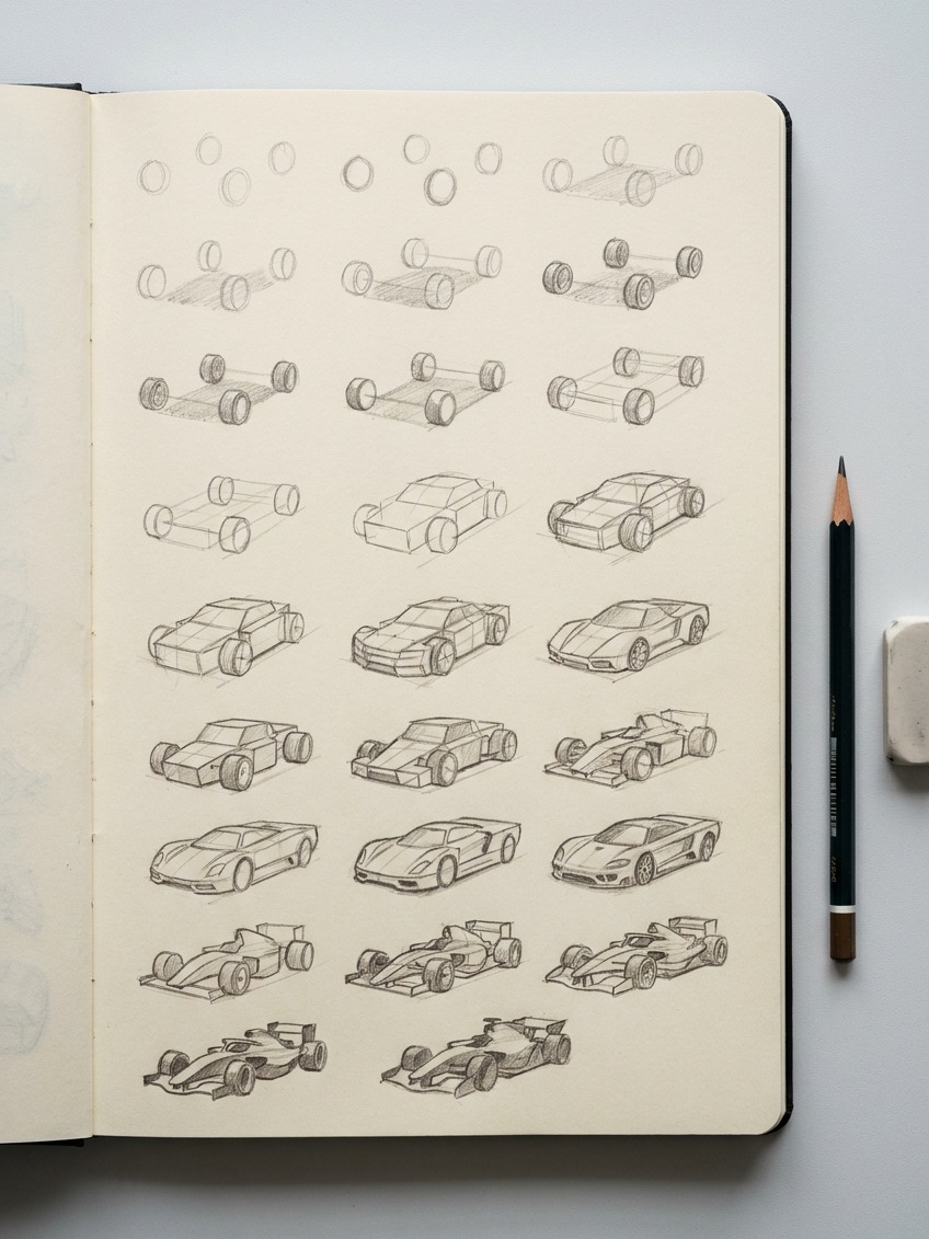
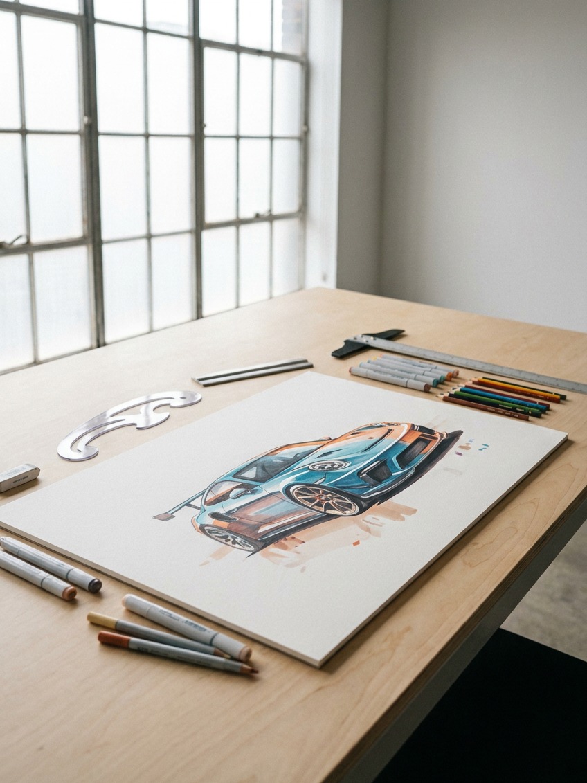
A race car’s wheels sit noticeably wider than its body’s visual centerline, wider than a road car’s proportions would suggest, and the whole body sits close to the ground. Both of these are functional, wide track for cornering grip, low ride height for a lower center of gravity, but they’re also the two proportion decisions that most directly signal “race car” rather than “road car” to the eye before any other detail gets added. Draw the wheels first, established wide and low, and let the body volume fill in around that foundation rather than the other way around.
A useful comparison worth studying directly: sketch the same basic car silhouette twice, once with the wheels tucked closer under the body and the ride height raised slightly, once with the wheels pushed wide and the body dropped low. The second version will read as meaningfully faster before a single other detail changes, which is worth internalizing as proof that this decision matters more than almost anything else in the drawing.
The ground plane and shadow are part of the drawing
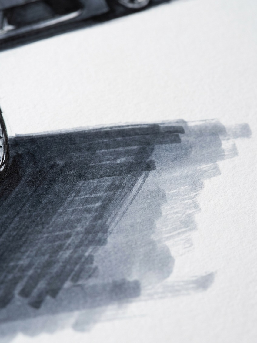
A car floating on white paper with no ground contact reads as weightless, regardless of how correctly the body itself is drawn. A simple, confident shadow directly beneath the car, denser right under the body and fading at the edges, anchors the car to a surface and does a surprising amount to sell both weight and speed simultaneously. Skipping this step is one of the most common reasons an otherwise well-proportioned car sketch still feels flat and static.
Design note
Block in the four wheels as simple ellipses and the ground shadow before drawing a single body panel. If the stance looks fast and grounded at that skeleton stage, everything you add afterward will read as fast too. If it doesn’t look right at the wheel-and-shadow stage, no amount of surface detail will fix it later.
Draw wheels as ellipses, not circles
This is the single most common technical mistake in amateur car drawings, and it’s almost entirely responsible for why so many otherwise decent sketches still look slightly wrong without the artist knowing exactly why.
Why a circle wheel breaks the whole drawing
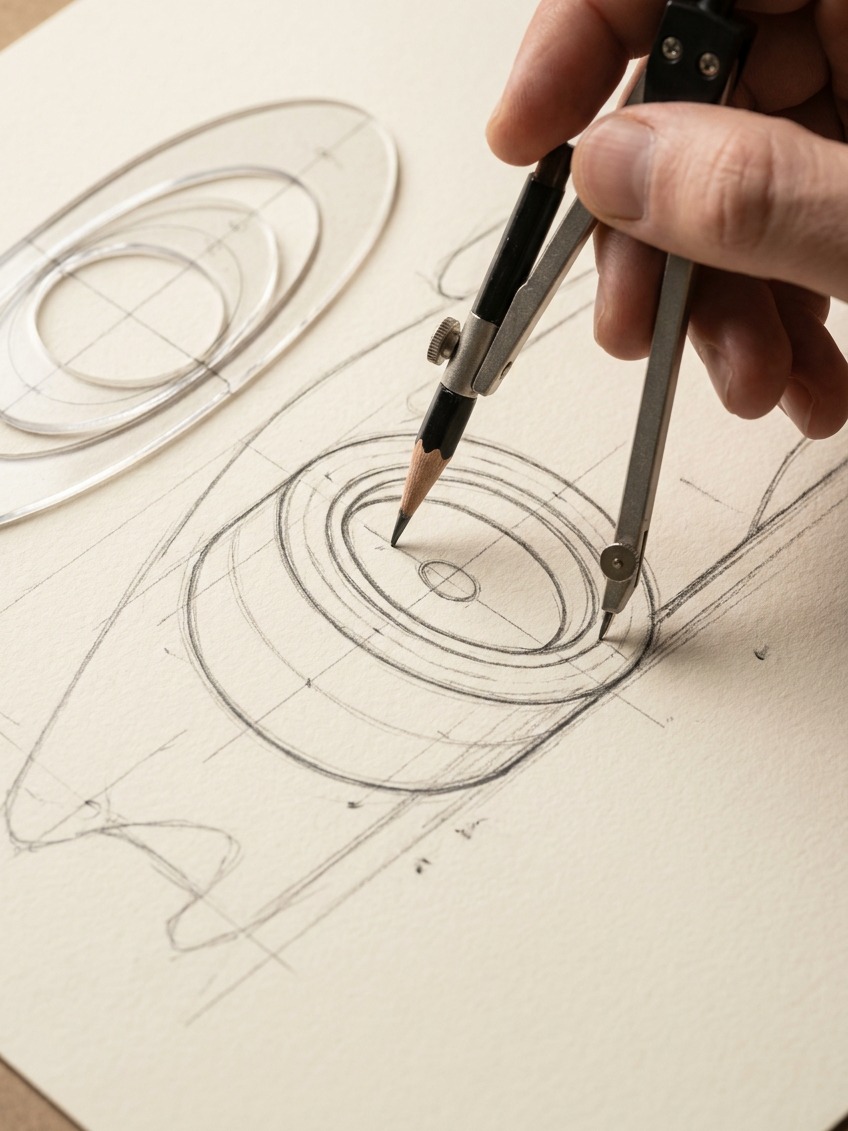
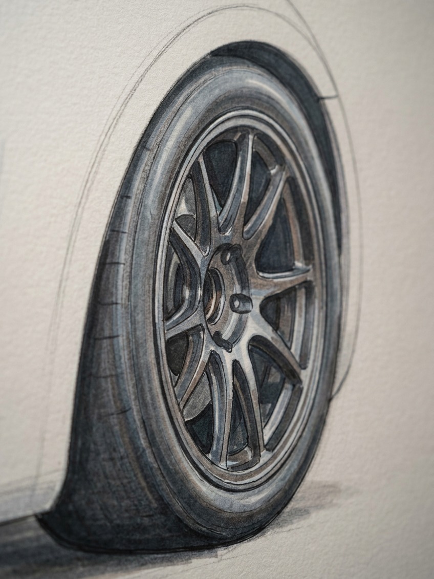
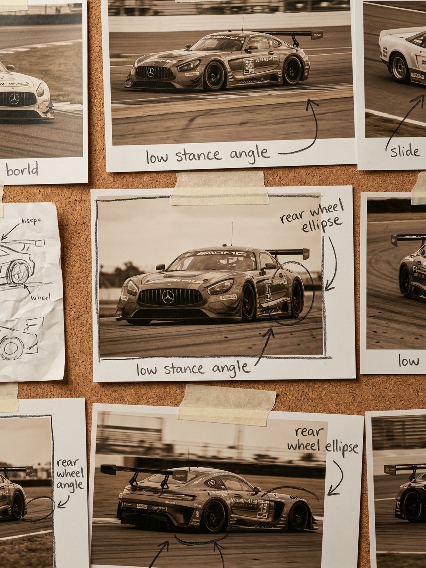
In any view except dead-on from directly the side, a wheel is a circle viewed at an angle, which means it reads as an ellipse, not a perfect circle. Drawing a wheel as a true circle in a three-quarter view is the fastest way to undercut an otherwise well-constructed perspective drawing, since the eye reads that mismatched wheel shape as “wrong” even when it can’t immediately articulate why.
The degree of ellipse compression, how flattened the circle appears, depends on the viewing angle: a wheel viewed nearly straight-on compresses into a very narrow ellipse, while one viewed from a shallower angle stays closer to a full circle. All four wheels on the same car, viewed from the same angle, should share a consistent degree of compression, which is a useful thing to check once the sketch is blocked in.
A simple physical exercise fixes this faster than any explanation: hold a coin or a circular lid at arm’s length and rotate it slowly while watching how its outline changes from a full circle to an increasingly narrow oval. That’s the exact transformation happening to every wheel on the car relative to your eye, and once you’ve actually watched it happen with a real object, drawing the correct ellipse becomes far more intuitive than trying to reason it out abstractly.
Building the wheel arch and tire sidewall correctly
Once the wheel ellipse is established, the tire sidewall reads as a second, slightly smaller concentric ellipse inside it, and the wheel arch above should echo that same curve rather than being drawn as an unrelated arbitrary shape. A wheel arch that doesn’t share the wheel’s actual curvature is a small mismatch that reads as a surprisingly large visual error once the drawing is finished and colored.
Build the body from big volumes, not outlines
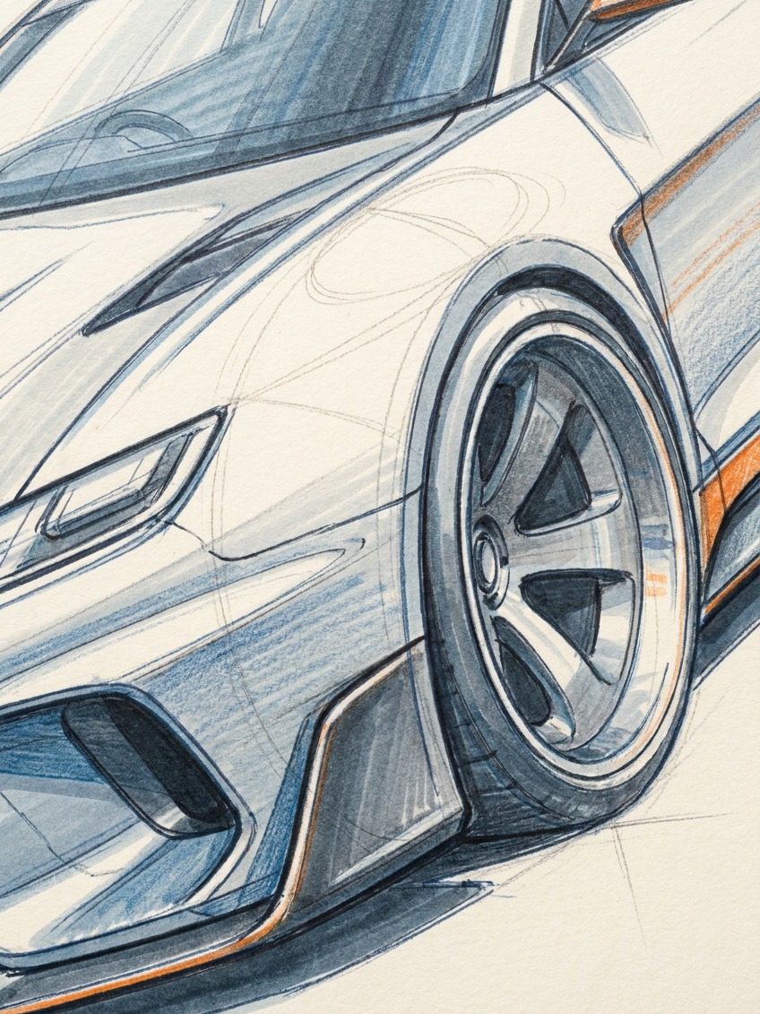
Treat the car’s body as a small number of large three-dimensional volumes stacked and blended together, not as a flat outline waiting to be filled in with detail.
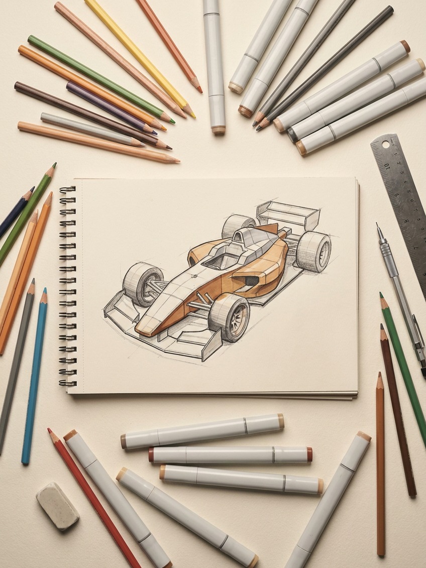
A useful simplification: block the car as a low wedge for the main body volume, a smaller, rounded box for the cockpit or cabin sitting on top of it, and cylindrical volumes for the wheel and tire assemblies at each corner. Getting these rough volumes right in relation to each other, before refining a single line, does more for the final drawing’s believability than any amount of detail added to a poorly proportioned base.
This volume-first approach also makes correcting a mistake far less painful. A wedge that’s the wrong proportion is easy to resize and redraw in a few strokes. A fully detailed, finished car drawing with the same underlying proportion problem requires redoing hours of finished linework and shading, which is exactly the kind of frustration that pushes people to abandon a drawing rather than fix it. Solve the big shapes first, while fixing them is still cheap.
Highlights and reflections that make painted metal look fast
A race car’s paint and bodywork are highly reflective, and that reflectivity is one of the strongest tools available for making a drawing feel dynamic rather than static.
This is the same principle behind why a clay modeler checks a surface under a single raking light rather than flat, even studio lighting. A single strong, directional light source produces one clear, readable highlight system, where flat, shadowless lighting produces no useful information about the surface’s actual shape at all. Choose one light direction for the drawing and commit to it fully, rather than trying to render every panel as if lit from everywhere at once.
One continuous highlight line, not scattered white marks
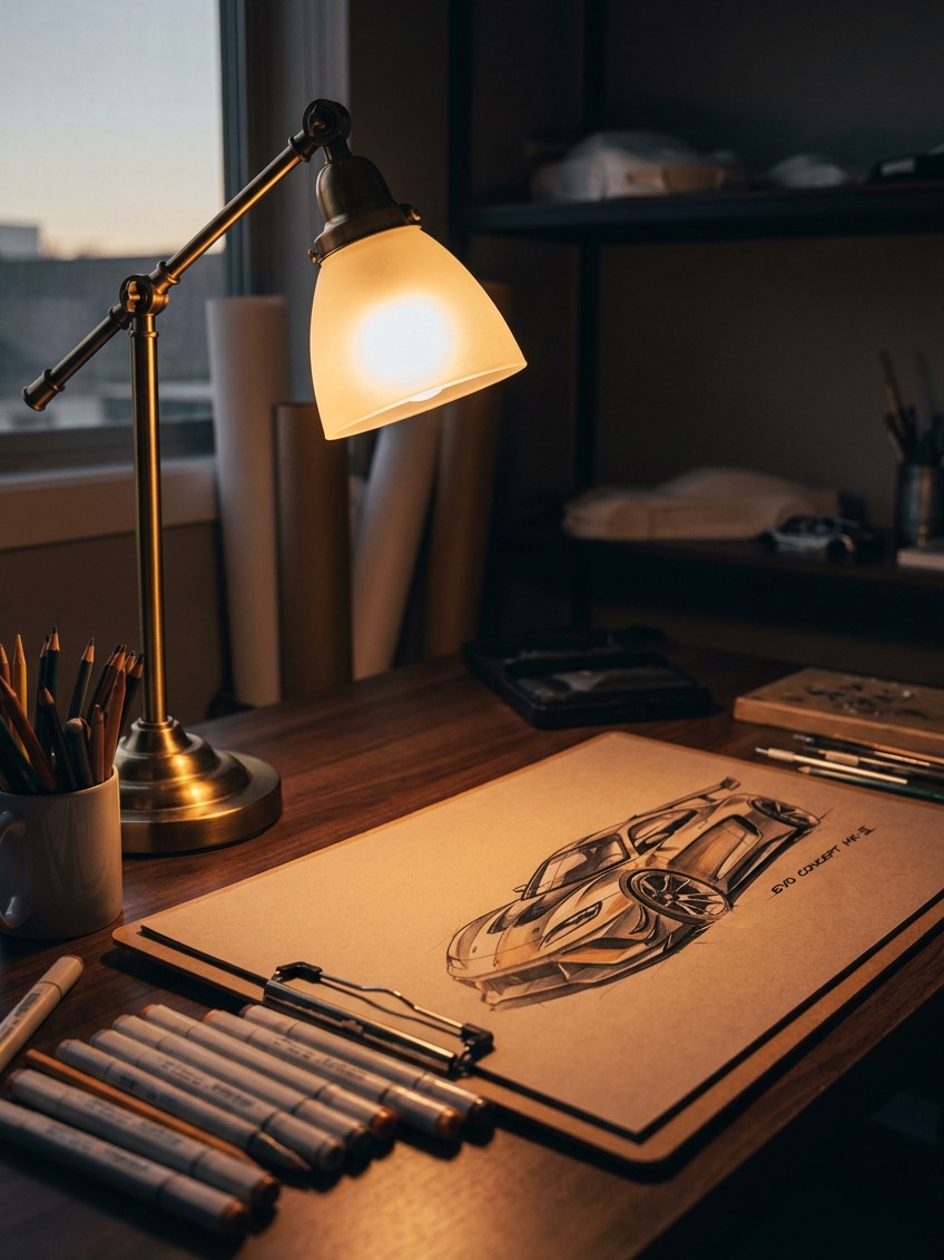
A single, continuous highlight running along the car’s main character line, the crease or fold that runs from front to rear along the body’s upper surface, reads as far more convincing than several disconnected white marks scattered across the panels. This highlight should curve and shift subtly as it follows the body’s actual surface, straightening where the surface flattens, curving more where the body bulges, rather than running as a rigid, mechanically straight line from end to end.
Using reflection direction to suggest motion
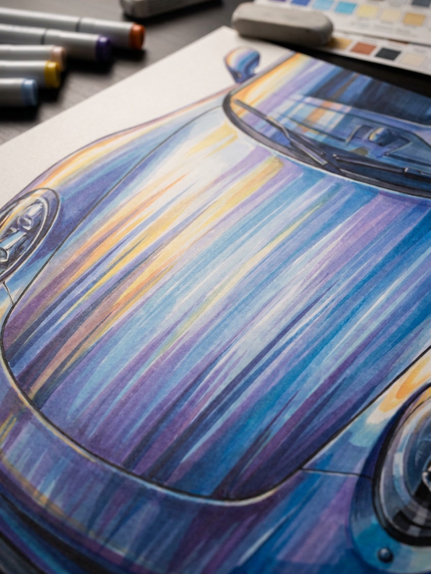
Angling the reflected highlights and any implied environment reflections slightly, as though streaking backward along the body, is a classic device for suggesting speed even in a completely static drawing. This works because it mimics how a real reflective surface moving quickly through an environment would actually blur and stretch reflected light, and the eye reads that visual cue as motion almost instinctively, even in a still image.
Common mistakes that flatten a race car drawing
A short list of the errors that show up constantly, worth checking for specifically once a drawing feels close to finished.
Wheels the same size front and rear
In a three-quarter view, the nearer wheels should appear slightly larger than the farther ones due to basic perspective, and getting this backward or ignoring it entirely is a common, easily fixed mistake that undermines the sense of depth the three-quarter view was meant to establish in the first place.
A body that ignores its own perspective convergence
Once a vanishing point has been established for the car’s major horizontal lines, every other line that should logically converge toward that same point, window trim, panel gaps, side vents, needs to follow the same convergence. Mixing perspective systems within a single drawing, some lines converging correctly, others drawn as though from a flat side view, is one of the fastest ways to make an otherwise strong sketch feel subtly broken.
No visual weight difference between front and rear
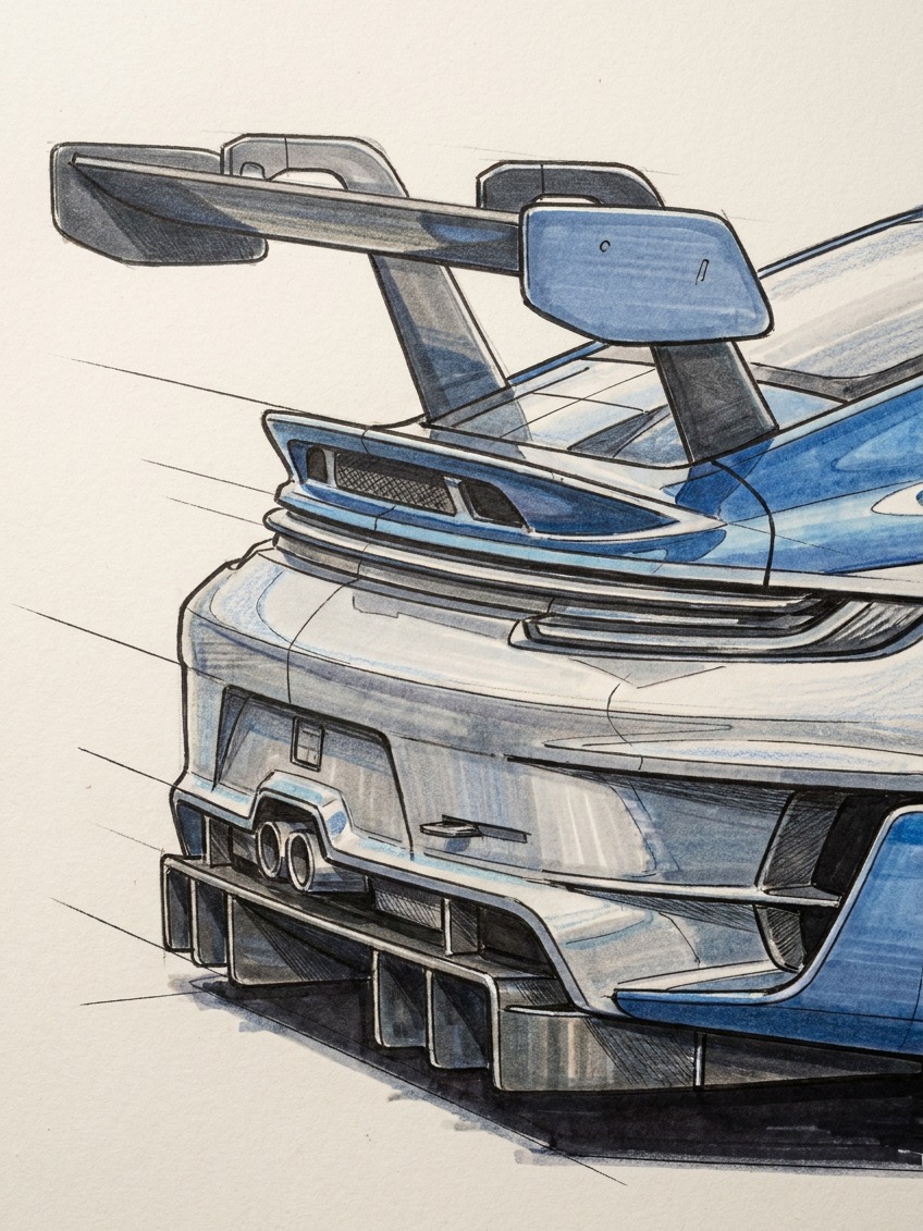
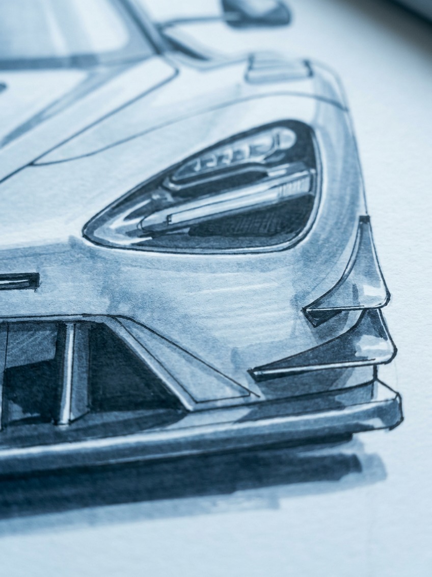
A race car’s front and rear ends usually carry different visual weight, a larger front splitter or intake, a bigger rear wing or diffuser, and flattening that asymmetry into a visually balanced, symmetrical-feeling car removes some of the aggressive, purposeful character that makes a race car read as a race car rather than a generic sports car silhouette.
A practice sequence that builds the skill fast
Isolate each piece of this before combining them into a full, finished drawing, the same approach that works for any complex observational drawing subject.
Start with wheel-ellipse studies alone, four ellipses at consistent compression, nothing else, until the shape feels automatic rather than effortful. Move to simple stance studies, four wheels and a ground shadow with no body at all, checking whether the proportions alone already read as fast and grounded. Only then add the body as large volumes, refine to actual panel lines and details, and finish with the continuous highlight running the car’s length. Rushing straight to a fully detailed drawing without these intermediate steps is exactly why the skill feels harder than it needs to be, and why so many attempts stall out looking flat despite genuine effort and detail.
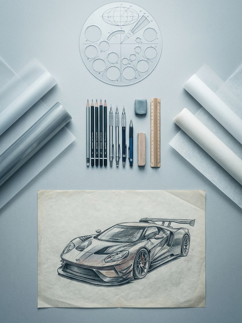
One more habit worth building early: date and keep every stance study and ellipse drill, even the rough ones, rather than discarding them once a session ends. Flipping back through a month of these small studies is the fastest way to actually see the skill improving, which is a far more reliable confidence builder than judging progress solely against finished, fully rendered drawings that take much longer to complete and compare.
FAQ
Why does my race car drawing look flat?
A: Almost always because it was drawn from a flat side view rather than a three-quarter angle, which gives the eye no depth information about the car’s actual width and volume. Establishing a simple vanishing point and drawing the car’s front or rear corner foreshortened toward the viewer fixes most of this immediately.
How do you draw car wheels correctly in perspective?
A: Draw them as ellipses, not circles, with the degree of compression matching the viewing angle. All four wheels on the same car, viewed from the same angle, should share a consistent ellipse compression, and the tire sidewall and wheel arch should echo the same curve as the wheel itself.
What makes a drawn car look fast rather than static?
A: Stance and proportion do most of the work: a wide track relative to the body, a low ride height, and a confident ground shadow anchoring the car to a surface. A continuous highlight line following the body’s main character line, angled slightly as though streaking backward, adds a strong secondary cue for implied motion.
Do I need to know formal perspective drawing to draw a race car well?
A: Not formally, but understanding a simple single vanishing point and applying it consistently across every line in the drawing, wheels, panel lines, window trim, makes a far bigger difference than detailed rendering skill. Mixing perspective systems within one drawing is one of the most common reasons an otherwise detailed sketch still looks subtly wrong.
What is the fastest way to practice drawing race cars?
A: Isolate the skills before combining them: practice wheel ellipses alone first, then simple stance studies using just four wheels and a ground shadow with no body, and only then build up to a fully detailed car. Attempting a complete, detailed drawing before these fundamentals feel automatic is why the skill often feels harder than it needs to be.
For more vehicle studies, browse the car drawing tutorials on Sky Rye Design.
- 828shares
- Facebook0
- Pinterest828
- Twitter0
- Reddit0