When you’re trying to make your brand memorable, coming up with the right brand mark idea is one of the most important first steps. A strong brand mark instantly communicates who you are and sets you apart from competitors with just a simple image or symbol. No matter your industry or business size, creative concepts for your brand mark can help express your unique identity and make an impression that lasts.
Finding the inspiration for your brand mark may seem challenging, but keeping your design simple, memorable, and relevant will guide you in the right direction. From classic symbols to modern abstract art, there are effective techniques and styles to help your visual identity stand out.

Key Takeaways
- A brand mark visually defines your brand in one glance.
- Simplicity and relevance are crucial for strong brand marks.
- Creative inspiration and smart design choices make your mark memorable.
What Is a Brand Mark?
Understanding what sets a brand mark apart from other visual elements helps you create a stronger, more memorable presence for your business. Brand marks and logomarks communicate your identity and values, supporting consistency in all your branding efforts.
Defining Brand Marks vs. Logomarks
A brand mark, often called a logomark, is a graphic symbol or icon used to represent your brand without relying on words. Instead of your company’s full name, it uses shapes, images, or abstract forms to make your brand instantly recognizable.
Examples of well-known logomarks include:
- The Apple symbol (Apple)
- The Swoosh (Nike)
- The Golden Arches (McDonald’s)
While a brand mark logo focuses on imagery, a wordmark relies on stylized text. Many brands use both together for flexibility across platforms. A logomark works especially well on products, social media icons, or app buttons where space is limited.
Role in Branding and Visual Identity
A strong brand mark makes your business stand out and is often the most recognizable part of your visual identity. It offers an immediate visual cue that reminds people of your brand values, quality, and personality.
Brand marks help create emotional connections with your audience. They simplify communication by expressing your style, tone, and message at a glance—even across language barriers.
Using a well-designed brand mark logo keeps your branding consistent. You’ll have a symbol that fits everywhere, from packaging to websites to advertising, making your business look polished and professional. Consistency builds trust and reinforces your identity each time customers see your logomark.

Core Principles of Effective Brand Mark Ideas
Strong brand marks are built on practical design principles that help your business stand out, stay memorable, and adapt across all touchpoints. Keep in mind that your brand mark isn’t just a logo—it’s a key part of your overall brand identity and how your audience perceives your company.
Simplicity and Memorability
A great brand mark is easy for people to recognize and recall. Simple logos avoid unnecessary complexity—think about the Apple or Nike mark. These designs use basic shapes and limited colors, making them easy to spot on any medium.
Memorability goes hand in hand with simplicity. When your design features clean lines and a distinct concept, customers can quickly remember and associate your mark with your brand. An effective test is to see whether someone can draw your brand mark from memory.
Key attributes for simplicity:
- Few colors
- Uncluttered shapes
- Clear typography (if text is included)
Aim for a look that’s iconic rather than busy. This helps your brand stick in the minds of your audience.
Relevance and Uniqueness
Your brand mark should directly reflect your brand identity, values, and industry. For example, a legal consultancy might use strong, traditional shapes to convey trust, while a creative studio could prefer unconventional forms and brighter colors.
Originality is critical. Avoid generic symbols or overused icons that could confuse your brand with others. Research competitor logos to make sure your design stands apart, and focus on what makes your business different.
Checklist for relevance and uniqueness:
- Does it speak to your target audience?
- Is it distinct from competitors?
- Does it convey your core promise or value?
If your mark has a story or a clever visual twist related to your brand, it gives people another reason to remember you.
Versatility for Different Applications
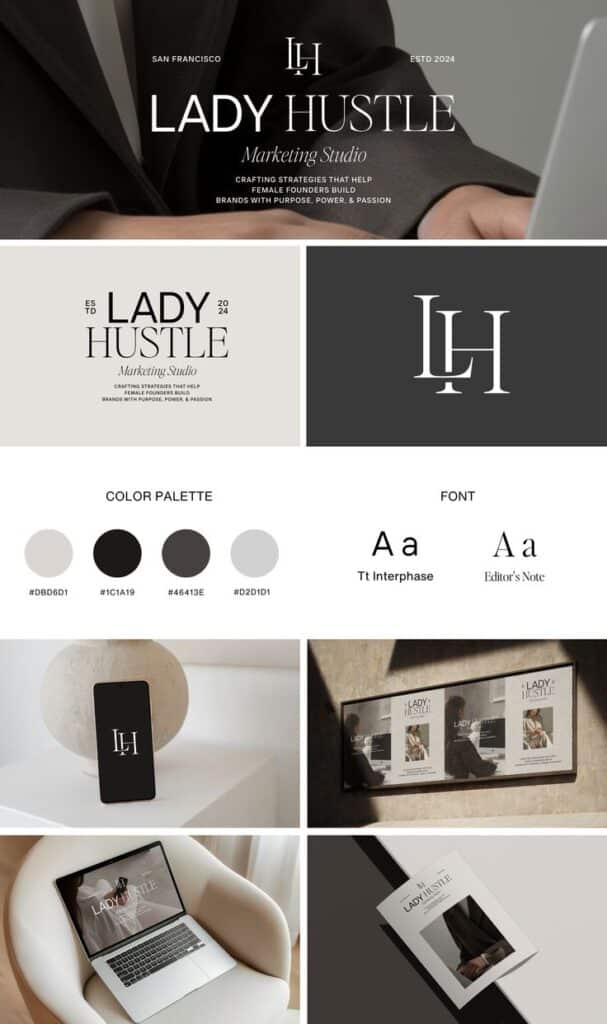
A strong brand mark looks good everywhere, whether it’s printed small on business cards or blown up on a billboard. Test your design in black and white as well as color, and check how it renders at different sizes.
You want your logo to be readable and recognizable when used on digital screens, product packaging, merchandise, and social media icons. Flexible designs make it easier to maintain a cohesive appearance across all branding materials.
Tips for versatility:
- Use vector formats for scaling
- Avoid excessive detail
- Design versions for different backgrounds
Building a versatile brand mark ensures you won’t face design issues as your business grows or your branding needs change.

Creative Approaches to Generating Brand Mark Ideas
Generating strong brand mark ideas involves knowing your industry, using relevant visuals, revising concepts, and making sure your brand’s essence comes through in your design. A successful brand mark relies on research, creativity, and a clear connection to your brand identity.
Researching Industry Trends
Start by analyzing what’s popular in your industry right now. Identify which visual elements and color schemes are gaining traction, but also pay attention to what your competitors are doing—especially how their logo design stands out or blends in.
Look for trends specific to your business type, such as minimalist marks for tech companies or handcrafted looks for small local brands. Using online resources, trade publications, and sites like Behance or Dribbble can give you inspiration and highlight what customers expect from brands like yours.
Create a simple table to keep notes:
| Industry Trend | Example Brands | Common Elements |
|---|---|---|
| Minimalist Logos | Apple, Airbnb | Simple, Clean Lines |
| Vintage/Hand-drawn | Ben & Jerry’s, Mailchimp | Illustrative, Textured |
| Geometric Shapes | Adidas, Mitsubishi | Angles, Shapes |
Identifying trends helps you strike the right balance between fitting in and standing out.
Exploring Iconic and Symbolic Imagery
Selecting the right imagery is key to creating a memorable brand mark. Think about symbols or icons that clearly relate to what you offer and how they can represent your core message at a glance.
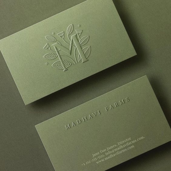
For instance, an eco-friendly brand might use leaves or earth shapes, while a tech company could use circuitry patterns or abstract forms representing connectivity. Keep your design simple and make sure it is visible at any size, from a website favicon to a storefront sign.
The use of meaningful shapes or even animals can quickly communicate your brand’s personality. Review some of the best brand marks—Nike’s swoosh or Twitter’s bird, for example—these work because they are simple, distinctive, and tied directly to the brand’s story.
Brainstorming and Iteration in Logo Creation
Effective logo creation often starts with a brainstorming session. Write down every idea, even the ones that seem outlandish. Sketch rough drafts by hand or digitally, then gather feedback from your team or industry peers.
Use the following steps for the brainstorming process:
- List words that describe your brand.
- Sketch 5–10 quick logo concepts.
- Review what works and doesn’t.
- Make minor adjustments and test different colors or fonts.
Iteration is a crucial part of logo design. Rarely will the first draft be the best, so refine your concepts repeatedly. Your focus should be refining ideas into a single, strong identity that matches your brand’s vision.
Incorporating Storytelling and Brand Values
A great brand mark should reflect your values and connect emotionally with customers. Before settling on a design, lay out your brand’s story—what inspired you, your purpose, and the principles you stand for.
Infuse symbols, colors, or even typefaces that have meaning for your business. For example, a nonprofit focusing on education might use an open book, while a fitness brand could include motion lines or strength-based symbols.
Make a short list of your key values and ask how each logo idea expresses them. This ensures your final logo design feels personal and genuinely connected to your broader branding efforts, leading to a deeper sense of recognition and trust.

Brand Mark Design Techniques and Styles
Choosing the right design approach is key in shaping your brand’s visual identity. The best techniques help your brand mark stand out while staying memorable and adaptable for any channel or context.
Minimalist Brand Marks
Minimalist brand marks use simple lines, shapes, and limited colors to create a strong impression. You’ll notice that these designs avoid unnecessary detail, focusing on clarity and instant recognition.
This approach works well for digital platforms, where clear visuals must scale to small sizes. A minimal design keeps your logo versatile and usable everywhere, from websites to mobile apps.
Consider brands like Apple or Nike—each uses a simple icon that’s easily recognized across the world. When designing your own minimalist mark, try exploring:
- Flat shapes without embellishments
- Neutral or monochrome color palettes
- Basic geometric forms
Tip: Start by sketching ideas in black and white. Once you find a shape that communicates your brand, reinforce it with color or subtle details as needed.
Abstract and Geometric Concepts
Abstract and geometric brand marks often rely on unique forms or patterns to hint at your business’s personality without being too literal. These designs can quickly grab attention and become synonymous with your brand’s values.
Abstract marks might combine circles, lines, or angles to form a distinctive shape, as with brands like Adidas or Pepsi. Geometric marks favor symmetry and balance, leading to clean and easily reproducible visuals.
If you want your visual identity to be open to interpretation, consider using:
- Overlapping shapes for dimensional effects
- Symmetrical or radial layouts
- Iconic motifs that capture your sector’s spirit
List the traits you want your brand to convey (e.g., innovation, stability) and select geometric elements that reflect those qualities in the simplest possible way.
Mascot and Character-Based Ideas
Mascot and character-based brand marks use illustrated figures or animals to create a personable, friendly identity. This style helps foster a connection with customers, especially for brands targeting families or younger audiences.
A well-designed mascot mark—like the Michelin Man or Pringles character—adds a storytelling element to your logo design and can be used in animations or merchandise. The design should be scalable and simple enough to work on both small icons and larger materials.
To develop a mascot brand mark, focus on:
- Distinct facial features or expressions
- Consistent colors and outfits
- Simple, reproducible outlines
Make your character memorable, but keep details manageable for all forms of reproduction, from digital avatars to physical packaging.

Inspiration and Examples of Outstanding Brand Marks
When you study outstanding brand marks, you’ll notice patterns in how simplicity meets function. Examining real examples helps you understand how logomarks shape brand identity and why some stand out in branding.
Analyzing Real-World Brand Marks
Some of the strongest brand marks have been designed to be instantly recognizable, even at the smallest sizes. For example, think about the Nike Swoosh or Apple’s apple. Both use minimal lines and shapes, but they embody the essence of their respective brands.
A good logomark works across many mediums, looking sharp on both a billboard and a business card. Successful designs are clear in black and white as well as in color. Consistency in logo design makes your branding more memorable and flexible.
Here’s a quick comparison of notable brand marks:
| Brand | Iconic Element | Industry |
|---|---|---|
| Nike | Swoosh | Sportswear |
| Apple | Bitten Apple | Technology |
| Bird silhouette | Social | |
| McDonald’s | Golden Arches | Food |
Studying these famous examples shows how powerful a simple design can be for a brand identity.
Lessons from Successful Brands
Effective brand marks often come from a clear understanding of the brand’s mission, values, and audience. Brands like Nike ensure their logomark aligns fully with their identity—speed, agility, and forward motion. This clarity influences every part of the branding process.
If you want a memorable brand, focus on simplicity. Avoid overly complex designs or details that get lost at small sizes. Think about the feeling you want your audience to have, then use shape and color to reinforce that.
It’s also smart to test your logomark in different uses: print, digital, merchandise, and signage. This helps make sure it will work wherever you need it. Consistent, flexible logo design is a major advantage when building recognition.
Making Your Brand Mark Stand Out
Creating a brand mark that stands out involves blending current design trends with the right digital tools. You need a logo that is flexible, memorable, and represents your brand’s visual identity.
Modern Trends and Innovations
Today’s logo design is all about versatility and clarity. Minimalist designs remain popular because they scale well, look great on digital and print materials, and are easy to remember.
Responsive logos—those that adapt seamlessly to different screen sizes—are also becoming essential, especially as people move between devices. Animated logos add a dynamic touch for websites and social media, giving your brand mark a modern edge.
Color trends often shift, but neutral backgrounds with bold accent colors help your logo stand out without being overwhelming. Custom typography can also set your visual identity apart, making it more distinctive.
Using Tools and Resources for Logo Creation
A range of tools can help you create a professional brand mark even if you aren’t a designer. Software like Adobe Illustrator, Canva, and Figma offer customizable templates, color palettes, and icon sets to get started quickly.
Using online logo generators is a practical way to explore ideas before working with a graphic designer. Many platforms provide AI-driven suggestions based on your business name and style preferences, helping you refine your visual identity.
When finalizing your logo, consider exporting it in various formats (SVG, PNG, EPS) to ensure it remains sharp and flexible for any use, from business cards to large banners. This ensures your brand mark maintains quality and consistency.
- 1.1Kshares
- Facebook0
- Pinterest1.1K
- Twitter3
- Reddit0


