People remember brands that feel familiar. Usually faster than they realize. You see a logo, a color palette, even a certain tone of voice and something clicks: Oh yeah, I know them.
That split-second recognition matters because people are tired. Too many ads. Too many choices. Too many businesses all saying roughly the same thing. Familiarity cuts through the noise. It saves mental effort. Customers do not have to stop and wonder if a business feels trustworthy because it already feels known.
- Design Is the First Handshake
- Signage That Carries the Brand Forward
- Online Presence Needs the Same Rules
- Fonts and Colors Do More Than Look Nice
- Tone of Voice Keeps Everything Aligned
- Small Touches Create Big Brand Moments
- Consistency Is the Real Brand Builder
- Final Thoughts on Building a Recognizable Brand
- Frequently Asked Questions
- Q: What makes a brand recognizable?
- Q: How do signage and branding work together?
- Q: Why is online consistency important for brand recognition?
- Q: What are the biggest branding mistakes businesses make?
- Q: How long does it take to build strong brand recognition?
- Q: What design elements matter most in branding?
- Q: How much should a business invest in branding and signage?
- Q: Can small businesses build strong brand recognition without a big budget?
And once something feels familiar, people relax a little. They click the website. Walk into the store. Book the service. Buy the product. Not automatically, obviously — a bad experience still ruins trust fast — but recognition gets you through the first door.
In crowded markets, consistency quietly does a lot of heavy lifting. The strongest brands tend to show up the same way over and over. Same look. Same tone. Same feeling. That repetition is not boring. It is reassuring. Familiar brands feel safer, and safe usually turns into loyalty over time.

Design Is the First Handshake
Visual design speaks before words ever show up. A logo sets expectations immediately. Colors trigger emotion without permission. Layouts suggest quality fast. Sloppy design creates hesitation. Clean design creates calm.
People judge brands in seconds. Sometimes faster. Design choices tell a story without explaining anything. Strong brands treat design as strategy. Not decoration. They choose visuals with purpose. They refine them slowly. Design becomes a quiet promise. It signals what customers should expect next.
Signage That Carries the Brand Forward
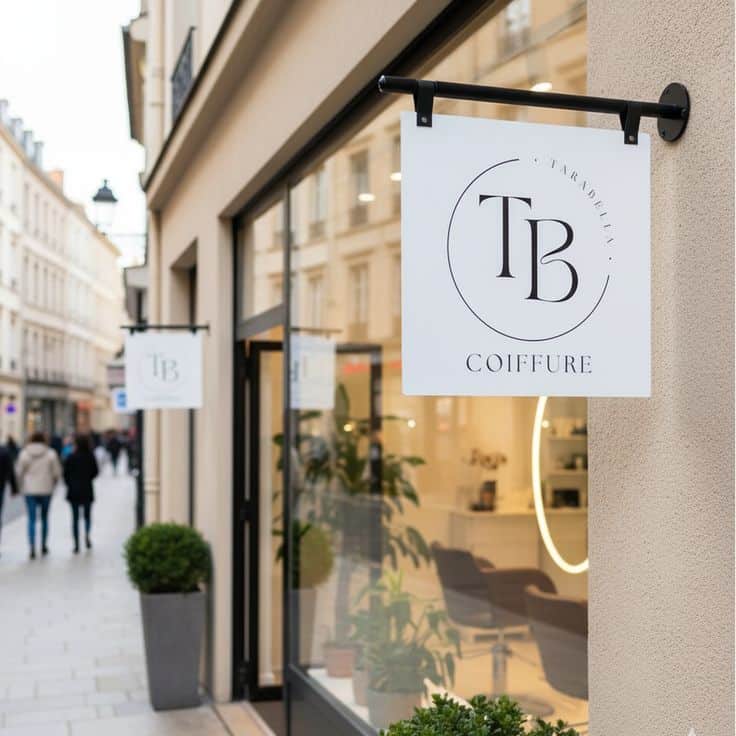

Physical spaces matter more than people admit. Customers notice signs right away. They scan walls. They read cues. They absorb the vibe. This is where tailored indoor signs help pull everything together. They guide movement. They reinforce identity. They reduce confusion.
Signs should never feel random. They should feel intentional. Fonts need to match. Colors should align. Messages must feel familiar. When signage feels cohesive, people relax. Relaxed customers stay longer.
Online Presence Needs the Same Rules
Your online presence usually makes the first impression now. Not the store. Not the office. Not even the first conversation. Someone lands on your website, checks Instagram for thirty seconds, maybe skims reviews, and decides whether the business feels legit.
This is where a lot of brands accidentally make things harder for themselves. The website feels clean and polished, but social media looks completely different. Fonts change. Colors drift. The tone suddenly sounds like a different company depending on the platform. Nobody says, Ah yes, the brand inconsistency concerns me. They just hesitate for a second and move on.
Good brands stay recognizable. Same patterns. Similar layouts. A tone that feels familiar wherever people find them. Predictable, but in a reassuring way. When things feel consistent, navigation feels easier too. Visitors stop figuring out who you are and start paying attention to what you actually offer.
Fonts and Colors Do More Than Look Nice

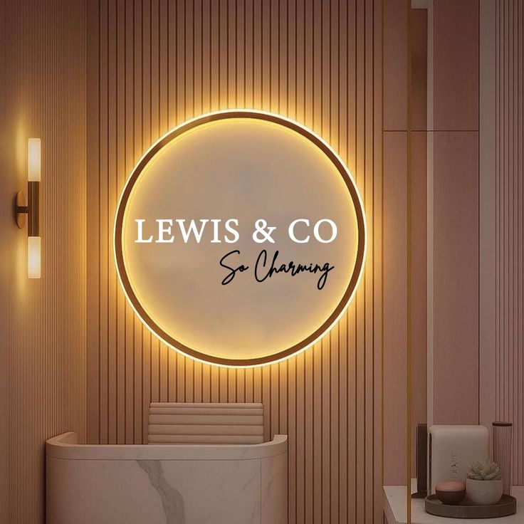
Typography carries personality. It sets mood instantly. Clean fonts feel modern. Rounded fonts feel friendly. Sharp fonts feel bold. Choose carefully. Then stick with them. Colors work the same way. Bright palettes feel energetic. Neutral tones feel refined. High contrast demands attention. Soft contrast calms the eye.
Once selected, stay consistent. Frequent changes weaken recognition. Visual memory depends on repetition. Familiar visuals stick longer. Random ones disappear fast.
Tone of Voice Keeps Everything Aligned


Words shape how a brand feels. Tone matters more than design sometimes. Casual language feels approachable. Polished language feels authoritative. Direct language feels confident.
Pick a voice that fits your brand. Then protect it. Use it everywhere. Website copy. Signs. Emails. Social captions. Automated messages. A mixed tone feels messy. Customers sense it immediately. They may not explain it. They still notice. A steady voice builds trust quietly.
Small Touches Create Big Brand Moments
Details do more work than most brands give them credit for. A wall graphic someone notices while waiting. The little card tucked into packaging. An appointment confirmation that sounds like it came from the same business people saw online. Even follow-up emails matter more than they seem.
None of these things need to be flashy. Honestly, flashy usually wears off fast. What sticks is consistency.
Branded apparel can play the same role—uniform caps at events or as giveaways extend your visual system into real-world interactions. Using services like customtruckerhats.com makes it easier to match colors, logos, and typography so even casual merchandise stays on-brand.
The same tone. The same visual cues. The feeling that somebody actually thought through the experience instead of throwing random pieces together.
And this stuff adds up. One small touch probably does nothing. Ten consistent ones? Different story. People start remembering the brand without really noticing why. Recognition turns into preference, and brands that pay attention to details usually feel more trustworthy because they feel intentional.

Consistency Is the Real Brand Builder
Strong brands are built through alignment. Design. Signage. Online presence. Tone. All moving together. Consistency does the heavy lifting. It builds familiarity slowly. It reduces confusion naturally. It creates confidence without noise.
When everything feels connected, customers relax. Relaxed customers return. They also recommend. Consistency turns visibility into trust. Trust turns into growth. Growth becomes sustainable when the brand stays recognizable.
Final Thoughts on Building a Recognizable Brand

Brand recognition usually grows slower than people expect. It is not one great logo or a clever slogan that suddenly changes everything. It is repetition. Seeing the same colors. Hearing the same tone of voice. Getting the feeling that the business knows exactly who it is every time you come across it.
People notice consistency even when they cannot explain what feels different. A website matches the in-store signs. Emails sound like the same company behind the social posts. Nothing feels random or stitched together. That kind of stability makes people more comfortable, and comfortable customers tend to trust faster.
Strong brands also remove little moments of hesitation. Decisions feel easier because the business already feels familiar. Design, signage, and digital presence all point in the same direction instead of competing for attention.
And that familiarity matters more than most brands think. Once recognition becomes automatic, people stop asking Who are these people? and start asking Do I want to buy from them? That shift is where a lot of growth starts.
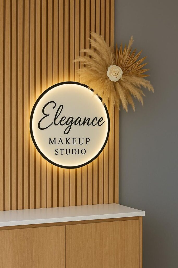
For beauty businesses, brand recognition also lives in the room itself; this beauty salon interior design guide shows how color, lighting, signage, and retail displays can make the brand feel consistent offline.
Frequently Asked Questions
Q: What makes a brand recognizable?
A: A recognizable brand is built through consistency. That means using the same logo, colors, fonts, messaging, and visual style everywhere — from your website and signage to packaging and social media. Think of brands like Apple Inc. or Starbucks: even without seeing the name, most people instantly recognize the look. Consistent branding helps customers remember and trust your business faster.
Q: How do signage and branding work together?
A: Signage acts like your brand’s physical handshake. Storefront signs, office graphics, event banners, and even vehicle wraps reinforce brand identity in the real world. Consistent signage builds familiarity. For example, matching fonts, colors, and logo placement between your storefront and website creates a seamless experience, making your business feel more professional and trustworthy.
Q: Why is online consistency important for brand recognition?
A: People often discover businesses online before ever visiting in person. If your website, social media, and email marketing all look different, it creates confusion. Consistent branding across digital channels — same tone, visuals, and messaging — can improve trust and recognition. Research shows repeated visual exposure helps customers remember brands more easily over time.
Q: What are the biggest branding mistakes businesses make?
A: One of the biggest mistakes is inconsistency. Businesses often use different logos, mismatched colors, or conflicting messaging across platforms. Another common issue is neglecting small touchpoints like email signatures, appointment confirmations, or packaging inserts. These details may seem minor, but they shape customer perception and influence how memorable your brand feels.
Q: How long does it take to build strong brand recognition?
A: Brand recognition rarely happens overnight. Most businesses see noticeable improvements after 6–12 months of consistent branding efforts. Frequency matters: customers often need multiple interactions before remembering a brand. Repeating visual patterns across signage, social media, websites, and customer experiences helps recognition grow faster.
Q: What design elements matter most in branding?
A: The most important elements are your logo, typography, color palette, imagery style, and brand voice. Consistency matters more than complexity. For example, using the same two or three brand colors across signage, websites, and marketing materials helps people instantly associate visuals with your business. Even small details like button styles or photo editing can reinforce identity.
Q: How much should a business invest in branding and signage?
A: Costs vary widely. A simple logo refresh might cost $300–$1,500, while full branding packages can range from $2,000 to $10,000+ depending on the agency. Professional storefront signage often starts around $500 and can exceed $5,000 for illuminated signs. Small businesses can start small — consistency often matters more than having a massive budget.
Q: Can small businesses build strong brand recognition without a big budget?
A: Yes. Consistency beats expensive design in many cases. A small business using the same logo, colors, tone, and signage everywhere can look more memorable than a larger competitor with inconsistent branding. Free tools like Canva or affordable design systems can help maintain a professional look without overspending.
- 50shares
- Facebook0
- Pinterest47
- Twitter3
- Reddit0