Pantone colors hold a powerful influence on how people feel in a space. Using Pantone’s color psychology in interior design helps create moods and atmospheres that match the purpose of each room. Designers use specific colors to evoke calm, energy, or creativity depending on the space’s function.
The Pantone system offers a clear and consistent way to pick colors that work well together. It also helps designers communicate exactly which shades to use, avoiding confusion. By understanding the emotional impact of these colors, interiors can become more effective and appealing.
This approach is useful for both homes and businesses, guiding choices that fit style and mood. It also keeps spaces up to date with current trends while considering how people respond to color every day.
Key Takeaways
- Pantone colors influence moods in interior spaces.
- The system ensures color accuracy and harmony.
- Color choices impact both personal and commercial environments.
Understanding Pantone Color Psychology
Pantone colors play a clear role in shaping how people feel in a space. The system has a long history and follows set ideas about how colors affect mood. Knowing these effects helps designers choose colors that create the right atmosphere.
History of Pantone in Interior Design
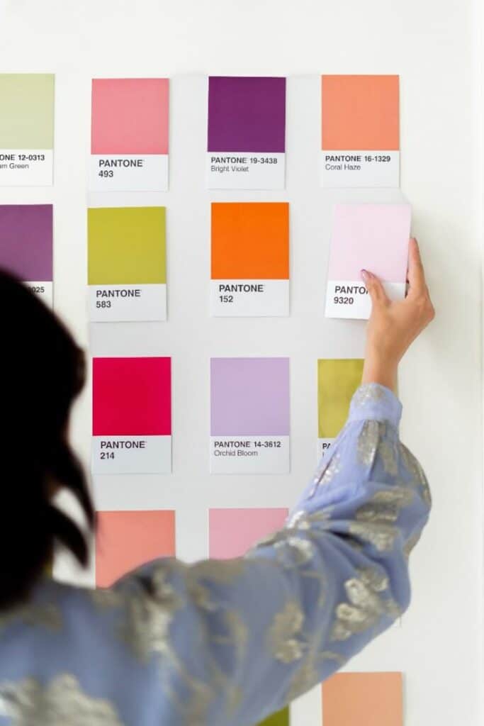
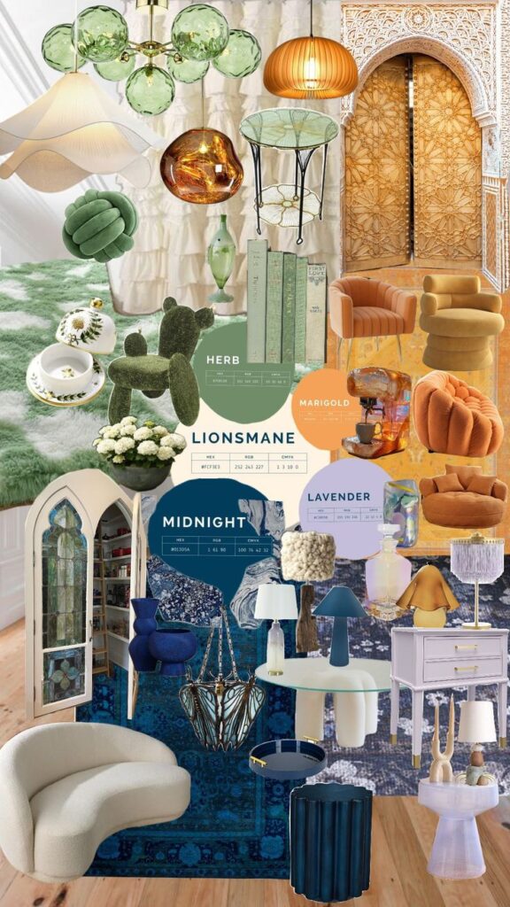
Pantone started in 1963 as a color matching system for printing. Designers quickly adopted it to ensure exact color use in spaces. It became popular because it offers a standard set of colors that everyone can identify.
In interior design, Pantone helps maintain color consistency across walls, fabrics, and furniture. This uniformity improves the quality and professionalism of a design. It also allows designers to communicate color choices clearly to clients and manufacturers.
The company’s annual Color of the Year influences many design trends. This yearly selection highlights one shade, showing its emotional and aesthetic power. Over time, Pantone has shaped how designers think about color choices in homes and offices.
Principles of Color Psychology
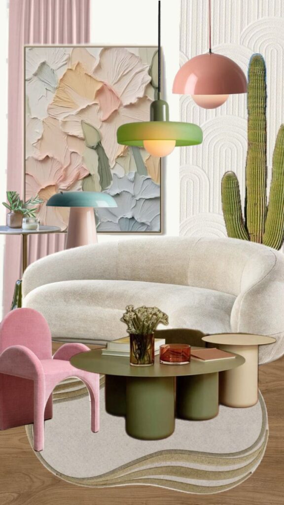
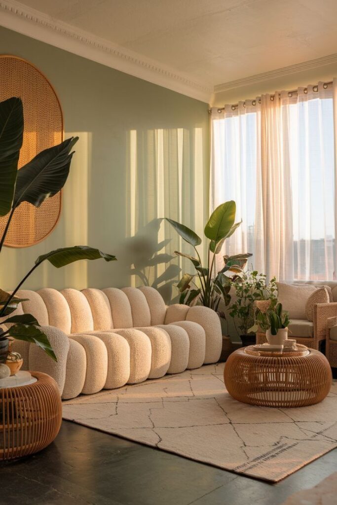
Color psychology studies how colors affect feelings and behavior. It assumes colors can trigger specific emotions and reactions. This knowledge lets designers pick colors that align with the room’s purpose.
There are three main ideas in color psychology:
- Hue: The basic color (red, blue, green) which has a direct emotional link.
- Saturation: The intensity of the color, where bright colors are more energetic, and dull colors are calmer.
- Value: The lightness or darkness, affecting mood subtly.
These principles guide choices so spaces either energize, calm, or focus people. For example, blue can cause calmness, while red can increase energy. Designers must balance these to suit the room’s use.
Influence of Pantone Colors on Emotions
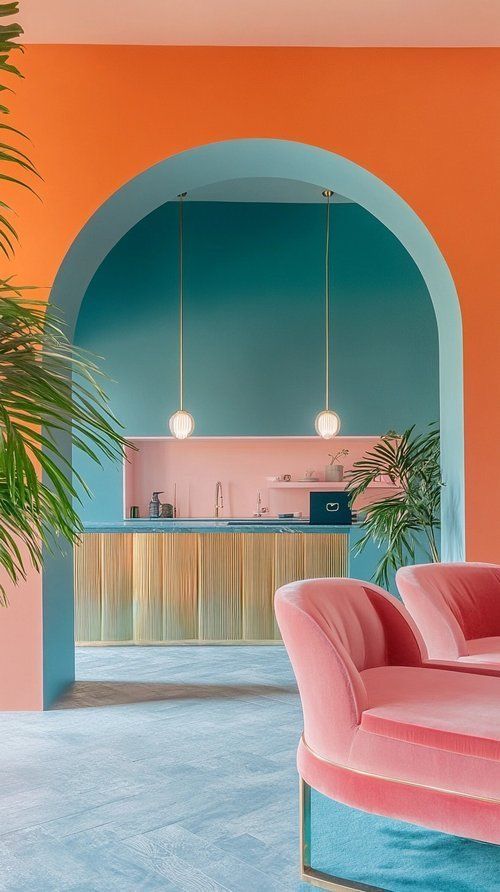
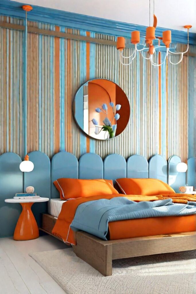
Pantone colors come with emotional meanings that designers use to affect moods. A color’s temperature (warm or cool) impacts how it feels in a room.
Warm colors like reds and oranges create feelings of warmth and excitement. They are often used in social spaces like living rooms or kitchens.
Cool colors like blues and greens promote calm and focus, suitable for bedrooms or offices. Neutral colors such as grays and browns act as balancing backgrounds without strong emotions.
Designers also consider cultural and personal differences in color meaning. Pantone colors make it easier to control these emotional effects by giving precise shades to evoke intended feelings.
Pantone Color System Basics
The Pantone system helps designers use exact colors when planning spaces. It provides a way to match, standardize, and select colors for interior design projects. This ensures color consistency across materials and products.
What Is the Pantone Matching System?
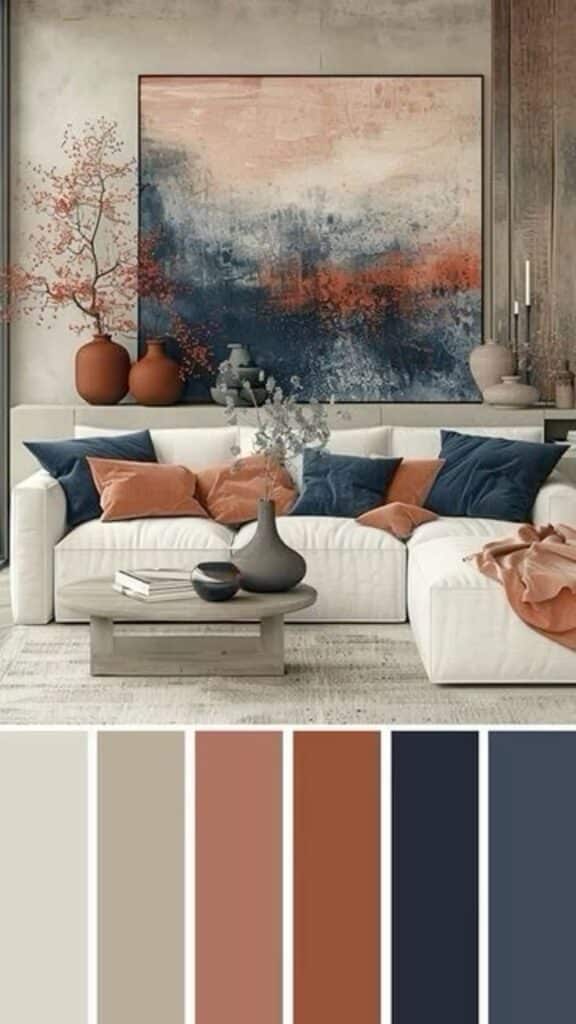
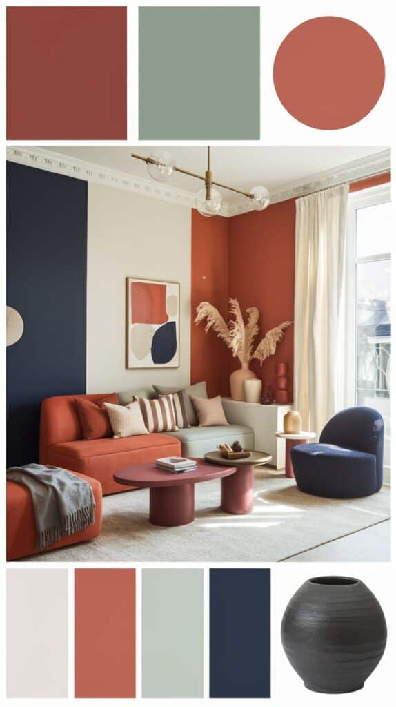
The Pantone Matching System (PMS) is a standardized color reproduction system. It assigns each color a unique number to ensure the same shade can be recreated anywhere. This system is widely used in graphic design, printing, and interior design.
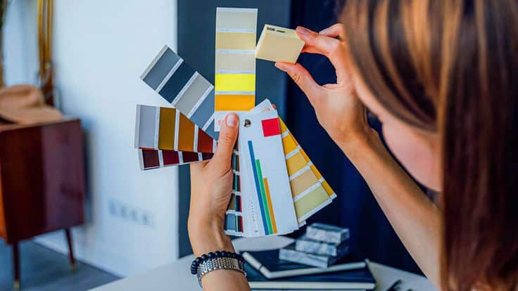
The PMS uses physical color guides called swatch books. These books show true color samples printed on paper or plastic. Designers use them to compare and choose colors accurately in their work.
With PMS, manufacturers and designers can communicate color choices clearly. This reduces the chance of mistakes or color mismatches during production.
Pantone Color Standards for Interiors
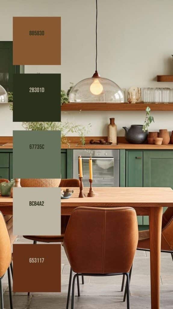
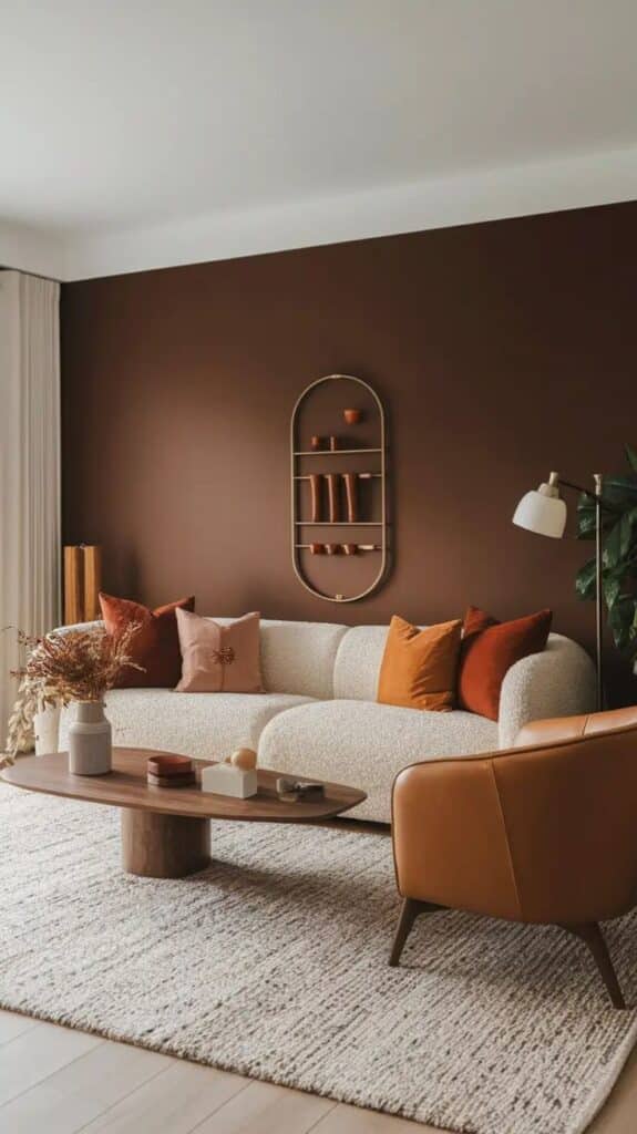
Pantone offers specific color standards focused on interior spaces. These standards include palettes suited to walls, fabrics, furniture, and decor items. They provide options that work well in different lighting and room uses.
Interior-focused Pantone colors are designed to evoke mood and style. For example, softer tones may create calmness, while vibrant hues can energize a room. These colors follow trends and science to meet design needs.
Pantone also recommends finishes and textures that pair well with specific colors. This helps designers plan materials that complement the chosen shades for a balanced look.
Selecting Consistent Shades
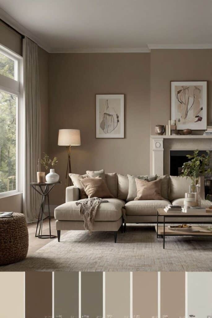
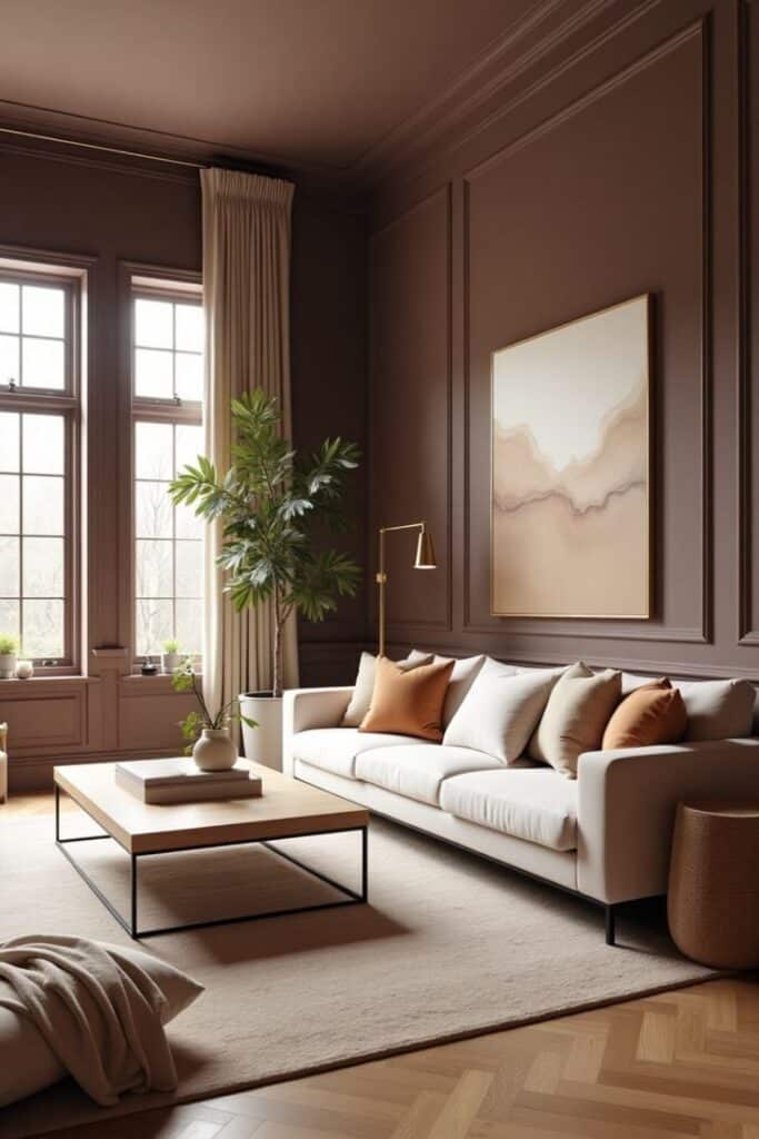
Consistent color selection is crucial to avoid visual disconnection in a space. Using Pantone numbers ensures exact shade matching in paint, textiles, and accessories. This consistency supports a uniform design theme.
Designers should check colors under various lights before finalizing choices. Color may look different in daylight or artificial light. Pantone guides help preview these variations for better decisions.
When substituting brands or products, Pantone codes let designers find closest matches easily. This keeps projects on track even if original items are unavailable.
Applying Pantone Colors in Residential Interiors
Using Pantone colors in homes helps create moods that fit each room’s purpose. Different shades can make spaces feel calm, energetic, cozy, or bright. Picking the right colors depends on how people use the room and the atmosphere they want to build.
Choosing Colors for Living Spaces
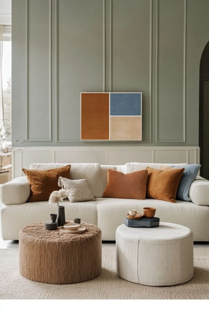
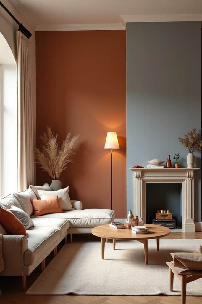
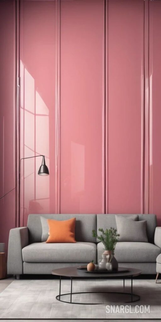
Living rooms benefit from warm, inviting Pantone hues like Pantone 7579 C (warm orange) or Pantone 7541 C (soft gray). These colors encourage comfort and socializing.
Neutral tones like Pantone 7527 C appeal to those who want calmness without dullness. Brighter colors can energize the space but should be balanced with softer shades to avoid overstimulation.
Lighting affects how colors show, so sampling paint or decor in natural light is important before finalizing choices.
Pantone Selections for Bedrooms
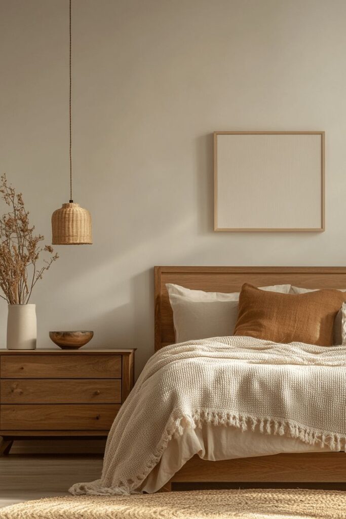
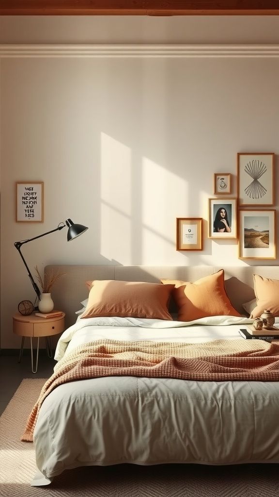
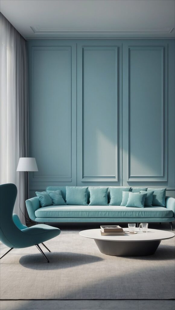
Calming colors are key in bedrooms. Cool blues like Pantone 290 C help reduce stress and promote rest. Greens such as Pantone 349 C bring a refreshing, peaceful vibe.
Avoid very bright or harsh colors. Soft neutrals like Pantone 7529 C also work well for a relaxing, warm feel.
Using multiple tones of the same color can add depth while maintaining tranquility.
Kitchen and Dining Area Color Impact
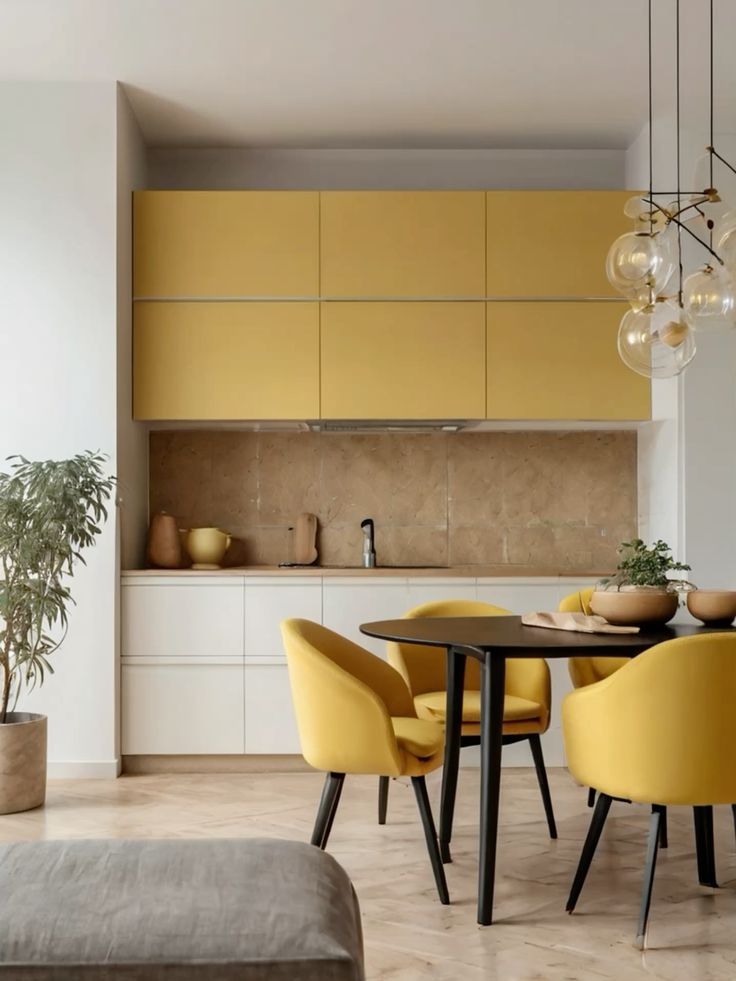
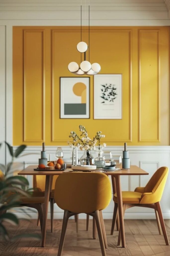
Kitchens and dining rooms often use energetic and appetite-stimulating colors. Warm reds like Pantone 200 C and yellows such as Pantone 123 C increase appetite and conversation.
However, very intense reds should be used sparingly to prevent overwhelming the space. Blues or greens with less saturation, such as Pantone 5493 C, can balance those warm tones in mixed palettes.
Color choices should also consider kitchen size and lighting to keep spaces feeling open and fresh.
Accent Walls and Decorative Elements
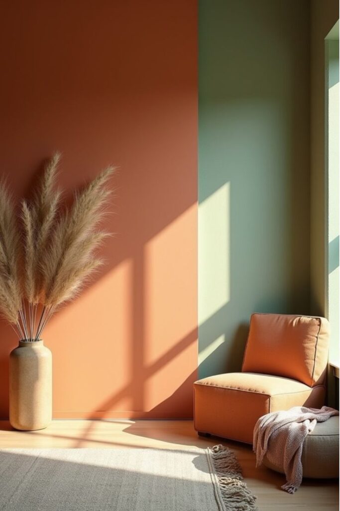
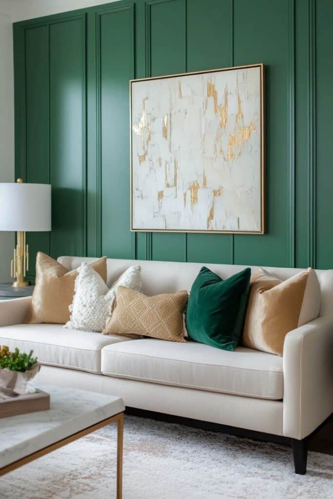
Accent walls are ideal for introducing bold Pantone colors without overwhelming a room. A single wall painted in Pantone 2767 C (deep navy blue) creates focus and contrast in neutral rooms.
Decor like cushions, vases, or rugs in Pantone 7625 C (vibrant red) or Pantone 377 C (olive green) introduce pops of interest and tie room colors together.
Using textured finishes or combining matte and gloss in accents can enhance color impact without adding clutter.
Pantone Color Psychology in Commercial Spaces
Colors influence mood and behavior differently in work, shopping, and hospitality settings. The right Pantone choices can boost focus, encourage spending, or create a relaxing atmosphere. Each commercial space benefits from tailored color use to match its goals.
Office Productivity and Color Choices
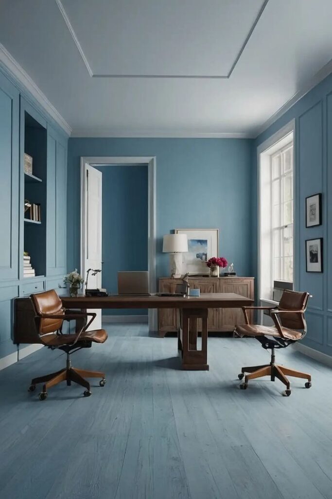
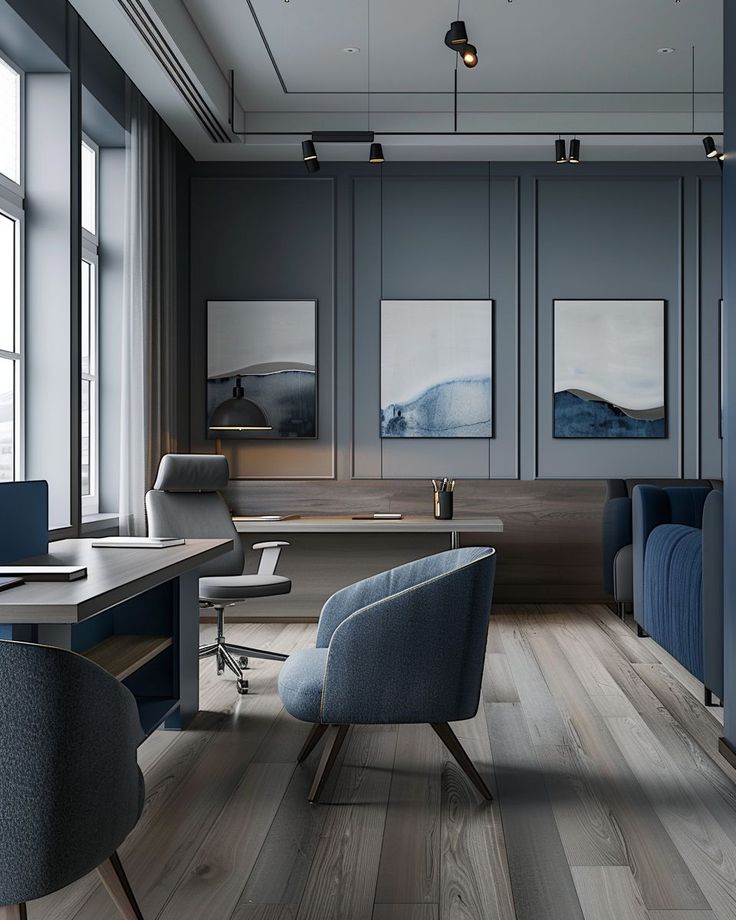
In offices, colors like Pantone 2925 C (blue) and Pantone 368 C (green) improve concentration and calmness. Blue tones support clear thinking, while green reduces eye strain, making them ideal for workspaces.
Bright colors like Pantone 165 C (orange) can increase energy but may become distracting if overused. Neutral shades such as Pantone Warm Gray 1 C balance stimulation without causing fatigue.
Choosing the right color combination helps reduce stress and promotes teamwork. It also improves creativity when used thoughtfully in meeting rooms and collaborative zones.
Pantone for Retail Environments
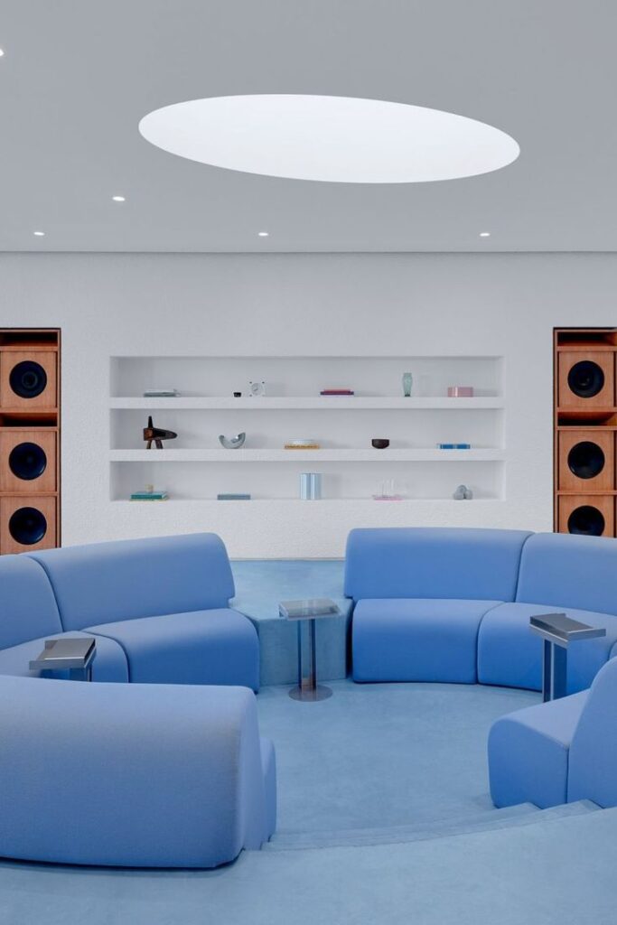
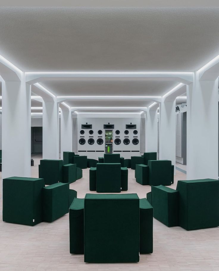
Retail stores use colors to impact shopper behavior and time spent in-store. Bold shades like Pantone 1795 C (red) capture attention and encourage impulse buys. Warm colors tend to increase excitement and urgency.
Calm colors such as Pantone 7541 C (light gray-blue) can make luxury brands feel more exclusive. They create a sense of trust and quality, encouraging repeat visits.
Lighting and color work together to highlight products. Retail designers often mix Pantone hues to create a balanced, appealing environment that supports the brand’s image.
Wellness and Hospitality Design Considerations
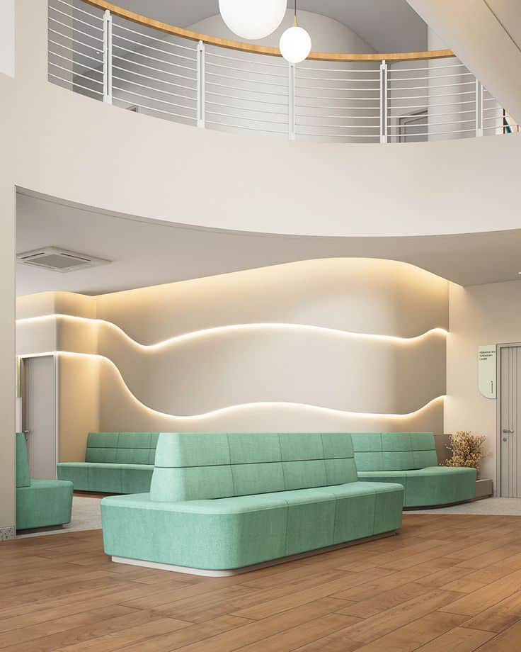
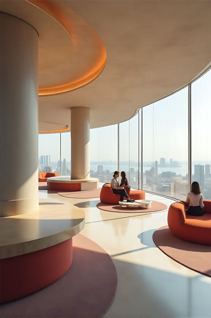
Wellness spaces use soft, nature-inspired tones to evoke comfort. Colors like Pantone 7499 C (beige) and Pantone 5535 C (deep green) help guests relax and feel secure.
Hospitality designs often prefer warm colors such as Pantone 7417 C (warm coral) to create a welcoming vibe. These hues increase social interaction and satisfaction.
Color consistency across different rooms supports a seamless experience. Careful Pantone selection can reduce anxiety and enhance overall guest comfort in hotels and spas.
Pantone Trends and Annual Color Selections
Pantone’s yearly color choices shape many interior design trends. These selections influence paint, fabrics, and decor. Designers use them to create fresh, up-to-date spaces that align with wider cultural moods.
Pantone Color of the Year Influence
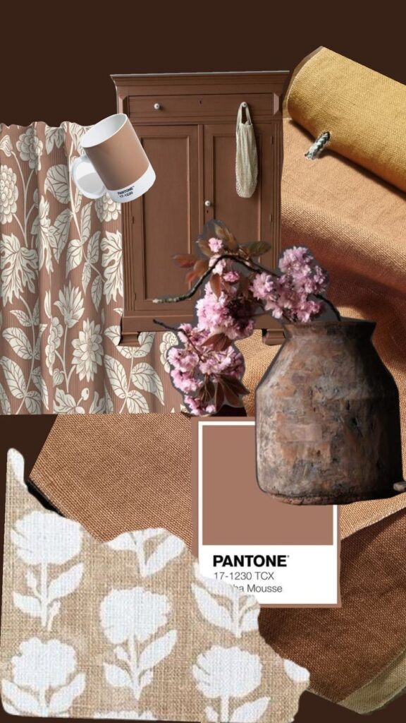
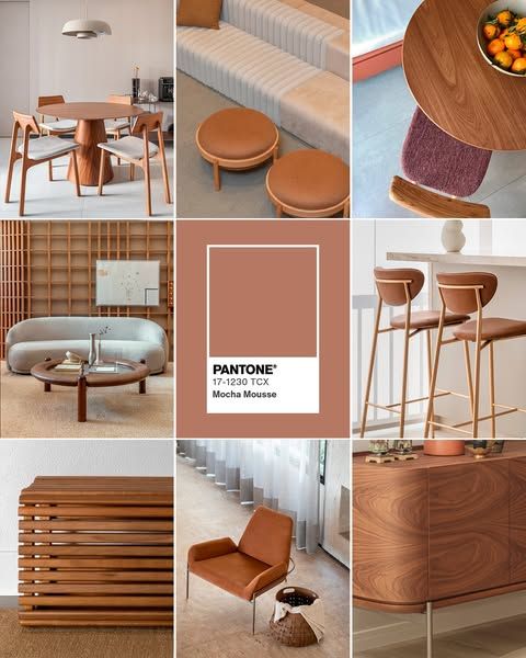
Each year, Pantone picks a Color of the Year based on social trends, art, and technology. This color often highlights feelings designers want to bring into homes, like calmness or energy. For example, a soft blue might be chosen to create a peaceful atmosphere.
This choice affects many brands and designers, who use the color in walls, furniture, and accessories. It becomes a tool for connecting interiors with current emotions and styles. Consumers often look for this color to keep their homes modern and stylish.
Trend-Driven Interior Solutions
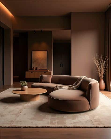
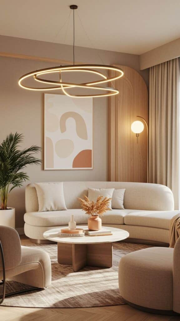
Pantone’s colors help interior designers solve design challenges. For example, warm tones can make large spaces feel cozier, while cool tones open up small rooms. Designers mix these colors with neutral shades to balance intensity and keep rooms comfortable.
Trends from Pantone often focus on blending nature and technology. Earthy greens or beiges pair with sleek metals and glass. This mix creates spaces that feel both grounded and contemporary, appealing to those who want natural yet modern homes.
Color Associations and Emotional Responses
Colors in interior design influence how people feel and behave in a space. Different colors can create moods or highlight certain emotions. Choosing the right Pantone colors involves understanding their temperature, energy level, and cultural meanings.
Warm Versus Cool Pantone Palettes
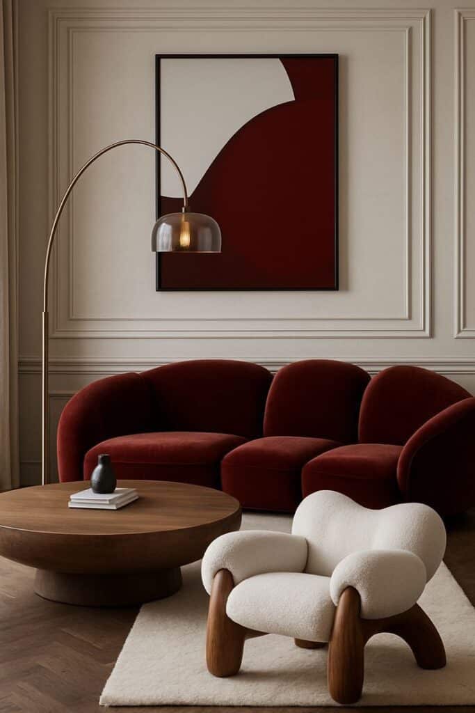
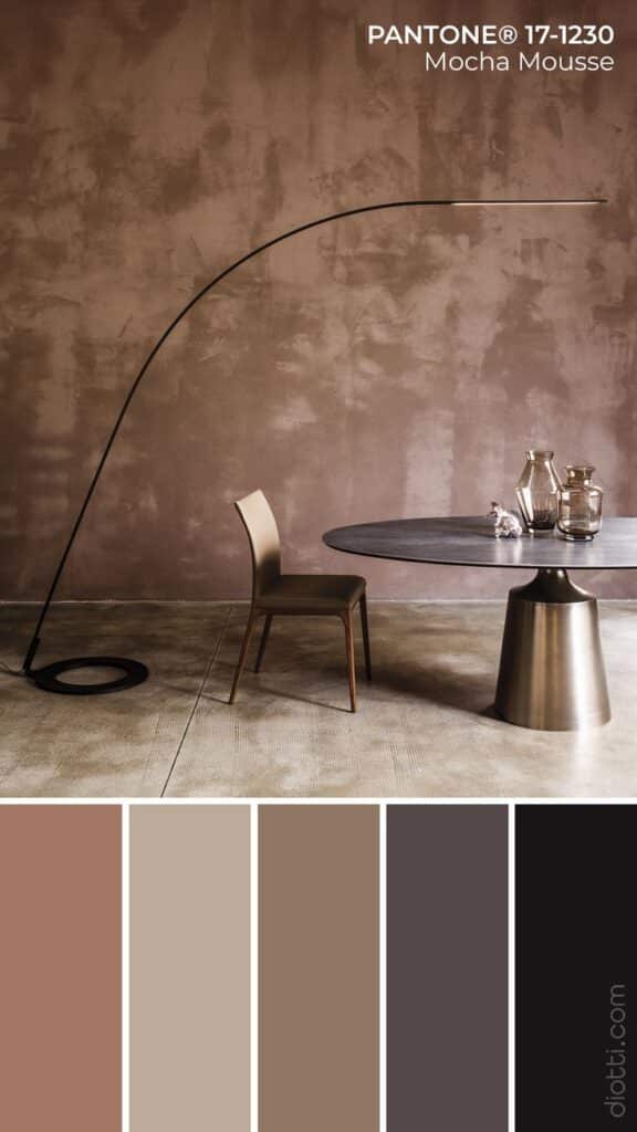
Warm Pantone colors include reds, oranges, and yellows. These shades often make spaces feel cozy, inviting, and lively. They can stimulate conversation and activity, so they are popular in living rooms and kitchens.
Cool Pantone colors cover blues, greens, and purples. These tend to calm and soothe, helping reduce stress and promote focus. Bedrooms and offices often use cool colors to encourage relaxation or concentration.
Warm and cool colors can be mixed to balance a room. For example, a warm yellow with cool blue accents can create an inviting yet calm environment.
Energizing Versus Calming Tones
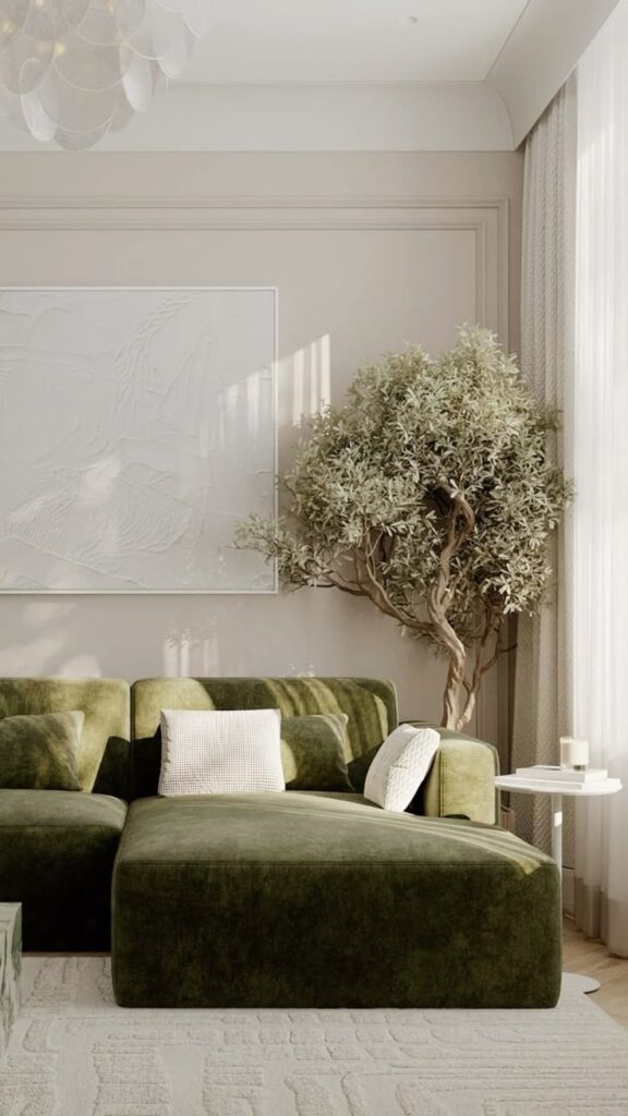
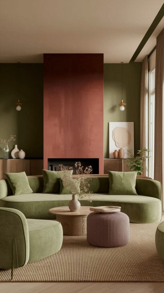
Bright Pantone tones like vibrant reds or electric blues increase energy and attention. They work well in spaces where motivation or alertness is needed, such as gyms or creative studios.
Muted or pastel tones, such as soft greens or pale pinks, produce calming effects. These colors reduce tension and help people feel secure. They are common in bedrooms, waiting rooms, or meditation spaces.
Using too many energizing colors in one room can cause restlessness. On the other hand, too many calming tones may make a space feel dull or sleepy.
Color Symbolism in Cultural Contexts
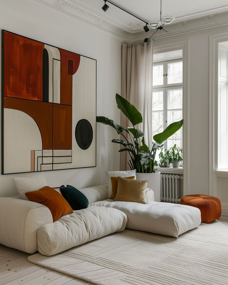
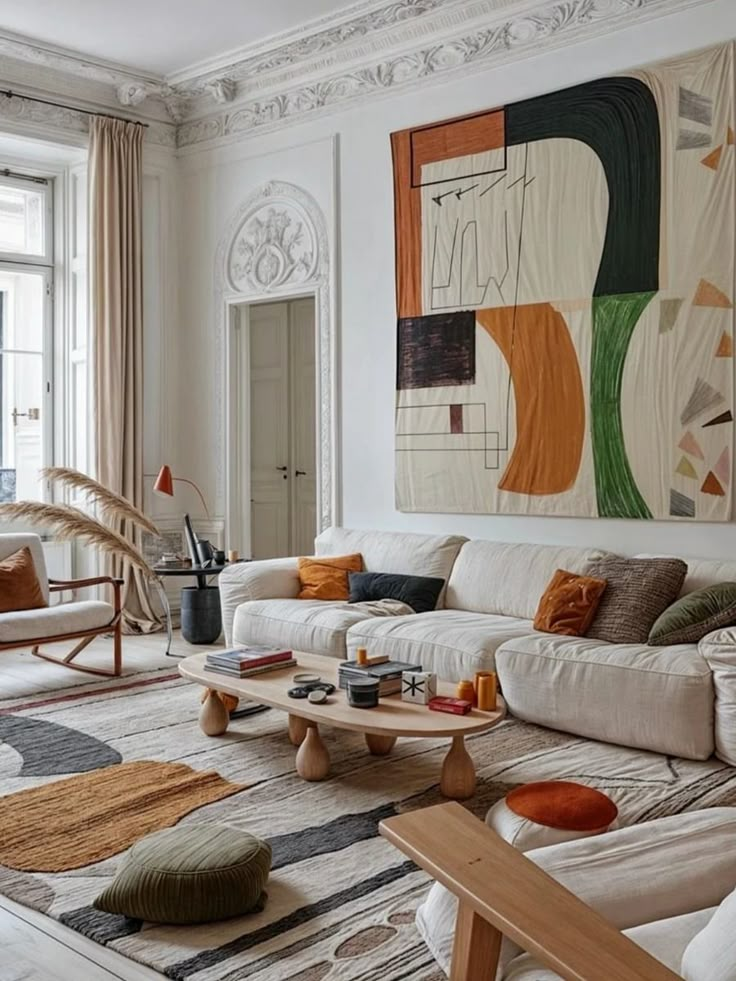
Colors may have different meanings depending on culture. For instance, white often represents purity in Western countries but can signify mourning in some Asian cultures.
Red is commonly linked to luck and celebration in China but can also mean danger or warning in Western contexts. Understanding cultural symbolism helps avoid design misunderstandings.
Designers should consider the cultural background of occupants or visitors when choosing Pantone colors. This ensures the space feels appropriate and respectful to all users.
Tips for Choosing Pantone Colors for Interiors
Selecting Pantone colors for interior spaces involves balancing shades carefully, considering how light changes color perception, and pairing colors that work well together. Each step helps create a space that feels harmonious and suits its purpose.
Balancing Color Schemes
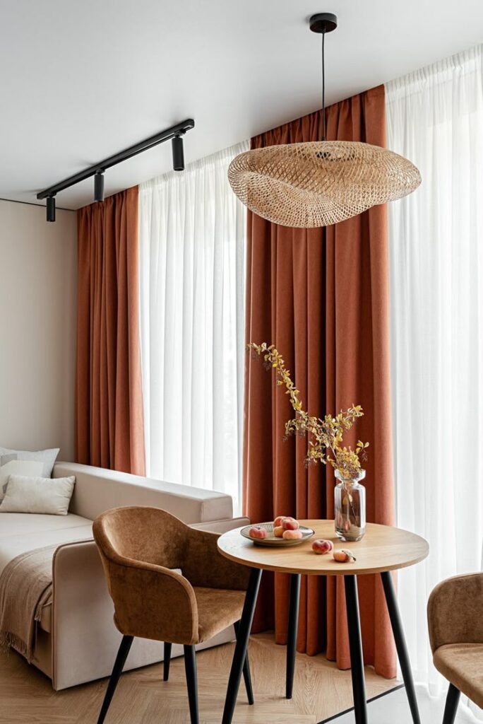
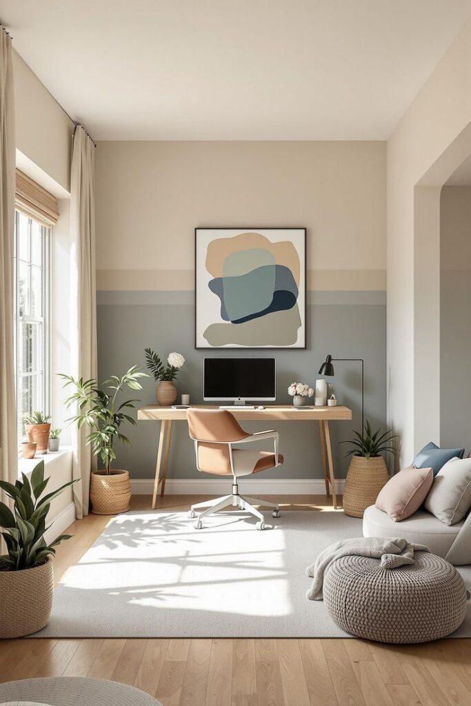
Balancing colors means mixing light, medium, and dark shades to avoid overwhelming a room. Too much of one color can make a space feel heavy or dull. Designers often use the 60-30-10 rule: 60% should be the dominant color, 30% a secondary color, and 10% an accent.
For example, if a deep blue Pantone is the main color, lighter shades of blue or neutral tones can be the secondary colors. Then, a bright Pantone accent like orange can add interest without clashing.
Keeping balance in mind helps maintain a comfortable, inviting space.
Lighting Effects on Pantone Choices
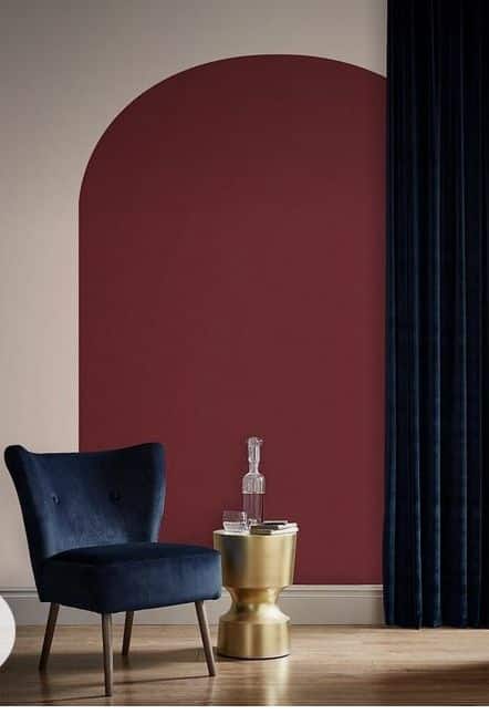
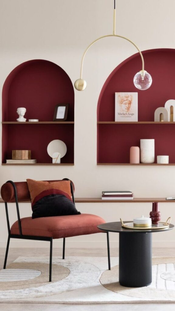
Light changes how Pantone colors look in a room. Natural sunlight makes colors appear brighter and cooler. Artificial lighting, like warm bulbs, gives colors a yellow or orange tint.
West-facing rooms often have warmer late afternoon light, making colors appear richer. North-facing rooms get cooler, softer light, which can mute colors.
It’s important to test Pantone samples in the actual room, at different times of day. This step prevents surprises and ensures the chosen colors look right under normal lighting conditions.
Complementary Pantone Pairings
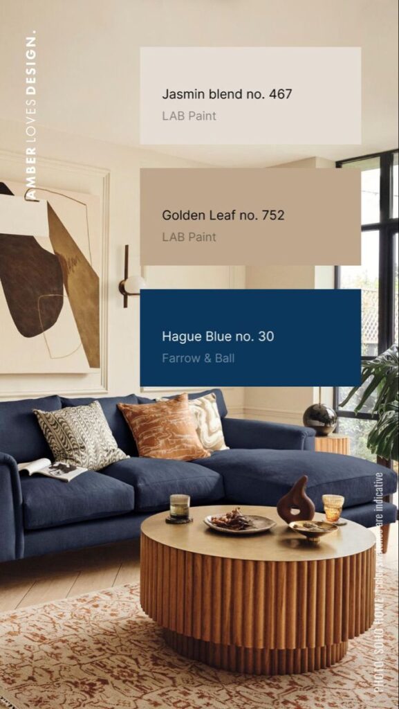
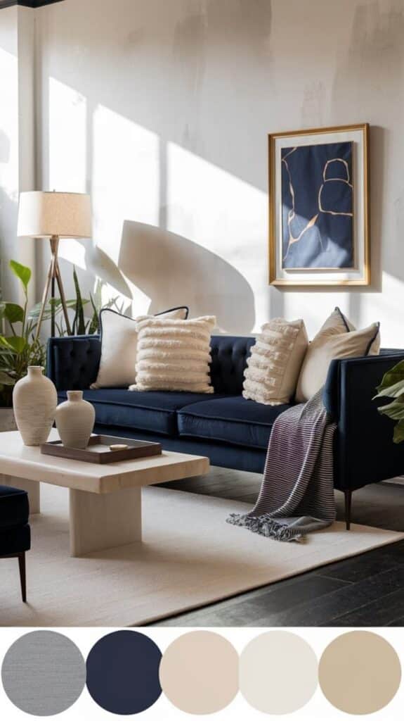
Complementary colors sit opposite each other on the color wheel and create contrast when paired. Using Pantone colors like teal and coral together can make a space lively without feeling chaotic.
Pairing warm colors (reds, yellows) with cooler colors (blues, greens) can balance energy and calmness in a room. When choosing complementary Pantones, using one more dominant and the other for accents helps avoid visual overload.
Here is a simple pairing example:
| Dominant Color | Complementary Accent |
|---|---|
| Pantone 2145 C (Teal) | Pantone 806 C (Bright Pink) |
| Pantone 7599 C (Coral) | Pantone 7718 C (Teal) |
Complementary pairings highlight each color’s best features and make interiors feel well-designed.
Sustainability and Ethical Considerations in Pantone Usage
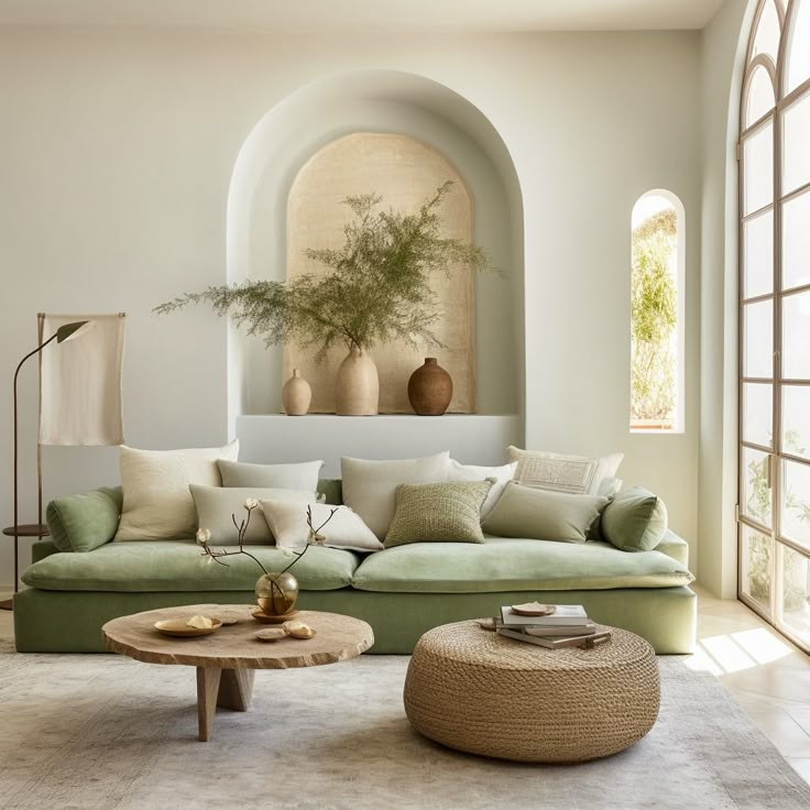
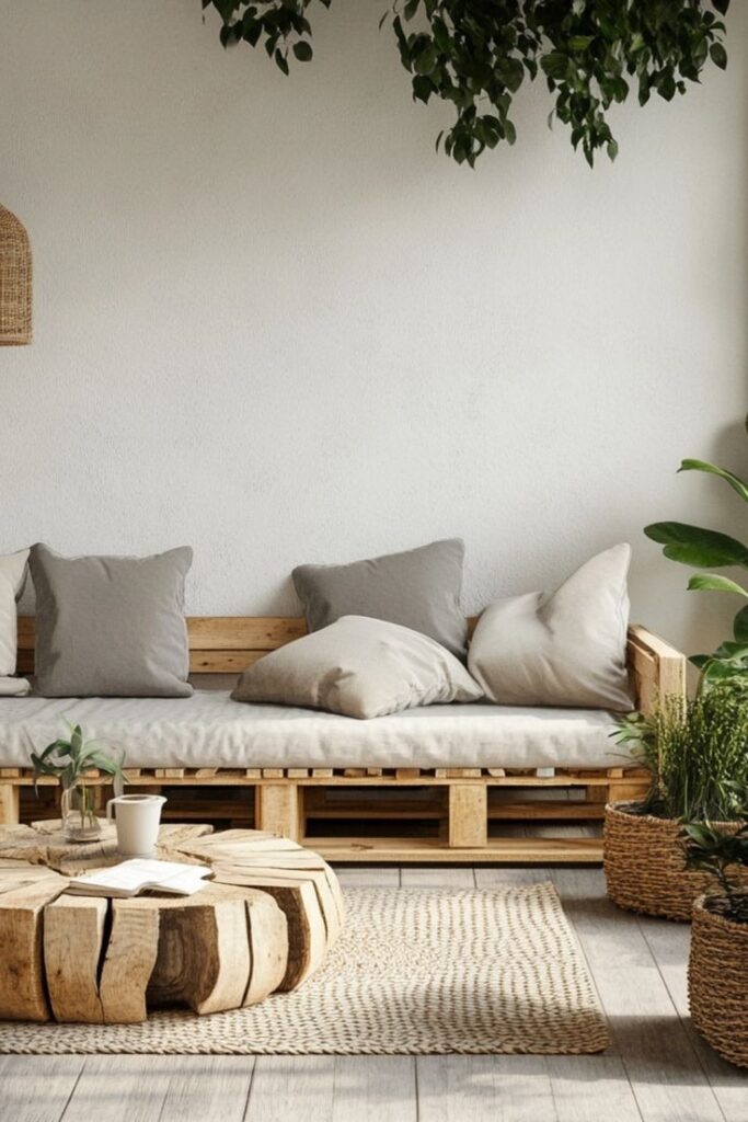
Pantone colors play a key role in interior design, but choosing colors also involves thinking about sustainability. Designers and manufacturers should consider how the production of pigments and dyes affects the environment.
Many traditional color dyes use chemicals that can harm waterways and soil. Using eco-friendly pigments or natural dyes reduces this impact. Some companies now offer sustainable Pantone colors made with safer materials.
Waste reduction is another concern. Overusing colored materials or frequently changing color palettes can increase waste. Designers can promote sustainability by selecting long-lasting colors and materials.
Ethical considerations include fair labor practices in color production and sourcing. Buyers should verify that manufacturers follow fair trade guidelines and avoid exploiting workers.
To sum up, sustainable Pantone use means:
- Choosing non-toxic pigments
- Minimizing waste in projects
- Supporting ethical sourcing
This approach helps the environment and supports responsible industry practices.
Future Perspectives on Pantone and Interior Design
Pantone continues to influence interior design by providing a trusted system for color selection. As technology advances, its role will expand beyond physical colors into digital and virtual spaces.
Designers will increasingly use Pantone colors in virtual reality (VR) and augmented reality (AR) environments. This will help clients visualize how colors affect mood and space before actual implementation.
Sustainability is also shaping future trends. Pantone is expected to promote eco-friendly pigments. This will align color psychology with environmental concerns, making design choices more responsible.
The use of data and AI may allow for personalized color suggestions. These tools could analyze preferences and spaces to offer tailored Pantone combinations.
| Trend | Impact on Interior Design |
|---|---|
| VR and AR | Better client visualization |
| Eco-friendly colors | Support sustainable design |
| AI-driven palettes | Customized, psychology-based colors |
Pantone’s future in interior design will likely be more integrated with technology and sustainability. This will offer designers tools to make spaces more meaningful and adaptive to human psychology.
- 1.5Kshares
- Facebook0
- Pinterest1.5K
- Twitter3
- Reddit0

