
Color psychology explores how hues influence human behavior, mood, and cognition. In educational spaces, where mental engagement, emotional stability, and productivity are critical, color selection goes beyond aesthetics—it becomes a strategic tool. From boosting focus to reducing anxiety, colors can quietly shape students’ learning experiences. As research on environmental psychology grows, schools are increasingly adopting purposeful color schemes to support student outcomes.
Understanding the Psychological Influence of Color

Neurocognitive Responses to Color Stimuli
Colors are processed in the brain’s visual cortex, sending signals that influence emotional and hormonal responses. For example, warm colors like red and yellow stimulate the amygdala, triggering alertness, while cool tones like blue engage the parasympathetic nervous system, promoting calmness. These responses can either enhance or hinder learning depending on the context.
Emotional Associations and Learning Outcomes
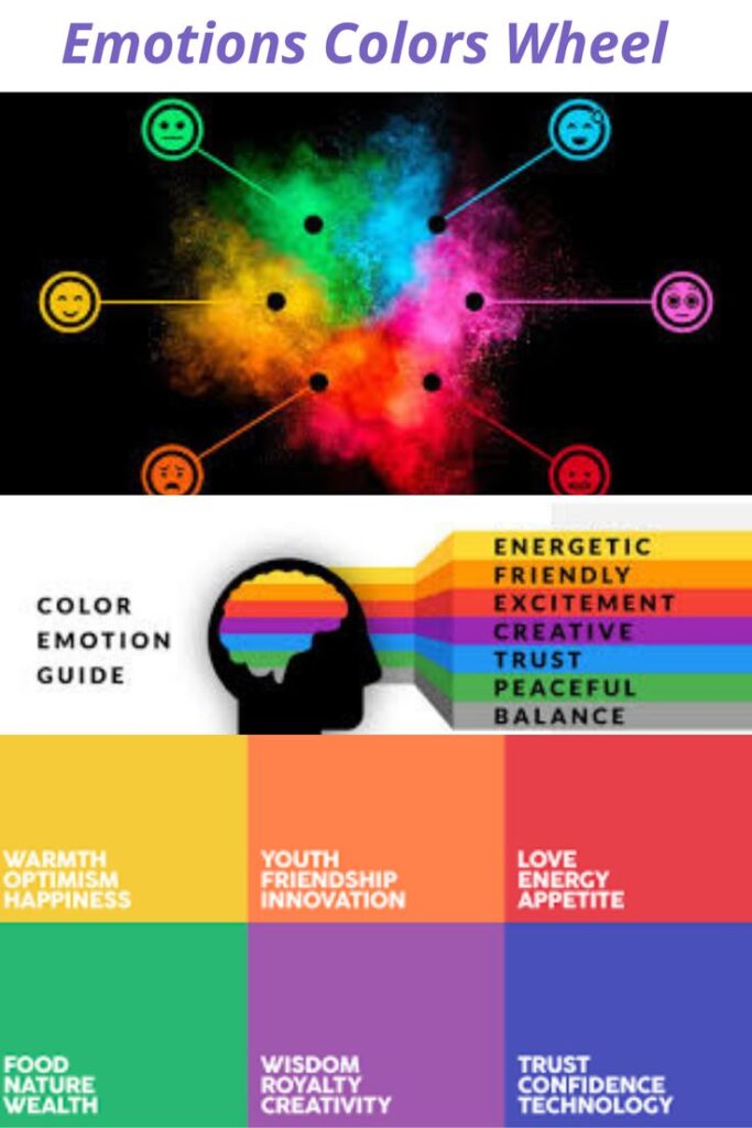
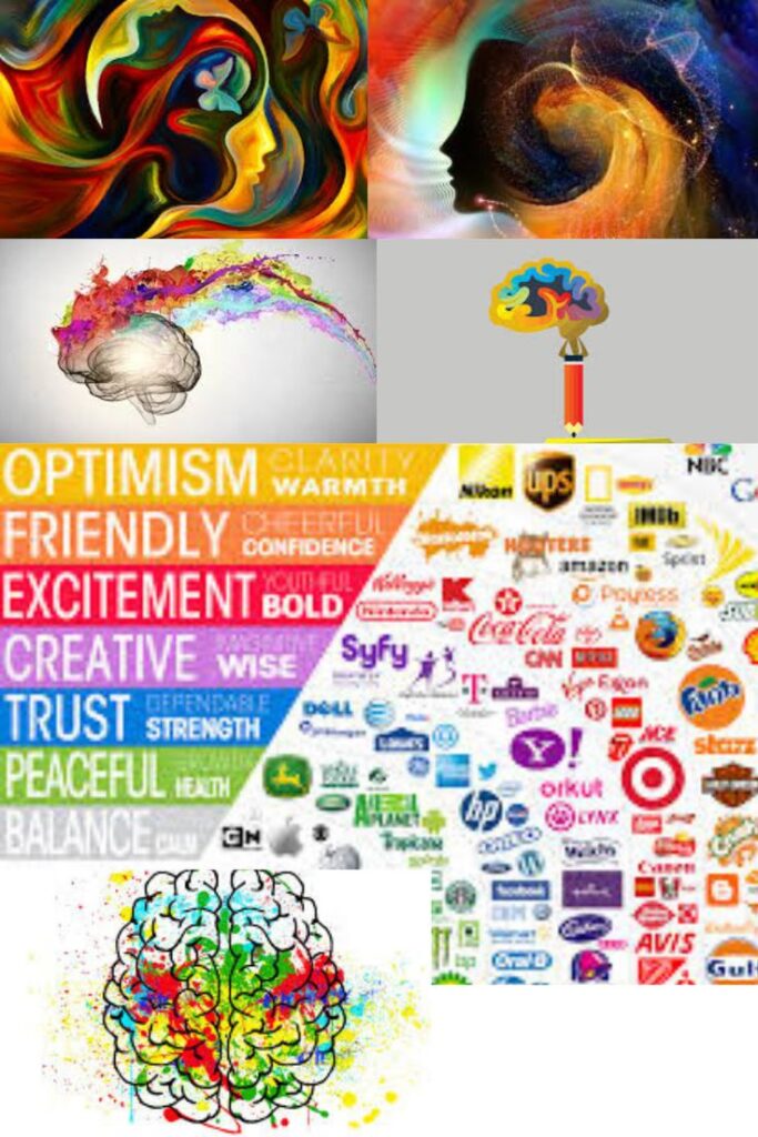
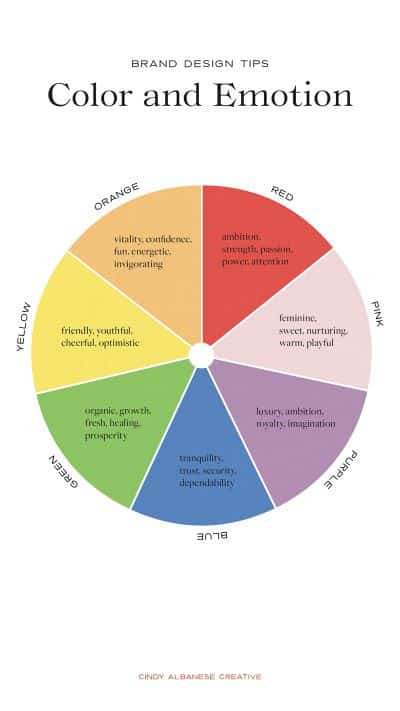
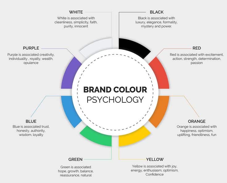
Colors trigger subconscious reactions that influence how we feel and perform. Blue often conveys trust and mental clarity, green promotes a sense of calm and balance, while red tends to signal urgency or stress. These color associations can significantly impact motivation, memory retention, and focus. For example, a testing room painted red may unintentionally heighten anxiety levels, whereas a study space accented with green could foster calmness and perseverance. If you’re interested in exploring more about how color affects the mind, you can read posts about color associations at The Bruin Voice.
Cultural Perceptions and Personal Interpretations
While some color effects are universal, others vary culturally. White, associated with purity in Western contexts, may represent mourning in parts of Asia. Designers must consider the cultural backgrounds of students to ensure inclusivity and emotional safety when choosing color schemes.
Impact of Specific Colors on Learning
Blue: The Productivity Enhancer
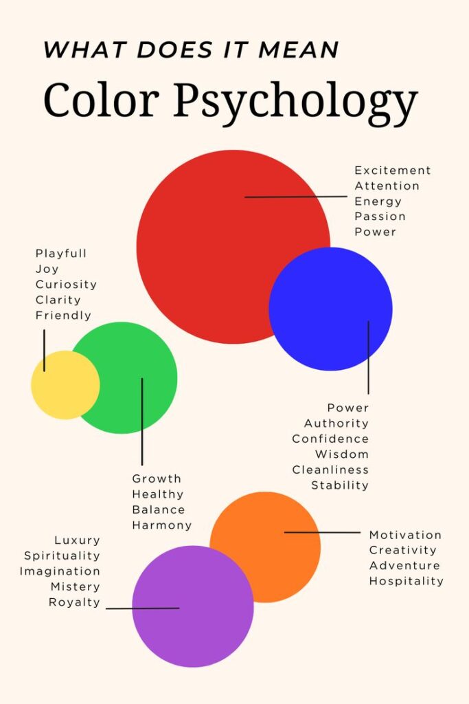
Blue promotes intellectual thought, clarity, and sustained focus. Often used in classrooms and computer labs, it helps reduce heart rate and anxiety, making it ideal for settings requiring deep concentration. Pale or pastel shades of blue also enhance airiness and openness, which can psychologically reduce cognitive load.
Green: The Relaxation and Balance Agent
Green, associated with nature, has calming effects that reduce eye strain and stabilize mood. It’s particularly effective in reading areas or counseling offices. By evoking equilibrium, it can help students manage academic pressure more effectively.
Yellow: The Optimistic Stimulator
Yellow stimulates mental activity and creativity. Ideal for innovation labs and early childhood classrooms, it enhances memory and optimism. However, overly bright yellows can cause visual fatigue or agitation in sensitive students. Strategic use as an accent color helps maintain balance.
Red: The Alertness Trigger
Red raises energy levels and attracts immediate attention. It can be beneficial in athletic spaces or competitive environments but should be used cautiously in classrooms, as it can also increase stress. In moderation, red can emphasize important information or safety cues.
Orange: The Social Connector
Orange combines the energy of red and the cheerfulness of yellow. It promotes warmth and enthusiasm, making it a good choice for group learning zones or lunchrooms. It encourages participation and interpersonal connection but may be overwhelming if overused.
Neutral Colors: The Foundation of Balance
Colors like beige, gray, and white act as background stabilizers. They help tone down vivid hues and provide visual breaks. However, overreliance on neutrals can make environments feel sterile or uninspiring. Balancing them with dynamic accent colors can create harmony.
Color Usage According to Space Function
Classrooms: The Core Learning Zones
In traditional classrooms, a blend of blue and soft green promotes calm focus, supporting lessons that require sustained mental effort. Yellow accents can boost energy without overwhelming students. Accent walls or color-coded learning zones can subtly encourage engagement.
Libraries and Quiet Study Areas
Green and muted blues are ideal for spaces dedicated to independent work. These colors support tranquility and mental clarity, fostering longer periods of concentration and reducing mental fatigue. Subdued tones also lower auditory distraction levels, enhancing silence.
Creative Arts Rooms and Innovation Labs
Warm, vivid tones such as orange, coral, and yellow are ideal for art rooms and maker spaces. These hues stimulate ideation and free thinking. They break routine, inspiring students to explore novel ideas and creative problem-solving.
Cafeterias and Social Areas
Colors like orange, light red, and warm wood tones help build community and spark conversation in common areas. These tones encourage appetite and sociability. They can be paired with neutrals to maintain visual restfulness.
Hallways, Staircases, and Transition Spaces
These are ideal for softer shades—light grays, pastel blues, or sandy neutrals. They facilitate movement without overstimulation. Color contrasts on stair edges or wall patterns can also enhance safety while maintaining aesthetic appeal.
Age-Sensitive Color Applications
Early Childhood Environments
Young children respond strongly to vibrant colors like red, yellow, and blue. These hues support brain development and emotional expression. However, overuse can lead to sensory overload, so it’s best to combine vivid palettes with soft lighting and natural materials.
Elementary and Middle School Settings
Balanced combinations of cool and warm colors help children stay energized without being distracted. Blues and greens are suited for core learning, while soft orange or muted yellow may be used in reading corners or project zones to maintain stimulation.
High School and Post-secondary Institutions
Older students benefit from more mature, cool-toned environments. Navy, forest green, and slate gray support focus and emotional control. Minimalist color schemes also align with the professional transition these learners are preparing for.
Inclusive and Accessible Design Considerations
Color Vision Deficiency and Accessibility
About 1 in 12 men and 1 in 200 women have some form of color blindness. Designers must avoid color-only signals for navigation or instruction. Using texture, patterns, and labels ensures everyone can interpret visual cues.
Neurodivergent-Friendly Design
Students with autism or ADHD may be hypersensitive to certain colors. Overly bright or saturated hues can cause discomfort or distraction. Designers should favor muted palettes and offer sensory-safe zones that use calm-inducing tones.
Balancing Contrast and Harmony
Proper contrast is crucial for readability, especially in instructional materials and signage. High contrast supports legibility, but stark extremes (e.g., black and white) can strain the eyes. Choosing mid-contrast pairings ensures clarity without visual fatigue.
Real-World Examples and Case Studies
Finland’s Color-Conscious School Architecture
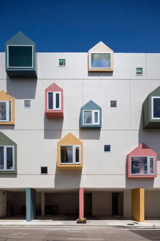
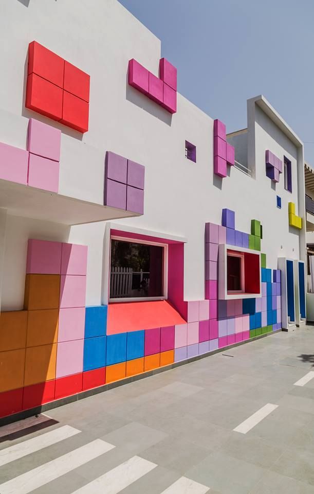
Finland, known for its progressive education model, uses color psychology in school design to foster learning and well-being. Classrooms incorporate soft blues and greens, while creative spaces use bold tones to trigger innovation. Student satisfaction and engagement levels are consistently high.
United Kingdom’s Color-coded Learning Zones
Several schools in the UK now use color zoning, where each subject or type of activity has a distinct color scheme. Math corners may use blue to support logic, while writing zones feature yellow and orange for ideation. This method has helped improve task-switching efficiency and classroom flow.
U.S. Green School Designs
LEED-certified schools in the U.S. integrate color psychology with sustainable design. Natural light and green tones dominate, reducing eye strain and improving attendance. Schools report lower stress levels and increased student satisfaction post-renovation.
Practical Implementation Strategies
Conducting a Color Audit
Educators and administrators can begin by auditing existing color schemes—what emotional tone do the current colors set? Are students overstimulated or disengaged? Simple surveys or mood tracking can offer insights.
Collaborating with Experts
Working with environmental psychologists, interior designers, or occupational therapists can produce evidence-based design choices. Even small adjustments, like repainting walls or switching furniture colors, can yield significant benefits.
Low-Cost, High-Impact Changes
Schools don’t need massive budgets to implement color psychology. Swapping colored posters, adding colored mats, or using peel-and-stick wall decals can transform the learning atmosphere. Lighting upgrades can also enhance color perception.
Student Participation in Design
When students are involved in choosing or designing their learning environments, they feel a sense of ownership. This participatory approach improves morale and ensures the color palette reflects user needs. Mood boards or classroom design projects can be part of this process.
Conclusion: Merging Aesthetics and Neuroscience in Education
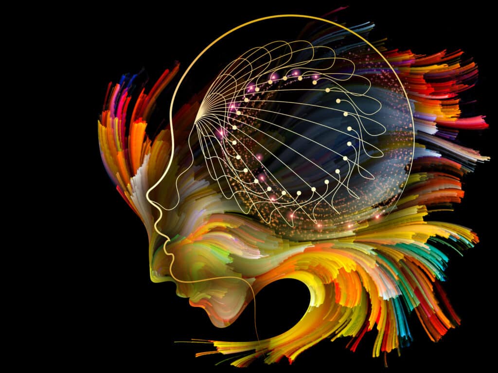
Color psychology is a powerful yet underutilized tool in educational design. When used thoughtfully, colors influence how students feel, behave, and perform. Schools that integrate intentional color schemes create environments that are not only visually pleasing but cognitively and emotionally supportive. As education becomes more student-centered, understanding how the built environment shapes experience will be essential. With creativity, consultation, and sensitivity, color can become a silent partner in learning success.
While developing my certification study plan, I discovered that Exam-Topics.info provides practice questions that some professionals use to test their knowledge, though it should be used alongside official study materials for comprehensive exam preparation.
- 206shares
- Facebook0
- Pinterest203
- Twitter3
- Reddit0


