Creating a fitness logo is a crucial step in building a recognizable brand that connects with your audience. A well-designed fitness logo uses strong colors, clear fonts, and relevant symbols to convey energy, strength, and professionalism, making your business stand out in a competitive market. The right logo instantly communicates your brand’s purpose, whether you’re a personal trainer, gym owner, or fitness apparel designer.
When designing your fitness logo, consider how it will appear across different platforms, from business cards to gym signage. Your choice of layout, color scheme, and iconography should reflect your unique identity and resonate with your target audience to create a lasting impression. Using specialized tools can simplify the process, helping you craft a logo that feels both unique and appropriate for your niche.
Key Takeways
- Your logo should clearly reflect your brand’s values and fitness focus.
- Choose colors and symbols that convey energy and professionalism.
- Use adaptable designs for different applications and marketing materials.
Core Principles of Fitness Logo Design
When creating a fitness logo, you need to balance clarity, appeal, and brand message. Your design must connect with your target audience while being adaptable across mediums. Focus on key elements that make your fitness brand recognizable and memorable.
Importance of Logo Design in the Fitness Industry
Your logo is often the first impression your fitness brand makes. It conveys professionalism and the energy behind your business. In a competitive market, a strong logo helps you stand out and attract customers who identify with your mission and style.
A well-crafted fitness logo signals trust and expertise. It encourages potential clients to engage with your services or products. Without a clear or impactful design, your brand risks being overlooked or confused with others.
Key Design Elements for Fitness Logos
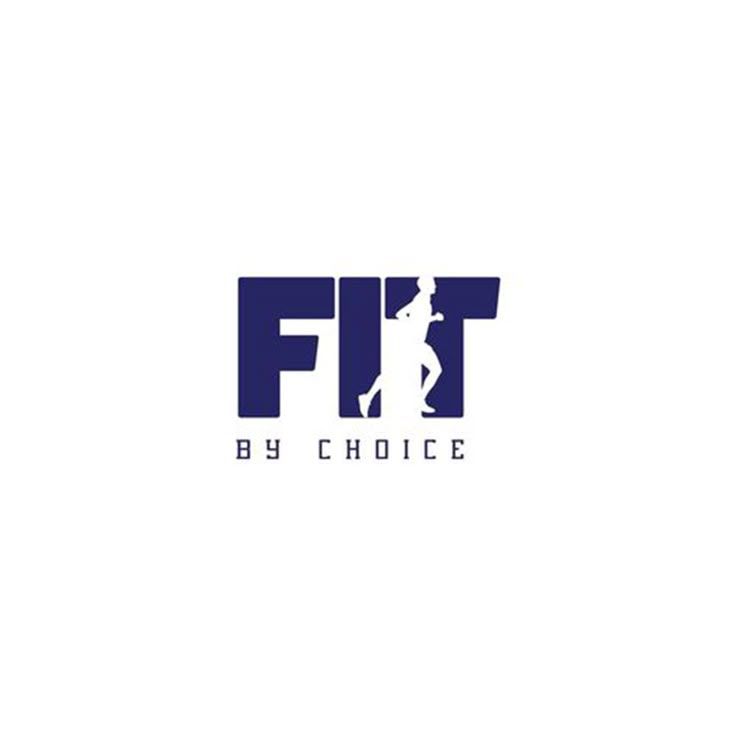
Simplicity is critical. Avoid cluttered designs that confuse your message. Use bold, clean lines combined with strong typography. Colors like red, black, or vibrant greens and blues often convey energy and vitality.
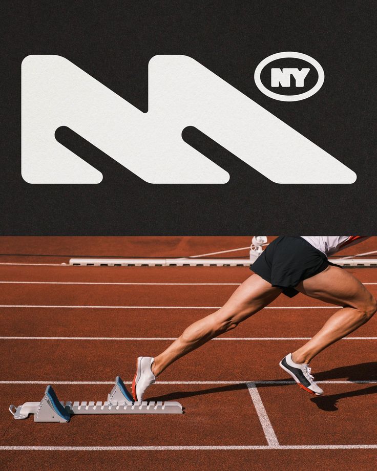
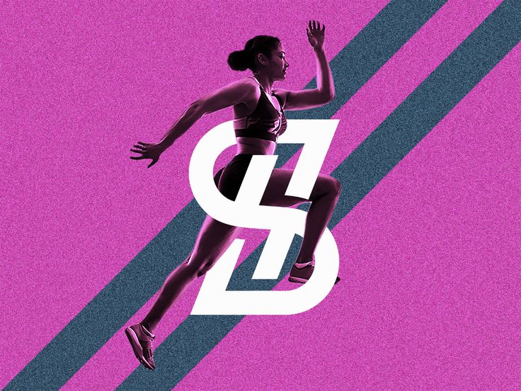
Incorporate shapes and symbols that reflect movement, strength, or health, but avoid clichés. Creative use of negative space can add uniqueness. Balance these elements to ensure your logo is effective in both large formats and small digital icons.
Branding and Identity for Fitness Brands
Your fitness logo should embody your brand’s story and core values. Think about what sets you apart—whether it’s your training style, product focus, or community. Your logo must communicate this identity clearly.
Consistency in logo application across all materials—website, merchandise, social media—builds brand recognition. Your fitness logo becomes a visual ambassador, so prioritize originality to avoid blending into generic fitness branding.
Choosing the Right Logo Type and Style
Your fitness logo needs to clearly represent your brand identity through its style and structure. Focus on the type of logo, how the elements are arranged, and the flexibility of customization options to ensure your logo fits all uses.
Understanding Fitness Logo Types
There are several logo types you can choose for your fitness brand:
- Wordmarks: Your business name in a distinctive font style. Clean and straightforward, best if your name is unique.
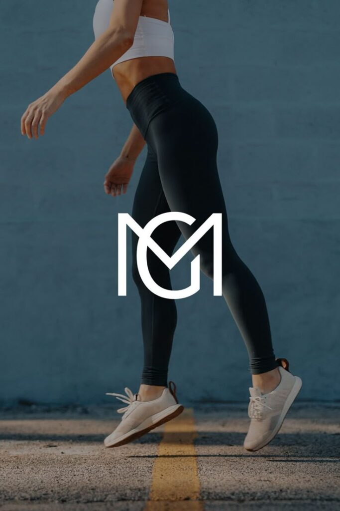
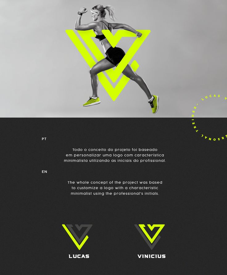
- Lettermarks (Monograms): Initials or acronyms represent your brand, ideal for lengthy names.
- Icon or Symbol-based: Uses a graphic symbol related to fitness, helpful for creating instant brand recognition.
- Combination Mark: Merges text and symbol, offering versatility for multiple platforms.
- Emblem: Logo text inside a shape, lending a traditional or badge-like feel.
Choose a type aligned with your branding goals. For instance, an icon-based logo may work well if you want an easily recognizable mark on apparel.
Selecting a Logo Layout
Layout refers to how text and graphic elements arrange relative to each other. Common arrangements include:
| Layout Type | Description | Use Case |
|---|---|---|
| Horizontal | Text and icon side by side | Website headers, social media |
| Vertical/Stacked | Icon above text | Mobile apps, avatar icons |
| Emblem | Text locked inside a shape | Signage, stamps |
| Isolated Icon | Only symbol without text | Merchandise, small branding |
Your choice affects readability, scaling, and cross-platform versatility. A horizontal layout often suits websites, whereas stacked works better for compact spaces or apps.
Logo Options and Customization
Custom fitness logos allow you to tailor fonts, colors, and icons to your brand personality. Many platforms offer logo templates as a starting point to modify.
Consider these customization points:
- Typography: Opt for fonts that reflect your brand—clean sans-serif for modern vibes or bold, sturdy typefaces for strength.
- Color Palette: Bright colors like reds and blues attract attention, while neutral tones like gray or black add stability.
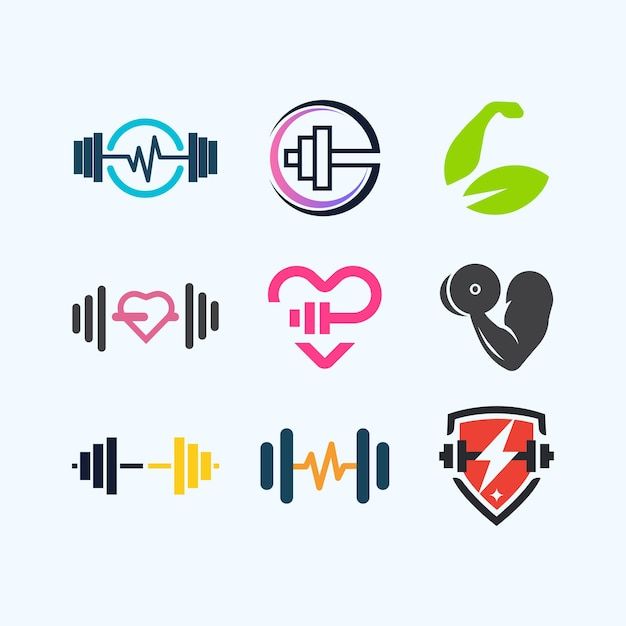
- Icons: Select symbols that clearly connect to fitness, such as dumbbells or heartbeat lines; ensure they remain identifiable at different sizes.
Using a logo maker tool with customizable templates can save time and help you visualize your logo’s adaptability across devices and materials.
Fonts, Colors, and Visual Elements
Your fitness logo’s impact depends largely on how you combine typography, color, and visual symbols. These elements must work together to convey energy, strength, and professionalism, matching the identity you want to communicate.
Best Fonts for Fitness Logos
Choose fonts that reflect movement and power. Sans-serif fonts are popular because they look clean and modern, improving legibility on various platforms. Fonts like Rexak give a futuristic, dynamic feel, while Gym Sports offers boldness suited to athletic brands.
Consider brush or stencil styles if you want a creative or gritty vibe, but keep readability top priority. Avoid overly decorative fonts that can hinder quick recognition. When adding text, ensure spacing and alignment support clarity, especially in smaller sizes.
Choosing a Color Palette
Your color choices influence how your brand feels. Reds and oranges evoke energy and intensity, suitable for high-impact gyms. Blues and greens can suggest trust and health, ideal for wellness-focused fitness businesses.
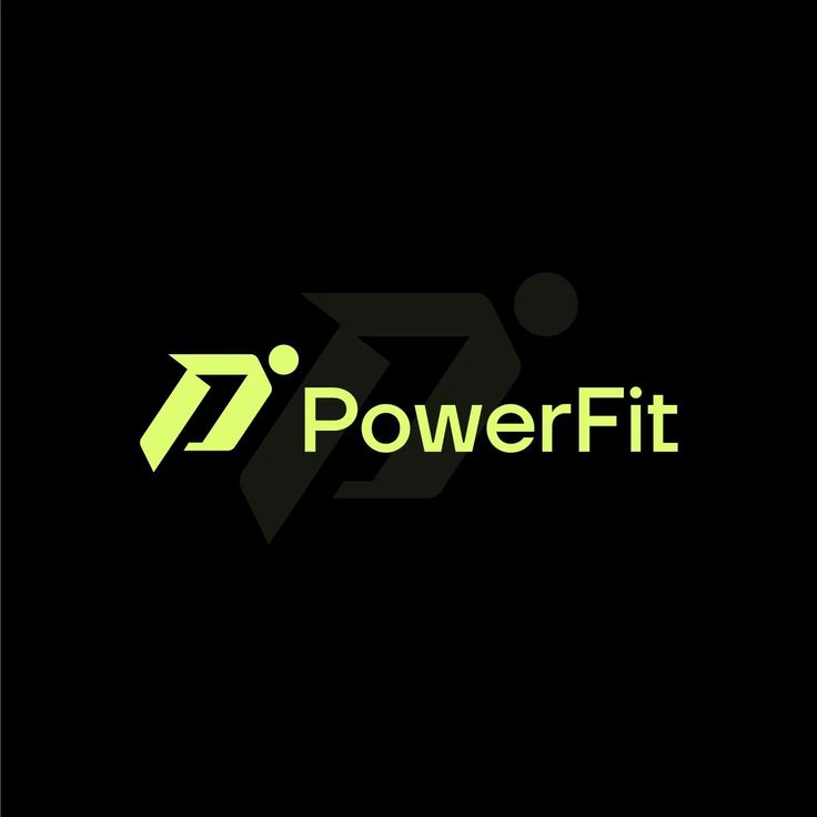
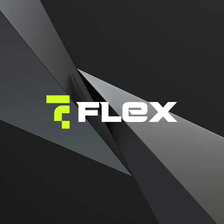
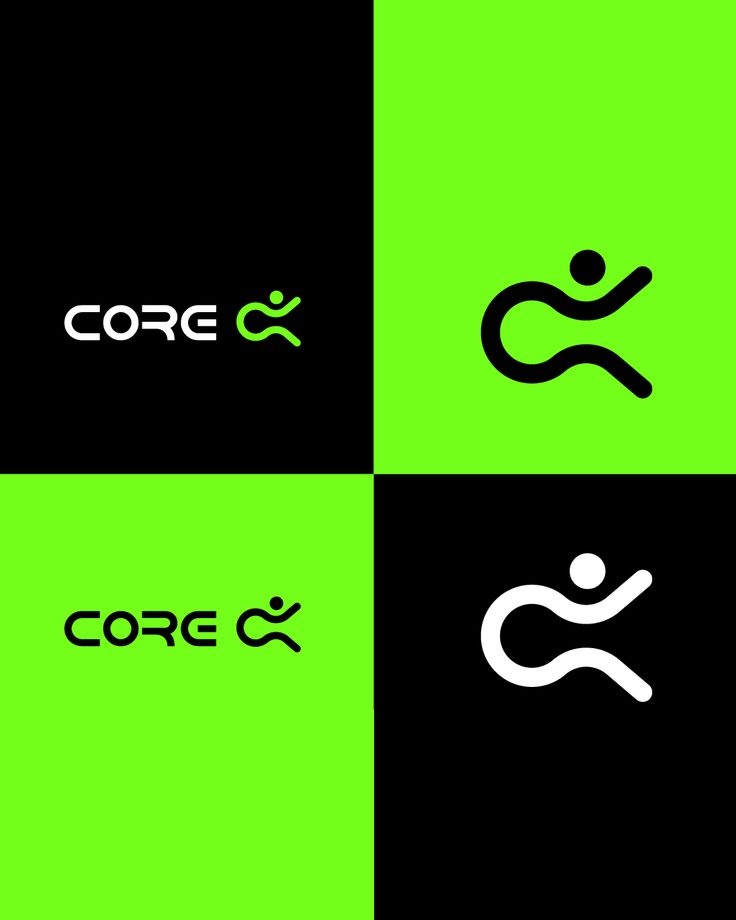
Limit your palette to two or three colors to maintain simplicity and visual harmony. Use contrast to make your logo stand out. For example, pairing a dark background with bright accents ensures visibility across different media.
Iconography and Symbolism for Fitness Brands
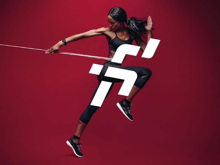
Selecting the right icon helps reinforce your brand message quickly. Common symbols include dumbbells, flexing arms, or abstract shapes that imply movement and strength. Keep icons simple — complex details may not scale well or be memorable.
Balance the icon size with typography; neither should overpower the other. Your icon can also incorporate subtle symbolism related to your niche, like a heart for wellness or a flame for intensity. This adds depth without complicating the design.

Tools and Resources for Fitness Logo Creation
To create an effective fitness logo, you need tools that offer customization, ease of use, and a variety of design options. Selecting the right resources helps you shape a logo that fits your brand’s identity while saving time and effort.
Using Online Logo Makers and Generators
Online logo makers and generators provide a fast way to produce several logo options based on your input. You typically start by entering your business name and a brief description, and the tool generates designs reflecting the fitness theme.
Many platforms, like AI-powered logo generators, offer real-time rendering, allowing you to see instant changes. These tools often include features for adjusting colors, fonts, and icons. Instant and unlimited alterations make refining your logo simple without hiring a designer. You get professional-looking results suited to gyms, personal trainers, or activewear brands in just minutes.
Editing Tools and Software
Editing tools let you customize or refine your chosen logo beyond automatic generation. Programs range from beginner-friendly to professional-grade software, depending on your skills and needs.
You can use editing tools to tweak fonts, reshape icons, or adjust layout and spacing. Powerful features such as layering, vector editing, and color management offer precision. These tools ensure your logo is scalable and clear on all platforms, from social media to merchandise. They also improve the logo’s uniqueness by allowing more personalized adjustments than online logo makers.
Accessing Logo Templates
Logo templates give you a head start with pre-designed fitness logos that you can modify. Many websites offer a broad library of fitness-related templates featuring symbols like dumbbells, kettlebells, or muscular figures.
Using templates saves time by eliminating design from scratch. You can easily replace text, swap icons, and experiment with fonts and colors. Templates often come with high-resolution options for print and digital use. This resource is practical if you want a quick design but still need control over the final look.

Applications and Formats of Fitness Logos
Your fitness logo must be versatile and suitable for various uses, including physical locations, merchandise, and digital platforms. Understanding the specific requirements for different applications ensures your logo maintains its integrity and professionalism everywhere it appears.
Gym and Fitness Center Branding
Your gym logo serves as the face of your fitness center. It should be prominently displayed on signage, entry points, and interior decor to create a cohesive brand identity.
Consider how the logo looks on walls, windows, and equipment. Clarity and simplicity help it stand out from a distance.
Using a gym logo template can help maintain consistency in color, font, and iconography. The logo needs to reflect the tone of your facility, whether it’s a hardcore gym or a welcoming yoga studio.
Print and Merchandise Uses
When used on print materials such as flyers, brochures, and business cards, your logo must be high resolution and adaptable to different sizes.
Your fitness logo is also critical on merchandise like t-shirts and water bottles. It should work well in both single-color and full-color versions.
File formats like PDF ensure print quality remains sharp. Make sure you have a scalable vector file to avoid pixelation when resizing.
Digital Formats and File Types
On digital platforms, your fitness logo appears on websites, social media, and mobile apps. You need formats like PNG with transparent backgrounds for flexible placement.
Optimizing your logo for various screen sizes is essential to keep clarity and impact. Consider having multiple versions for icons, banners, and profile images.
Keep editable files, such as AI or EPS, for future updates or customizations. These formats allow you to tweak colors, fonts, and designs without loss of quality.
Sports-Specific Fitness Logo Designs
Designing logos that represent specific sports requires attention to unique visual cues and symbols. Your logo should clearly reflect the essence of the sport while maintaining a strong, professional appearance. Focus on key elements such as equipment, posture, and sport culture to create a precise identity.
Football Logo Design
When designing a football logo, emphasize strong, dynamic imagery that conveys power and teamwork. Common symbols include helmets, footballs, goalposts, or player silhouettes in motion. Use bold lines and sharp edges to create a sense of energy and impact.
Colors often reflect team spirit—deep reds, blues, and blacks are popular choices. Typography should be robust and easily readable. You can also use elements like stripes or a mascot to reinforce identity. Ensure the logo works well on uniforms, merchandise, and digital platforms.
Golf Logo Design
Golf logos lean towards elegance and precision. Clean lines and minimalist design often work best here. Include golf-specific icons such as clubs, golf balls, tees, or course flags. Subtle curves can represent the flow and calmness of the game.
Color palettes typically favor greens, whites, and earth tones to evoke nature and tranquility. Fonts for golf logos are often sleek, serif or sans-serif styles that convey sophistication. Your logo should reflect both the sport’s refined image and the leisurely experience it offers.
Other Sports Logos
For other sports logos, tailor your design to the core attributes of the sport. Use recognizable equipment or stances specific to the activity, like basketballs, boxing gloves, or yoga poses.
Consider the sport’s energy level: fast-paced sports benefit from angular shapes and vibrant colors, while slower or more technical sports call for softer tones and smoother lines. Consistency in style between the icon, typography, and color scheme is essential to create a cohesive and professional sports logo.
- 3shares
- Facebook0
- Pinterest0
- Twitter3
- Reddit0


