Every “how to draw a lynx” tutorial I pulled up before writing this used the same trick: two circles for the head, a bigger circle for the body, connect the dots. It’s the same method you’d use for a housecat, a fox, or honestly a teddy bear. And that’s the problem — a lynx doesn’t read as a lynx because of its outline. It reads as a lynx because of the ear tufts, the stare, and a proportion that’s just slightly off from a normal cat in a way most people can’t name but instantly notice.
I spent years in life-drawing classes before I ever touched automotive design, and one thing stuck: get the proportion wrong and no amount of shading saves the drawing. Get it right, and even a rough sketch looks alive.
- Getting the proportions right before you draw a single line
- Reference photos vs. memory
- The block-in method
- How to draw a lynx step by step
- Eurasian lynx vs. Canada lynx vs. bobcat — know what you're drawing
- Drawing the eyes with real depth
- Pupil shape for cats vs. lynx-specific squint
- Rendering fur: graphite, colored pencil, or digital
- Graphite technique
- Colored pencil layering
- Digital brush settings
- Fixing the 3 mistakes that make lynx drawings look like generic cats
- Final thoughts
- FAQ
I’ll walk you through building a lynx from real structure — not circle guides — through fur rendering in three different materials, and eyes that actually hold weight. By the end you’ll know exactly why most online tutorials make a lynx look like a confused housecat.
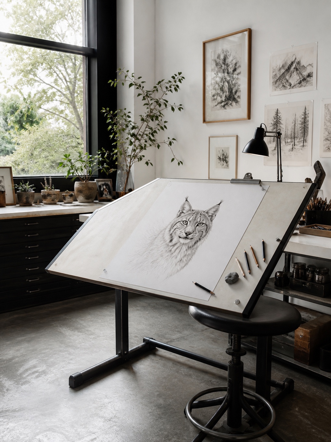
Getting the proportions right before you draw a single line
A lynx isn’t built like a housecat, even though most tutorials treat it that way. The legs are proportionally longer — especially the back legs, which sit higher than the front — and the head is smaller relative to the body than people expect. That mismatch is exactly why circle-guide tutorials fall apart: they borrow a generic cat template and slap ear tufts on top.
I think about proportion the way I did when surfacing the Mazda CX-5’s rear haunch — you’re not drawing individual shapes, you’re reading how mass shifts and where the weight sits. A lynx’s back legs carry more visual bulk than the front, which is what gives it that coiled, ready-to-pounce stance even standing still.
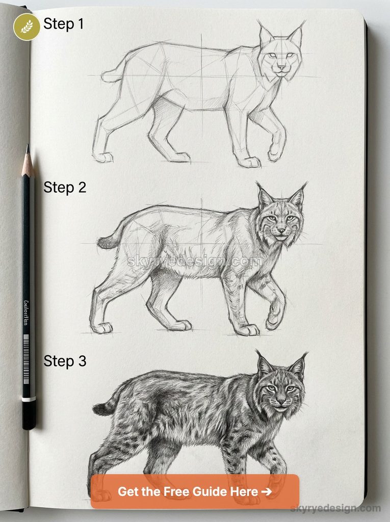
Reference photos vs. memory
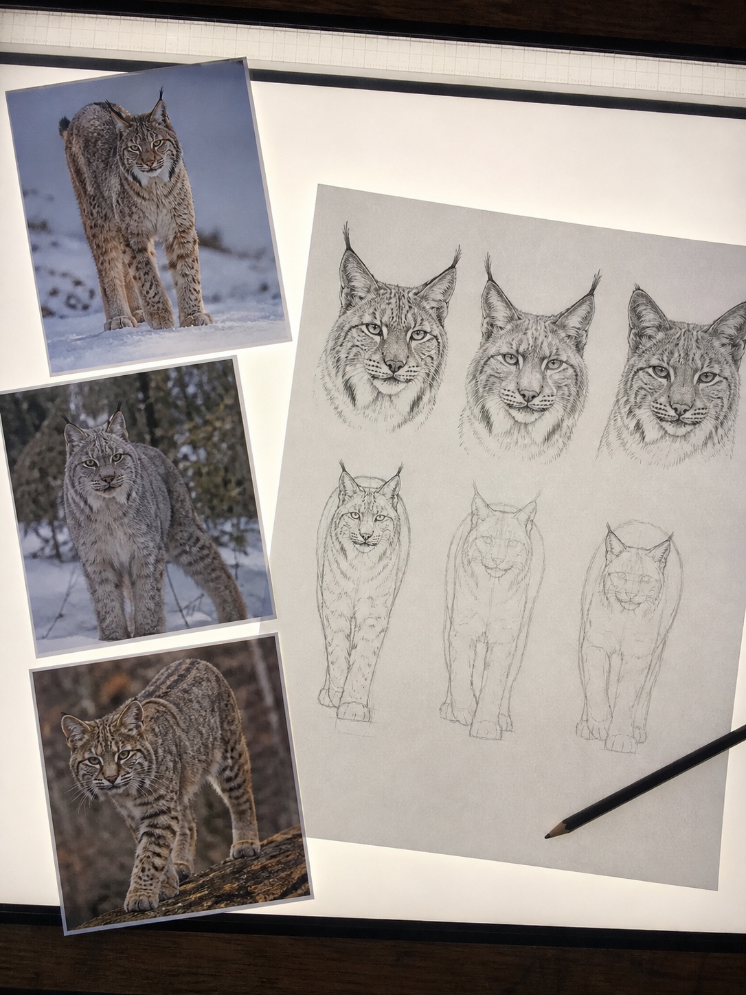
Don’t draw a lynx from memory unless you’ve studied one closely. Pull 3-4 reference photos — front-facing, side profile, and a three-quarter angle if you can find one. I keep a folder of big-cat references from Wikimedia Commons and iNaturalist; both are free to use for practice and give you actual proportion data instead of cartoon shorthand.
The block-in method
Start with a loose rectangle for the torso — wider than it is tall — and a smaller oval offset above it for the head. The head should sit at roughly a third of the torso’s width, not half, which is the mistake that makes most amateur lynx drawings look like an overweight tabby. Mark the shoulder and hip points before you touch a single curve. Everything else in this tutorial builds off these four marks.
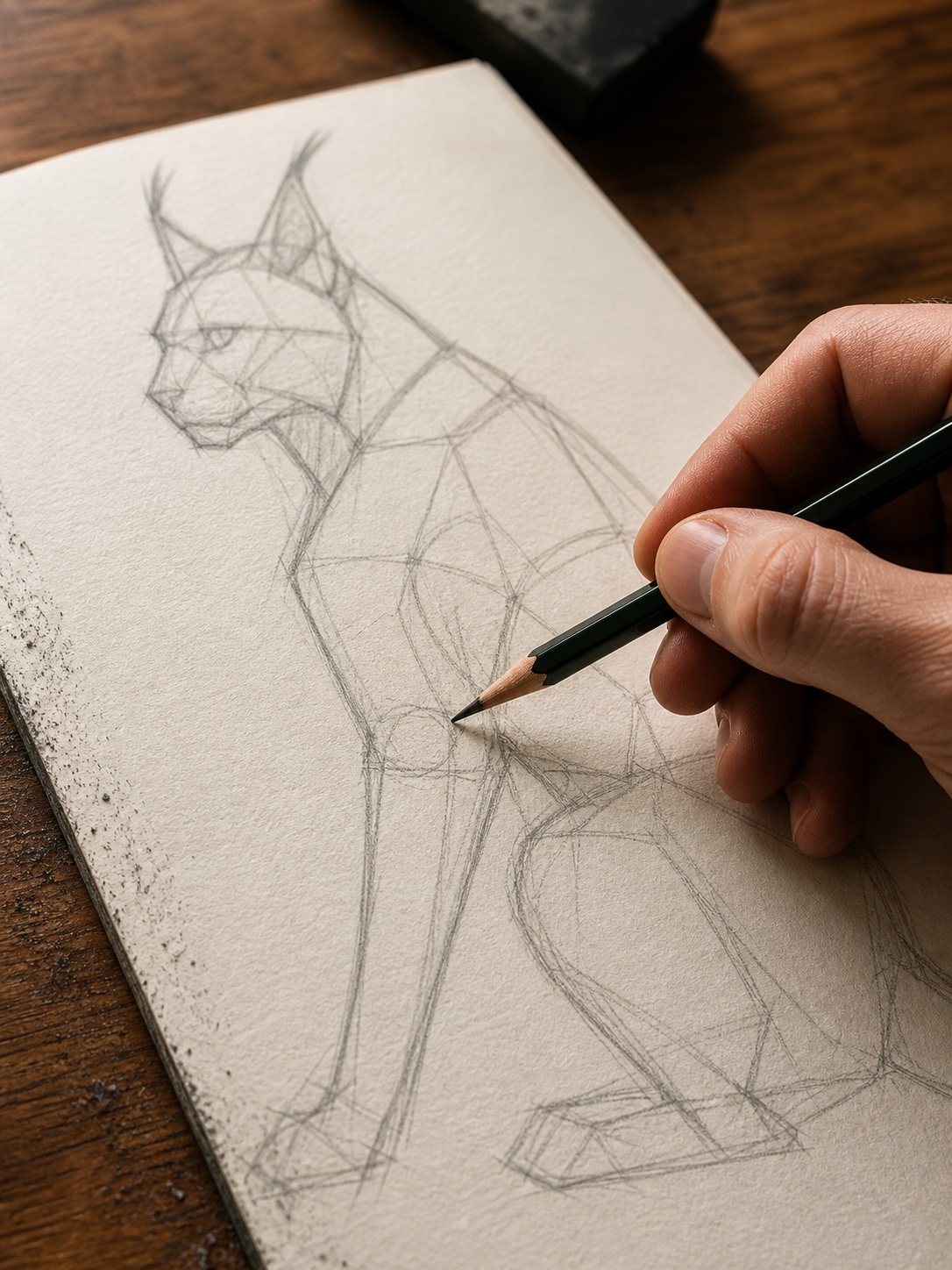
How to draw a lynx step by step
Once your proportions are marked, the actual construction moves fast. I’ll break this into four steps — follow them in order, and resist the urge to jump to detail work before the structure is locked in. That’s the single biggest reason beginner drawings stall out halfway through.
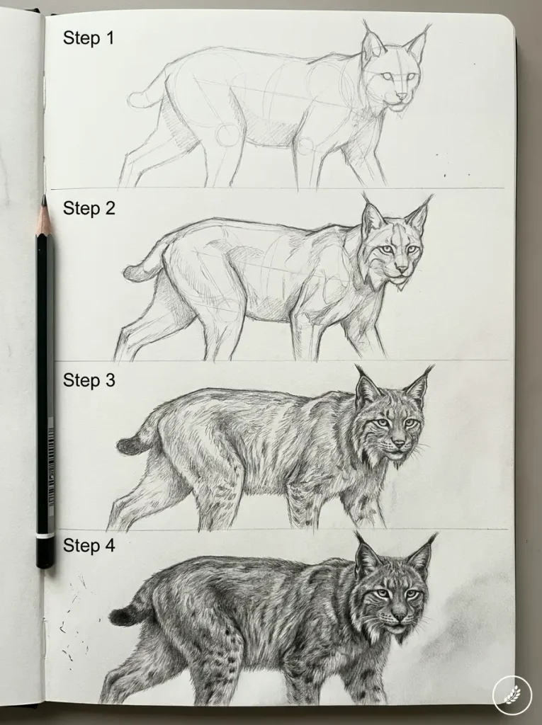
Step 1: Block in the head and body shapes
Using the torso rectangle and head oval from your proportion sketch, round out the edges. The chest should read fuller than the hindquarters at this stage — a lynx carries visible bulk through the shoulders and neck ruff, even before you’ve drawn a single fur strand. Keep your lines light. I use a 2H pencil for this entire stage; it’s hard enough that you won’t smudge the sketch as your hand moves across the page, but soft enough to erase cleanly.
Connect the head to the torso with a short, thick neck — shorter than you’d draw on a domestic cat. This is where most tutorials go wrong: they draw a long, elegant neck because that’s what “cat” suggests, and it immediately kills the lynx silhouette.
Step 2: Construct the ears and tufts
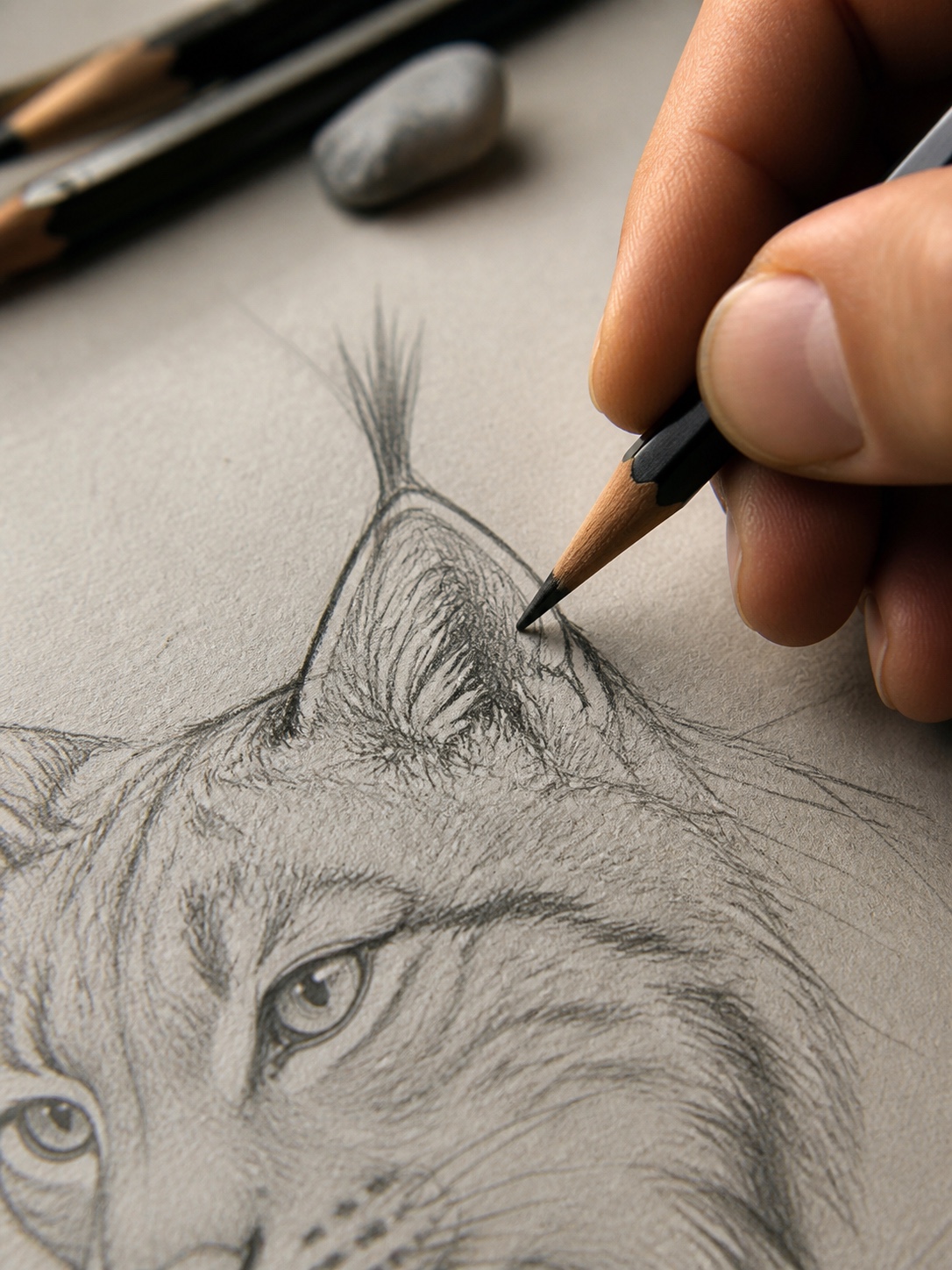
This is the step that actually makes the drawing read as lynx, so don’t rush it. Place two triangular ear shapes at the top of the head oval, angled slightly outward — not straight up like a housecat’s. The tufts extend from the tip of each ear, roughly a third again as long as the ear itself, and they curve slightly inward toward each other.
The mistake I see constantly: ears drawn too small and too centered, which makes the animal look alert and startled rather than watchful. Push them a bit wider than feels natural, closer to the outer edge of the head oval. It’ll look wrong for a second — then you’ll add the tufts and it’ll click into place.
Step 3: Build the legs, paws, and tail
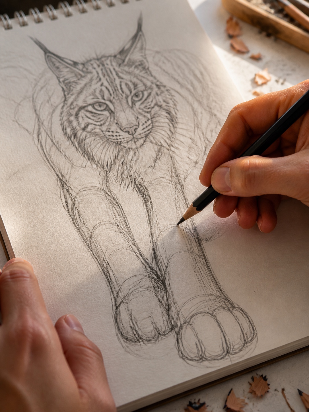
Sketch the front legs first, straight down from the shoulder points you marked earlier. Lynx legs are notably long relative to the torso — don’t shorten them to “fit” the body the way instinct tells you to. The back legs bend at a sharper angle than the front, with the haunch sitting noticeably higher than the shoulder line. That height difference is what gives a standing lynx its coiled, spring-loaded look.
Paws are big — disproportionately big, actually, which helps distribute weight over snow. Draw them wider than you think they should be; this is one detail where exaggeration reads as accuracy. The tail is short, maybe a quarter the length of the body, with a blunt, dark tip. Don’t draw a long, tapering tail here — that’s the single fastest way to turn your lynx into a generic wildcat.
Step 4: Add facial details and refine the line work
Place the eyes along the horizontal guideline from your original block-in, spaced about one eye-width apart. Add a small triangular nose centered below, and a short muzzle line beneath that. Now go back over your entire sketch with a slightly softer pencil (I switch to an HB here) and commit to your final lines, erasing the construction marks as you go.
This is also where I do a proportion check against my reference photos one more time — comparing head-to-body ratio, leg length, and ear placement before adding any fur or shading. It’s tempting to skip this because the drawing “looks done,” but five minutes of comparison here saves you from redoing shading work later.
Eurasian lynx vs. Canada lynx vs. bobcat — know what you’re drawing
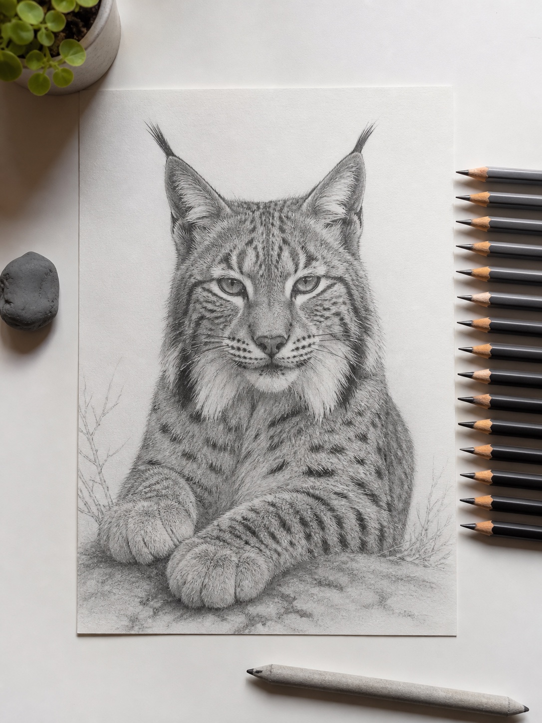
People search “how to draw a lynx” and end up referencing a bobcat photo half the time, which explains a lot about why so many online tutorials look inconsistent. These are three distinct animals, and if you’re drawing from mixed references without realizing it, your proportions will fight each other.
Eurasian lynx is the largest of the three — long legs, a heavy ruff around the neck that reads almost like a mane, and the most dramatic ear tufts of the group. If your reference has a lynx that looks almost too majestic to be real, it’s probably this species.
Canada lynx is smaller and stockier, with proportionally bigger paws (built for snow) and a shorter, less dramatic ruff. The face reads rounder. This is the lynx most North American tutorials default to, often without saying so.
Bobcat isn’t a lynx at all, technically — it’s a different genus, though closely related and constantly confused in search results. Shorter ear tufts (sometimes barely visible), a longer, spotted tail with a white underside, and a leaner build overall. If your reference photo has a long tail, you’re looking at a bobcat, not a lynx — that’s the fastest way to tell them apart at a glance.
I ran into this exact confusion drawing reference sheets for an animal-anatomy study a while back — pulled a “lynx” stock photo that turned out to be a bobcat, and the proportions I’d blocked in were wrong before I’d drawn a single detail. Worth double-checking your source before you commit to a two-hour drawing.
Drawing the eyes with real depth
This is where most lynx drawings die on the vine. The proportions are solid, the ears read correctly, and then the eyes get drawn as two flat circles with a dot in the middle — and the whole thing suddenly looks like a stuffed animal instead of a predator.
I spent a lot of hours in academic life-drawing sessions rendering eyes on human portraits, and the same principles carry straight over to animals: an eye isn’t a circle, it’s a sphere sitting inside a socket, catching light from one direction and casting a shadow from the other. Skip that and no amount of detail elsewhere saves the drawing.
Pupil shape for cats vs. lynx-specific squint
A lynx’s pupil is vertically slit in bright light, like most cats, but the overall eye shape reads slightly more almond and slightly more hooded than a housecat’s — part of what gives it that watchful, half-lidded stare. Draw the upper lid line with a bit more curve and weight than the lower one; that asymmetry alone does most of the work.
Start with a light oval, then add a small highlight — a single white dot placed off-center, toward the upper third of the pupil. That’s your catchlight, and it’s non-negotiable. Without it, the eye looks dead no matter how carefully you shade everything else. Around the pupil, add subtle radial lines fading outward from the center, the way you’d render the fibers in a human iris — it’s a small detail, but it’s the difference between an eye that looks painted-on and one that looks like it’s actually looking at something.
Shade the socket area slightly darker than the surrounding fur, and leave a thin rim of lighter fur just below the lower lid — lynx have a subtle pale marking there that reads almost like eyeliner in photos, and it’s an easy detail to miss.
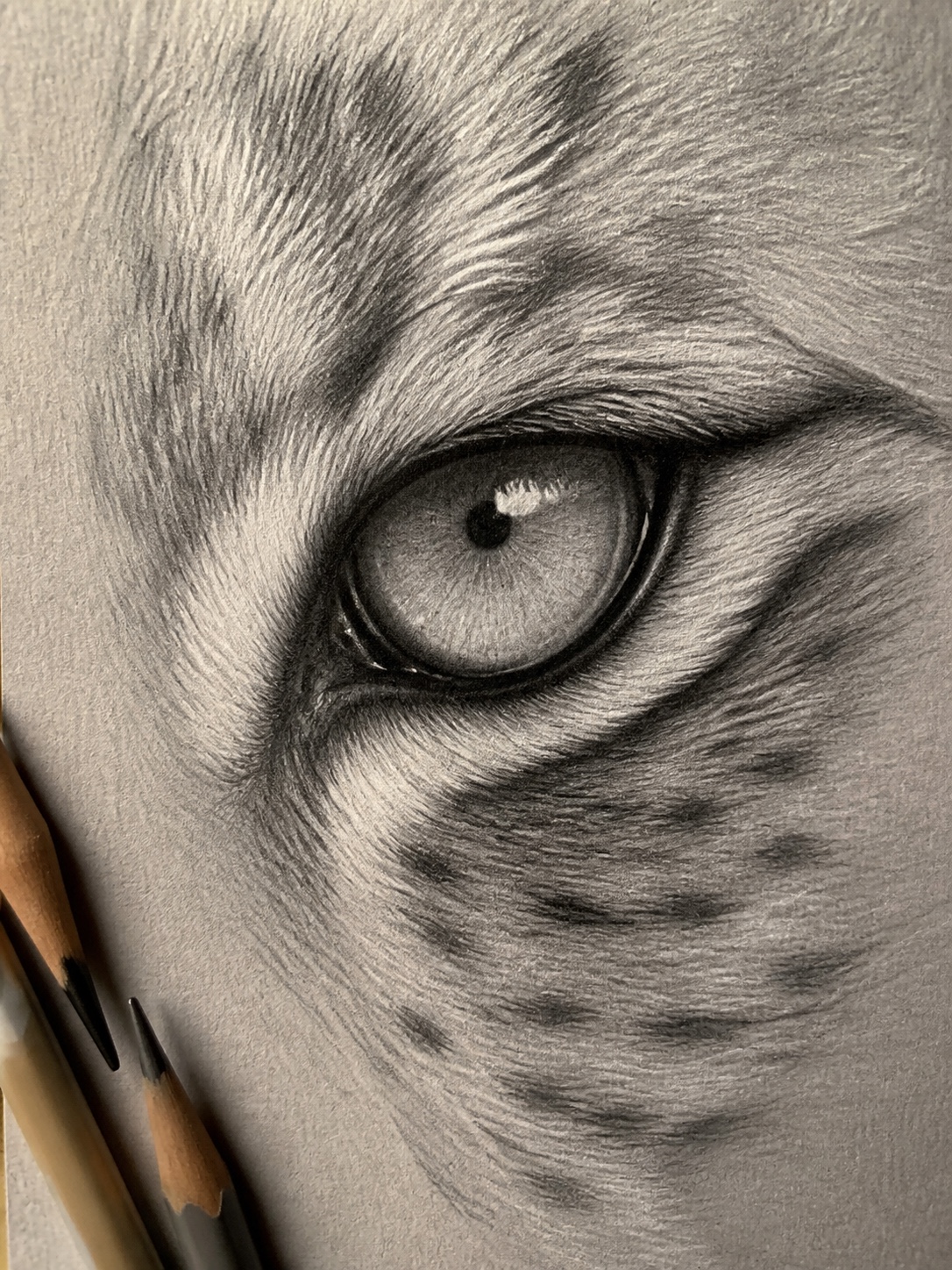
TIP: Catchlight placement matters more than iris detail. If you only have time for one eye refinement, add the highlight — it does more work than any amount of radial shading.
Rendering fur: graphite, colored pencil, or digital
None of the tutorials I pulled up during research touch this — they all default to “color it in” like fur is a flat fill. It isn’t. Fur has direction, layering, and length variation, and how you render it depends heavily on which material you’re working in.
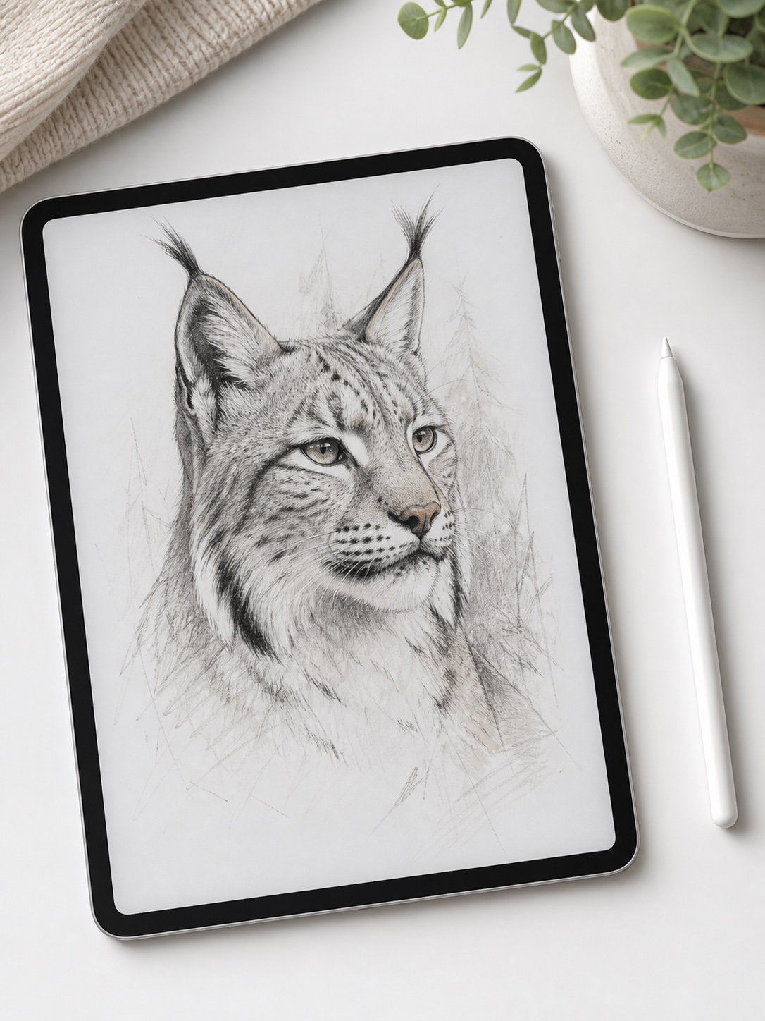
Graphite technique
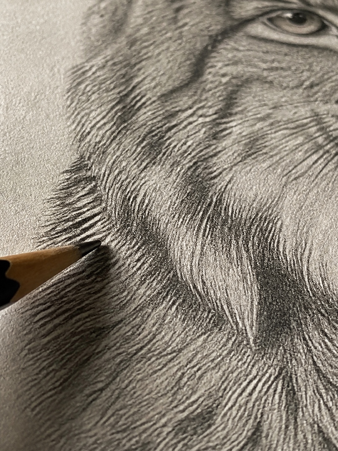
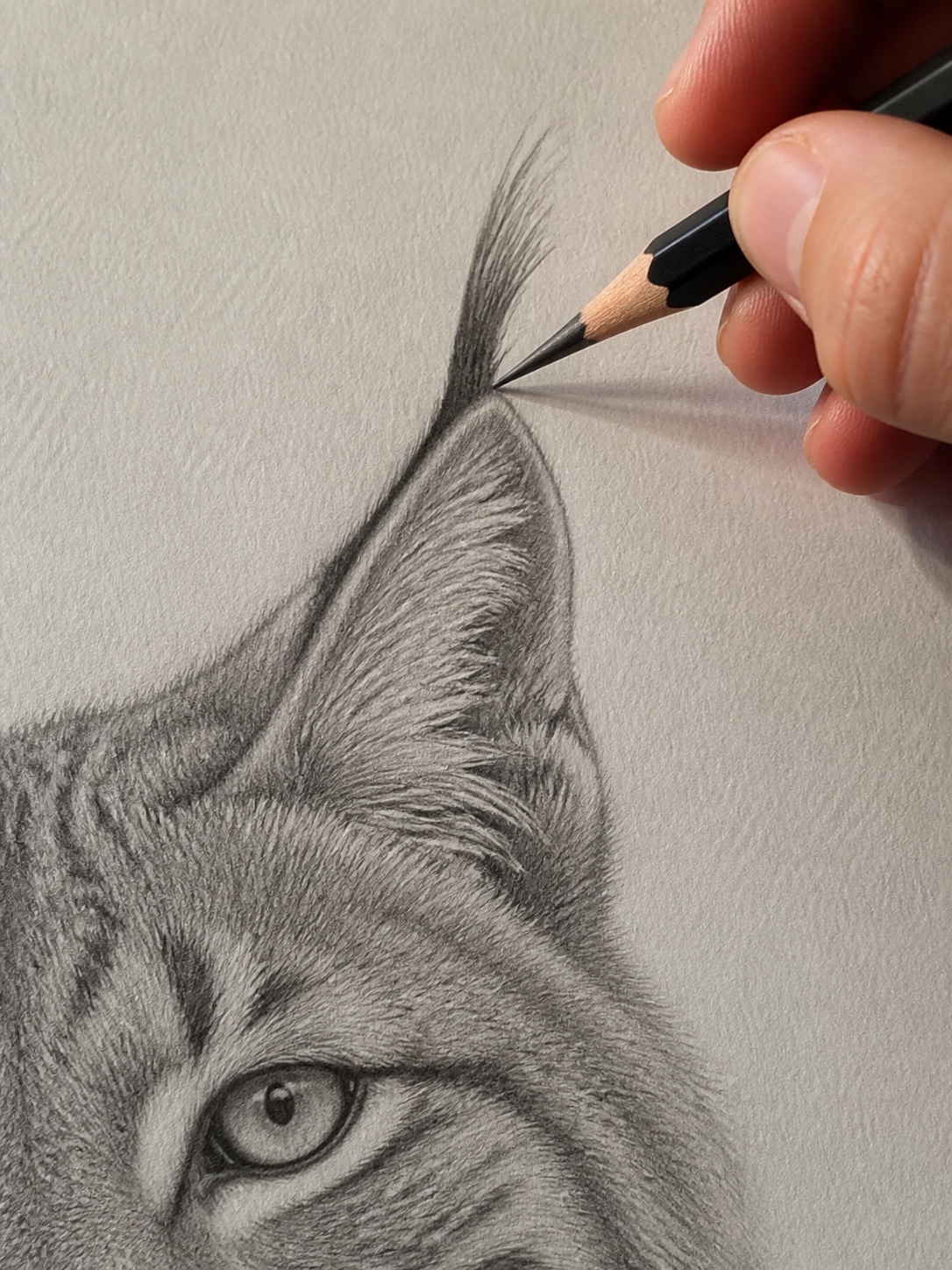
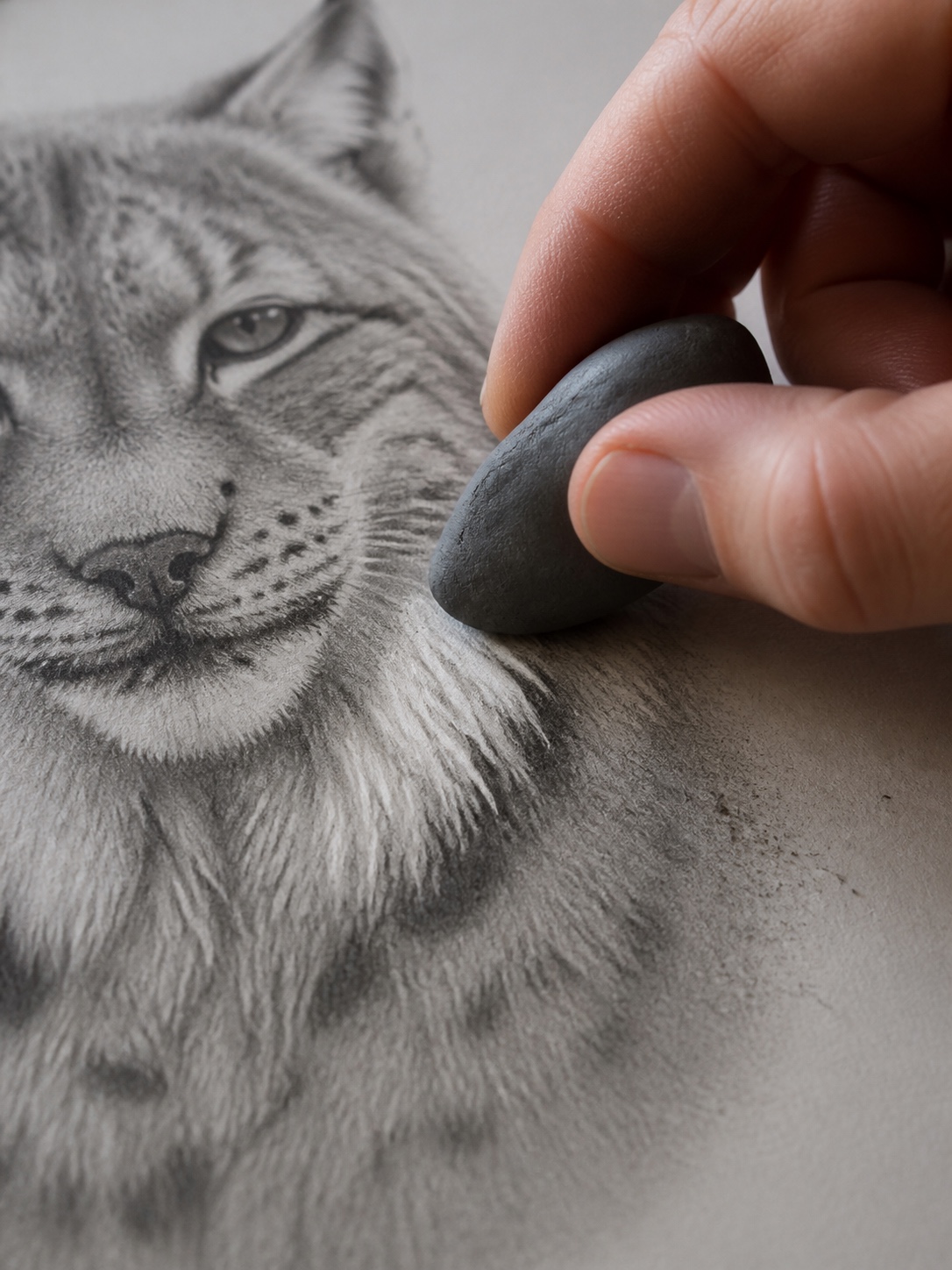
Work in layers, not one pass. Start with a light base layer of short, directional strokes following the muscle structure you built in the block-in stage — strokes should curve with the form, not run in straight lines across it. Build up darker fur (the spots and the darker ruff edges) with a second layer of tighter, closer strokes, using a softer pencil like a 4B. The ear tufts need the longest, most deliberate strokes on the whole drawing — pull them out from the ear tip with a single confident motion rather than short scratchy marks. A kneaded eraser is essential here; lift out highlights on the ruff by pulling graphite away rather than trying to draw around them.
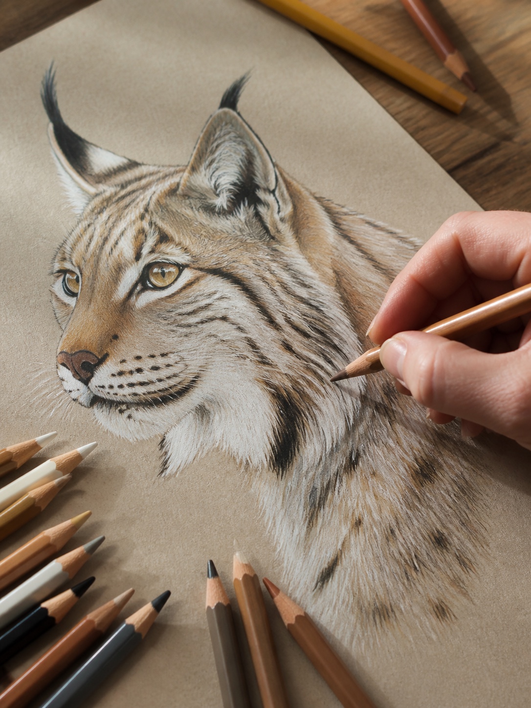
Colored pencil layering
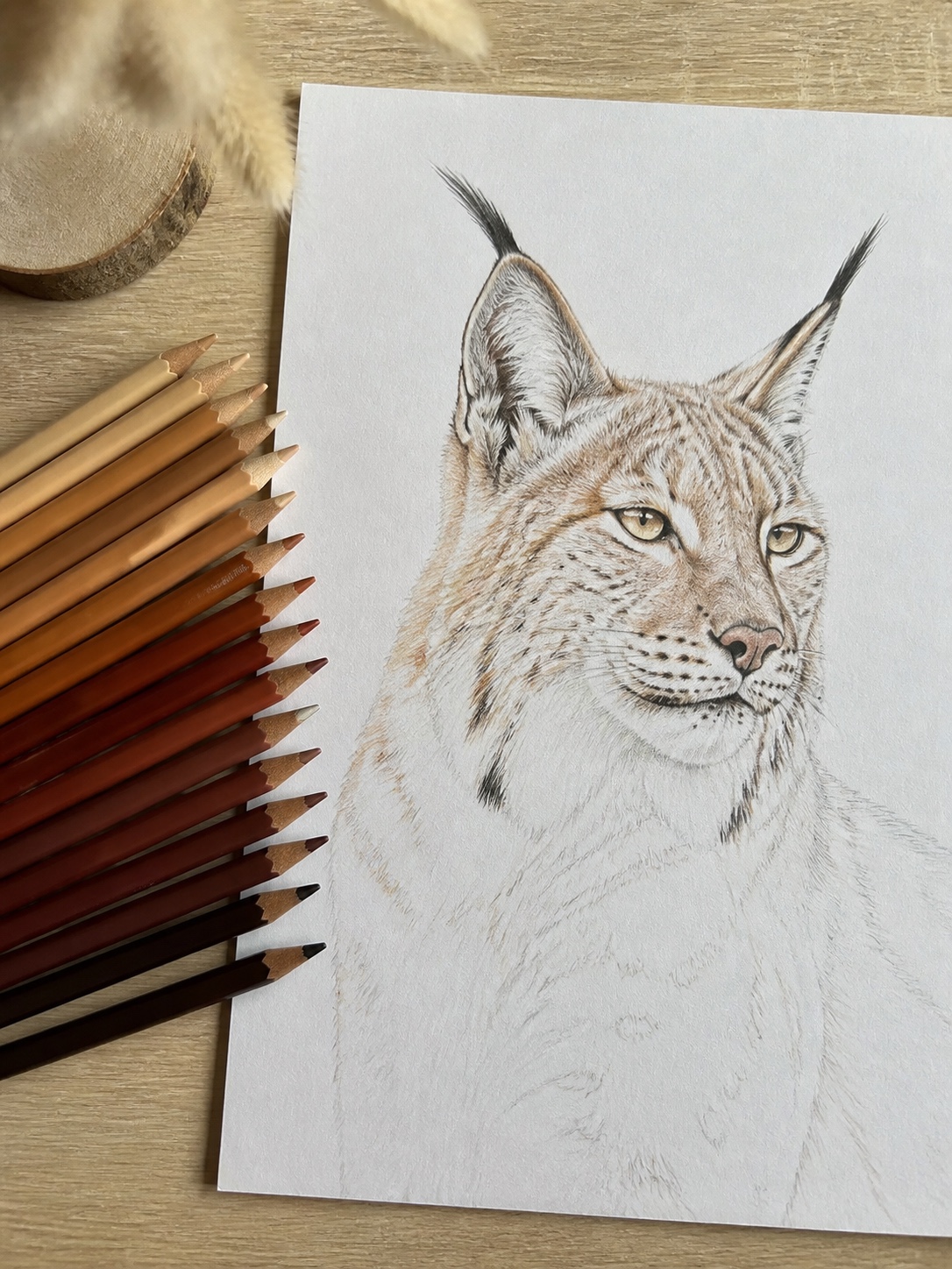
This is where a lot of people rush and it shows. Lay down a base layer in a light tan or ochre, covering the whole body evenly. Then layer in a mid-tone brown for the spot pattern and shadow areas, and finish with a darker umber or black for the deepest shadows — ear tips, spot centers, nose. I always go back in with a white or cream pencil at the very end for highlight strokes on the ruff and the top of the head; it’s a small step that adds real dimension. Prismacolor and Faber-Castell Polychromos both blend well for this kind of layering, though Polychromos holds a sharper point longer, which matters for the finer tuft strokes.
Digital brush settings
If you’re working digitally, skip any hard round brush entirely — it flattens fur instantly. Use a textured, low-opacity brush (something like Procreate’s “Fur” or a custom scatter brush in Photoshop) set to build up gradually across multiple passes rather than one solid stroke. Keep opacity around 40-60% on your base layer so strokes overlap and blend naturally instead of stacking as visible hard lines. For the tufts specifically, increase brush size and reduce opacity even further — a single overly opaque stroke there reads as plastic instead of fur.
Fixing the 3 mistakes that make lynx drawings look like generic cats
If your drawing still isn’t reading as lynx after all this, it’s almost always one of three things. Here’s the quick troubleshooting pass I run through before calling a drawing finished.
Mistake 1:
Ears too small or too centered. This is the most common issue by far. Go back and compare your ear placement against the reference — they should sit closer to the outer edge of the head than feels natural, with tufts extending a third again past the ear tip. If the animal reads as “surprised housecat” instead of “watchful predator,” this is almost always why.
Mistake 2:
Tail too long. A lynx’s tail is short and blunt — roughly a quarter of the body length, with a solid dark tip. If you’ve drawn a tapering tail that extends past the hind legs, you’ve drifted into bobcat or generic-wildcat territory without meaning to. Shorten it and square off the end.
Mistake 3:
Eyes without a catchlight or socket shadow. Flat circles kill the drawing faster than any proportion error. If the stare isn’t landing, it’s rarely the iris detail — it’s almost always a missing highlight or insufficient shadow under the brow. Add both before you touch anything else.
Run this three-point check against your reference photos one more time. In my experience, catching even one of these early saves an hour of rework later, because fur rendering built on top of a wrong proportion just makes the error more convincing.
Final thoughts
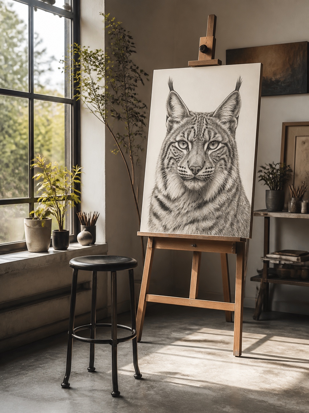
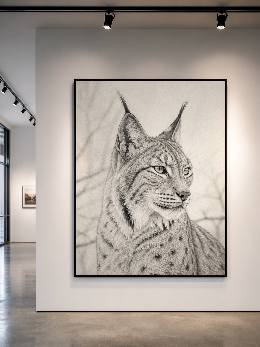
A convincing lynx drawing comes down to three things most tutorials skip entirely: proportion that respects the actual animal instead of a generic cat template, ear tufts placed wider than instinct suggests, and eyes rendered with real depth instead of flat circles. Get those right and the fur technique — whichever material you choose — does the rest of the work for you.

If this one clicked for you, try the full-body version next: same proportion logic, but with the lynx mid-stride instead of standing still, which changes how the weight distributes through the legs.


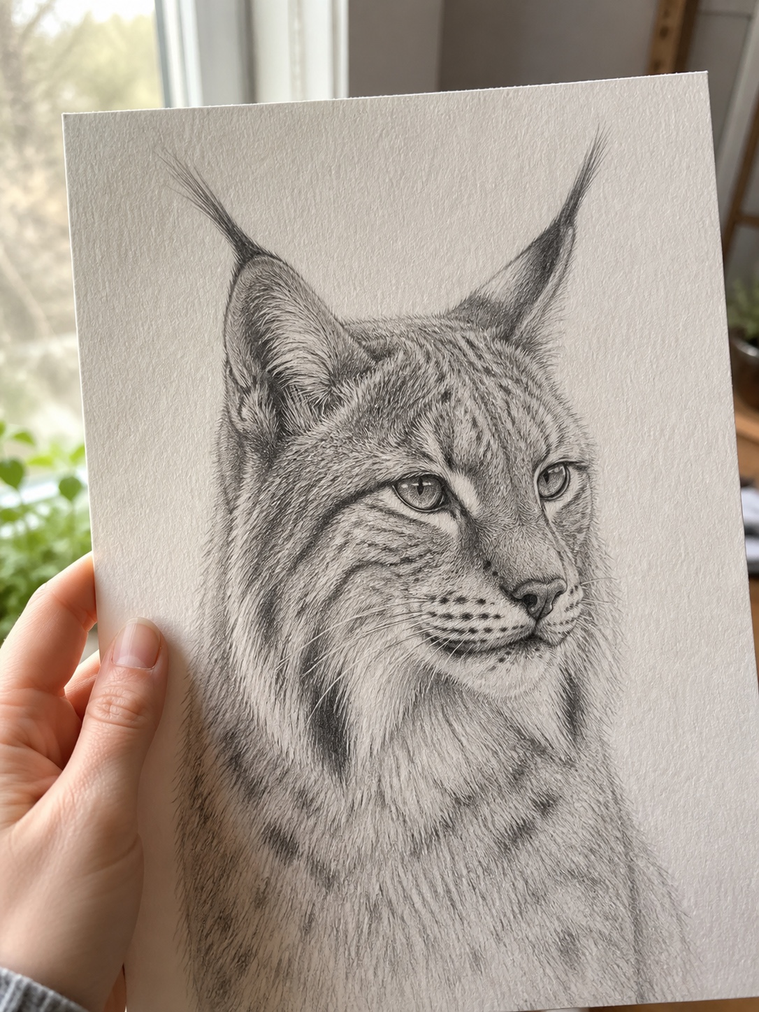
FAQ
Q: Is a lynx a cat?
Yes — lynx belong to the cat family (Felidae), specifically the genus Lynx, which includes four species: Eurasian, Canada, Iberian, and bobcat (technically a close relative, not a true lynx). They’re wild cats, not domestic breeds, with proportions built for hunting rather than sitting on a couch.
Q: What’s the easiest way to draw a lynx face?
Start with a rounded triangle for the head shape rather than a circle — lynx faces are less round than a housecat’s. Place the ears wide and angled outward, add the tufts, then focus most of your effort on the eyes (catchlight and socket shadow) before touching fur detail. The face reads correctly once ears and eyes are right, even with minimal shading.
Q: How do you draw lynx ear tufts?
Draw the base ear as a triangle angled slightly outward from the head, then extend a single confident stroke from the tip — about a third again as long as the ear itself, curving slightly inward. Avoid short, scratchy marks; one deliberate line reads more convincingly than several hesitant ones.
Q: What’s the difference between a lynx and a bobcat drawing?
Tail length is the fastest tell — a lynx has a short, blunt tail, while a bobcat’s is longer and spotted with a white underside. Bobcats also have shorter, less dramatic ear tufts and a leaner overall build. If your reference shows a long tail, you’re drawing a bobcat, not a lynx.
Q: Best pencil for fur texture?
A 2H for your initial block-in (light, easy to erase), then a 4B for building up darker fur layers and the ear tufts. If you’re working in colored pencil, Faber-Castell Polychromos holds a sharp point longer than most brands, which matters for fine tuft strokes.
Q: How long does a realistic lynx drawing take?
For a detailed graphite piece with full fur rendering, plan on 3-5 hours split across proportion block-in, construction, and layered fur work. A simpler line-and-shade version following just the four core steps can be done in under an hour.
Q: Can beginners draw a realistic lynx?
Yes, as long as you follow the structure-first approach — proportion and ear placement before any fur detail. Most beginner lynx drawings fail not from lack of skill but from skipping straight to shading before the underlying construction is solid.
- 9shares
- Facebook0
- Pinterest9
- Twitter0
- Reddit0