A commercial building can lose its appeal quietly. Nothing breaks, nothing floods, nothing trips a code violation. The walls just fade a shade at a time until one day a tenant walks the lobby and can’t quite say why the place feels tired. I’ve walked properties like that with owners who assumed the problem was the floor plan or the location, when the real issue was sitting right in front of them: color that stopped doing its job years ago.
Paint is the fastest, cheapest lever a commercial property has for changing how it reads to the people walking through it, and it’s also the one most owners think about last, if at all. This isn’t a renovation checklist. It’s a look at how color and finish actually shape the way an office, retail space or commercial building feels, from the first glance at the facade to the last impression in a reception area.
- First impressions start with color
- Facade design ideas for commercial buildings
- Office paint color ideas that support focus and comfort
- Commercial building color schemes: choosing a palette by business type
- Commercial interior design colors for reception and common areas
- Common mistakes: choosing color before fixing the surface
- FAQ
- How does commercial painting improve the value of a property?
- Should exterior color choices be planned before or after other renovations?
- How often should commercial color schemes be refreshed?
- Can paint color affect how a space feels without a full renovation?
- How do I choose a color scheme that matches my business type?
- Color is the fastest read a property gets
I keep coming back to color because it’s the one design decision that touches every square foot of a property and costs less per square foot than almost anything else on a renovation list. A structural upgrade or new mechanical system might solve a specific functional problem, but color is the layer that decides whether a visitor, tenant or buyer registers the building as cared for the moment they walk in.
First impressions start with color
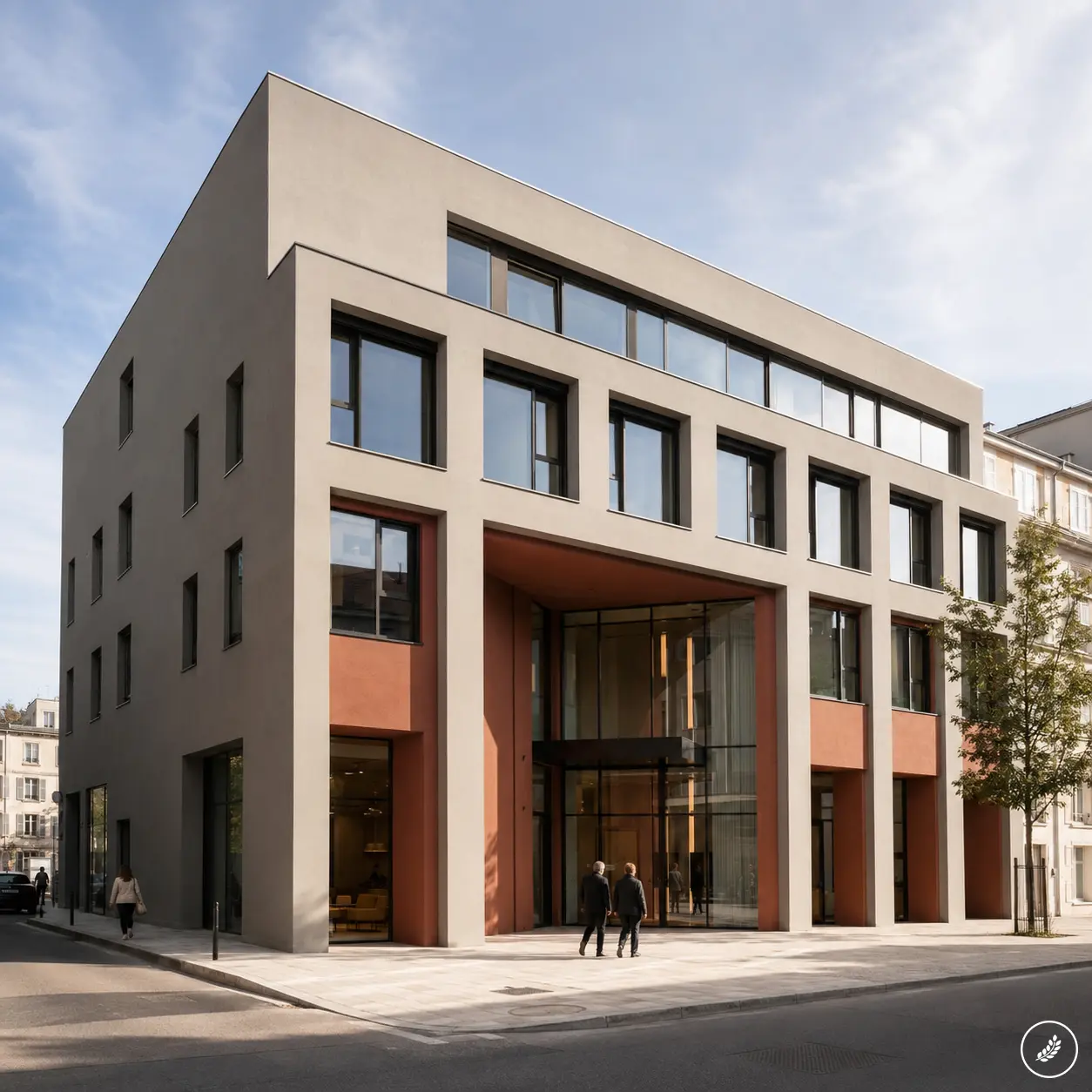
A visitor reads a building’s facade before they read anything else about it, often from the car before they’ve even parked. Color and finish register faster than layout, signage or landscaping, which is exactly why a faded or mismatched exterior can undercut a property that’s structurally sound and well maintained everywhere else. I think about this the same way I think about a car’s paint at a dealership: the mechanical quality underneath barely matters to the first impression if the finish looks tired under showroom light.
That first-impression effect compounds at the entrance specifically. A reception area or lobby painted in the wrong tone for its lighting can feel dim and uninviting even with strong natural light coming in, since color absorbs or bounces that light depending on value and finish. Get the color and finish right at the two points people actually stop and look, the facade and the entry, and the rest of the building gets the benefit of the doubt.
This is also where owners most often underinvest relative to impact. A lobby repaint costs a fraction of a lighting overhaul or a flooring replacement, yet it’s frequently the detail that decides whether a prospective tenant’s first reaction is positive or lukewarm. I’ve seen buildings with genuinely strong bones lose tenant interest purely because nobody had looked hard at the entrance sequence in years.
Facade design ideas for commercial buildings
Matching finish to exposure (fade, moisture, weather)
Exterior color decisions can’t be separated from what a specific facade actually faces. A south-facing wall in full sun fades faster than a shaded north elevation, sometimes visibly within a single season if the coating wasn’t rated for that exposure. Moisture matters just as much: a wall that catches wind-driven rain or sits near irrigation overspray needs a finish built to resist that constant dampness, not just a color that looks good in a sample chip under office lighting.
I treat facade color the way I’d treat exterior automotive finish selection: the environment the surface actually lives in should drive the spec, not the other way around. A pigment that holds up beautifully in a dry climate can chalk and fade within a few years somewhere humid and sun-exposed, and no amount of color theory fixes a finish that was never rated for its actual conditions.
Orientation deserves a walk of the building before any color gets chosen, not just a glance at a site plan. I check each elevation at different times of day when I can, since a wall that looks fine at 10am can be taking direct, punishing sun by 3pm depending on the season and nearby structures casting shade. A single color specified uniformly across all four elevations often ages unevenly for exactly this reason, with the harshest-exposed wall visibly ahead of the others within a couple of years even though they were painted on the same day.
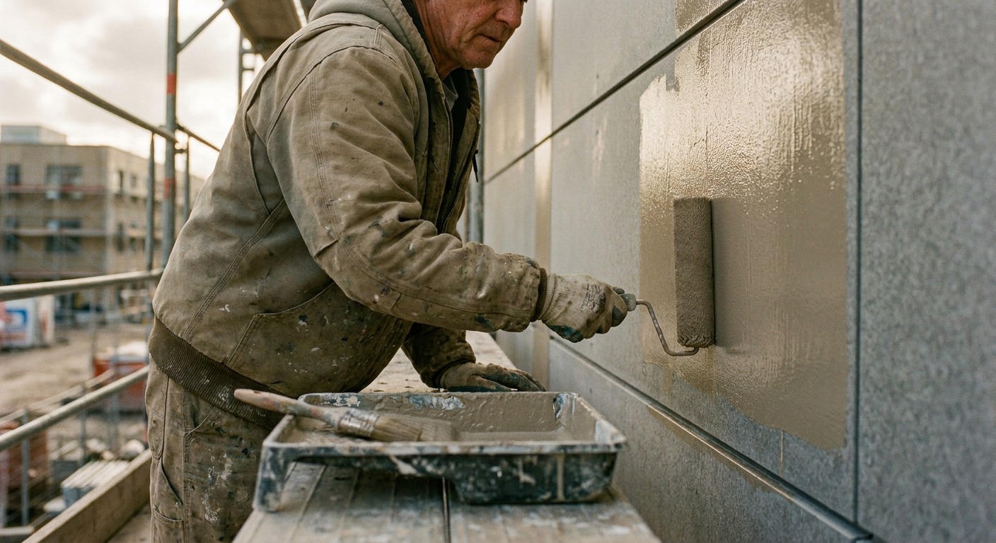
Substrate matters as much as exposure. Render, brick, timber cladding and metal panel all take and hold color differently, and a coating system suited to one substrate can fail early or look chalky on another even if the pigment itself is identical. Confirm the coating system is rated for the specific substrate on each elevation before finalizing color, since a beautiful sample on the wrong base material is a repaint waiting to happen.
Reflective vs. matte — how finish affects perceived light
Finish changes how a color reads almost as much as the pigment itself. A reflective or satin finish bounces more ambient light back at a viewer, which can make a facade feel brighter and more current, but it also shows every surface imperfection, patch and repair line more clearly than a matte coating would. Matte finishes hide substrate flaws better and read as quieter and more architectural, at the cost of looking slightly duller under flat, overcast light.

Neither option is universally correct. A modern glass-and-steel office building often wants the crispness a satin or semi-gloss finish gives it, while a masonry or brick-adjacent facade with texture worth showing usually reads better in something closer to matte. Look at the building’s actual materials before choosing a sheen, not just the color.
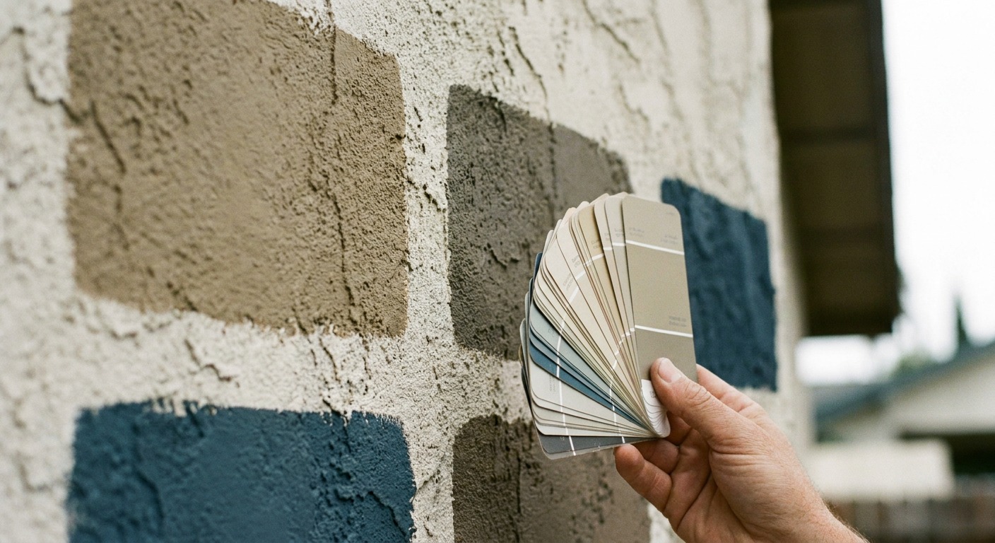
I test finish samples on an actual section of the facade whenever possible, at the time of day the building gets the most foot or vehicle traffic, rather than trusting a small chip under a showroom light. The difference between how a satin sample reads on a card and how it reads across an entire two-story wall in afternoon glare is significant enough that I’ve changed sheen recommendations on-site more than once after seeing the real thing.
Office paint color ideas that support focus and comfort
Light-reflective palettes for low-light interiors
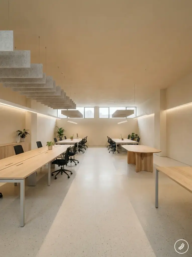
Interior offices without generous natural light benefit enormously from color choices that bounce what light they do get rather than absorbing it. Pale, warm-neutral walls reflect both daylight and artificial light back into a room more effectively than deeper tones, which can measurably reduce how dim a north-facing or interior office feels without touching the lighting fixtures at all. This matters most in older buildings where adding windows or skylights simply isn’t an option.
I keep a mental rule from years of working under studio lighting: a wall color that looks correct under a bright showroom bulb can read completely differently under standard office fluorescents or LEDs. Always check a sample under the actual lighting the space will use before committing to a full repaint, since color temperature shifts a paint’s undertone more than most people expect.
Ceiling color matters more than people assume in this same conversation. A ceiling painted the same pale tone as the walls, rather than a flat white treated as an afterthought, reflects more of a room’s available light back down into the working plane instead of absorbing it overhead where nobody benefits from it. This is a nearly free adjustment during any repaint and one of the higher-impact changes available for a genuinely dim interior office.
Color zoning for different work areas
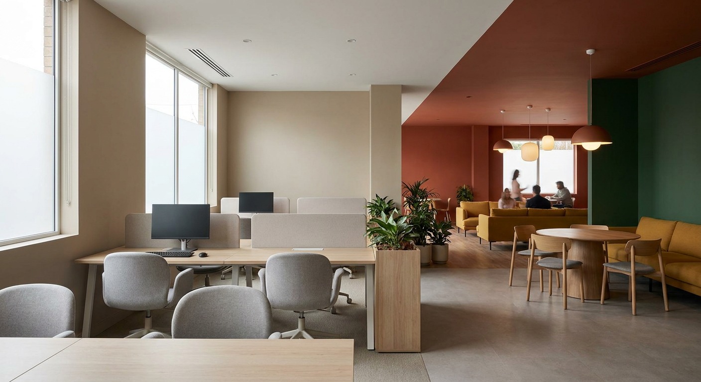
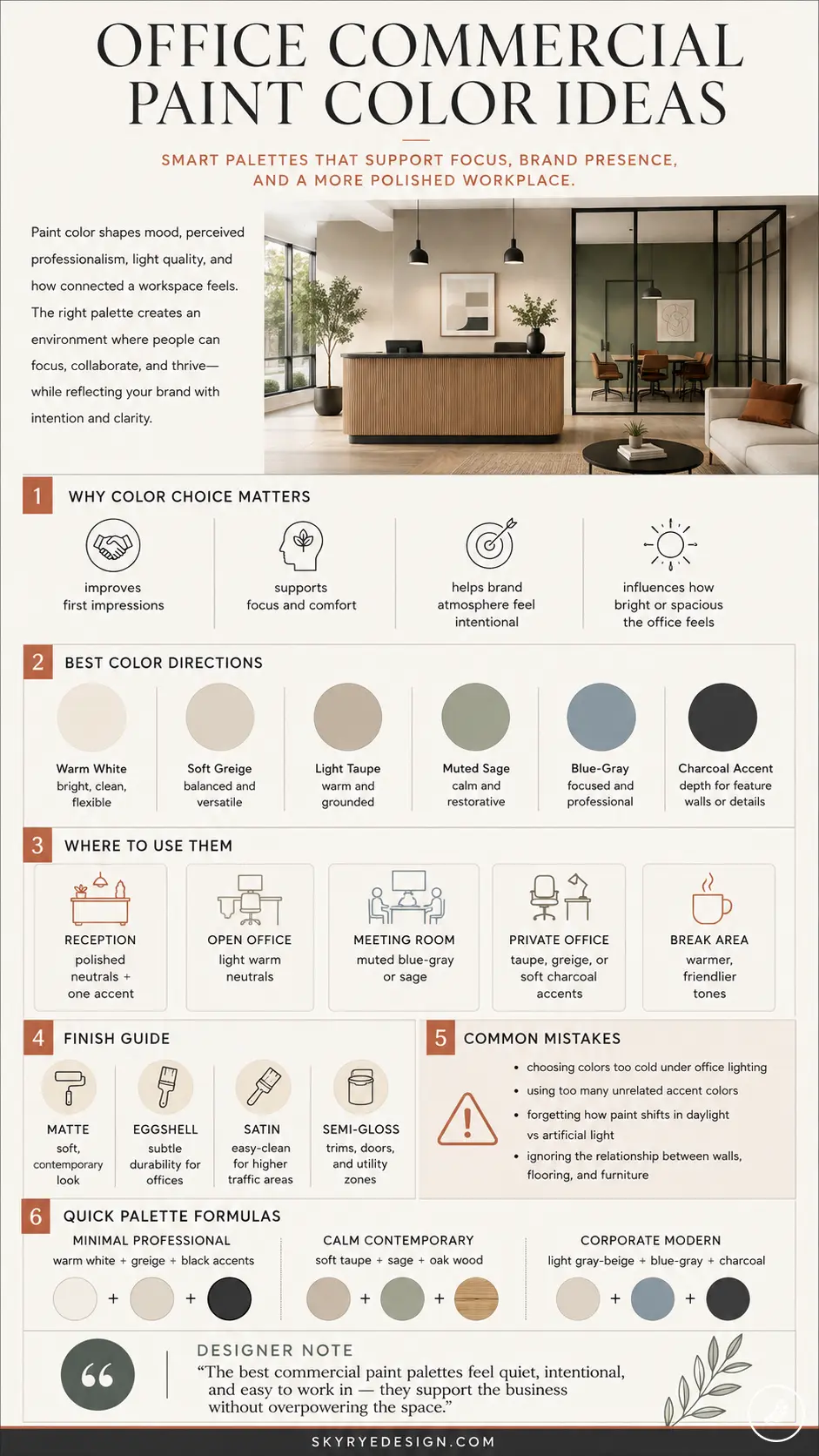
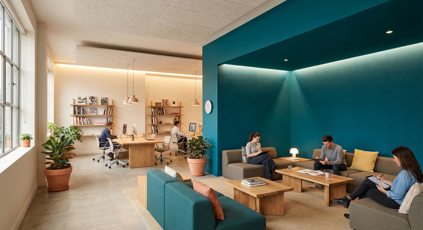
Not every zone in an office needs, or benefits from, the same palette. Focus-heavy areas like private offices and quiet workrooms generally do better with calmer, lower-saturation tones that don’t compete for attention over an eight-hour day. Collaborative spaces, break rooms and creative zones can carry more saturation and contrast without becoming fatiguing, since people aren’t spending sustained, heads-down hours staring at those walls.
Zoning color this way also gives visitors and employees an intuitive sense of a space’s function before anyone explains it. A meeting room that shifts to a slightly different tone than the surrounding open-plan area reads as a distinct destination rather than just another patch of the same office, which helps wayfinding in larger commercial floor plates more than most signage budgets do.
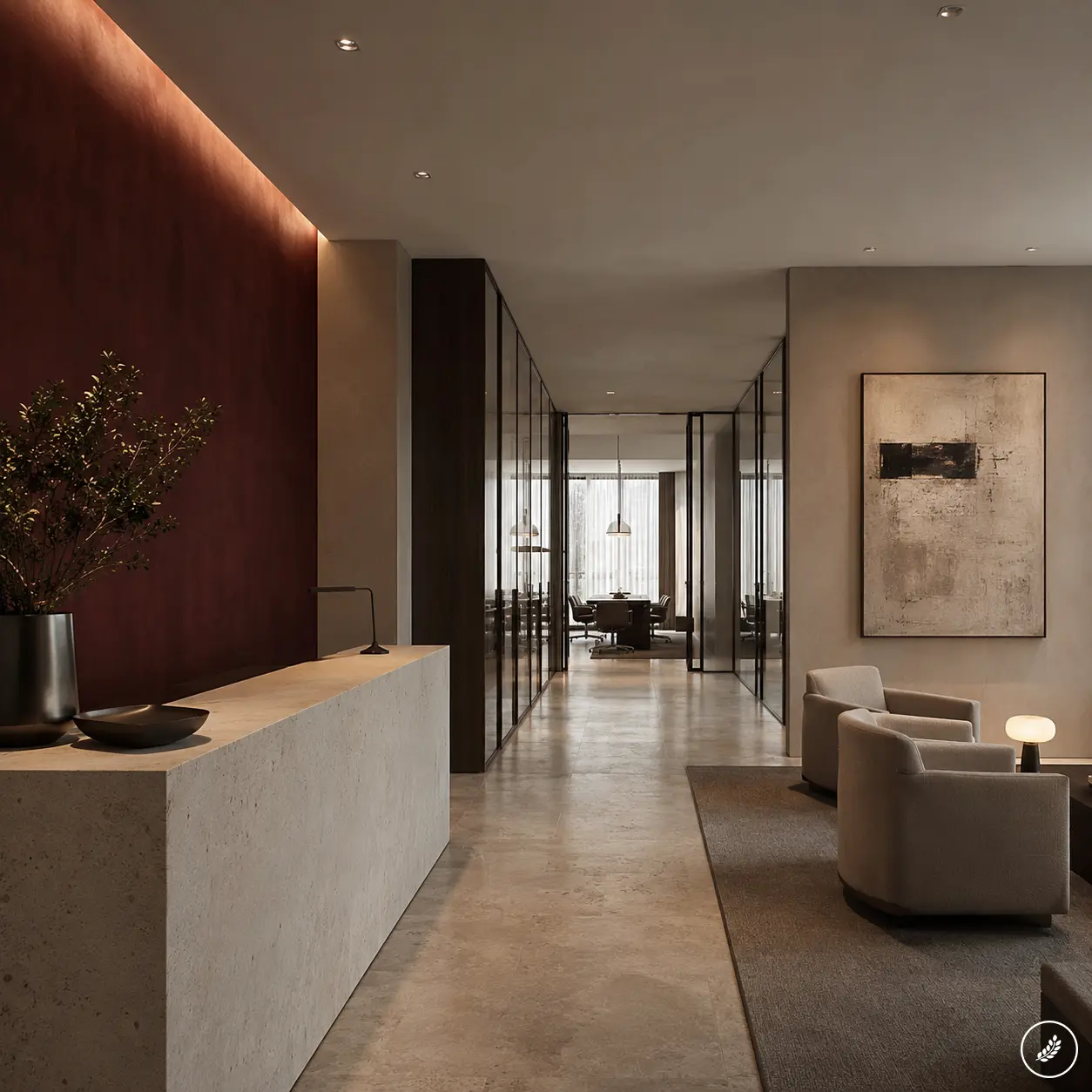
I usually recommend limiting a full floor to two or three coordinated palettes rather than a different color in every room, since too much variation reads as chaotic rather than zoned. Pick one calm neutral as the base across most of the floor, one slightly bolder accent for collaborative or public-facing zones, and reserve a third, more saturated tone for a single feature wall or landmark space that people can use as a mental anchor point when navigating the building.
Commercial building color schemes: choosing a palette by business type
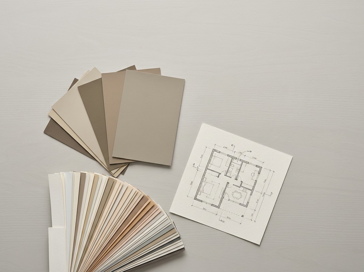
A palette should reflect what a business actually is, not a generic idea of “professional” that ends up looking identical to every other tenant on the block. A law firm or financial services office generally leans into restrained, low-saturation neutrals with one deeper accent, since the goal is to project stability rather than energy. A creative agency or tech company can push further into saturated accent walls and unexpected color pairings, since the brand benefits from reading as current and distinct rather than conservative.
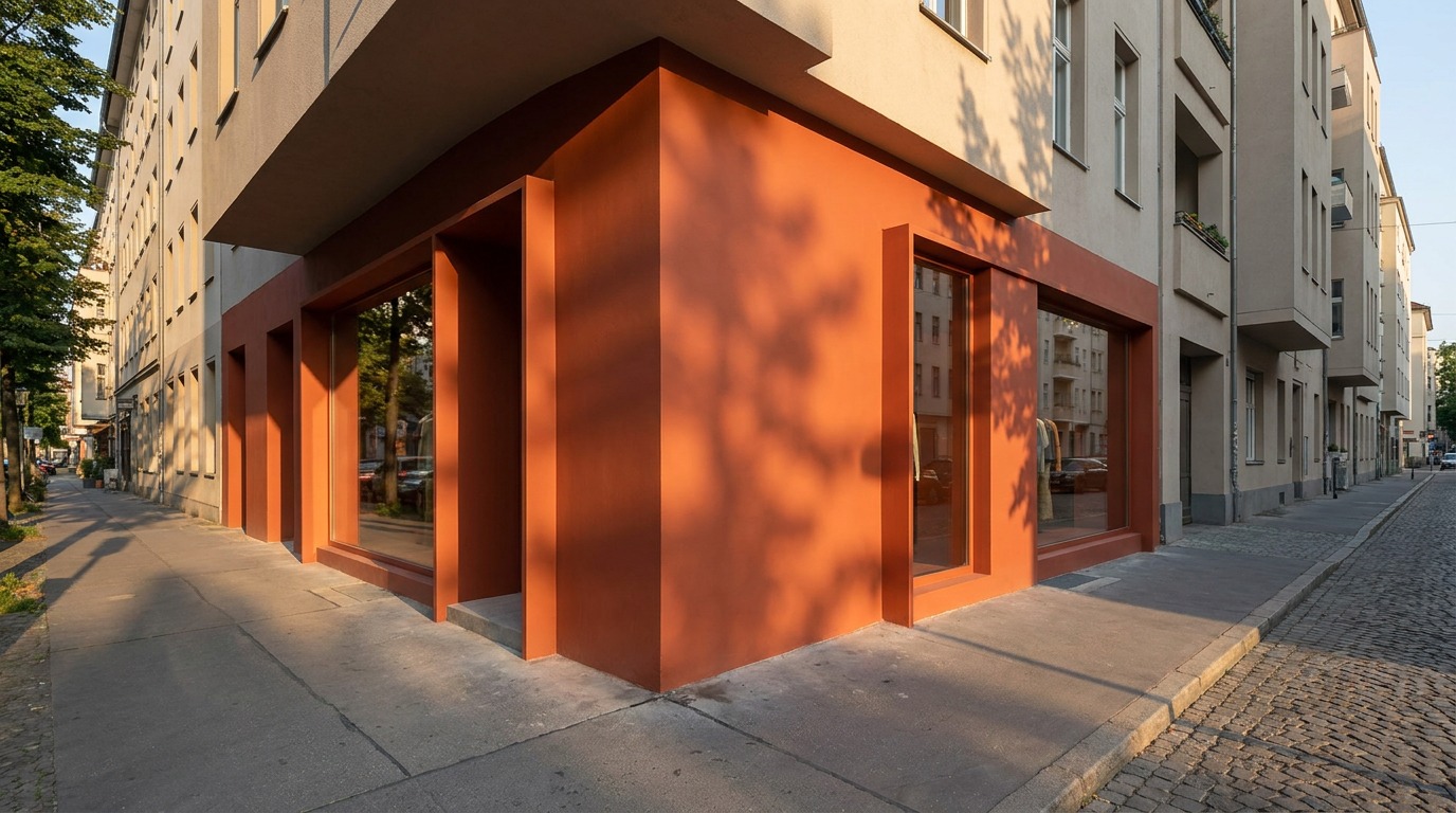
Retail and hospitality sit somewhere else entirely, since their color scheme is doing marketing work as much as architectural work. A boutique retail storefront often wants a facade color bold enough to function almost like signage from the street, while a hospitality space might lean warmer and more saturated specifically to feel inviting rather than restrained. I always ask a client what their business needs a visitor to feel within the first ten seconds inside the door, and build the palette backward from that answer rather than starting with a generic commercial color chart.
Medical and healthcare-adjacent spaces need their own logic again: calming, low-arousal palettes that read as clean and current without tipping into the cold, clinical blue-white that makes patients more anxious rather than less. The specific business type should drive the palette decision more than any general trend does.
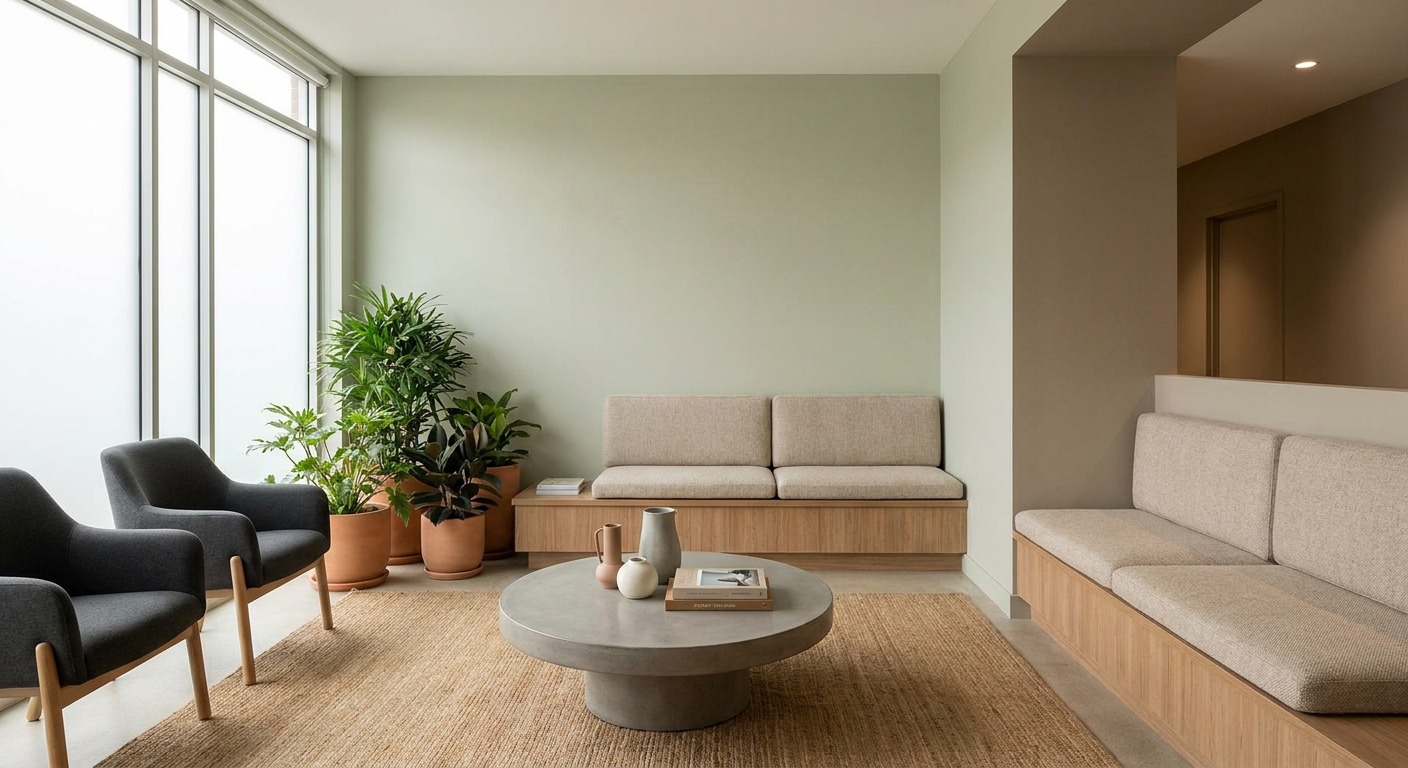
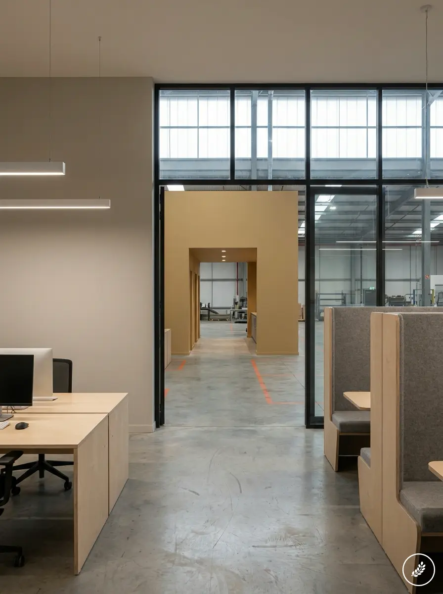
Industrial and warehouse-adjacent commercial spaces get overlooked in most color guidance, but they benefit from the same thinking. Safety-critical zones, loading areas, equipment paths, benefit from clear color coding that most people already read intuitively, while office-adjacent sections of the same facility can carry a warmer, more considered palette that signals the business takes its people as seriously as its operations. A warehouse doesn’t need to look like a showroom, but the sections where staff actually spend their day shouldn’t look like an afterthought either.
Commercial interior design colors for reception and common areas
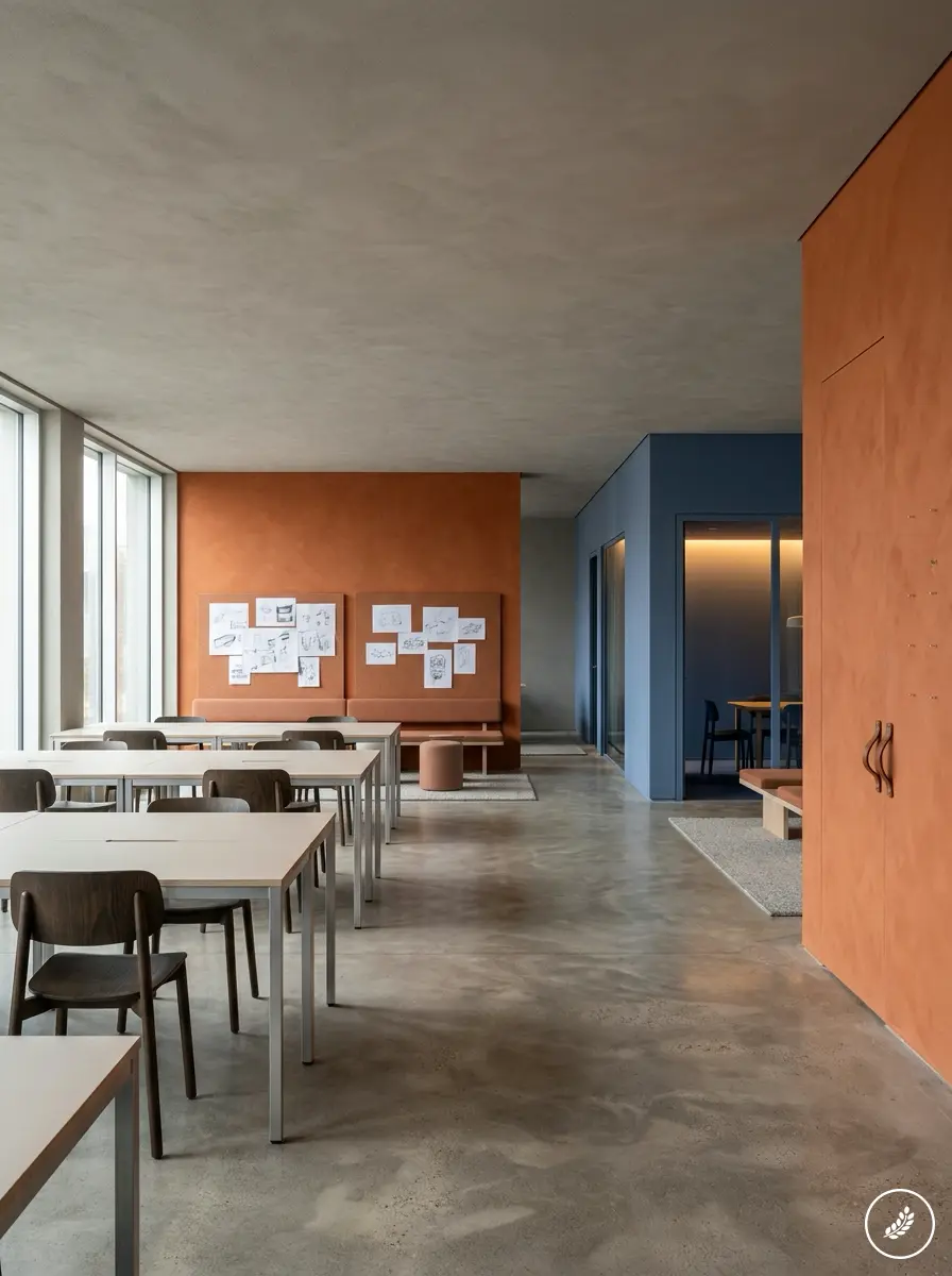
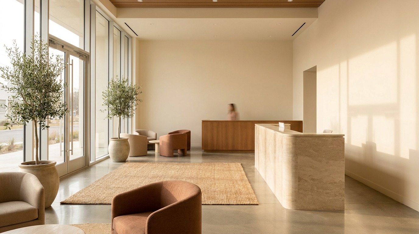
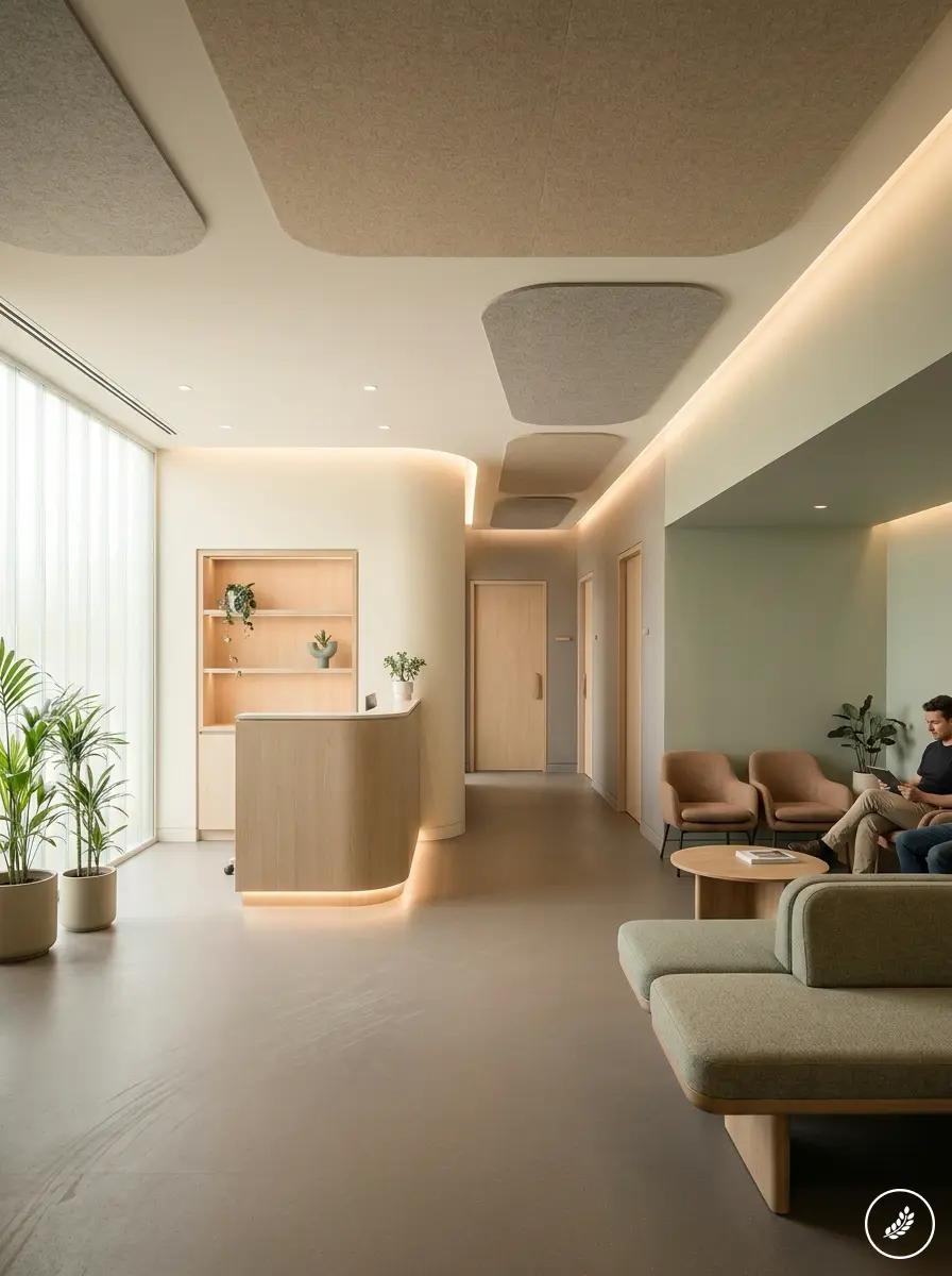
A reception area carries more design weight than its square footage suggests, since it’s often the only interior space every visitor sees regardless of why they came in. The color and finish here should feel intentional and current, generally warmer and more welcoming than the working areas beyond it, since a visitor’s first few minutes set the tone for how they judge everything that follows.
Common areas like corridors, break rooms and shared kitchens deal with heavier daily traffic and more wear than private offices, which should factor into both color and finish choice. A washable, slightly more durable finish in a mid-tone that hides scuffs and fingerprints performs better in these zones than a pale, delicate color that shows every mark within a few months of real use. If you’re weighing that kind of finish and durability decision for a specific project, working with a team that handles commercial painting services in Sydney day to day can save a lot of trial and error on which coatings actually hold up under real foot traffic.
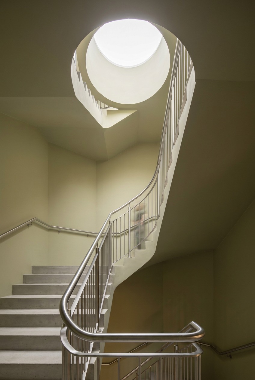
Elevators and stairwells are worth a specific mention, since they’re transitional spaces people move through quickly but notice more than expected precisely because there’s nothing else to look at. A confident, well-maintained color in these compressed spaces reads as attention to detail that extends the whole building’s presentation, while a scuffed or mismatched stairwell undercuts an otherwise well-designed lobby just a few steps away
For a Sydney fit-out, I’d have a commercial electrician in Sydney confirm any lighting, outlet or switch changes before approving the final paint palette, since even a small shift in color temperature can change how the walls read.
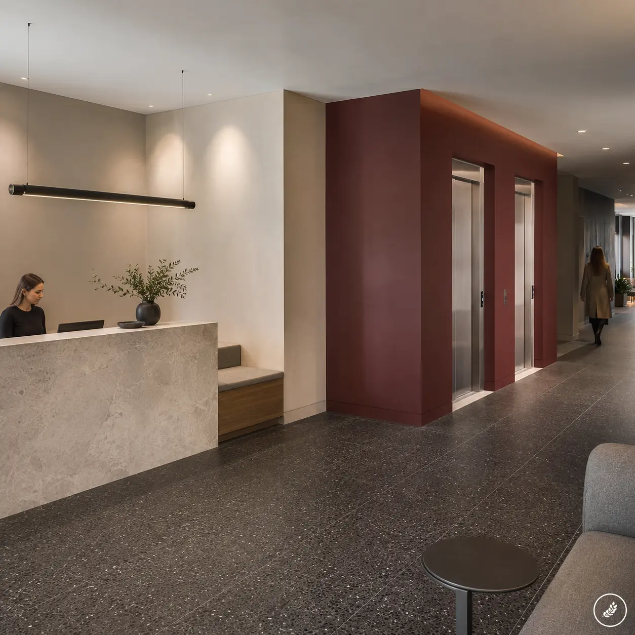
Bathrooms and kitchenettes deserve the same standard as the lobby even though they get far less design attention in most commercial buildings. These are close-quarters spaces where a visitor spends enough uninterrupted time to actually notice finish quality, chipped paint or a mismatched touch-up in a way they might miss entirely while walking briskly through a corridor. Treating these smaller rooms as an extension of the reception standard, rather than the lowest priority on the paint schedule, closes a gap most properties leave open.
Common mistakes: choosing color before fixing the surface
The single most common mistake I see is treating paint as a fix for a surface problem rather than a finish applied over one. Cracks, moisture damage, chalking and loose material all telegraph straight through a fresh coat within a season or two, and no amount of careful color selection changes that outcome. Surface prep, patching and moisture resolution have to happen before color decisions matter at all, not after.
The second common mistake is sequencing color choice before other planned work that will disturb the same surfaces. Repainting a facade before roof or gutter repairs means redoing the paint once the trades responsible for that work are finished, and choosing an interior palette before confirming lighting or fixture changes risks a color that looked right under the old light and wrong under the new. Lock in the structural and mechanical scope touching a surface first, then bring in color and finish as close to the final step as the project allows.
A third mistake, smaller but common, is choosing a color from a tiny sample chip and skipping a real test patch entirely. Paint reads differently at the scale of a whole wall than it does at the scale of a two-inch card, and lighting, adjacent materials and room proportion all shift how a color actually performs once it’s covering hundreds of square feet instead of a few square inches. A test patch, left up for a few days across different light conditions, catches most surprises before they become an expensive full-building mistake.
For residential projects using some of the same finish logic, I’ve covered the topic from the home side in four ways a professional painter can transform your home and in easy DIY painting tips for a flawless finish, both worth a look if the project in question is residential rather than commercial.
Color can help an office feel sharper, but the body still notices the chair first. This refurbished ergonomic chairs guide is a useful next step when a workspace needs comfort as well as better walls.
FAQ
How does commercial painting improve the value of a property?
Fresh, well-chosen paint improves first impressions, protects surfaces from moisture and wear, and makes older interiors feel brighter and better maintained without a full renovation. The effect is strongest when the color and coating are matched to the space’s actual use and lighting, rather than chosen for appearance alone. A property that looks cared for from the curb also tends to hold tenant interest longer, since color is one of the first signals a prospective tenant reads before they’ve evaluated anything about the lease itself.
Should exterior color choices be planned before or after other renovations?
Plan exterior color after any work that will disturb the same surfaces, such as roof repairs, facade cladding changes or window replacement, since repainting before that work usually means redoing it. Interior color decisions should similarly wait until lighting and fixture plans are confirmed, since artificial light shifts how a color reads.
How often should commercial color schemes be refreshed?
Timing depends more on exposure, traffic and coating quality than on a fixed schedule. High-traffic interiors and sun-exposed facades typically need attention sooner than low-use interior offices, and visible fading, chalking or scuffing is a more reliable signal than a calendar date. A short annual walk-through, checking the same high-exposure elevations and high-traffic corridors each time, catches the early stages of wear well before a full repaint becomes urgent.
Can paint color affect how a space feels without a full renovation?
Yes, often more than any other single change at a comparable cost. Lighter, more reflective interior colors can make a room feel brighter without new fixtures, and a confident facade color can modernize a building’s street presence without touching the structure underneath it.
How do I choose a color scheme that matches my business type?
Start with what a visitor should feel within the first ten seconds inside the door, then build the palette around that feeling rather than a generic idea of professional design. Financial and legal offices typically read best in restrained, low-saturation neutrals, creative businesses can carry more contrast and saturation, and retail or hospitality spaces often benefit from bolder, more memorable color that supports the brand.
Color is the fastest read a property gets
Color and finish are doing more communicative work than almost any other design decision on a commercial property, and they’re usually the cheapest to get right. Match the finish to the exposure it actually faces, choose interior palettes around how each zone gets used and lit, and let the business type shape the scheme rather than a generic idea of what “commercial” should look like.
Fix the surface before you choose the color, sequence the paint after anything else that touches the same walls, and the finished result reads as a property that was designed with intention, not one that just happened to get repainted at some point.
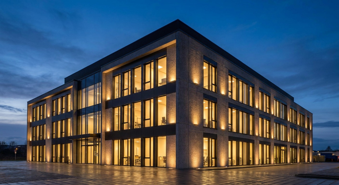
Walk the building the way a visitor would, starting from the street and moving through the entrance sequence before you look at anything else. The zones that get noticed first deserve the most careful color and finish decisions, and getting those right does more for how a property feels than a much larger, much more expensive renovation ever could on its own.
Related commercial space planning note
Color choices work harder when they are tied to circulation, daylight, and efficient commercial space design instead of being treated as a separate finish decision.
- 48shares
- Facebook0
- Pinterest48
- Twitter0
- Reddit0