Paint colors for selling a house should be chosen with the camera and the rooms in mind. A color that looks calm on a small chip can turn dull beside a warm oak floor or shift blue in an evening listing photo. Start with the surfaces you already own, then test paint in the actual light of each room.
The most useful color decision is often an undertone decision. Warm floors, cool tile and mixed light can make the same white paint read very differently from room to room. A buyer may not name that mismatch, but the photos will show it.
This guide builds one practical palette around existing floors, counters and fixtures. It covers where repainting is worth the effort, how to test samples, and how to carry the palette from the living room to the front door without making every room identical.
Paint will not hide a maintenance problem or fix a poor layout. Treat it as a finishing decision for a home that is already clean and in good repair, and keep a small sample board beside each major surface before buying gallons.
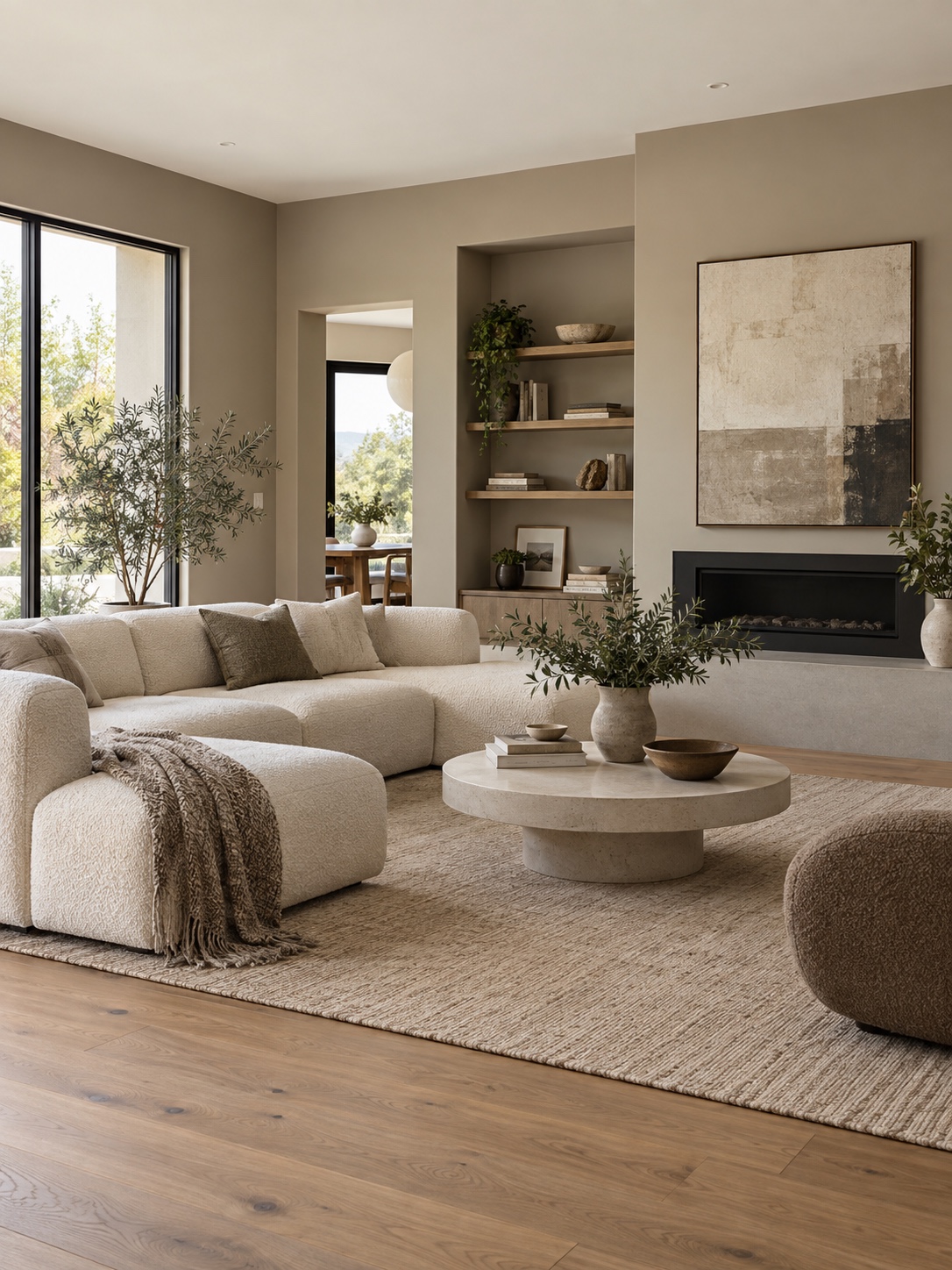
Should you repaint before selling? A visual checklist
Not every wall needs fresh paint before listing, and repainting a home you’re about to sell is its own decision, separate from picking colors.
When touch-up and a wall wash are enough
If the current color is neutral and the finish is sound, clean the wall and repair a few scuffs before committing to a full repaint. Test any cleaner in a discreet spot first: aggressive scrubbing can leave shiny patches on flat paint. Look for fading around windows and touch-up marks that become obvious in side light.
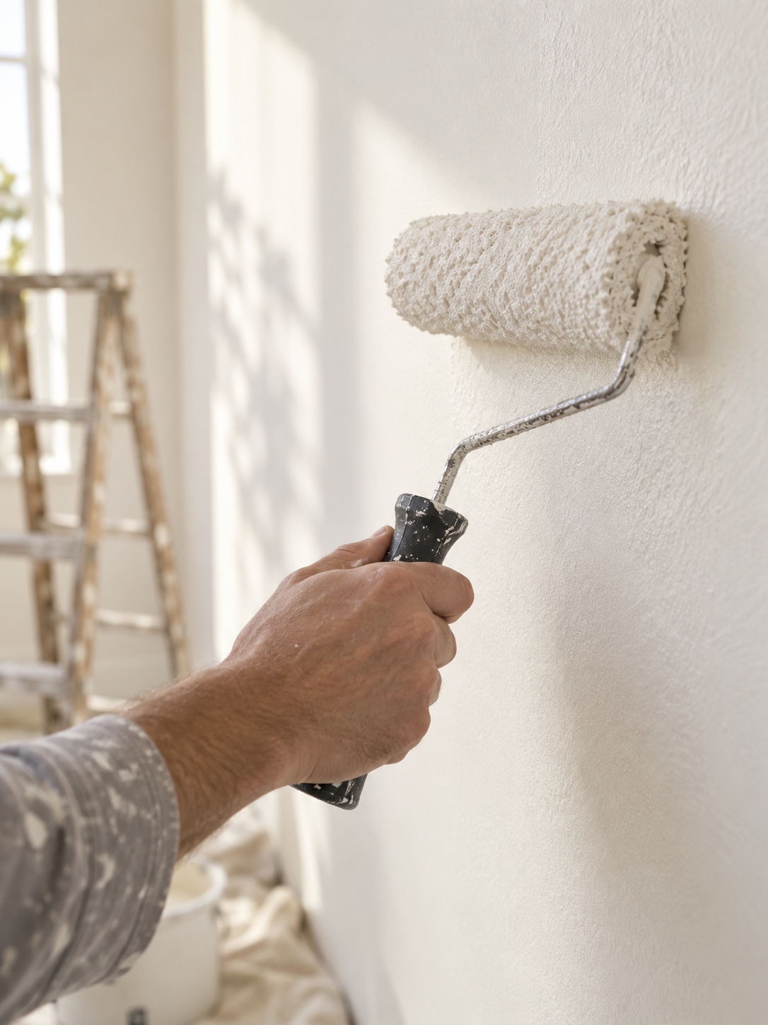
When color or wear is actively hurting showings
Bold colors, worn trim and patchy touch-ups can distract from the room in listing photos. Photograph each space from the doorway and repaint the surfaces that look uneven on screen. If the choice is close, a local team familiar with Salt Lake City listings can help prioritize rooms for that market; compare its advice with your budget before starting work.
Reading the room the way a buyer actually will
Do a five-minute walkthrough with your phone camera raised. Photograph each room from the doorway, as a listing photographer might. A photo compresses the space and can expose a wall color that clashes with the floor or makes an otherwise bright room look flat.
Build one palette around existing finishes
The palette that photographs well isn’t the trendiest one; it’s the one that agrees with the materials already installed in the house.
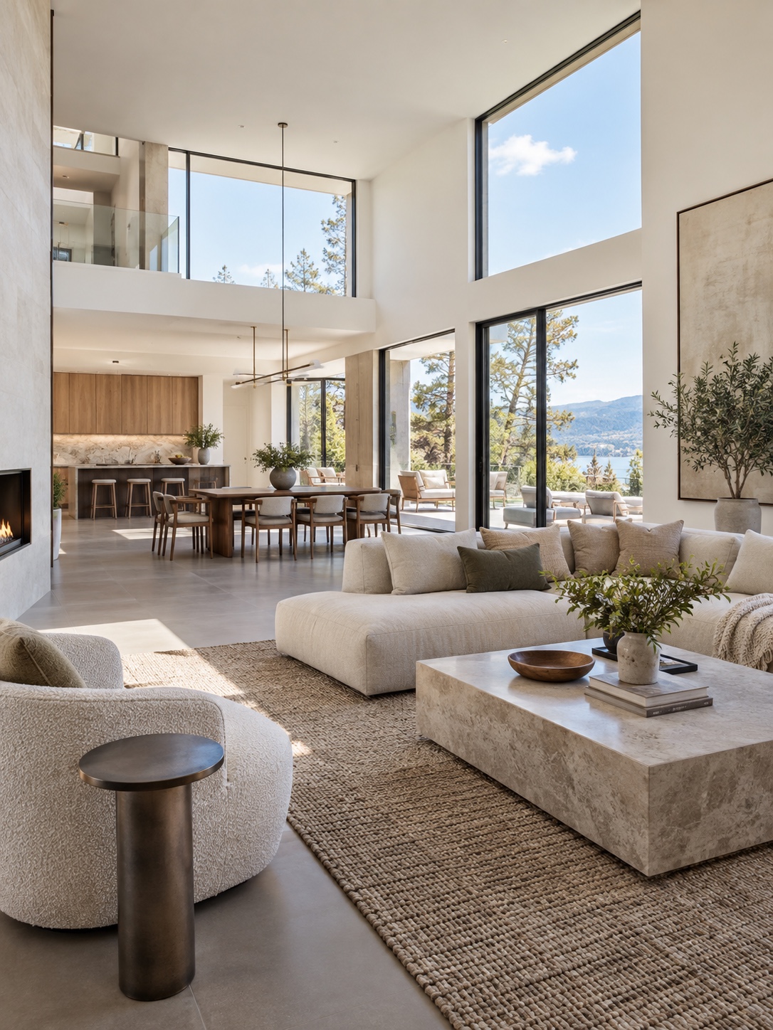
Reading the undertones in your floor, counters and tile
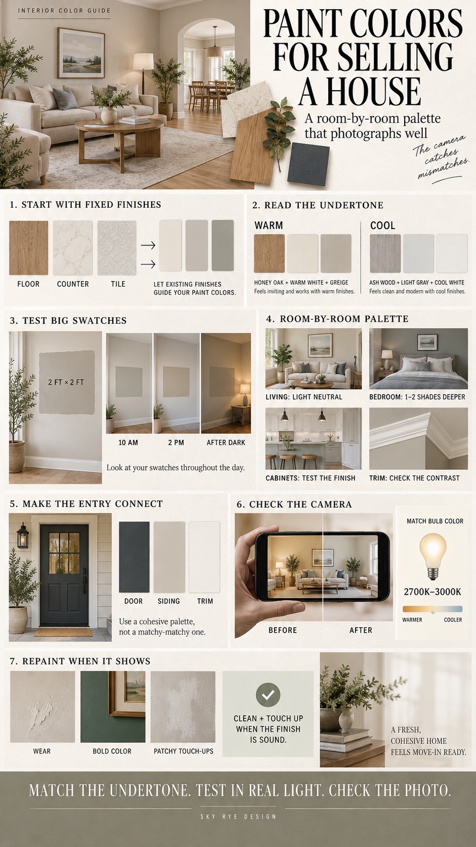
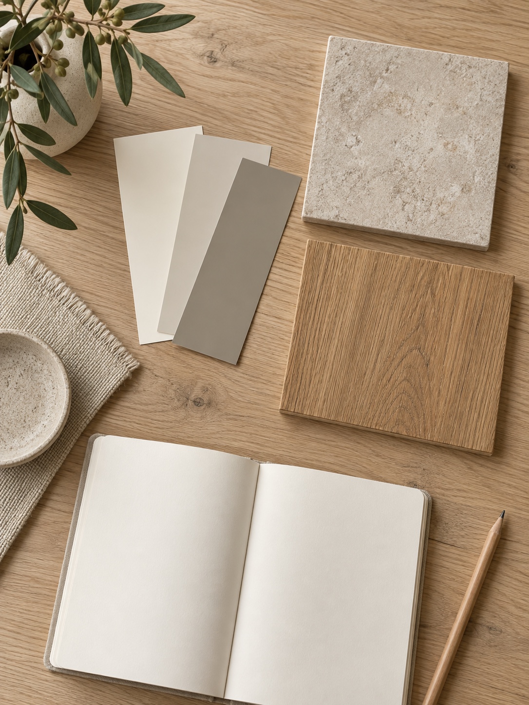
Neutral surfaces still have undertones. Hold paint samples beside the floor, countertop and tile in daylight, rather than judging a chip alone. Honey-toned wood and cream stone often sit better with warm whites or soft greiges; gray tile and ash-toned wood may call for a cooler neutral. Keep the samples together so you can see whether they belong to the same palette.
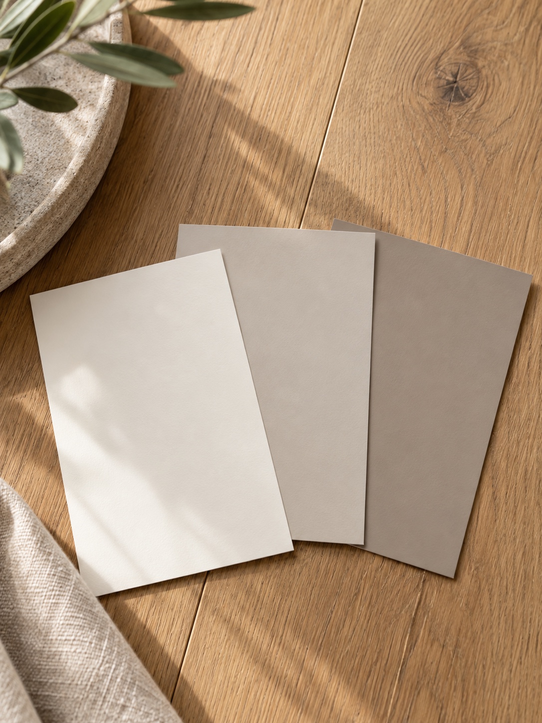
Testing samples in daylight and evening light
Test a large sample on the actual wall or a movable board, then look at it in the morning, afternoon and after dark under the room’s own lamps. Move the board beside the floor and countertop as well. Paint can shift noticeably as daylight changes; a sample check is much cheaper than repainting a room after the listing photos are booked.
Why one undertone should carry through the whole house
A buyer sees the house as a sequence. If connected rooms jump from a warm beige to a blue-gray and back again, the transition can feel unsettled in a walkthrough video. Keep one undertone family through shared sightlines, then vary the depth of color where a bedroom or smaller room needs its own mood.
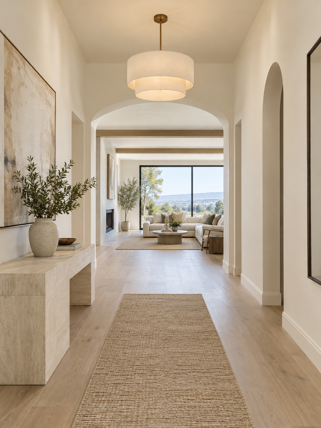
Paint colors by room: living areas, kitchen, bathroom and bedrooms
Once the undertone is settled, the room-by-room choices get much easier, because you’re no longer picking colors in isolation.
Walls and ceiling: color, contrast and the sense of space
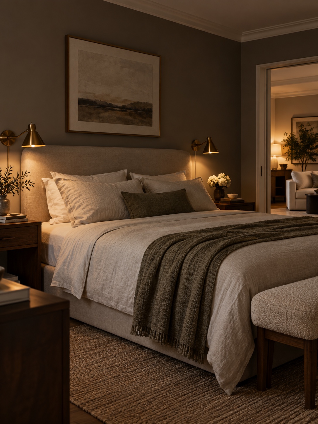
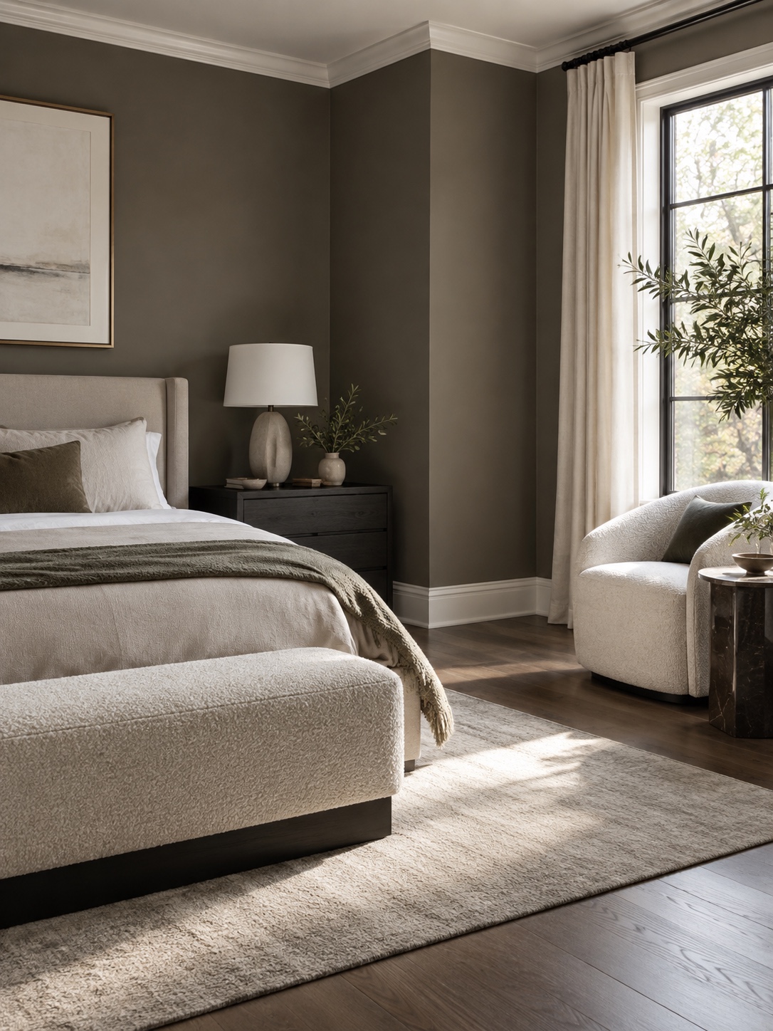
A soft warm white or light greige can keep a living area bright, while a slightly different ceiling white can define the edge of the room. In a small space, test both a subtle contrast and a matching ceiling; either can work depending on ceiling height and natural light. Bedrooms can go one or two shades deeper than the main living area if the undertone stays consistent.
Kitchen cabinets and bathroom: when repaint beats replace
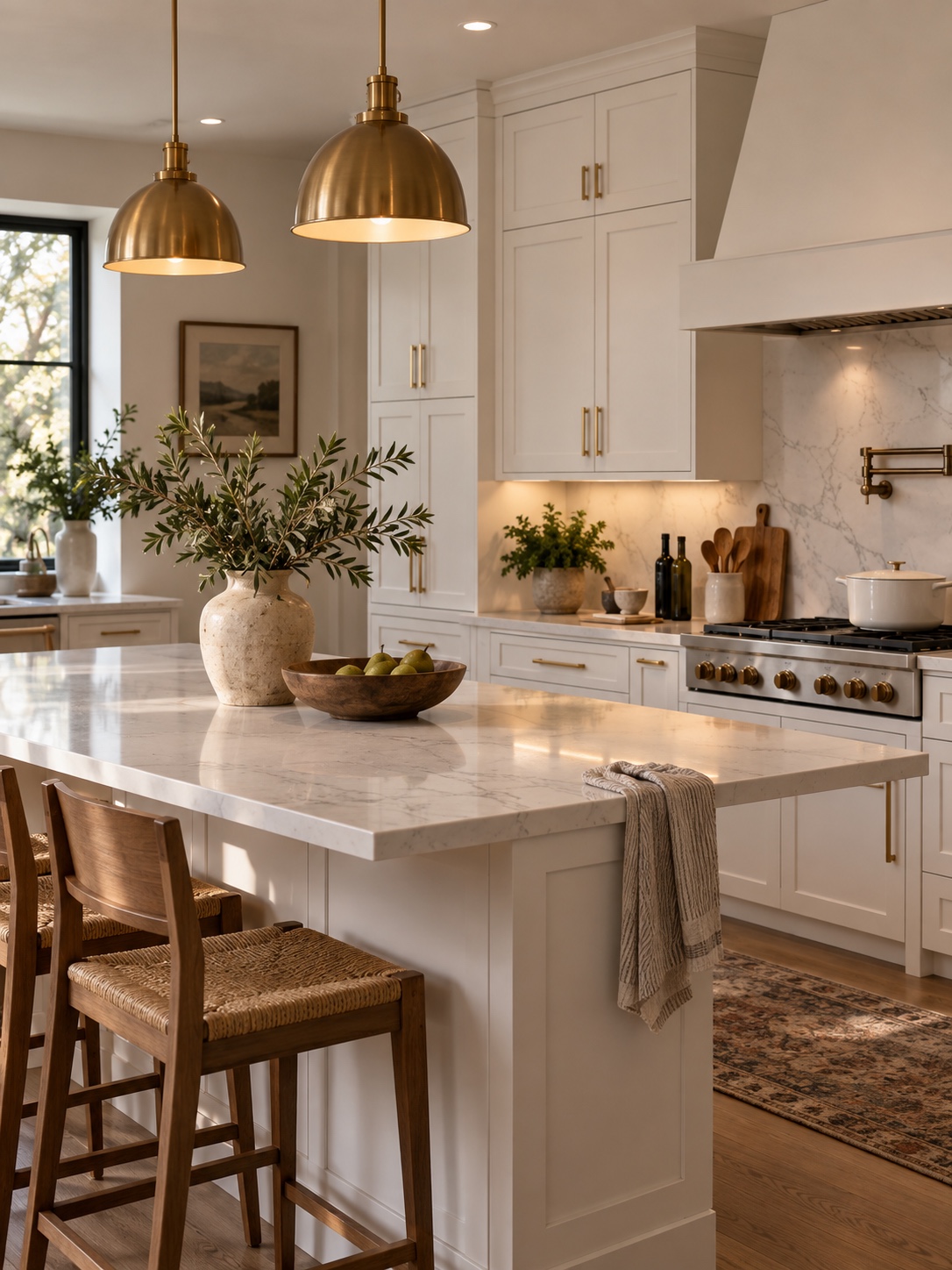
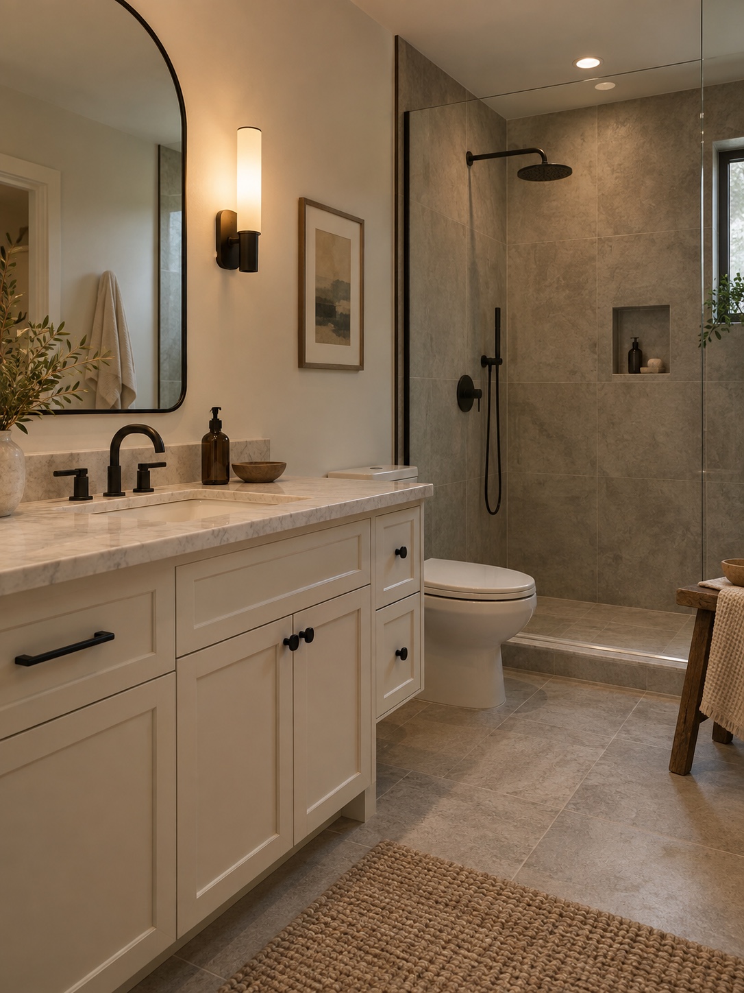
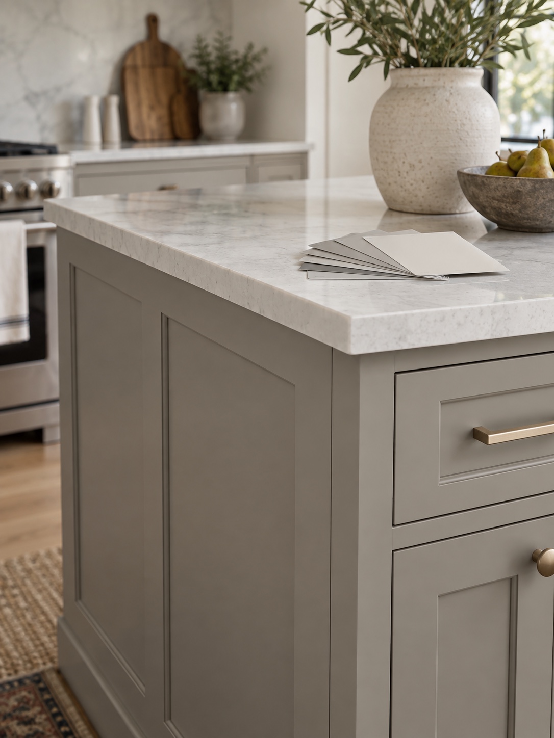
Cabinet replacement is a large project, so check the condition of the boxes and doors before choosing it for a pre-sale refresh. Sound cabinets can often be painted in a white or muted gray that works with the countertop and floor; a vanity can be treated the same way. Reusing the existing units can also reduce waste, an approach discussed in this home improvement guide. For changes beyond paint, see these kitchen remodel ideas.
Spray finish versus brush and roller for cabinets
Cabinet finish matters as much as color. A sprayed finish can look smooth when the doors are properly prepared and the product is applied well. If you use a brush and roller, choose a cabinet-rated coating and follow the label’s preparation, coat and cure instructions. Test the finish on one door before committing to the full kitchen.
Trim and door casings deserve the same attention as walls
Trim, baseboards and door casings often show scuffs beside freshly painted walls. Clean them first and decide whether touch-up or a full coat will look more even. Check the contrast in a photo: yellowed trim beside a cool new wall color is easier to spot on screen than it is while standing in the room.
Front door and exterior accents
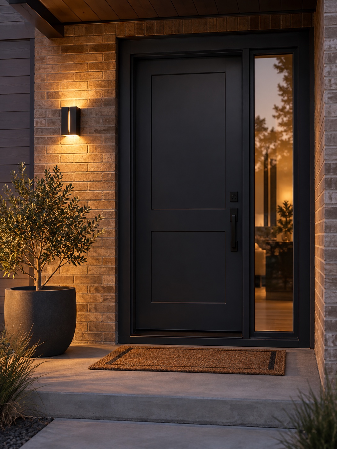
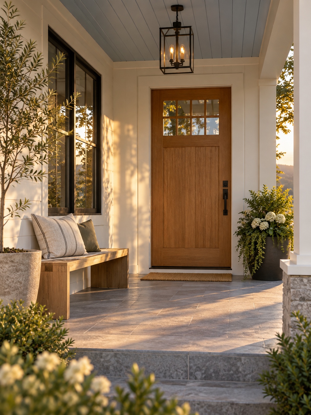
The front door is the one exterior color choice that directly frames a buyer’s first and last impression, and it needs to feel connected to what’s inside, not like a separate decision made by a different person.
A door color pulled from the same warm or cool family as your interior undertone reads as intentional rather than trendy. If your interior leans warm, a deep charcoal, forest green, or warm black door works; if it leans cool, a true navy or cooler black holds together better. Skip anything neon or high-saturation regardless of current trend cycles; listing photos compress color intensity, and an overly bold door can look garish in a thumbnail even if it looked great in person. Keep house numbers, mailbox, and any exterior trim in the same metal finish (matte black, aged brass, or brushed nickel) so the whole entry reads as one coordinated update rather than a pile of small mismatched fixes.
Siding, shutters and trim don’t need to match the door exactly
The door, shutters and trim do not need to match exactly. A deeper door color against quieter siding gives the entrance a focal point; matching every surface can make the facade look flat. Test the door sample outside at midday and dusk, then check it against the siding and roof before painting.
Porch ceilings and small architectural details
A pale blue or soft gray porch ceiling is a regional tradition in a lot of markets, and it’s worth keeping if your home already has it in good condition, since it photographs as an intentional, cared-for detail rather than something to strip out. If your porch ceiling is currently just unfinished or flat white and showing wear, a fresh coat in that same soft blue-gray family is a low-cost way to add a small, memorable detail to the entry sequence without competing with the door color for attention.
Make the palette work in listing photos
A palette that looks great to the eye in person can still underperform in photos if the lighting and small visual details aren’t accounted for.
Matching lamp color temperature and removing visual noise
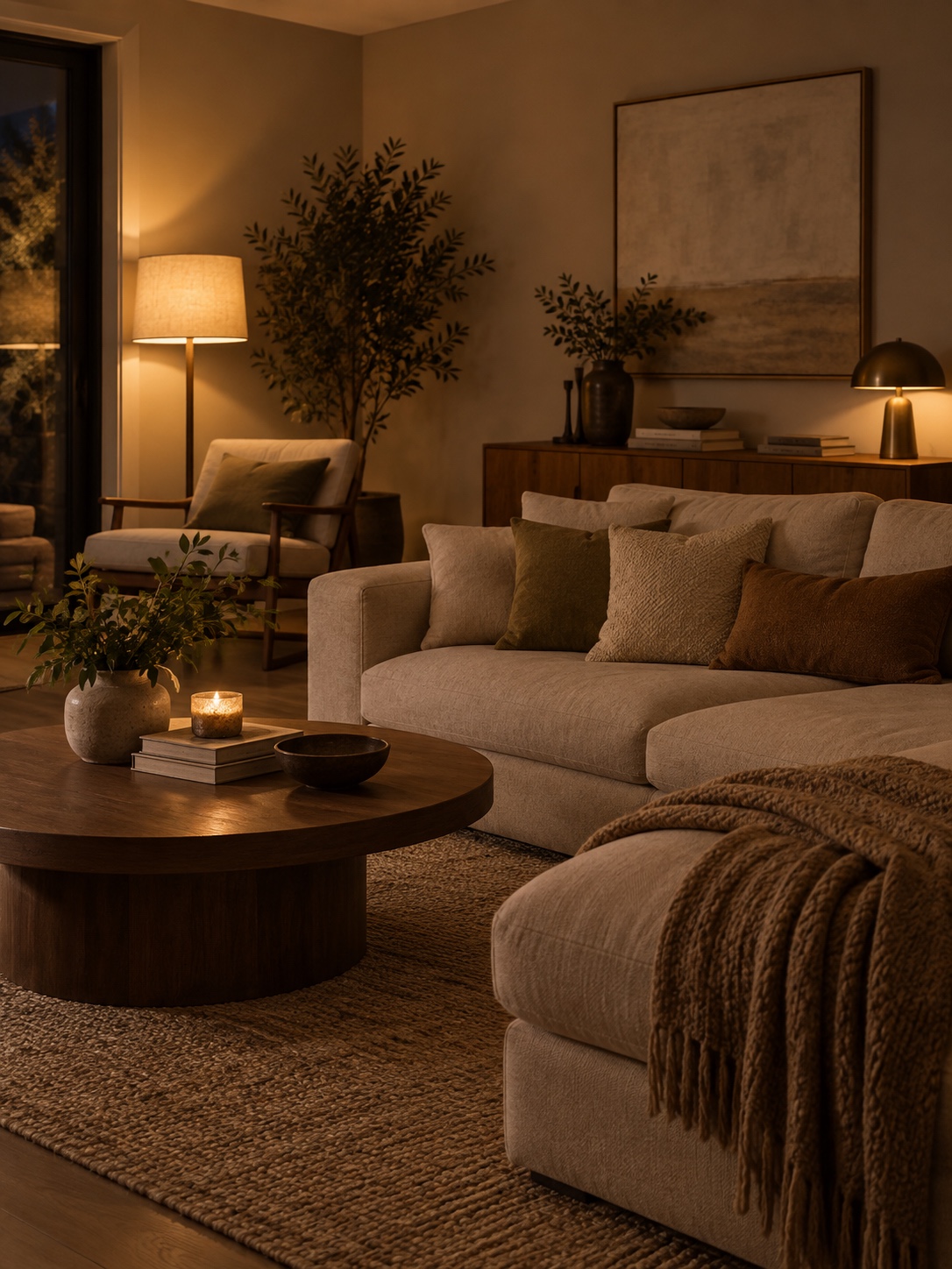
Mixed bulb colors can make a freshly painted wall look uneven in photos. Choose one warm-white range for the main living areas and check it in the actual fixtures before the shoot. Replacing mismatched bulbs with LED bulbs can make the lighting more consistent and use less energy; keep the color temperature similar from lamp to lamp.
A simple surface-by-surface testing table
| Surface | Shade Direction | Test Sample Size | Decision Point |
|---|---|---|---|
| Living room walls | Warm or cool white, matched to floor undertone | 2 ft x 2 ft swatch | Compare at 10am, 2pm, and after dark |
| Kitchen cabinets | Muted white or warm gray | Painted cabinet door sample | Check under daylight and under-cabinet lighting |
| Bathroom vanity | Off-white matching wall trim | Small painted board | View next to existing tile and countertop |
| Front door | Deep tone from same undertone family | Painted sample board outdoors | View at midday and again at dusk |
| Bedroom walls | Muted neutral, slightly deeper than living areas | 2 ft x 2 ft swatch | Compare under lamp light in the evening |
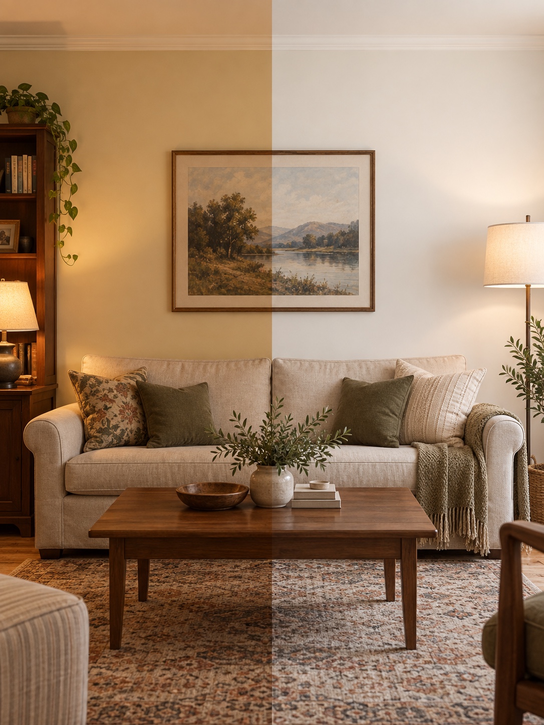
Take a few before-and-after photos from the same angle and at similar times of day. They will help you compare the palette without changes in lighting confusing the result. If you are also rearranging furniture, use a general staging guide; for hardware and fixture ideas, see these fast fixes for sellers.
Time the paint work around the photographer
Book the photographer after the final coat is dry and the room is ready to use. Dry-to-touch, recoat and full-cure times differ by product, temperature and humidity, so follow the paint label rather than a fixed three-day rule. Leave time to ventilate, put the room back together and check for missed patches in daylight.
A final walkthrough with fresh eyes
Once the walls are dry and the bulbs match, ask someone who has not watched the project unfold to walk through the house. Have them point out unfinished edges, mismatched switch plates or anything visually busy. A fresh set of eyes is useful just before the photographer arrives.
FAQ
Should I paint my house before selling it?
A clean, neutral wall with a sound finish may only need careful touch-ups. Repaint if wear, strong color or visible patches distract in listing photos. Test the result under the same light the photographer will use.
What paint color works best when selling a house?
There is no universal shade. Begin with the floor, countertop and tile undertones, then test a few compatible whites, greiges or muted neutrals in the room’s daylight and evening light. The best choice is the one that works with those fixed finishes.
Should every room be the same color?
No. A consistent neutral helps connected living areas flow together, while bedrooms can be a shade or two deeper. Keep the undertone family consistent where rooms are visible from one another.
Is painting the front door worth it before listing?
It can be worthwhile if the current finish is chipped, faded or out of step with the exterior. First clean the door and photograph it. If it still looks tired, test a new color against the siding, trim and interior palette before painting.
Final thoughts
Start with the floor and countertop undertones, test generous paint samples in real light, and check the result through a phone camera. Repaint the surfaces that visibly need it, keep connected rooms in one color family, and use the front door as a considered accent. That is a more useful plan than choosing a generic white for every surface.
- 64shares
- Facebook0
- Pinterest64
- Twitter0
- Reddit0