I still remember the first time an instructor made us measure a room with nothing but our own forearm, no tape measure allowed, just to prove that proportion isn’t really about numbers, it’s about relationships the eye can verify instantly.
Years later, working across automotive surfacing and architectural interiors, that lesson never stopped applying. A dashboard, a facade, a living room, they all succeed or fail on the same underlying logic: how the parts relate to each other and to the whole.
- Why Proportion Is the Real Foundation of Good Interior Design
- Classical Ratios Every Designer Should Actually Understand
- Furniture Scale: Matching Pieces to the Room They Live In
- Vertical Proportion: Ceilings, Windows, and the Often-Ignored Third Dimension
- Proportion Mistakes That Quietly Undermine a Room
- Conclusion
- Frequently Asked Questions
- What's the difference between scale and proportion in interior design?
- What size rug should I use under my living room furniture?
- How does ceiling height affect furniture selection?
- Is the golden ratio actually useful for real interior design decisions?
- How much walking space should I leave around furniture?
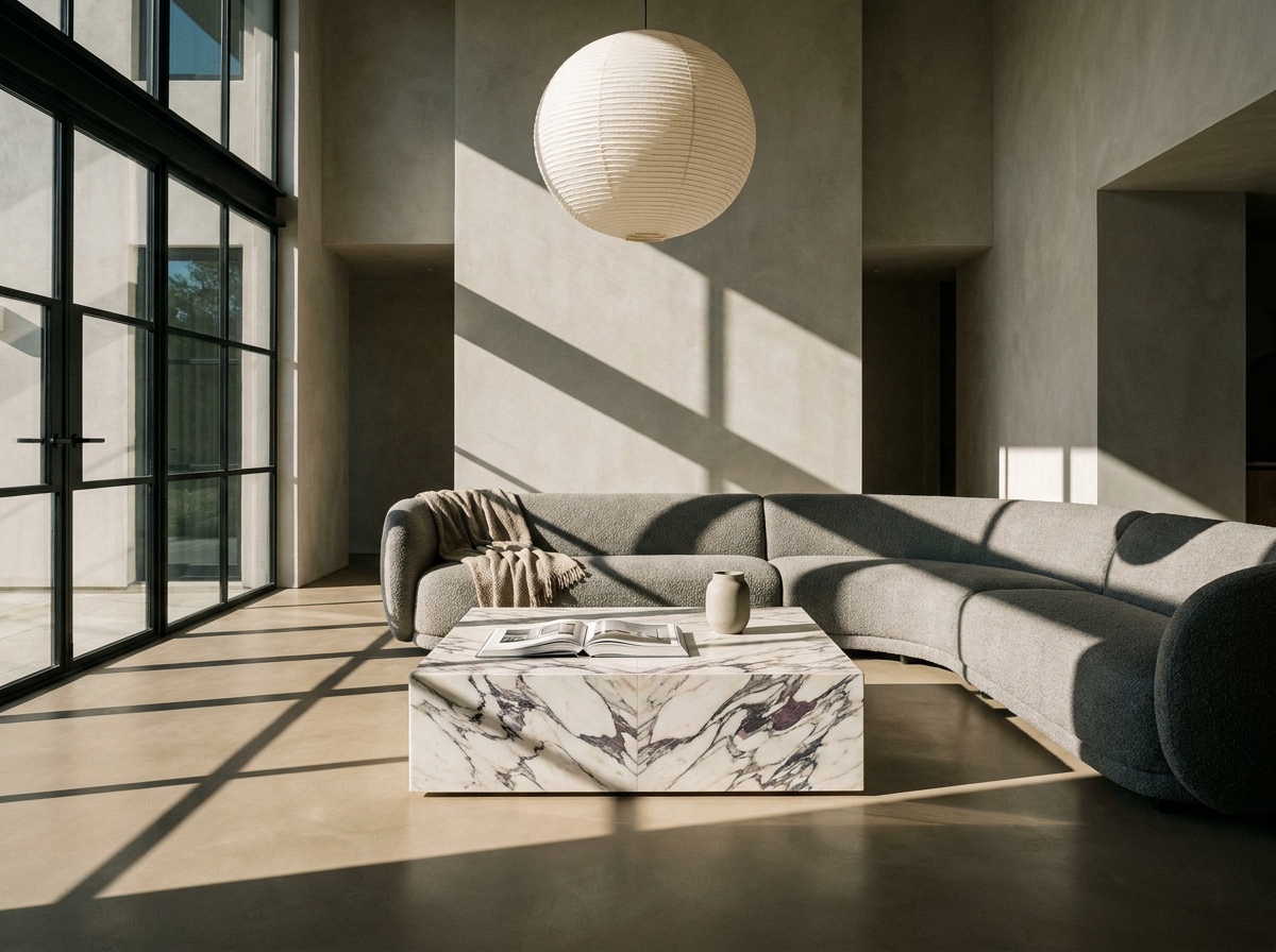
Most interior design content treats proportion as a footnote to color and furniture selection. That’s backwards. Proportion is the structural grammar underneath everything else, get it wrong and no amount of styling saves the room, get it right and even a sparsely furnished space reads as resolved.
This guide breaks down proportion in interior design the way I actually think about it on a project: classical ratios worth knowing, how scale works room by room, where most homeowners go wrong, and the practical techniques that fix a room that just feels slightly off without anyone being able to say exactly why.
Why Proportion Is the Real Foundation of Good Interior Design
Color trends change every few years. Proportion doesn’t. A room built on sound proportional relationships still reads as calm and resolved a decade later, regardless of what’s currently fashionable in finishes.
What Proportion Actually Means in a Room
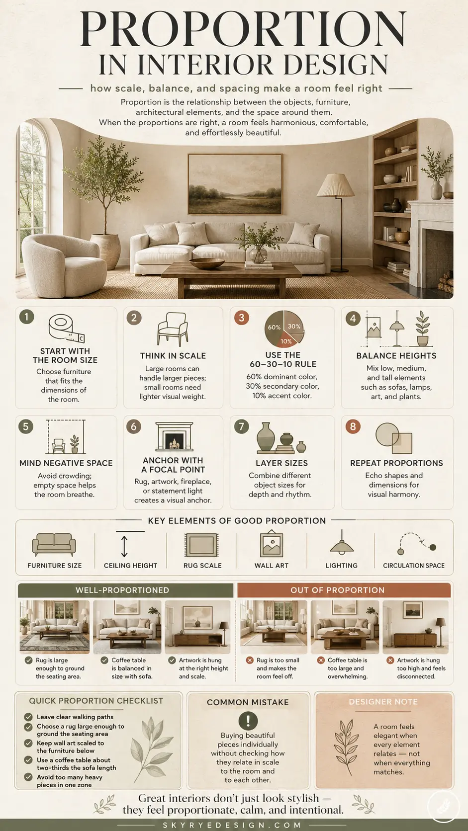
Proportion describes how parts relate to each other in size, not the absolute dimensions themselves. A sofa can be objectively large and still feel proportional in a big room, or objectively modest and feel oversized in a small one. It’s always relational, the sofa to the room, the coffee table to the sofa, the artwork to the wall behind it.
I learned to see this clearly through life drawing training, where the entire discipline revolves around comparing one part of a figure to another rather than measuring absolute lengths. A head that’s technically the right size in isolation can still look wrong if it doesn’t relate correctly to the shoulders beneath it. Rooms work identically. Nothing exists in isolation.
Scale vs. Proportion, and Why the Distinction Matters
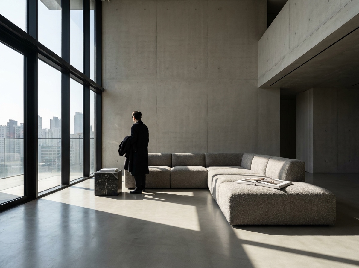
Scale refers to size relative to the human body, does a chair feel right to sit in, does a doorway feel comfortable to walk through. Proportion refers to size relative to other elements in the same composition. A room can have correct scale, furniture sized appropriately for a person, while still having poor proportion, if that furniture doesn’t relate well to the room’s own dimensions or to each other.
Quick tip: When a room feels “off” but you can’t identify why, check proportion before touching color or decor. A blue sofa in the wrong size will still look wrong once you repaint it a different blue.
Classical Ratios Every Designer Should Actually Understand
These aren’t decorative trivia. They’re working tools that show up constantly once you know to look for them.
The Golden Ratio, Applied Practically
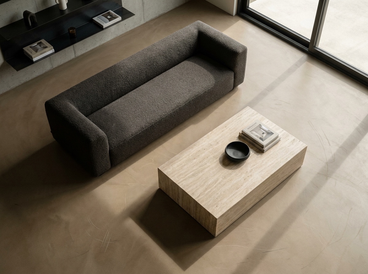
The golden ratio, roughly 1 to 1.618, shows up in furniture proportions more often than people realize, a coffee table that’s about 60% the length of the sofa it sits in front of tends to feel instinctively correct, close to that same ratio. I don’t measure this out with a calculator on every project, but I’ve internalized the rough visual relationship enough to spot when a piece is noticeably off from it.
Artwork placement benefits from the same logic. A piece hung above a console or sofa that occupies roughly two-thirds of that furniture’s width reads as intentional, while a piece that’s either much smaller or exactly the same width tends to feel accidental or overly rigid.
The Rule of Thirds in Room Layout
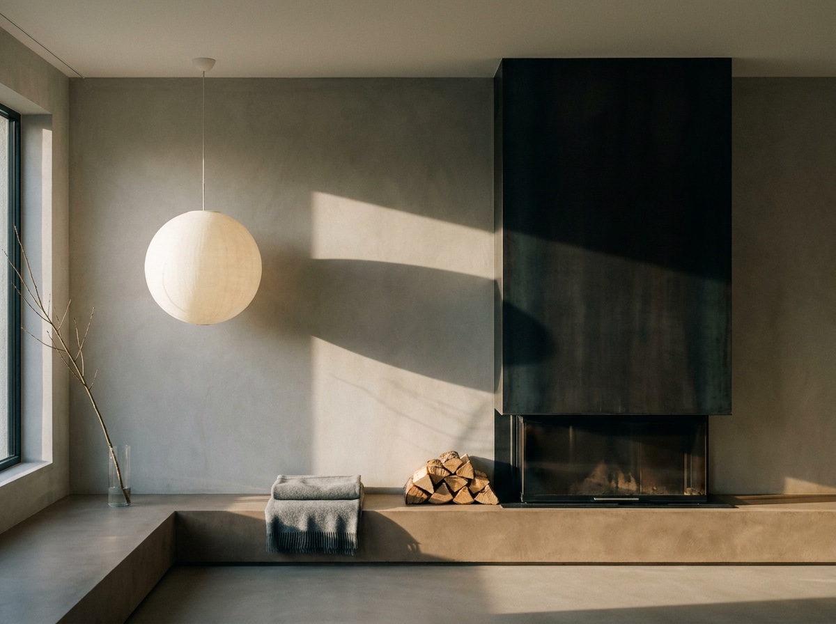
Borrowed directly from composition and photography, dividing a room’s key wall or floor area into thirds gives you natural placement points for a focal piece, a fireplace, an art wall, a statement light fixture, rather than defaulting to dead-center placement, which often reads as static rather than considered.
Modular Coordination and Repeating Units
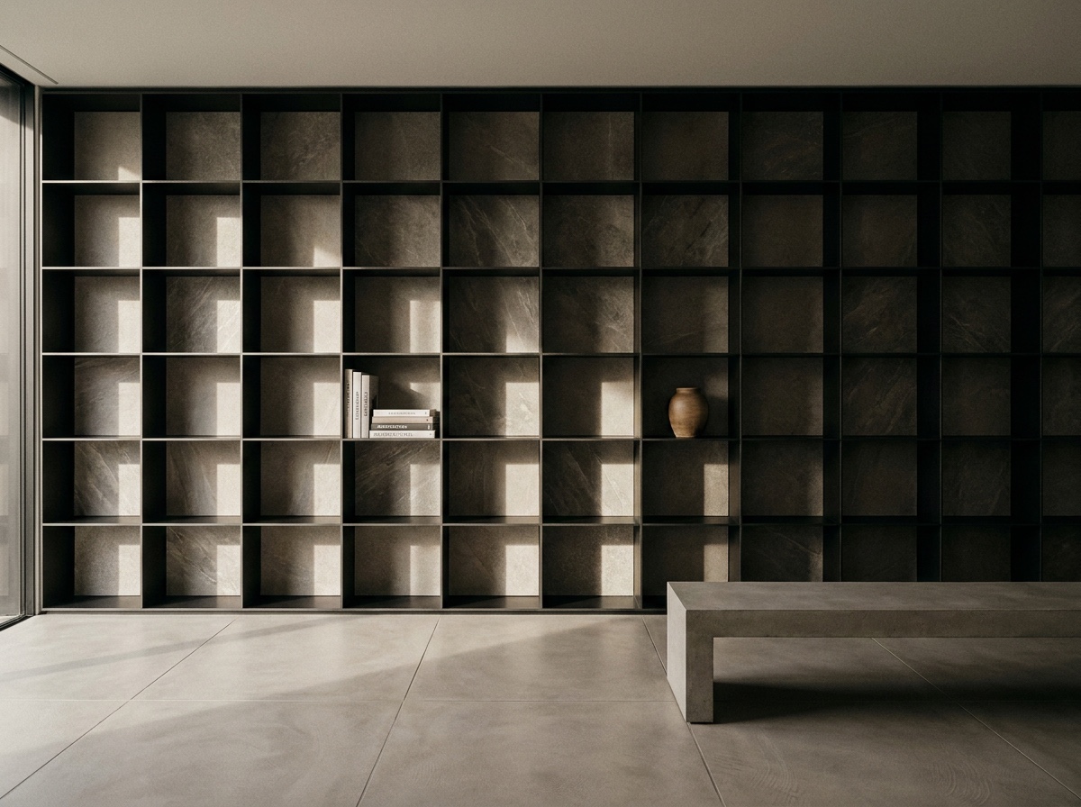
Architectural modular coordination, using a consistent base unit that scales up through furniture, millwork, and spatial divisions, keeps a room feeling coherent even when styles mix. I’ve used a single dimension, say a 4-inch module, to inform everything from tile grout lines to shelving spacing on a project, and the repetition reads as intentional even to people who couldn’t articulate why.
Furniture Scale: Matching Pieces to the Room They Live In
Furniture that’s individually beautiful can still wreck a room’s proportion if it doesn’t relate correctly to the space around it.
Reading Ceiling Height Before Choosing Furniture
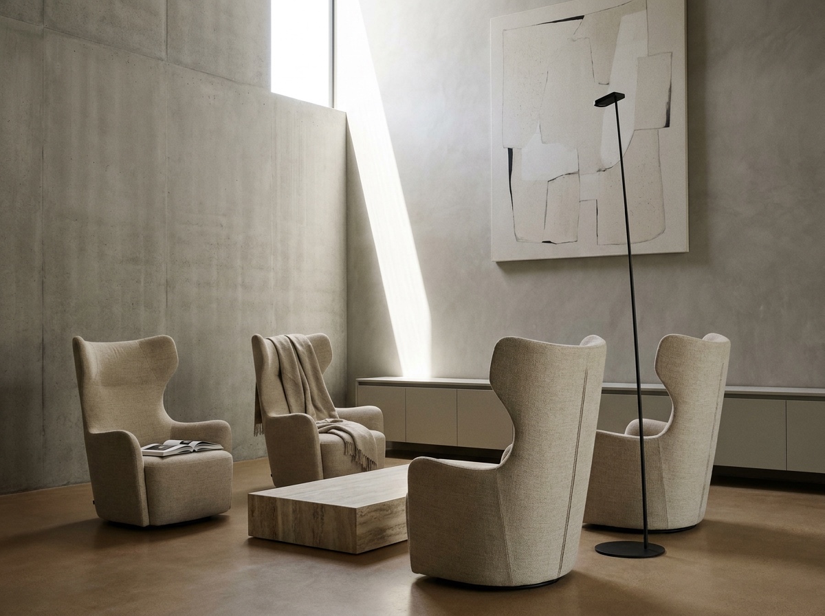
A low-slung sofa that looks sleek in a photo can feel lost under a 10-foot ceiling, while the same piece anchors a room with an 8-foot ceiling perfectly. I check ceiling height early in any furniture selection process, since it changes almost every subsequent decision, sofa arm height, table proportions, even how tall a floor lamp should read against the wall behind it.
Taller ceilings generally want furniture with more vertical presence, higher-backed chairs, taller case goods, art hung with more breathing room above it, so the eye has something to travel toward rather than reading the upper third of the room as dead space.
The Coffee Table and Sofa Relationship
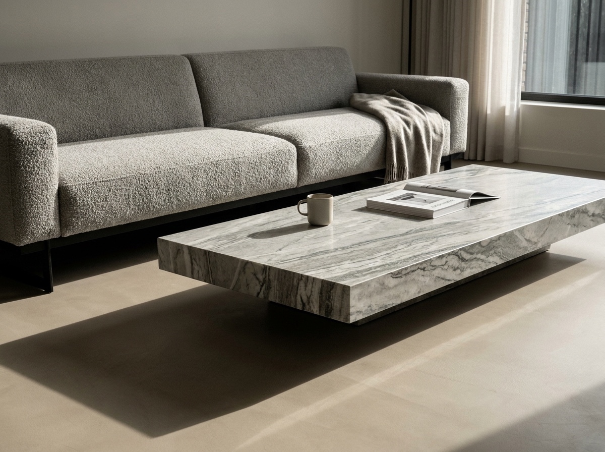
Beyond the rough golden-ratio length guideline, coffee table height matters just as much, ideally within an inch or two of the sofa seat height, close enough that reaching for a drink doesn’t feel like an awkward stretch downward or upward. I’ve measured seat heights on client sofas specifically to spec a custom table height when nothing off-the-shelf matched correctly.
Negative Space as an Active Design Element
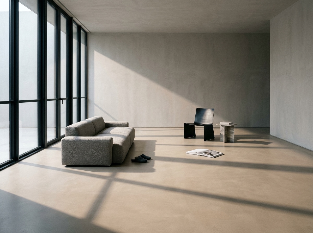
Empty floor space isn’t wasted space, it’s doing real proportional work by giving furniture room to read as individual objects rather than a crowded cluster. A rough guideline I use: leave at least 30 inches of clear walking path around primary furniture pieces, both for function and because that breathing room is what lets a room’s proportional relationships stay legible rather than visually compressed.
Quick tip: Photograph your room from the doorway before buying new furniture. Photos flatten depth perception in a way that makes scale problems, oversized or undersized pieces, immediately obvious in ways standing in the room doesn’t always reveal.
Vertical Proportion: Ceilings, Windows, and the Often-Ignored Third Dimension
Most proportion mistakes happen because people design in plan view, floor layout only, and forget that a room is experienced vertically just as much as horizontally.
Window and Door Proportion
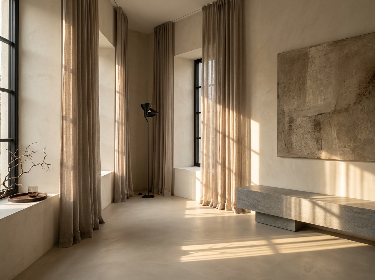
Window height relative to wall height shapes a room’s entire mood, tall windows that extend closer to the ceiling read as more generous and airy than the same window width set lower on the wall. When window placement can’t change, curtain hardware mounted higher than the window frame itself, closer to the ceiling, visually extends the opening and improves the room’s vertical proportion without any construction work.
Layering Height Through Lighting and Millwork
A room with everything sitting at roughly the same height, artwork, shelving, lighting, all clustered around eye level, reads as visually flat regardless of how good each individual piece looks. I deliberately stagger height across a room, a floor lamp reaching toward the upper third, artwork occupying the middle band, low furniture anchoring the base, so the eye travels through the full vertical volume rather than stalling at one level.
Molding and Trim as Proportional Tools
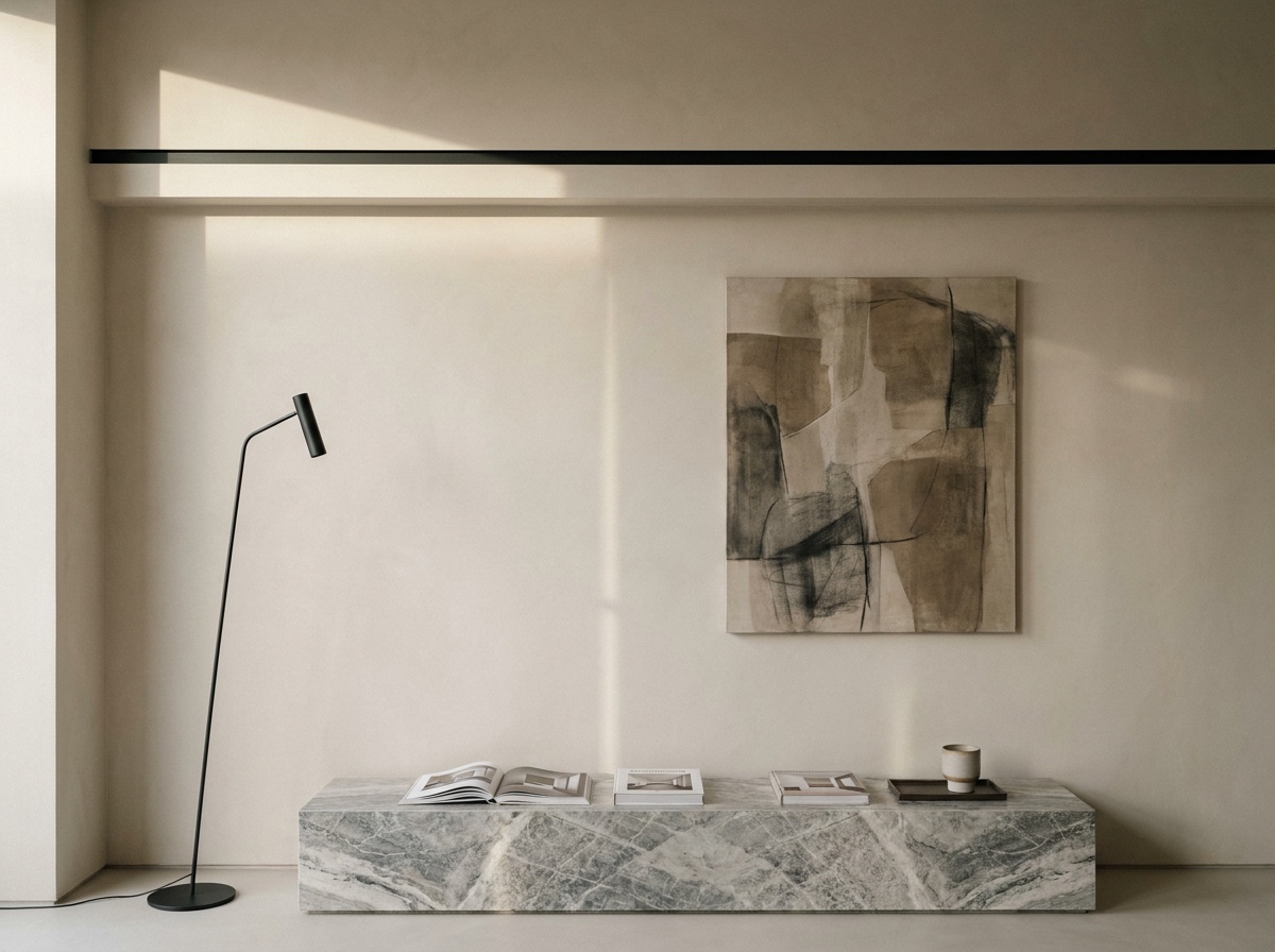
Crown molding, picture rail, or a simple painted band near the ceiling can visually adjust a room’s proportion without touching the actual architecture, a band of contrasting color a foot below the ceiling line can make a too-tall room feel more grounded, while all-white trim from floor to ceiling tends to exaggerate height further.
Proportion Mistakes That Quietly Undermine a Room
A handful of recurring errors explain most of the “something feels off” complaints I hear from clients.
The Undersized Rug Problem
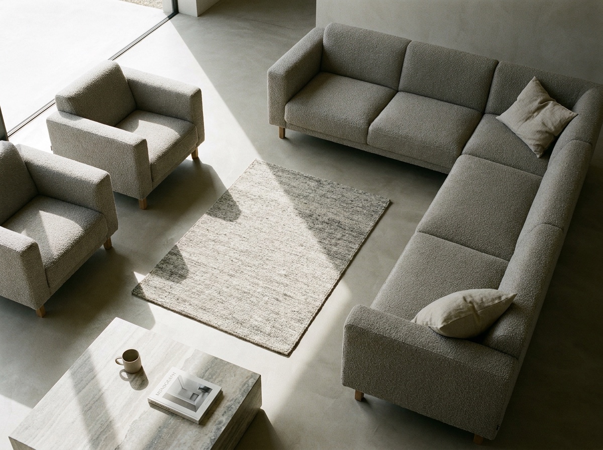
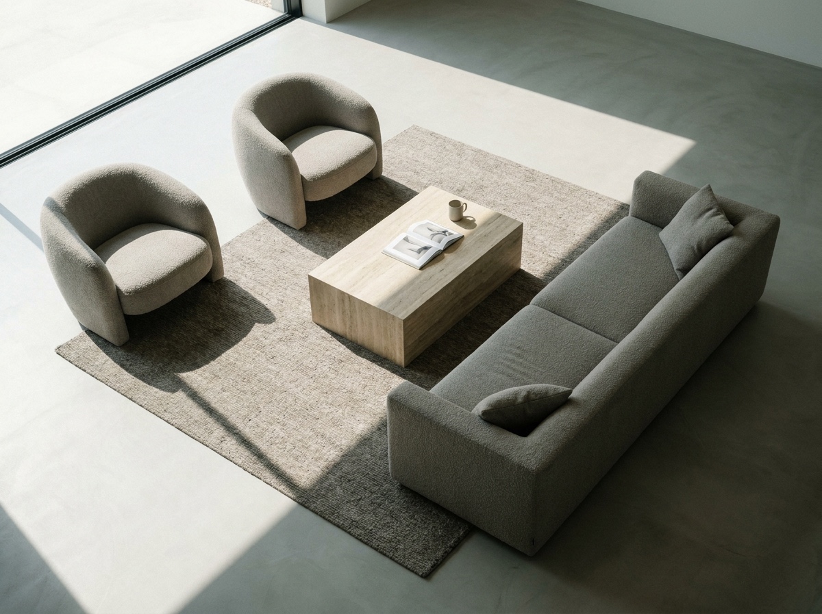
An area rug too small for its furniture grouping is probably the single most common proportion mistake in residential interiors. Front legs of major furniture pieces should sit on the rug at minimum, ideally all four legs for a fully anchored look, rather than the rug floating disconnected in the center of the seating arrangement like an island.
Matching Everything to the Same Scale
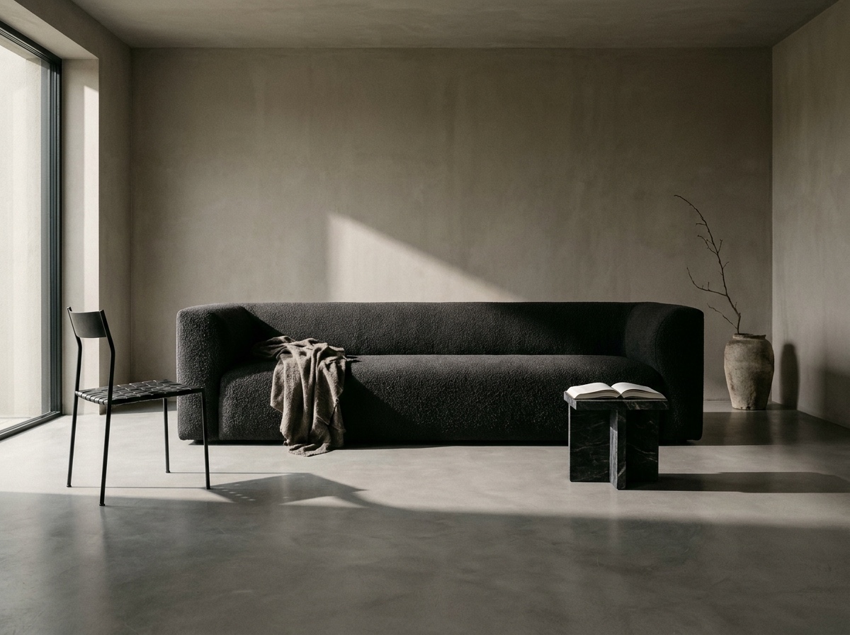
A room where every piece is roughly the same visual weight, all similarly sized furniture, all similarly scaled art, reads as monotonous rather than harmonious. Genuine proportional success usually includes deliberate contrast, one larger anchor piece against smaller supporting elements, rather than uniform scale throughout.
Ignoring How Adjacent Rooms Relate
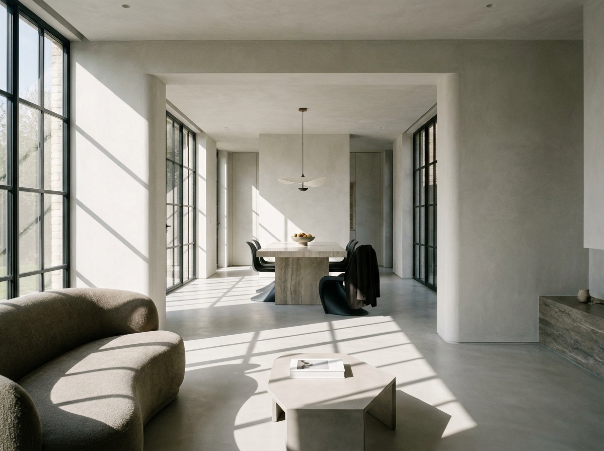
Proportion doesn’t stop at a doorway. A large, generously scaled living room next to a cramped, undersized hallway creates a jarring transition that undermines both spaces. I look at sightlines between connected rooms specifically for this reason, checking whether the proportional language carries through or breaks abruptly at each threshold.
Quick tip: Stand in the center of your main living space and look toward every doorway and hallway visible from that point. If one of them feels noticeably cramped or mismatched in scale, that transition point is usually where the room’s overall proportion starts to unravel.
Conclusion
Proportion is the part of interior design that works silently in the background, the reason a room feels resolved or slightly wrong long before anyone consciously registers color or furniture style. Classical ratios give you a starting framework, but the real skill is learning to read relationships, sofa to room, table to sofa, window to wall, the way you’d read any composition.
Walk your own space this week and check the basics first: does your rug anchor the furniture, does your ceiling height match your furniture’s vertical presence, does the transition between rooms feel continuous. Fix those relationships before anything else, and most of what people call “styling” starts falling into place on its own.
Frequently Asked Questions
What’s the difference between scale and proportion in interior design?
Scale refers to size relative to the human body, whether furniture feels comfortable to use. Proportion refers to how elements relate to each other in size, sofa to room, table to sofa. A room can have correctly scaled furniture that’s still poorly proportioned if those pieces don’t relate well to each other or the space.
What size rug should I use under my living room furniture?
At minimum, the front legs of your major furniture pieces should sit on the rug, ideally all four legs for the most anchored look. A rug that floats disconnected from the furniture arrangement is one of the most common proportion mistakes in residential rooms.
How does ceiling height affect furniture selection?
Taller ceilings generally call for furniture with more vertical presence, higher-backed chairs, taller case goods, art hung with more space above it, so the room’s upper volume doesn’t read as empty. Lower ceilings often suit lower-profile furniture that doesn’t compete with the compressed vertical space.
Is the golden ratio actually useful for real interior design decisions?
Yes, in a practical rather than mathematical sense. A coffee table around 60% the length of its adjacent sofa, or artwork spanning roughly two-thirds the width of the furniture below it, both approximate the golden ratio and tend to read as instinctively correct without needing to calculate the exact figure.
How much walking space should I leave around furniture?
A rough guideline is at least 30 inches of clear path around primary furniture pieces. Beyond function, that negative space is what allows a room’s proportional relationships to stay visually legible rather than feeling crowded or compressed.
- 70shares
- Facebook0
- Pinterest67
- Twitter3
- Reddit0