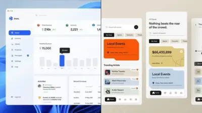
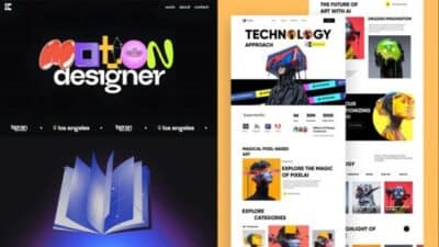
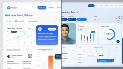
As we move through 2025, website design continues to evolve at a rapid pace, blending aesthetic appeal with functional innovation. Modern web design is shifting towards cleaner aesthetics while embracing creative elements that push traditional boundaries. Trends like purposeful white space, asymmetrical layouts, and dark mode implementations are becoming essential for brands looking to create memorable digital experiences.
The landscape of digital design now celebrates both minimalism and experimental approaches. Anti-design elements that challenge conventions through cluttercore and experimental typography are gaining popularity among forward-thinking brands. From floating objects that defy structural norms to nostalgic retro tech aesthetics, designers are finding new ways to capture user attention while maintaining functionality.


Key Takeaways
- Modern web design is embracing both minimalist principles and boundary-pushing experimental elements to create distinctive user experiences.
- Dark mode, purposeful white space, and asymmetrical layouts have become fundamental components of contemporary website aesthetics.
- Implementing these design trends can significantly enhance user engagement while keeping your digital presence fresh and competitive.
Essential Web Design Trends
The digital landscape continues to evolve rapidly, with several key design approaches becoming must-haves rather than optional extras. These trends not only enhance visual appeal but also improve functionality and user experience across all devices.
Minimalist Design and Whitespace
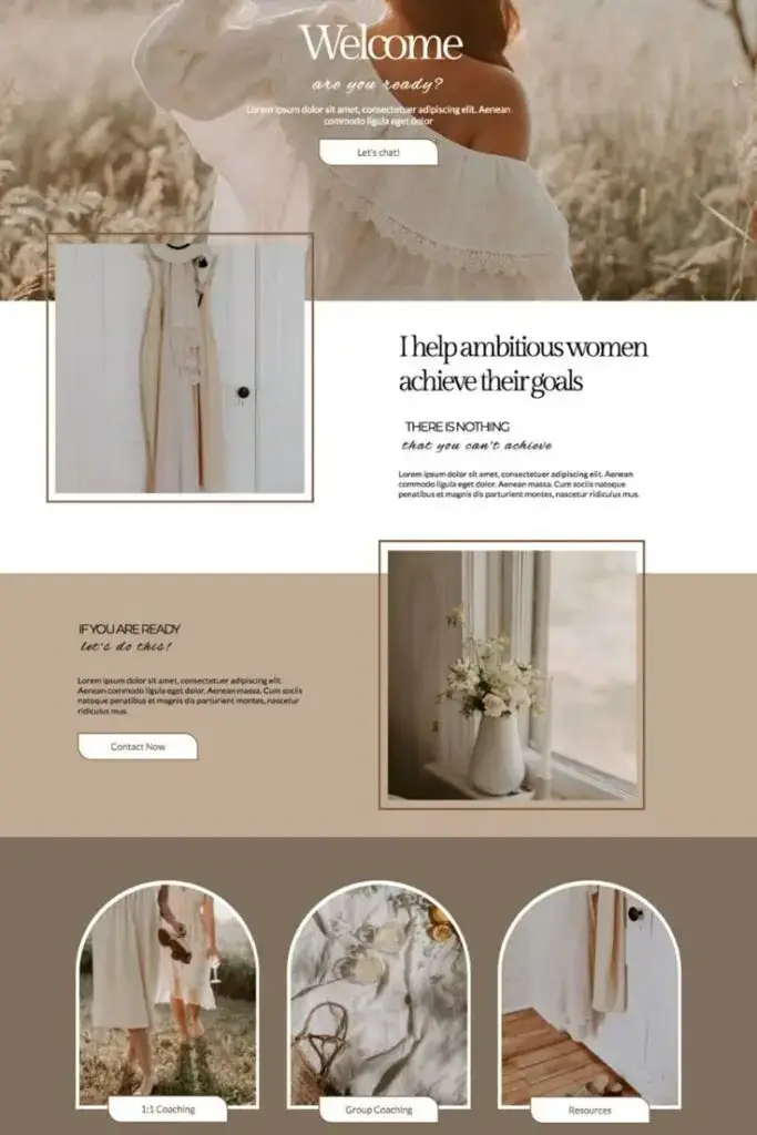
Minimalist design remains at the forefront of modern web aesthetics in 2025. By embracing simplicity and clean layouts, your website can communicate more effectively with less visual clutter. Think of whitespace as a powerful design element rather than empty space.
A clean design approach allows your content to breathe and helps users focus on what’s important. Many leading brands are now using ample whitespace to highlight key messages and create a sense of sophistication.
Try incorporating:
- Simplified navigation menus
- Reduced color palettes (2-3 primary colors)
- Focused content with fewer distractions
- Strategic use of negative space to guide the eye
This approach isn’t just visually pleasing—it improves load times and creates a more intuitive user journey through your site.
Bold Typography and Bright Colors
Typography has evolved from a mere readability concern to a central design element. In 2025, bold fonts and striking typography choices serve as powerful visual anchors that can instantly communicate your brand personality.
Large, expressive headlines paired with bright, vibrant colors create immediate visual impact. You’ll notice many websites now use typography as the hero element rather than relying solely on images.
Consider these typography trends:
- Oversized type for headers and key messages
- Custom fonts that reflect your brand identity
- Variable fonts that adjust dynamically
- Bright color contrasts between text and backgrounds
This combination of bold typography and bright colors creates memorable visual experiences while maintaining readability across devices.

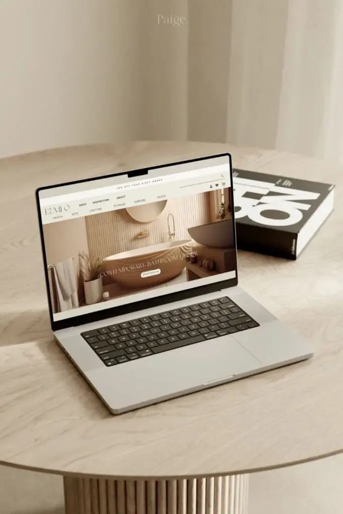
Responsive and Mobile-First Design
With mobile traffic consistently exceeding desktop usage, a mobile-first approach is no longer optional. Your website must deliver an exceptional experience regardless of screen size or device.
Responsive design has evolved beyond basic adaptation to truly device-agnostic experiences. This means thinking about how users interact with your content on smaller screens first, then expanding to larger displays.
Key aspects to implement:
- Touch-friendly navigation elements
- Content prioritization for smaller screens
- Faster load times through optimization
- Thumb-zone mapping for interactive elements
A truly responsive, mobile-first website improves your search engine ranking while ensuring every visitor enjoys a seamless, user-friendly experience regardless of how they access your site.
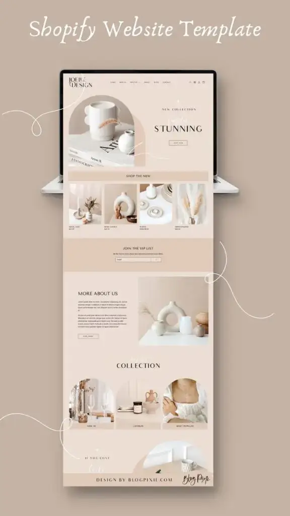

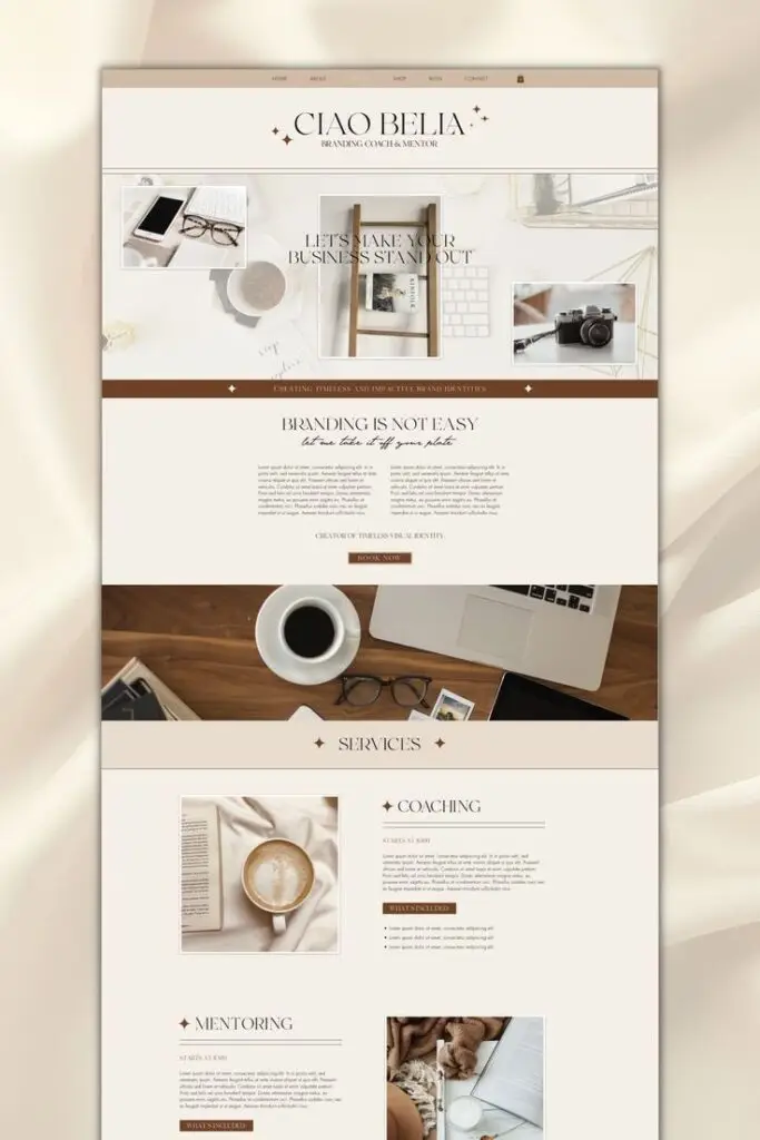
Enhancing User Experience (UX)
User experience has become the cornerstone of modern website design in 2025. Effective UX design creates meaningful connections with visitors and transforms casual browsers into loyal customers through thoughtful interactions.
Intuitive Navigation and User Interaction
Creating seamless navigation pathways is crucial for keeping visitors engaged on your site. When users can easily find what they’re looking for, they’re more likely to stay longer and explore further. Consider implementing breadcrumb trails that show users exactly where they are within your site’s hierarchy.
Prioritize accessibility by ensuring your navigation works for everyone, including those with disabilities. Voice navigation options have gained significant traction in 2025, allowing users to browse hands-free.
Simplify menu structures by grouping related items together and limiting main navigation options to 5-7 items. This prevents the cognitive overload that comes with too many choices.
Personalization and Micro-Interactions
AI-powered personalization has revolutionized how websites connect with users in 2025. Your site can now dynamically adjust content based on user behavior, location, and preferences without requiring explicit input.
Implement subtle micro-interactions that provide immediate feedback when users take action. These small but meaningful responses—like button animations or color changes—create satisfying moments that enhance overall usability.
Consider these popular personalization approaches:
- Content recommendations based on browsing history
- Location-based UX that tailors experiences to local contexts
- Customized user interfaces that adapt to individual usage patterns
Animation and Interactive Elements
Strategic animations guide users’ attention and make your website feel alive and responsive. Animated icons have become a 2025 staple, providing visual cues that help users understand functionality at a glance.
Immersive 3D elements create depth and dimension, transforming flat interfaces into explorable environments. These elements work particularly well for product showcases, allowing users to interact with virtual representations.
Keep animations purposeful and performance-friendly. Excessive or slow-loading animations frustrate users and defeat their purpose of enhancing experience.
Interactive content like quizzes, calculators, and configurators encourages active participation rather than passive browsing. When users can manipulate elements and receive immediate responses, they develop stronger connections with your brand.
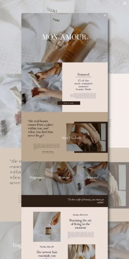

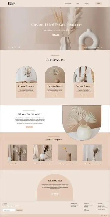
Technical Aspects of Modern Web Design
Technical elements are the backbone of any successful website in 2025. While aesthetics catch the eye, it’s the underlying technology that ensures your site performs well and delivers a seamless user experience.
Website Builders and Platforms
Choosing the right platform for your website is crucial for implementing modern design trends effectively. WordPress continues to dominate with its flexibility and robust plugin ecosystem, powering over 40% of all websites worldwide.
For beginners looking for simplicity, Wix and Squarespace offer intuitive drag-and-drop interfaces with stunning templates that incorporate current design trends. These platforms handle the technical complexities for you.
Webflow has gained significant popularity among designers who want more control without coding. It bridges the gap between visual design tools and custom development.
Consider these factors when selecting your platform:
- Technical expertise required
- Customization capabilities
- Budget constraints
- Specific feature requirements
Remember that each platform has different learning curves. Your choice should align with both your technical abilities and design goals.
SEO and Loading Speed
Search engines now prioritize user experience metrics alongside content relevance. Page speed has become a critical ranking factor, with Google’s Core Web Vitals measuring loading performance, interactivity, and visual stability.
A one-second delay in page loading can reduce conversions by 7%. To improve your loading times:
- Compress and optimize images
- Minimize HTTP requests
- Implement browser caching
- Use content delivery networks (CDNs)
Mobile optimization is non-negotiable in 2025. Google predominantly uses mobile-first indexing, meaning it primarily uses your site’s mobile version for ranking and indexing.
Dwell time—how long visitors stay on your site—directly impacts your SEO performance. Engaging design elements like micro-interactions and smooth navigation help keep users on your site longer.
Accessibility and Color Scheme
Creating an inclusive website isn’t just ethical—it’s becoming a legal requirement in many regions. Approximately 15% of the global population experiences some form of disability, making accessibility essential.
Dark mode has evolved from a trend to a standard feature. It reduces eye strain in low-light conditions and can decrease device battery consumption. Implementing a toggle for light/dark preferences shows consideration for user needs.
Your color scheme should maintain proper contrast ratios (minimum 4.5:1 for normal text) to ensure readability. Use tools like the WebAIM Contrast Checker to verify compliance.
Consider these accessibility best practices:
- Add alt text to all images
- Create keyboard-navigable interfaces
- Design forms with clear labels and error messages
- Structure content with proper heading hierarchy
Testing your site with screen readers and other assistive technologies helps identify improvement opportunities that many designers overlook.
- 6shares
- Facebook0
- Pinterest3
- Twitter3
- Reddit0
