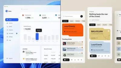
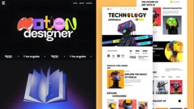
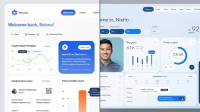
Designing a magazine website means balancing style with usability. You want a layout that feels dynamic, showcases a variety of content, and still makes navigation simple. A strong magazine website design highlights articles, images, and multimedia in a way that keeps attention while making information easy to find.
You don’t need to reinvent the wheel to achieve this. Many successful magazine sites use proven layouts, bold typography, and well-structured templates to create a professional look. By focusing on clear organization and visual hierarchy, you can present a large amount of content without overwhelming the audience.
The right design choices also depend on the type of magazine you’re building. Whether you focus on lifestyle, technology, fashion, or news, tailoring the design to match the subject ensures the site feels cohesive and engaging. Adding multimedia elements like video and interactive galleries can further enhance the experience.
Key Takeaways
- Strong design balances visual appeal with easy navigation
- Templates and layout choices help organize large amounts of content
- Multimedia and style choices should match the magazine’s focus
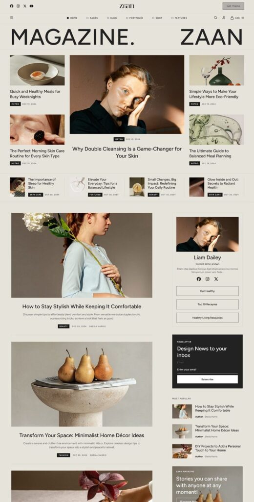
Key Elements of Magazine Website Design
A strong magazine website depends on how well you organize content, present text, and use visual identity. Clear structure, legible fonts, and consistent branding help readers navigate easily and connect with your publication.
Visual Hierarchy and Layout
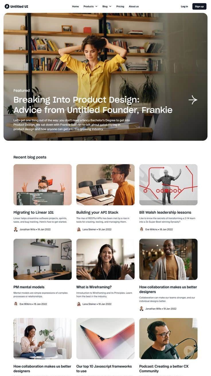
Your layout should guide readers’ eyes through the page without confusion. Place the most important stories or features in prominent positions, such as the top of the homepage or highlighted sections. Use grid systems to keep content balanced and consistent across different pages.
Navigation menus should remain simple and predictable. A clear top menu with categories like Features, News, and Archives helps readers find what they need quickly. Sticky headers or sidebars can also improve accessibility without cluttering the design.
Visual hierarchy also comes from scale and spacing. Larger headlines, bold feature images, and white space around articles make it easy to identify primary content versus supporting details. A well-structured magazine design ensures readers don’t feel overwhelmed by too much text or imagery at once.
Typography and Readability
Readable typography is essential for long-form articles and quick news updates alike. Choose typefaces that balance style with clarity. Many magazine websites pair a bold serif font for headlines with a clean sans-serif font for body text. This combination creates contrast while keeping the reading experience comfortable.
Font size and line spacing matter just as much as typeface choice. Aim for body text around 16–18px with enough line height to avoid crowding. Short paragraphs and subheadings break up long content, making it easier for readers to scan.
You should also consider how text adapts across devices. Responsive typography ensures that whether someone views your magazine design on a desktop, tablet, or phone, the text remains clear and consistent. Accessibility features like adjustable font sizes and high contrast options further improve usability.
Use of Color and Branding
Color plays a major role in shaping your magazine website’s identity. A defined palette creates consistency across pages and reinforces your brand’s personality. For example, a lifestyle magazine might use soft, muted tones, while a tech magazine could lean on bold contrasts.
Use color strategically to highlight key elements. Headlines, call-to-action buttons, and subscription links should stand out against the background. Supporting colors can separate content sections without distracting from the main articles.
Consistency is key. Apply your brand’s colors not just in the website design but also in graphics, icons, and interactive elements. This creates a cohesive visual experience that strengthens recognition and trust with your readers.


Choosing the Right Magazine Website Template
The right magazine website template helps you organize large amounts of content, keep your site easy to navigate, and present articles in a visually balanced way. A good design also saves you time during the website build by giving you a strong foundation that already fits the needs of content-heavy magazine websites.
Template Features to Look For
When selecting a template, focus on structure and usability first. A strong magazine website template should support multiple content categories, allowing you to group articles into sections like news, lifestyle, or technology without clutter.
Look for responsive design so your site works well on desktops, tablets, and phones. Readers expect smooth navigation across devices, and templates built with mobile-first layouts usually perform better.
Performance also matters. Templates that load quickly improve user experience and help with search rankings. Check if the template is optimized for speed and supports lightweight code.
Other useful features include:
- Grid or card-based layouts for highlighting multiple stories
- Built-in ad spaces for monetization
- Support for multimedia like video and image galleries
- SEO-friendly structure to improve visibility
Customization Options
Even the best pre-built template needs adjustments to match your magazine’s identity. You should be able to change colors, fonts, and layouts without touching code. Templates with flexible theme settings save time and reduce reliance on developers.
Check if the template lets you rearrange homepage sections. For example, you may want a featured story at the top, followed by trending articles or category blocks. This flexibility makes your site feel unique while still using a standard framework.
Some templates also include drag-and-drop builders or integration with page-building tools. These allow you to test different layouts quickly. If you plan to scale your magazine website, choose a template that supports adding new sections or categories later.
Popular Template Platforms
You’ll find magazine website templates across several platforms. WordPress offers the widest range, from free themes to premium designs tailored for news and editorial sites. Many of these include demo content so you can launch quickly.
Squarespace provides polished, minimalist templates that work well for lifestyle or niche magazines. They emphasize clean typography and easy customization without plugins.
If you prefer full creative control, Webflow gives you advanced design options and responsive tools, though it may take more setup time. For a simpler start, HTML templates from providers like Colorlib or ThemeForest offer lightweight designs that you can adapt with basic coding.
Each platform has trade-offs, so consider your technical skills, budget, and the scale of your publication before choosing.


Optimizing User Experience for Magazine Sites
When you design a magazine website, you need to balance readability, speed, and ease of navigation. A smooth experience keeps readers engaged, encourages return visits, and helps your content perform better in search rankings.
Responsive Design Best Practices
Your magazine site must adapt to different screen sizes without breaking layouts or hiding content. Readers often switch between smartphones, tablets, and desktops, so a responsive design ensures consistency across devices.
Use flexible grids and scalable images. Instead of fixed pixel dimensions, design with percentages so elements resize naturally. Test layouts in both portrait and landscape orientations to avoid awkward cutoffs.
Typography also matters. Choose legible fonts that remain clear on small screens, and keep line spacing generous for better readability. Avoid cramming too much text into narrow columns.
Consider touch interaction. Buttons, menus, and links should be large enough to tap easily on mobile devices. A responsive magazine site should never force users to zoom or pinch to read content.
Navigation and Category Organization
Clear navigation helps readers quickly find articles, categories, and archives. If users struggle to locate content, they are less likely to return.
Start with a simple main menu that highlights your most important sections, such as News, Features, Reviews, or Columns. Avoid clutter by limiting the number of top-level categories.
Use drop-downs or mega menus for subcategories. This works well for magazine sites with diverse topics. For example:
| Main Category | Subcategories |
|---|---|
| Lifestyle | Travel, Food, Health |
| Technology | Gadgets, Software, Reviews |
Add a search bar in a visible location. Many readers prefer searching directly rather than browsing menus.
Breadcrumbs also improve navigation by showing users where they are within the site’s hierarchy, making it easier to move between sections.
Page Load Speed and Performance
A slow magazine website drives readers away before they even view your content. Optimizing speed is critical for both user satisfaction and search visibility.
Compress and resize images without losing quality. Large image files are one of the most common causes of sluggish load times. Using modern formats like WebP can reduce file sizes significantly.
Enable browser caching so returning visitors don’t need to reload the same assets every time they visit. Minimize HTTP requests by combining CSS and JavaScript files where possible.
Test performance with tools like Google PageSpeed Insights or GTmetrix. These tools highlight issues such as unoptimized code, unused scripts, or slow server response times.
Finally, ensure your hosting plan can handle traffic spikes. Magazine sites often experience surges during breaking news or popular features, so scalable hosting helps maintain performance.


Integrating Multimedia Content
Adding multimedia content to your news and magazine website helps create a more dynamic reading experience. By combining images, video, audio, and interactive tools, you give readers multiple ways to engage with stories and explore content in greater depth.
Incorporating Images and Galleries
High-quality images remain one of the most effective ways to capture attention. You can use feature images to highlight major stories and thumbnail previews to guide readers through related articles.
Image galleries work well for event coverage, fashion spreads, or travel features. They allow readers to browse through multiple visuals without overwhelming a single page.
To keep your site fast, compress images without losing quality. Tools like WebP formats or lazy loading help maintain performance.
A simple table can guide your choices:
| Image Type | Best Use Case | Format Suggestion |
|---|---|---|
| Feature Image | Article headers | JPEG/WebP |
| Gallery Photos | Event or photo essays | WebP/PNG |
| Infographics | Data visualization | SVG/PNG |
Video and Audio Embeds
Video and audio can make your magazine website feel more interactive. You can embed short clips to explain complex topics or add interviews that provide extra context.
Podcasts or audio snippets are useful for readers who prefer listening over reading. They also extend your reach to mobile audiences who consume content on the go.
When embedding, use responsive players so that media adjusts to different screen sizes. Hosting on platforms like YouTube, Vimeo, or SoundCloud reduces server strain while still giving you control over placement.
Keep clips concise. A 2–5 minute video or a 15–20 minute podcast segment tends to hold attention better than longer formats.
Interactive Features
Interactive elements give readers more control over how they consume content. Quizzes, polls, and clickable timelines encourage participation and make stories more memorable.
For data-heavy articles, interactive charts or maps let readers explore information at their own pace. This works especially well for news websites covering demographics, elections, or economic shifts.
You can also add hover effects or expandable sections to keep layouts clean while still offering depth. Just ensure that interactivity does not slow down page performance.
Accessibility matters here too. Provide clear labels, keyboard navigation, and alternative text so that all readers can engage with your interactive features.


Design Inspiration by Magazine Type
Different types of magazines call for different design priorities. The way you structure navigation, highlight visuals, and present content depends on the subject matter and the expectations of your readers. Paying attention to these details helps you create a site that feels natural to explore and easy to return to.
Technology Magazine Website Design
When you design a technology magazine website, clarity and usability should come first. Readers often want quick access to product reviews, tutorials, and industry news. A clean grid layout with well-organized categories makes it easier for them to find what they need.
Use contrasting color schemes like dark backgrounds with bright accents to reflect a modern, tech-focused aesthetic. Incorporating icons and interactive elements such as hover effects or expandable menus can also enhance the experience.
Tables can be especially useful for comparing specs or highlighting differences between devices. For example:
| Device | Processor | Storage | Price |
|---|---|---|---|
| Phone A | A16 | 256GB | $999 |
| Phone B | Snapdragon 8 | 512GB | $899 |
Including these structured elements helps readers process technical information quickly without feeling overwhelmed.


News Magazine Website Design
For a news magazine website, your priority should be speed and readability. Breaking stories need to be placed front and center, often through a headline carousel or a grid of the latest articles. A clear hierarchy of typography makes it easy for readers to scan headlines and dive deeper into stories.
You should also consider regional or topic-based navigation. Tabs for categories like politics, business, and culture allow readers to narrow their focus without digging through unrelated content.
A balanced use of text and images is key. Too many visuals can distract from the story, while too little can make the site feel dry. A simple rule is to pair each major headline with a strong photo to draw attention.
Lifestyle Magazine Website Design
Lifestyle magazines benefit from a more relaxed and inviting design. Readers often look for inspiration, ideas, and stories that feel personal. Wide margins, soft color palettes, and generous white space help create a comfortable reading environment.
You can use modular card layouts to showcase diverse content such as travel guides, food recipes, and wellness tips. Each card should include a clear headline, short excerpt, and inviting image.
Interactive features like polls, comment sections, or embedded playlists can make your site feel more community-driven. By giving readers ways to engage beyond just reading, you encourage them to spend more time exploring your content.
Fashion Magazine Website Design
Fashion magazine websites rely heavily on visual storytelling. High-resolution photography, bold typography, and dynamic layouts are essential. You should prioritize large image galleries, lookbooks, and video content to highlight trends and collections.
A grid or masonry layout works well for showcasing editorial spreads. Pairing images with minimal text keeps the focus on visuals while still giving readers context.
Consider adding a shoppable feature where users can click on items within an editorial and be directed to purchase pages. This creates a seamless bridge between inspiration and action.
Color choices matter here too. Neutral backgrounds often allow bold fashion photography to stand out, while accent colors can be used sparingly to highlight calls to action like “Shop Now” or “Read More.”
- 3shares
- Facebook0
- Pinterest0
- Twitter3
- Reddit0

