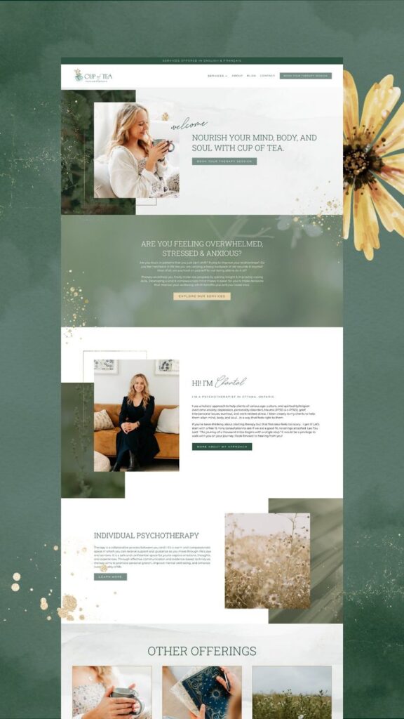
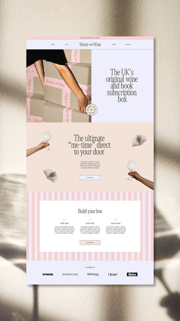
When building a website, the style you choose can significantly impact user experience and engagement. Exploring the top website styles helps you identify the best approach for your goals and audience. Whether you prioritize aesthetics, functionality, or a combination of both, understanding these styles will enable you to make informed choices.
Website design trends evolve, and what works today may change tomorrow. By staying informed about the most effective styles, you can ensure your site remains appealing and relevant. This article will highlight five popular website styles that can enhance your online presence.

1) Minimalist Design
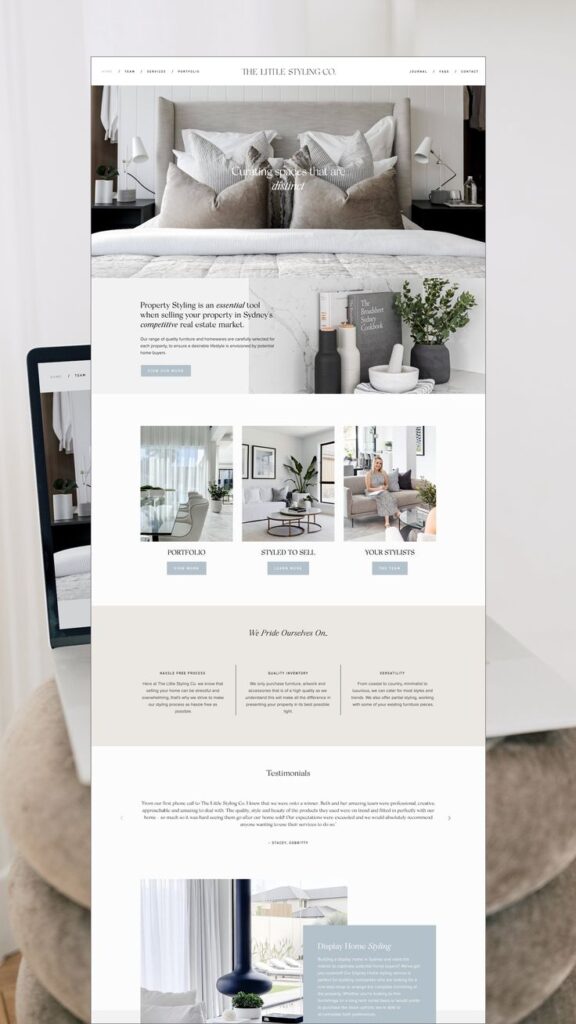
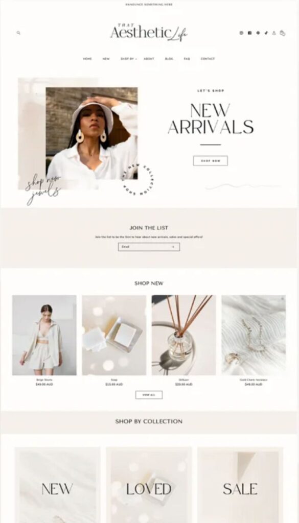
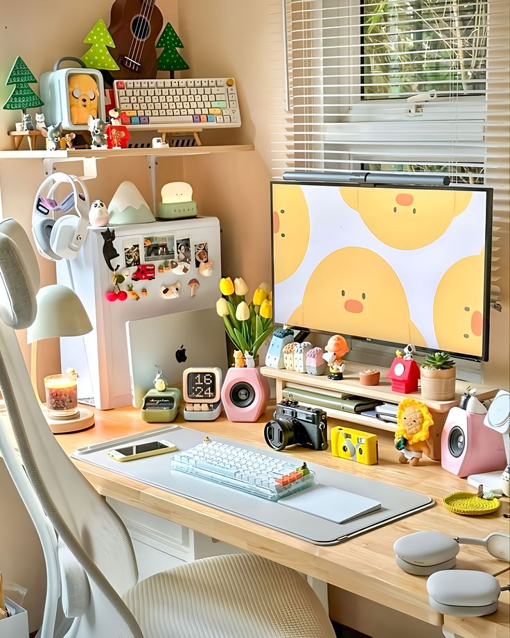
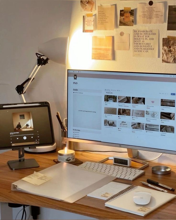
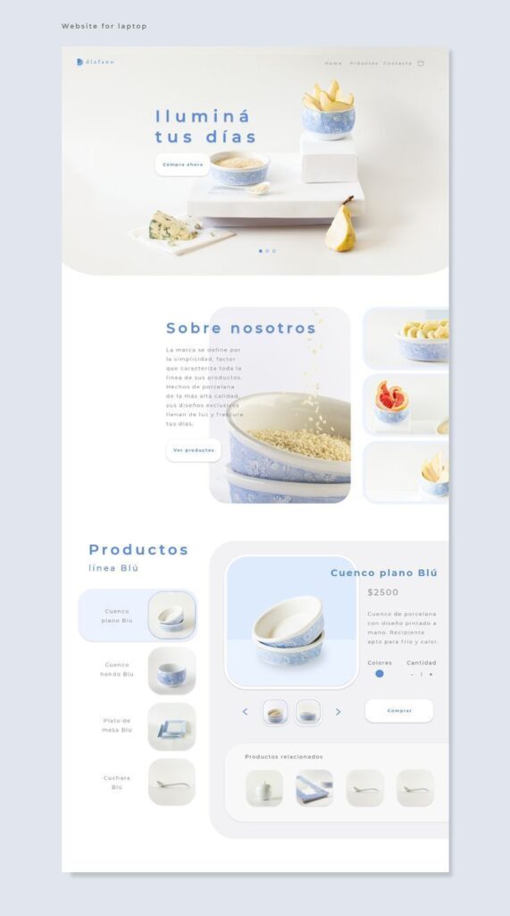
Minimalist design emphasizes simplicity and functionality. You focus on the essential elements of your website while eliminating unnecessary features.
This style often includes ample white space and a limited color palette. This approach draws attention to key content and navigation options.
In minimalist design, typography plays a prominent role. You select clear, legible fonts that enhance the user experience and support your brand identity.
Images and graphics are used sparingly, serving to complement or emphasize the text. Each visual element should support your message without overwhelming the viewer.
Responsive design is crucial for a minimalist website. You ensure that your site functions well on various devices, maintaining simplicity across screens.
This style often contributes to faster load times. By reducing clutter, you can improve performance, contributing to better user engagement.
2) Responsive Layouts
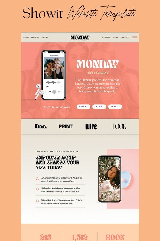
Responsive layouts adapt to different screen sizes and orientations. They ensure that your website looks good on desktops, tablets, and smartphones.
Using flexible grids and layouts, responsive design allows elements to resize and rearrange based on the viewport. This approach enhances user experience by providing easy navigation and readability.
Media queries play a critical role in responsive design. They enable CSS to apply different styles depending on the device characteristics, such as screen width and resolution.
With a responsive layout, you reduce the need for separate mobile sites. This simplifies maintenance and improves SEO, as all content is accessible through a single URL.
Incorporating responsive design is essential for reaching a wider audience. As more users access websites via mobile devices, your site must be versatile to meet their needs.

3) Parallax Scrolling
Parallax scrolling is a web design technique that creates a sense of depth by making background images move slower than foreground images. This effect enhances user engagement by providing a dynamic experience as users scroll through a webpage.
You can use parallax scrolling to highlight different sections of your website. It draws attention to key content and can guide users through a narrative journey. This style works well for storytelling websites and portfolios.
It’s important to implement parallax scrolling thoughtfully. Overusing the effect can lead to distractions and make navigation challenging. Ensure that content remains accessible and easy to interact with, even with the engaging visuals.
When applied correctly, parallax scrolling can significantly elevate your website’s aesthetics and functionality. It encourages exploration and can leave a memorable impression on your visitors.

4) Dark Mode
Dark mode is a design feature that uses a dark color palette, primarily black or dark gray, for user interfaces. This option is becoming increasingly popular across websites and applications.
You may find dark mode beneficial for reducing eye strain, especially in low-light environments. The contrast between text and backgrounds can make reading easier for some users.
Implementing dark mode can also enhance battery life on devices with OLED screens. By using darker pixels, these screens consume less power.
Many users appreciate the sleek and modern look of dark mode. It can give your website a contemporary feel while meeting user preferences.
Offering a dark mode option can improve user satisfaction. When you provide flexibility in interface settings, users are more likely to engage with your content.

5) Retro Aesthetic
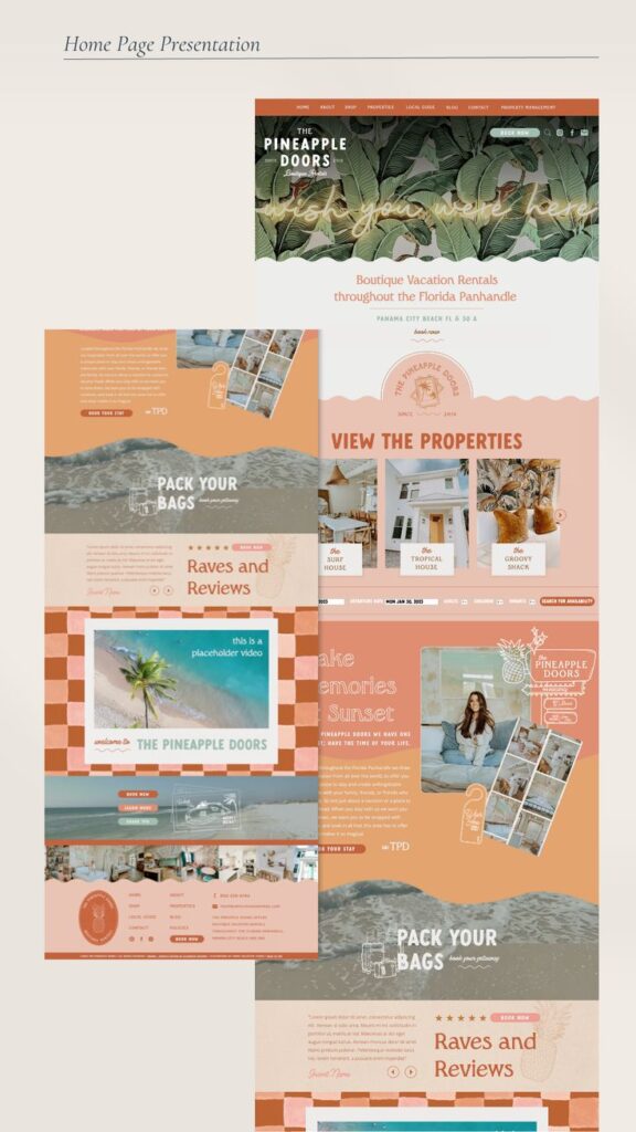
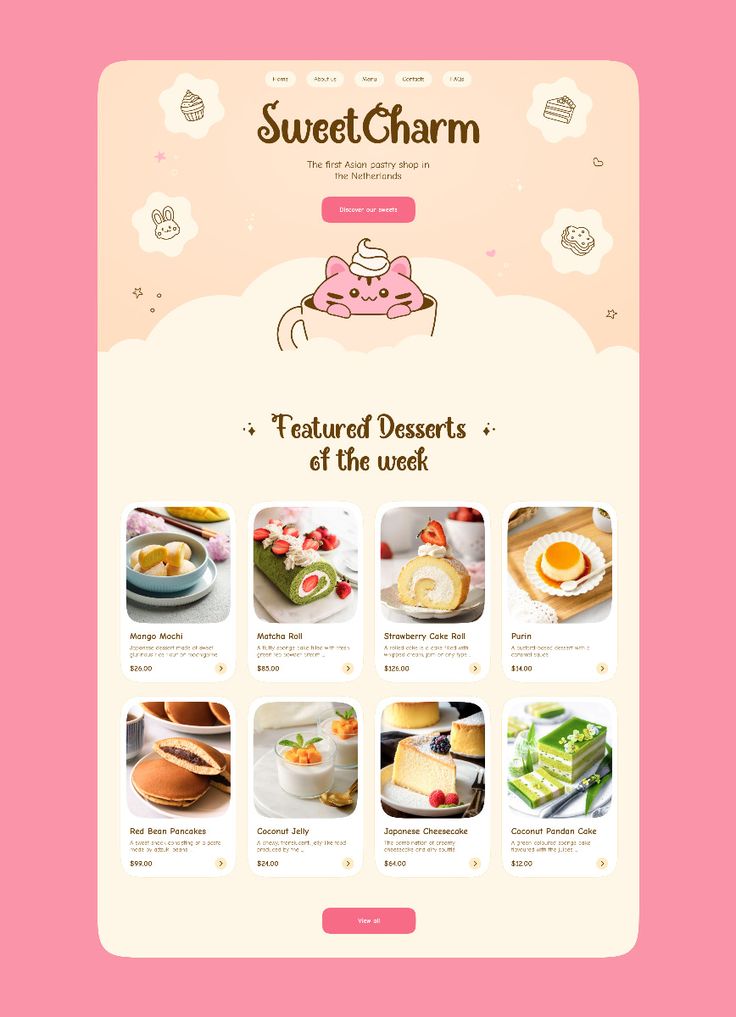
The retro aesthetic embraces visual elements from past decades. It often incorporates vibrant colors, vintage typography, and nostalgic imagery.
You can find inspirations from the 70s, 80s, or 90s in various design choices. Patterns, gradients, and pop culture references play a key role in creating a retro vibe.
This style can evoke feelings of nostalgia, making users feel connected to a specific time. You may notice the use of old-school fonts and pixel art for digital interfaces.
Incorporating textures and materials reminiscent of vinyl or film can enhance this look. You have the flexibility to mix modern elements with retro styles, creating a unique blend.
The retro aesthetic stands out in web design by offering something different from minimalist trends. It invites creativity and playful expression while resonating with a diverse audience.

Understanding Website Styles
Website styles encompass the design elements, layouts, and functionalities employed in creating an online presence. These styles are shaped by historical context and design principles that enhance user experience and interaction.
History and Evolution
The evolution of website styles traces back to the early days of the internet. Initial designs featured basic HTML with minimal aesthetics, focusing on functionality. The introduction of CSS (Cascading Style Sheets) in the late 1990s marked a turning point, allowing for greater design flexibility and separation of content from layout.
As technology advanced, so did design philosophies. Responsive design emerged with the rise of smartphones, ensuring websites adapt to different screen sizes. The contemporary landscape now includes elements like flat design, minimalism, and immersive experiences, driven by user preferences and usability standards.
Visual Hierarchy in Design
Visual hierarchy in design is crucial to guiding users through a website. It involves arranging elements to prioritize content effectively. Key aspects include size, color, contrast, and placement. For example, larger fonts attract attention, while contrasting colors can highlight important actions.
Implementing a clear visual hierarchy helps users navigate easily. Use headings, subheadings, and bullet points to break information into digestible parts. Consistent spacing and alignment also enhance readability. Effective visual hierarchy not only improves user engagement but also supports the overall goals of a website, such as conversion or information dissemination.
Choosing the Right Style for Your Brand
Selecting a website style that aligns with your brand is crucial. This decision impacts how customers perceive your business and their overall experience on your site. Focus on coherence with your brand identity and ensuring an intuitive user experience.
Using a reliable website builder can simplify this process, allowing you to create a professional-looking site with ease.
Aligning Design with Brand Identity
Your website’s design should reflect your brand’s core values and personality. Begin by defining your brand identity: colors, typography, and imagery should resonate with your target audience. For example, a tech brand may use sleek, modern fonts and a minimalist layout, while a creative agency might opt for vibrant colors and dynamic visuals.
Consider creating a mood board to gather inspiration. This helps in visualizing the elements that convey your brand message. Consistency across all platforms strengthens recognition and trust. Aligning your design with your identity not only engages users but also builds brand loyalty.
User Experience Considerations
User experience (UX) is essential for keeping visitors on your site. Your design should prioritize usability and accessibility. A clear navigation structure enables users to find information quickly, while responsive design ensures functionality across devices.
Incorporate visual hierarchies to guide attention. Use headings, bullet points, and contrasting colors for key elements. Additionally, page load speed affects retention; optimize images and scripts to avoid slowdowns. Testing with real users can uncover pain points and areas for improvement, ensuring a seamless experience that keeps users coming back.
- 2.0Kshares
- Facebook0
- Pinterest2.0K
- Twitter0
- Reddit0
