Color is a powerful tool in web design, impacting not only aesthetics but also user behavior and interaction. Mastering color theory enables you to create visually appealing palettes that enhance user experience and drive conversions. Understanding how colors work together can transform your designs from ordinary to exceptional, making your website more engaging and effective.
By exploring the fundamentals of color theory and its application to web design, you can unlock the secrets to crafting harmonious color schemes that resonate with your audience. Color choices influence emotions and perceptions, so selecting the right colors for your brand is crucial.
Whether you are looking to elevate your design skills or improve user engagement on your site, mastering color theory is essential. The right palette not only attracts visitors but also guides them toward taking action.


Key Takeaways
- Effective use of color enhances user experience and interaction.
- Understanding color psychology influences audience perception and choices.
- Clever color schemes lead to higher conversion rates on websites.
The Basics of Color Theory
Understanding color theory is essential for effective web design. It helps you create visually appealing and cohesive color palettes that enhance user experience and conversion rates.
Understanding the Color Wheel
The color wheel is a fundamental tool in color theory. It organizes colors in a circular format to show their relationships. Primary colors—red, blue, and yellow—are the building blocks of the wheel.
When you mix primary colors, you create secondary colors: green, orange, and purple. This illustrates how colors interact and can be combined.
Tertiary colors arise from mixing primary and secondary colors, yielding hues like red-orange and blue-green. Utilizing the color wheel allows you to create harmony and contrast in your designs, making strategic choices easier.
Exploring Primary, Secondary, and Tertiary Colors
Primary colors are pure colors that cannot be created by mixing other colors. They serve as the foundation for the entire color palette and are vital for any design.
Secondary colors result from blending two primary colors. Each secondary color complements its primary counterparts, allowing for dynamic combinations.
Tertiary colors emerge from mixing primary and secondary colors, providing nuance and depth. Examples include yellow-green and blue-violet. Understanding these categories enables you to choose colors purposefully, enhancing aesthetic appeal while meeting specific design goals.
Color Schemes and Relationships
Creating an effective color scheme is essential for web design. It not only enhances visual appeal but also influences user experience and interaction rates. By understanding and implementing various color relationships, you can develop a palette that captures attention and drives conversions.
Developing a Cohesive Color Palette
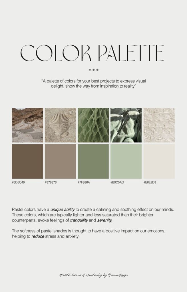
To create a cohesive color palette, start by selecting a primary color that reflects your brand identity. Consider the emotions associated with this color. Then, choose 2-3 secondary colors that complement or contrast with your primary color.
Utilize tools like Adobe Color or Coolors to visualize combinations. Keep your palette limited to a maximum of five colors to maintain simplicity. Balance your choices with light, medium, and dark shades to create depth. Consistency across your website strengthens recognition and fosters trust.
Harmonizing Complementary and Analogous Colors
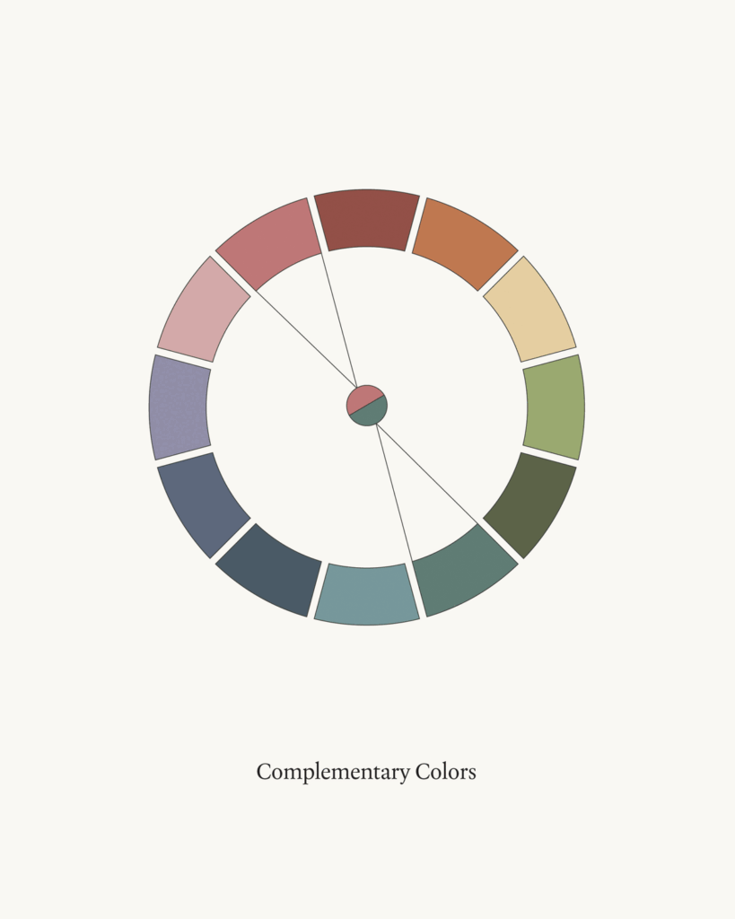
Complementary colors lie opposite each other on the color wheel, creating vibrant contrasts. To use them effectively, select one as your dominant color and the other for accents. This approach can highlight important elements and calls to action.
Analogous colors, which sit next to each other on the wheel, offer a harmonious look. Use them for backgrounds or larger sections. Ensure that at least one color is dominant while the others provide support, maintaining visual interest without overwhelming the viewer.
Experimenting with Triadic and Tetradic Themes
A triadic color scheme involves three colors spaced evenly around the color wheel. This scheme provides balance and diversity. Choose one color as the primary focus and use the others as accents. This method adds energy while keeping your design structured.
On the other hand, a tetradic scheme consists of four colors forming two complementary pairs. This approach offers richness and complexity. Ensure that one color dominates, while the others serve to enhance the overall design. Attention to hierarchy is key for effective communication with your audience.


Applying Color Theory in Web Design
Color theory plays a crucial role in web design by influencing user experience and brand perception. Effective use of color enhances navigation and reinforces brand identity, making your website not only visually appealing but also functional.
Incorporating Color for Effective Design and Navigation
When designing a website, you should prioritize effective color choices that guide users through your content. Utilizing a limited color palette can create a harmonious look, aiding in creating visual hierarchy.
Choose a Dominant Color: Select a primary color that reflects your brand’s message. This will be the most visible on your site and will anchor your design.
Add Accent Colors: Use contrasting colors for buttons and calls-to-action. This draws attention where you want users to engage.
Maintain Readability: Ensure that text is easily readable against background colors. High contrast enhances legibility, improving user experience.
Consistent and thoughtful application of these principles helps in creating a seamless navigation flow.
Using Color to Enhance Brand Identity and Recognition
Your color choices contribute significantly to brand identity. Colors evoke emotions and associations, which can influence how users perceive your brand.
Color Consistency: Use the same color scheme across all platforms to reinforce brand recognition. Users should immediately identify your brand by its colors.
Emotional Impact: Different colors can trigger specific emotional responses. For example, blue often conveys trust, while red can indicate urgency. Choose colors that align with your brand’s core values.
Cultural Considerations: Be aware of cultural differences in color perception. Colors can have varying meanings across cultures, which may impact global audiences.
By applying these strategies, you strengthen your brand’s presence and create a more engaging web experience for your users.
Designing for Readability and User Experience
Creating an engaging palette significantly impacts both readability and user experience. You must consider how color choices affect accessibility, especially for those with visual impairments. Additionally, optimizing color contrast and saturation can enhance overall clarity for all users.
Ensuring Accessibility for Visual Impairments
Accessibility is crucial in web design. You should prioritize color combinations that are inclusive to users with visual impairments, such as color blindness. Use color blindness simulators to test your palette.
Color Pairing Tips:
- Avoid Red-Green Combinations: These are the most challenging for many users.
- Use Textures and Patterns: This can help differentiate elements beyond color.
Incorporate descriptive text labels alongside color indicators. This offers clarity and ensures your design communicates effectively to everyone.
Optimizing Color Contrast and Saturation for Clarity
Color contrast is vital for readability. Ensure there’s a significant contrast between text and background colors. This helps improve legibility, especially for those with low vision.
Contrast Ratio Guidelines:
- Text vs. Background: Aim for a contrast ratio of at least 4.5:1 for normal text.
- Larger Text: For large text, a 3:1 ratio is acceptable.
Adjusting saturation can also affect how colors are perceived. Highly saturated colors can be overwhelming, while softer tones offer a more pleasant viewing experience. Test your designs across various devices to ensure optimal clarity.

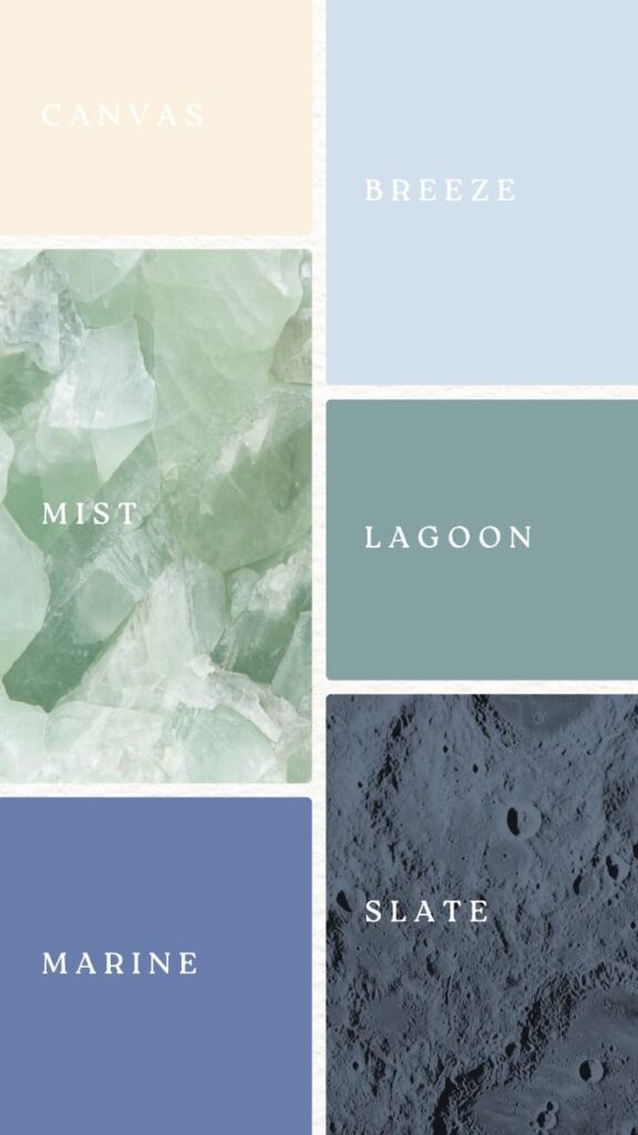
Color Psychology and Cultural Considerations
Colors evoke specific emotions and responses, making understanding their psychological impact crucial in web design. Equally important are the cultural meanings associated with various colors, as they can significantly influence user perception and engagement.
The Emotional Impact of Colors
Each color carries distinct emotional connotations. For example:
- Red: Often signifies passion and urgency. It’s effective for calls to action.
- Blue: Generally evokes feelings of trust and calmness. This is ideal for corporate sites.
- Green: Associated with nature and tranquility. It’s frequently used in health and wellness sectors.
- Yellow: Represents optimism and energy. It can attract attention, though should be used sparingly.
When designing, consider how these colors align with your brand’s message and target audience’s feelings. By selecting colors that resonate emotionally, you enhance user engagement and conversion rates.
Understanding Color Meaning Across Different Cultures
Color symbolism varies significantly across cultures, impacting your design choices. For instance:
- White: In Western cultures, it symbolizes purity and peace. In some Eastern cultures, it represents mourning.
- Black: Often conveys elegance in Western contexts. Conversely, in many cultures, it is associated with death or misfortune.
- Red: In China, it symbolizes luck and prosperity, differing from its cautionary connotations in Western contexts.
Being aware of these cultural differences ensures your design communicates effectively to diverse audiences. Tailor your color palette to not just your brand, but also the cultural backgrounds of your users for optimal impact.
Technical Aspects of Web Colors
Understanding technical details about colors can significantly impact your web design effectiveness. Key components like RGB and hex codes are essential for ensuring your designs are accurate and visually appealing. Additionally, A/B testing helps you fine-tune your color choices to improve user engagement and conversion rates.
Knowing the Significance of RGB and Hex Codes
RGB (Red, Green, Blue) and hex codes are fundamental to defining colors on the web. RGB uses a combination of these three colors to create a wide spectrum. Each color component ranges from 0 to 255. For example, pure red is represented as RGB(255, 0, 0).
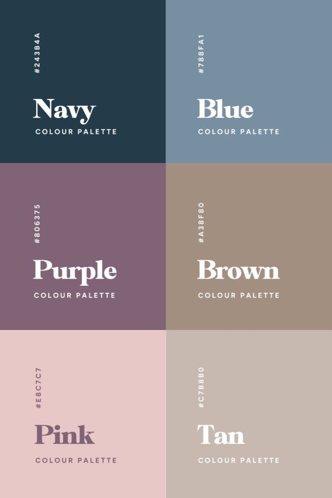
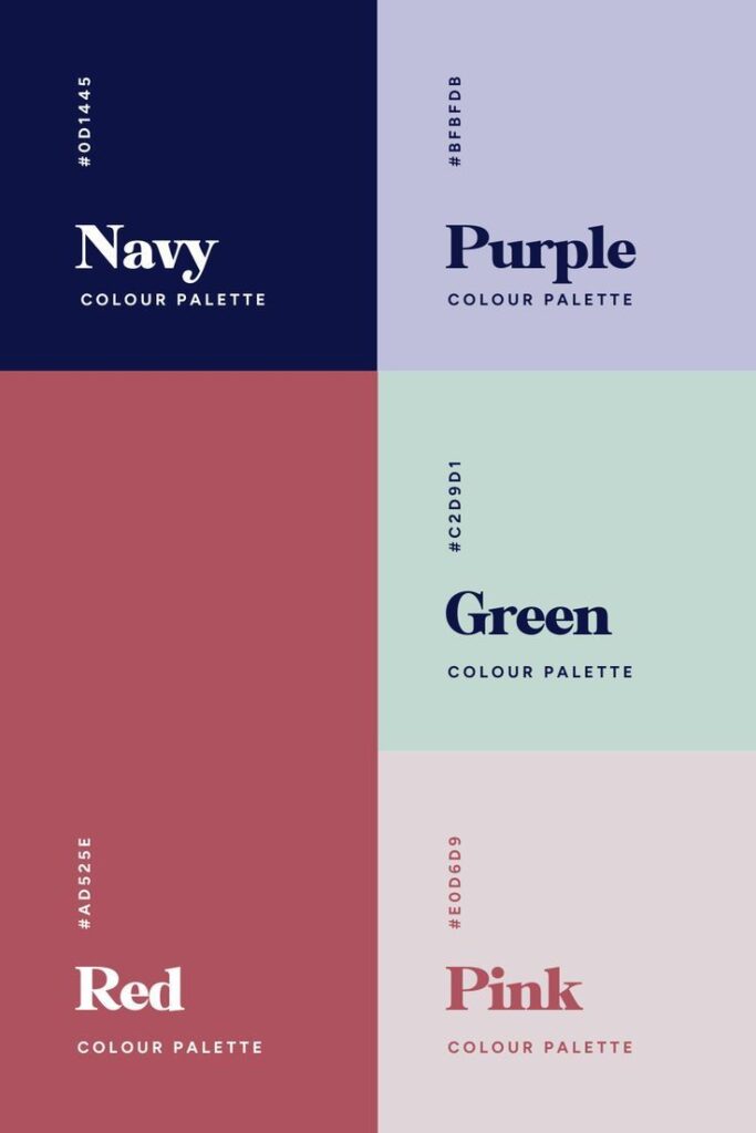
Hex codes provide a shorthand method to represent these colors. A hex code starts with a “#” followed by six alphanumeric characters. For instance, the hex code for white is #FFFFFF, while black is #000000. Understanding these codes allows you to maintain consistency across your design.
Familiarizing yourself with color pickers and design software can enhance your color selection process. Resources like Adobe Color or Coolors can help you visualize and generate palettes based on RGB and hex specifications.
A/B Testing for Color Optimization
A/B testing enables you to evaluate how different color choices affect user behavior. By creating two versions of a webpage—Version A with one color scheme and Version B with another—you can track which performs better in terms of user engagement or conversions.
Utilizing tools like Google Optimize or Optimizely can streamline this process. You can easily measure metrics such as click-through rates or bounce rates for each design. This data-driven approach can lead to informed decisions on color strategies.
When conducting A/B tests, start with key elements like buttons, calls to action, or background colors. Small adjustments can dramatically impact user perception and interactions. Gather sufficient data over time to validate your findings, ensuring reliable results that enhance website conversion.
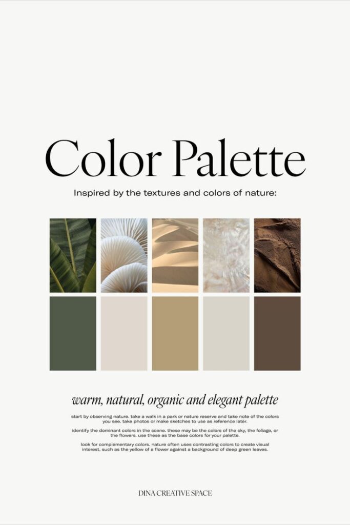

Advanced Techniques in Color Manipulation
Exploring advanced color manipulation techniques can elevate your web design. By strategically using tints, shades, tones, and gradients, you can create visually appealing palettes that engage users.
Playing with Tints, Shades, and Tones
Tints, shades, and tones are essential for adding depth to your designs. Tints are created by mixing a color with white, resulting in lighter variations. Shades are the opposite, formed by combining a color with black, producing darker hues. Tones involve mixing a color with gray, softening its intensity.
In your design, consider how these variations influence the mood. For instance, light tints can evoke calmness, while deep shades can signal sophistication. A well-structured approach could involve maintaining a consistent ratio of tints and shades across your palette to ensure harmony. Use a color wheel to identify complementary colors that work well together.
Crafting Gradients and Color Transitions
Gradients introduce dynamic visual elements that guide the viewer’s eye. You can blend two or more colors smoothly to create a gradient. This technique allows you to add dimension and interest to backgrounds, buttons, and icons.
Consider different types of gradients. Linear gradients transition colors in a straight line, while radial gradients radiate from a central point. When implementing gradients, maintain clarity and readability of your text by ensuring sufficient contrast with background colors.
Use tools like CSS for smooth transitions. Create hover effects with color changes to engage users further. A well-crafted gradient can help draw attention to specific focal points within your design.
Responsive Color Design and Current Trends
Responsive color design is essential in creating visual appeal and enhancing user engagement across devices. Understanding how to adapt your color choices and staying updated with current trends can significantly impact your web design.
Adapting Color Choices for Different Devices
When designing for various devices, consider how color perception can change. For example, bright colors may appear more vibrant on a mobile device compared to a desktop screen.
To ensure consistency, you can use tools like:
- Color Contrast Analyzers: Check legibility on different backgrounds.
- Responsive Design Frameworks: Adapt colors based on screen size.
As a best practice, maintain a limited color palette that is flexible. This will help preserve your brand identity while catering to different screens. Test your designs on multiple devices to evaluate how colors interact with the layout and improve visual interest.
Keeping Up with Web Design Color Trends
Staying informed about current color trends can enhance the appeal of your website. Trending colors often reflect broader design aesthetics and user preferences. For 2024, consider these key trends:
- Muted Earth Tones: These convey calmness and stability.
- Vibrant Contrasts: High-contrast combinations create visual dynamism.
Utilizing trend forecasting tools or websites specializing in color palettes can help you stay ahead. Also, observe successful competitors to identify effective color schemes.
Integrating trending colors not only captures attention but also strengthens user engagement, making it essential to keep your designs fresh and relevant.
Creating Calls-to-Action That Convert
Effective calls-to-action (CTAs) are crucial for boosting website conversions. The color choices for these buttons can significantly influence user engagement and overall effectiveness.
The Role of Color in Call-to-Action Buttons
Color plays a pivotal role in the visibility and effectiveness of your call-to-action buttons. Using your website’s main color can create a unified brand identity, but contrasting hues can enhance attention. For example:
- Red often signals urgency, prompting quick decision-making.
- Green signifies safety and can lead to a calming effect, suitable for financial sites.
- Blue instills trust, ideal for e-commerce platforms.
Consider accessibility; ensure that color contrast meets standards for readability. Tools like color contrast checkers can assist in this area. Test different color combinations to identify which ones yield the highest conversion rates.
Balancing Color Harmony with User Engagement
Achieving color harmony while encouraging user engagement requires a delicate balance. You should aim for complementary colors that align with your branding while evoking the desired emotions. For instance, if your main color is blue, consider pairing it with an orange or yellow CTA for a vibrant contrast.
Utilize color psychology principles to understand the emotional impact of your choices. Ensure that your CTAs are prominent yet harmonious within the overall palette. It’s also effective to employ the 3:1 rule: make the CTA button three times larger than surrounding elements.
Regularly analyze performance data to refine your approach. A/B testing can reveal which color schemes resonate most with your audience, leading to higher conversion rates.
- 4.7Kshares
- Facebook0
- Pinterest4.7K
- Twitter0
- Reddit0


