A gallery wall can make a room feel personal, collected and finished. It brings favorite artwork, photographs and meaningful pieces together in one place. If you’ve ever tried to work out how to choose frames for a gallery wall, you already know that the effortless look takes more than a few photo frames and a hammer.
Sometimes the art is beautiful, yet the wall still feels a little off. Often the frames are the problem. They compete with the pieces inside them, swamp a small drawing, or clash with the wood and metal already in the room.
I’ve spent more than 15 years working across industrial and product design, automotive concepts, jewelry, architecture, web and app interfaces, and visual communication. Before that came academic training in composition, drawing and life painting. One lesson holds across all of it: the edge of an object changes how you read what sits inside it. A frame is that edge.
Framing mistakes are usually easy to fix. This guide focuses on frame selection and artwork preparation. For the arrangement itself, our gallery wall layout guide covers scale, spacing and paper templates in detail.
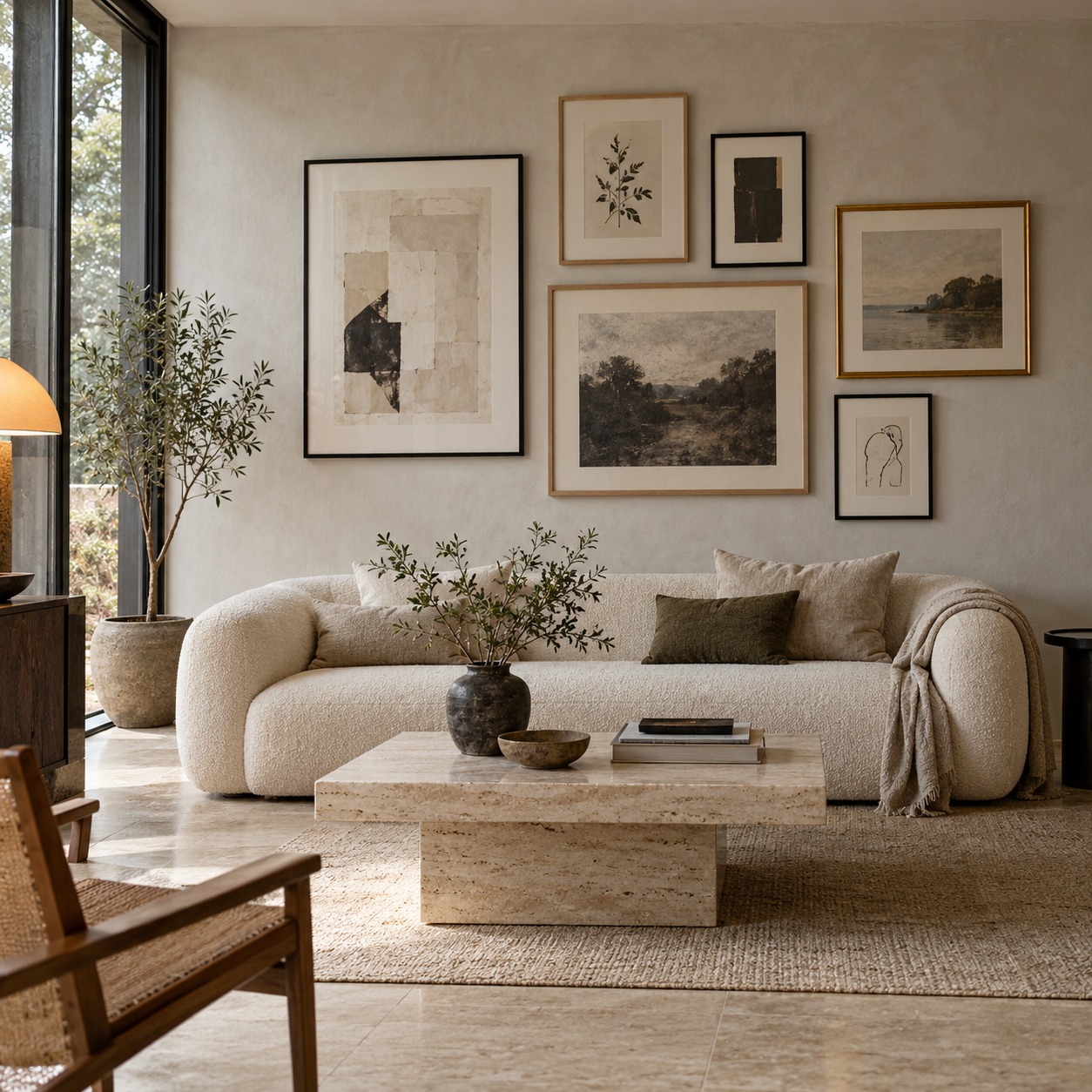
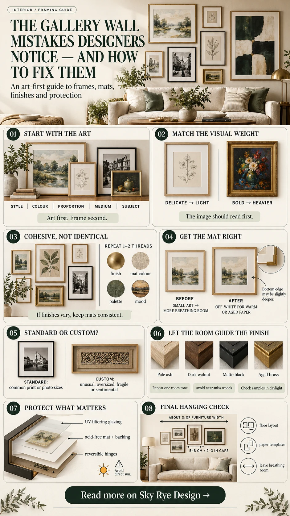
How to choose frames for a gallery wall, starting with the artwork
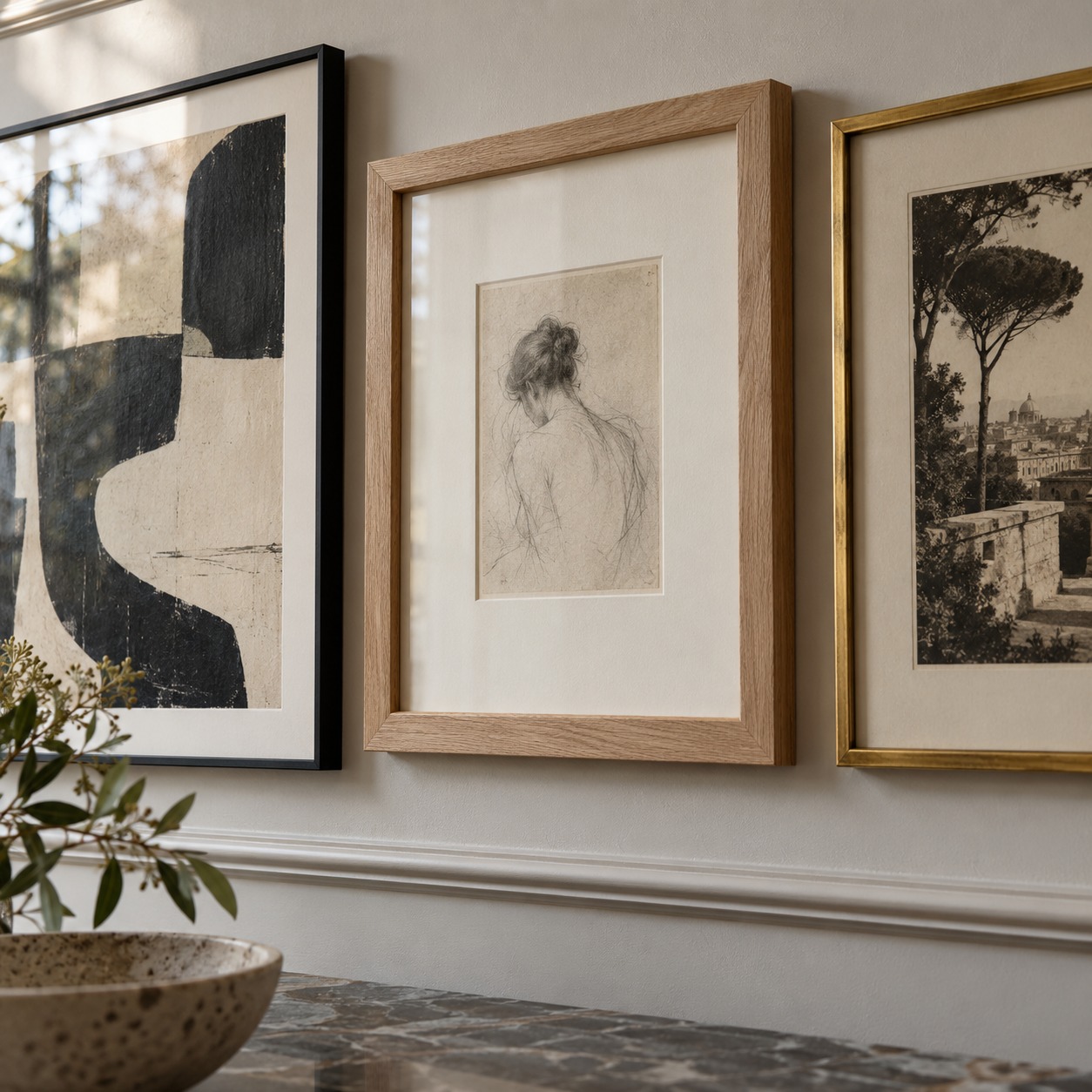
Most of us do it the wrong way round. We spot a set of frames we like, buy them, and then hunt for something to put inside. It feels sensible at the time, but it often leads to a wall that looks a little forced.
Your artwork already has a personality. It has its own colors, mood and proportions. The frame should support that, not compete with it.
So before you buy picture frames, spend a few minutes with the pieces themselves. Lay them out on a table or the floor and look at what each one actually needs.
What to look at first
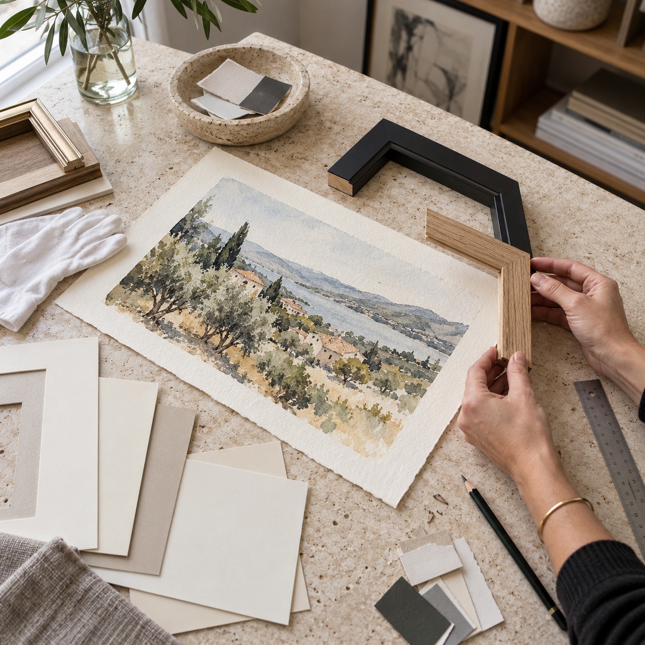
Every piece gives you clues about the frame it wants. Check the style, colors, proportions, medium and subject before you shop. A loose watercolor feels different from a crisp black-and-white photograph. A moody landscape painting rarely wants the same treatment as a bright child’s drawing.
Look at the palette and decide whether the frame should pick up one tone from the work or stay neutral and out of its way. Then look at the shape. Long, narrow or square pieces can look awkward in a frame designed for a standard rectangle.
Once you’ve noted these down, the choice becomes much easier. You’re no longer guessing. You’re responding to what the piece is already telling you.
When a simple frame works best
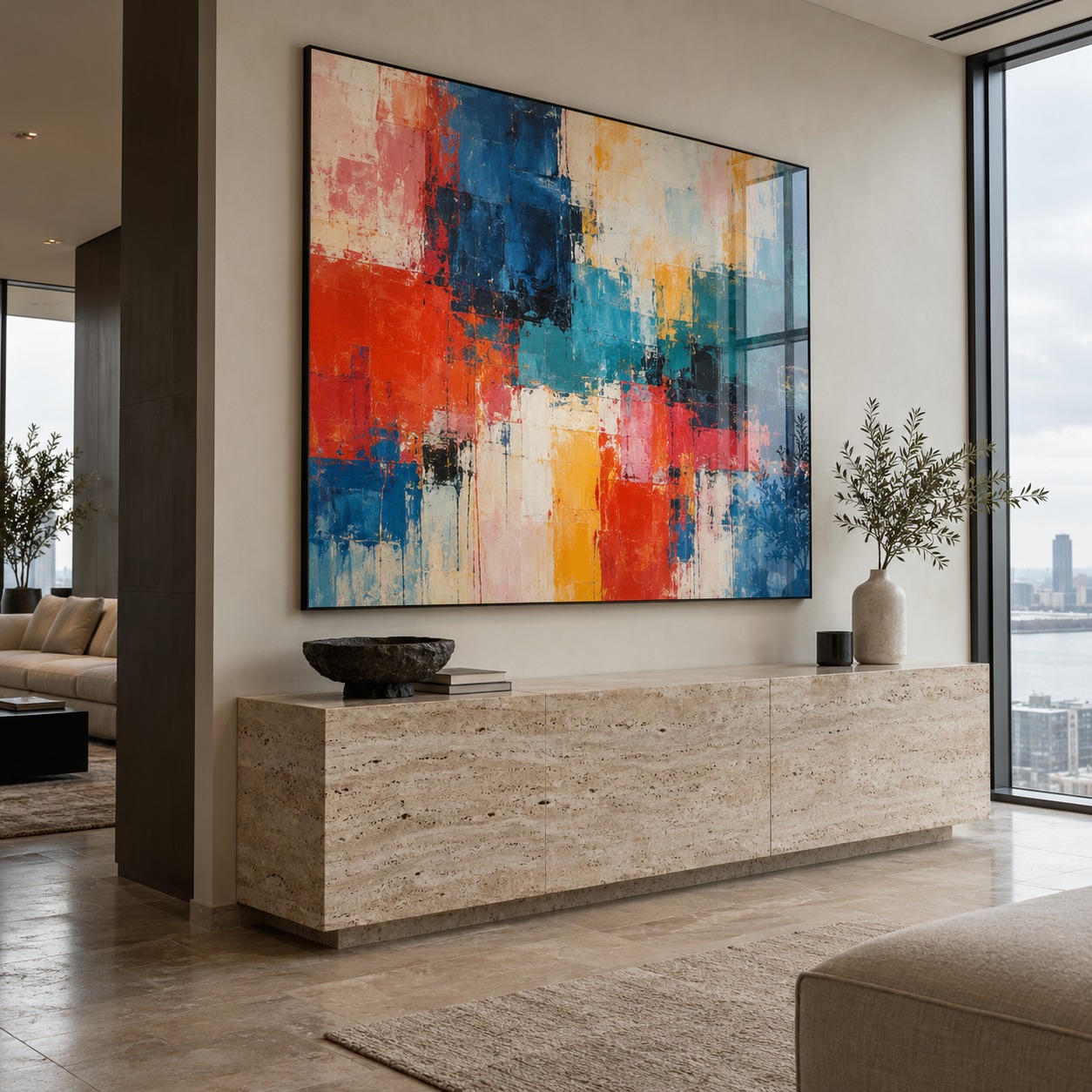
Some artwork needs no help at all. Bold prints, striking photographs and busy paintings already have plenty going on. A slim, clean frame in black, white or natural wood lets them take center stage.
The frame becomes a quiet edge rather than a feature. Your eye goes to the image first, which is exactly where you want it.
A rule I use is that the frame should be the second thing you notice, never the first. If someone comments on the frame before the picture, the frame is probably working too hard.
When a bolder frame helps
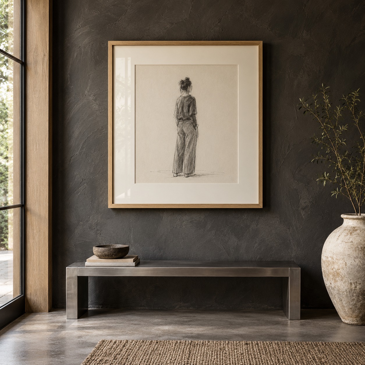
Small or delicate pieces can look lost on a busy wall. A pencil sketch or a tiny vintage photograph is a good example. A wider, more substantial frame gives it presence and makes it feel intentional rather than forgotten.
The same goes for pale artwork on a dark wall. A stronger frame gives the piece a clear boundary, so it doesn’t fade into the paint behind it.
Matching frame weight to the art
Frame weight is the visual heft of the molding. Its width, depth, profile and finish all add to it. A heavy, deep frame around a light pencil study feels like a coat two sizes too big. A wafer-thin metal frame around a dense oil painting can look underdressed.
Try to match the weight of the frame to the weight of the image. Strong contrast, thick paint, saturated color and large scale can carry a heavier molding. Fine linework, soft tones and lots of white paper usually want something lighter, or a light frame paired with a generous mat.
Depth is easy to forget. A deep box frame casts a shadow line on the wall and adds weight even when the face of the molding is narrow. That suits objects, textiles and thick canvases. Flat paper pieces usually sit better in shallower frames unless you want them to feel more sculptural.
Profile matters too. A flat, square-edged molding reads as modern and graphic. A rounded or stepped profile feels softer and more traditional. Neither is right on its own. It depends on the piece.
If you’re torn between two widths, photograph the piece with a sample of each and view the photos small on your phone. The version where the image still reads first is usually the right one.
Jewelry design taught me that a setting either holds the stone or competes with it. Frames behave the same way. The best ones are often the ones you barely register.
You don’t need identical frames
Choosing frames to suit each piece doesn’t mean ending up with a mismatched wall. Framed artwork can vary in width, finish and depth and still look cohesive. What matters is that the choices feel considered.
A shared tone, a repeated finish or similar proportions is often enough to tie everything together. Start with the artwork, then let the frames follow. When you work in that order, the wall feels collected rather than assembled.
Making every frame match too perfectly
Many people assume a gallery wall means a wall of identical frames. It doesn’t. A perfectly matched set can even feel a bit stiff, like a hotel corridor where every print came from the same catalog page.
Matching everything also takes away one of your most useful tools. If every frame is the same, you can’t give a small piece more presence or let a busy one breathe.
Uniformity, consistency and cohesion
It helps to separate three ideas. Uniformity means everything is the same: same frame, same size, same finish. Consistency means repeating a few details, such as a white mat on every piece or equal gaps between frames.
Cohesion is the overall feeling that the pieces belong together, even when they’re different. Cohesion is the goal. Uniformity is only one fairly blunt way of getting there.
Designing enterprise dashboards made this clear to me. A screen full of different components still reads as orderly when spacing, alignment and a small set of colors stay consistent. A gallery wall follows the same logic.
Mixing frames without visual chaos
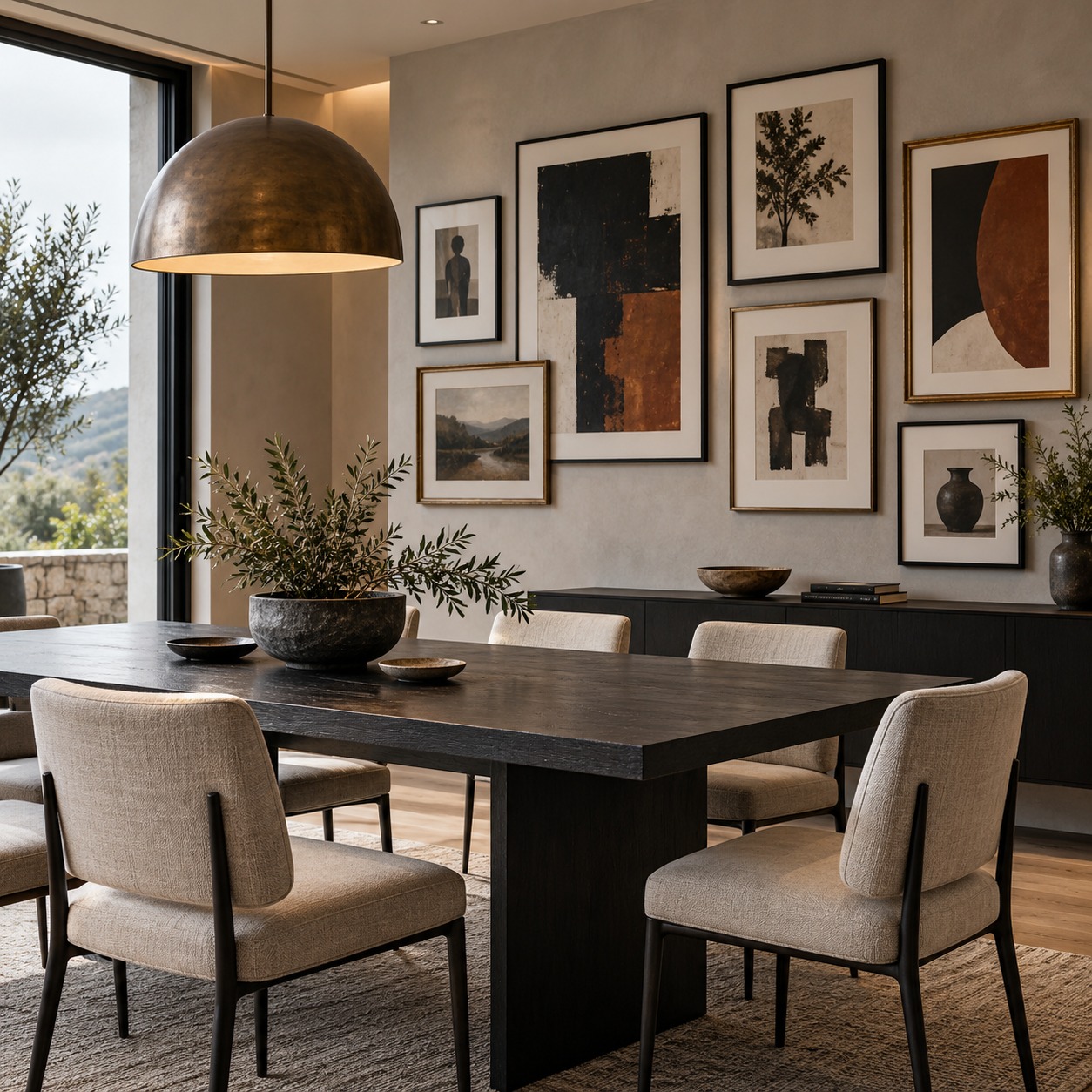
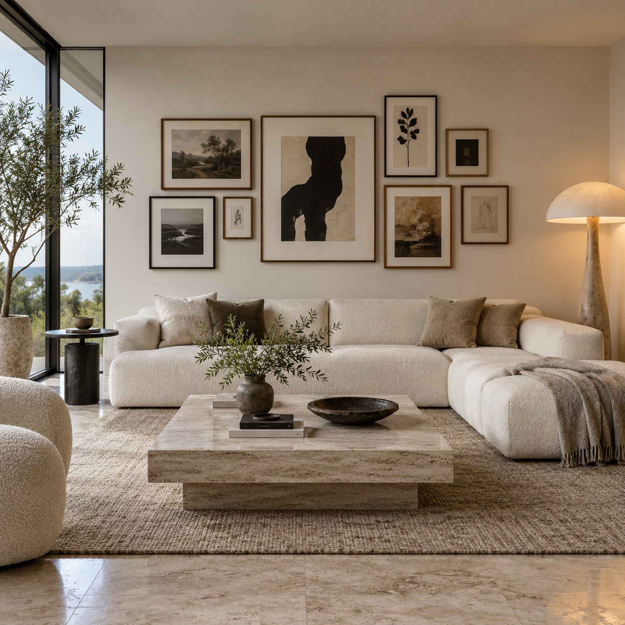
You can safely mix wood and painted finishes, different frame widths, portrait and landscape orientations, and vintage and contemporary pieces. A slim black frame beside a chunky oak one adds depth. An old gilt frame next to a modern print adds a little story.
Something still has to connect it all visually. Without a link, mixed frames look random. With one, they look intentional. Useful threads include:
- a recurring frame finish, such as black or one wood tone
- the same mat color across most pieces
- a shared color in the artwork
- a common theme or mood in the images
Pick one or two threads and keep them steady. A rule I find reliable is to let only one variable change freely. If the finishes vary, keep the mats consistent. If the frame widths vary, keep the palette tight.
Watch the ratio
One wood frame among eight black ones can look like a mistake. Two or three of the odd finish, spread across the arrangement, look like a choice.
The same applies to ornate frames. One gilt frame can be a lovely focal point. Several, scattered at random, start to fight each other for attention.
Ignoring mat width and proportion
The space between artwork and frame can make as much difference as the frame itself. A mat, or mount, creates a pause around the piece. It gives the eye a moment before it reaches the image.
A wider mat can give a small print or photograph far more presence. Similar matting can also connect works of very different sizes. That makes it one of the easiest ways to bring a mixed wall together.
Getting the width right
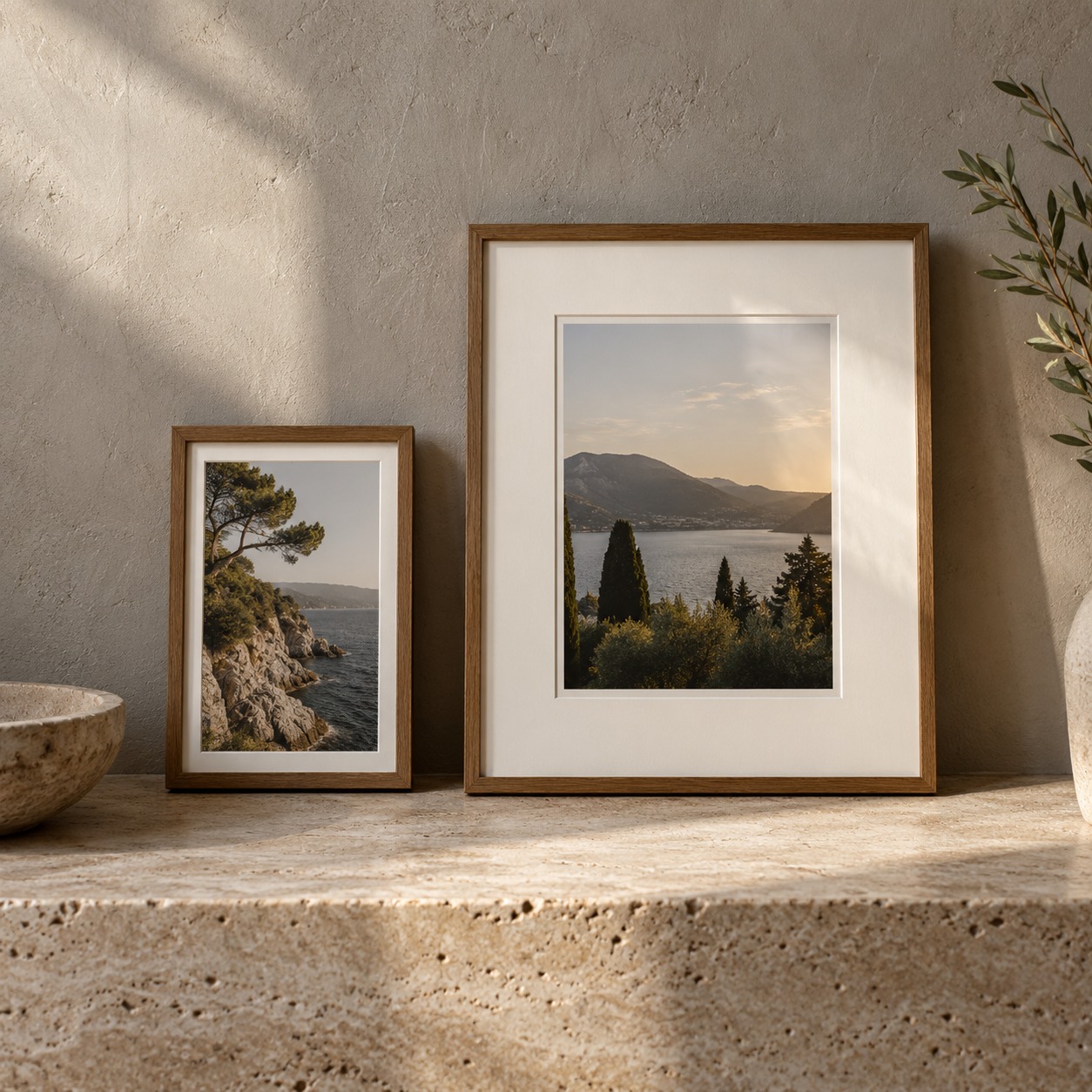
Make sure the proportions feel comfortable. A mat that’s too narrow looks accidental, as if the frame was simply a little too big. One that’s too wide can swallow the image and make it look like an afterthought.
Small pieces usually benefit from a mat that’s generous relative to their size. Larger pieces often need less, because they already have presence. Many framers also make the bottom border slightly deeper than the top and sides. This old trick stops the image from looking as if it’s sliding down inside the frame.
Mat thickness plays a part as well. A thicker board or a double mat creates a deeper bevel and a small shadow at the opening, which feels more finished on originals. A thin reveal of a second color under the top mat can echo a tone in the art, but keep that line narrow so it reads as a detail rather than a stripe.
If you’re unsure, cut a few strips of white card and lay them around the artwork at different widths. You’ll usually see the right one quickly.
Choosing mat color
White and off-white mats are popular for good reason. They stay quiet and let the artwork lead. But “white” covers a lot of ground, and a bright optical white next to a warm, aged print can make the paper look dirty.
Pick a mat tone that sits comfortably with the paper or the lightest part of the image. Soft whites suit vintage photographs and watercolors. Brighter whites suit crisp modern prints. Colored mats can work, but they quickly become part of the artwork, so use them deliberately and sparingly.
Matted and unmatted pieces together
Not every piece needs a mat. Canvases, panels and many bold posters look better without one. A mixed wall can include both, as long as the matted pieces share a similar color and width. That repetition is often enough to read as consistency.
Forcing unusual artwork into standard frame sizes
Not every piece comes in a standard size. A vintage photograph, child’s drawing, favorite poster, textile or piece of memorabilia may not fit an off-the-shelf frame. Forcing it in can leave awkward gaps, require unwanted cropping, or crowd the work against the edges.
The usual workarounds rarely help. Trimming a sentimental drawing to fit is permanent. Taping a small photo behind a mat opening that’s clearly the wrong shape looks makeshift, even from across the room.
When standard sizes work
Standard frames are perfectly fine when the artwork was made to fit them. Many prints and photographs are produced in common sizes, and a ready-made frame with a matching mat opening can look clean and considered. There’s no need to custom frame everything.
When made-to-measure makes sense
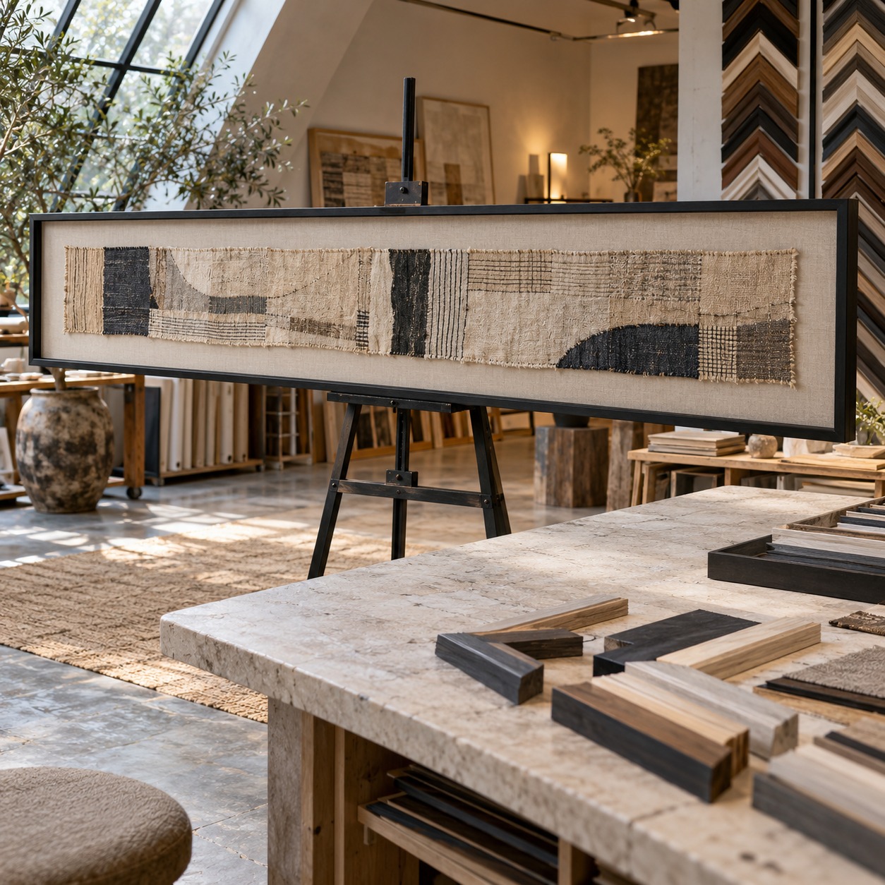
custom picture frames fit the artwork rather than forcing the artwork to fit a preset size. They make particular sense for unusually narrow, oversized, fragile or sentimental pieces. They’re also useful when you want a mat width that standard frames can’t offer.
Custom framing also gives you control over proportion across the whole wall. You can give a tiny sketch and a large print the same molding width, or keep the mat depth consistent across pieces of very different sizes.
The goal isn’t identical frames. It’s the right amount of space around each piece.
Choosing frame finishes that fight the room
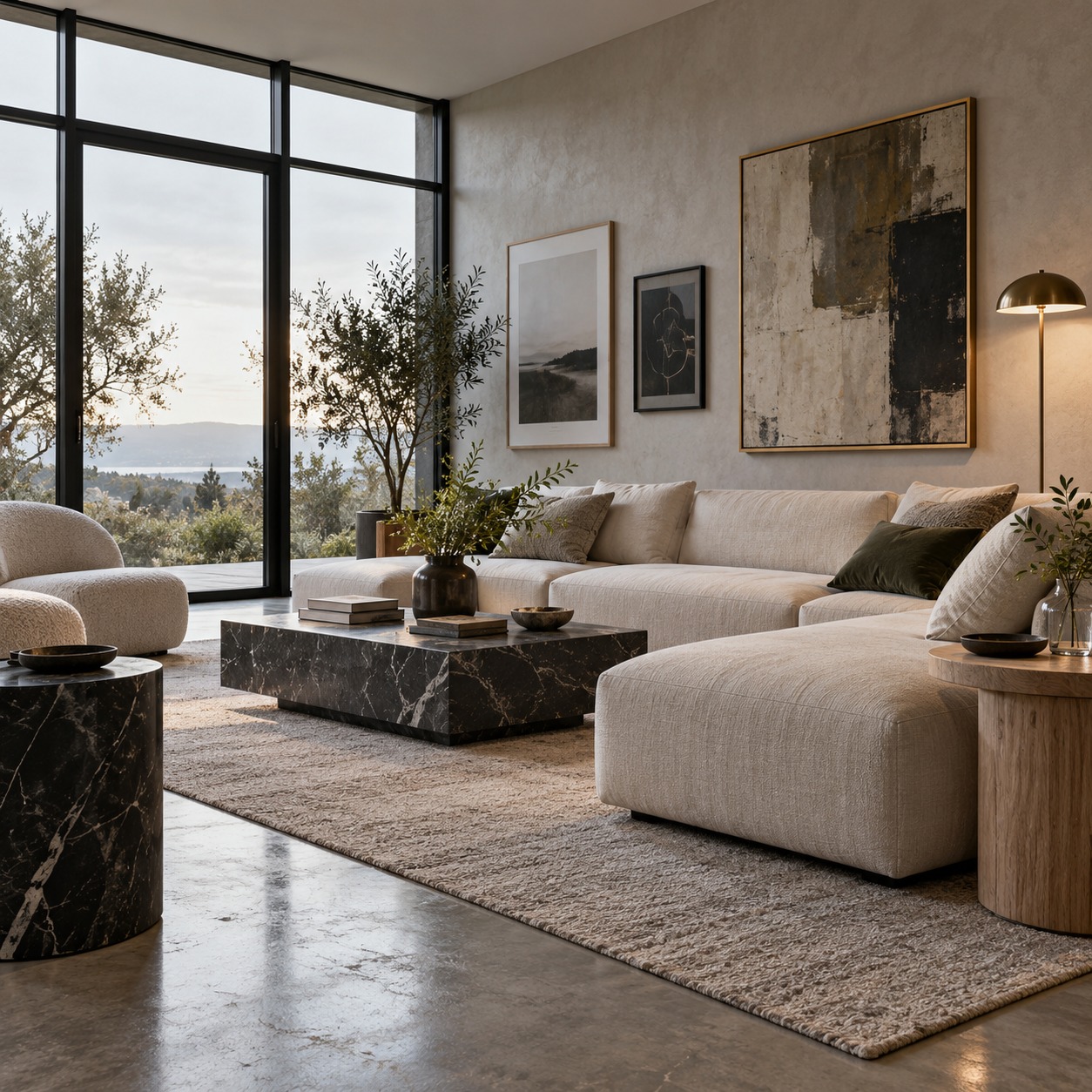
The wall isn’t isolated. Furniture, flooring, lighting, rugs, curtains and hardware all affect how a gallery wall feels. A finish that looks lovely in the shop can clash once it hangs near an orange-toned oak floor or a brushed brass lamp.
You don’t need to match everything exactly. That can feel staged. Instead, repeat one finish or tone from the room. Black frames can echo window frames or metal chair legs. Light oak can pick up a side table. Brass can connect to a mirror or a light fixture.
Wood tones need care
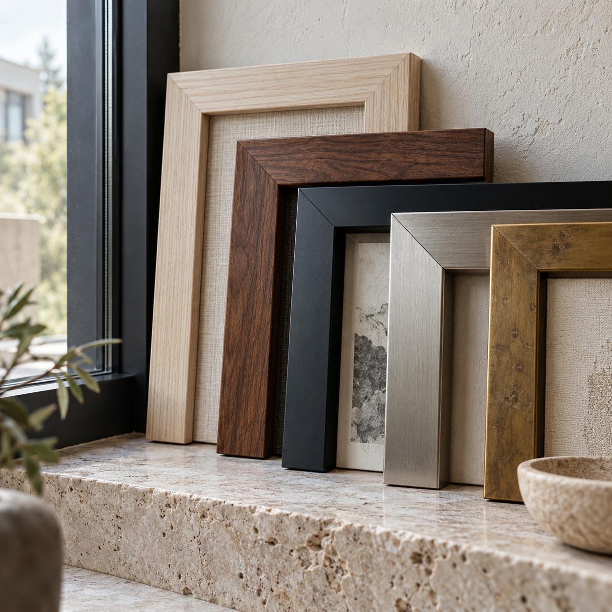
Wood is where most clashes happen. Two woods that are close but not the same can look like a failed match. Woods that are clearly different, such as pale ash beside dark walnut, usually look intentional.
Pay attention to undertone as well as depth. Warm, red-leaning woods and cool, gray-leaning woods can sit awkwardly together, even when they look similar in a product photo. Hold a sample against the furniture in daylight before committing.
Metal and painted finishes
Metal frames read as cleaner and more graphic. Black and silver suit modern rooms and photography. Brass and gold add warmth, but polished versions can look loud beside matte furniture. Brushed or aged finishes are usually easier to live with.
Painted frames are flexible. White frames on a white wall almost disappear, which works well for colorful art. Frames painted close to the wall color create a softer, more built-in look.
My decision rule here is simple. If the room is already busy with materials, use fewer frame finishes. If the room is quiet, the frames can carry more variety.
Skipping protective framing details
Protective details are easy to ignore because you can’t see most of them. But they decide whether your art still looks good years from now. This matters most for original works on paper, old photographs, and artwork you or your children have made at home.
Glazing
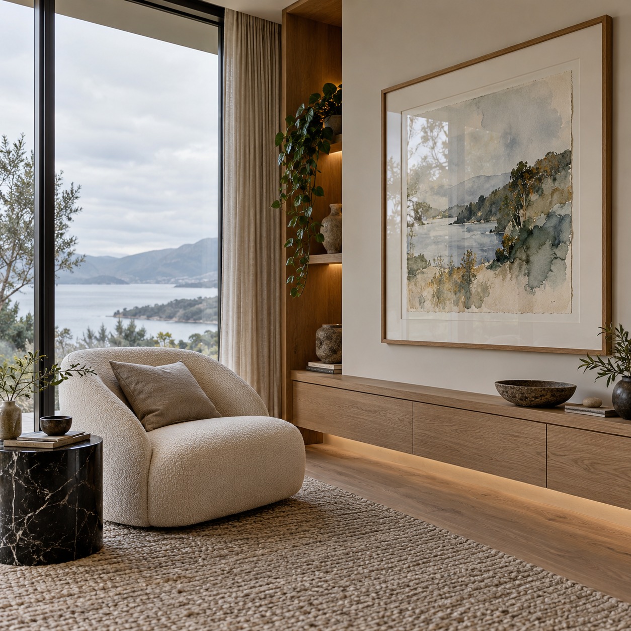
Glazing is the clear layer in front of the art. Standard glass is affordable and clear, but it can reflect windows and lamps. Acrylic is lighter and less likely to shatter, which makes it a sensible choice for large frames, children’s rooms or busy hallways.
Anti-reflective and UV-filtering glazing cost more, but they’re worth considering for valuable or light-sensitive pieces. Sunlight can fade inks, watercolors and photographs over time, and UV-filtering glazing helps slow that down. It won’t make a piece safe in direct sun, so placement still counts.
Before choosing glazing, look at the wall at different times of day. A spot opposite a large window can turn glossy glass into a mirror.
Mats, backing and conservation materials

Ordinary card and backing board can contain acids that discolor artwork over time. You’ll sometimes see a brown line along the edge of an old print where a cheap mat touched it. Acid-free, conservation-grade mats and backing help prevent this.
Ask how the artwork is attached, too. Original pieces should be held with reversible hinges or photo corners, not glued down or stuck with household tape. A mat also keeps the art from touching the glazing, which matters because paper and photographs can stick to glass over time. For unmatted pieces, ask the framer about spacers that do the same job.
Think about where the frame will hang. Paper can cockle with changes in humidity, so keep originals away from radiators, bathrooms and damp exterior walls. A well-sealed back also helps keep dust and small insects out of the frame.
What can stay simple
Not every piece needs full conservation framing. An inexpensive poster you plan to replace in a few years can live happily in a standard frame. Save the extra spend for originals, irreplaceable photographs and work you want to pass on.
A quick layout and hanging check
Once the frames are chosen, the arrangement needs a final check. Our layout guide covers this in depth, so here’s the short version.
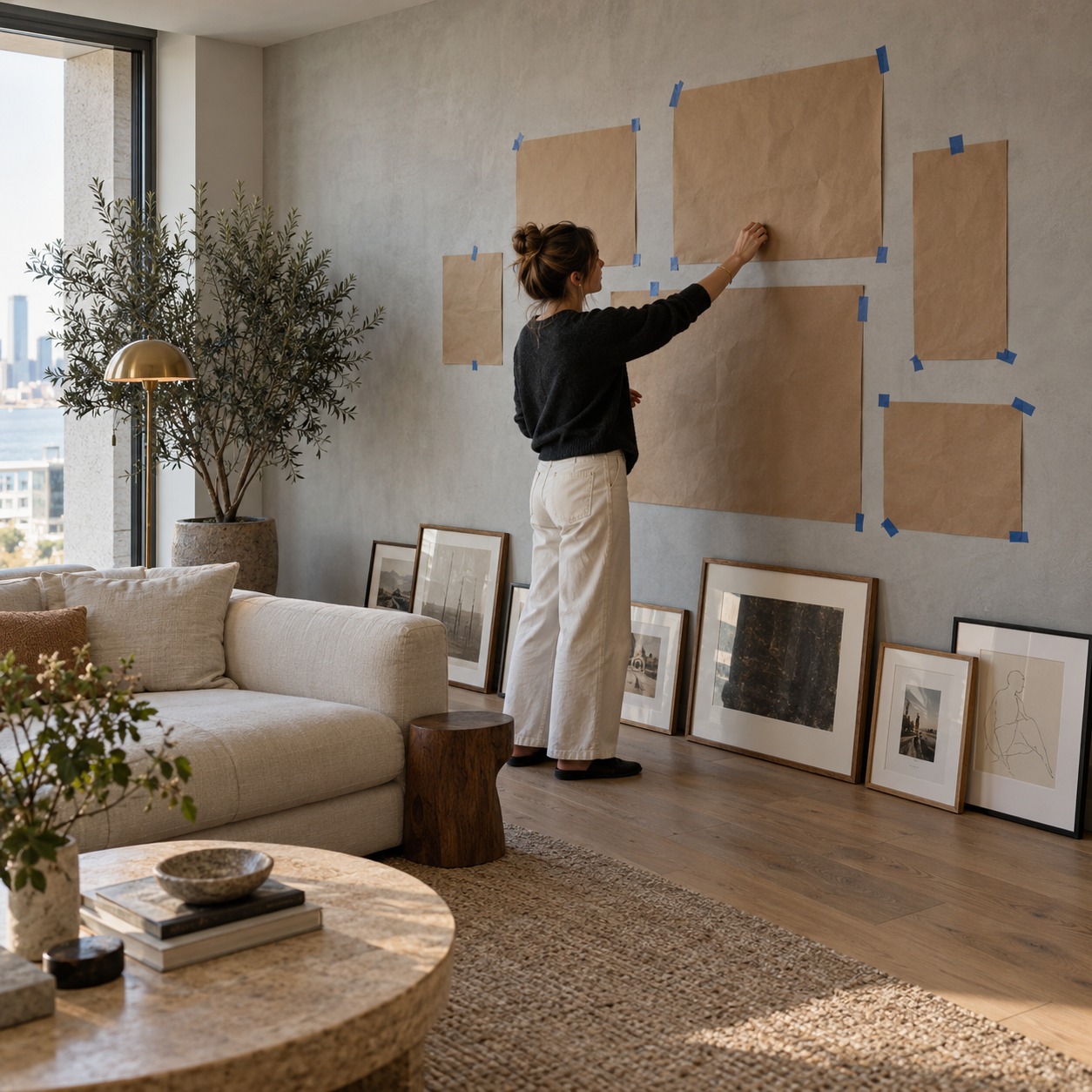
Treat the collection as one large piece. Above a large sofa, a small cluster usually looks lost. As a general guide, aim for the arrangement to cover about two-thirds of the width of the furniture below it. Keep the gaps between frames consistent, roughly 5 to 8 cm (2 to 3 inches) for most walls.
Lay everything on the floor first, then photograph it from standing height. Use paper templates or painter’s tape before making holes. And don’t feel you must fill every inch. Empty space gives the eye somewhere to rest and lets the wall grow over time.
Frequently asked questions
Do all frames in a gallery wall need to match?
No. Frames can vary in finish, width and style as long as something connects them. Repeat one or two details, such as a frame color, mat treatment or palette, and the wall will read as cohesive.
How do I choose the right frame size for artwork?
Start with the artwork’s dimensions, then decide whether it needs a mat. Add the mat border on each side to find the frame size. If a standard frame would force cropping or leave awkward gaps, a made-to-measure frame is usually the better option.
Should every picture in a gallery wall have a mat?
No. Canvases, panels and bold posters often look better without one. If you mix matted and unmatted pieces, keep the matted ones similar in color and width so they read as a set.
Can I mix wood and metal frames?
Yes. Mixing wood and metal adds depth and makes the wall feel collected over time. Repeat each material more than once across the arrangement, and choose a wood tone that suits the furniture nearby.
When is custom framing worth the cost?
Custom framing makes the most sense for unusual sizes, originals, fragile or sentimental pieces, and anything you want to protect long term. For standard-size prints you may replace, a good ready-made frame is often enough.
The final check before you buy
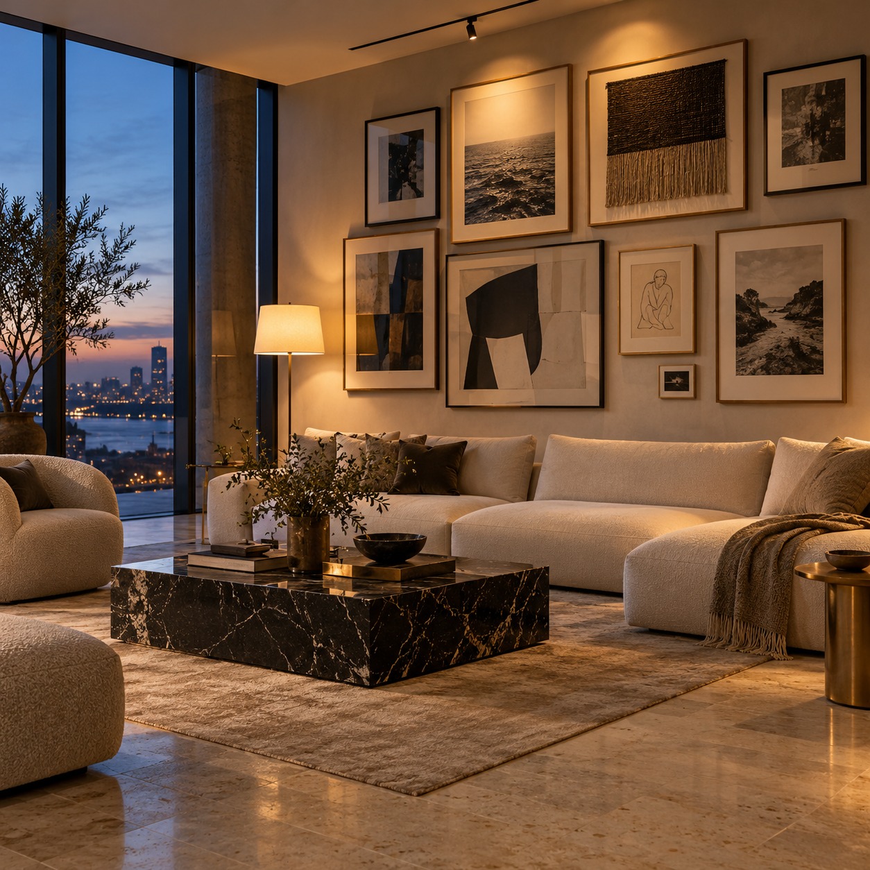
Before you order a single frame, hold each piece and answer three questions. How heavy is the image? What tone is the paper? How much would you mind if it faded or yellowed? Those answers set the frame weight, the mat color and the level of protection.
Next, measure the artwork itself, not the old frame or the sheet it arrived on, and note how much border you want visible. Check the wall at the time of day you use the room most, since that light decides how the glazing and finishes will read. Then split the budget: conservation materials for the pieces that need them, simpler frames for the rest.
Finally, choose one thread to repeat across the wall, whether that’s a finish, a mat or a palette, and let everything else vary. That’s how to choose frames for a gallery wall without guesswork: read each piece first, protect what can’t be replaced, and keep one detail steady from frame to frame.
- 5shares
- Facebook0
- Pinterest5
- Twitter0
- Reddit0