A few years back I worked on a residential project where the client kept using the word “boho” but pointing at photos that had nothing in common with each other — one was all white linen and rattan, another looked like a Moroccan souk exploded in a living room.
- What bohemian interior design actually means
- Is Boho Out of Style in 2026?
- The different faces of boho: modern, rustic, and glam
- The design principle nobody mentions: curated vs. cluttered
- Building a boho color palette
- Bohemian design in the bedroom and small spaces
- Getting the look: budget basics vs. real vintage pieces
- Conclusion
- Small details that make boho feel collected
- FAQ
- What is bohemian interior design?
- Is boho out of style in 2026?
- What are the different types of bohemian interior design?
- What's the biggest mistake people make with boho decor?
- What is the best color palette for a boho room?
- How do you do bohemian design on a budget?
- Can bohemian design work in a small space?
That’s when it clicked: most people can list the ingredients (macramé, jute rug, rattan chair, a few plants) without understanding what actually makes a boho room read as curated instead of like a garage sale.
Bohemian interior design isn’t a shopping list. It’s a design philosophy with real structural logic underneath the layered textures and warm colors — the same way any style has rules, even the ones that look rule-free on purpose.
This isn’t another “add a jute rug and some plants” roundup. It’s what the style actually means, an honest answer on whether it’s played out in 2026, the real differences between its sub-styles, and the one design principle that separates a boho room that works from one that just looks cluttered.
What bohemian interior design actually means
Say “boho” to most people and they picture a Pinterest board — macramé, a rattan peacock chair, maybe a Moroccan pouf. That’s the surface. The actual style has a specific origin and a more precise definition than the aesthetic shorthand suggests.
Where the style comes from
The term traces back to 19th-century Paris, where “bohemian” originally described artists, writers, and free-thinkers living outside conventional social and financial norms — often literally with fewer means, filling their homes with whatever had meaning rather than what matched.
That origin matters, because it explains why the style has always been about accumulation over time and personal history, not a coordinated purchase. A room furnished in a weekend from one catalog can look boho-adjacent, but it’s missing the thing the word originally described.
The real characteristics
Strip away the surface signifiers and three things actually define the style: layered texture (rattan next to velvet next to a worn kilim, each material doing different work), globally-influenced pattern and craft (Moroccan, Indian, West African textile traditions showing up as real references, not just “ethnic print”), and objects that carry a story — a piece your grandmother owned, something bought on a specific trip, a chair that doesn’t match anything else but earns its place anyway.
In my experience, that last point is what separates a boho room from an eclectic one. Eclectic design mixes styles intentionally for visual contrast. Boho mixes them because the objects actually came from different places and moments in someone’s life — the mismatch is honest, not staged.
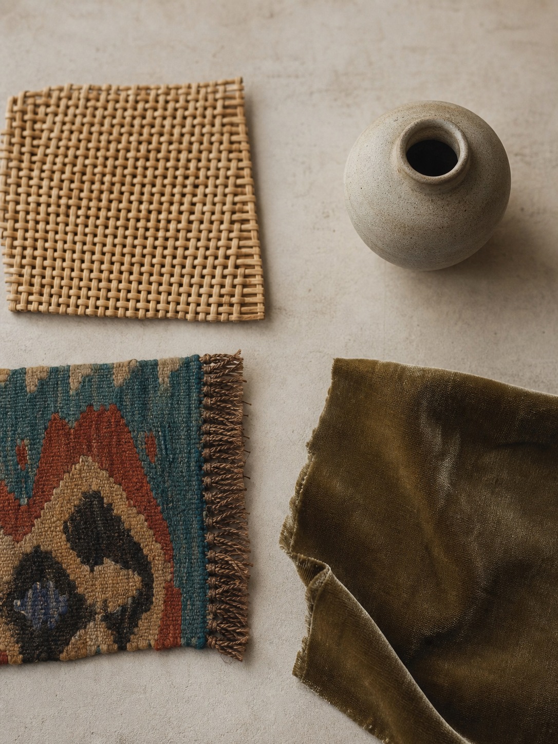
Tip: before buying anything labeled “boho,” ask whether it has any actual connection to you or your history. If the answer is no, it’s decor. If yes, it’s the real thing.
Is Boho Out of Style in 2026?
I get asked this constantly, usually by people worried their living room is about to look dated. Short answer: no, but a specific version of it is — and knowing the difference matters more than the trend headlines suggest.
Why the “boho is dead” claim keeps resurfacing
Boho went through an oversaturation cycle — the same five signifiers (macramé wall hanging, rattan pendant light, jute rug, monstera plant, Moroccan pouf) showed up in so many rental apartments and Instagram feeds around the same time that the formula started to feel stale. That’s a real phenomenon. It’s also not the same thing as the underlying design philosophy going out of style. What got tired was the checklist version — five identical objects arranged the same way in a thousand different rooms.
What’s actually changed vs. what’s just execution getting lazy
What’s genuinely shifted is a move away from that exact formula toward more considered, personal versions of the same idea — which is, ironically, closer to what bohemian design meant in the first place. I’ve noticed the rooms that still feel fresh right now aren’t avoiding boho elements; they’re using fewer of them, chosen more specifically, mixed into a base that isn’t purely boho at all. A rattan chair against clean white walls with almost nothing else reads completely different from a rattan chair in a room where every surface has a plant, a textile, and a piece of macramé competing for attention.
So the honest answer: the aesthetic checklist version of boho is tired. The actual design principle — personal, layered, collected over time — was never really a trend to begin with, which is exactly why it keeps surviving every cycle that declares it over.
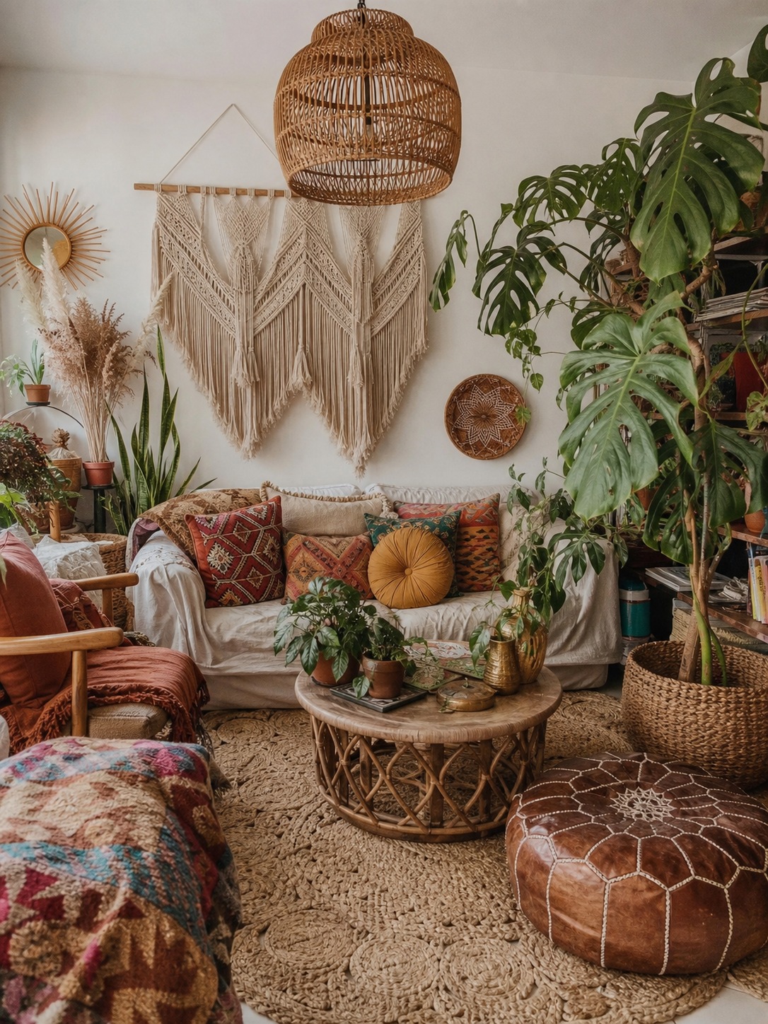
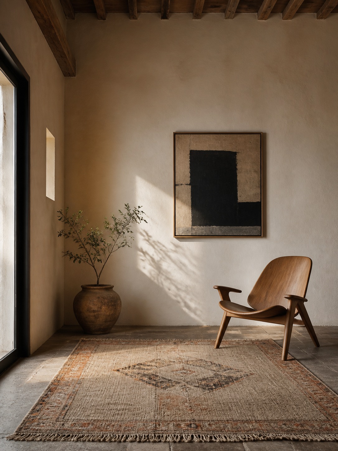
The different faces of boho: modern, rustic, and glam
Most articles use “boho,” “modern boho,” and “boho glam” interchangeably, which is exactly why so many people end up with a room that doesn’t cohere — they’re pulling references from three different sub-styles without realizing it.
Modern boho
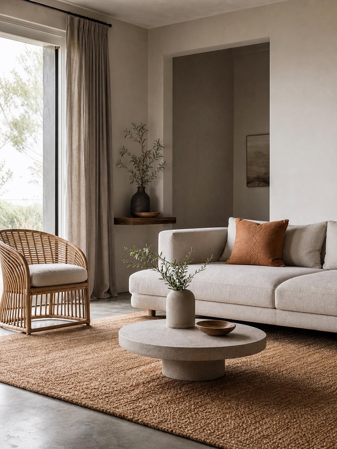
This is boho with the volume turned down. A clean, mostly neutral base — white or warm-gray walls, simple furniture silhouettes — with boho elements used as accents rather than the whole language: one textured rug, a single rattan piece, restrained pattern. It borrows boho’s warmth and texture without the density, which is why it photographs so well and reads as less risky to commit to. If you’re nervous about “too much,” this is the entry point.
Rustic boho
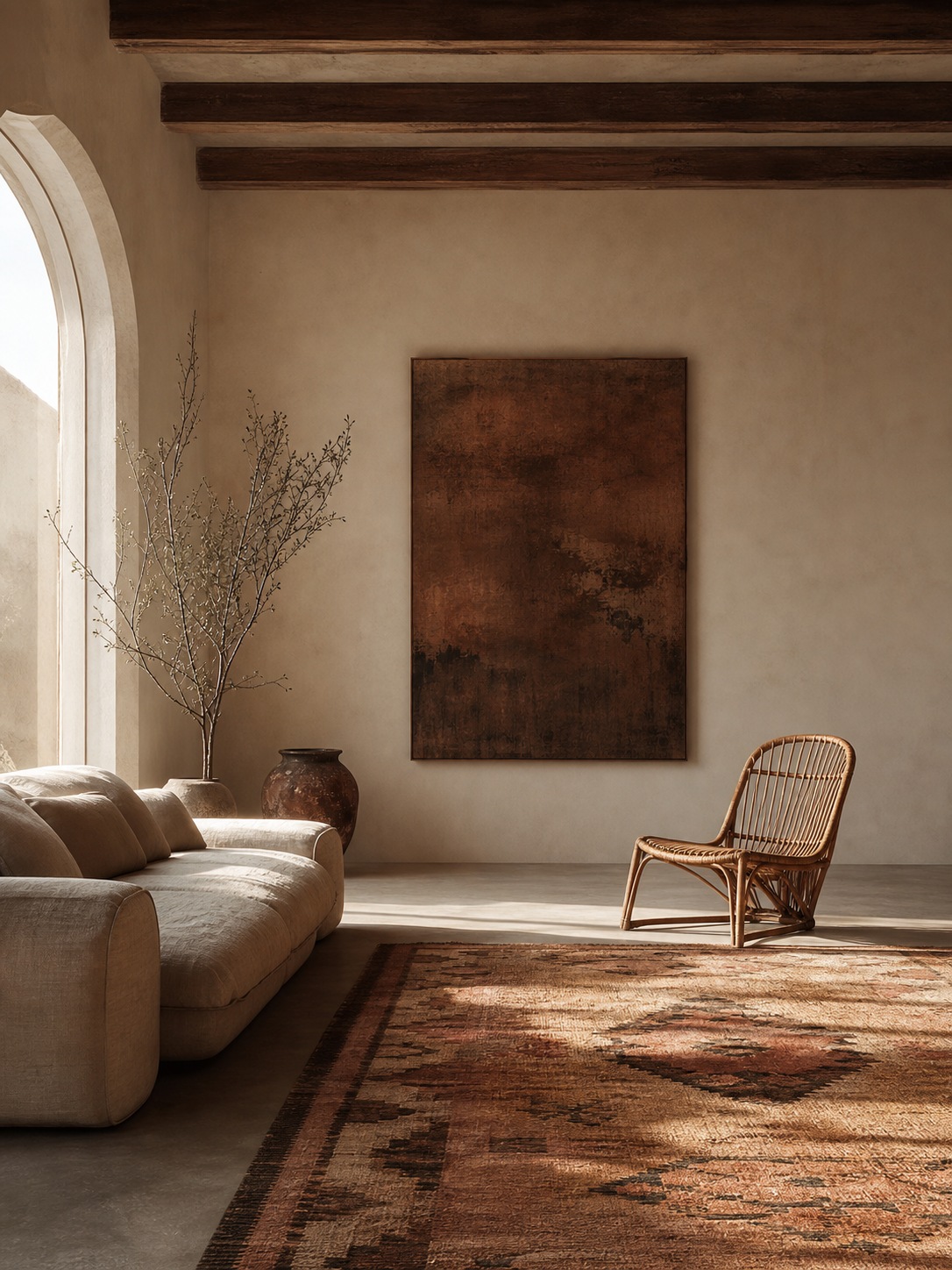
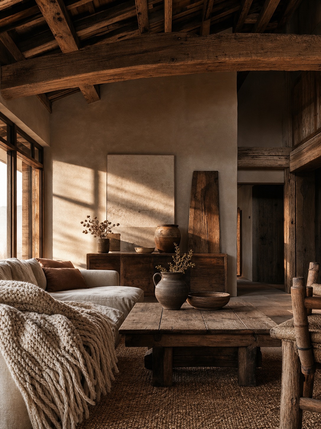
This version leans into raw, natural materials — unfinished or reclaimed wood, heavier textures, deeper earth tones, less polish overall. Think exposed beams, a chunky handwoven throw, ceramics with visible imperfection rather than a clean glaze. It has more in common with Scandinavian and farmhouse styles at the edges than modern boho does, but the layered, collected quality still separates it from either of those.
Boho glam
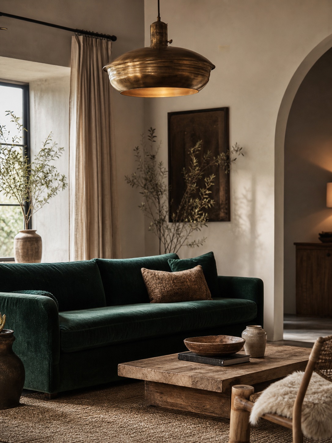
The least talked-about version and, in my opinion, the hardest to get right. This adds metallics, jewel tones, and more polished materials — velvet, brass, mirrored surfaces — into the boho mix, aiming for warmth and richness rather than raw texture. Done well it looks luxurious and considered. Done poorly it looks like two unrelated Pinterest boards collided, because glam’s instinct toward polish and boho’s instinct toward lived-in texture actively pull against each other. If you’re going this route, pick one element to be the “glam” anchor (a brass light fixture, a velvet sofa) and let everything else stay closer to rustic or modern boho.
Tip: pick one sub-style as your primary reference before you start buying anything. Pulling one piece from each version is the fastest way to end up with a room that feels like three different projects stitched together.
The design principle nobody mentions: curated vs. cluttered
Every boho article tells you to layer textures and mix patterns. Almost none of them explain the thing that actually determines whether that layering reads as rich or just busy — and it’s not a materials question at all. It’s proportion.
Proportion and negative space in a “maximal” style
Boho gets filed under “maximalist,” which leads people to assume more is always more. It isn’t. Even the most layered boho room has negative space doing real work — a blank wall behind a gallery of objects, a stretch of floor between a rug and the next piece of furniture, a ceiling left alone above a busy floor level. Without that breathing room, every object competes for attention at once and the eye has nowhere to rest. That’s the actual mechanism behind a room feeling “cluttered” versus “layered” — it’s not how much is in the room, it’s whether there’s enough negative space around it for each piece to still read individually.
I think about this the same way I’d think about a facade’s proportion grid or an automotive surface’s negative space — a design with a lot of visual information still needs a rhythm of dense and empty, or it stops reading as composed and starts reading as noise. Boho just applies that principle to a room instead of a building or a car body.
Why a boho room needs a hierarchy of focal points, not equal-weight objects everywhere
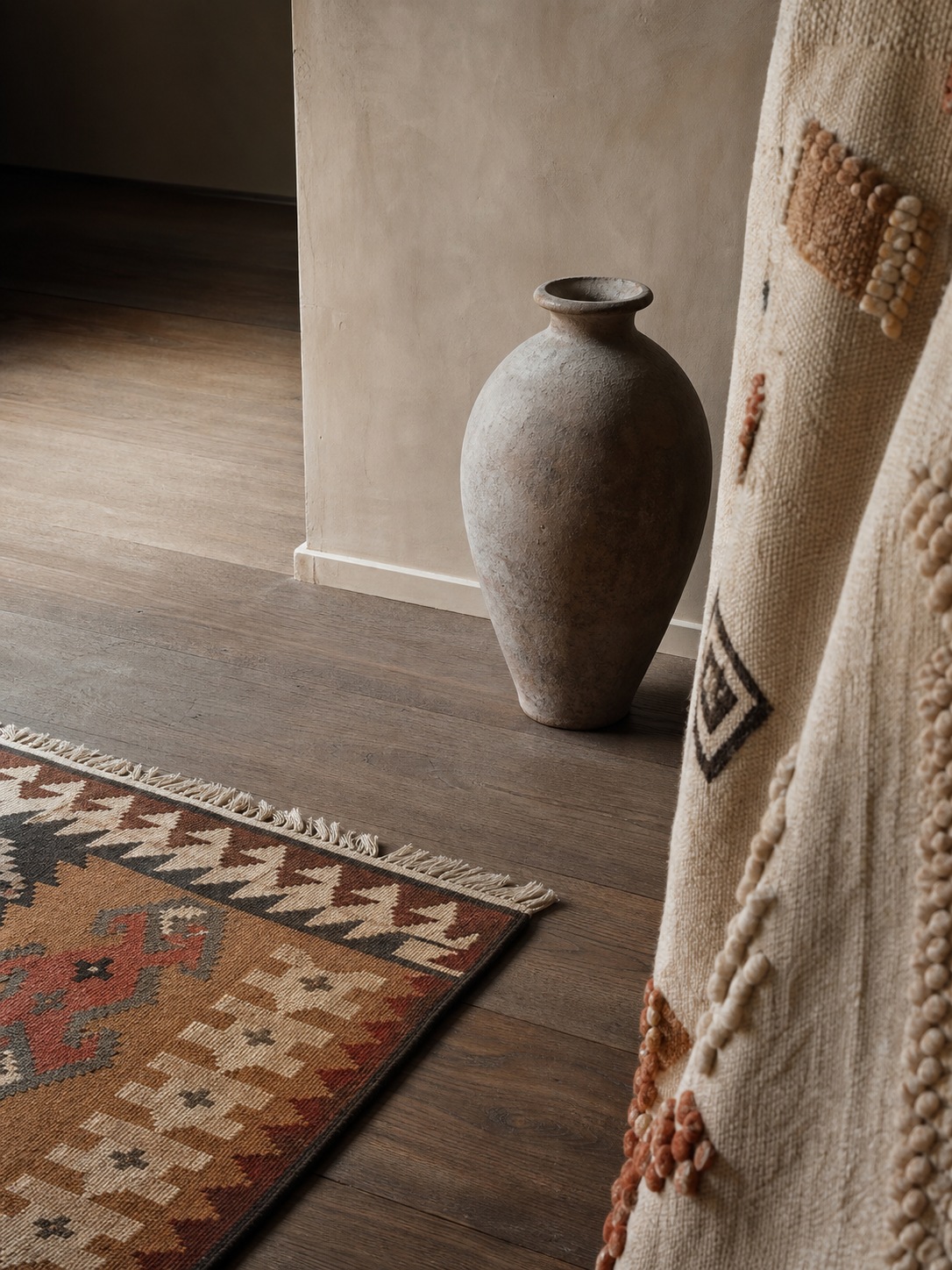
The second half of this: not every object in the room should carry equal visual weight. Pick one or two genuine focal points — a vintage rug, a striking piece of art, an heirloom cabinet — and let everything else, including other textured or patterned pieces, sit slightly behind them in visual priority. Rooms that feel chaotic usually have five or six objects all shouting at the same volume. Rooms that feel rich usually have one or two loud pieces and everything else whispering in support.
Tip: stand in the doorway and pick the one object your eye lands on first. If you can’t name one, or if five things are competing equally, the room needs editing, not more objects.
Building a boho color palette
Boho color doesn’t start with the bright, saturated tones people associate with the style — it starts with restraint, and the vibrant color earns its place on top of that base.
The earthy base
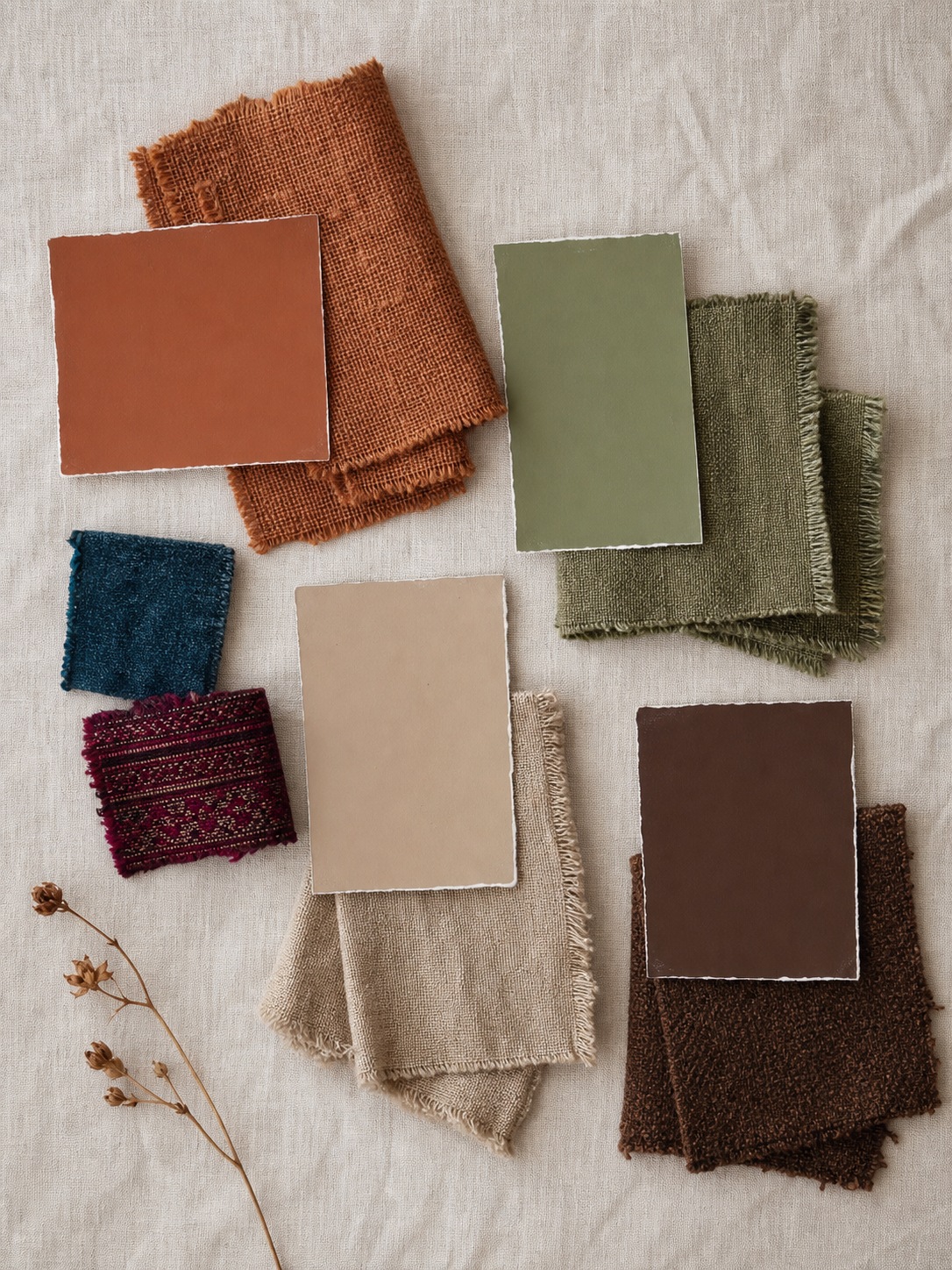
Almost every boho room that works starts from an earthy neutral foundation: terracotta, warm sand, sage green, deep browns. These colors do the same job walls do in a more minimal room — they’re the quiet backdrop that keeps everything layered on top of them from fighting each other. Terracotta specifically shows up constantly in boho spaces because it bridges warm and neutral at once; it reads as a color choice without competing with pattern the way a brighter tone would.
I lean on this same logic in branding work — you pick a dominant neutral before you decide where the accent color goes, because the accent only reads as intentional if it has something quiet to sit against. A boho room without that earthy base and jumping straight to jewel tones and pattern everywhere is why some spaces read as chaotic rather than rich.
Where jewel tones and pattern earn their place
Once the earthy base is set, jewel tones — deep blues, burnt oranges, ochre, a rich burgundy — come in as accents, usually through textiles: a single patterned rug, a set of cushions, a wall hanging. The mistake is treating every surface as an opportunity for color and pattern at once. Pick two or three moments for the jewel tones to show up, and let the earthy base carry the rest of the room. That restraint is what makes the accent colors actually register as accents instead of getting lost in a sea of equally saturated choices.
Tip: photograph your room in black and white before committing to a palette. If the composition doesn’t read clearly without color, adding vibrant tones on top won’t fix it — it’ll just be more color on the same underlying problem.
Bohemian design in the bedroom and small spaces
The bedroom is where boho’s usual approach — layer everything, add texture everywhere — runs into a problem: the room still has to function as somewhere you actually sleep, and a small space punishes visual clutter faster than a living room does.
Layering in a space that has to stay functional
A bedroom has fewer surfaces to work with than a living room, which means every layered element has to earn its spot twice as hard. I’d rather see one genuinely good textile — a vintage kilim as a wall hanging above the headboard, or a single well-chosen throw — than four smaller decorative pieces competing for the same visual attention in a room this size. The bed itself is usually the dominant object by default, so let it stay dominant: layer textures on the bedding itself (a woven throw, mixed pillow textures) rather than trying to out-compete it with wall decor.
Lighting matters more here than people expect. A warm, low bedside lamp does more for a boho bedroom’s atmosphere than another patterned textile would, because boho is ultimately about warmth and comfort, and warm light reads as both instantly.
Adapting the style for small rooms without it feeling chaotic
In a genuinely small room, the negative-space principle from earlier becomes non-negotiable rather than a nice-to-have. Pick a single rug, a single significant wall piece, and one or two supporting textures — resist adding a fourth or fifth layer just because there’s an empty corner. An empty corner in a small room is doing you a favor; it’s the only thing keeping the space from feeling like storage.
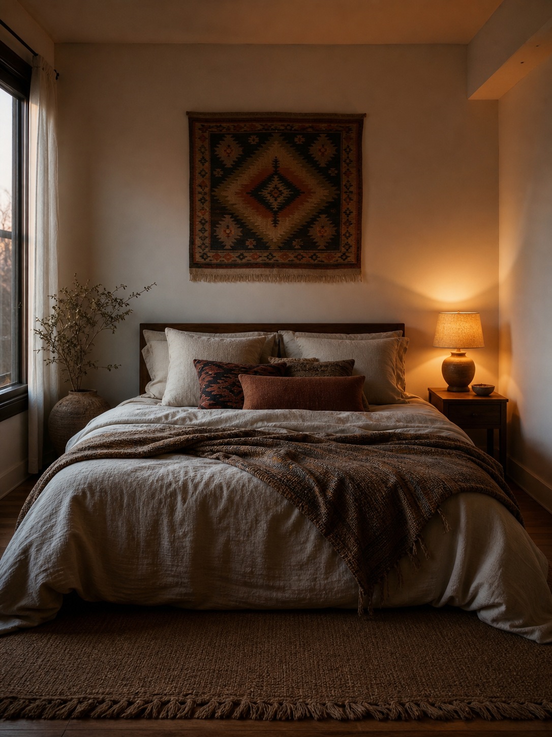
Tip: in a small bedroom, choose your one “story” piece — the item with real personal history — and build everything else as quiet support around it, rather than trying to give every object equal presence.
Getting the look: budget basics vs. real vintage pieces
Not every piece in a boho room needs to be a hard-won vintage find, and pretending otherwise makes the style feel more inaccessible than it actually is. The trick is knowing which pieces are worth the hunt and which ones can honestly come from anywhere.
Where budget-level pieces work fine
Base layers — a jute or plain woven rug, simple linen bedding, basic rattan storage — don’t need history to do their job. These are the neutral infrastructure of the room, the equivalent of the earthy color palette from earlier: they’re supposed to sit quietly in the background. IKEA, and similar mass-market retailers, cover this tier well, and there’s no design reason to spend more chasing a “vintage” version of something whose whole job is to stay unremarkable.
Where it’s worth hunting for something real
The pieces that actually carry the room — the ones I called “story pieces” earlier — are worth the extra effort. A genuine vintage kilim, a piece of pottery from an actual trip, a chair with some age and wear to it. These don’t need to be expensive; secondhand shops, estate sales, and local makers usually beat new “boho-style” reproductions on both price and authenticity. What they need is a real story attached, because that’s the entire mechanism that makes bohemian design read as personal instead of purchased.
I’d rather see one secondhand find with genuine wear and a story behind it than three brand-new items styled to look aged. The fake patina always reads slightly wrong up close, in a way that’s hard to name but easy to feel.
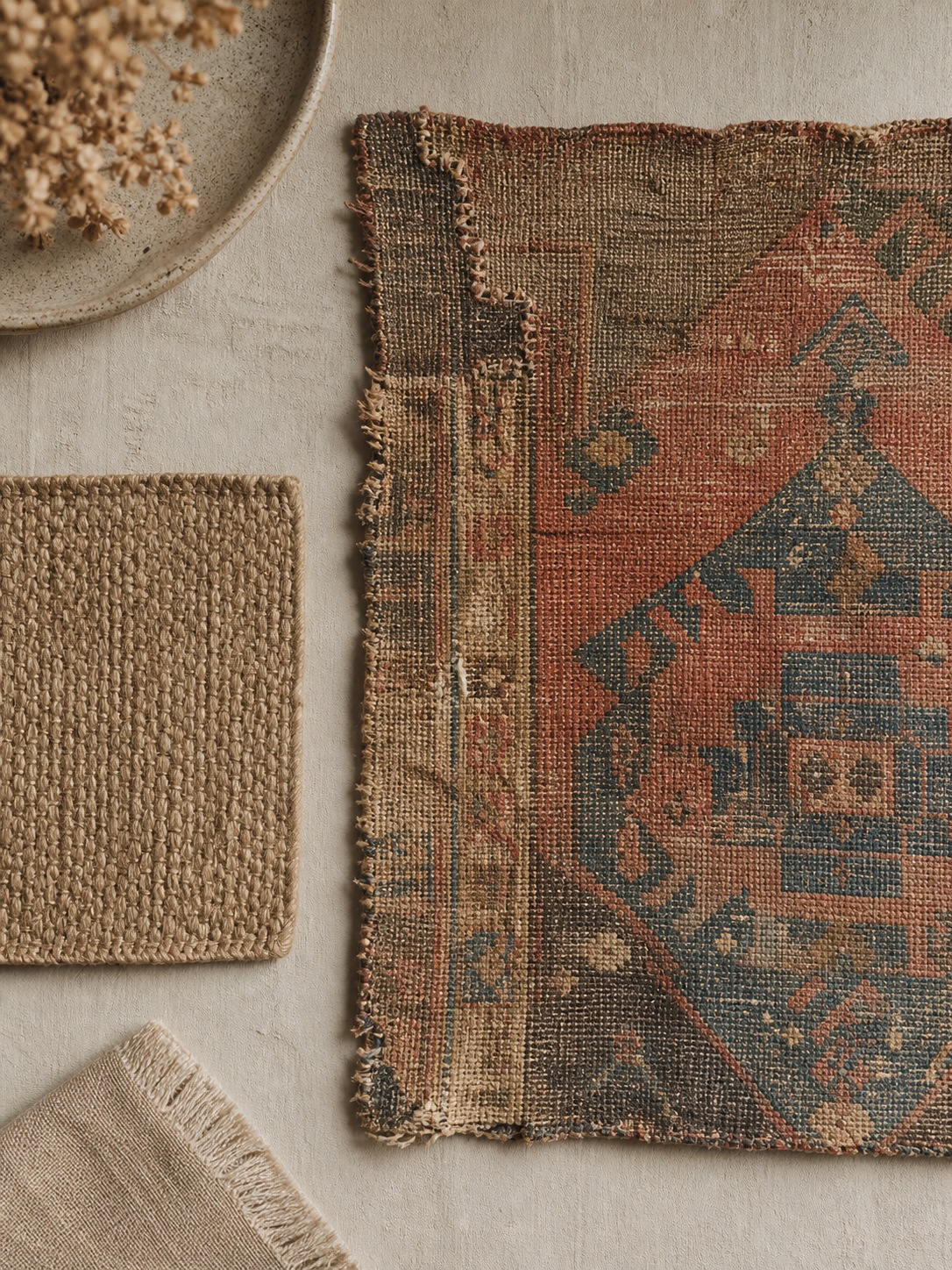
Tip: budget for one real piece per room rather than spreading the same money across several “boho-style” mass-produced items. One authentic object does more design work than five imitations of the same idea.
Conclusion
Bohemian interior design works as a philosophy, not a shopping list — layered texture with real negative space between elements, a hierarchy of focal points instead of everything shouting at once, an earthy base that lets accent colors actually register, and objects that carry a genuine story rather than just the right label. Skip the formula-checklist version people got tired of, and the style holds up exactly as well in 2026 as it always has.
You don’t need to buy an entire room’s worth of “boho” at once.
Pick three pieces with real personal meaning to you — something with actual history, actual wear, an actual story — before you buy anything generic labeled “boho.” Build the room around those, and let the earthy neutral base and negative space do the rest of the work. That’s the difference between a room that looks boho and one that actually is.
Small details that make boho feel collected
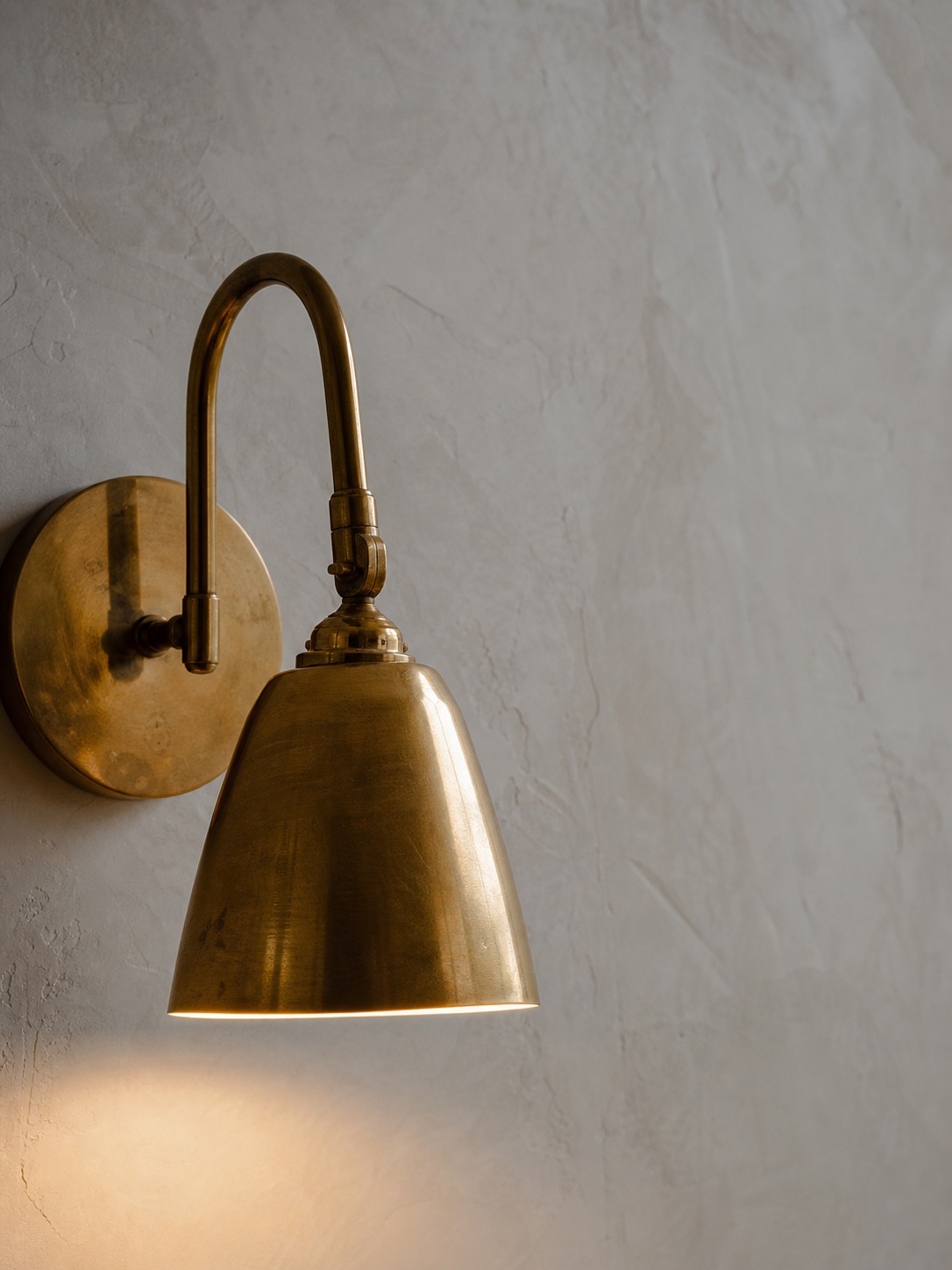
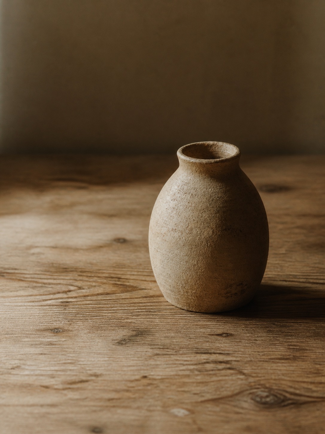
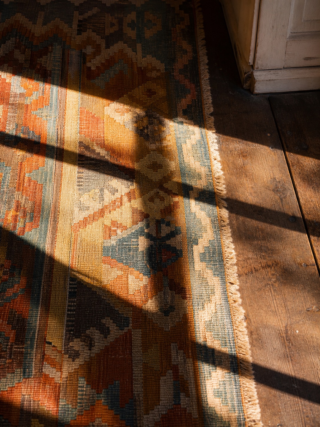
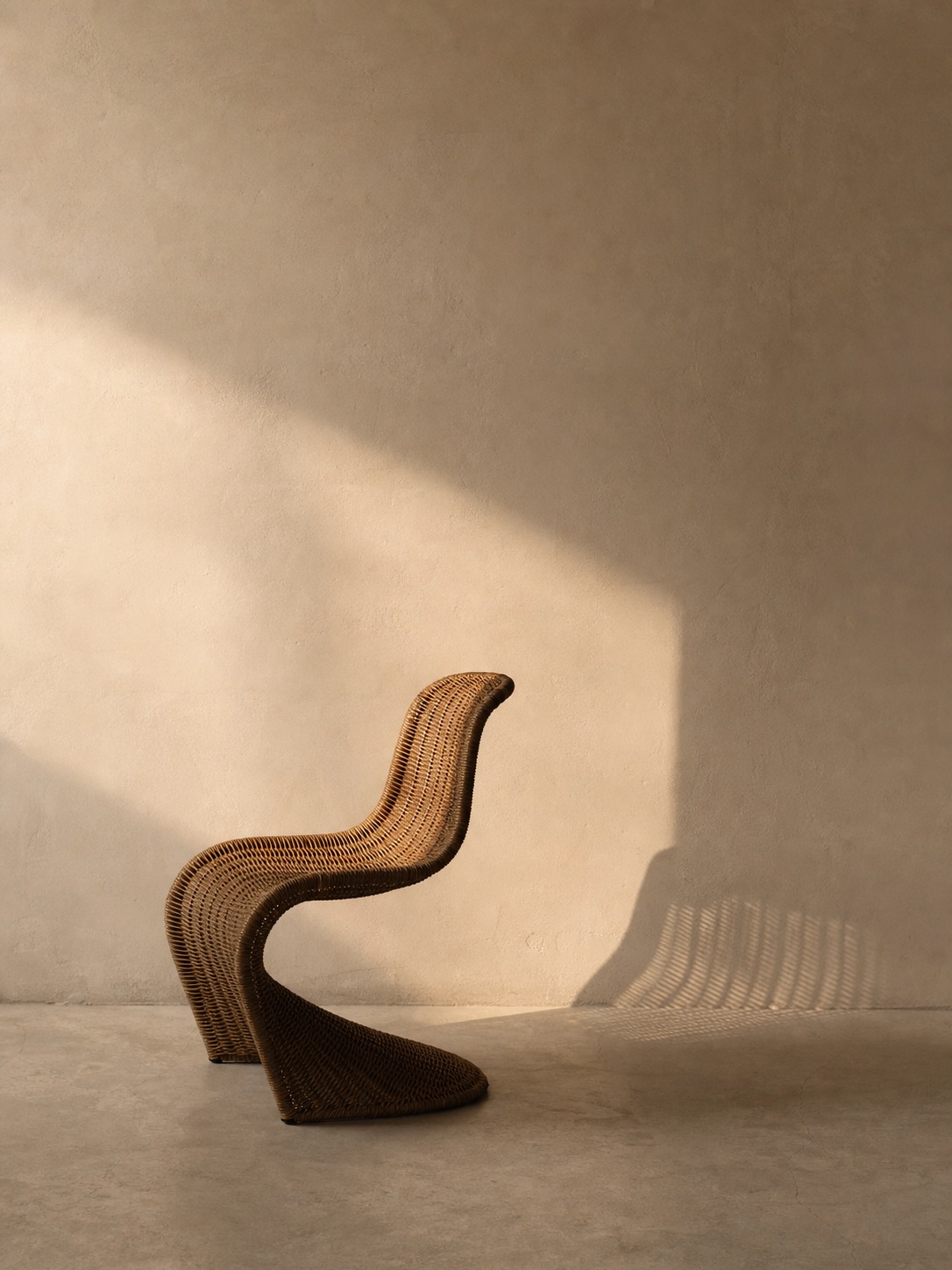
Once the larger room is edited, the small pieces start doing quieter work: a brass fixture, an imperfect ceramic vessel, a worn kilim edge, or one sculptural chair can carry more personality than a dozen generic accents.
Want to build your eye for interior styling?
Browse interior design and styling classes on Skillshare and start applying proportion and color theory to your own space.
FAQ
What is bohemian interior design?
Bohemian interior design is a style rooted in 19th-century bohemian culture — artists and free-thinkers who furnished their homes with objects that carried personal meaning rather than matching sets. Today it’s defined by layered natural textures (rattan, jute, velvet, kilim), globally-influenced pattern and craft, an earthy color base with jewel-tone accents, and pieces collected over time rather than bought as a coordinated set.
Is boho out of style in 2026?
The formulaic version — the same five signifiers (macrame, rattan pendant, jute rug, monstera, Moroccan pouf) repeated identically across rental apartments and Pinterest boards — has gotten stale. The underlying design philosophy, personal and layered objects with real negative space between them, hasn’t gone anywhere, since it was never really a trend in the first place. Rooms that still feel fresh use fewer, more specific boho elements rather than the full checklist.
What are the different types of bohemian interior design?
The three main variations are modern boho (a clean neutral base with boho used sparingly as accents), rustic boho (raw and reclaimed wood, heavier natural textures, deep earth tones), and boho glam (jewel tones and polished materials like brass and velvet layered into the boho mix). Mixing references from all three without picking a primary direction is a common reason rooms feel disjointed.
What’s the biggest mistake people make with boho decor?
Treating it as a shopping list instead of a design principle. The actual mechanism behind a boho room feeling rich instead of cluttered is proportion — negative space between layered objects and a clear hierarchy of one or two focal points, rather than every object competing for attention at equal volume. Buying five equally busy pieces and placing them without any breathing room is what makes a room read as chaotic.
What is the best color palette for a boho room?
Start with an earthy neutral base — terracotta, sage green, warm sand, deep brown — and treat jewel tones (deep blue, burnt orange, ochre, burgundy) as accents layered on top through textiles, not as the dominant palette. Photographing the room in black and white is a useful test: if the composition doesn’t read clearly without color, adding vibrant tones on top won’t fix the underlying proportion problem.
How do you do bohemian design on a budget?
Spend less on the neutral infrastructure — a plain woven rug, simple linen bedding, basic rattan storage — since these pieces are meant to sit quietly in the background and don’t need history to do their job. Save the budget for one or two genuine story pieces per room: a real vintage textile, a secondhand find with actual wear, something with a real connection to you. One authentic piece does more design work than several mass-produced imitations.
Can bohemian design work in a small space?
Yes, but the negative-space principle becomes essential rather than optional. Pick a single rug, one significant wall piece, and one or two supporting textures, and resist filling every empty corner. In a small room, empty space is doing you a favor by keeping the room from feeling like storage — the same restraint that makes a large boho room feel curated matters even more at a smaller scale.
- 86shares
- Facebook0
- Pinterest86
- Twitter0
- Reddit0