From the glow of a candle to the texture of your favorite blanket, it’s the small details that create a space you’ll want to spend time in. Thoughtfully chosen candles, textiles, and colors work together to shape the atmosphere of your home, influencing both your comfort and mood. Whether you realize it or not, these elements impact how a room looks and how you feel while you’re there.
By swapping a cushion, choosing a new scent, or adding a pop of color, you refresh your space in an instant. Paying attention to these details helps you express your personality and create an environment that truly feels like yours.
Key Takeaways
- Paying attention to small design details can transform your home.
- Your choices in candles, textiles, and colors shape mood and ambiance.
- Trend awareness helps you personalize and refresh your space.
Understanding the Role of Details in Aesthetics
Details like specific candle scents, fabric choices, and subtle color differences shape the feeling of a space. These small elements influence how you experience style, express your individuality, and respond emotionally to your environment.
The Significance of Small Touches
Minor choices—such as the flicker of a candle or a patterned throw pillow—can transform a room’s atmosphere without major changes. These small touches add character, making a space feel curated and personal rather than generic.
Attention to detail is crucial in design. For example, choosing natural fibers or textured textiles brings warmth and dimension. Even candle holders or the placement of a blanket influence your perception.
Use details to anchor your style. Selecting elements that reflect your taste gives your home a unique identity, turning ordinary areas into places that feel truly yours.
Aesthetics and Self-Expression
The details you pick—colors, fabrics, and scents—are powerful tools for expressing your personality. Soft linens, bold throws, or artful candle arrangements can communicate your mood, interests, and cultural influences without a word.
Your preferences shape your space and make it a reflection of your individuality. For instance, if you love minimalism, you may prefer neutral shades and clean lines. If you prefer a cozier or more eclectic style, mixing textiles and vibrant accents lets your personality shine.
Aesthetic choices are about more than decoration. They offer a canvas where your identity and experiences are put on display for yourself and others.
Emotional Responses in Design
Colors, textures, and objects like candles evoke specific feelings and memories. Warm colors can enhance comfort, while cooler tones promote calm and focus. Soft textiles encourage relaxation, and the glow of a candle can feel soothing or intimate.
Design details strongly influence your emotional state. A lavender-scented candle, for example, can reduce anxiety, while certain textures deliver a sense of security or luxury.
Use these responses to your advantage by thinking about how you want a space to feel. Let your choices guide both the mood and emotional experience of your environment.
Candles as Decorative Statements
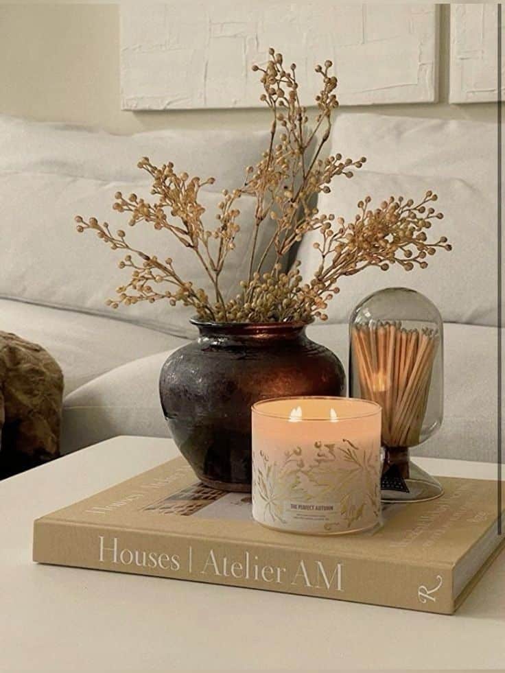
Candles do more than light a room—they add visual character and express personal style. Choosing the right candle shape, material, or finish can enhance your decor, set moods, and reflect both modern and vintage aesthetics.
Unique Candle Designs
Decorative candles today come in many distinctive forms, from geometric pillars to sculpted or novelty shapes. Spiral and twisted tapers, bubble-shaped cubes, and arch candles stand out as common choices for a fresh, modern look.
For artistic flair, popular designs often use vivid color blocking, marbling effects, or embedded textures. Statement pieces like oversized ball candles or perfectly imperfect “drip” candles instantly draw the eye. You might also see candles that mimic natural elements, such as stone, wood, or even fruit.
Choosing unusual candle designs allows you to punctuate minimalist spaces or act as a talking point during gatherings. Unique candles become both functional and a clear element of your overall decor.
Candle Making Techniques
Candle making methods directly influence appearance and durability. The two main types are molded and poured candles. Molded candles allow for detailed sculptures and nontraditional shapes, while hand-poured candles excel in layered color or fragrance blends.
Common techniques include:
- Hand dipping: Produces classic tapers with subtle texture variation.
- Container pouring: Ideal for glass or ceramic vessels; allows for custom blends and layering.
- Rolled beeswax: Creates textured, patterned surfaces and highlights natural material hues.
Crafting small-batch or handmade candles lets you experiment with color mixes, scents, and finish details. This opens up options for personal touches, such as swirling color or using unique molds for one-of-a-kind pieces.
Vintage and Trendy Candle Styles
Vintage candle styles focus on soft lines, subtle pastel shades, and ornate details. Victorian-style candelabras with elaborate holders or traditional ivory tapers evoke historic charm. Natural beeswax and softly colored soy candles can also provide a classic, timeless effect in a vintage-inspired room.
Current trends highlight bold colors, unexpected forms, and sustainable materials. Soy or coconut wax candles with terrazzo or stone-like exteriors are favored in modern settings. Metallic accents, minimalist shapes, and mixed media containers have become popular for those seeking something new.
Blending vintage aesthetics with trendy touches, such as pairing a classic brass holder with a vibrant sculptural candle, allows you to create a signature decorative statement.

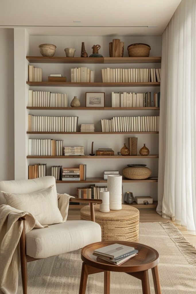
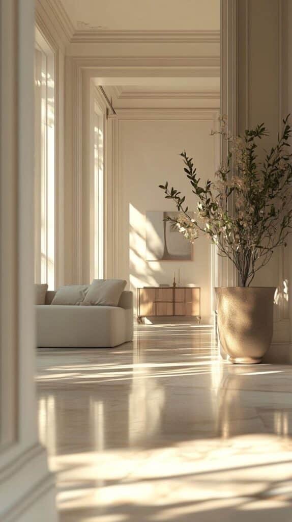
Textiles and the Art of Layering
Layering textiles transforms a room, creating depth, warmth, and a dynamic atmosphere. By exploring thoughtful design, color, and process choices, you can highlight the unique qualities of textiles in your home.
Textile Design Inspirations
When choosing textiles, start with what inspires you: traditional craftsmanship, global patterns, or bold modern motifs. Techniques like quilting, embroidery, and weaving each offer distinct looks, letting you reflect your personal style.
For visual interest, consider layering throws, cushions, and rugs with different stitching methods or fabric types. Materials such as linen, velvet, or cotton provide unique texture. Textile art isn’t only decorative—quilted wall hangings or handwoven table runners can also tell a story and express your creativity.
A mix of handmade and carefully selected manufactured pieces can balance authenticity and practicality in your space.
Color and Texture Combinations
Colors influence mood and perception. Earthy tones like terracotta, olive, or sand often promote calmness and comfort, making them a popular choice in textile layering.
Blending textures is just as important as color. Pair soft, plush fabrics with coarse, woven pieces to create a tactile experience. Use a table to visualize combinations:
| Texture | Color Example | Effect |
|---|---|---|
| Velvet | Deep green | Luxurious, rich |
| Woven cotton | Ochre | Casual, earthy |
| Linen | Slate blue | Relaxed, cool |
Layering a chunky knit throw over a smooth sateen sheet adds visual contrast and comfort.
Natural and Digital Textile Processes
How textiles are made impacts both aesthetics and sustainability. Natural dyes—derived from plants, minerals, and insects—provide eco-friendly options and often produce soft, earthy hues.
If you desire precise patterns or vibrant shades, digital printing is a powerful option. This process enables detailed designs and a wide color palette. It also supports small-batch production, which can reduce waste.
Combining naturally dyed linens with digitally printed cushions or curtains lets you create a modern, conscious look while celebrating different making techniques. Your choices here influence your home’s atmosphere and environmental footprint.
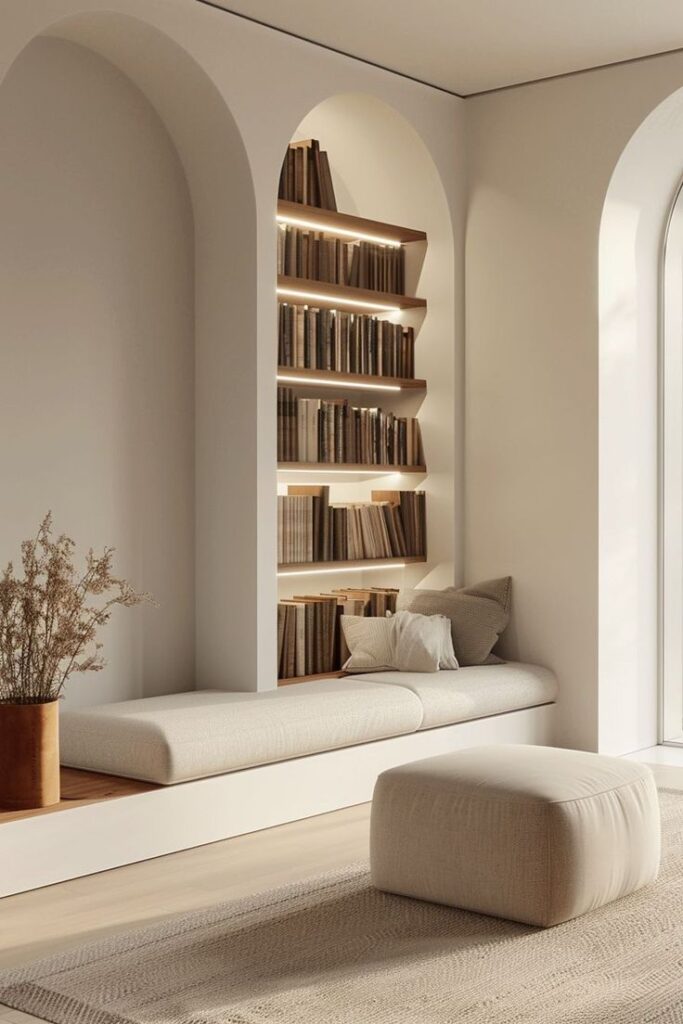
The Power of Colors in Creating Ambiance
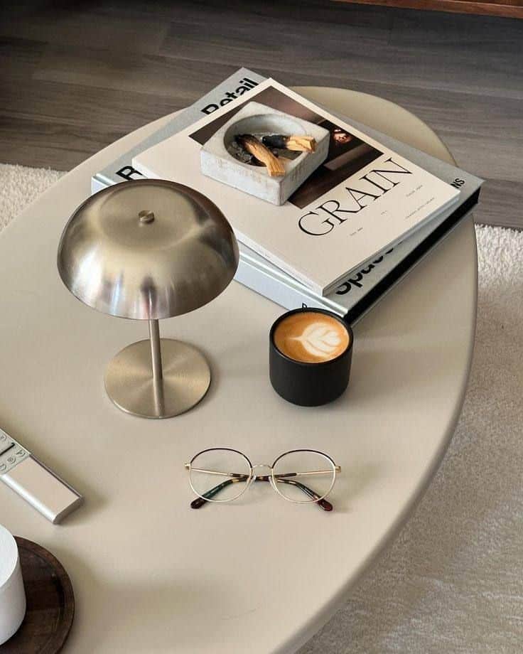
When you design a space, the colors you choose affect not only the way a room looks, but also how it feels. Small shifts in color selection can change the mood, energy, and perception of any area in your home.
Building Color Palettes
A thoughtful color palette helps tie together different design elements. Start with a base or neutral shade—such as white, beige, or gray—to set the overall tone. From here, you can add accent colors to introduce layers of interest or emphasize certain focal points.
Consider using a table to experiment with color combinations:
| Base Color | Accent 1 | Accent 2 | Mood |
|---|---|---|---|
| White | Navy Blue | Gold | Calm, Luxe |
| Gray | Blush | Olive | Relaxing |
| Beige | Terracotta | Sage | Cozy, Earthy |
Try to balance warm and cool tones, and repeat prominent colors in different textiles or decor to make the space cohesive. For small rooms, lighter shades can make the area seem larger and airier.
Color Psychology and Mood
Colors influence your emotions and behavior. For example, blue tones tend to create a calm and peaceful ambiance, making them ideal for bedrooms or bathrooms. In contrast, yellows and oranges feel energetic and welcoming, which suits kitchens or living spaces.
Pay attention to how specific colors affect your mood:
- Green: Fresh, restful, promotes balance
- Red: Energizing, increases excitement
- Neutrals (white, beige, gray): Versatile, soothing
Use color psychology intentionally. If you want a room to energize you in the morning, opt for brighter hues. If relaxation is your goal, soft and muted tones are best. Every color you select shapes the emotional feel of the environment.
Popular Styles and Trends Influencing Details
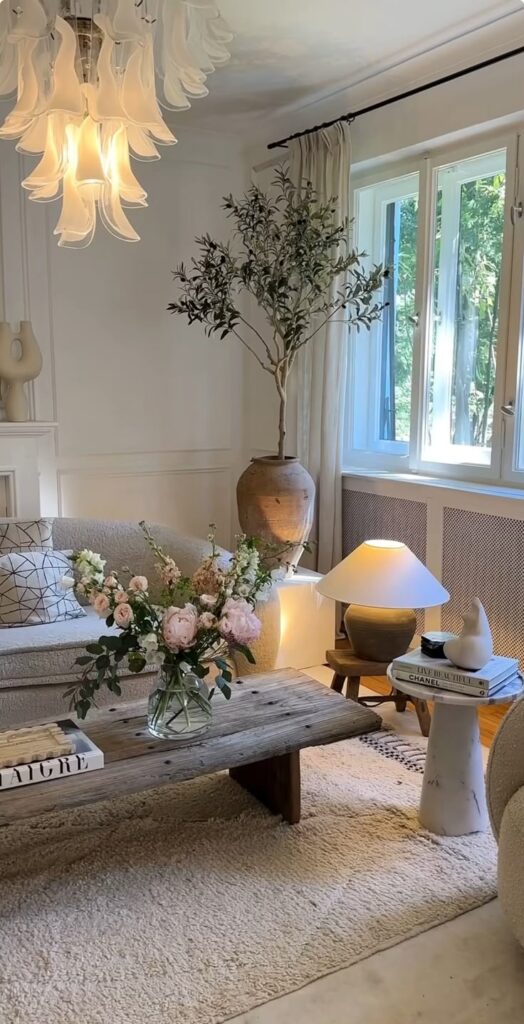
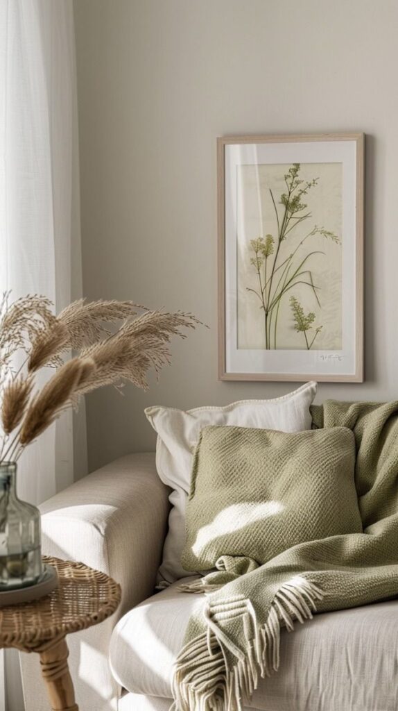
The details you choose—whether in candles, textiles, or colors—are shaped by the overall style of your space. Different aesthetics bring out unique ways to use small decor to achieve a cohesive and inviting atmosphere.
Minimalist and Contemporary Looks
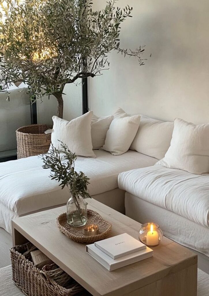
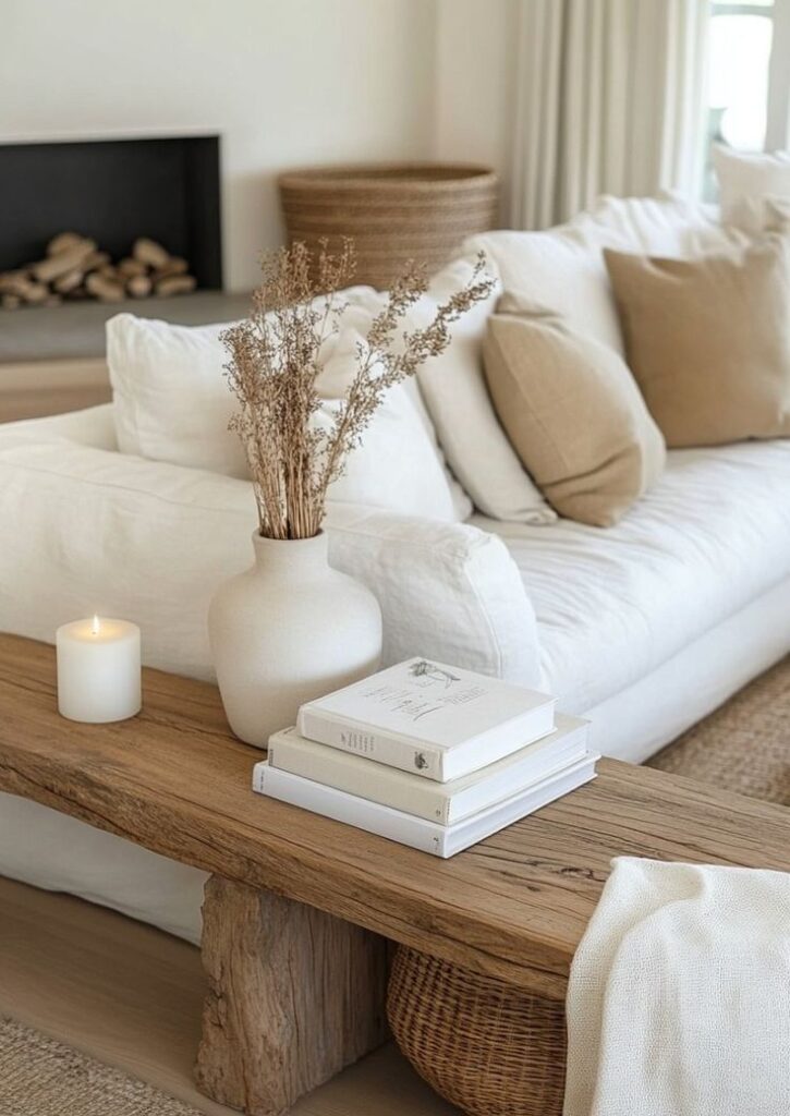
Minimalist and contemporary spaces emphasize simplicity and function. Candles are often unscented, in neutral colors like white, beige, or soft gray, and come in geometric or cylindrical shapes.
Textiles in these interiors stick to streamlined materials such as linen or cotton, with little to no patterns. You might find a throw blanket with a subtle woven texture or pillows in solid colors.
Color palettes focus on soft earth tones or crisp black and white. The key is restraint—each piece feels intentional, without clutter.
| Element | Color Palette | Common Features |
|---|---|---|
| Candles | White, beige | Cylindrical, unscented |
| Textiles | Off-white, gray | Linen, cotton, solid |
| Decor | Black, neutral | Subtle, essential |
Mid-Century Modern and Bohemian Vibes
Mid-century modern style blends vintage charm with clean lines and earthy materials. Candles in amber glass, teak holders, or bold retro shapes highlight this look. For textiles, you’ll notice woven rugs, graphic prints, and pops of mustard or teal.
Bohemian interiors embrace mixtures of textures and colors. Layered textiles like macramé wall hangings, kilim throws, and velvet pillows create a relaxed atmosphere. Candles may be colorful or paired with brass and carved wooden holders.
Colors tend to be warm and earthy, with accents in terracotta, olive, and ochre. These styles invite mixing patterns, using handmade items, and layering decor for a cozy, curated space.
Subcultures and Playful Approaches
Subcultural and playful interiors thrive on bold statements and surprising choices. Candles come in quirky shapes—think fruit, animals, or hand gestures—and often use strong, unexpected colors. Fun accessories like novelty cushions or patterned throws add energy.
Textiles vary widely: faux fur, neon fleece, or holographic fabrics might feature prominently. Metallic finishes and mixed materials give your space an experimental feel.
Color is where these styles shine. You might cluster clashing hues or opt for vivid pastels. The goal is self-expression and comfort, with a hint of nostalgia or pop culture references woven throughout the space.
Exploring Today’s Key Color Directions
This year’s color trends highlight a shift from subtle, earthy palettes to high-energy hues and nostalgic motifs. Styles span from calming, sun-baked tones and breezy neutrals to expressive colors inspired by Y2K, cyberpunk, and even the dark academia mood.
Earth Tones and Neutrals
Earth tones remain an anchor in design, offering stability and warmth. You’ll see plenty of terracotta, clay, olive green, ochre, and sandy beiges. These shades are favored for their grounding effect and the way they complement wood, linen, and other natural textiles.
Neutrals like cream, taupe, and warm gray provide a versatile backdrop that lets other decor elements—like candles or textured throws—stand out. In a coastal setting or regency-inspired space, soft sands and cloud whites bring out a relaxed, timeless energy. This palette is especially popular if you want your space to feel cozy yet sophisticated with very little effort.
Key Color Pairings:
| Main Color | Accent Suggestions |
|---|---|
| Terracotta | Olive or cream |
| Warm gray | Pale blush or sand |
| Ochre | Deep forest green |
Vibrant Hues and Bold Statements
Vibrant hues are making a big comeback, especially in accessories and accent pieces. Think fuchsia, bright yellow, cobalt blue, and even acid green, all working as “pops” of color against more subdued backgrounds. If you love a bold look, a neon candle or a vivid e-girl-inspired throw pillow instantly shifts the mood.
This approach works well in modern and Y2K-inspired interiors, infusing energy and personality. Bold color blocking and high-contrast pairings are a nod to both 80s and Y2K styles, while cyberpunk influences appear with electric tones and glossy textures. Here, the goal is not subtlety—vibrant details are meant to catch the eye and spark interest.
Tips:
- Try mixing unexpected hues for a playful vibe.
- Use bold colored candles as table focal points.
Soft Pastels and Tie-Dye Revival
Pastel colors never really disappear from trend cycles, but this season, they’re joined by a tie-dye revival. Soft shades like mint, blush pink, lilac, and dusty blue add a serene and whimsical note to spaces. These hues are especially at home in spring decor or e-girl and coastal-inspired rooms.
Tie-dye brings a breezy, nostalgic feel and can be introduced through textiles—think throw blankets, pillow covers, or even pastel gradient candles. Pair pastels with light woods or rattan for a soft but modern finish. These looks suit casual living areas and bedrooms alike, making them flexible for your home.
Popular Pastel-Tie-Dye Combos:
- Mint + Blush + Soft Yellow
- Lilac + Pale Blue + Cream
Dark Academia, Y2K, and Futuristic Influences
If you’re drawn to moody or eclectic aesthetics, dark academia and grunge-inspired palettes are gaining momentum. Rich shades like burgundy, forest green, and charcoal take the lead, often paired with candlelight and velvet or tweed textiles. These tones set a scholarly, introspective environment.
On the other end, Y2K and futuristic aesthetics favor metallics, neon lights, and pops of ultraviolet or electric blue. Cyberpunk-inspired elements use reflective surfaces, LED accent candles, and color-shifting textiles. Mixing these influences can give your space a unique, playful twist—think a chrome-finished vase next to a matte black candle.
Influence Quick Guide:
| Style | Key Colors |
|---|---|
| Dark Academia | Burgundy, moss, navy |
| Y2K | Neon pink, silver |
| Futuristic | Chrome, blue, violet |
- 32shares
- Facebook0
- Pinterest29
- Twitter3
- Reddit0

