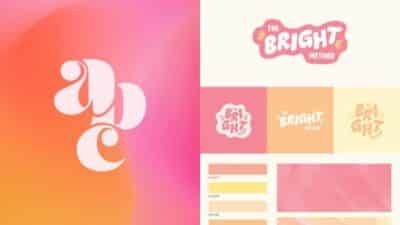
In the world of branding, minimalist logos have become increasingly popular for their clean aesthetics and effective communication. These designs strip away unnecessary embellishments to create impactful visual identities that resonate with audiences. A minimalist logo focuses on essential elements, using limited colors, simple shapes, and thoughtful negative space to create a mark that’s just as powerful as complex designs.
Minimalist logos aren’t just about looking modern – they serve practical purposes for brands navigating today’s multi-platform environment. You’ll find these streamlined designs maintain their clarity across various mediums, from tiny mobile icons to large billboards. This versatility makes minimalist logos particularly valuable for businesses seeking recognition in crowded marketplaces.
Creating a successful minimalist logo requires careful consideration of your brand’s core message and values. By eliminating visual clutter, you force every remaining element to work harder and communicate more clearly. The best minimalist logos appear effortless but result from meticulous design processes that distill a brand’s essence into its purest visual form.
Key Takeaways
- Minimalist logos use essential elements and limited colors to create impactful brand identities that remain recognizable across all platforms.
- Effective minimalist design requires strategic elimination of unnecessary elements while preserving your brand’s core message.
- The simplicity of minimalist logos creates timeless designs that adapt well to changing design trends and technological environments.

What Is a Minimalist Logo?
Minimalist logos strip away unnecessary elements to create clean, impactful brand identifiers that communicate effectively across various platforms. They embody the philosophy that “less is more” while maintaining strong brand recognition.
Defining Minimalism in Logo Design
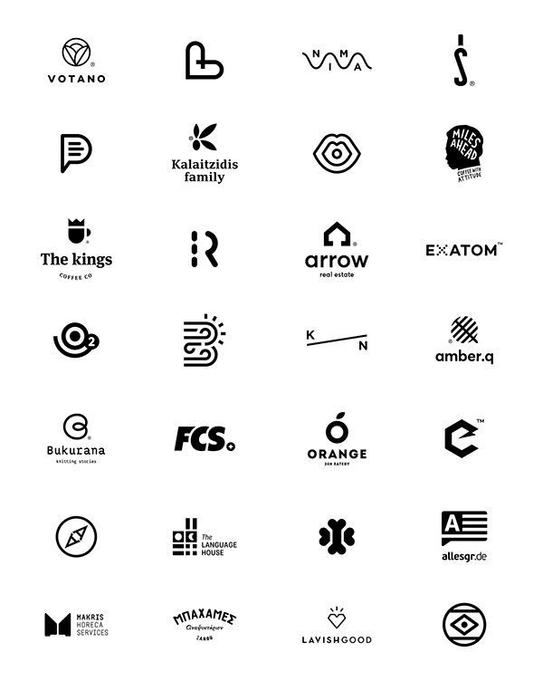
Minimalism in logo design focuses on simplicity, clarity, and removing decorative elements that don’t contribute to the core message. A minimalist logo can take the form of a wordmark (text-only logo) or include a simple symbol alongside limited text. The approach emphasizes using only what’s essential to communicate your brand’s identity.
This design philosophy originated from the broader minimalist art movement but has become increasingly popular in modern branding. Rather than viewing minimalism as a limitation, it’s better understood as a deliberate choice to refine your brand’s visual identity to its most powerful core elements.
You’ll find minimalist logos particularly prevalent in tech companies, where they symbolize clean code and user-friendly interfaces.
Key Characteristics of Minimalist Logos
Simple color palette: Minimalist logos typically use 1-3 colors maximum, often employing black and white or monochromatic schemes.
Clean typography: Sans-serif fonts are common choices for their readability and modern feel, though carefully selected serif fonts can work effectively too.
Ample negative space: The strategic use of empty space creates breathing room around design elements and helps guide the viewer’s eye.
Geometric shapes: Basic shapes like circles, squares, and lines form the foundation of many minimalist logos.
Reduced elements: Every component serves a purpose—nothing extraneous remains in the final design.
Your minimalist logo should still be distinctive enough to be recognizable at various sizes, from app icons to billboards.
Benefits of Minimalist Logos
Minimalist logos offer excellent scalability, maintaining clarity whether displayed on a small smartphone screen or a large billboard. This adaptability is increasingly important in today’s multi-platform marketing environment.
These logos tend to have greater longevity than trend-based designs. By focusing on timeless elements rather than fleeting design fads, your minimalist logo can serve your brand for years without appearing dated.
Production costs often decrease with minimalist designs. Fewer colors mean lower printing expenses, and simple designs reproduce well across various materials and applications.
Minimalist logos communicate efficiently, allowing viewers to quickly grasp and remember your brand identity. This immediacy makes them particularly effective for creating strong first impressions in competitive markets.
Your brand’s memorability improves when customers can easily recall a clean, straightforward design rather than a complex one.
Core Design Principles and Elements
Minimalist logo design relies on fundamental principles that emphasize clarity and impact through simplicity. These principles guide designers to create memorable visual identities that communicate effectively without unnecessary elements.
Geometric Shapes and Silhouettes
Geometric shapes form the foundation of many minimalist logos because they’re instantly recognizable and versatile. Circles, squares, and triangles create a sense of order and stability that resonates with viewers on a subconscious level.
Companies like Apple and Twitter leverage simple silhouettes to create iconic brand marks. The power of silhouettes lies in their ability to convey complex ideas through simplified outlines.
When designing with geometric elements, consider how shapes interact with your brand personality. Angular shapes often communicate precision and technology, while curves suggest approachability and comfort.
Flat design techniques work particularly well with geometric logos, eliminating unnecessary gradients or shadows. This approach ensures your logo remains clear across various applications and sizes.
Typography and Wordmarks
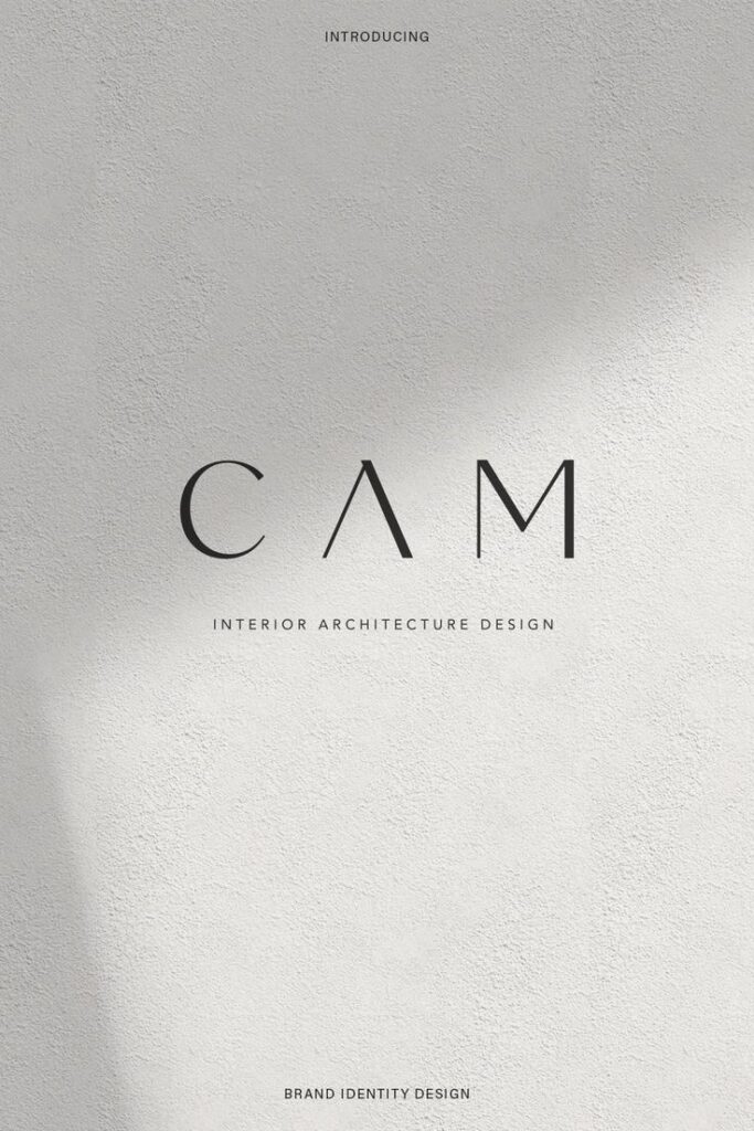
Typography plays a crucial role in minimalist logo design, especially for wordmarks where the company name itself becomes the logo. Sans serif fonts are particularly popular due to their clean lines and modern appearance.
When selecting typography, consider legibility at different sizes. A truly effective minimalist wordmark remains recognizable whether on a business card or billboard.
Font weight creates visual hierarchy within your design. Bold letterforms command attention, while lighter weights convey elegance and sophistication.
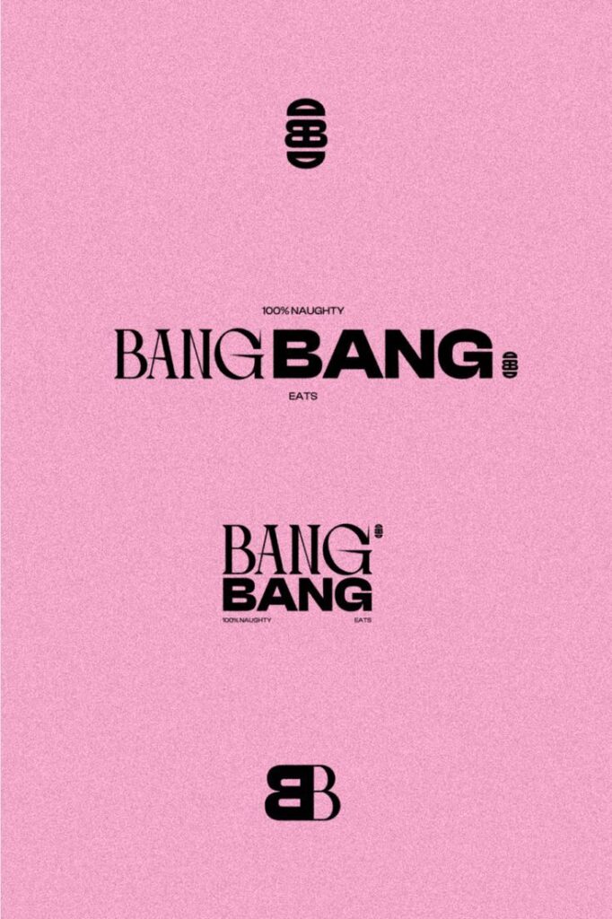
Custom typography often elevates minimalist logos beyond the ordinary. Slight modifications to existing fonts can create proprietary letterforms that distinguish your brand from competitors.
Spacing between letters (kerning) deserves careful attention in wordmarks. Proper spacing ensures visual harmony and prevents awkward gaps that distract from the overall design.
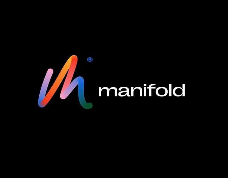

Use of Negative Space and Contrast
Negative space transforms simple logos into clever, memorable designs. The FedEx arrow hidden between the E and X demonstrates how negative space can add layers of meaning without adding visual complexity.
Strategic use of empty space creates breathing room around key elements, improving comprehension and recall. Your logo should never feel crowded or overwhelming.
Contrast establishes visual tension that guides the viewer’s eye. In minimalist design, this often means bold black against white, though any high-contrast color combination can be effective.
Color contrast requires restraint in minimalist logos. Limit your palette to 1-2 colors plus black and white for maximum impact and versatility.
The relationship between positive and negative elements creates visual balance. Consider how shapes interact with the space around them to create a cohesive whole rather than disconnected parts.
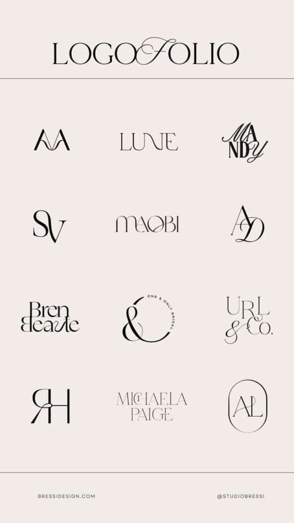
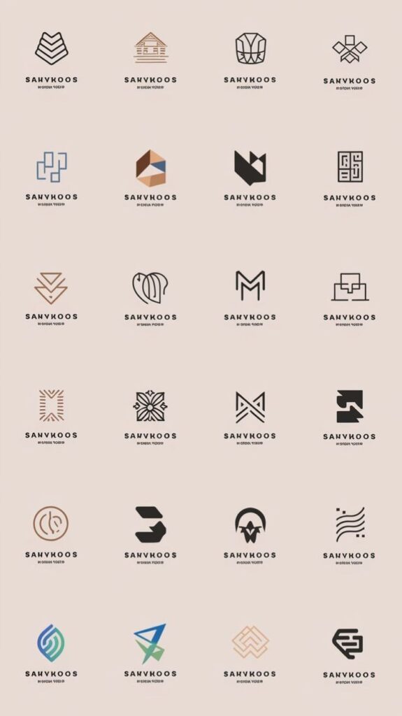
Minimalist Logo Creation Process
Creating a minimalist logo requires thoughtful planning and execution to achieve a design that communicates your brand essence through simplified elements. The process involves several key stages that transform initial concepts into a refined visual identity.
Generating Logo Ideas and Moodboards
Begin your minimalist logo journey by gathering inspiration from various sources. Create a moodboard that includes examples of logos you admire and visual elements that align with your brand values. Pinterest, Behance, and Dribbble are excellent platforms for collecting reference materials.
Look for patterns in the designs that appeal to you. Do you prefer geometric shapes or organic forms? Are you drawn to lettermarks or abstract symbols?
A well-organized moodboard helps identify the aesthetic direction for your logo. Consider categorizing your references by style, industry, or emotional response to better understand what resonates with your vision.
Document key characteristics you want to incorporate, such as simplicity, balance, and negative space usage. This foundation will guide your design decisions throughout the process.
Sketching and Refining the Logo
Transform your ideas into tangible concepts through sketching. Start with quick, rough sketches to explore multiple directions without getting caught in details.
Focus on essential elements that represent your brand identity. For minimalist logos, ask yourself: “What can I remove while maintaining recognition?”
After creating several options, select the strongest concepts for refinement. Digitize these sketches using design software like Adobe Illustrator or Figma.
Pay attention to proportion, balance, and visual weight during refinement. A minimalist logo often relies on perfect execution of simple elements.
Test your designs at different sizes to ensure scalability. A truly effective minimalist logo remains recognizable when reduced to small dimensions for various applications.
Choosing the Right Color Palette
Select colors that enhance your brand message while maintaining minimalist principles. Limit your palette to 1-3 colors maximum for true minimalism.
Black and white combinations offer timeless appeal and versatility. If incorporating color, choose hues that convey your brand personality—blue for trustworthiness, green for growth, red for energy.
Consider color psychology when making selections. Each color evokes specific emotional responses that should align with your brand positioning.
Test your color choices across different backgrounds and applications. A minimalist logo should maintain its impact in various contexts and printing methods.
Remember that color can dramatically affect perception. Even a single, well-chosen accent color can elevate a simple design to become distinctive and memorable.
Selecting Logo Templates
If creating a logo from scratch seems daunting, quality templates can provide excellent starting points. Many platforms offer minimalist logo templates that can be customized to your needs.
Look for templates with clean lines, ample white space, and geometric precision. These characteristics form the foundation of effective minimalist design.
When customizing templates, focus on making thoughtful modifications rather than drastic changes. Sometimes, adjusting typography or proportions is sufficient to create a unique identity.
Avoid templates that contain unnecessary decorative elements. The best minimalist templates already embody the “less is more” philosophy that defines this style.
Ensure your selected template allows for the technical requirements you need, such as vector format availability and color customization options.

Brand Identity and Recognition
Minimalist logos serve as powerful anchors for brand identity, creating instant visual associations in consumers’ minds. A well-designed minimal logo communicates brand values clearly while standing out in crowded marketplaces.
How Minimalist Logos Enhance Brand Identity
Minimalist logos distill your brand essence into its purest visual form. By removing unnecessary elements, you create a focused representation that communicates your core values instantly. Simple logos are more memorable, making your brand easier to recall when consumers make purchasing decisions.
A clean, minimal design conveys professionalism and confidence. Your text logo becomes more versatile when simplified, working effectively across all platforms from large billboards to tiny app icons. This consistency strengthens brand identity by ensuring recognition regardless of where customers encounter your logo.
Minimalist designs also tend to age better than complex ones. By avoiding trendy details, your logo maintains relevance for longer periods, building trust through visual consistency over time.
Strategies for Achieving Brand Recognition
Start by identifying your brand’s unique personality traits and translate them into simple visual elements. Choose 1-2 distinctive features that will make your logo immediately identifiable – perhaps a unique color combination or a distinctive typographic treatment.
Testing your minimalist logo at different sizes ensures it remains recognizable even at small scales. This scalability is crucial for digital applications where your logo may appear as a tiny favicon or social media profile picture.
Consider these practical approaches:
- Color psychology: Select colors that align with your brand values
- Negative space: Utilize empty space creatively to add meaning
- Typography focus: For text logos, choose distinctive yet readable fonts
Maintaining consistency in how your minimal logo appears across all touchpoints reinforces recognition. Each exposure builds familiarity, gradually strengthening the association between your visual identity and brand values.

Applications and Global Perspectives
Minimalist logos transcend geographical boundaries and industry limitations, adapting to diverse contexts while maintaining their fundamental principles of simplicity and clarity. Their versatility makes them particularly effective in our increasingly digital and global marketplace.
Trends in Flat Logo Design
Flat logo design has become a dominant approach in minimalist branding since 2020, with even greater prominence in 2025. This two-dimensional design style eliminates shadows, gradients, and textures in favor of clean lines and solid colors. Major brands like Google, Microsoft, and Apple have embraced this aesthetic, influencing countless others across the globe.
You’ll notice that flat designs load faster on digital platforms and remain legible at various sizes—crucial advantages in today’s mobile-first world. Recent trends show an increasing use of negative space and geometric shapes that create memorable visual identities.
Color palettes in flat minimalist logos typically feature 1-3 carefully selected hues that complement each other while ensuring maximum contrast for visibility.


Minimalist Logos in Different Industries
Different sectors apply minimalist principles according to their unique needs and audience expectations. In technology, companies like Apple demonstrate how a simple fruit silhouette can become instantly recognizable worldwide.
Financial institutions in the USA and Europe have increasingly abandoned complex crests and shields for streamlined wordmarks and abstract symbols, projecting reliability through clarity rather than ornate tradition.
Food and beverage brands often retain colorful elements while simplifying forms—consider how Pepsi and Starbucks have progressively reduced detail in their iconic logos.
The spa and wellness industry embraces minimalism through soft curves, natural colors, and generous white space, creating a sense of calm that aligns with their services.
Cultural and Language Considerations
When designing minimalist logos for global markets, you must consider how visual elements translate across cultures. Symbols that seem innocuous in one region may carry unintended meanings elsewhere.
Language differences significantly impact logo effectiveness. Logos using English text or Western alphabets may need thoughtful adaptation when entering markets like China, Japan, or the Middle East.
Colors carry different associations globally—white symbolizes purity in Western contexts but represents mourning in some Asian cultures. Successful minimalist logos often incorporate culturally neutral elements or adapt color schemes for specific markets.
Typography choices must consider legibility across languages. Sans-serif fonts typically translate better across scripts like Latin (ENG), Cyrillic (RUS), and various Asian writing systems, making them popular choices for truly global minimalist logos.
- 1.4Kshares
- Facebook0
- Pinterest1.4K
- Twitter3
- Reddit0


