Looking to create a logo but not sure where to start? If you’re a beginner, focusing on simple shapes, clear fonts, and easy-to-remember symbols is the best way to design a logo that stands out and is easy to recognize. Whether you want to capture your brand’s essence or just make something unique, learning the basics can give you confidence and direction.
Logo design might seem overwhelming, but even as a newcomer, you can use practical steps and free or easy-to-use tools to bring your vision to life. By exploring different logo types and paying attention to color and typography choices, you can quickly create logos that look professional and fit your brand.
Key Takeaways
- Learn the core elements of memorable logo design
- Discover simple ways to explore fonts, colors, and logo styles
- Find beginner-friendly tools that help you design with ease
Fundamentals Of Logo Design For Beginners
When designing a logo, you need to balance creativity with clarity. Focusing on your audience, choosing the right concept, and understanding the connection between design and branding are essential to making your logo effective and memorable.
What Makes An Effective Logo
An effective logo serves as an immediate identifier for your business or organization. It should be distinctive, easy to recognize, and clearly linked to your brand values.
An effective logo does not rely on trends or unnecessary details. It works across multiple platforms and sizes, from business cards to billboards. Your logo should remain legible and attractive whether it is in color or black and white.
Good logos incorporate the basics of visual design: clear typography, balanced layout, and a focused use of color. Consider these common elements of effective logos:
| Element | Description |
|---|---|
| Clarity | Easily understood at a glance |
| Versatility | Works in various sizes and applications |
| Relevance | Reflects your industry or business values |
| Memorability | Leaves a lasting positive impression |
The Role Of Branding And Brand Identity
A logo is not just a decorative mark—it plays a vital role in your branding and overall brand identity. Branding includes the emotional and visual elements that customers associate with your business.
Your logo acts as the visual entry point to your entire brand experience. It should align with your company’s mission, tone, and audience. Consistency in color, style, and imagery builds brand recognition.
When your logo matches your other brand assets—from websites to packaging—you strengthen your overall identity. Think about how your logo will look on all materials, such as social media profiles, store signage, and promotional items.
Effective branding is about trust. A strong logo helps people quickly recognize and remember your business, supporting long-term loyalty.
Importance Of Simplicity And Timelessness
Simplicity is at the heart of many successful logos. A simple logo is easier for people to process and recall, which makes it more effective as a branding tool.
Timelessness means your logo should avoid overly trendy elements. Trends fade, but classic, simple designs stand the test of time. The most recognizable logos, like Nike or Apple, have changed very little because of their timeless qualities.
You can achieve simplicity by focusing on a single idea, limiting your color palette, and using clear shapes or lettering. Avoid overly complex images or crowded designs, as these can make your logo hard to reproduce and recognize.
A logo that is both simple and timeless will be much easier to use in many contexts and will help your brand remain consistent as trends change.

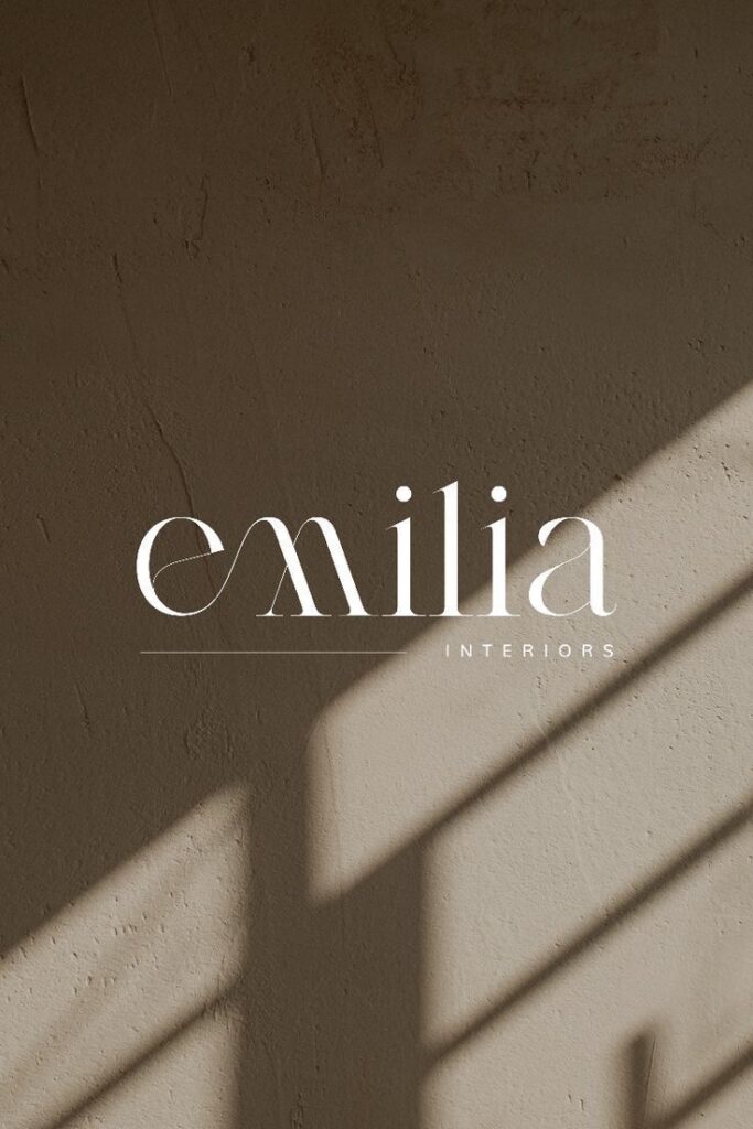
Types Of Logos To Explore
When creating a logo, you have different options that can shape how your brand is seen. Each type of logo has unique strengths and matches different needs, so it’s worth exploring what fits your vision best.
Wordmark Logos
A wordmark logo uses your brand’s name as the central element of the design. Think of logos like Google or Coca-Cola—the entire identity is conveyed through a distinct font style and color choice.
This style is perfect if your brand name is unique and easily memorable. It relies on clear, custom typography to make your name stand out. You can play with letter spacing, sizing, or effects to give it personality.
Wordmark logos don’t include symbols or icons. Simplicity here works to your advantage, helping people remember your name directly. If you want immediate brand clarity and recognition, this is a strong choice.
For beginners, a wordmark is approachable—no need for complicated graphics, just a focus on lettering and color. Use legible, distinctive fonts to help your logo make an impact, even at small sizes.
Lettermark Logos
Lettermark logos use the initials of your brand instead of the full name. Famous examples are IBM, CNN, or HP. This approach works well if your brand name is long, hard to pronounce, or consists of several words.
A lettermark focuses attention on your brand’s abbreviation. The design is all about clever, distinctive typography that keeps things simple yet effective. You can choose bold, modern, or classic styles, depending on your brand personality.
This logo style helps make lengthy business names easier to remember and visually appealing. For new businesses, it keeps branding crisp and fits well on business cards, social media, and merchandise.
Customization is key—a unique font or custom-designed letters will make your logo stand out. Lettermarks are particularly handy if you want people to refer to your business by its initials.
Logo Symbols And Abstract Logos
Logo symbols use icons or simple illustrations to represent your brand. They might depict a literal object (like Apple’s apple) or use an abstract shape (like Nike’s swoosh) that captures the brand’s spirit.
A logo symbol is great if you want an easily recognizable mark. Abstract logos, in particular, offer creative freedom—they don’t depict real-world objects but convey ideas through unique shapes, lines, and colors.
Symbols can be powerful if your goal is to stand out globally, where language barriers exist. People recognize images faster than text, which leads to stronger brand recall.
For beginners, creating a good logo symbol or abstract logo requires some design skill. Focus on simplicity, clarity, and making sure the symbol connects with what your brand offers or values.
Combination Logos
A combination logo merges text and a symbol or icon into a single design. Brands like Adidas, Burger King, and Lacoste use this versatile approach. It gives you the benefits of both text clarity and a memorable graphic.
This type of logo often includes the brand name alongside a graphic element. You can stack, align, or blend the elements for visual interest. It’s flexible—you can use just the icon or just the wordmark when needed.
Combination logos are user-friendly for beginners, as you have more freedom to experiment with layouts and styling. They work well across different mediums—websites, products, business cards, or signs.
If you want both strong visual identity and name recognition, the combination logo offers a balanced, professional solution. It provides clear branding even when used in black and white or in small sizes.
Summary Table:
| Logo Type | Key Features | Best For |
|---|---|---|
| Wordmark Logo | Brand name in stylized type | Unique, clear names |
| Lettermark Logo | Initials, focused typography | Long or complex names |
| Logo Symbol/Abstract | Icon or abstract image | Visual recognition |
| Combination Logo | Text plus symbol or icon | Versatility, flexibility |

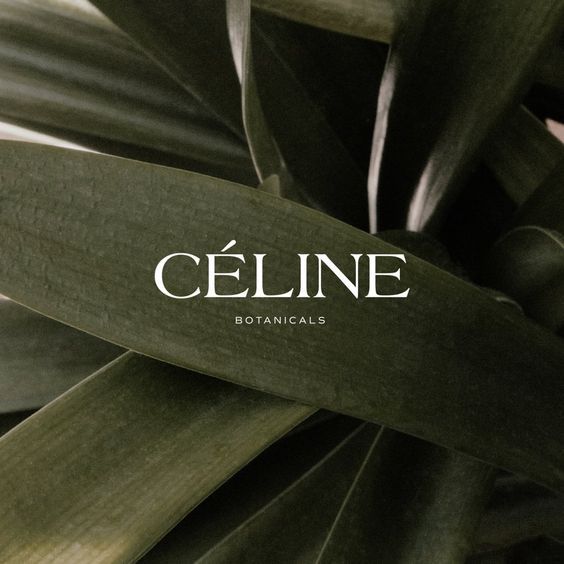
Step-By-Step Logo Design Process
A successful logo starts with a clear direction and creative exploration. Focusing on your brand’s message, gathering visual ideas, and sketching initial concepts gives you a structured way to begin the logo design process.
Defining Your Brand Message
Before you start creating a logo, clarify what your brand stands for. Think about your core values, target audience, and industry positioning. Ask yourself how you want customers to feel when they see your logo—this guides every design decision.
Write down a few key words or phrases that summarize your brand message. For example, you might want your brand to feel trustworthy, energetic, or minimalist. List them out:
| Brand Value | Description |
|---|---|
| Trustworthy | Dependable, safe |
| Energetic | Lively, dynamic |
| Minimalist | Simple, uncluttered |
Use this list to filter all your logo ideas. Aligning every visual element—like color, shape, and typography—with your brand message makes your logo more effective and memorable.
Creating A Mood Board For Inspiration
A mood board is a visual collection of ideas that inspire your logo creation. Gather images, colors, fonts, and existing logos that match your brand message. Tools like Pinterest or Canva make this process simple.
Focus on specific elements such as:
- Color palettes (e.g., calming blues, bold reds)
- Font styles (modern sans-serif, classic serif)
- Visual motifs (geometric shapes, nature symbols)
Arrange these elements on your board. Review what stands out, overlaps, or feels most relevant. This organized reference helps you stay consistent when moving to the next design phase and sparks new ideas you might not have considered on your own.
Sketching And Conceptualizing Ideas
Start with quick, rough sketches based on your mood board and brand message. You don’t need to be an artist; focus on translating your ideas into simple shapes and layouts. Use pencil and paper or digital tools—whichever you prefer.
Try out different logo types:
- Wordmarks: Just your brand name in a unique font
- Symbols: Abstract or literal icons representing your business
- Combination marks: A mix of text and symbol
Experiment with composition, size, and spacing. Keep your sketches loose at this stage. Refine your top ideas by redrawing and adjusting details until you find 2-3 favorites to develop further.
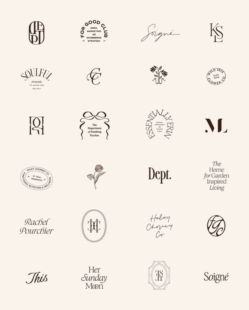
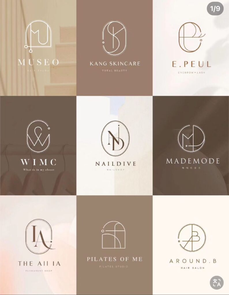
Choosing Fonts And Typography In Logos
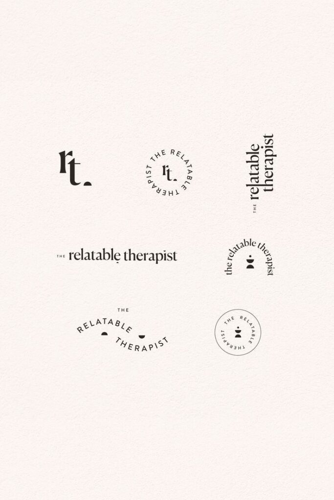
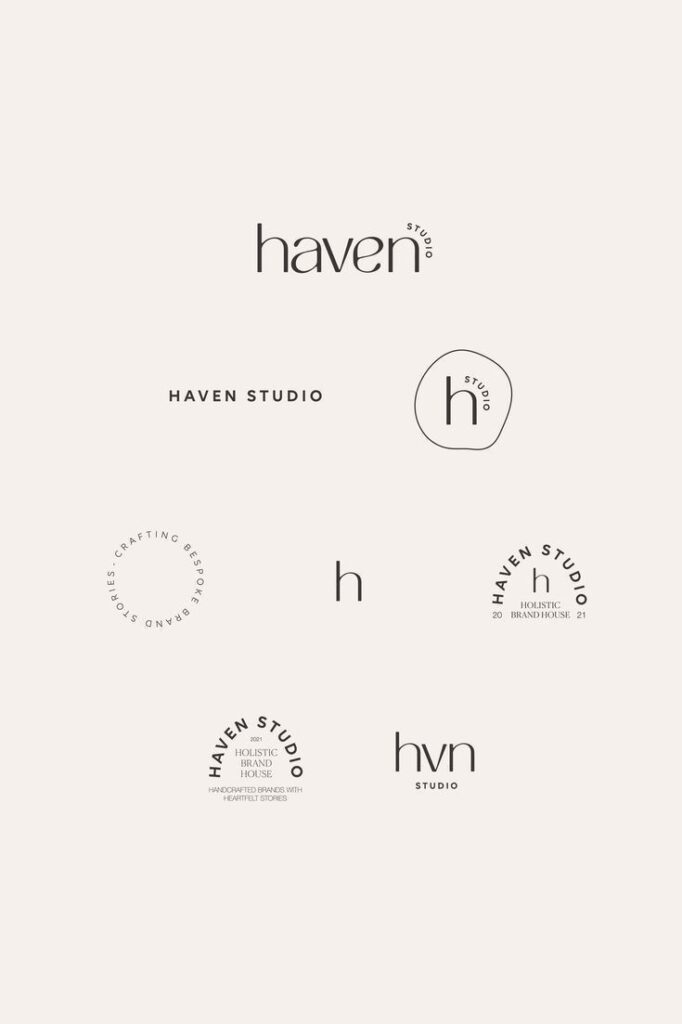
Selecting the right typography shapes the perception of your brand and impacts how memorable your logo appears. Your font choice, attention to letter spacing, and style decisions work together to enhance recognition and deliver your brand’s message clearly.
Font Styles And Logo Fonts
Logo fonts come in many styles, from bold and geometric to handwritten or script. Each style carries a different personality. A rounded font like Quicksand feels warm and approachable, while a geometric font like Futura appears stable and modern.
Aim for originality; avoid default or overused fonts to help your logo stand out. You can use a single font family and adjust weights (like bold or medium) to create contrast, instead of mixing several typefaces. Popular choices for beginners include Montserrat, Raleway, Bebas Neue, and Playfair Display.
Tips for choosing a logo font:
- Check if the font supports all needed characters.
- Be sure you have the right license before using it commercially.
- Test the font at large and small sizes.
Serif Versus Sans Serif Fonts
Serif fonts have small lines at the ends of each letter, while sans serif fonts do not. This difference affects both style and message.
Serif fonts feel classic and trustworthy. Brands like Honda and Bank of America use slab serif fonts to convey professionalism and dependability. Serif fonts often suit traditional industries or brands aiming for sophistication.
Sans serif fonts offer a clean, modern look. They are easy to read at different sizes, making them ideal for digital-first or minimalist brands. Sans serif logos work well in tech, fashion, and startups.
| Font Type | Typical Feelings | Example Brands |
|---|---|---|
| Serif | Formal, Reliable, Elegant | Honda, Bank of America |
| Sans Serif | Modern, Clean, Simple | Google, Spotify |
Kerning And Readability
Kerning refers to the spacing between individual letters in a word. Proper kerning ensures your logo text is easy to read and visually balanced.
Logos with poor kerning can look awkward or unprofessional. Pay close attention to letter pairs that appear crowded or too distant. Adjusting kerning helps keep your brand name legible at any size.
For best results:
- Zoom out to see if your logo’s text remains clear.
- Avoid fonts with inconsistent spacing in their design.
- Prioritize simple, readable letterforms that do not get lost at small sizes.
Testing your logo in both color and black-and-white also highlights any issues with font clarity or spacing.
Color Choices And Logo Psychology
Color is more than decoration—it shapes how people respond to your logo. Your color decisions affect recognition, emotion, and brand identity.
Selecting A Color Palette
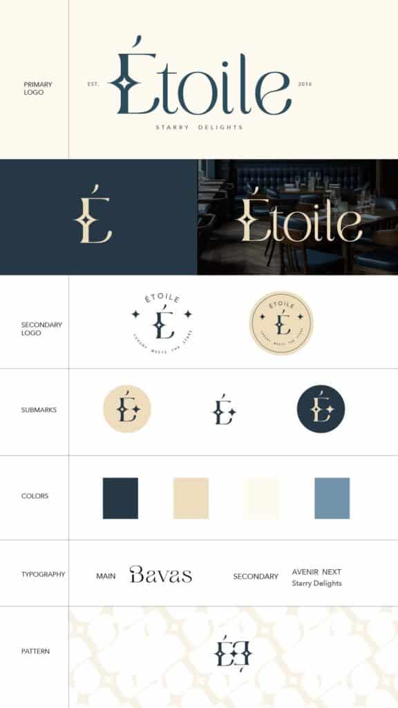
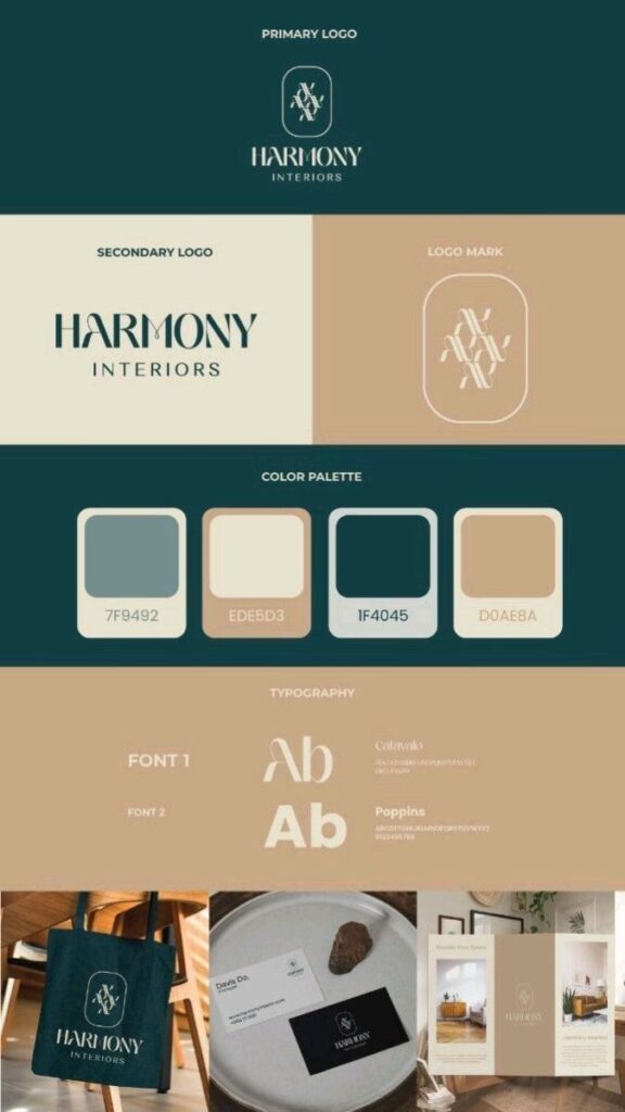
Choosing your color palette is one of the first practical steps in logo design. A good color palette usually includes one or two primary colors and one or two accent colors. This helps keep your design focused and avoids overwhelming your audience.
Common palette structures include:
| Palette Type | Example |
|---|---|
| Monochrome | Various shades of blue |
| Complementary | Blue and orange |
| Analogous | Red, orange, yellow |
| Triadic | Red, yellow, blue |
Keep industry trends in mind. For example, tech brands favor blue, while food companies often use red or orange. Make sure your palette works well in black and white to ensure flexibility.
Understanding Color Psychology
Each color sends a signal and can trigger different feelings. Blue is linked to trust and calm, so you’ll see it in banks and tech logos. Red grabs attention and creates excitement, making it popular in food and retail.
Here’s a quick reference:
- Red: Energy, passion, appetite
- Blue: Trust, reliability, calm
- Yellow: Optimism, friendliness
- Green: Growth, health, nature
- Black: Sophistication or simplicity
Cultural context matters too. For example, white means different things across cultures. Always match color meanings to your audience for the best effect.
Monochrome And Black And White Logos
Monochrome logos use just one hue in varying shades. Black and white logos use only black, white, and the gray tones in between. Both styles simplify your design, making it highly versatile.
These logos often appear more timeless and work well at any size. For beginners, starting with black and white ensures your logo is recognizable without color. Add more colors later, but make sure your core design holds up without them.
Another advantage: monochrome and black and white logos reproduce well on different backgrounds, making branding much simpler.
Effective Color Combinations
Not all color combinations are equally effective. You want enough contrast for readability and enough harmony to be visually appealing. Pairing complementary colors—like blue and orange—creates striking contrast. Analogous colors, such as red and orange, give a more subtle look.
Test your logo on different screens and backgrounds. Make sure your choices meet accessibility standards; text should always be legible against the logo colors. Some combinations, like red and green, may cause problems for colorblind viewers.
Use color sparingly at first. Let your brand and logo shape which combinations work best instead of relying on trends.
Easy Logo Design Tools And Resources
You have more choices than ever before when it comes to designing a logo, even if you’re just starting out. From drag-and-drop online logo makers to advanced software and working with professional designers, each path suits different comfort levels, budgets, and project needs.
Using Free Logo Makers And Apps
If you want to make a logo quickly without much prior experience, free logo makers are a practical starting point. These tools usually don’t require a download—they run in your web browser or as mobile apps. Most offer a drag-and-drop interface, abundant templates, and customization options.
Popular options include Logomakr, Looka, and DesignEvo. You can browse hundreds of templates by industry, switch out icons, edit text, and preview how your logo looks on different backgrounds. Some platforms use AI to suggest logo layouts based on your answers to a few simple questions.
Key Advantages:
- No graphic design skills required
- Most logos can be created and downloaded for free or at a low cost
- Fast process—from idea to a finished design in minutes
For basic projects like a startup, blog, or personal brand, these free logo makers help you get started without investing in paid design tools or hiring a designer.
Designing With Canva
Canva is a widely used free logo maker that’s popular for its intuitive interface and huge library of customizable templates.
With Canva, you can:
- Use drag-and-drop tools to assemble your logo
- Choose from thousands of icons, fonts, and color palettes
- Collaborate online, letting multiple users edit or view the design
- Export logos in multiple file formats, including PNG and SVG
Tip: Stick to two or three colors and one or two fonts for a cleaner look. Canva’s template library covers every niche—from tech startups to food businesses—making it easy to find inspiration.
Upgrading to Canva Pro unlocks premium templates, branding kits, and the ability to resize your logo automatically for different social media platforms. However, the free version suits most beginners and small businesses.
Intro To Adobe Illustrator And Photoshop
Adobe Illustrator and Adobe Photoshop are industry-standard tools for creating professional, scalable logos. If you’re looking to move beyond templates and want more customization, these programs offer unmatched control.
Adobe Illustrator is best for logo design. It uses vector graphics, so logos stay crisp at any size. You can draw, edit, and arrange shapes precisely and work with advanced typography tools.
Adobe Photoshop is mainly for photo editing, but it’s also widely used for raster-based logo mockups or complex effects.
| Tool | Best For | File Types |
|---|---|---|
| Illustrator | Vector, print/web logos | .AI, .EPS, .SVG, .PDF |
| Photoshop | Raster, photo/logo mockups | .PSD, .JPEG, .PNG |
Learning these tools takes time, but Adobe provides many tutorials for beginners. If you need an API for automation or integration, Adobe’s Creative Cloud supports advanced workflows for larger projects.
When To Hire A Professional Logo Designer
Sometimes, using a logo maker or Canva isn’t enough—especially for businesses that need a unique, memorable, or trademarked brand identity. That’s where working with a professional logo designer or creative agency makes sense.
A professional graphic designer can:
- Create fully custom logos not based on pre-made templates
- Develop logos that scale across websites, print, signs, and more
- Deliver brand guidelines with your logo (colors, fonts, usage rules)
- Revise and tweak based on your feedback
When to consider hiring a pro:
- You’re launching a business and want strong, original branding
- You need a logo that can be legally protected
- You’re growing and want something that stands out, not a template
Costs vary based on designer experience, complexity, and revisions needed. Many designers offer packages or hourly rates, and freelance platforms can help you find someone who matches your style and budget. Working directly with a designer can save you time in the long run and ensure your logo is truly one-of-a-kind.
- 3shares
- Facebook0
- Pinterest0
- Twitter3
- Reddit0


