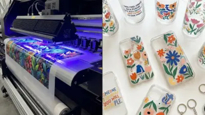
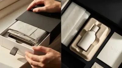
Creative business card designs help people stand out in a crowded market. They go beyond the usual paper rectangle by using unique shapes, materials, colors, or interactive elements. A creative business card can make a strong first impression and help others remember a person or brand more easily.
In a world where digital connections are common, a well-designed business card still has value. It works as a tiny, portable advertisement that encourages conversations and builds lasting relationships. Whether a person wants something simple or eye-catching, creative cards offer ways to show personality and professionalism at the same time.
People often look for ideas that fit their style and business needs. From floral patterns to bold colors, or even cards with special functions, creative business cards bring fresh ways to catch attention and make networking more effective.
Key Elements of Creative Business Card Designs
A creative business card uses typography, color, and imagery to catch attention and communicate clearly. Each element needs to work together to reflect the brand’s personality while staying easy to read and professional.
Typography Techniques


Typography sets the tone of the business card and helps guide the reader’s eye. Using a mix of font styles can create visual interest but should be done carefully.
For example, pairing a bold font for the name with a simple, clean font for contact details makes the card easy to scan. Avoid using more than two or three different fonts to keep the design cohesive.
Size and spacing are important too. Larger text highlights key information, while good spacing prevents clutter. Some designers use creative typography, like all caps for emphasis or unique typefaces tied to the brand’s style.
Color Combinations
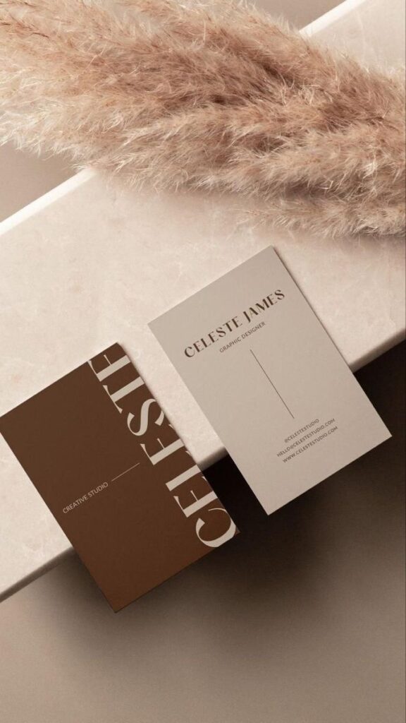

Choosing colors that fit the brand and stand out clearly is crucial. The right colors grab attention but also keep the text easy to read.
Complementary colors (opposites on the color wheel) often work well. For example, blue paired with orange creates contrast without clashing. Monochrome schemes with varying shades can also look clean and professional.
It’s smart to limit the palette to two or three colors. Too many colors can make the card look busy. Some cards use subtle backgrounds or accents like colored edges or icons to add style without overwhelming the design.
Imagery and Icons
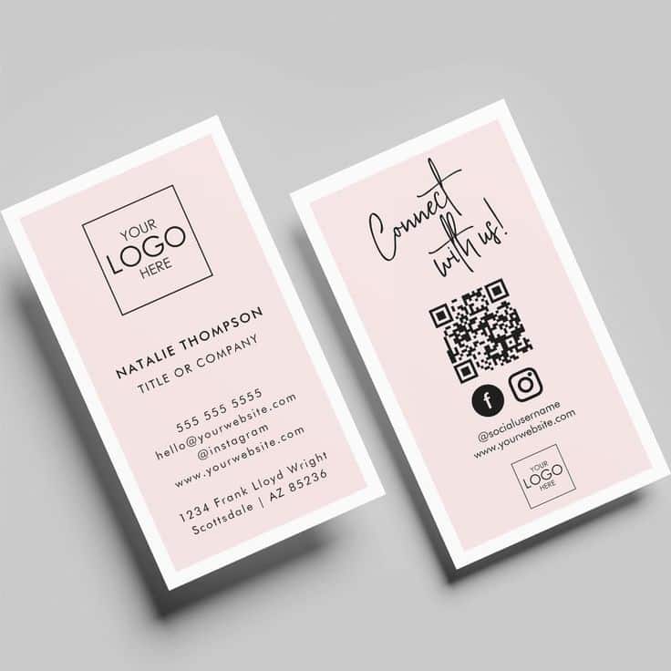
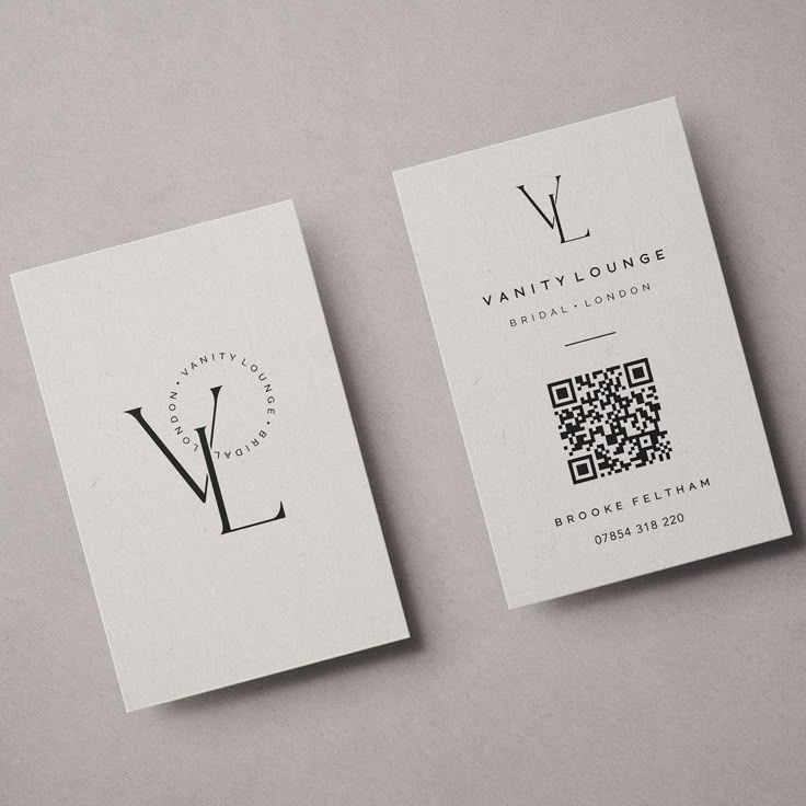
Adding images or icons can make a card memorable and explain what the business does quickly.
Simple icons related to the business—like a camera for a photographer—help communicate at a glance. Using custom or hand-drawn icons also adds a personal touch.
Photos or logos should be clear and high quality. Overcrowding the card with too many images can distract, so it’s usually best to stick to one or two visual elements. Creative layouts like icons beside text or small illustrations in corners keep the design balanced.
Popular Styles and Trends
Creative business card designs today focus on clear visuals, memorable details, and strong brand identity. Some cards use simple layouts and clean lines, while others add bright colors or unique features to grab attention. Interactive elements also help cards stand out by engaging recipients more deeply.
Minimalist Concepts

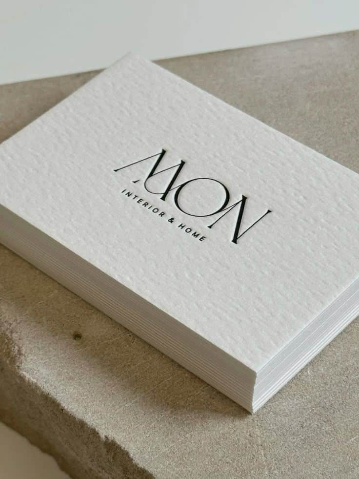
Minimalist business cards use clean spaces, simple fonts, and limited color palettes. They avoid clutter, making key details easy to find.
People who prefer minimalist designs often choose muted tones like black, white, or soft pastels. These choices help their card look polished and professional.
A lot of minimalist cards rely on high-quality paper and subtle textures. This adds a tactile experience without extra visuals.
The design might include only the name, title, and contact info, arranged neatly. This style suits anyone who wants to show clarity and confidence.
Bold and Vibrant Designs
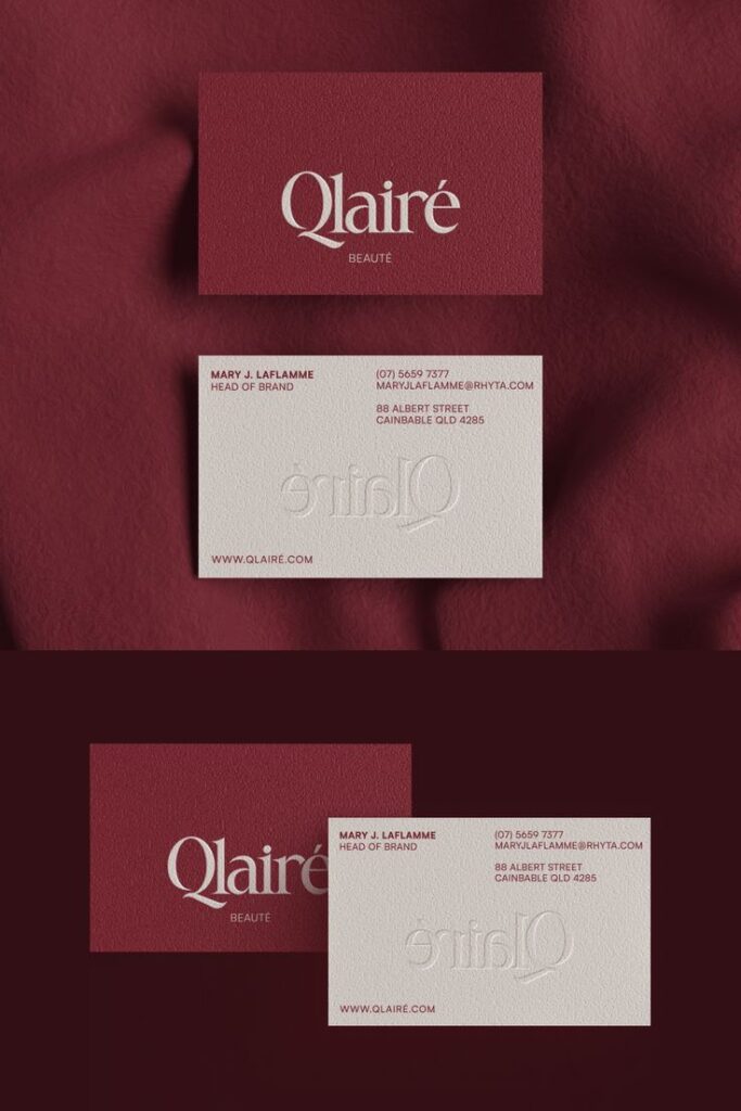
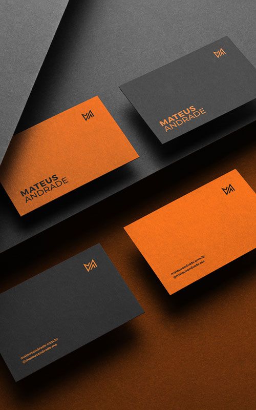
Bold business cards use bright colors and large fonts to catch the eye fast. Vibrant gradients or color blocking are popular ways to add energy.
These cards often mix contrasting shades, like electric blue with orange or neon green with black. This creates a strong visual impact.
Some designs include large illustrations or mascots that tell a company’s story. These elements make the card memorable and reflect brand personality.
For businesses in creative fields, bold colors suggest innovation and excitement. The style helps cards stand out in stacks or at busy networking events.
Interactive Cards
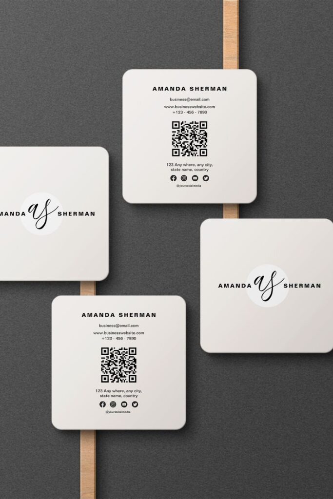

Interactive business cards invite people to engage beyond just reading. Examples include cards with QR codes, fold-out elements, or textures that encourage touch.
QR codes link to websites, portfolios, or videos with more information. This lets recipients instantly connect with the brand.
Fold-out or pop-up cards add surprise and fun. These features make the card a small keepsake rather than just a piece of paper.
Some cards use materials like embossed patterns or scratch-off sections to create a sensory experience. This can make the card feel more personal and special.
Materials and Finishes for Business Cards
Choosing the right materials and finishes can help a business card feel unique and make a strong impression. Options range from thick papers to durable metals, with many creative finishes that add texture and shine. These choices affect how the card looks, feels, and lasts.
Premium Papers

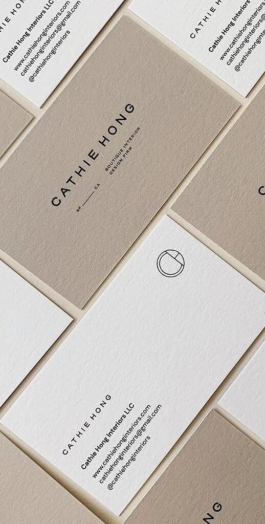
Premium paper stocks offer a classic feel with high-quality texture and weight. Thick cardstock, usually between 300 to 600 gsm, feels sturdy and professional in hand. Options like matte, glossy, or textured finishes help highlight the design and add subtle uniqueness.
Eco-friendly papers, such as recycled kraft or cotton blends, appeal to those who want sustainable choices. They often have a natural look and feel while still holding color well. Some papers also work better for special effects like embossing or foil stamping, adding an elegant dimension.
Metal and Plastic Options

Metal business cards bring durability and a modern edge. Stainless steel or aluminum cards feel heavy and solid. They often include stamped or engraved details for a sleek design that stands out. Metal cards can handle wear better than paper but usually cost more.
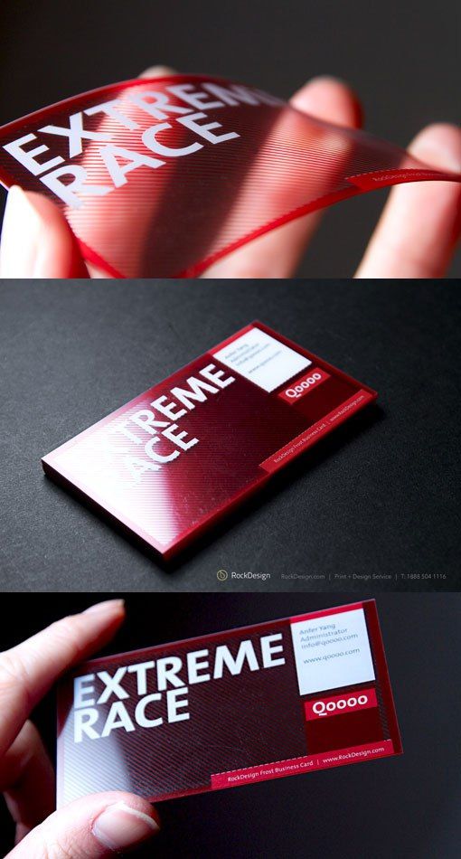
Plastic cards offer versatility with smooth, flexible surfaces. Clear or colored plastic cards can be transparent or matte. They resist water and bending, making them good for longer use. Both metal and plastic allow unique shapes and finishes but require specialized printers.
Specialty Coatings and Textures
Special finishes add distinct looks and tactile experiences. Foil stamping uses metallic colors like gold or silver for shiny accents that catch the eye. Embossing raises certain parts of the card to create a 3D effect, adding depth.
Matte lamination gives a smooth, non-reflective surface that feels soft and reduces glare. Soft-touch coatings add a velvety feel for a luxurious experience. Textured finishes, like linen or felt, create visual interest and make cards more memorable while staying durable.
Design Inspiration and Creative Ideas
Creative business cards catch attention through thoughtful themes, unique shapes, and clever use of both sides. These aspects can reflect personality and professionalism while making a card memorable.
Thematic Approaches

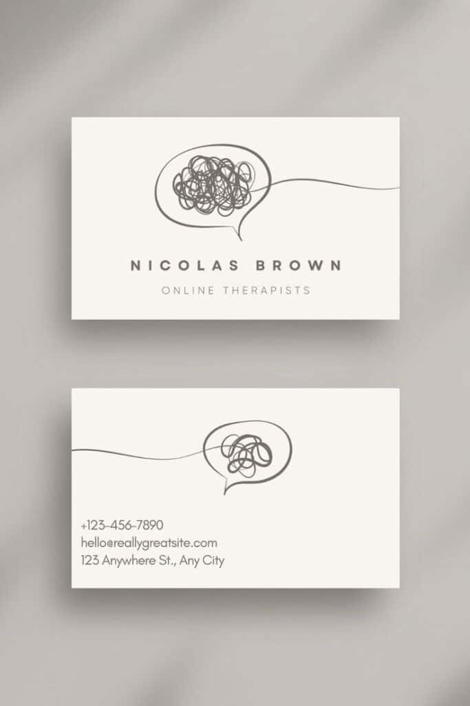
Using a clear theme helps a business card tell a story or express a brand’s identity. For example, an artist might use colorful paint splashes or brushstroke textures. A tech professional could feature sleek lines or circuit patterns.
Themes can draw from the industry or the person’s interests. Some cards use nature motifs like leaves or wood grain for an eco-friendly look. Others might mimic a product, such as a coffee cup shape for a café owner.
Choosing the right colors and fonts supports the theme. A clean, minimalist style works for corporate fields, while playful fonts suit creative industries. Consistency in design makes the card feel intentional and polished.
Shape and Layout Innovations
Moving away from the standard rectangle can instantly make a card stand out. Rounded edges, square shapes, or custom die-cut designs create visual interest. Cards shaped like tools, logos, or icons tie the shape to the business’s purpose.
The layout can also break tradition. Vertical cards or folded cards offer more space to organize details. Some use grids, asymmetry, or overlapping elements to guide the reader’s eye.
It’s important to keep essential information clear, even with unusual shapes or layouts. White space and balance prevent clutter. Creative cuts and alignments can add style without sacrificing readability.
Double-Sided Designs
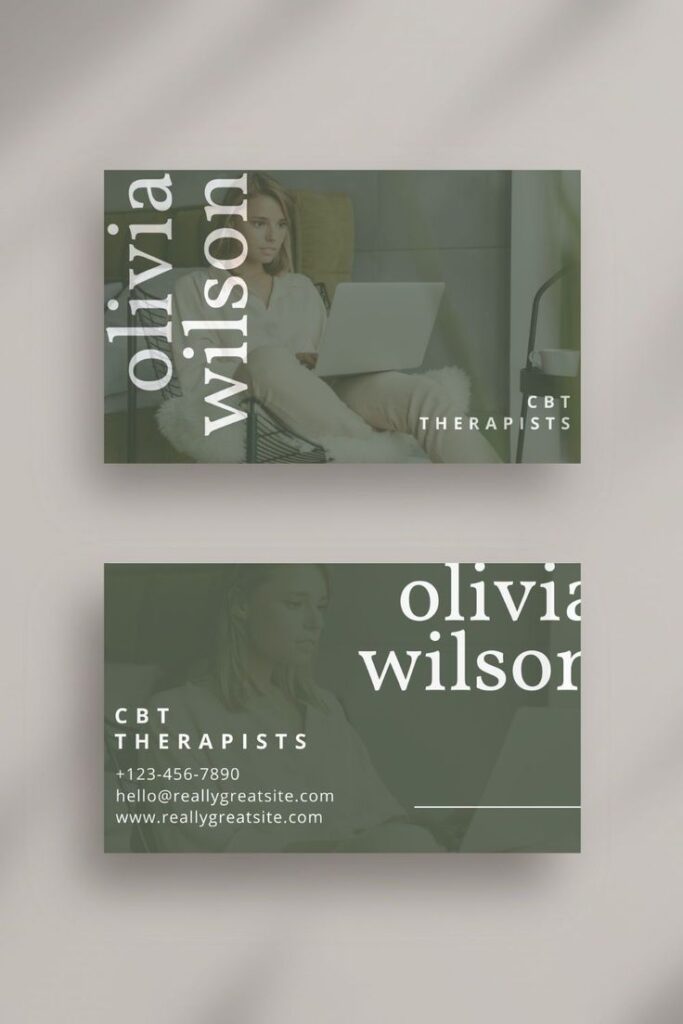
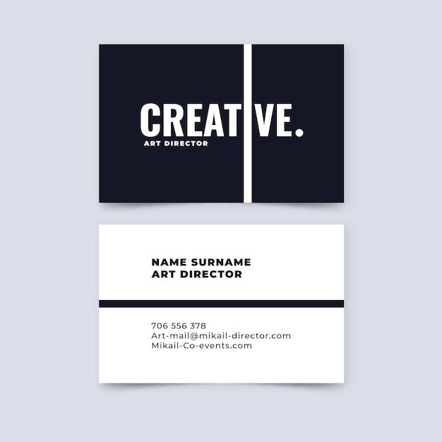
Using both sides of a card doubles the space for information and design. One side typically holds key details like name, title, and contact info. The other side can show a logo, product image, or a slogan for brand reinforcement.
This approach allows for cleaner layouts, avoiding overcrowding. It also invites interaction, as people flip the card to see more.
Some businesses use the back side for functional purposes, like appointment reminders or QR codes linking to websites. This gives the card extra value and makes it more useful to the receiver.
Tips for Making a Memorable Impression
A business card should show who a person is and make it easy for others to connect. Using bold personal touches and clear, creative ways to share contact details can help the card stand out. Small details and thoughtful design choices can make a big difference.
Personal Branding Strategies
The card should reflect the person’s style and brand. Using consistent colors, fonts, and logos ties the card to other materials like websites or social media. This makes it easier for people to remember the brand.
Adding a tagline or a brief description can quickly explain what the person or company offers. Including a photo or a custom graphic helps the card feel personal and unique.
The design should match the person’s industry. For example, creative professionals might use bold colors and playful layouts, while formal industries may choose clean lines and simple fonts.
Incorporating Contact Information Creatively
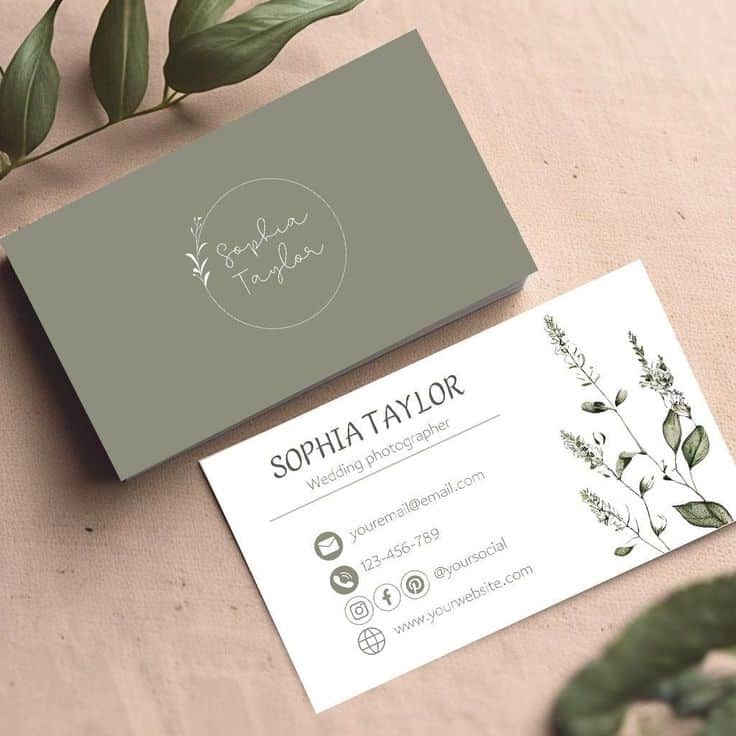

Contact details must be easy to find but don’t need to be boring. Using icons for phone, email, and website simplifies the look and saves space.
Putting contact info on different parts of the card, like the back or a fold, can make the design more interesting. QR codes are a great way to link directly to a digital portfolio or social profile.
It’s important to only include essential information. Too much can clutter the card and overwhelm the reader. Clear hierarchy, such as larger text for the name and smaller text for other details, helps guide the eye.
- 2.1Kshares
- Facebook0
- Pinterest2.1K
- Twitter3
- Reddit0
