A great bakery logo does more than just look pretty—it tells your story at a glance and makes your shop memorable to customers. The right logo helps you connect with your audience by reflecting your bakery’s style, quality, and unique personality. From whimsical cupcakes to elegant bread symbols, your design choice sets the tone for your brand.
Whether you’re opening a neighborhood bake shop or updating your brand, you don’t need to be a designer to create a logo that stands out. With the right guidance, tools, and examples, you can combine appealing imagery, thoughtful typography, and just the right colors to create a logo you’ll be proud to display.

Key Takeaways
- A good bakery logo builds brand recognition.
- Design choices like imagery and color matter.
- You can create a strong logo with the right tips and tools.
Fundamentals of Bakery Logo Design
Your bakery logo is the first impression customers get of your brand. Paying close attention to the design ensures your logo stands out and effectively communicates what makes your bakery unique.
What Makes a Successful Bakery Logo
A successful bakery logo captures the essence of your products and sets the right mood for your brand. The imagery you choose, such as bread, cupcakes, or rolling pins, signals to customers the types of goods you offer.
Choosing the right font is crucial. Hand-drawn or script fonts often convey a homemade or artisanal feel, while bold, clean fonts feel more modern and accessible. Color choices set the tone—soft pastels suggest sweetness, and earthy tones add warmth.
Make sure the logo design is scalable and looks good on everything from business cards to storefront signs. Simplicity ensures your logo is easily recognized and remembered.
Logo Design Principles for Bakeries
When designing a bakery logo, balance is important. Use white space strategically so the logo doesn’t feel crowded or overwhelming.
Contrast helps the key elements, such as your bakery name or icon, stand out. A well-chosen color palette and complementary typography go a long way in creating memorable logo designs.
Consistency matters. Use your logo across packaging, menus, and online platforms. This builds brand trust and recognition. Keep in mind that your bakery logo should remain clear and legible whether it’s printed small on a label or large on outdoor signage.
Here’s a quick checklist for bakery logo design:
- Easily recognizable shape
- Legible typography
- Appropriate color choices
- Relevant, bakery-themed imagery
- Scalable for different uses
Choosing the Right Imagery
Selecting the right imagery shapes how customers see your bakery brand. Distinct symbols and thoughtful design choices make your logo memorable and help communicate what you specialize in.
Popular Bakery Logo Symbols
Bakery logos often feature imagery that instantly signals fresh, baked goods. You might see loaves of bread, classic chef’s hats (great for a baker logo), or a simple rolling pin. These symbols quickly tell customers what your business offers. Cupcake and cake logos, especially those depicting a birthday cake or a layered slice, are commonly used for bakeries that focus on celebrations.
Some logos incorporate a doughnut or even cookies, which work well for shops that cater to sweet treat lovers. Beyond baked goods, items like a barista logo or drink logo can be used if your bakery serves specialty coffees or beverages. If your bakery has a unique twist, consider subtle additions like an apple or banana logo for healthy product lines.
Common Bakery Symbols Table
| Symbol | Communicates |
|---|---|
| Bread | Fresh daily baking |
| Chef’s Hat | Skilled baking |
| Cupcake | Sweet treats, fun occasions |
| Doughnut | Playful, casual vibe |
| Cookies | Comfort snacks |
Incorporating Baked Goods Icons
Including actual baked goods in your logo extends your brand message. For example, a cupcake logo might be topped with sprinkles to attract families or children. A detailed pastry logo like a croissant suits patisseries aiming for a European feel. If you run a bakeshop or patisserie, capturing the delicate details in a patisserie logo or bread logo sets you apart.
Highlighting specific items your bakery is known for—such as a birthday cake or artisan bread—is a practical way to set expectations. Make sure these icons are clear and not overly complicated. Bold, simple outlines work best for small labels and digital spaces.
When selecting icons, keep in mind their versatility. A strong icon will look good both on your storefront and your business cards.
Selecting Complementary Elements
Adding supporting elements can complete your logo’s story. Aprons, whisks, and even rolling pins often serve as subtle cues of your baking expertise. If you serve drinks or have a cafe-style bakery, small barista or drink icons can add personality without overwhelming the main image.
Colors, backgrounds, and shapes also guide how people feel about your brand. For a contemporary bakery, you might use minimalist backgrounds or single colors for a modern effect. Rustic bakeries often choose earth tones or textured backgrounds to reflect warmth.
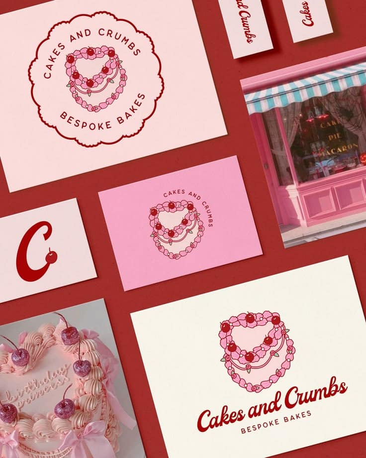
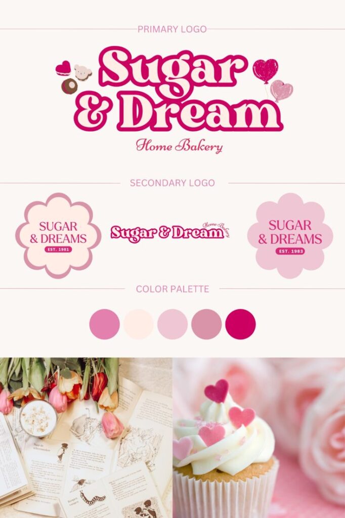
Typography should match your imagery. Soft, rounded fonts look friendly beside a cupcake logo or cookies logo, while script fonts might pair nicely with a patisserie logo or chef logo. Keep each element cohesive so customers recognize your bakery at a glance.
Typography and Color Schemes
Typography and color choices shape the first impression of your bakery’s brand and appeal directly to your customers’ senses. The right fonts and palettes create inviting, memorable logos that match your bakery’s personality.
Choosing Bakery-Friendly Fonts
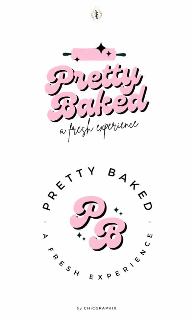
Selecting fonts for a bakery logo is about balancing warmth with clarity. Script and handwritten styles, such as Pacifico or Bakerie, are popular for conveying a cozy or artisanal vibe. These fonts mimic traditional bakery signs and evoke feelings of nostalgia.
When legibility is your priority, pair script fonts with a clean sans-serif for taglines or secondary text. This helps ensure your logo remains easy to read, even at small sizes or from a distance.
Here’s a quick reference table:
| Font Style | Mood | Example Uses |
|---|---|---|
| Script | Friendly, Nostalgic | Bakery name, signage |
| Sans-Serif | Clean, Modern | Tagline, product labels |
| Serif | Traditional, Elegant | Established bakeries |
Limit your font choices to two per logo to avoid clutter. Consistency will help reinforce your brand identity across packaging and marketing materials.
Effective Color Palettes for Bakery Logos
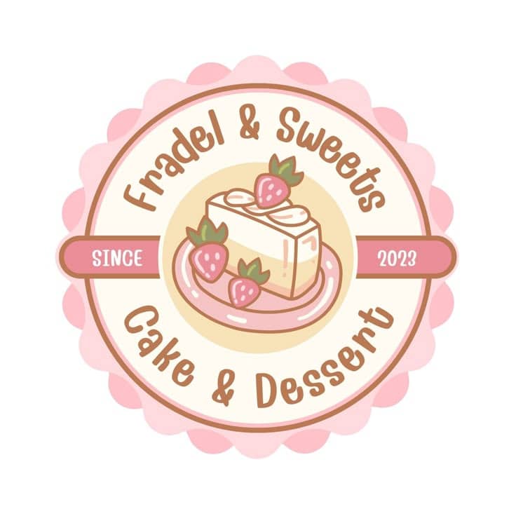
Bakery logos often use color schemes that are warm, inviting, and appetizing. Soft pinks, creamy browns, pastel blues, and gentle oranges are commonly used. These shades suggest the sweetness and freshness of baked goods.
A warm brown can communicate chocolate, coffee, or baked bread. Soft pinks and oranges cue up frosting, macarons, or fruity fillings. For a contemporary touch, try pairing classic pastels with a pop of fresh blue or green.
Common bakery palette ideas:
- Pinks + Browns: Sweet and comforting
- Oranges + Cream: Fresh and cheerful
- Pastel Blue + Pink: Playful and light
Use 2–4 colors to keep your logo visually appealing but not overwhelming. Test your palette in various settings, such as packaging, signage, and digital designs, to ensure it looks consistent and appetizing everywhere.
Creating and Editing Your Logo
Making a bakery logo involves choosing tools that fit your needs and having a basic understanding of graphics. Adjusting font, color, and icons matters just as much as picking the right format for crisp results across your products and online presence.
Using Logo Design Tools and Resources
You can use online logo makers like Canva, BrandCrowd, or Looka to get started quickly. These platforms offer a wide range of templates, letting you tweak your logo’s colors, fonts, and layout without design experience.
Some tools are free to use, but you may need to pay to download high-resolution files. Look for features that allow easy adjustments to text and icon placement. The ability to upload your own images or photos can make your design stand out.
When selecting a tool, prioritize export options like PNG, JPG, or even vector files (SVG, EPS). These formats ensure your logo stays sharp on signs, packaging, or social media. Many platforms include helpful tutorials or customer support if you get stuck.
Working with Vectors and Graphics
Vectors are key for editing and scaling logos without loss of quality. Unlike photos, which are made of pixels, vectors use mathematical paths to outline shapes. This makes them perfect for creating logos that look great on everything from business cards to storefront banners.
Popular vector editing tools include Adobe Illustrator and free alternatives like Inkscape. These programs allow you to adjust every detail of your logo, from stroke width to color gradients.
When working on your logo, ensure your graphics are in a vector format (such as SVG or EPS) for flexibility. If your design includes photos or detailed graphics, keep in mind that these may not scale as well as vector artwork. Clean, simple lines will make your logo more adaptable and easy to reproduce in various sizes.
Showcasing Bakery Logo Designs
Highlighting bakery logos can help you see what works and understand how presentation impacts perception. Examining different designs and showing your own logo in the right way makes a real difference.
Logo Inspiration and Case Studies
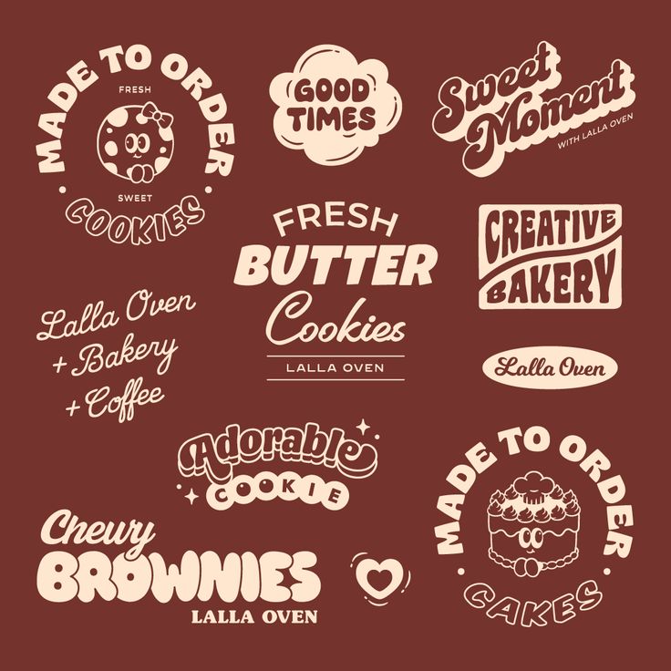
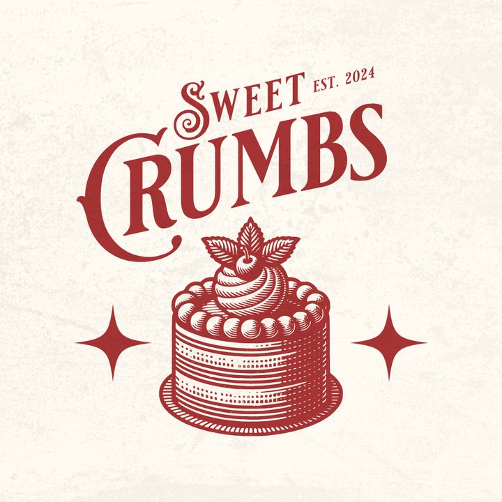
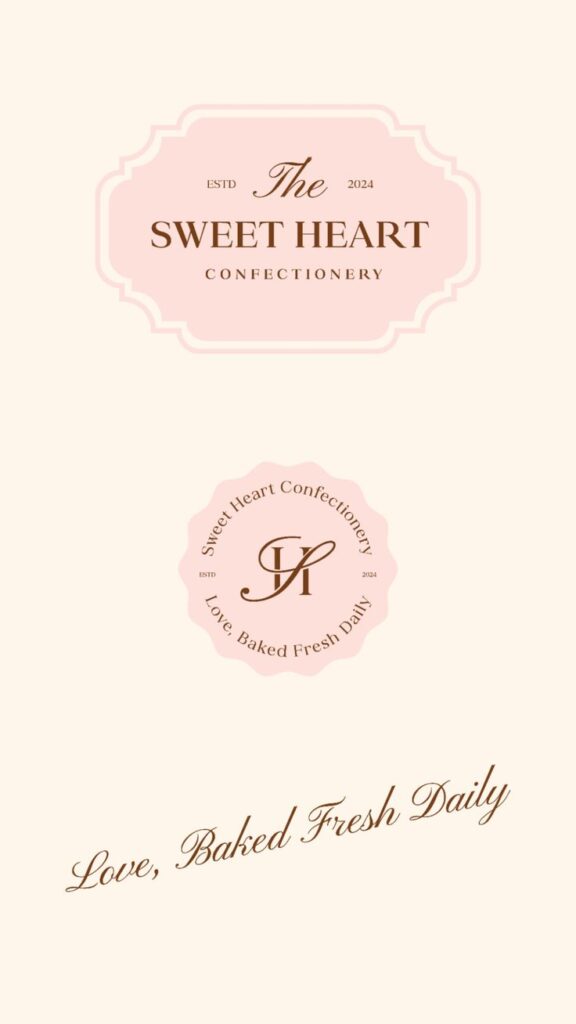
Exploring great bakery logo designs can give you a clear idea of what styles appeal to customers. Many bakeries, from neighborhood shops to larger brands, use symbols like bread, whisks, and rolling pins to signal quality and freshness. Color choices tend to include warm tones such as cream, pastel pinks, or soft browns that feel inviting and familiar.
You’ll notice some logos use playful fonts and bold shapes to stand out, while others keep it simple for a classic look. Reviewing examples on platforms like Canva, Looka, and DesignCrowd lets you compare real-world approaches side by side. Studying how these bakeries tailor their logos to their business type—whether artisan or modern—can spark ideas for your own design.
Presenting Your Final Bakery Logo
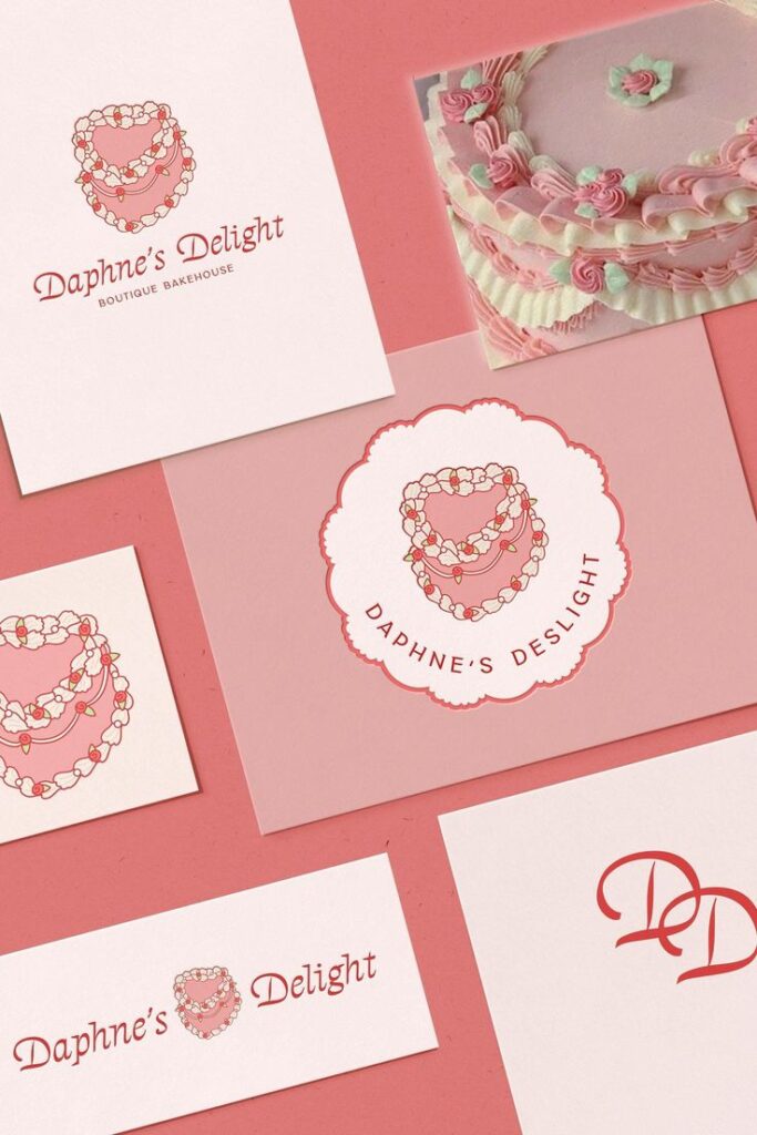
How you present your new bakery logo is key to making a strong first impression. Use clean, high-resolution images for every application, from storefront signs to digital ads. Mockups can help visualize your logo on packaging, menus, and uniforms, helping you spot any issues before committing.
Consider creating a simple style guide that explains your logo’s usage, colors, and spacing. This keeps your branding consistent whether you’re printing bags or posting online. By showing your logo in multiple contexts, you demonstrate its flexibility and build confidence in your bakery’s image.
- 3.5Kshares
- Facebook0
- Pinterest3.5K
- Twitter0
- Reddit0


