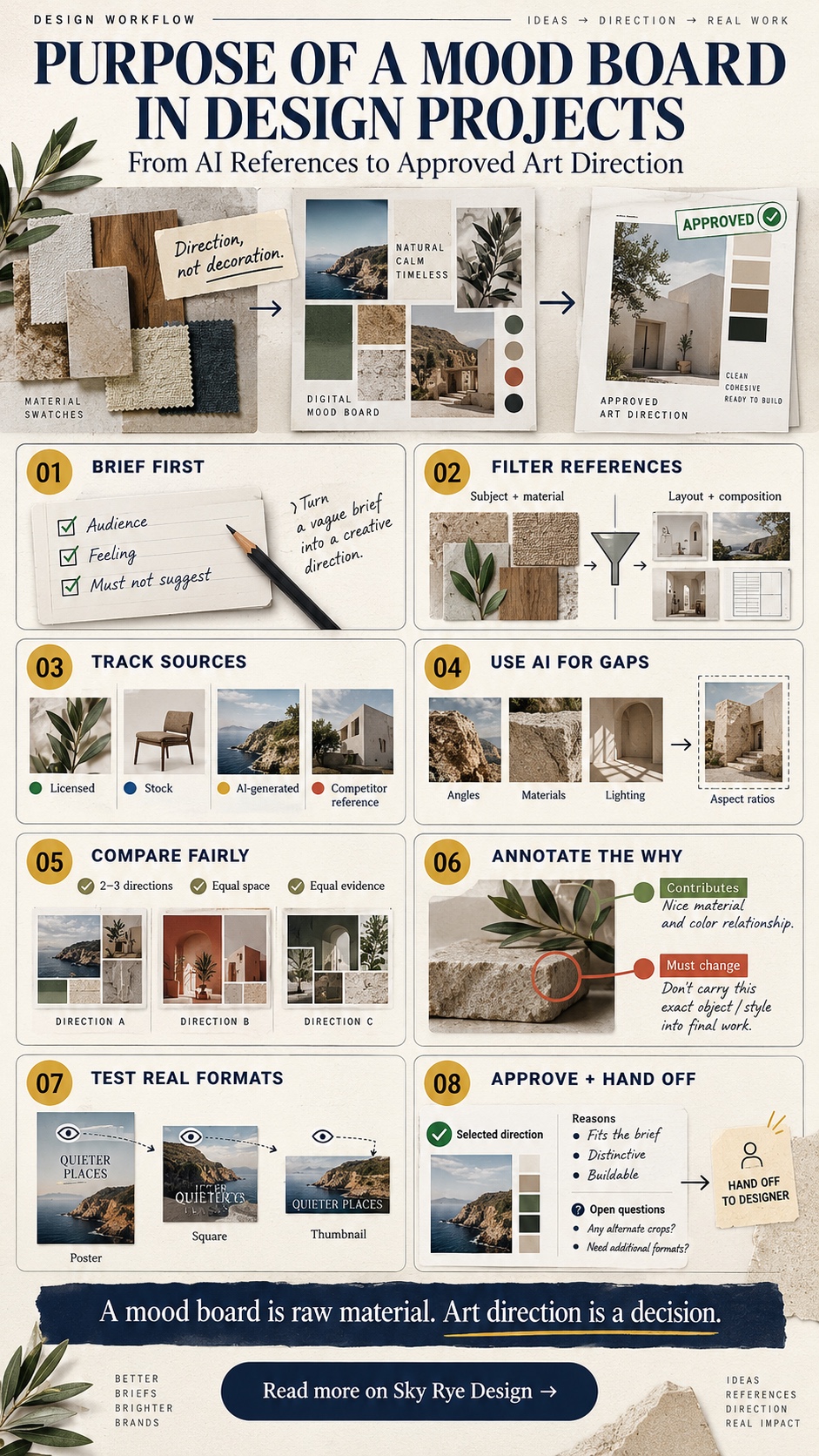
A mood board that gets compliments in a client meeting and a mood board that actually moves a project forward are two different objects, even when they look identical on screen. I’ve built boards for everything from a car interior concept to a jewelry brand’s first collection, and the ones that mattered weren’t the prettiest ones — they were the ones where every image was there for a reason I could defend. The purpose of a mood board in a real design project isn’t to look inspiring. It’s to turn a vague brief into a set of decisions someone can actually approve, build from, and hand off without you standing in the room explaining it.
- What is the purpose of a mood board in a design project?
- Write the art direction brief before generating images
- Build a source-aware reference library
- Use AI to fill reference gaps without letting it choose the direction
- Compare and annotate two or three art directions fairly
- Turn the selected mood board into an editable design test
- Approve, document, and hand off the art direction
- Common mistakes when moving from AI mood board to art direction
- FAQ
That distinction matters more now than it did a few years ago, because AI reference generation has made it trivially easy to produce a beautiful, cohesive-looking board in an afternoon — and just as easy to produce one that’s persuasive without being useful. This guide walks through what a mood board is actually supposed to accomplish inside a design project, how to build one with AI references without letting the tool choose your direction for you, and how to turn the result into something a client or team can actually sign off on.
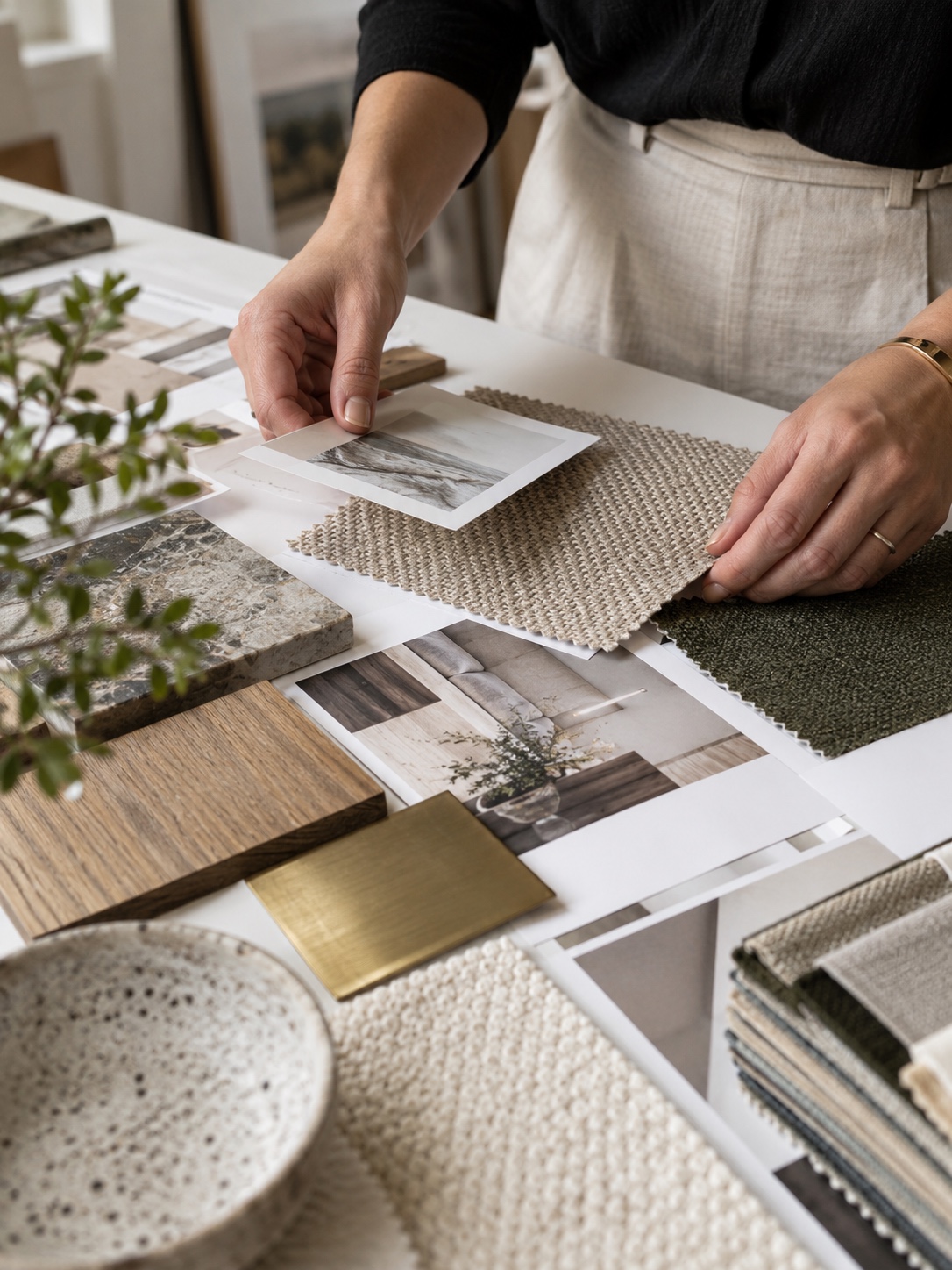
I think about a mood board the same way I think about a material sample board on a product design project — the physical swatches of leather, metal finish, and stitching an industrial design team pins up before committing to a production spec. Nobody mistakes that board for the finished product. It exists to force a conversation about which qualities actually belong together before money gets spent tooling up a factory line. A digital mood board for a brand identity or a web interface deserves the same discipline, even though swapping an image costs nothing compared to re-tooling a production line. The low cost of changing your mind digitally is exactly what makes it easy to skip the discipline — and exactly why skipping it causes so much rework later.

What is the purpose of a mood board in a design project?
Why an attractive reference board is not yet a design direction
A folder of beautiful, visually consistent images proves you have taste. It doesn’t yet prove you’ve made any decisions. I’ve seen plenty of boards where every image individually looks great and the collection as a whole says almost nothing specific — no clear point of view on proportion, material, color relationship, or mood that a second designer could pick up and continue. A reference collection becomes a design direction only when it answers specific questions the brief raised, which means it has to exclude things as deliberately as it includes them.
Picking a visual theme is a useful starting point, but it’s only that — a starting point. Fresh Mood Board Themes covers how to choose and combine themes that stay visually coherent, which is worth reading before you begin gathering references. This piece picks up from there, once a rough theme direction exists and the harder work of turning it into a defensible decision begins.
The difference between inspiration, a reference board, and an approved art direction

These three get used interchangeably and shouldn’t be. Inspiration is anything that caught your eye — unfiltered, personal, not yet accountable to a brief. A reference board is a curated subset of that inspiration, organized around a specific project’s needs but not yet tested against real layouts. Approved art direction is the narrower thing that survives comparison, annotation, and a stakeholder sign-off — it’s the version someone can actually build from without guessing. Most of the friction I see on real projects comes from treating stage one or two as if it were stage three.
What the board must let another designer decide without explanation
A genuinely useful mood board passes a simple test: hand it to a designer who wasn’t in the room when you built it, and they should be able to make the next ten small decisions — a secondary color, a texture choice, a typeface weight — in a way that’s consistent with the direction, without calling you to ask. If the board can’t do that, it’s still inspiration, not direction, no matter how polished it looks in a presentation deck.
Write the art direction brief before generating images
Write the audience message, intended feeling, and “must not suggest” statement
Before touching an image generator or opening a new Pinterest board, write three short statements: what the design needs to communicate to its audience, what feeling it should leave them with, and — just as important — what it must not accidentally suggest. That last one is the piece most briefs skip, and it’s often the most useful. An automotive interior concept I worked on early in my career needed to read as “precise and confident,” but explicitly could not read as “cold” or “clinical” — writing that constraint down before gathering references kept us from drifting toward a sterile, overly minimal direction that technically fit the first two words but violated the third.
Turn the brief into visible selection criteria

Once you have those three statements, convert them into a short checklist you can hold against every single reference image: does this support the message, does it match the feeling, does it avoid the thing we’re steering away from. This is the step that turns gathering references from a vibe exercise into an actual filtering process. Without it, you end up curating based on what looks good in isolation rather than what the project specifically needs, and that gap is exactly where boards go wrong.
Build a source-aware reference library
Separate subject references from layout and composition references
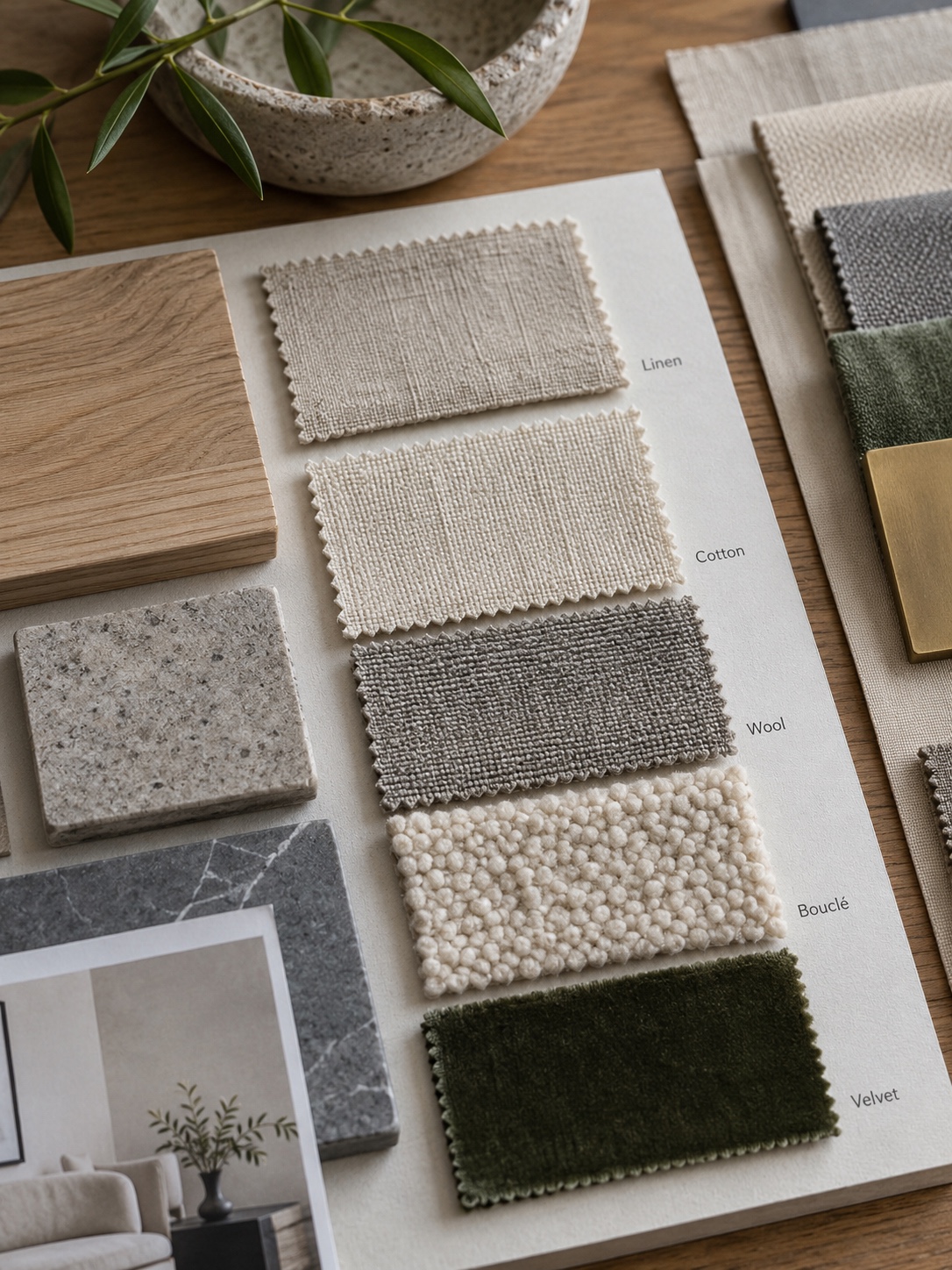
Mixing “what the subject should look like” with “how the composition should be arranged” into one undifferentiated pile makes a board harder to read and harder to act on. I keep these as two visually separate groups from the start — material and subject references in one cluster, layout, hierarchy, and composition references in another — because a designer building from the board later needs to know which lesson to take from which image. A gorgeous photo of a product might be there purely for its lighting quality, not its composition, and that distinction gets lost fast if everything lives in one undifferentiated grid.
Pinterest is where most designers still gather the bulk of this raw material, and that’s fine as a sourcing habit as long as it stays a sourcing habit rather than the organizing system itself. Pinterest Mood Boards covers how to set up boards there that actually stay organized and searchable, which makes the subject-versus-composition split above far easier to maintain once references start accumulating in the dozens.
Record each source, permission status, and intended use
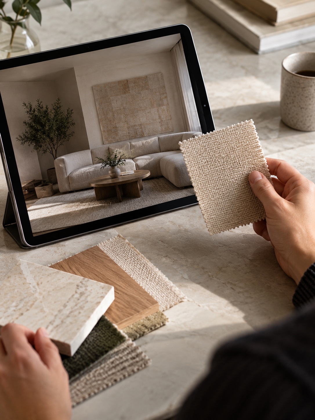
Every reference needs a one-line note: where it came from, whether it’s licensed, stock, AI-generated, or a competitor’s published work, and what role it’s playing on the board. This feels like overhead until the first time a client asks where an image came from, or a reference that looked like generic inspiration turns out to be a specific photographer’s signature shot that can’t be used as a direct visual basis for anything shipped. Image to Image: Reference-Based AI Generation goes deeper into managing reference provenance once AI variation enters the workflow, which is worth reading before you start generating fill images for gaps in the board.
A simple spreadsheet or a tagged folder structure handles this fine — it doesn’t need dedicated software. What it does need is consistency from the very first reference you save, because retrofitting source notes onto forty images after the fact is tedious enough that it rarely actually gets done. I learned this the hard way early on, rebuilding sourcing information for a jewelry brand board from memory after a client requested documentation we hadn’t kept — a half-day of guesswork that a one-line habit from day one would have avoided entirely.
Use AI to fill reference gaps without letting it choose the direction
Describe visual qualities instead of imitating a famous designer
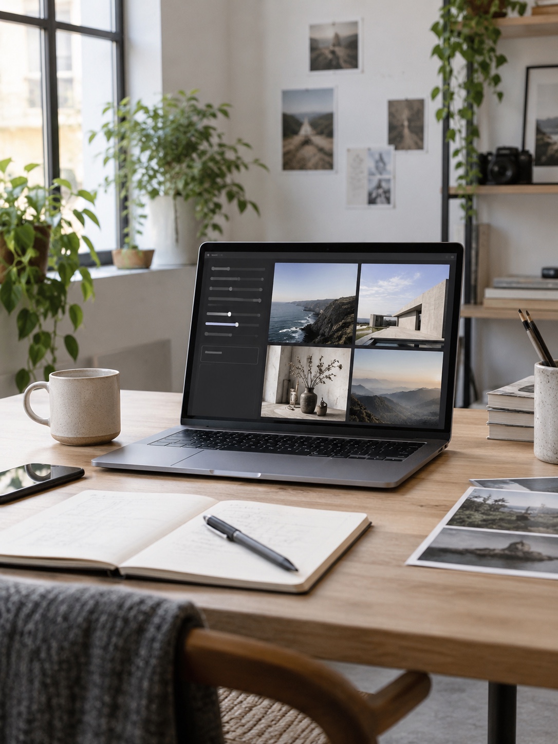
The fastest way to get a generic, instantly-forgettable AI reference is to prompt with a famous designer’s or studio’s name and hope the tool captures something specific. It’s also a legal and ethical shortcut worth avoiding. Describing the actual visual qualities you want — warm, directional side lighting; a matte, slightly textured surface finish; a restrained three-color palette — produces references that are more specific to your actual brief and don’t quietly borrow someone else’s established visual signature without crediting it.
Generate missing angles, materials, lighting, or aspect ratios
AI reference generation earns its place on a mood board when it’s filling a specific, nameable gap — you have four strong subject references but nothing showing the material at night, or nothing in the vertical crop you’ll actually need for a social post. Nano Banana Pro is a tool worth knowing for exactly this kind of targeted gap-filling, since it can generate a missing angle or lighting condition that matches an established reference set rather than introducing a new, unrelated visual voice into the board. The goal is always to complete a direction you’ve already defined, not to let the generator suggest a new one because it’s faster than sourcing a real photograph.
Label generated images and keep factual references separate
Every AI-generated image on a working board should carry a visible label saying so, kept distinct from photographed or licensed material. This isn’t bureaucracy for its own sake — a stakeholder reviewing the board needs to know which images represent something that actually exists and can be sourced or licensed, and which are synthetic stand-ins for a quality you’re still planning to source or produce for real. Blurring that line is how boards end up promising a material finish or lighting setup nobody has actually confirmed is achievable.
Compare and annotate two or three art directions fairly

Give every direction the same amount of space and evidence

When you’re presenting more than one direction, resist the pull to quietly favor your preferred one with more images, better placement, or stronger supporting evidence. I lay out competing directions with identical reference counts and identical annotation depth specifically so a stakeholder’s reaction reflects the actual design merit of each one, not which one I happened to spend more time polishing. An unevenly built comparison isn’t really a comparison — it’s a soft pitch dressed up as a choice.
Annotate what each image contributes and what must change
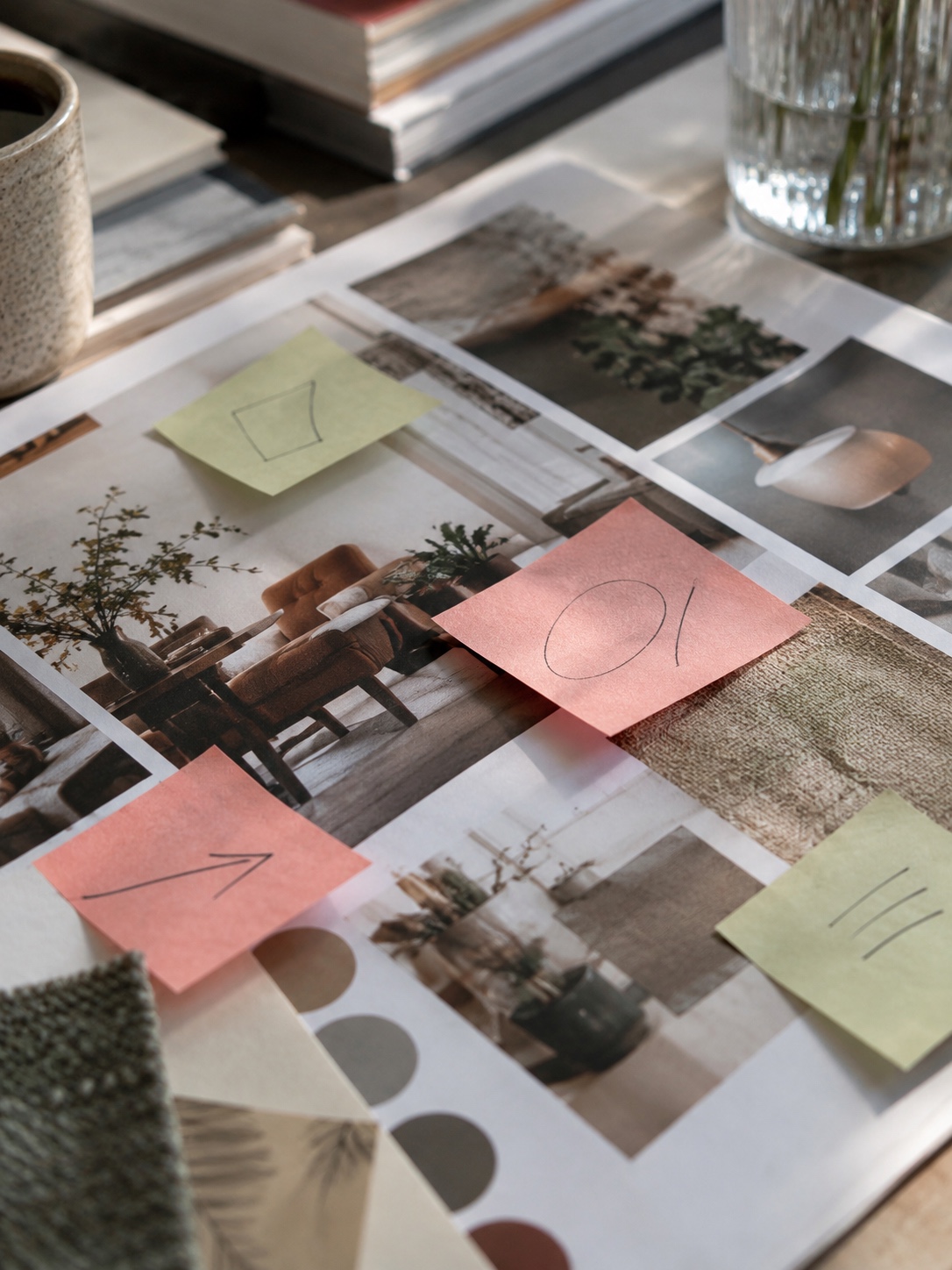
Every reference on a finalized comparison board needs a short note explaining exactly what it’s contributing — this color relationship, this proportion, this material quality — and, just as importantly, what about it doesn’t apply and needs to change before it informs the final work. An un-annotated board forces every viewer to guess which part of each image matters, and different viewers will guess differently, which is how a single board generates three contradictory interpretations of the same direction.
Reject attractive references that fail the brief
The hardest discipline in this whole process is cutting a reference image that’s genuinely beautiful but doesn’t actually serve the brief you wrote at the start. I’ve pulled plenty of images out of boards I personally loved because they pulled the direction toward something more generic or because they quietly violated the “must not suggest” statement from the brief. Keeping them in because they’re pretty is exactly how a board drifts from a specific point of view toward a vague, crowd-pleasing aesthetic that doesn’t actually commit to anything.
Turn the selected mood board into an editable design test
Add rough hierarchy sketches before client review
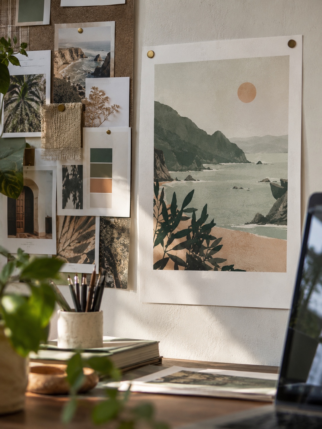
A mood board full of beautiful references still leaves open the question of how those qualities translate into an actual layout with real hierarchy — what’s biggest, what reads first, where the eye lands. A handful of rough, low-fidelity hierarchy sketches laid over or alongside the board answers that question before a client sees it, and it’s a far cheaper place to catch a hierarchy problem than after a full comp is built.
Keep typography, dates, credits, and access information editable
At this stage, treat typography choices, any placeholder dates or event details, and credit or access information as editable fields, not finished design — locking them in too early is one of the more common ways a direction gets rejected for a reason that has nothing to do with the actual visual concept. A client fixating on a wrong date in a mockup can derail a conversation that should have been about color and material.
Test the direction as a poster, square announcement, and thumbnail

A direction that only exists as a moodboard-style collage hasn’t actually been tested yet. Push it into at least two or three real output formats — a poster layout, a square social announcement, a thumbnail-sized crop — before calling it approved. Directions that look strong as a loose collage sometimes fall apart the moment they’re forced into a fixed, real-world format, and it’s much better to discover that now than after a client has already approved the collage version.
Approve, document, and hand off the art direction

Record the selected direction, reasons, and unresolved questions
Once a direction is chosen, write down what was selected, the specific reasons it won out over the alternatives, and anything still genuinely unresolved — a material that hasn’t been confirmed available, a typography pairing still pending licensing. This record is what keeps a project from re-litigating the same decision three weeks later when a new stakeholder joins and asks why you didn’t go with the other option.
A short written record also protects the designer, not just the project. On larger engagements with multiple approval layers, I’ve seen a direction get quietly second-guessed weeks after sign-off simply because nobody could reconstruct why it had been chosen in the first place. A paragraph of recorded reasoning, saved alongside the board itself, settles that conversation in a minute instead of reopening a debate that should have already been closed.
Separate approved art direction from approved final artwork
Approving a direction is not the same as approving finished artwork, and conflating the two creates real friction later. An approved direction says “this color relationship, this material language, this composition logic is correct” — it doesn’t mean every pixel of the eventual final piece has been signed off. Making that distinction explicit in the handoff prevents a client from assuming the project is further along than it actually is.
Archive rejected directions without losing source notes

Keep the rejected directions and their sourcing notes rather than deleting them. A direction that got cut for timing or budget reasons rather than genuine design weakness often becomes useful again on a future phase or a related project, and rebuilding a reference set from scratch because the original got discarded wastes real time. Infinite Canvas for AI Creative Workflows covers a workspace approach that keeps rejected branches, source references, and the winning direction all visible on one connected canvas rather than scattered across folders.
Common mistakes when moving from AI mood board to art direction
Generating options before defining selection rules
Firing up an AI image tool before writing the brief and selection criteria is the single most common mistake I see. It feels productive — you get a wall of options fast — but without criteria to filter against, you end up picking based on which image you personally like best in the moment, which is exactly the subjective drift a proper art direction process is supposed to prevent.
Mixing incompatible directions into one persuasive-looking board
A board that blends two genuinely different visual directions into one collage can look cohesive through sheer visual polish while actually representing no coherent decision at all. It photographs well and presents badly in practice, because nobody can actually build consistently from a direction that’s secretly two directions wearing one outfit.
Treating generated imagery as evidence or reproduction-cleared artwork
An AI-generated reference image proves a visual quality is achievable in concept. It doesn’t prove a specific photograph exists, that a material behaves exactly as rendered, or that the image itself is cleared for reproduction in finished work. Treating a generated reference as if it were a licensed photo or a confirmed material sample is how production timelines get quietly built on assumptions nobody actually verified.
FAQ
How do you make a mood board with AI?
Start with a written brief — the audience message, intended feeling, and what the piece must not suggest — then gather real references first and use AI generation only to fill specific, nameable gaps like a missing angle or lighting condition. Label every AI-generated image clearly and keep it separate from photographed or licensed material.
What is the difference between an AI mood board and art direction?
An AI mood board is a curated collection of references, some generated and some real. Art direction is the narrower output that survives comparison against alternatives, gets annotated with specific reasoning, and is tested in real formats before approval. A mood board is raw material; art direction is a decision.
How do you present an AI mood board to a client?
Present two or three directions with equal space and evidence rather than one favored option, annotate what each reference contributes, and show the direction tested in at least one real output format — a poster or thumbnail crop — rather than only as a loose collage of inspiration images.
Can AI-generated images be used in the final design?
It depends on the specific tool’s licensing terms and how the image is used, which varies enough that it’s worth confirming per project rather than assuming. Generated references are reliably useful for establishing direction during the mood board stage; treat their use in shipped final artwork as a separate decision requiring its own confirmation.
What is the difference between a mood board and a reference board?
In practice they’re often used interchangeably, but a useful distinction is that a reference board is a broader, less filtered collection tied loosely to a project, while a mood board has been curated against specific selection criteria drawn from a brief. The mood board is the reference board after it’s been held accountable to actual project requirements.
- 0shares
- Facebook0
- Pinterest0
- Twitter0
- Reddit0