Exploring Japanese style illustration is a great way to expand your creative skills and bring new life to your artwork. Whether you’re a beginner or looking to refine your technique, learning the fundamentals behind manga, anime, and traditional Japanese art can help you create expressive and memorable illustrations.
By understanding key tips behind Japanese style illustration, you can build authentic and eye-catching art that stands out. This guide will help you discover practical approaches and inspiration for your own unique drawing journey.
1) Master clean line work for crisp anime characters
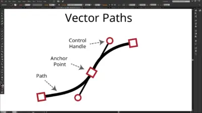
Clean line work is essential for creating sharp and polished anime characters. You want your outlines to be smooth, controlled, and clear to best define shapes and details.
Start by adjusting your pen or brush settings for steady and consistent strokes. Use a drawing tablet for more precise control, and try varying your stroke pressure for subtle line width changes. Thicker lines can be used for outer contours, while finer lines suit facial features and details.
Work with layers to keep your sketch and line art separate. This makes it easier to fix mistakes and refine your lines. Zoom in to carefully polish areas like eyes, hair, and clothing edges.
Reference professional art and study how artists balance line weight across their characters. Practice drawing with quick gestures first, then slow down for the final inking pass. Clean line art helps your characters stand out and appear more expressive.
Keep practicing—small improvements will add up with each drawing.
2) Use dynamic poses to convey motion effectively
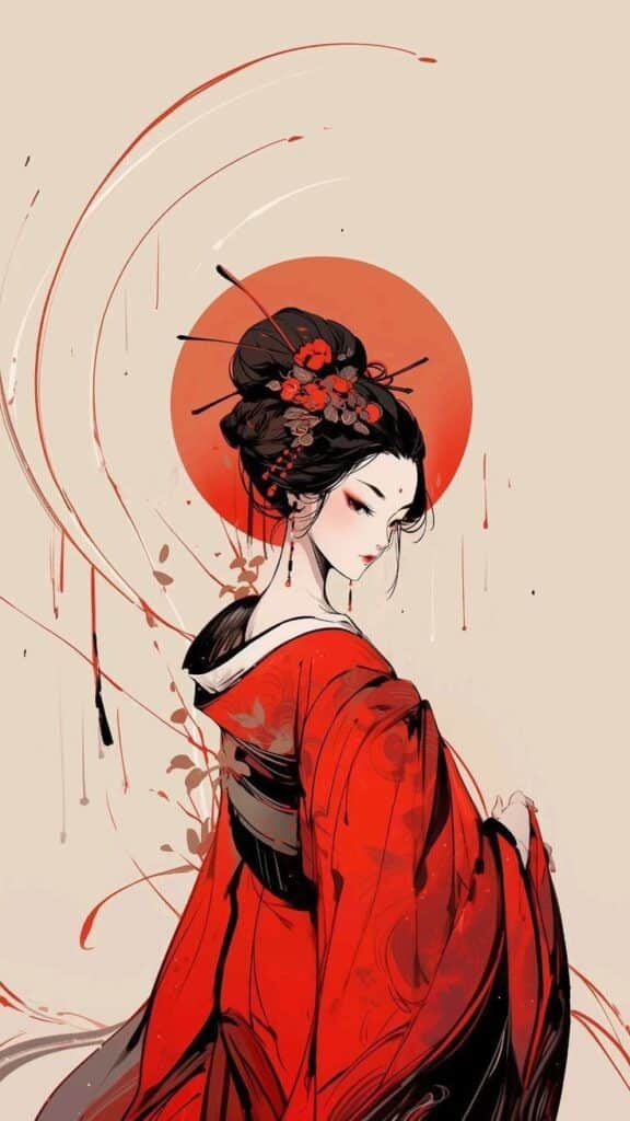
Dynamic poses help your illustrations stand out and look more lively. Instead of drawing characters in stiff or static positions, try to capture them mid-action—like jumping, running, or twisting. This approach brings a sense of energy and movement to your work.
Pay attention to the flow of the body and how weight shifts from one part to another. Using strong lines of action and exaggerated gestures can emphasize motion and make your characters appear more expressive.
Look for real-life references or use 3D pose models to get the angles right, especially for tricky positions. Experiment with motion lines, overlapping shapes, and blurred effects to push the sense of speed or direction.
Japanese illustration often amplifies the drama and impact of a moment by using bold, dynamic angles and poses. Don’t be afraid to push the limits a bit—the right pose can make your composition memorable and exciting.

3) Apply traditional sumi-e brush techniques digitally
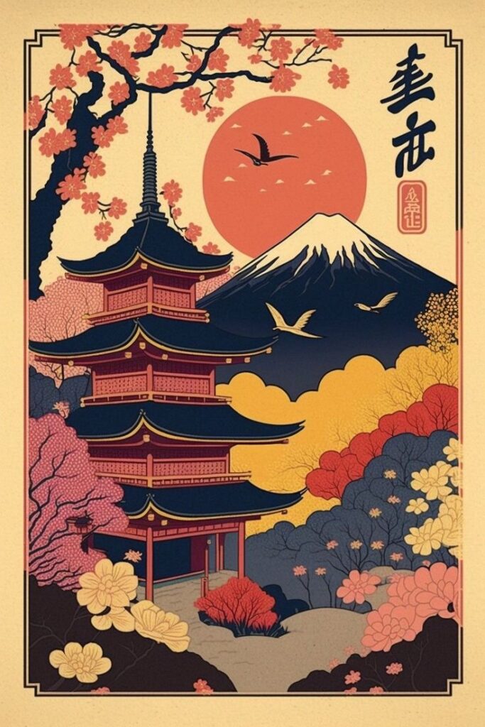
Sumi-e is known for its expressive brushwork and careful balance of simplicity and detail. You can bring these same qualities into your digital illustrations with a few mindful steps.
Start by choosing digital brushes that mimic traditional ink textures. Adjust the pressure settings on your tablet to respond to your hand movements, just as a real sumi-e brush would.
Experiment with varying pressure, speed, and direction to create lively lines. Lifting the stylus quickly can imitate the soft, fading edges of sumi-e strokes.
Try layering different shades of gray and black to add depth, using watercolor or ink wash effects. Leave areas of white space to highlight contrast and create a sense of calm.
Focus on the rhythm and natural flow of each brushstroke. Don’t rush; practice mindful movements to let your gestures show in your work.
Digital tools let you undo and experiment, so use this to your advantage while respecting the deliberate feel of traditional sumi-e. Keeping brushwork simple and intentional will help you achieve that classic Japanese look.
4) Focus on facial expressions to show emotion clearly
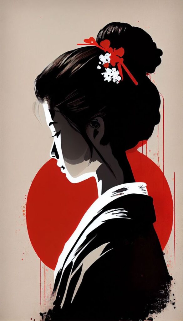
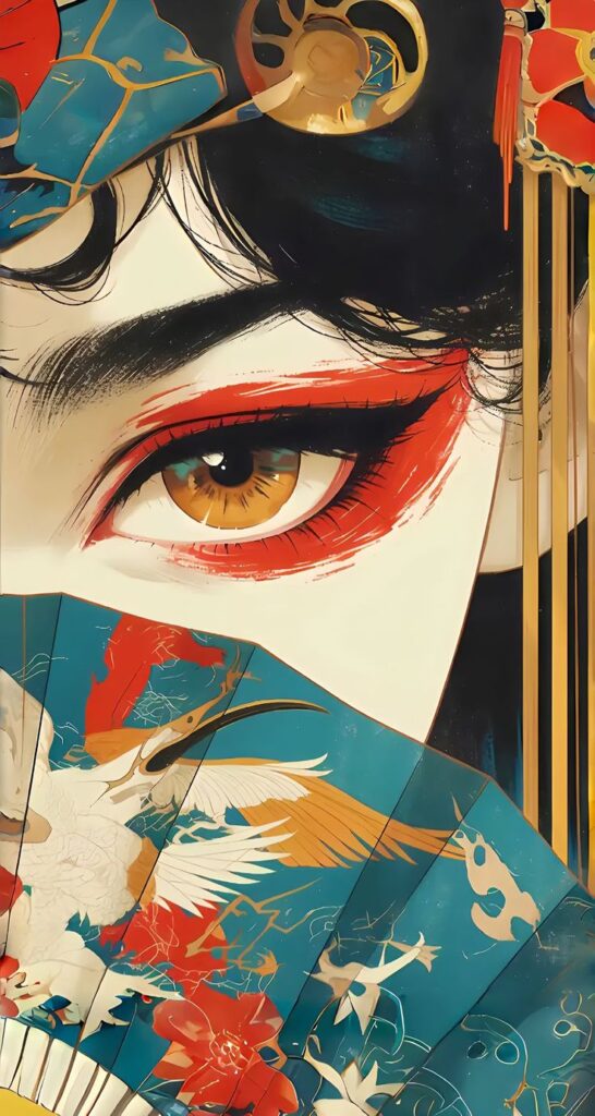
In Japanese-style illustration, facial expressions play a key role in communicating how a character feels. Even a simple change in the shape of the eyes or mouth can dramatically shift the emotion you want to show.
Try practicing a variety of emotions, like happiness, sadness, surprise, or anger, by sketching different mouth curves, eyebrow tilts, and eye shapes. This practice helps you get comfortable recognizing and drawing those small details that make each feeling clear.
You can look at expressions in anime, manga, or even photos of real faces to see how certain emotions are expressed. Breaking down complex feelings into simple facial features will allow your characters to appear more authentic and relatable.
Start by drawing basic emotions and gradually move to mixing emotions for more nuanced expressions. A character’s face is often the first place a viewer looks, so making emotions easy to read will make your art more engaging.
5) Incorporate asymmetry to add visual interest
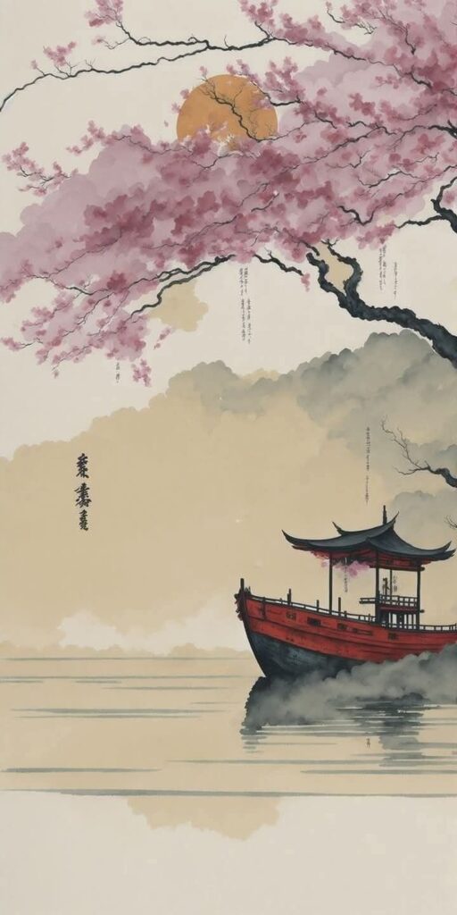
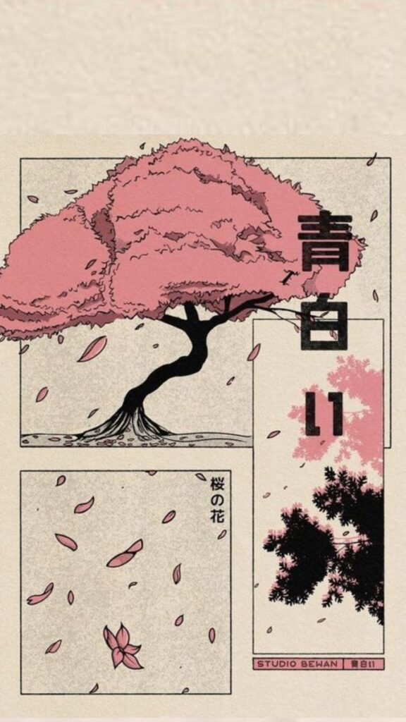
Japanese illustration often embraces asymmetry to create movement and a sense of life in an artwork. Unlike perfectly balanced designs, asymmetrical layouts can make your illustrations feel more organic and dynamic.
Try placing key elements slightly off-center or at varying heights. Use negative space deliberately, allowing the composition to breathe while keeping the viewer’s eye engaged.
Asymmetry appears in traditional Japanese art, from Ukiyo-e prints to Ikebana flower arrangements. These art forms use uneven balance to spark curiosity and keep things visually stimulating.
Don’t be afraid of imperfection. Small imbalances, like having one side heavier than the other or letting elements break out of uniform shapes, often make your work more charming and unique.
Remember, asymmetry does not mean chaos. Your goal is to guide attention naturally, not to distract. Start small by adjusting the size, shape, or spacing of objects in your illustration to see where subtle changes bring more life to your work.
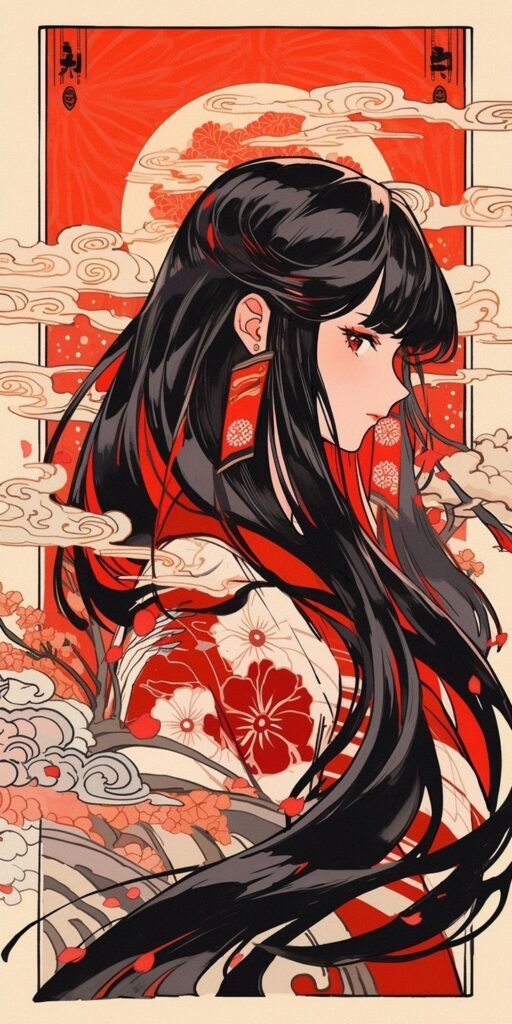

6) Practice manga-style screentone shading
Screentone shading is a classic technique in manga art that lets you add depth, shadow, and texture without relying entirely on solid black or pencil shading. You can use screentone to suggest light sources and create gradients while keeping your illustration clean.
Traditional screentones were adhesive sheets with patterns like dots or lines that manga artists would cut and stick onto their pages. Now, you can find these effects built into most digital art programs.
To get started, experiment with different densities and sizes of dots. Changing the scale or spacing can affect how soft or intense your shadows look. Lines or cross-hatching screentones are great for dramatic or textured effects.
Try layering multiple screentone patterns to add a sense of volume or to separate objects and figures from the background. Don’t be afraid to erase or adjust the screentone where you want highlights or lighter areas.
With regular practice, you’ll be able to create richer, more dynamic scenes while keeping that signature manga vibe in your work.
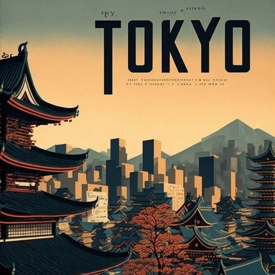
7) Study ukiyo-e prints for composition inspiration
Looking for ways to refine your illustration layouts? Take time to study ukiyo-e prints, which are well-known for their distinctive compositions and balanced use of space. These traditional Japanese woodblock prints have influenced artists for generations.
Notice how ukiyo-e artists like Hiroshige and Hokusai often guide your eye with diagonal lines, open spaces, and subtle layering. Their thoughtful arrangements make each scene feel deliberate, even if the subject is simple.
Try paying attention to how elements are placed—like figures, trees, or architecture—and how they interact with backgrounds. You’ll often see a pleasing mix of detail and emptiness that can help make your own work feel more harmonious.
Ukiyo-e prints tend to embrace asymmetry, creating visual interest while avoiding clutter. This approach encourages you to experiment with balance in new ways.
By observing these prints, you can gather fresh ideas about rhythm, flow, and the use of negative space. Let their thoughtful arrangements inspire new possibilities in your own illustration compositions.
8) Keep color palettes simple and harmonious
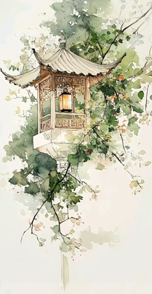
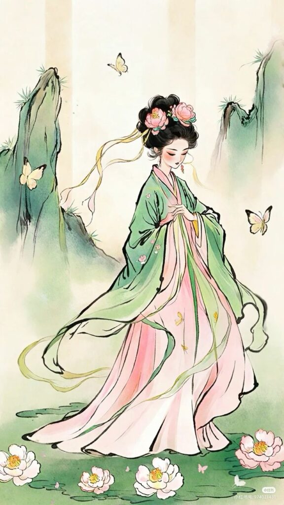
When illustrating in a Japanese style, using a simple and harmonious color palette is key. Stick to a few main colors to avoid overwhelming the viewer. Japanese art often features muted earth tones, soft neutrals, and the occasional bold accent.
You can start by picking colors inspired by nature, such as moss green, sakura pink, indigo blue, or warm brown. These shades reflect traditional aesthetics and create a calm feeling.
Try pairing complementary colors, like a rich green with a gentle pink or a deep indigo with quiet grays. This balance helps your illustration feel unified and pleasing to the eye.
Limiting your palette also makes your work look more cohesive. When in doubt, choose subtle hues and add a small pop of brighter color for emphasis. This approach echoes the refined, understated beauty found in many classic Japanese designs.
Don’t be afraid to experiment, but remember that less is often more. Focusing on simplicity will help your illustration stand out while remaining true to the Japanese style.
9) Use layering in Photoshop for depth and detail
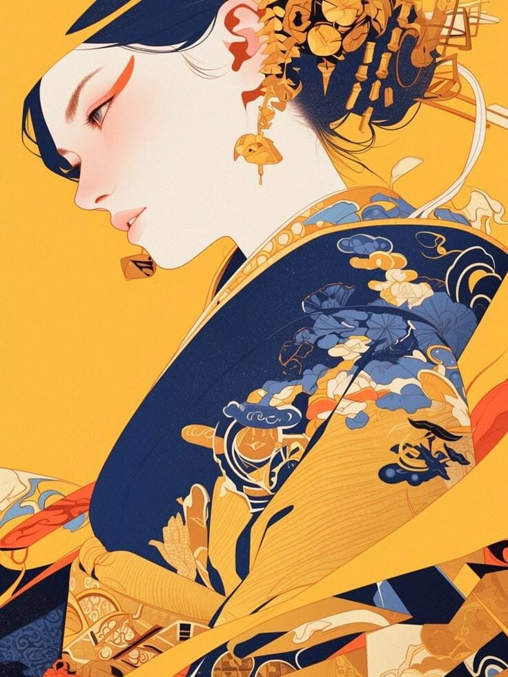
When creating Japanese-style illustrations, layers in Photoshop are your best friend. With layers, you can separate different parts of your artwork, making adjustments easy and non-destructive. Start by placing your background, line art, colors, and effects on different layers.
Try grouping related layers together. For example, keep all your background layers in a single folder. This makes organizing your work much simpler and keeps your workspace tidy.
Adjusting the opacity of layers helps achieve subtle shading or create atmospheric effects. You can use blending modes to experiment with how colors interact between layers for more interest and depth.
Add highlights and shadows on new layers above your base colors. This gives you control to edit or erase details without touching the main artwork underneath.
Using layers, you can make detailed changes, tweak colors, or transform specific parts of your image without starting over. Layers not only help you build depth and realism but also give you the flexibility to experiment freely.
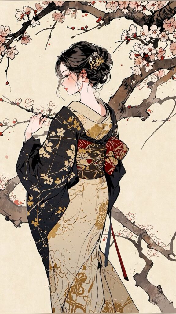
10) Capture iconic Japanese motifs like cherry blossoms
Including cherry blossoms in your illustrations brings an instant Japanese flavor. Sakura, or cherry blossoms, are a classic motif symbolizing the fleeting nature of beauty and life.
Look at traditional Japanese art and ukiyo-e prints for inspiration on how blossoms are arranged and stylized. Notice the delicate petals and subtle color transitions artists use to create a gentle, ethereal effect.
You can scatter blossoms as background elements or focus on close-up branches. Both techniques bring movement and a sense of season to your artwork. Try pairing cherry blossoms with other icons like bamboo or pine to deepen the traditional atmosphere.
Use gentle pinks and whites for petals, keeping lines soft and flowing. Paying attention to shape and negative space helps your blossoms feel light and natural. Incorporating these details will give your illustrations an authentic Japanese touch without overwhelming the composition.
Understanding Japanese Art Influences
Japanese illustration is shaped by a deep respect for tradition and a layered use of symbols. Paying attention to these influences will help you bring more authenticity and meaning into your work.
Traditional Aesthetics in Modern Illustrations
Japanese art is famous for its balance, asymmetry, and simplicity. When you’re drawing in a Japanese style, you’ll notice influences from sumi-e ink painting and ukiyo-e woodblock prints, which emphasize clean composition, flat color areas, and minimal lines.
Common elements you can incorporate include nature imagery, such as cherry blossoms or cranes. These motifs appear often because they reflect the traditional focus on the seasons and the beauty of everyday life. The use of negative space (known as “ma”) is also key; it gives your artwork room to breathe and helps guide the viewer’s eye.
Modern Japanese illustrations, including manga and anime, blend these classic touches with contemporary techniques. You might see expressive linework alongside simple backgrounds, or vibrant digital colors paired with traditional motifs. Learning from both old and new styles gives your work a richer foundation.
Cultural Symbolism and Meaning
Symbols in Japanese art often carry specific cultural or emotional meanings. For example, the koi fish stands for perseverance and strength, while the crane is linked with good fortune and longevity. When you add these elements to your illustrations, you’re inviting viewers to see beyond the surface.
Nature isn’t just a backdrop; it often symbolizes bigger ideas. Autumn leaves can hint at change or impermanence, while waves might represent resilience and adaptability. Take care with your color choices too—red suggests energy and celebration, while white may represent purity, but also mourning in some contexts.
Before you use any imagery, it helps to research its background. Consider making a reference table:
| Symbol | Meaning |
|---|---|
| Cherry Blossom | Renewal, beauty |
| Koi Fish | Perseverance, luck |
| Crane | Longevity, happiness |
Choosing culturally meaningful themes adds real depth and resonance to Japanese-style illustrations.
Common Challenges for Beginners
As you start exploring Japanese-style illustration, you’ll notice two areas that can quickly become stumbling blocks. Learning to combine the gentle simplicity often found in traditional art with the intricacies of detailed design, and mastering harmonious color choices both require care and practice.
Balancing Minimalism and Detail
In Japanese illustration, minimalism is valued, but knowing when to add detail can be confusing at first. If you add too many elements, the core message or emotion might be lost, making your work look cluttered rather than serene.
To help maintain balance, try using blank space (negative space) intentionally. This lets your main subject stand out and gives viewers’ eyes a place to rest.
One way to practice is to sketch a scene using only a handful of lines, then see what extra detail actually enhances the meaning, rather than simply filling space. A helpful table:
| Minimalism | Detail |
|---|---|
| Few, bold lines | Fine patterns |
| Open backgrounds | Texture & depth |
Ask yourself for each addition: Does this serve the subject or distract from it? This mindset helps keep your illustration clean, clear, and expressive.
Choosing the Right Color Palettes
Selecting colors is another common challenge, especially since Japanese art often relies on subtle, harmonious palettes. Using too many bold or saturated colors can make your illustration feel noisy and distract from the intended mood.
Start by studying classic works, noting recurring color combinations such as indigo, vermilion, off-white, and gold. Limiting your palette to 3-5 colors often produces a more unified look.
Try assembling a set of swatches before you begin drawing. Use online tools or real-world inspiration, like traditional kimono patterns or seasonal landscapes in Japan, to build your palette.
Consider how colors interact emotionally. For example, red often signals energy or celebration, while muted blues create calm and reflection. Testing colors together, either digitally or on scrap paper, helps ensure your choices complement rather than clash.
- 3.4Kshares
- Facebook0
- Pinterest3.4K
- Twitter0
- Reddit0
