Your sunset has stripes. You can see exactly where the yellow ends and the orange begins. The orange stops abruptly where the pink starts. And that pink? It crashes into purple like two cars at an intersection.
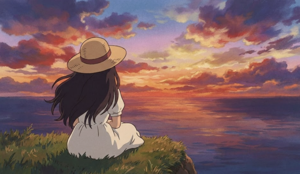
I see this in almost every beginner sunset drawing. The colors are right—warm yellows, fiery oranges, soft pinks, deepening purples. But they don’t blend. They sit next to each other in distinct bands, more like a pride flag than an actual sky.
Here’s what’s happening: real sunsets don’t have edges between colors. The transitions are gradual, almost imperceptible. One hue melts into the next over the span of degrees across the sky. Your eye can’t pinpoint exactly where orange becomes red—it just happens somewhere in between.
This isn’t just about blending technique (though that matters). It’s about understanding why sunset skies look the way they do. The science behind those colors—Rayleigh scattering, atmospheric depth, light wavelengths—directly informs how you should approach drawing them. When sunlight travels through more atmosphere at sunset, shorter blue wavelengths scatter away completely, leaving longer red and orange wavelengths to dominate. That’s physics. And physics creates the visual logic your drawing needs to follow.
- The Science Behind Sunset Colors
- Materials for Sunset Drawing
- The Five-Zone Color System
- Step-by-Step Sunset Drawing
- Step 1: Establish the Composition (2 minutes)
- Step 2: Lay the Base Colors (10 minutes)
- Step 3: Blend Zone Transitions (15 minutes)
- Step 4: Build Intensity (5 minutes)
- Step 5: Add Clouds (10 minutes, if applicable)
- Step 6: Create Silhouettes (5 minutes)
- Step 7: Add Reflections (5 minutes, if water is present)
- Step 8: Final Adjustments (15 minutes)
- Common Sunset Drawing Mistakes
- Sunset Variations
- FAQ
- Conclusion
This guide covers the complete approach: the science behind sunset colors (so you understand what you’re drawing), the five-zone color system (so you know where colors belong), blending techniques for different media, and step-by-step methods for creating convincing sunset skies. We’ll also address clouds, silhouettes, and reflections—the elements that turn a colored gradient into an actual scene.
Whether you’re working in colored pencil, pastel, or paint, the principles remain the same. Sunsets are among the most forgiving subjects for beginners—but they still require understanding, not just copying.


The Science Behind Sunset Colors
Understanding why sunsets look the way they do makes drawing them dramatically easier. You’re not guessing at colors—you’re following physical logic.
Why Sunsets Are Orange and Red
The phenomenon is called Rayleigh scattering, named after British physicist Lord Rayleigh who explained it in the 19th century.
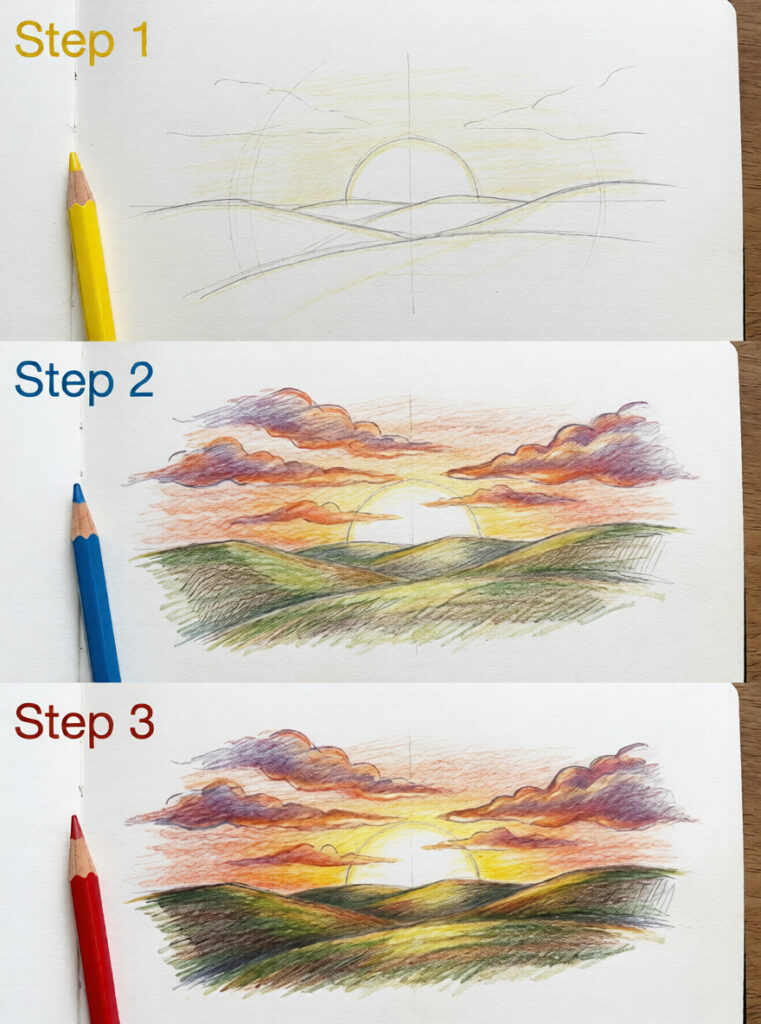
Here’s the short version: sunlight contains all colors of the visible spectrum. When this light enters Earth’s atmosphere, it collides with gas molecules—primarily nitrogen and oxygen. These collisions scatter the light, but not equally. Shorter wavelengths (blue and violet) scatter much more than longer wavelengths (red and orange).
During midday, when the sun is overhead, sunlight travels through a relatively thin layer of atmosphere. Blue light scatters in all directions, making the sky appear blue. But at sunset, sunlight must travel through a much thicker slice of atmosphere—sometimes 40 times more than at noon. This extended path scatters away nearly all the blue light before it reaches your eyes. What remains are the longer wavelengths: red, orange, and yellow.
This is why sunsets near the horizon are most intensely colored. The lower the sun, the more atmosphere the light traverses, and the more blue gets filtered out.
What Affects Sunset Intensity
Not all sunsets are equal. Several factors influence how vivid the colors appear:
Atmospheric particles: Dust, pollution, and aerosols scatter light differently than clean air. Counterintuitively, slightly polluted air can produce more vivid sunsets because particles scatter longer wavelengths more effectively. This is why cities often have striking orange sunsets, while pristine mountain air may produce subtler hues.
Humidity: Water vapor in the atmosphere affects how light scatters. Humid air tends to produce softer, more diffused colors. Dry air creates cleaner, more saturated hues.
Clouds: High clouds (cirrus) catch sunlight and glow with reflected color. Low clouds can block the sun entirely or create dramatic silhouettes. The most spectacular sunsets often feature scattered high clouds that act as a canvas for the light.
Season: In fall and winter, cooler air holds fewer particles and less moisture, often producing cleaner, more vivid pinks and oranges.
The Color Sequence Logic
Understanding the physics explains the color sequence you should follow in your drawings:
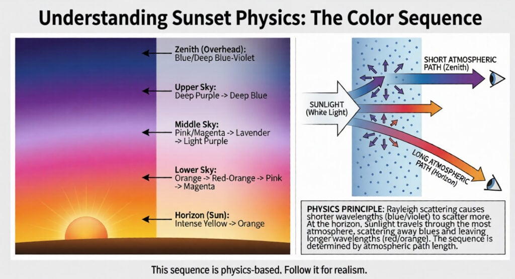
Horizon (where sun is): Brightest, warmest colors—intense yellow fading to orange. This is where light travels through the most atmosphere and the scattering effect is strongest.
Lower sky: Orange transitions to red-orange, then to pink and magenta as you move up. The atmosphere is still thick here, but less so than at the horizon.
Middle sky: Pinks and magentas fade into lavender and light purple. Blue light is partially returning as the atmospheric path shortens.
Upper sky: Deep purples transition to deep blue. This area receives the least scattered red light and retains more blue.
Zenith (directly overhead): Often still blue or deep blue-violet, since sunlight traveling straight down encounters less atmosphere.
This sequence isn’t arbitrary—it’s physics. Follow it, and your sunset will feel real.
Materials for Sunset Drawing
Different media produce different effects. Choose based on the result you want.
Colored Pencils
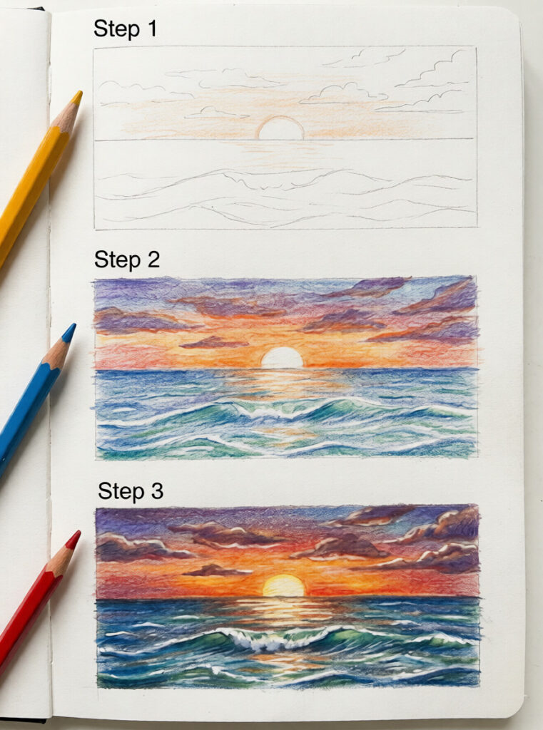
Advantages: Excellent control, forgiving of mistakes, easy to layer gradually.
Best for: Detailed sunsets with subtle transitions, beginners learning blending.
Recommended approach: Use wax-based pencils (Prismacolor) for smoother blending or oil-based (Faber-Castell Polychromos) for more precise layering. A colorless blender pencil helps merge colors without adding more pigment.
Paper choice: Smooth paper (Bristol) allows more layering before tooth fills up. Textured paper creates interesting effects but requires more pressure to fill gaps.
Soft Pastels
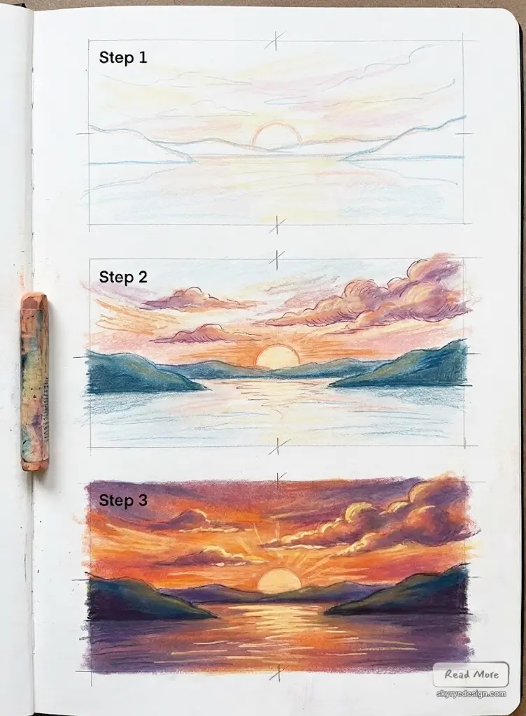
Advantages: Rich, immediate color; natural blending with fingers or tools; excellent for large gradient areas.
Best for: Expressive, atmospheric sunsets; working quickly; large-scale pieces.
Recommended approach: Start with the lightest colors and build darker values on top. Use the side of the pastel for broad strokes, the tip for details. Blend with fingers, chamois, or blending stumps.
Paper choice: Textured pastel paper (Canson Mi-Teintes, Strathmore) holds pigment better. Toned paper (gray or blue) provides a mid-value base that enhances both lights and darks.
Acrylic or Oil Paint
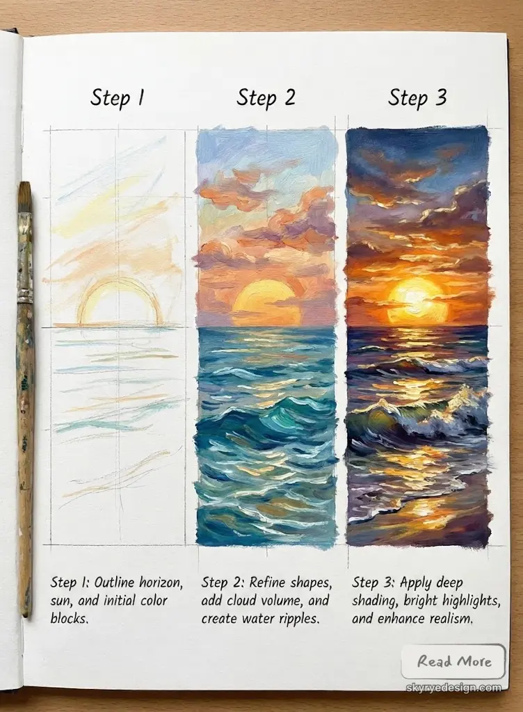
Advantages: Richest color saturation; can work wet-into-wet for seamless blending; can be reworked extensively.
Best for: Bold, saturated sunsets; larger pieces; professional-quality results.
Recommended approach: For acrylics, work quickly while paint is wet, or use a retarder medium to extend blending time. For oils, take advantage of longer drying time for smooth gradients.
Surface choice: Primed canvas or heavy paper (140lb+). Gesso provides tooth for paint adhesion.
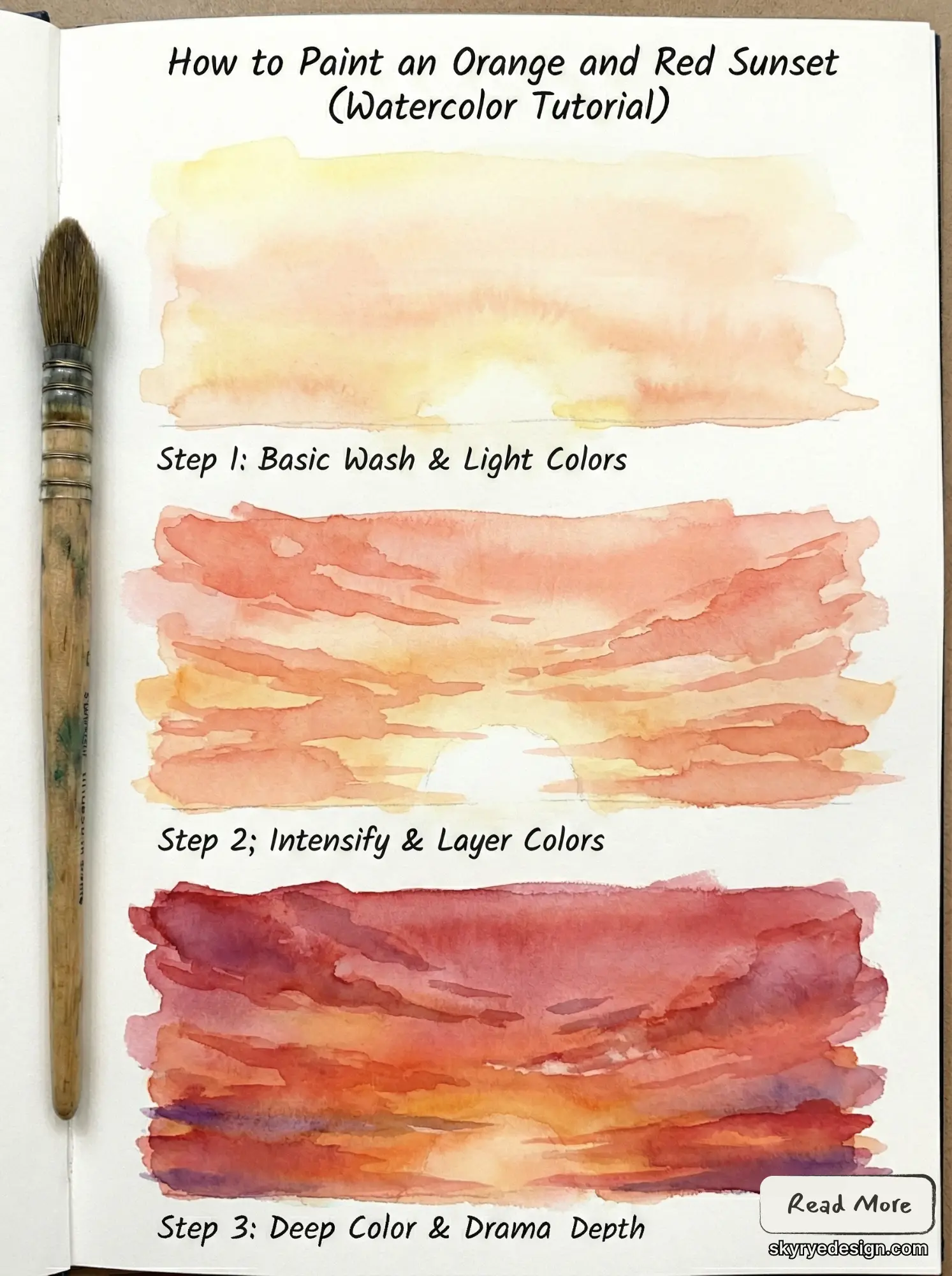
Watercolor
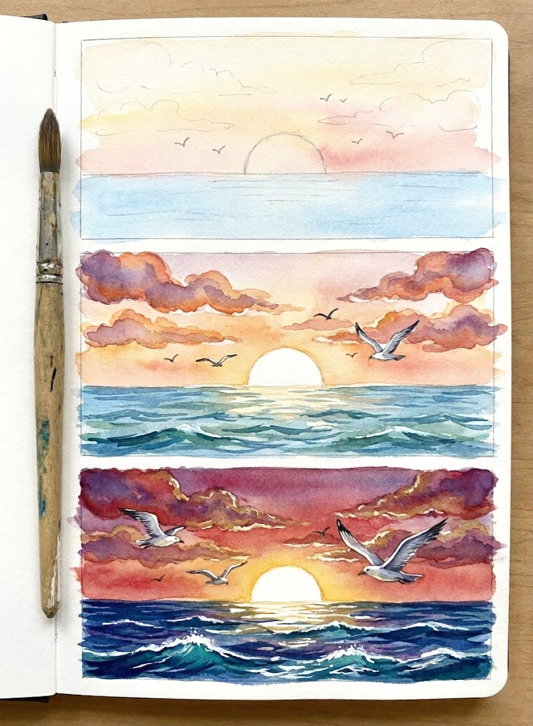
Advantages: Transparent layers create luminous effects; wet-on-wet technique produces natural blending; unique atmospheric quality.
Best for: Soft, dreamy sunsets; transparent, glowing effects; loose, expressive styles.
Recommended approach: Work from light to dark. Wet the paper first for soft blends, or work wet-on-dry for more control. Let layers dry before adding subsequent washes.
Paper choice: Cold-press watercolor paper (140lb minimum) prevents buckling and allows rewetting.
Blending Tools
Regardless of medium, these tools improve blending:
Blending stumps/tortillons: Paper tools for precise blending in small areas (pencil, pastel, charcoal).
Chamois: Soft leather for broad, smooth blending in pastels.
Colorless blender pencil: Merges colored pencil layers without adding color.
Soft brushes: For paint and for applying fixative between pastel layers.
Fingers: Your most versatile blending tool for pastels—the oils in your skin help move pigment smoothly.


The Five-Zone Color System
Break the sunset sky into five distinct zones. Each zone has its own color character and blending requirements.
Zone 1: The Horizon Glow
Location: A narrow band at the horizon, where the sun sits or has just set.
Colors: Bright yellow transitioning to intense orange. This is the hottest, most saturated part of the sunset.
Character: High intensity, strong warmth. The sun itself (if visible) is nearly white at center, ringed with yellow.
Drawing approach: Start with your lightest, brightest yellow. Leave the sun center nearly white or very pale yellow. Build orange around it, keeping transitions smooth. This zone should practically glow.
Zone 2: The Lower Sky
Location: Above the horizon glow, roughly 15-30% up from the horizon.
Colors: Orange deepening to red-orange, then to coral and salmon pinks.
Character: Still warm but transitioning. Intensity decreases as you move up.
Drawing approach: Overlap Zone 1 colors generously. Introduce reds and pinks gradually. The transition from orange to pink is critical—this is where many drawings fail with visible bands.
Zone 3: The Middle Sky
Location: The middle third of the sky.
Colors: Pinks to magentas to lavenders. The warm-to-cool transition happens here.
Character: This is where warm colors yield to cool. The shift should feel natural, not abrupt.
Drawing approach: Use transitional colors—rose, magenta, and lavender bridge the gap between warm and cool. This zone often benefits from the most blending attention.
Zone 4: The Upper Sky
Location: In the upper third of the sky, just below where the sky really opens up.
Colors: You’ll be working with shades of light purple that gradually darken into deep purples and finally a blue-violet hue.
Character: The upper sky in this zone has a pretty cool feel to it – the blue tones are coming back in a big way.
Drawing Approach: Start by mixing up some purple and blue colours – the key here is to get a nice fade going as you go up, with the colours getting lighter and less intense near the zenith. Don’t make the edge too harsh either – aim for a soft subtle finish.
Zone 5: The Zenith
Location: This is the top of your composition – think directly overhead or the edge of your sky.
Colors: You’ll be looking at deep, rich blue colours in this zone – sometimes with a hint of purple as well. And yes you can still catch a bit of daylight blue up here too.
Character: The zenith is all about cool colours and calm – it’s the perfect spot to provide a bit of relief from the warm colours of the horizon and really ground your composition.
Drawing Approach: Remember this is the top of your composition – you don’t want it to be black or overly dark – go for deep but not quite, and you’ll be fine. This zone does the heavy lifting for you in terms of contrasting with the warm of the horizon below.
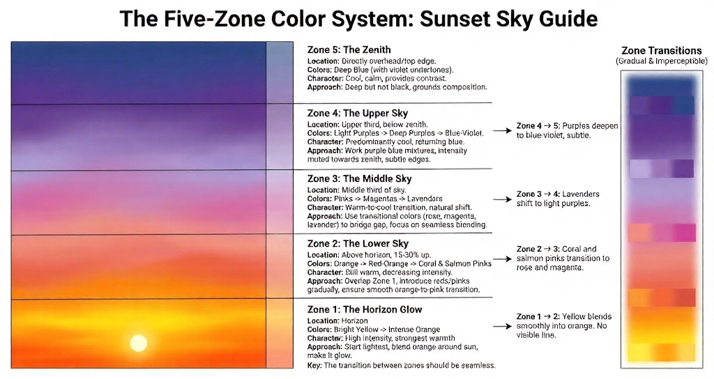
Zone Transitions
The key isn’t the zones themselves—it’s the transitions between them. Each transition should be gradual and imperceptible:
Zone 1 → 2: Yellow blends smoothly through orange to red-orange. No visible line.
Zone 2 → 3: Coral and salmon pinks transition to rose and magenta. This is often the trickiest transition.
Zone 3 → 4: Lavenders shift to light purples. Relatively easy since both are cool.
Zone 4 → 5: Purples deepen to blue-violet. Subtle, often the gentlest transition.
Step-by-Step Sunset Drawing
Here’s a systematic approach that works across media.
Step 1: Establish the Composition (2 minutes)
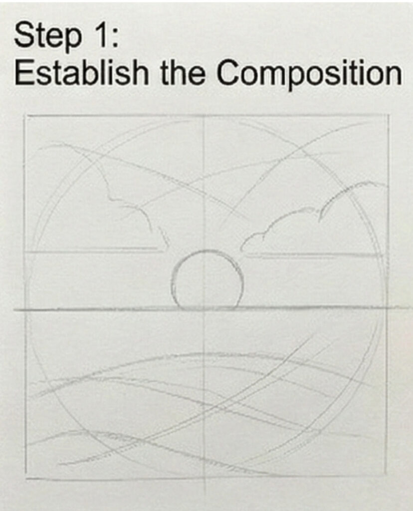
Before any color, decide:
Horizon placement: Low horizon (bottom third) emphasizes the sky. High horizon (upper third) emphasizes landscape. Middle horizons feel static—avoid them.
Sun position: Centered creates symmetry; off-center feels more natural. The sun can be visible, partially set, or just below the horizon (showing only its glow).
Foreground elements: Trees, mountains, water, buildings? Sketch their silhouettes lightly. These will be added after the sky is complete.
Step 2: Lay the Base Colors (10 minutes)
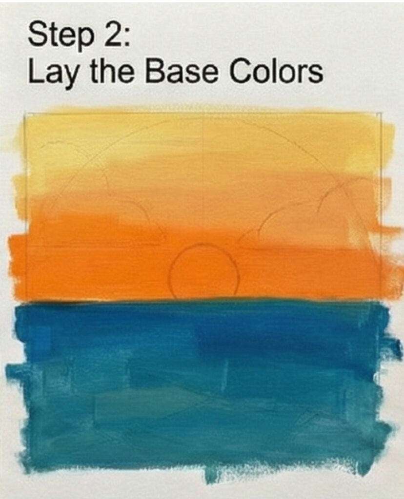
Work in broad strokes without worrying about blending yet.
Start at the horizon with your brightest yellow. Apply a band of color where Zone 1 will be.
Add orange above the yellow, overlapping generously.
Continue with red-orange and pink for Zone 2, again overlapping.
Apply magenta and lavender for Zone 3.
Add purple and deep blue for Zones 4 and 5.
At this stage, the colors should look banded and rough. That’s fine—blending comes next.
Step 3: Blend Zone Transitions (15 minutes)
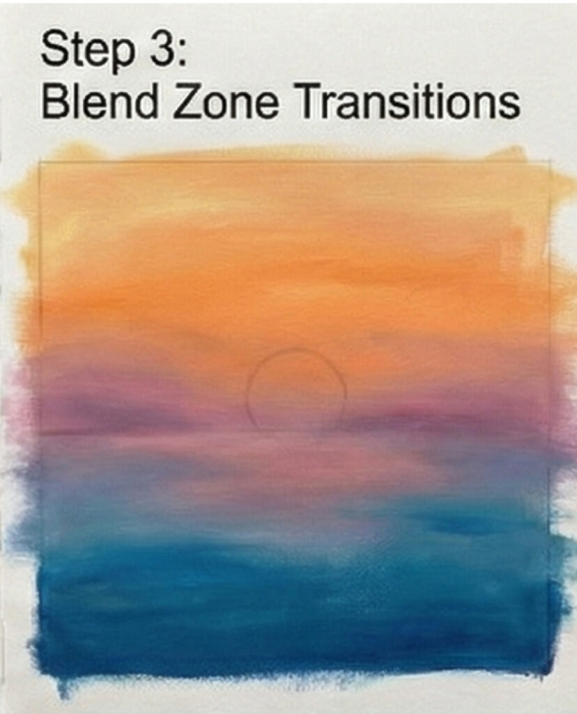
This is where the magic happens.
Work from light to dark (horizon upward). This prevents dark colors from contaminating light areas.
Use circular motions or gentle back-and-forth strokes. Avoid harsh directional lines.
Overlap colors extensively. The blending zone between two colors should be wider than you think—at least as wide as either color band.
Clean your blending tool (or use a fresh finger area) when moving to a new color zone. Cross-contamination creates muddy transitions.
Check frequently by stepping back or squinting. Visible bands mean more blending is needed.
Step 4: Build Intensity (5 minutes)
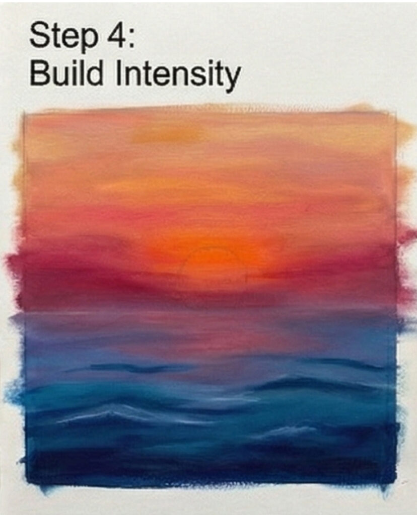
After initial blending, the colors may look washed out. Now strengthen them:
Return to the horizon and intensify the yellows and oranges. These should be the most saturated areas.
Deepen the purples at the top. This contrast makes the warm colors pop.
Blend again after adding intensity—new pigment may create new edges.
Step 5: Add Clouds (10 minutes, if applicable)
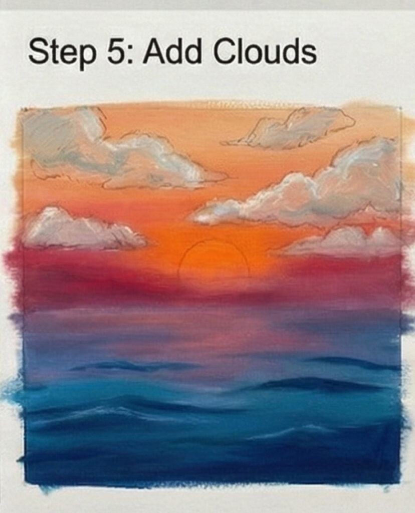
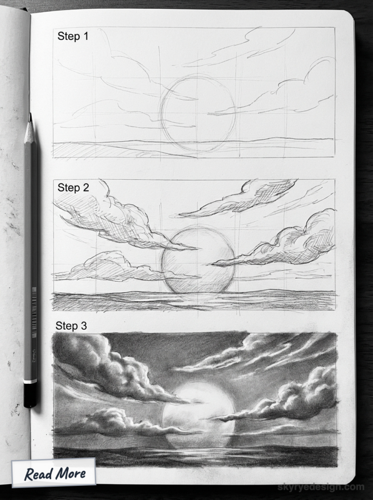
Clouds transform a gradient into a sky.
Identify cloud types:
- High cirrus (wispy, thin) catch light beautifully
- Cumulus (fluffy) create dramatic shapes
- Stratus (layered) add horizontal bands of color
Cloud coloring logic: Clouds near the horizon reflect the warmest colors—orange, pink, gold. Clouds higher up show cooler tones—lavender, gray-blue on their shadow sides.
Underlight effect: The bottoms of clouds are often brighter than their tops at sunset because they’re lit from below by reflected light from the horizon.
Keep edges soft where clouds meet sky. Hard edges look cut-and-pasted.
Step 6: Create Silhouettes (5 minutes)
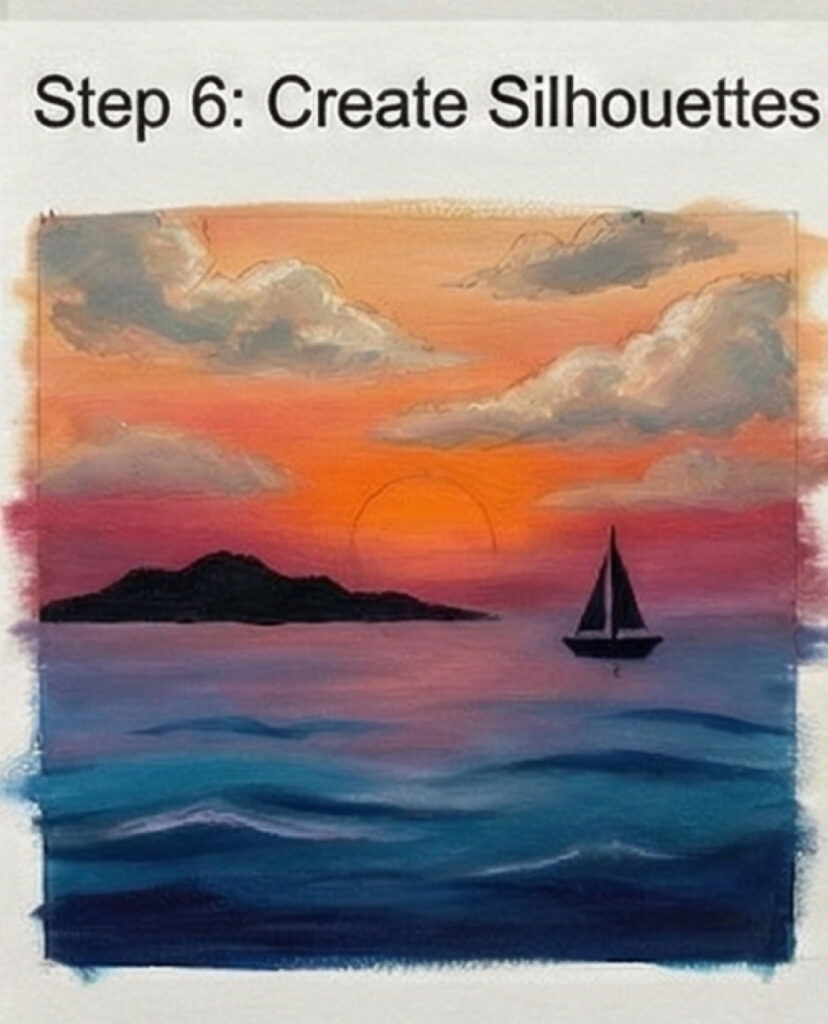
Silhouettes anchor the sunset and provide scale.
Use pure darks. Silhouettes at sunset are nearly black because they’re backlit. No detail should be visible—just the shape.
Keep edges clean. Unlike clouds, silhouette edges should be crisp and defined against the bright sky.
Common silhouette elements: Trees (especially distinctive shapes like palms or pines), mountains, buildings, birds, boats, power lines.
Avoid overcrowding. A few well-placed silhouettes are more effective than many cluttered ones.
Step 7: Add Reflections (5 minutes, if water is present)
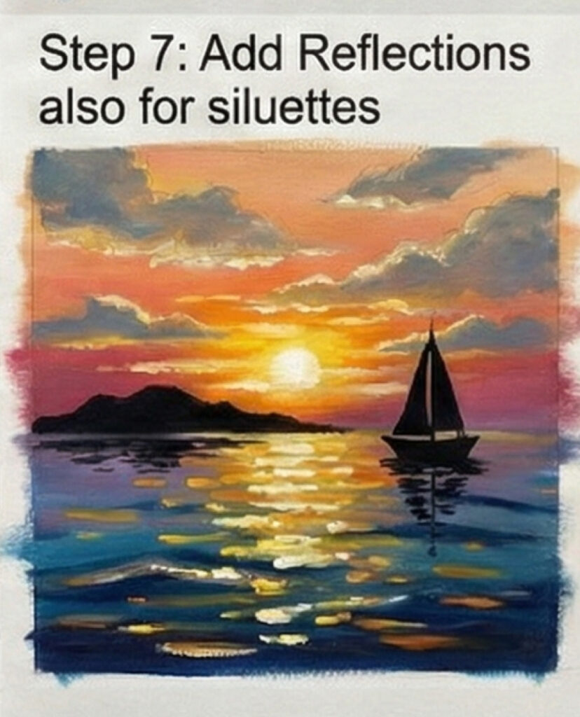
Water reflections extend your sunset downward.
Reflection rules:
- Reflections show the same colors as the sky, but slightly darker and less saturated
- Reflections are interrupted by surface texture—use horizontal strokes to suggest ripples
- Colors reflect directly below their source—the horizon glow reflects nearest the shore
Keep water darker overall than the sky. This provides grounding contrast.
Step 8: Final Adjustments (15 minutes)
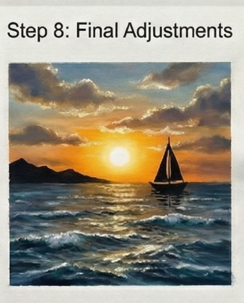
Step back and evaluate:
Check for banding. Any visible color edges need more blending.
Verify value structure. Lightest at horizon, darkest at zenith (for sky). Silhouettes should be the darkest elements overall.
Adjust saturation. Sunsets have high saturation near the horizon, decreasing upward. If your upper sky is too colorful, knock it back.
Add subtle details if needed—birds, distant lights, texture in clouds.
Common Sunset Drawing Mistakes
These issues appear constantly in sunset drawings. Here’s how to fix them.
Visible Color Bands
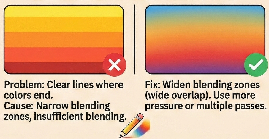
The problem: You can see exactly where one color ends and another begins.
The cause: Insufficient blending, or blending zones that are too narrow.
The fix: Widen your blending zones. The overlap between adjacent colors should be at least as wide as each color band. Use more pressure when blending, or make multiple passes.
Muddy Colors
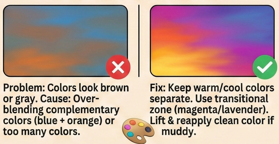
The problem: Colors look brownish or grayish instead of vibrant.
The cause: Over-blending complementary colors (blue into orange, for example), or using too many colors in one area.
The fix: Keep warm colors (yellow, orange, red, pink) on one side and cool colors (purple, blue) on the other. The transition zone (magenta, lavender) bridges them without mixing directly. If an area gets muddy, lift some pigment (with kneaded eraser for pencil, damp cloth for pastel) and reapply clean color.
Uniform Intensity
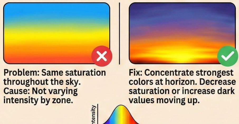
The problem: The entire sky has the same color saturation throughout.
The cause: Not varying intensity by zone. Real sunsets are most saturated at the horizon.
The fix: Concentrate your strongest colors near the horizon. As you move up, either decrease saturation or let values get darker without maintaining intensity.
Flat-Looking Clouds
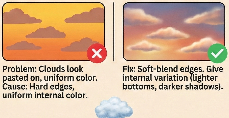
The problem: Clouds look like colored shapes pasted onto the sky, not integrated with it.
The cause: Hard edges and uniform color within the cloud.
The fix: Soft-blend cloud edges into the sky. Give clouds internal variation—lighter where they catch direct light, darker in shadow areas. The bottom edge is often brighter than the top at sunset.
Wrong Color Sequence
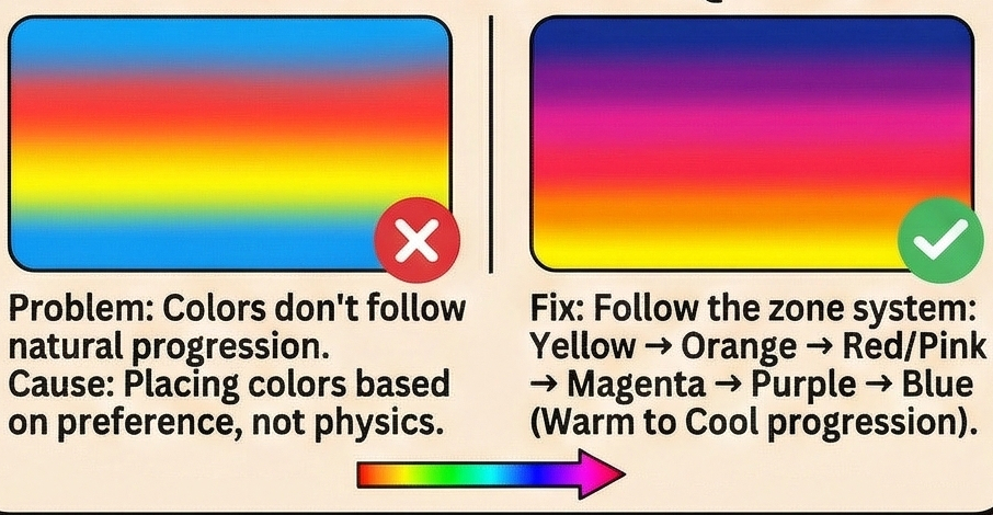
The problem: Colors don’t follow the natural progression of a sunset sky.
The cause: Placing colors based on preference rather than physics.
The fix: Follow the zone system: yellow → orange → red/pink → magenta → purple → blue. You can vary the specific hues, but the warm-to-cool progression from horizon to zenith should always be present.
Silhouettes That Glow
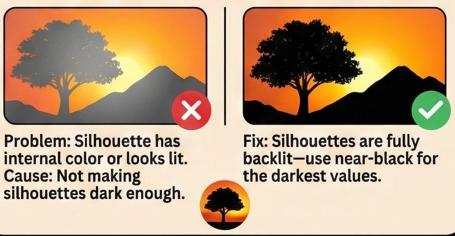
The problem: Silhouette elements have visible internal color or look like they’re lit from within.
The cause: Not making silhouettes dark enough, or using colors other than near-black.
The fix: Silhouettes at sunset are fully backlit—they should be the darkest values in your drawing. Use near-black for all silhouette elements. If your medium doesn’t achieve true black, make silhouettes as dark as possible.
Sunset Variations
Once you understand the basic approach, try these variations.
Beach Sunset
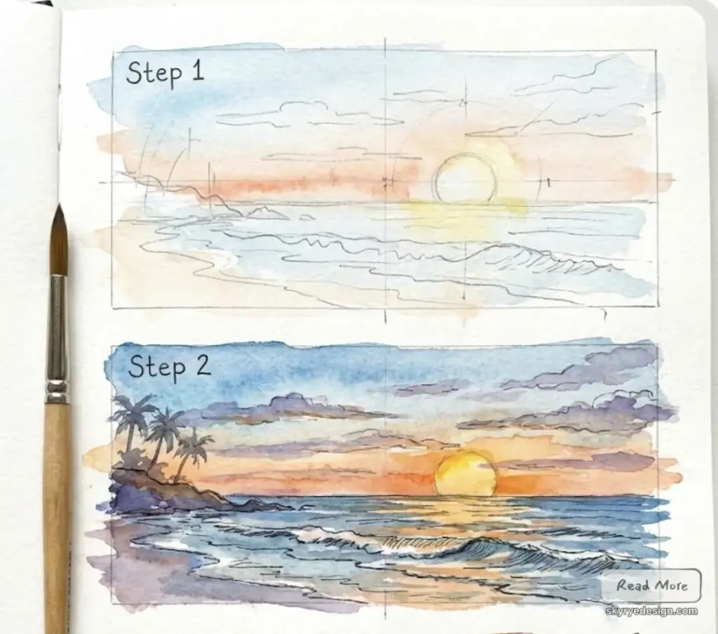
Special elements: Water reflection, possible waves, sand in foreground.
Color considerations: Water reflects sky colors but adds blue undertone. Wet sand near water’s edge reflects sky; dry sand stays neutral warm.
Silhouettes: Palm trees, beach grass, distant boats, people walking.
Mountain Sunset
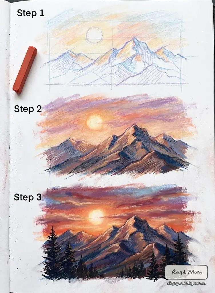
Special elements: Layered mountain ridges, possible alpenglow.
Color considerations: Distant mountains take on purple-blue tones (atmospheric perspective). Closer mountains show more detail and warmer colors.
Silhouettes: Mountain ridge lines should have interesting variation—not smooth curves but irregular profiles.
Urban Sunset
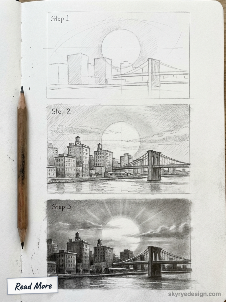
Special elements: Building silhouettes, light pollution effects, possible reflections in glass.
Color considerations: Urban sunsets often have more orange/yellow (particulate matter) and less pink. City lights begin to appear in silhouettes.
Silhouettes: Skyline profiles, communication towers, cranes, distinctive architectural shapes.
Tropical Sunset
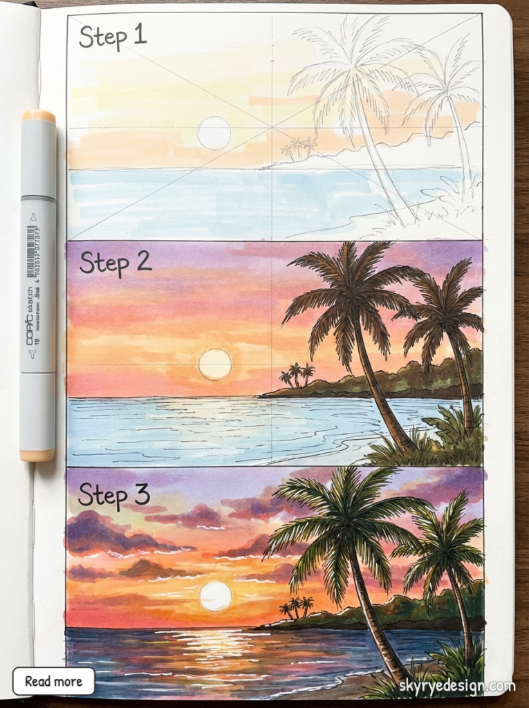
Special elements: Often more saturated colors, palm tree silhouettes, ocean setting.
Color considerations: Tropical sunsets can be intensely orange and pink due to humidity and clean ocean air. Greens may be visible in the upper sky as twilight approaches.
Silhouettes: Palms, tropical plants, boats, thatched roofs.
FAQ
Why do my sunset colors look muddy?
You’re probably blending complementary colors directly together. Orange and blue are opposites on the color wheel—when mixed, they neutralize each other into brown or gray. Keep your warm colors (yellows, oranges, pinks) transitioning through magenta and lavender before reaching blue and purple. These transitional colors bridge warm and cool without creating mud.
What’s the easiest medium for sunset drawings?
Soft pastels are the most forgiving for beginners. They blend naturally with finger pressure, build up quickly, and are easy to lift and correct. Colored pencils offer more control but require more patience. Paint requires understanding of wet blending but produces the richest results.
How do I make the sun look like it’s glowing?
Leave the sun center white or very pale yellow, then build intense orange-yellow around it. The contrast creates a glowing effect. Make sure the colors radiating from the sun are your most saturated—duller colors nearby will enhance the illusion of brightness.
Should clouds be lighter or darker than the sky?
Both, depending on position. Cloud tops often appear darker than the surrounding sky (they’re in shadow). Cloud bottoms at sunset are often brighter because they catch light reflected from below. Near the horizon, clouds may glow with warm light. Higher up, clouds show more gray and cool tones.
How long does a sunset drawing take?
For a focused session: 45-60 minutes for a complete sunset scene including sky, clouds, and silhouettes. The sky gradient alone takes 25-35 minutes. Speed increases with practice—experienced artists can capture convincing sunsets much faster. I’d recommend completing 10-15 sunset drawings before expecting consistent quality.
What time of day should I observe sunsets for reference?
The most dramatic colors appear 15-30 minutes before and after the sun touches the horizon. This “golden hour” provides peak color saturation. Civil twilight (just after sunset) offers softer purples and blues. For drawing from life, set up your materials before the sun gets low—colors change quickly once the show starts.
Conclusion
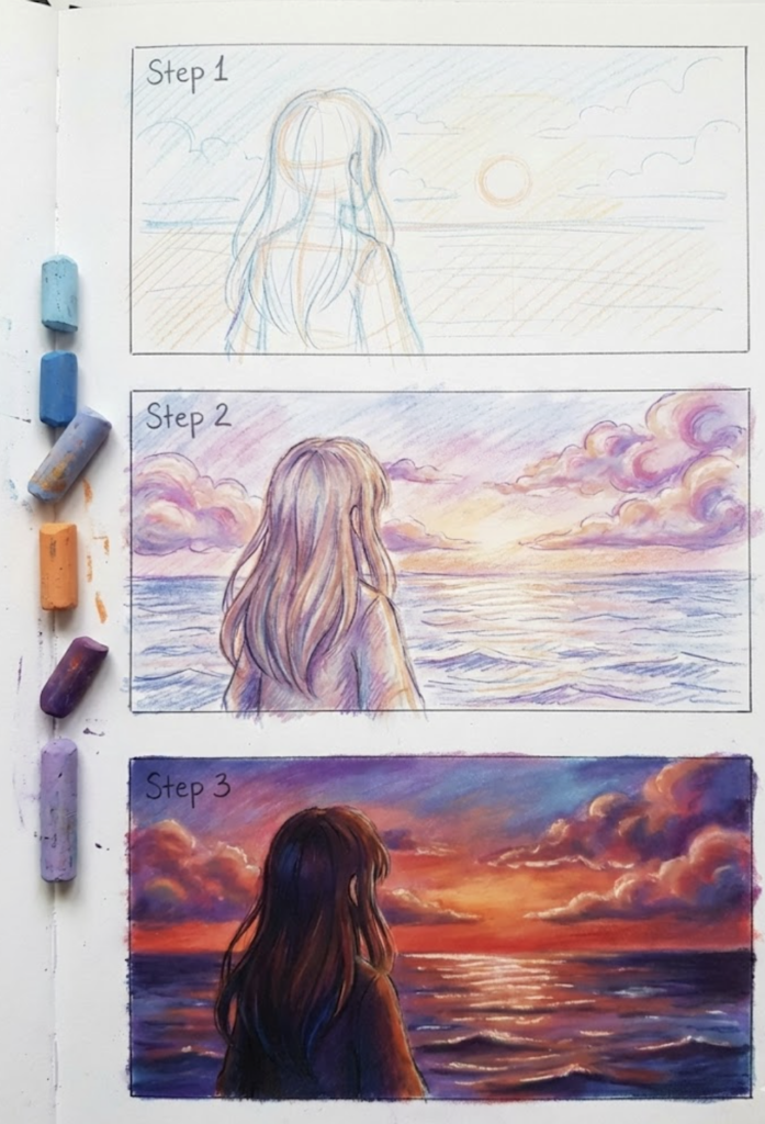
Sunset drawings tend to either knock it out of the park or crash and burn at the transitions. The colours themselves are fairly straightforward – yellows, oranges, pinks, purples, blues – so that’s not the problem, the challenge is getting those colours to melt into each other just like they do in real life.
Pay attention to how light works – remember that Rayleigh scattering gives you a pretty clear idea of the order of the colours from horizon to sky’s zenith. Warm colours lead the way at the horizon where light’s had to travel the furthest through the atmosphere, while cool colours start to come back into play as the light’s path gets shorter (that’s as you move upwards). It’s not about artistic licence – this is just how actual light behaves. Stick to the physics and your sunsets are going to look a lot more convincing.
Here’s your practice plan:
This week: Draw three sunsets without any clouds or silhouettes to focus on getting the smooth colour transitions right. Try to use the five-zone system, and if you can still see where one colour ends and another starts, just keep blending away.
Next week: Add some clouds to the mix, but this time pay attention to how they interact with the sky. Practice drawing clouds with soft edges and just the right amount of light on them – bright bottoms at sunset, and with some variation in colour too.
Week three: Finally add some silhouettes to the mix, along with optional reflections. Keep those silhouettes nice and simple – just straightforward shapes with solid dark values and crisp edges. Don’t forget to show the way they cut against the sky.
I’ve noticed that artists who struggle with sunsets almost always rush the blending stage. They’re eager to add clouds and silhouettes—the “interesting” parts—before the sky itself is convincing. But the sky is the foundation. Get that right, and everything you add to it looks natural. Get it wrong, and no amount of detail saves the drawing.
Your sunset is waiting. Start with the gradient.
- 5.0Kshares
- Facebook0
- Pinterest5.0K
- Twitter3
- Reddit0

