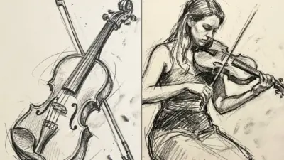
Creating a realistic interior sketch can feel challenging at first, especially when perspective and small details come into play. Learning how to draw accurate perspectives and thoughtfully add details transforms flat sketches into dynamic, lifelike spaces. Whether someone is just starting or looking to sharpen their skills, mastering these techniques sets a strong foundation for every interior design project.
Getting to grips with vanishing points and choosing the right tools can make sketching both easier and more enjoyable. Readers will discover practical advice on perspective basics, essential materials, and simple methods to add texture, depth, and realism. Each tip is designed to help make interior sketches look professional while keeping the process approachable and fun.
Key Takeaways
- Perspective techniques add depth to sketches
- The right tools improve accuracy and detail
- Simple tips make sketches more realistic
Understanding Perspective in Interior Sketching
Perspective drawing allows interior sketches to appear three-dimensional and realistic by guiding how objects relate spatially within a room. Knowing when and how to use vanishing points, horizon lines, and different perspective types is essential to communicate depth and accuracy in interior design.
The Role of Vanishing Points and Horizon Line
A vanishing point is where parallel lines seem to converge as they recede into the distance. In a room, floor and ceiling lines, or tile patterns, all appear to meet at these points on the horizon line—an invisible line that matches the viewer’s eye level.
The horizon line establishes the perspective for the entire scene. It tells the viewer where to “stand” within the room. Placing the vanishing point(s) accurately on this line helps keep furniture, walls, and decor objects in correct proportion.
Incorrect placement can distort the room’s appearance, making objects look tilted or misaligned. For clarity, many designers sketch light guidelines to mark horizon lines and vanishing points before adding details.
Tip: Use a ruler or straightedge for cleaner perspective lines.
Visual Guide:
| Element | Role |
|---|---|
| Horizon Line | Viewer’s Eye Level |
| Vanishing Point(s) | Where lines converge in perspective |
One-Point and Two-Point Perspective Explained
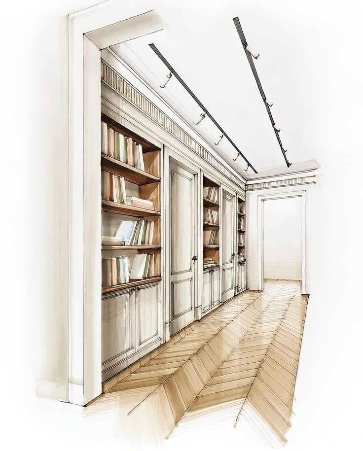
One-point perspective uses a single vanishing point, typically suitable for views facing directly down a wall or hallway. All receding lines go towards this one spot, making it easiest for beginners and for room views where one wall faces the viewer.
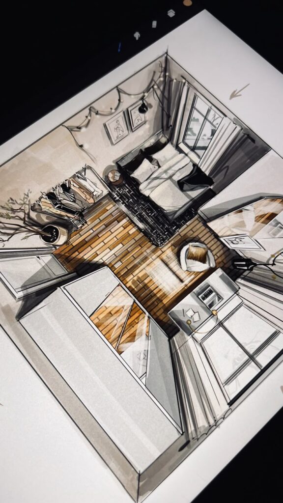
Two-point perspective introduces a second vanishing point, usually seen when sketching the corner of a room. Horizontal lines now converge towards two separate points on the horizon. This technique adds more depth and presents a more dynamic, natural view of interior spaces.
Both methods are common in interior design sketching. Designers select between them based on the viewpoint:
- Use one-point perspective for direct, frontal views.
- Use two-point perspective for corner angles or more complex compositions.
Three-Point Perspective Applications
Three-point perspective involves a third vanishing point, normally above or below the horizon line. This point controls the vertical lines, which now angle towards it rather than remaining parallel. It’s especially useful for dramatic interior views, such as looking up at a tall ceiling or down from a mezzanine.
This perspective type conveys strong spatial effects and is often used in advanced commercial or conceptual interior sketches. While it’s more complex to plot, it can show height and depth with greater realism.
When applying three-point perspective, it’s helpful to pre-plan vanishing points and keep guidelines visible until the major elements are in place. This method is best reserved for projects that require heightened realism or dynamic architectural viewpoints.
Essential Tools and Materials for Interior Design Sketching
Choosing the right tools can make sketching interiors more efficient and enjoyable. Each approach and material comes with unique advantages, affecting technique, workflow, and final results.
Traditional vs Digital Approaches
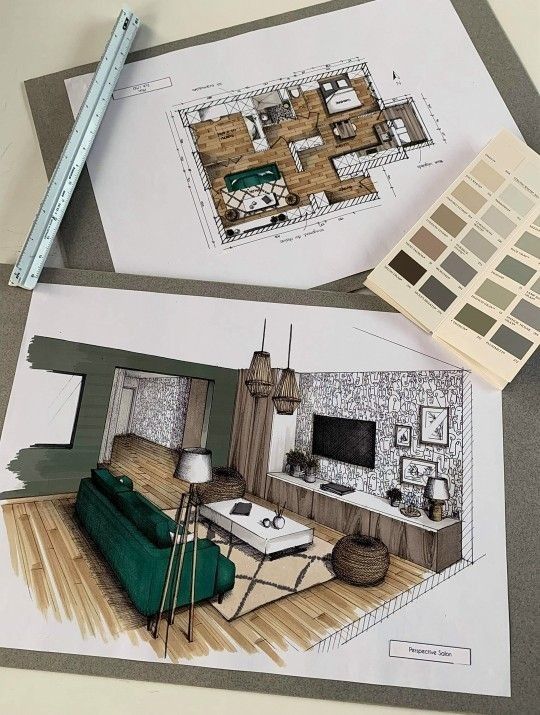
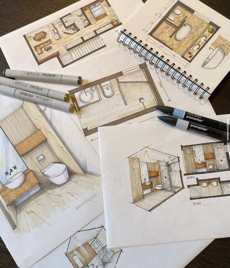
Traditional sketching relies on pencils, pens, markers, and paper. These materials let designers quickly work through ideas and adjust details with ease. The tactile feeling of drawing by hand can also help some people process space and proportion more intuitively.
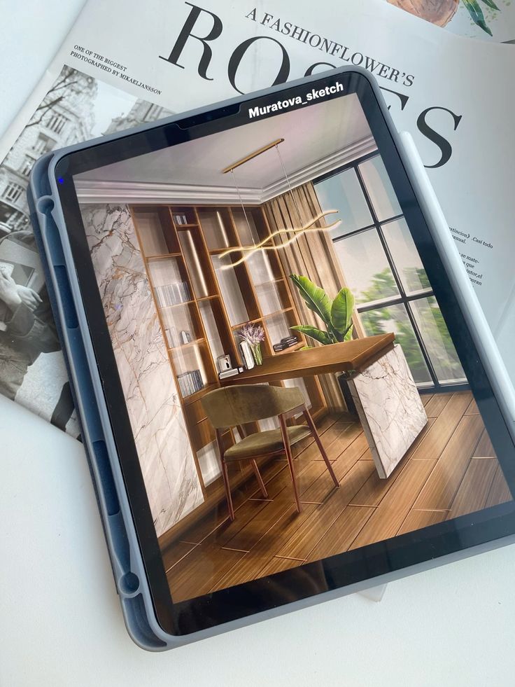
Digital tools such as tablets and apps like Procreate enable users to create, modify, and share designs digitally. Layers, undo features, and digital brushes help streamline workflows and reduce material costs. Digital sketching is also ideal for creating 3D perspectives and making rapid changes to layouts.
Both traditional and digital methods have their strengths. Many designers use both, sketching initial ideas by hand then refining them digitally.
Choosing the Right Sketchbook
Selecting a sketchbook is an important first step for interior design sketching. Paper weight should be at least 90–120 gsm for markers and ink to prevent bleed-through. Smooth, acid-free paper keeps lines crisp and colors true.
Some designers prefer a wire-bound sketchbook, which lays flat and makes two-page spreads easier. Others opt for pocket-sized options for more portability.
A sketchbook with blank pages offers more freedom than lined or grid pages, though some use dotted guides for perspective. If working digitally, a tablet with a responsive stylus and a high-resolution display, like the iPad paired with Procreate, substitutes the physical sketchbook.
Recommended Drawing Tools
For traditional sketching, a basic kit includes:
- Mechanical pencils: Consistent line quality and easy refilling.
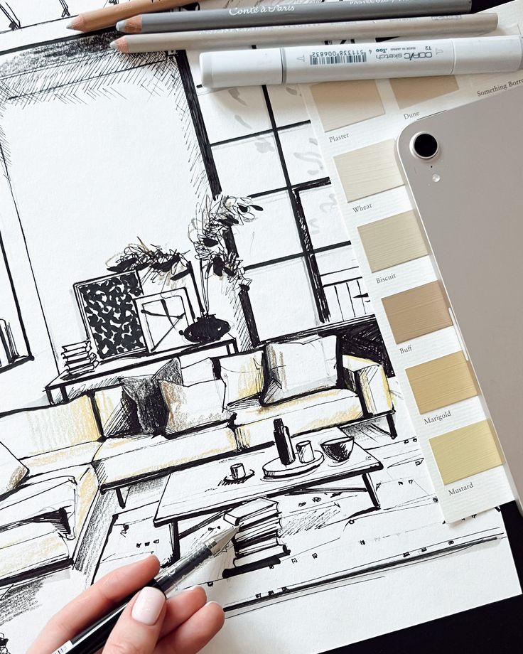
- Graphite pencils (HB, 2B, 4B): Varying hardness for shading and structure.
- Black fineliner pens: Define details and outlines.
- Blending stumps: Smooth graphite for shadow and depth.
- Markers (cool and warm grays): Add tonal value and highlights.
An eraser, ruler, and a transparent triangle help with precision and perspective lines.
For digital sketching, a pressure-sensitive stylus, tablet, and drawing software like Procreate are essential. Pre-made brush sets replicate traditional media, while digital rulers, grids, and symmetry tools improve accuracy. Storing tools in an organized case—physical or digital—helps keep the workflow smooth.

Step-by-Step Process for Sketching an Interior
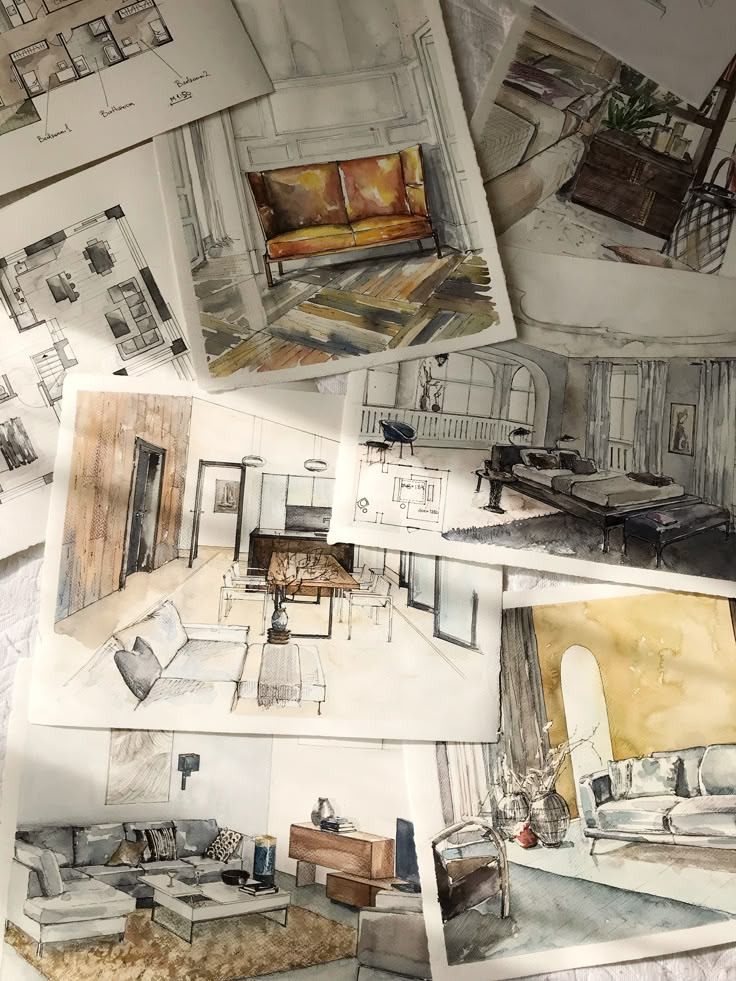
Sketching interiors requires thoughtful planning, careful perspective, and a foundational structure. Focusing on these stages helps to make sketches look more realistic while capturing essential interior elements.
Planning Your Layout
Before putting pencil to paper, it’s important to start with a clear vision. Interior sketching skills improve when the designer takes time to decide what part of the room will be included and from which viewpoint.
First, they should make quick thumbnail sketches or a rough floor plan to figure out the room’s main architectural features, like doors, windows, and focal walls. Thinking about sightlines, traffic flow, and important furniture placements will help organize the space.
A designer should also choose a perspective—one-point or two-point—early on, as this will influence how depth appears in the final sketch. Identifying the vanishing point(s) is critical, and this choice sets the tone for the entire layout.
Checklist for Planning:
- Decide on the area and angle to sketch
- Draw a basic floor plan or thumbnails
- Note the main features and focal points
- Choose the perspective type
Establishing Depth and Proportion
Once the layout is mapped, accurately representing depth and proportion makes the room believable. Perspective lines, especially the horizon line and vanishing points, are essential for this.
In one-point perspective, all lines converge at a single point on the horizon, ideal for facing a wall head-on. For spaces viewed at an angle, two-point perspective often suits better. Use a straightedge or ruler to lightly mark these lines, ensuring architectural elements like walls, floors, and ceilings all align correctly.
Scaling is just as important. Designers should compare furniture and architectural features against each other, using proportional marks or light guide lines. Consistency in scale avoids awkward-looking objects and helps the viewer interpret the sketch accurately.
Creating the Basic Structure
With perspective set, they can begin outlining the room’s primary forms. Starting with the major architectural shapes—such as walls, floor, and ceiling—lays a sturdy foundation.
Simple geometric shapes, drawn lightly, block out large furniture and major objects. For example, a couch might start as a rectangle, while a table begins as an oval or elongated box. From here, details are gradually layered over these simple forms.
They should avoid jumping into intricate decorations too soon. Keeping lines light and erasable lets adjustments happen easily. This approach builds confidence and keeps the composition balanced as more detailed interior design sketches come together.
Adding Details and Texture to Your Sketches
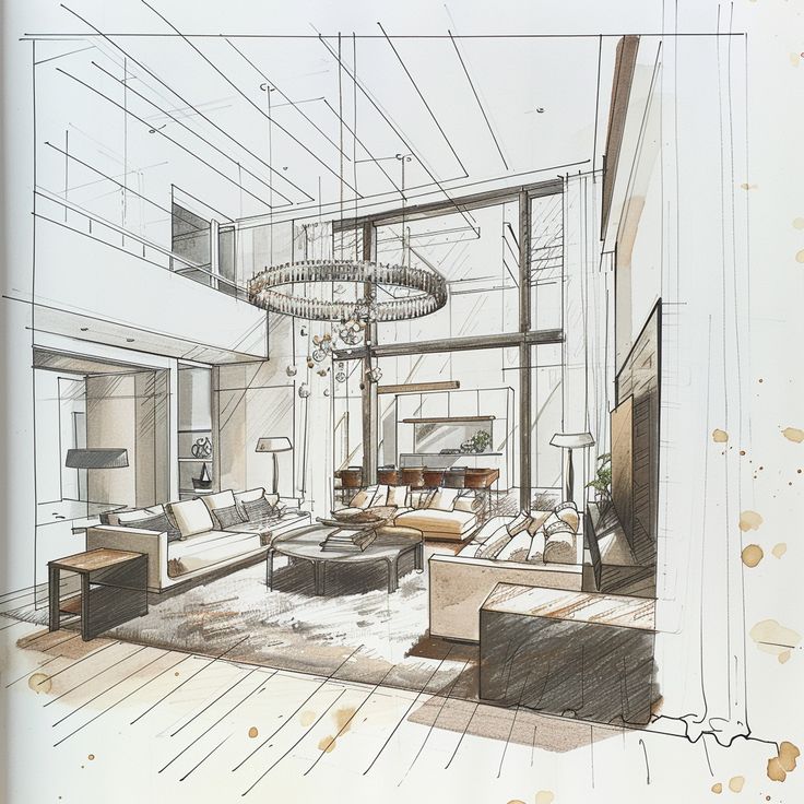
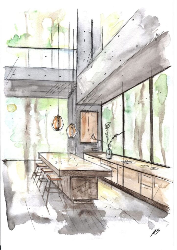
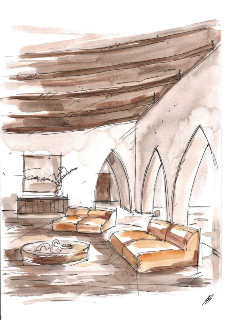
Effective interior sketches come to life with convincing details and well-applied texture. Whether the drawing is in black and white or color, the way details and surfaces are handled shapes the mood and realism of an interior drawing.
Techniques for Adding Texture
Texture helps viewers understand the surface quality of objects like wood floors, fabric upholstery, or brick walls. Pencil marks, hatching, stippling, and blending are popular ways to suggest these textures. For wood, parallel lines with slight variations can indicate grain patterns. Fabric can be shown with soft, curved shading or fine dots to hint at weave or pile.
Artists might use different pencil hardness, erasers, and blending stumps to create various effects. For example, a kneaded eraser can lift graphite, creating highlights on reflective surfaces. Layering and crosshatching add richness and depth without overwhelming the composition. Remember, less can be more—strategic texture placement often reads clearer than covering everything.
A simple reference table for common material textures:
| Material | Technique | Tip |
|---|---|---|
| Wood | Directional lines | Vary line direction |
| Fabric | Soft shading, stipple | Highlight folds |
| Stone/Brick | Irregular hatching | Leave uneven gaps |
| Glass | Minimal marks | Strong highlights |
Incorporating Furniture and Decor
Including furniture and decor adds scale and personality to a sketch. Start by lightly blocking out basic forms, then refine outlines and proportions. Accurately placed objects help reinforce the room’s perspective and depth.
Once the structure is in place, outline key features like chair legs, lamp bases, or pillow seams with crisp, confident lines. Add shadows to indicate weight and ground items within the space. Textural touches, like indicating leather grain or glass reflections, give these objects a more realistic presence.
Varying line thickness can further distinguish foreground furniture from background elements. Subtle details, such as hardware or fabric patterns, make the space more believable without overwhelming the composition. A short checklist can help:
- Block basic forms for each object
- Refine outlines gently
- Add key features and textures
- Use shadow for depth
Black and White Sketches vs Color Studies
Black and white sketches are ideal for learning structure and value. Artists can focus on light, shadow, and form without worrying about color choices. Shading, crosshatching, and erasing control the contrast, helping to separate objects and suggest texture.
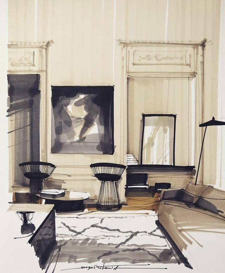
Color studies introduce the complexity of material hues, light temperature, and atmosphere. Watercolor, colored pencil, or markers can define surfaces such as warm wood or cool metal. Still, restraint is important—color should enhance, not overwhelm, the underlying structure and detail.
Black and white sketches often emphasize clarity and volume, while color studies can communicate mood and material richness. Both have a place: use black and white for design clarity or concept work, and color for presenting atmosphere or finished ideas. Select the method that best supports the intent of the drawing.
Tips and Tricks to Improve Your Interior Sketching Skills
Improving interior sketching skills comes down to mastering balance, proportion, and recognizing common errors before they take hold. Practicing perspective techniques and paying close attention to detail can quickly elevate both beginner and advanced sketches.
Maintaining Balance and Proportion
Accurate scale adds realism and believability to interior sketches. Begin by lightly marking a horizon or eye level line. Use this as a guide for aligning furniture, trimming, and architectural features. Mark out major shapes first, focusing on their relative sizes and placements.
A simple way to check balance is to compare object sizes. For example, a couch should never appear larger than a door. Use rulers or scale references when first starting to practice.
Perspective lines are key. Try using one-point and two-point perspective boxes to fit objects into correct spatial arrangements. If unsure, reference photos to spot proportion errors or consult basic floor plans as a guide.
Tables can help as a quick reference:
| Common Interior Objects | Standard Measurements |
|---|---|
| Door Height | 80″ (203 cm) |
| Table Height | 30″ (76 cm) |
| Chair Seat Height | 18″ (46 cm) |
Common Mistakes and How to Avoid Them
Many beginner sketches suffer from skewed angles or inconsistent scale. This can make interiors appear distorted or flat. Double-check vanishing points: all perspective lines should converge accurately for realism. If lines drift, use a ruler lightly at first.
Overcrowding elements is another frequent mistake. A cluttered drawing distracts from main features. Focus on the primary elements—large furniture, important windows, or doors—before adding small décor details.
Shading mistakes can flatten depth if not placed logically. Observe how light travels in real rooms. Shade consistently, placing shadows where objects block light sources.
To avoid rushing, set aside time to step back and observe the drawing, then make adjustments. Mistakes are best caught early, and regular review fosters improvement in interior design sketches.
- 0shares
- Facebook0
- Pinterest0
- Twitter0
- Reddit0
