Learning architecture drawing for beginners doesn’t require a background in engineering or drafting. When I first studied academic composition and architectural forms, the biggest hurdle wasn’t the perspective math—it was learning to see three-dimensional structures as a collection of simple geometric blocks.
- How to Start Architecture Drawing Step by Step
- Foundational Drawing Techniques
- Popular Beginner Architecture Drawing Ideas
- Common Architectural Drawing Mistakes for Beginners
- Enhancing Your Architectural Sketches
- Architecture Drawing for Beginners FAQ
- Q: What is the best pencil for beginner architecture drawing?
- Q: Do I need to be good at math to draw architecture?
- Q: What is the difference between 1-point and 2-point perspective?
- Q: Should I use a ruler for architectural sketching?
- Q: How do I make my building drawings look three-dimensional?
- Q: What are some easy architectural objects for beginners to start with?
By starting with basic 2B pencil sketches of house facades, single doorways, or small floor plans, you can build your structural confidence without getting bogged down in complex blueprints.
In this guide, we’ll break down the essential tools, line-work exercises, and practical ideas you need to start sketching buildings today. The goal here is simple: enough structure to keep the building believable, loose enough that it still looks like a sketch and not a blueprint.
How to Start Architecture Drawing Step by Step
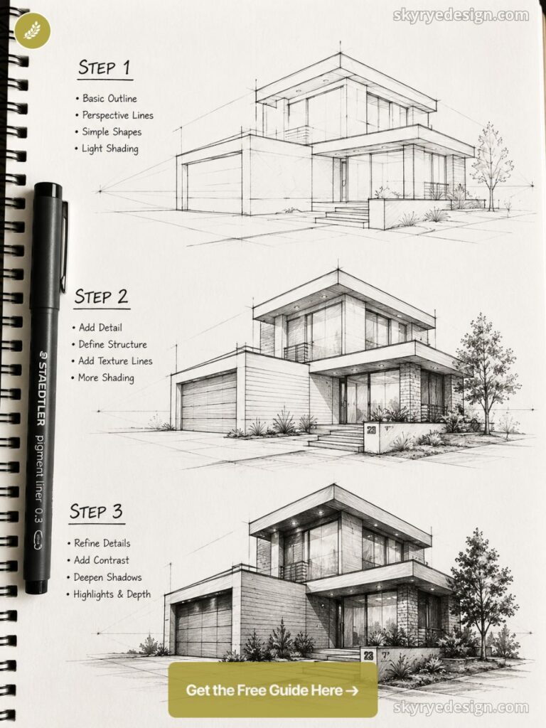
There’s a natural order to this: loose guidelines first, firm details last.
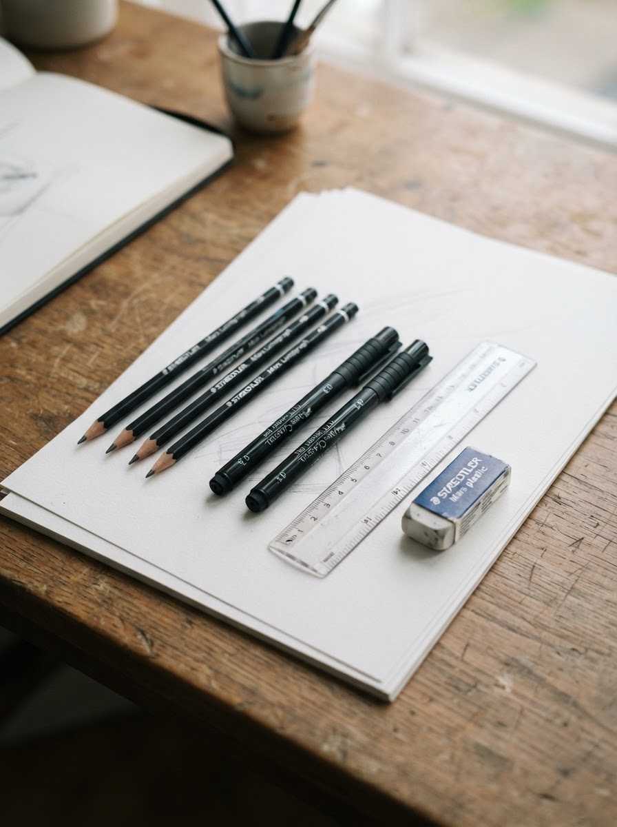
First, choose your tools: a 2B graphite pencil for sketching, a ruler for perspective lines, and fine-liner pens (0.3 and 0.5) for final ink work cover most of what a beginner needs.
Personally, once I’m past the first few loose sketches, I switch leads: a 2H for the initial axes and guidelines, because it’s light enough not to smudge under my hand, and something softer — an HB or a 2B — for the outlines and accents that actually need to read from across the room. It took me a while to land on that combination back in school. It saves a lot of eraser work later.
Second, block out the basic volumes: light, loose lines for the cubes, cylinders, and prisms that make up the building’s main shapes. Third, establish a horizon line and vanishing points, so everything you draw after this follows the same perspective rules.
Fourth, add architectural elements like doorways, windows, and roof lines, keeping their proportions balanced against each other.
Finally, define details and shading, using variable line weight and simple hatching to give the sketch depth.
| Exercise / Tool | Target Skill | Why It Matters for Beginners |
|---|---|---|
| Basic Form Blocking | Proportion & Volumetric Thinking | Teaches you to break complex buildings down into simple boxes and cylinders. |
| One-Point Perspective Box | Depth & Horizon Alignment | Ensures your building facades recede naturally toward a single vanishing point. |
| 2B / 4B Pencil Shading | Volume & Lighting | Creating light and dark values helps flat facades look solid and three-dimensional. |
| 0.3 / 0.5 Fine-Liners | Line Quality & Accentuation | Variable pen thickness helps distinguish primary outlines from small structural details. |
Foundational Drawing Techniques
Get these three things right — form, perspective, and line control — and everything else in this guide gets easier.
Sketching Basic Forms
Cubes, cylinders, and spheres are simple shapes that make drawing buildings easier. Almost any structure, from a simple cottage to a complex stadium, breaks down into some combination of these three. Learning to see that basic structure is most of the battle.
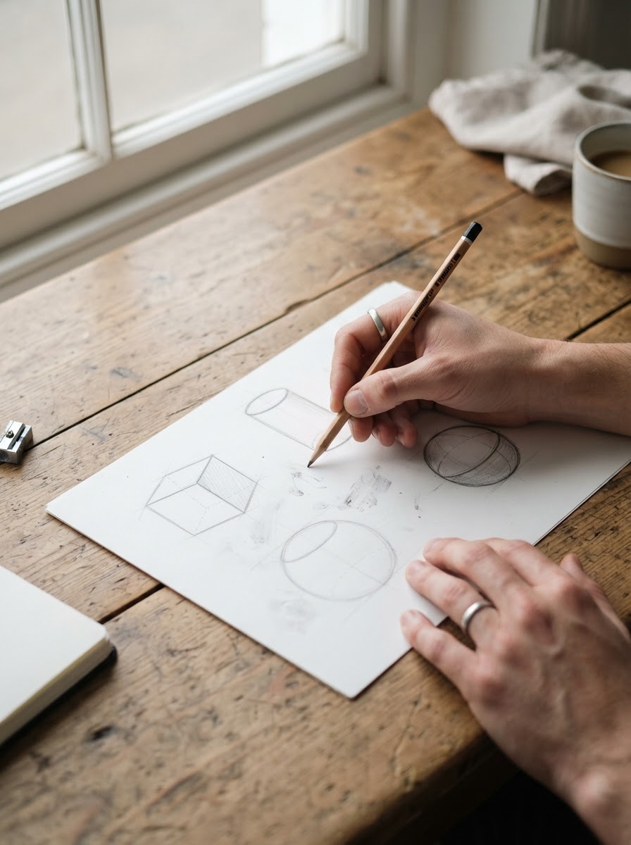


Practice sketching them from a few different angles until you don’t have to think about it. Once that’s automatic, breaking a complicated building into blocks stops feeling like a puzzle.
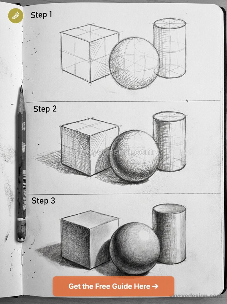
Start loose. Rough in the shapes with light pencil lines that are easy to erase. Once the proportions look right, commit to firmer outlines. Going straight to hard lines is the fastest way to end up erasing half the page.
Understanding Perspective
Perspective is just the rule that things look smaller the farther away they are — but getting it to feel natural on paper takes practice.
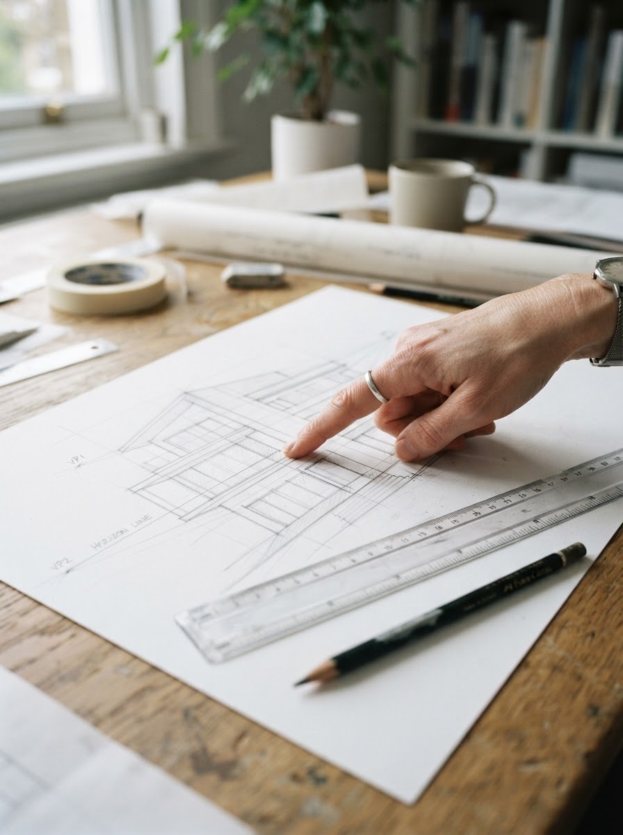
Start with two setups. One-point perspective uses a single vanishing point and works well for a building facing you head-on. Two-point perspective uses two vanishing points and is best for corner views.
The horizon line is your eye level. Every vanishing point sits on that line, and every receding edge of the building aims toward one of them. Get the horizon and vanishing points right first — everything else lines up from there.
Want more reference for how professionals stage a building sketch? Scroll through ArchDaily‘s project galleries for inspiring perspective and composition ideas.
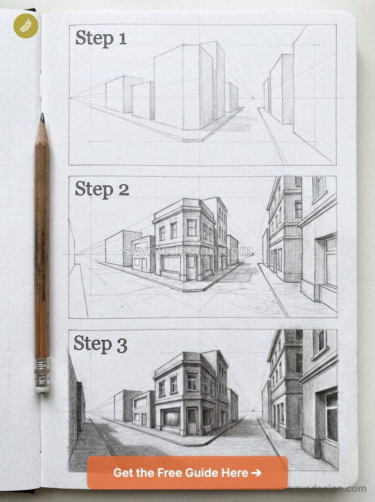
Draw a handful of simple boxes using these rules before moving to an actual facade. It’s tedious, but it’s the fastest way to get a feel for how scale and depth actually work on the page.
Line Quality and Control


Line quality is what separates a sketch that reads as confident from one that looks hesitant. It comes down to how much pressure you put on the pencil and how fast you move it.
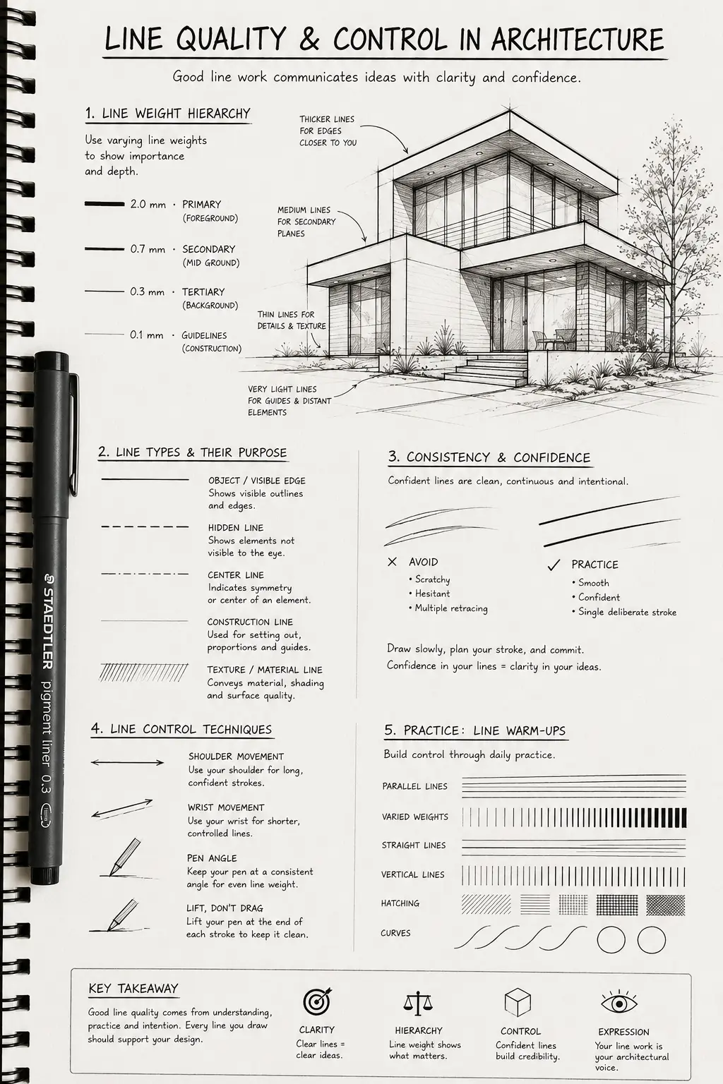
Use thick, committed lines for the building’s outline and the darkest shadow edges. Save thin lines for small details — brick joints, glass panes, anything close to the surface. That contrast alone does more for clarity than almost anything else.
Shaky lines usually come from moving too slowly. A faster, more deliberate stroke is often steadier than a cautious, slow one. Test this on scrap paper before committing to your real sketch.
Mix solid and broken lines to hint at material or distance. Use solid edges for close, defined shapes. Use broken or lighter lines for receding details.
Popular Beginner Architecture Drawing Ideas
These four subjects are where most people start, because each one isolates a specific skill — proportion, symmetry, detail, or spatial planning — without throwing a full building at you at once.
Drawing Simple House Facades


A simple house facade is the easiest place to start. You’re sketching the front of a building: straight lines, a few rectangles for the walls, a triangle or two for the roof.
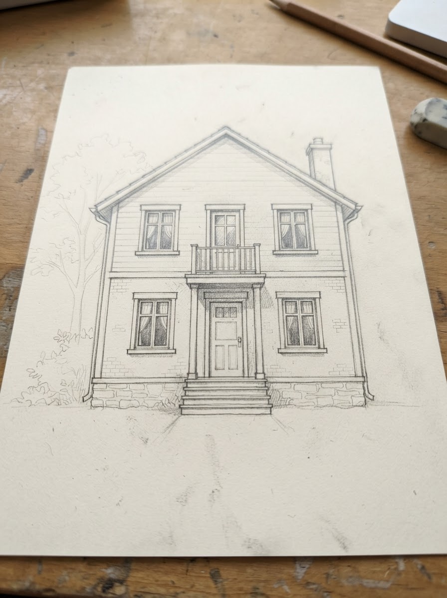
Add chimneys, roof tiles, or brick texture once the basic shape is solid — not before. Keep the windows and door symmetric if you can; it does more for the drawing’s balance than almost any other single choice. A ruler or a sheet of grid paper helps keep the lines straight while you’re still building that muscle memory.
Proportion is the real lesson here. A front door is usually about twice the height of a window next to it — get that relationship right and the whole facade reads as believable, even if the details are rough.
Sketching Doorways and Windows


Doorways and windows are where a building sketch gets its personality. Try a few different shapes — square windows, tall rectangles, arched doorways — instead of defaulting to the same generic box every time.
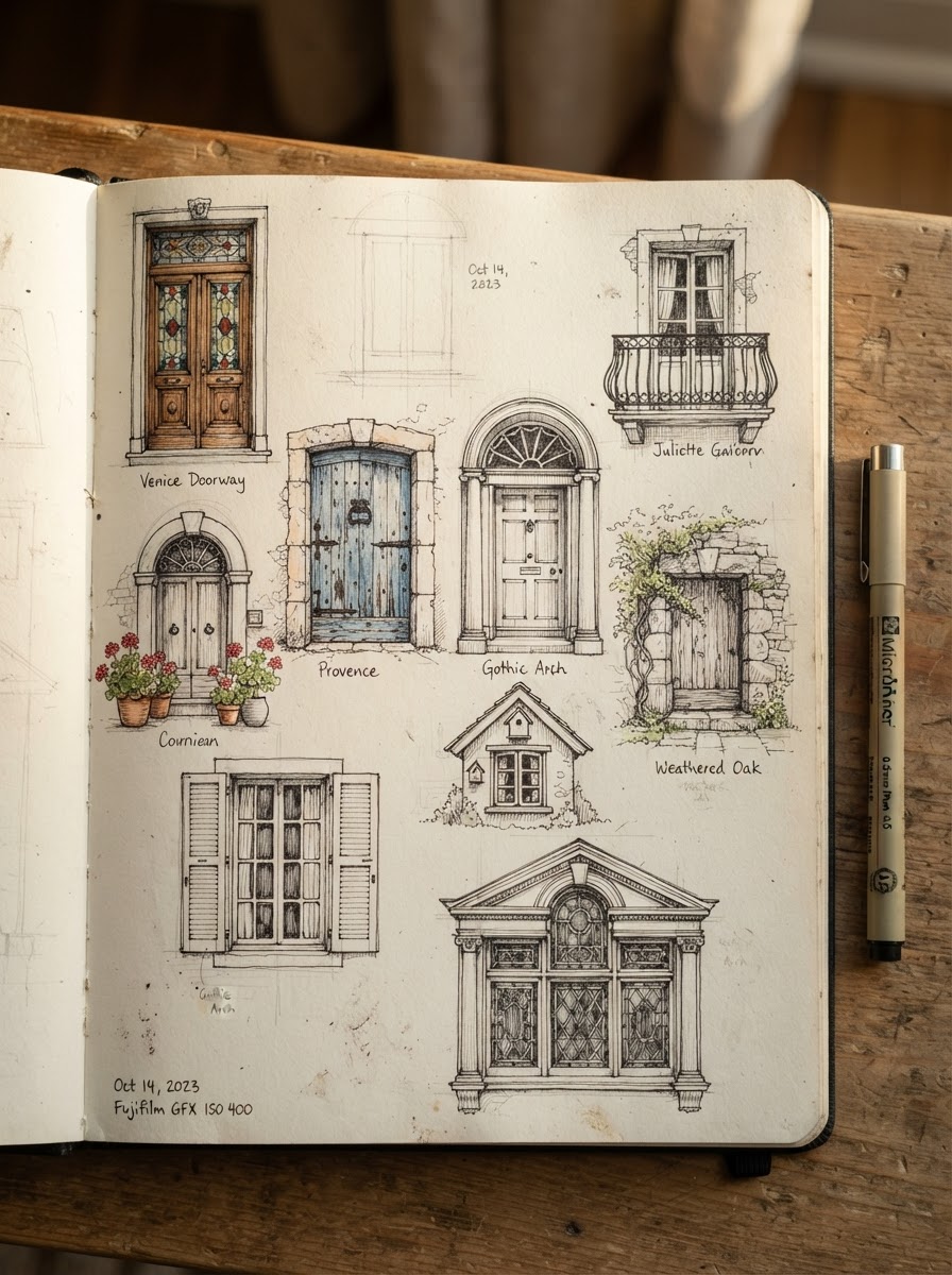
Frames, panes, and cast shadows are what sell the depth. A little shading along one edge, or a hint of reflection on the glass, goes a long way toward making a flat rectangle read as an actual window.
Start with something simple, like a plain rectangular door with a few panel lines, and get comfortable with clean linework before adding handles or trim.
Creating Small Floor Plans


Small floor plans are a different exercise — you’re not drawing what a building looks like, you’re drawing how it’s organized. Walls, rooms, doors, sometimes furniture, all seen from directly above.
Block the outer walls first, then divide the interior into rooms. Simple symbols keep things readable: a rectangle for a bed or table, a dashed line for a door swing.
Keep your scale consistent — 1 cm to 1 meter is an easy one to work with — so the rooms stay proportional to each other. It’s a small habit, but it’s the difference between a floor plan that looks planned and one that looks guessed.
Common Architectural Drawing Mistakes for Beginners
A few habits trip up almost everyone early on. None of them are hard to fix once you know what to look for:
- Forcing exact ruler lines for everything. Rulers earn their keep for the horizon line and vanishing points, but leaning on them for every single stroke makes a sketch look stiff and printed. Let freehand lines carry the texture and structural details — the small imperfections are what make it read as drawn, not plotted.
- Ignoring line weight variety. If every line is the same thickness, the sketch reads flat no matter how accurate the proportions are. Go thick on the silhouette and the deep shadow lines, thin on brick joints and glass panes.
- Misaligning vanishing points. If a window or roofline doesn’t converge toward the same vanishing point as the main walls, the building will look subtly warped — even to someone who couldn’t tell you why. Double-check the angles before you commit to ink.
- Overcomplicating the sketch too early. Brick patterns and shingle textures are tempting, but they mean nothing if the underlying volumes and proportions are off. Block the big shapes first, check that they hold up, then go back for detail.
The one I had to unlearn myself in school was over-shading — piling on hatching before the perspective and proportions were actually locked in. It’s an easy trap: shading feels like progress, so it’s tempting to reach for it early. But if the underlying lines are off, all that extra work just makes the mistake more visible instead of hiding it.
Enhancing Your Architectural Sketches
Once the basic structure holds up, you can enhance it. Adding shading, landscape, and color takes your sketch from “technically correct” to something people actually want to study.
Adding Shading and Texture


Shading is what turns a flat outline into something that reads as solid. Hatching and cross-hatching are the easiest place to start, whether you’re working in pencil or pen.
Texture is a separate job. It tells the eye whether you are drawing brick, glass, or wood siding. Work from a real photo reference rather than trying to invent textures from memory. Varying your pressure and stroke direction gets you most of the way there.
Between the two, a sketch stops looking like a diagram and starts looking like a building someone could actually walk up to.
Incorporating Landscape Elements


A building sketched in isolation, floating on white paper, always looks a little unfinished. A few trees, some ground texture, a path — even rough — anchor it to a real site.
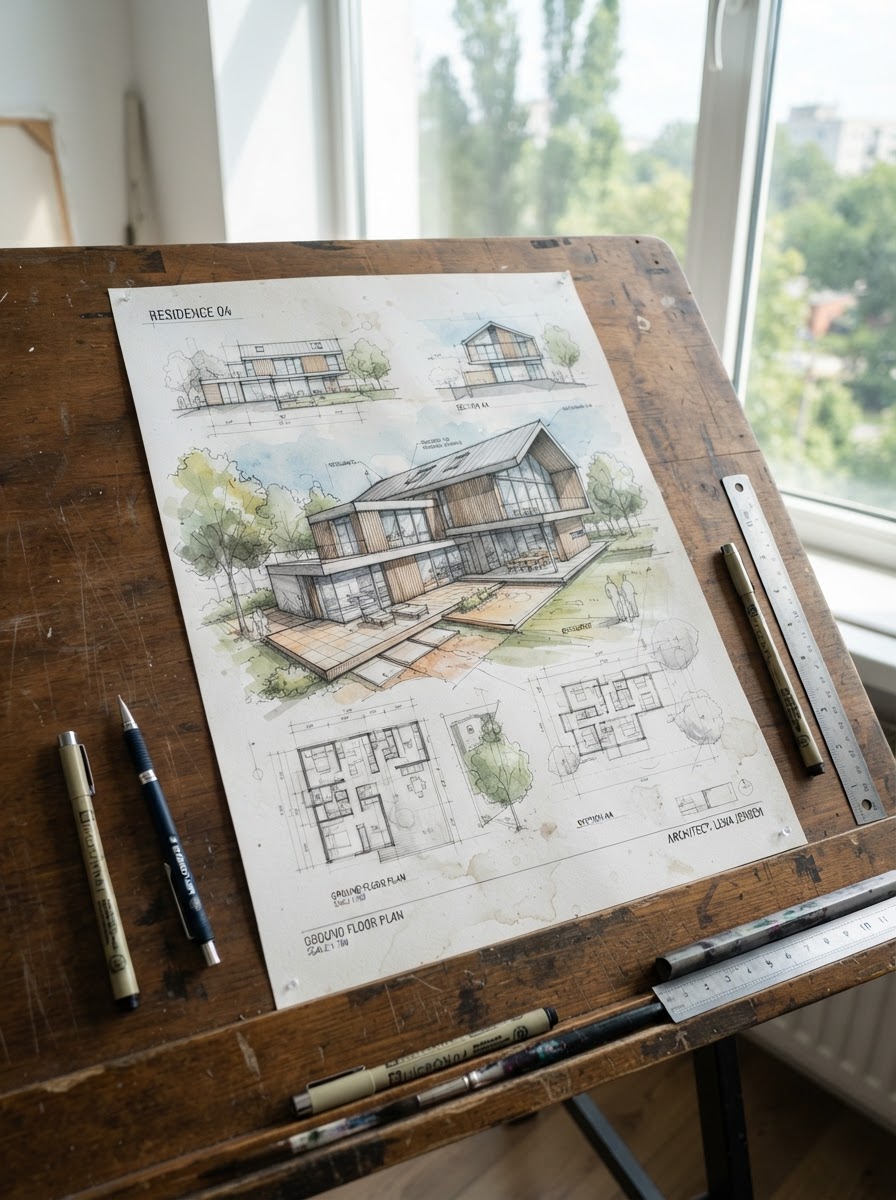
You don’t need botanical accuracy. A circle or cloud shape reads as a tree canopy; a few vertical strokes read as grass. Nobody’s checking your foliage against a field guide.
Rough is fine here, arguably better than fine — a loose sketch of a path or a rock outcrop tells the eye “this building exists somewhere” without competing with the actual subject.
Using Color for Emphasis


Use color sparingly, like a highlighter. It pulls the eye toward key features like a door, a window, or a standout material.
Colored pencils or a couple of markers are enough to start. Stick to one or two colors; past that, you’re fighting your own sketch for attention.
Color can also suggest materials, like red for brick or green for landscaping. The goal is consistency, not realism. Restraint adds life to the sketch without burying the linework.
If you want one longer walkthrough after these prompts, use this beginner architecture drawing guide to practice tools, perspective, drawing types, and a simple building sketch in sequence.
Architecture Drawing for Beginners FAQ
Here are some of the most common questions beginners ask when starting their architectural sketching journey:
Q: What is the best pencil for beginner architecture drawing?
A: A 2B graphite pencil is the absolute best starter tool. It is soft enough to lay down extremely light, erasable guidelines under minimal hand pressure, yet dark enough to create bold accents, silhouettes, and deep shadow values when pressed firmly.
Q: Do I need to be good at math to draw architecture?
A: No, you do not need any advanced math skills. Architectural sketching is about visual spatial relationships, not calculations. Once you understand how basic geometric forms (like cubes, prisms, and cylinders) fit together and how to guide your lines toward a vanishing point, you have all the theory you need.
Q: What is the difference between 1-point and 2-point perspective?
A: One-point perspective uses a single vanishing point on the horizon, which is ideal when you are looking at a building face-on (parallel to its facade). Two-point perspective uses two vanishing points and is essential when you sketch a building from an angle or corner, where both visible sides recede into the distance.
Q: Should I use a ruler for architectural sketching?
A: It is best to use a ruler for establishing your horizon line and main perspective guidelines, but try to sketch the actual building freehand. Freehand lines have subtle, natural imperfections that give your architectural drawings a warm, artistic, and professional look instead of a sterile, computer-generated feel.
Q: How do I make my building drawings look three-dimensional?
A: You can create 3D volume by using a combination of variable line weight and consistent shading. Darken the structural lines that face away from the light source, keep lines thinnest where the light hits directly, and use simple hatching lines to block out cast shadows on the ground.
Q: What are some easy architectural objects for beginners to start with?
A: Start with simple flat house facades, historical doorways, large windows with paned glass, basic top-down floor plans, or modern A-frame cabins which use clean, easy-to-draw triangular and rectangular silhouettes.
Editorial & Artist Disclaimer: This guide is written and reviewed by practicing designers and artists at Sky Rye Design, drawing on academic training in drawing, composition, and architectural visualization. Sketching techniques and tool recommendations reflect common studio practice, but individual style, hand, and skill level vary — treat these exercises as a starting point, not a rulebook.
Related home update idea
Drawing is a useful way to test a home design before changing real materials. When you move from sketch to renovation, these budget friendly flooring ideas can help you choose a practical starting point.
- 5.6Kshares
- Facebook0
- Pinterest5.6K
- Twitter0
- Reddit0