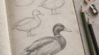
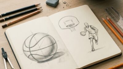
Most drawing mistakes are process errors, not a lack of talent. The eye jumps to details before the structure is in place, or the hand draws a remembered nose instead of the one in the reference. Sometimes the shading goes on before anyone has decided where the light comes from.
Each problem leaves a visible clue. A head that feels too narrow, furry lines, flat shading and a figure floating on blank paper all point to a specific cause. This guide treats the five most common mistakes as a diagnostic. For each one you get the symptom, the cause, the fix and a short drill. It works best with one of your own drawings beside you.
- The five drawing mistakes to check first
- 1. Starting with details before the big shapes and gesture
- 2. Drawing symbols from memory instead of observing the reference
- 3. Using hesitant, scratchy lines and pressing too hard
- 4. Ignoring value structure and a consistent light source
- 5. Treating composition, background and perspective as an afterthought
- When tools actually change the result
- The 10-minute drawing reset
- Conclusion
- FAQ
- Sources and further practice
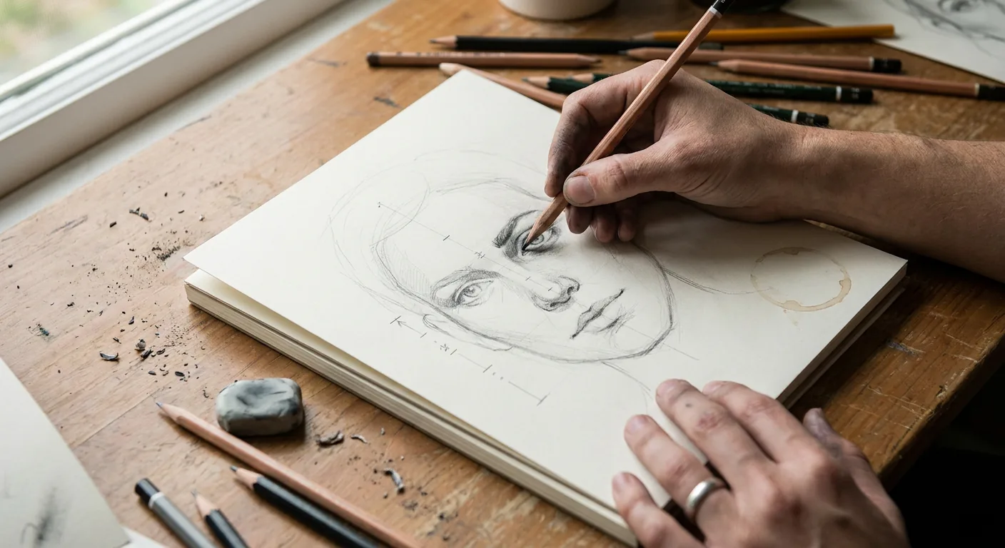


The five drawing mistakes to check first
Match the symptom in your drawing, then go to the section below.
| Symptom | Likely cause | Fastest fix |
|---|---|---|
| Individual features look fine, but the whole drawing is out of proportion | Details started before the big shapes and gesture | Block in the gesture, envelope and basic shapes first, then measure |
| Eyes, hands or trees look generic or cartoon-like | Drawing symbols from memory instead of observing | Look at the reference more than the paper and draw shapes and negative space |
| Lines look scratchy, hairy, or dented into the paper | Hesitant short strokes and heavy pressure | Use light, single strokes from the elbow and darken only the final lines |
| Shading looks flat, muddy or patchy | No value plan and an inconsistent light source | Choose one light source and map three to five values before blending |
| Subject floats, background looks pasted on, objects collide awkwardly | Composition and perspective left until the end | Thumbnail first, set the horizon line and check edges for tangents |
1. Starting with details before the big shapes and gesture
The result is a carefully rendered eye in a head that is too narrow, or a well-shaded hand on a forearm that is too short. Fixing it means erasing your best work, so the error often stays.
Details feel like progress, and it is hard to judge proportion while staring at a small area. You cannot see that an eye sits too high while you are only looking at the eye.
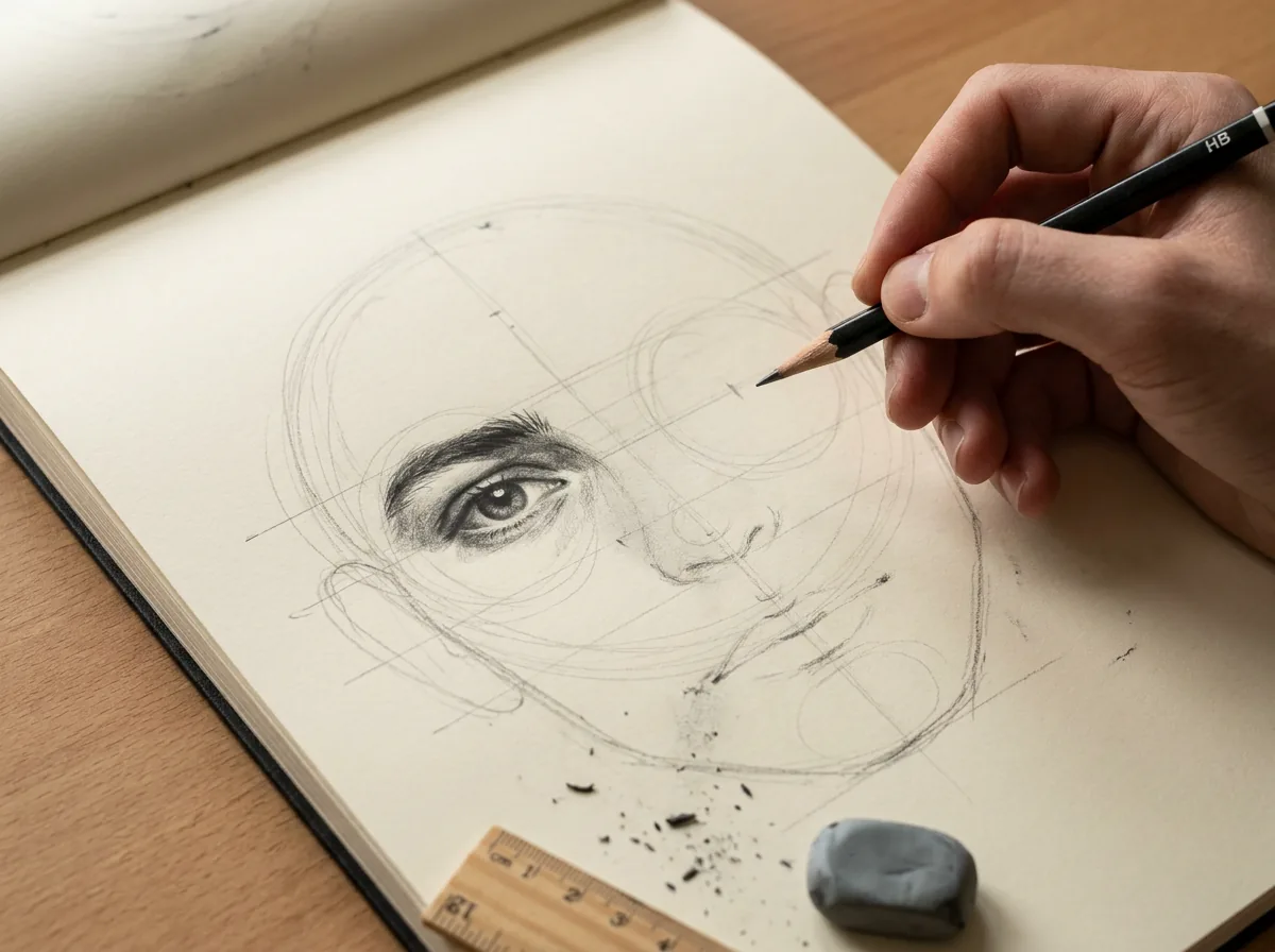
Work from big to small:
- Gesture line: one or two lines that capture the main direction of the pose or object.
- Envelope: a few straight lines enclosing the subject’s outermost points.
- Basic shapes: boxes, cylinders, spheres and wedges inside the envelope.
- Comparative measurement: hold your pencil at arm’s length, elbow locked, one eye closed. Measure one unit, such as head height, and compare other lengths against it. Hold the pencil vertical or horizontal to check angles.
For faces, use common adult starting points. The eyes sit roughly halfway down the head, about one eye-width apart, and the base of the nose falls roughly halfway between brow line and chin. A frequent eye drawing mistake is placing the eyes too high because the skull gets underestimated. Treat these as checks against the reference, not rules, because individual variation is where the likeness lives. The same structure holds when you move on to facial expressions.
Drill: envelope-only study (10 minutes)
Using a figure or still-life reference, spend two minutes on gesture and envelope, three on basic shapes and five measuring and correcting. No details allowed.
Decision rule: if you cannot name the three largest shapes and how their sizes relate, you are not ready for detail.


2. Drawing symbols from memory instead of observing the reference
This produces drawings that look like everyone else’s. Eyes become almonds with lashes all round, trees become lollipops and hands become five sausages. The drawing may be neat, but it does not resemble the subject.
The brain stores simplified labels for familiar things. When you look at the paper more than the subject, your hand reproduces the label. Faces are especially prone to this.
Break the label. Look at the reference far more often than at the drawing, and draw the shapes of light and dark you see rather than “an eye” or “a mouth”. Use negative space: draw the gap between an arm and the torso, or between chair legs. Those shapes have no name, so you have to observe them.
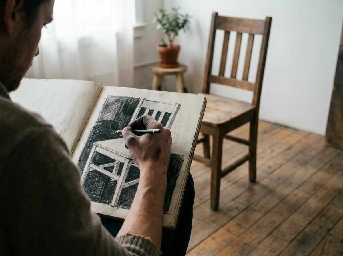
For eyes, look for what the symbol leaves out. The eyelids have thickness, and the upper lid often covers part of the iris and casts a shadow onto the eyeball. At normal viewing distances, lashes usually read as a dark edge rather than separate hairs. Many portrait drawing tips come back to this habit.
Drill: negative-space chair (7 minutes)
Draw only the empty shapes between the parts of a chair, stool or plant, then shade them in. The object appears without being drawn directly. For a variation, copy an upside-down reference photo for three minutes.
Decision rule: look at the reference before each new mark. If you have made more than a few marks without looking up, stop and compare.


3. Using hesitant, scratchy lines and pressing too hard
The drawing is built from short, overlapping strokes that look furry. Outlines are thick and uniform, grooves show through later shading, and repeated erasing leaves a grey haze.
Short strokes feel safer when you are unsure. Drawing only from the wrist makes it worse, because long, smooth lines need movement from the elbow or shoulder. Pressing hard early commits you to lines before you have checked them.
Erasing itself is not the problem. Heavy lines resist erasing, and repeated hard erasing roughens the paper, so later graphite goes on blotchy. Wiping out a whole area also removes the construction that shows where the error is, such as the reference point for a misplaced shoulder.
Start with a light sketch, using an H or HB pencil or light pressure. Ghost each long line by rehearsing the motion just above the paper, then make one confident stroke. Draw a correction beside the wrong line and erase the old one once, later. Darken only the lines you choose, with heavier weight where forms overlap or turn into shadow and lighter weight where light hits an edge.
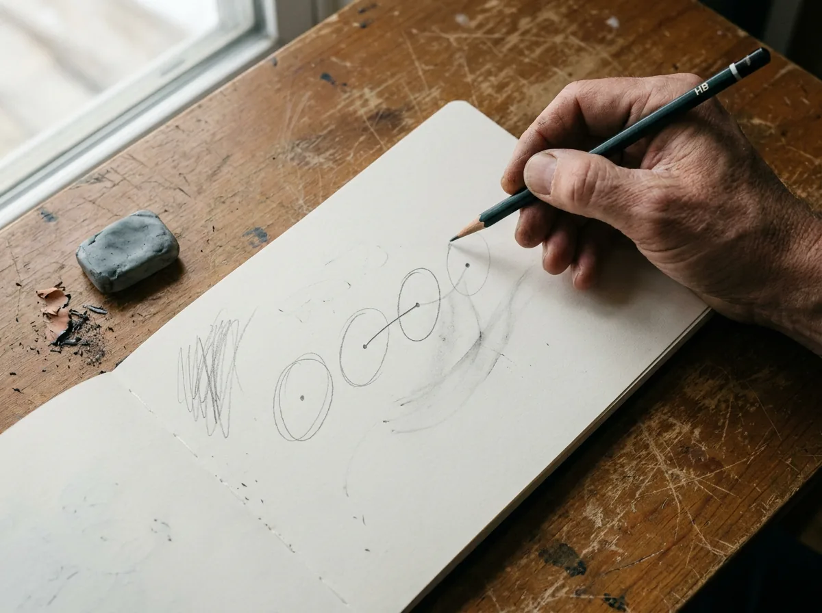
Drill: ghosted lines and ellipses (8 minutes)
Scatter pairs of dots across a page. Ghost each connection three times, then join it in one stroke. Fill a row with ellipses drawn from the shoulder. Finish with a three-minute contour drawing of a mug in single, unbroken strokes.
Decision rule: a construction line should lift with one or two dabs of a kneaded eraser. If it does not, you are pressing too hard.


4. Ignoring value structure and a consistent light source
This is the most common shading mistake. Everything sits in a narrow mid-grey band, dark outlines stand in for shadows, and shadows point different ways. Heavy blending smooths away the form, and small highlights appear everywhere.
It happens when you shade object by object instead of treating the image as one lighting situation. Fear of dark values flattens the range, and flat-lit phone photos make it harder.
Choose one light source and draw a small arrow in the margin as a reminder. Squint at the reference until details merge into big masses, then separate a light family from a shadow family before blending. Within those families, look for:
- Form shadow: the side turned away from the light, usually soft-edged.
- Cast shadow: the shadow thrown onto another surface, often darkest and sharpest near the point of contact.
- Reflected light: light bounced into the shadow side. It stays darker than the lit side.
- Highlight: the brightest point, usually small, which you can lift out with a kneaded eraser.
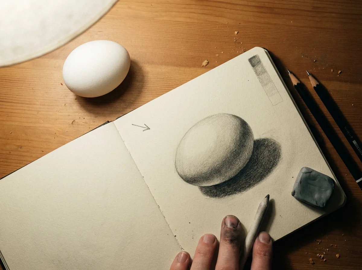
Include true darks; a 2B pencil reaches them more easily than an HB. Our shading techniques guide covers blending and hatching once the value plan is in place, and charcoal drawing is a quick way to practise bold darks.
Drill: three-value egg (8 minutes)
Place an egg or ball under one lamp on a plain surface. Draw it with three values only: paper white for light, one mid-tone, and one dark for form and cast shadows. Do not blend. If the three values are right, the form holds together without rendering.
Decision rule: reflected light belongs to the shadow family. It should never be as light as the lit side.


5. Treating composition, background and perspective as an afterthought
A small, centred subject floats on blank paper, or a background added later sits in a different perspective. Tangents appear, such as a head brushing the paper edge or a horizon line running through a chin. Ellipses on tabletop objects may not match the viewer’s eye level.
The background gets treated as filler, and the composition is set by wherever the first mark landed. Perspective is often checked only after the drawing already looks wrong.
Plan first. Make two or three stamp-sized thumbnails to test placements, then put the focal point off-centre. For anything with straight edges, set the horizon line, which is your eye level, and the vanishing points before drawing. Parallel edges converge towards a shared vanishing point, and ellipses get rounder the further they sit above or below eye level.
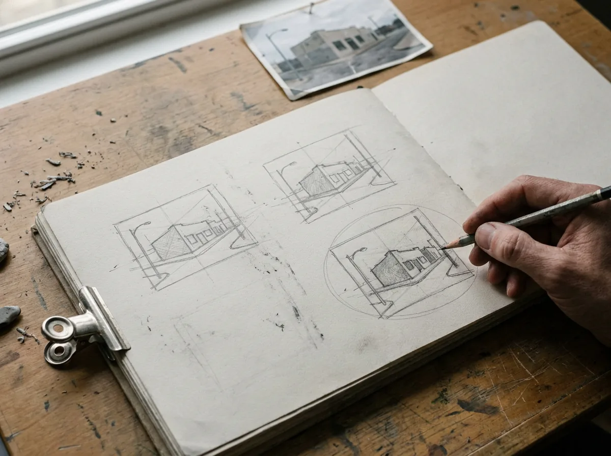
Use overlap to show depth, and resolve tangents by clearly overlapping or clearly separating shapes. A background rarely needs detail: a few values, a ground plane and a cast shadow can anchor the subject. Our perspective drawing guide and landscape and background drawing guide go further.
Drill: thumbnail trio (8 minutes)
Draw three two-minute thumbnails of one subject: placed high, placed low and cropped tight. Choose the strongest, then use the last two minutes to mark its horizon line and check every edge for near-touches.
Decision rule: if two edges nearly touch, either overlap them clearly or separate them clearly.


When tools actually change the result
You do not need a large kit, but a few choices make a visible difference:
- Pencil grade: H or HB keeps construction light. 2B gives darker values but smudges more.
- Kneaded eraser: it lifts graphite with dabs instead of rubbing, which is gentler on paper, and shapes to a point for highlights. Keep a plastic eraser for clean-up.
- Paper surface: smooth paper suits crisp lines and fine detail. Textured paper holds more graphite or charcoal for layered values, and its grain shows in the marks.
- Drawing angle: working flat on a table while viewing it at an angle can distort proportions. Tilting a board towards you helps.
The 10-minute drawing reset
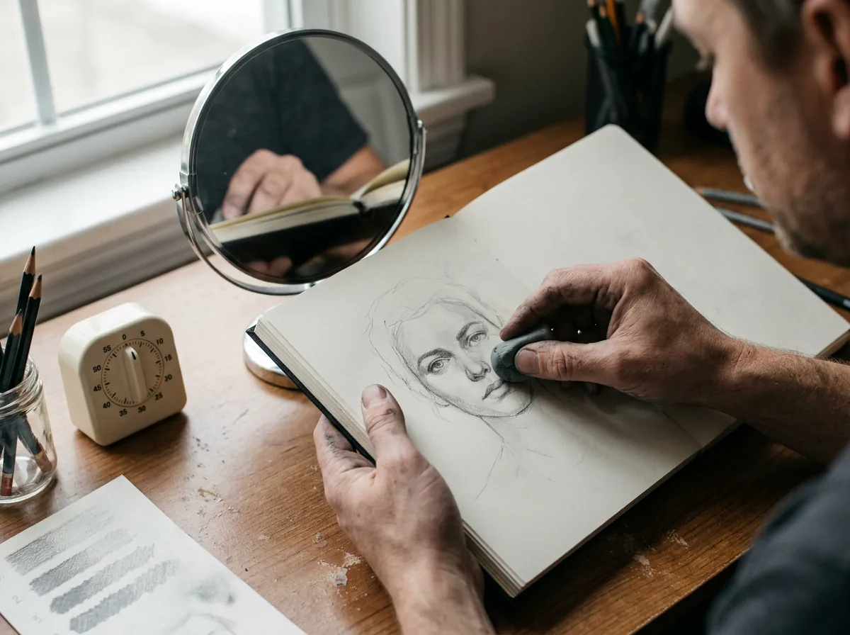
Use this on any drawing that looks wrong for reasons you cannot name:
- Distance (1 minute): step back, check a mirror image, or photograph the drawing and view it small.
- Big shapes (2 minutes): check the envelope and main angles, and measure one unit against the reference.
- Observation (2 minutes): compare drawing and reference glance by glance, marking differences with light ticks rather than erasing.
- Values (2 minutes): squint at both. Confirm one light direction and dark enough darks.
- Composition (2 minutes): look for tangents, a clear focal point and a ground plane.
- Decide (1 minute): pick the single fix with the biggest effect and make only that change.
Conclusion
A drawing that looks wrong usually has one main cause, and it is usually one of these five. Run the 10-minute reset on your most recent drawing, note which mistake appears first, and repeat that section’s drill three times before your next full drawing. A daily sketchbook practice suits this well: one drill a day, one mistake at a time. For a broader refresher, review these essential drawing techniques.
FAQ
Why do my drawings look wrong even when I copy a reference?
Usually the big relationships are off, even if the details are good. Copying feature by feature lets small errors add up, so a slightly narrow eye and a slightly high nose produce a face that feels wrong. Check the envelope, main angles and one measured unit first. Then check whether you drew the reference or a remembered symbol.
How can I get proportions right in a drawing?
Pick one unit, such as head height, and measure other lengths against it with your pencil at arm’s length, elbow locked and one eye closed. Block in the envelope and basic shapes before any detail, and check angles by holding the pencil vertical or horizontal. Facial guidelines are useful starting points, but always confirm them against the reference.
How do I stop drawing scratchy, hairy lines?
Draw longer strokes from the elbow or shoulder rather than the wrist. Ghost each line by rehearsing the motion above the paper, then commit to one stroke. Keep early lines light and correct a wrong line by drawing the right one beside it. Regular practice with straight lines and ellipses builds steadiness better than slowly redrawing one contour.
Why does my shading look flat?
Flat shading usually comes from a narrow value range and no clear light source. Choose one light direction, squint to find the big light and shadow shapes, and separate them before blending. Include genuine darks, especially cast shadows near contact points. Keep reflected light darker than the lit side, and avoid using outlines to suggest shadow.
Is it bad to erase a lot when drawing?
Erasing is a normal part of drawing. The trouble comes from repeatedly erasing heavy lines, which roughens the paper and makes later shading blotchy. Erasing whole areas also removes the construction that shows where an error is. Sketch lightly, correct beside the wrong line, then erase once. A kneaded eraser lifts graphite with less wear.
What is the fastest way to improve at drawing?
Work on one specific problem at a time instead of repeating the same kind of drawing. Diagnose a finished piece, name its main mistake and repeat a short targeted drill several times. Draw from observation often, using real objects or clear reference photos. Progress varies between people, but short, focused sessions usually help more than occasional long ones.
Sources and further practice
- Proko, “Top 5 Drawing Mistakes” (a lesson on common drawing errors).
- Art Prof, “Top 5 Portrait Drawing Mistakes” (a tutorial on common portrait drawing errors).
- Will Kemp Art School, “Compositional Mistakes in Drawing” (an article on composition problems in drawing).
- 1.0Kshares
- Facebook0
- Pinterest1.0K
- Twitter3
- Reddit0