I spent an afternoon a few years back sketching a hillside from a bench, and the grass in the foreground took longer than everything else in the drawing combined – because I started the way everyone starts, drawing individual blades one at a time. Dozens of little V-shapes, each one reasonable on its own, adding up to something that looked less like grass and more like a page of check marks.
- Why blade-by-blade grass never looks right
- How to draw grass step by step (the mass-first method)
- Tall/wild grass vs. mowed lawn – different mark logic
- Grass across mediums – pencil, colored pencil, digital
- Common grass-drawing mistakes (and the fix)
- Drawing grass behind a subject
- Materials that actually matter
- Final Thoughts
- Frequently Asked Questions
- What's the easiest way to draw grass?
- What are common mistakes when drawing grass?
- How do you draw realistic grass with a pencil?
- How is drawing wild grass different from a mowed lawn?
- How do you draw grass with colored pencils?
- How do you draw grass behind a subject without it looking flat?
- What's the negative-space technique for drawing grass?
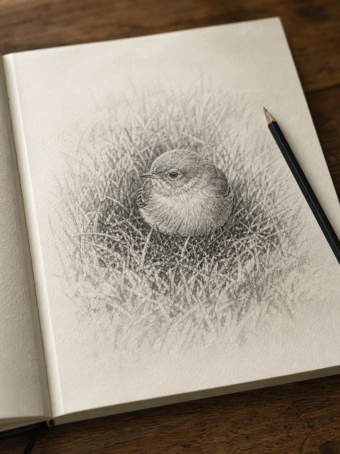
That’s the trap. A patch of grass isn’t hundreds of individual blades stacked into a drawing – it’s a mass with a value structure, the same way a hillside itself is a mass before it’s individual blades of anything. Skip that, and no amount of careful blade-drawing saves the result.
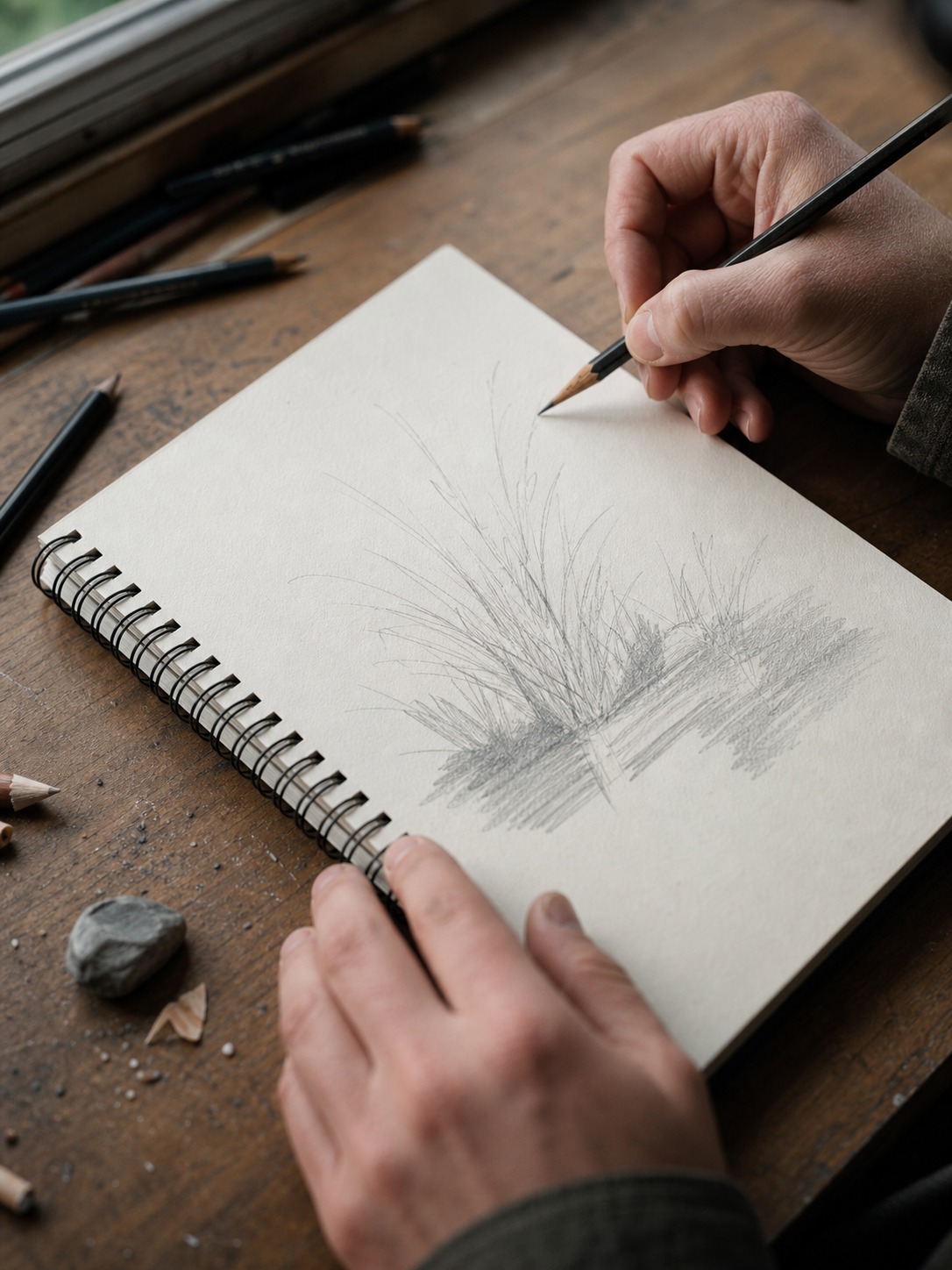
This guide covers the mass-first method: blocking the overall shape and light direction before a single texture stroke, the negative-space technique that separates convincing grass from a page of spikes, and how the approach shifts across pencil, colored pencil, and digital work.
Why blade-by-blade grass never looks right
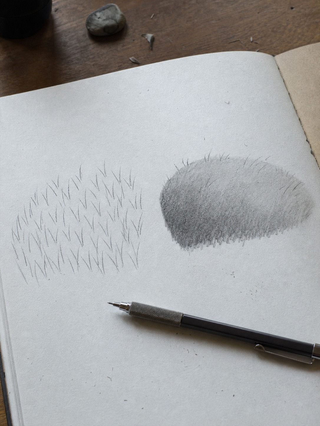
Nearly every “how to draw grass” tutorial teaches the same thing: a row of pointed V-shapes, sometimes varied in height, repeated until the space fills up. It’s an intuitive starting point – grass is made of blades, so you draw blades. The problem is that intuition skips a step every other subject in this method needs.
The V-shape trap
Individual V-shapes describe a blade’s outline, but a real patch of grass doesn’t read as individual blades from any normal viewing distance – it reads as a textured mass with light and shadow moving across it. Drawing blade-by-blade from the first stroke is a bit like the two-circle bunny problem: you’re building detail on top of nothing, because there’s no underlying mass decision driving where the light falls or where the shadow pools. The result technically looks like “grass symbols” without looking like an actual patch of grass.
What a grass patch actually is
Before it’s blades, a patch of grass is a shape with a value structure – a lit side, a shadowed side, denser and sparser areas depending on how the ground undulates underneath it. The mass shape itself might be almost featureless, closer to a rough, uneven oval or band than anything blade-like. Only once that mass and its light-to-shadow gradient are established does texture – individual strokes, negative-space gaps, directional marks – start getting added on top, the same order as the coconut’s fiber-direction-before-shading method or the rabbit’s gesture-before-outline approach.
How to draw grass step by step (the mass-first method)
Four steps, same order every time – this is the sequence that replaces blade-by-blade drawing.
Step 1 – block the overall mass and light direction
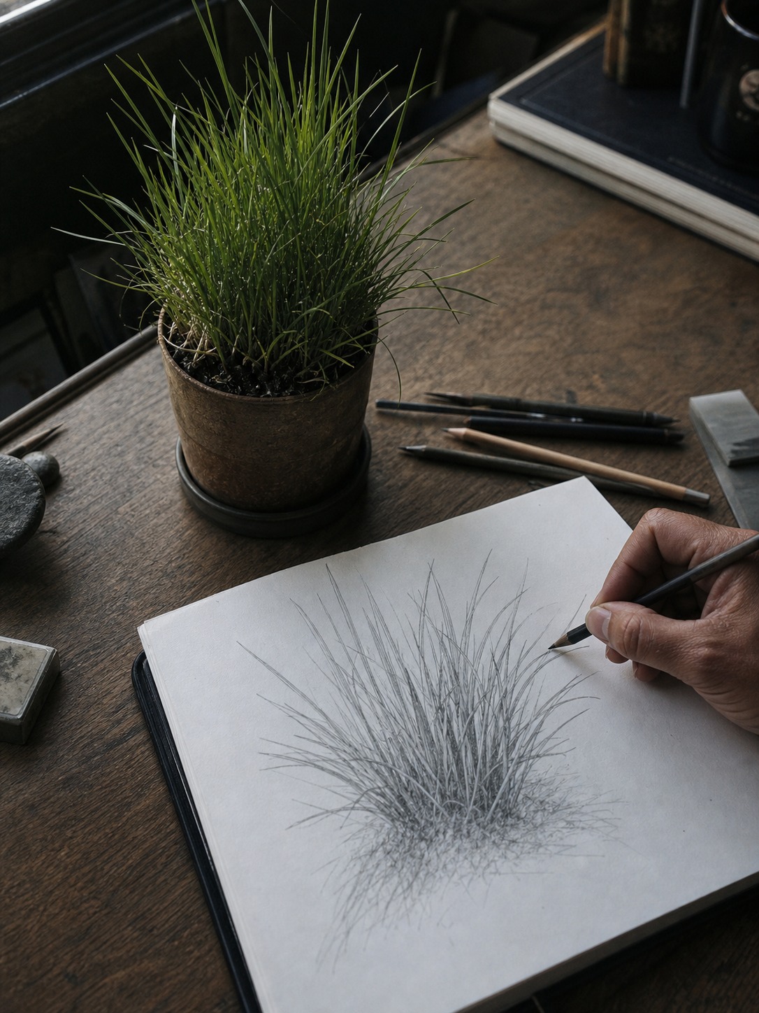
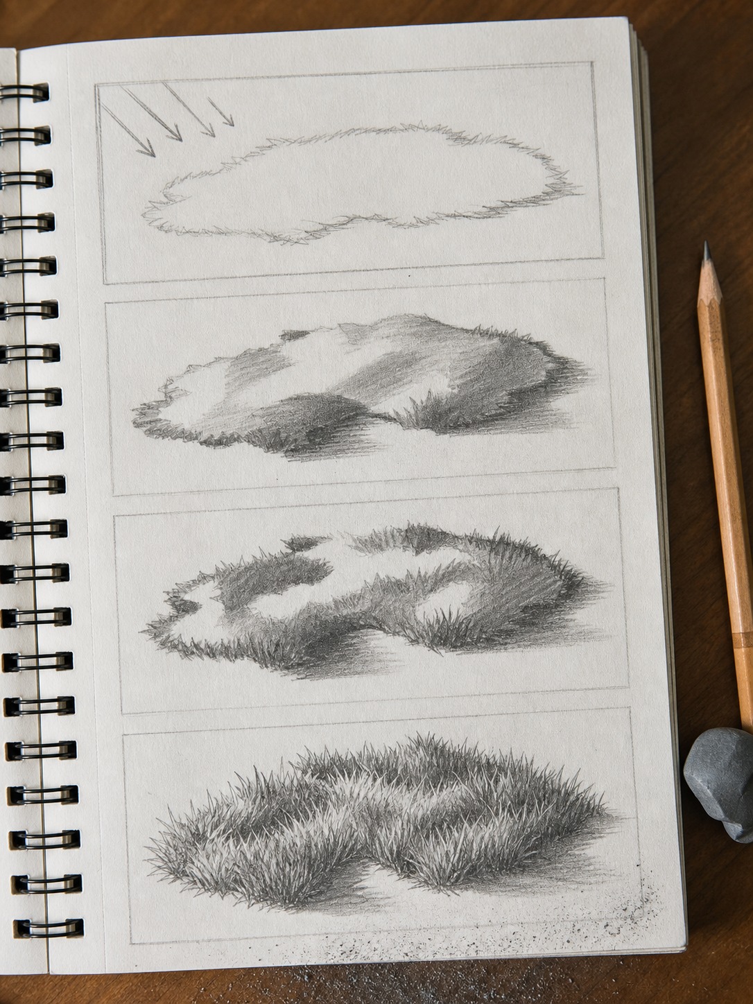
Before any texture, lightly sketch the overall silhouette of the grass patch as a rough, uneven shape – not a clean geometric outline, but not individual blades either. Decide where your light source is coming from right now, before you add a single mark, the same way you’d commit to a pose before blocking an animal’s mass. This single decision drives everything that follows: which side of the patch stays light, which side falls into shadow, and where the densest, darkest texture will eventually sit.
Step 2 – establish the value structure
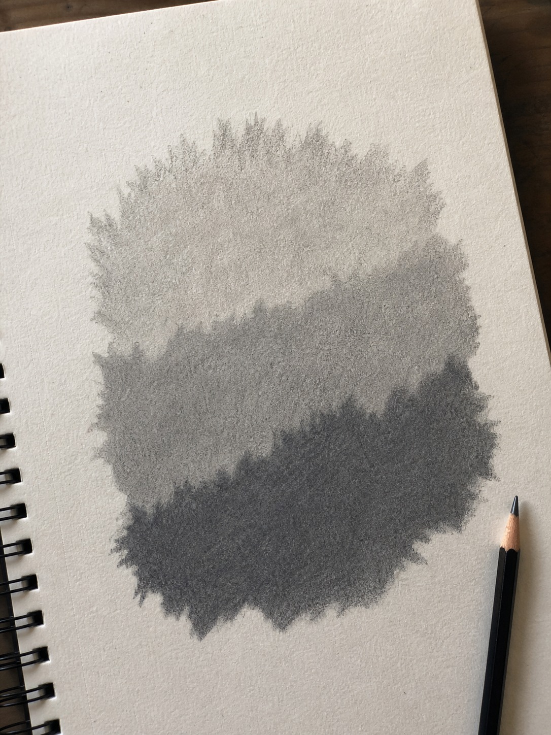
Working with the broadest tool you have (the side of a pencil, a light wash if you’re painting, a soft low-opacity brush digitally), block in two or three value zones across the mass: a lit patch, a mid-tone transition, and a shadowed patch. This should look almost abstract at this stage – closer to a rough tonal map than anything recognizable as grass. That’s correct. The texture strokes you add in Steps 3 and 4 are going to sit on top of this value structure, and if it’s wrong, no amount of careful blade-work fixes it afterward.
Step 3 – negative-space edges
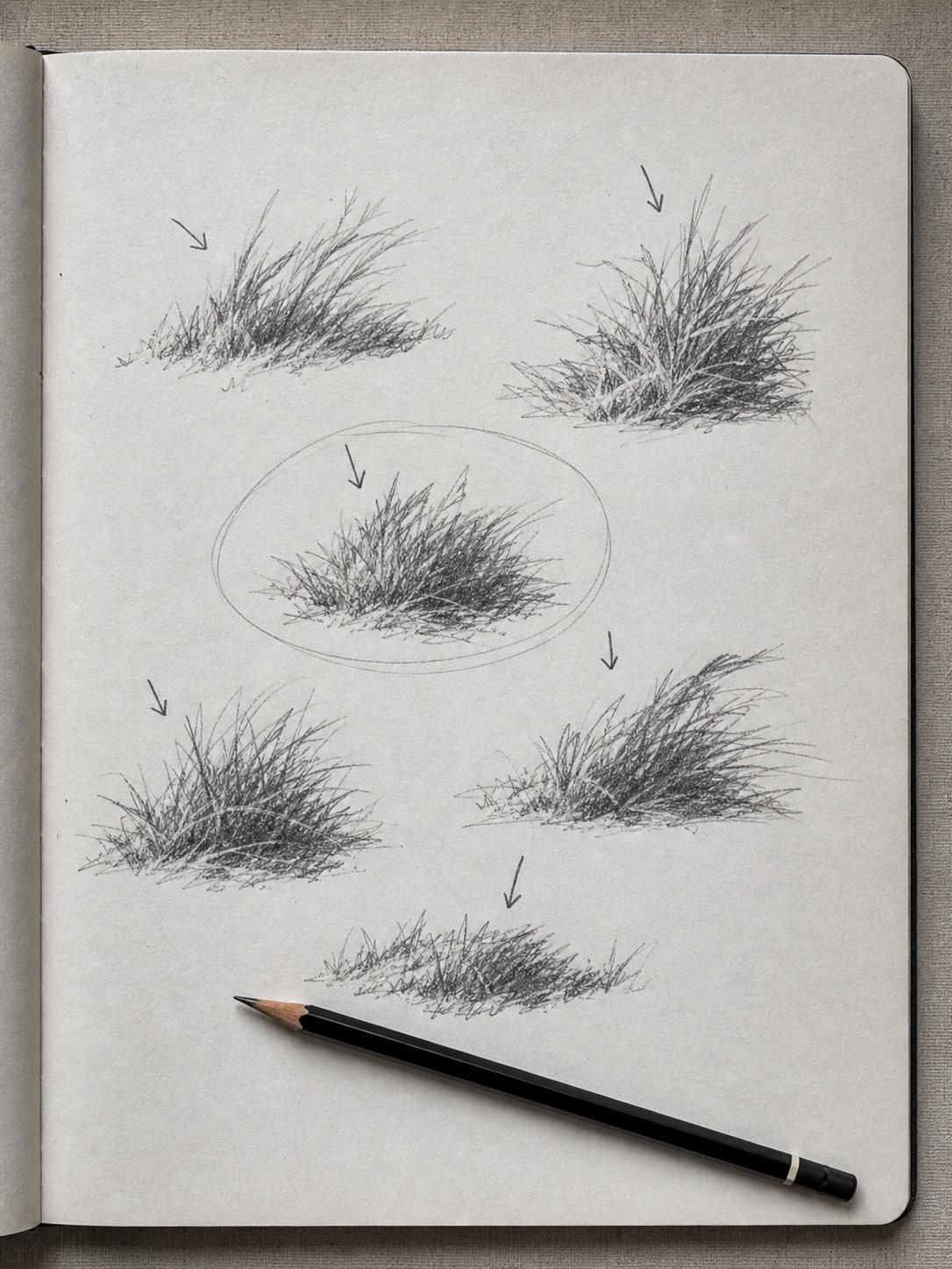
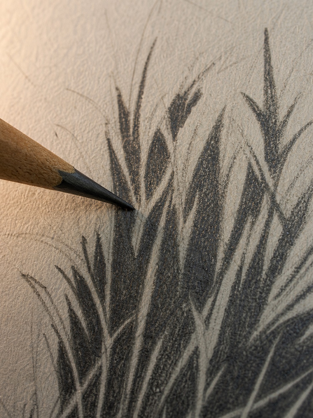
This is the technique Mike Sibley’s well-known grass tutorial is built around, and it’s worth understanding directly rather than just copying the result: instead of drawing individual blades as solid shapes, draw the dark gaps between where blades will be, leaving the paper (or a lighter value) untouched for the blades themselves. Your eye reads those negative shapes as grass blades even though you never actually drew a blade outline. It’s a genuinely counterintuitive technique the first time you try it, and it produces far more convincing edges than outlining blades directly – the irregular, overlapping negative shapes read as more naturally “grass-like” than any hand-drawn blade silhouette does.
Step 4 – directional texture strokes on top
Only now, with mass, value, and negative-space edges established, do you add actual directional strokes – short, varied-length marks following the grass’s general growth direction, concentrated more heavily in the shadowed zones from Step 2 and lighter in the lit zones. Vary the stroke length and angle; grass that all leans one exact direction at one exact length reads as a pattern, not a living surface. This is the step most tutorials start with, and it’s the reason their results look flat no matter how carefully the individual marks are drawn – there’s no value structure underneath for the texture to sit on.
TIP: Steps 1 and 2 take almost no time and produce something that doesn’t look like much on its own. It’s tempting to skip straight to Step 4 because that’s the part that finally looks like grass. Resist that. The fifteen seconds spent on mass and value in Steps 1 and 2 are doing more work than the several minutes you’ll spend on texture in Step 4.
Tall/wild grass vs. mowed lawn – different mark logic
The mass-first method from Section 2 applies to any grass, but the texture pass in Step 4 needs to look genuinely different depending on what kind of grass you’re actually drawing. Treating wild grass and a mowed lawn with the same marks is one of the more common reasons a drawing reads as generic “grass texture” rather than a specific, believable place.
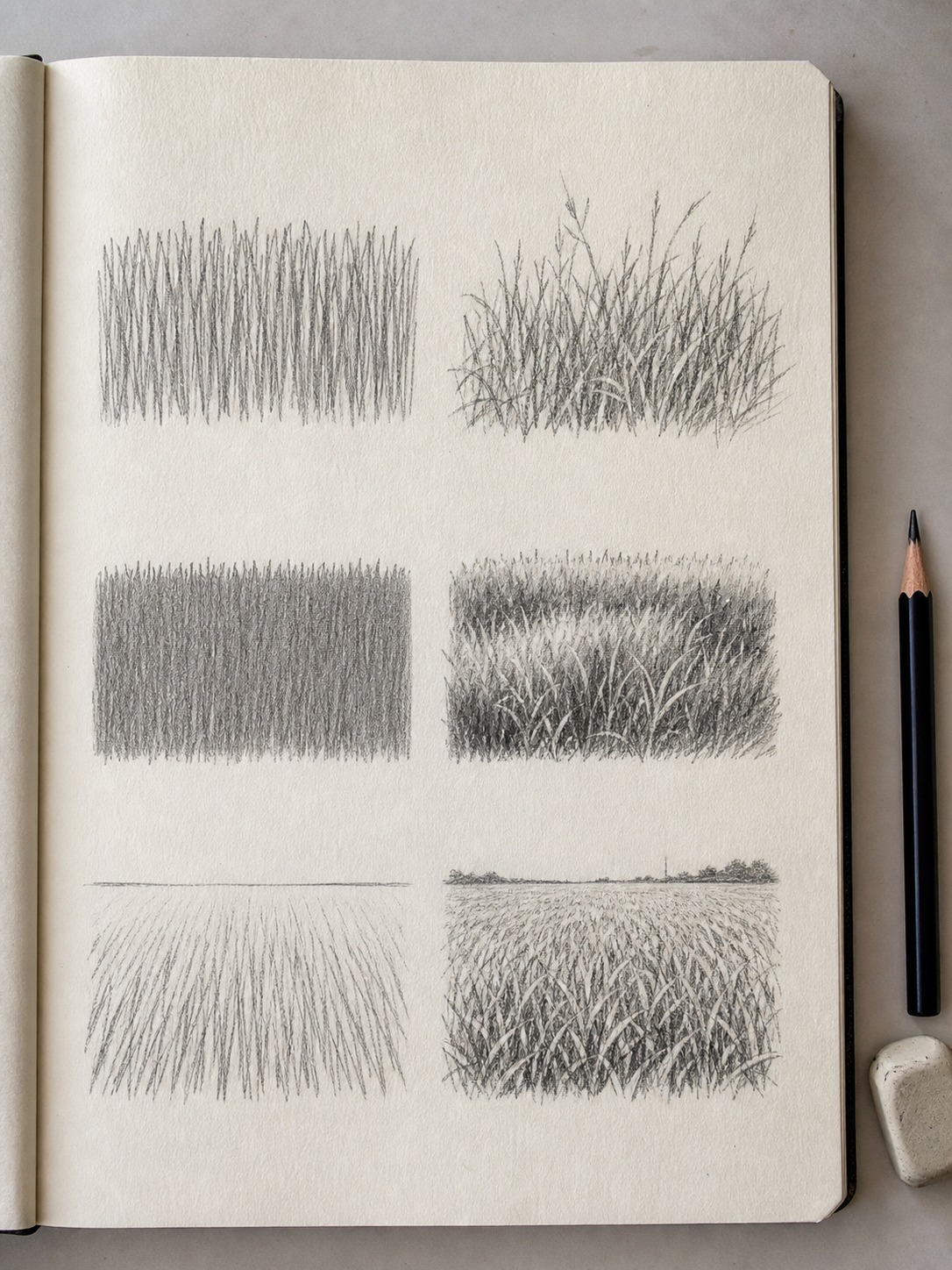
Wild grass – long sweeping strokes, varied height
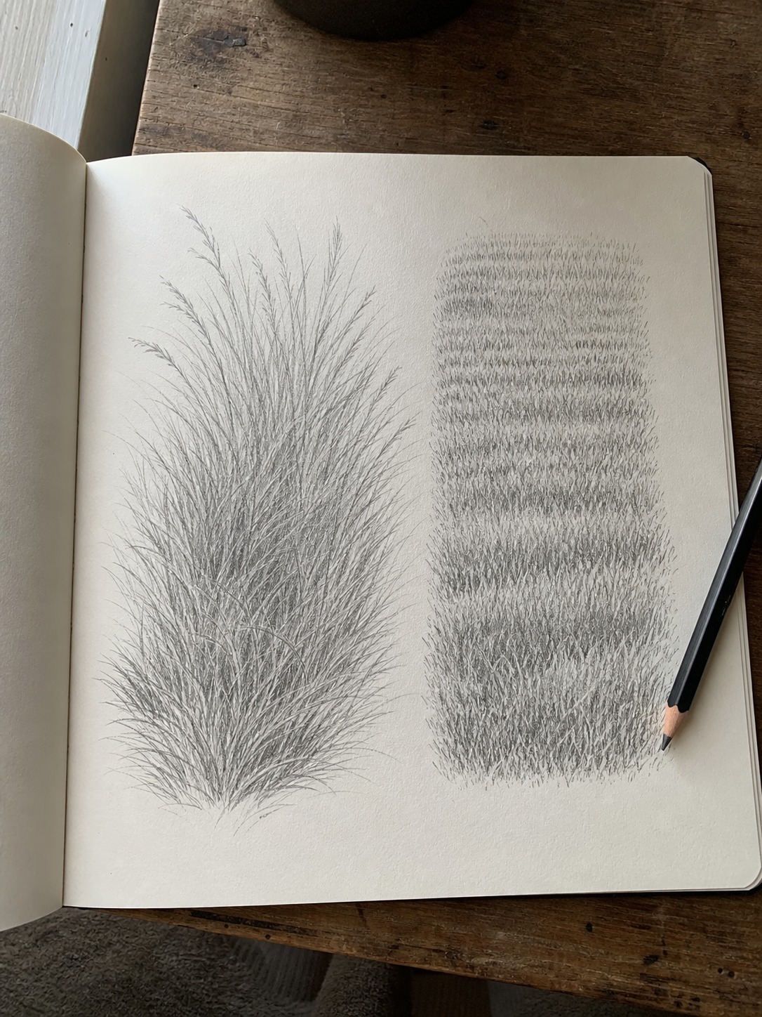
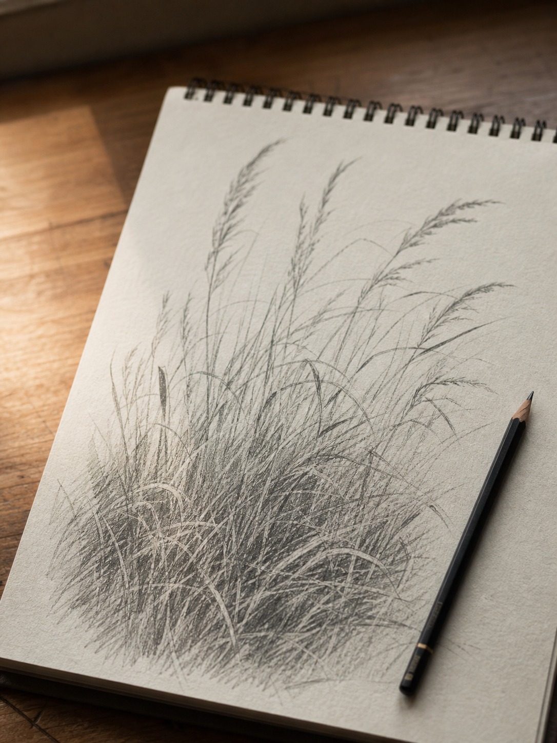
Wild or unmown grass grows at wildly inconsistent heights and bends under its own weight, especially anywhere near wind or foot traffic. Your directional strokes from Step 4 should be long, sweeping, and genuinely varied – some blades arcing almost horizontal, others standing nearly upright, with real gaps in height between neighboring clusters. I tend to work in loose bundles of three or four strokes radiating slightly outward from a shared base point, rather than single isolated lines, since real wild grass rarely grows as perfectly separated individual blades.
Mowed lawn – short, dense, uniform direction
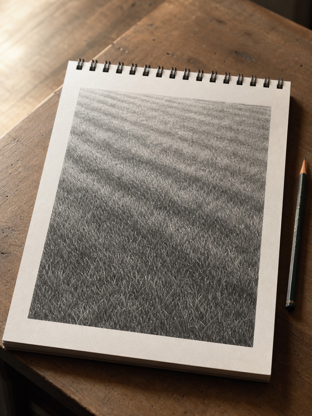
A mowed lawn is almost the opposite problem: short, dense, and much more uniform in both height and direction, since a mower enforces that consistency mechanically. Here the texture strokes should be short and close together, mostly following one dominant direction (mowers cut in passes, so real lawns often show faint directional banding if you look closely). The value structure from Step 2 still matters just as much – a mowed lawn isn’t flat green, it still has light and shadow zones – but the texture on top reads as considerably calmer and more controlled than wild grass’s loose, varied strokes.
Grass across mediums – pencil, colored pencil, digital
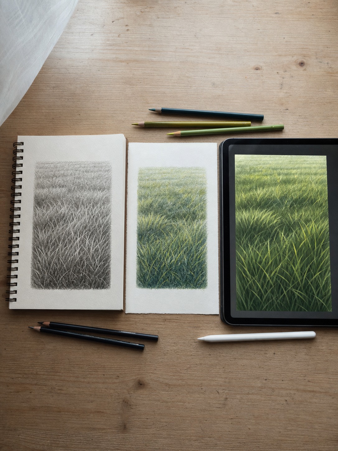
The mass-first method and negative-space technique stay identical no matter what tool is in your hand. What changes is how you execute Steps 2 and 4 with each medium’s specific strengths.
Graphite pencil approach
For the value structure in Step 2, use the side of a 2B pencil to lay down broad, soft tonal zones – this is faster and more even than trying to build value from small strokes this early.
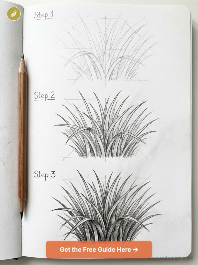
Switch to a sharper HB for the directional texture pass in Step 4, since you need controlled, varied line weight for individual grass strokes rather than the soft blocking tool from Step 2. Graphite is genuinely the easiest medium to learn the negative-space technique in, since erasing back into a mid-tone value to “carve out” blade shapes is more forgiving than trying to preserve negative space in ink or paint from the start.
Colored pencil layering
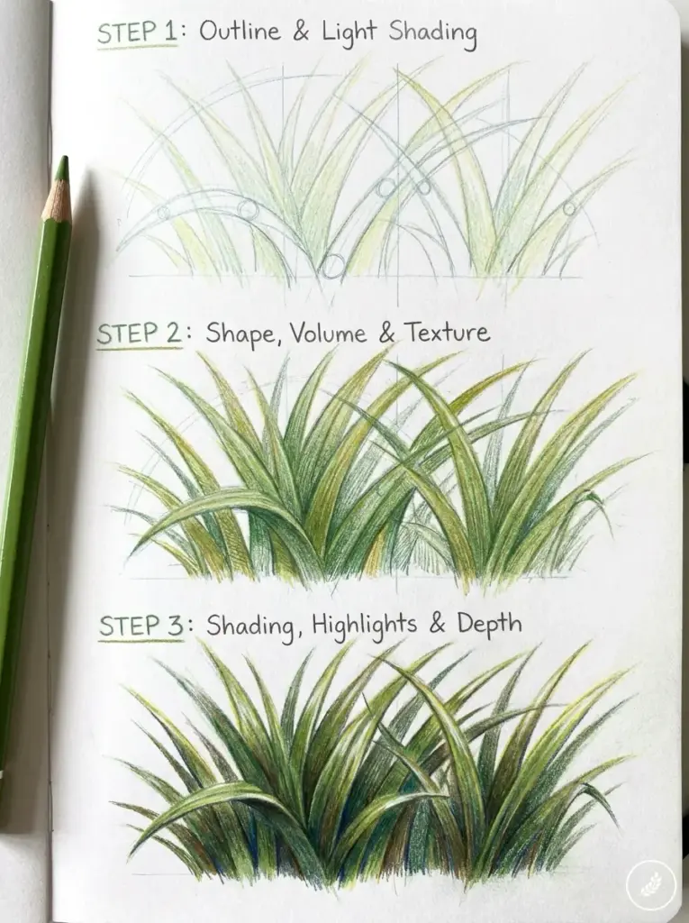
Colored pencil rewards patience in Step 2 more than any other medium here – build the value structure in thin, light layers of two or three greens (a cooler blue-green for shadow zones, a warmer yellow-green for lit zones) rather than pressing hard with one color immediately.
Heavy pressure too early locks in a flat, waxy layer that’s hard to build texture on top of convincingly. For Step 4, a darker green or brown for the deepest shadow strokes and a pale yellow-green or even white pencil for a few highlight strokes on top does more to sell realism than adding more green ever will.
Digital brush technique
Digital is the fastest medium for Steps 1 and 2 specifically – a soft, low-opacity round brush blocks value structure in seconds, and you can adjust it non-destructively before committing to texture.
For Step 4, use a scatter or dual-brush setting if your software supports it, with some rotation and size jitter enabled; grass texture brushes that stamp identical marks repeatedly are the digital equivalent of the uniform-height mistake, and they’re one of the fastest ways to make digital grass read as obviously brush-stamped rather than hand-observed. Turn the jitter settings up more than feels natural at first – real grass is messier than most default brush presets assume.
Common grass-drawing mistakes (and the fix)
This section maps almost directly onto what people are actually asking Google – “common mistakes when drawing grass” shows up as its own search. Here’s what I see most often, and the fix for each.
Uniform blade height and spacing
The mistake: every stroke in the texture pass is roughly the same length, spaced roughly the same distance apart, leaning the same direction. It happens because uniform marks are simply easier to draw consistently than varied ones – but that consistency is exactly what reads as artificial. The fix: deliberately vary length, spacing, and angle within the same patch. If you catch yourself falling into a rhythm where every third stroke looks identical to the one before it, break the pattern on purpose.
Flat, single-tone green
The mistake: coloring or shading the entire grass patch with one green value, skipping the value structure from Step 2 entirely. This is probably the single most common issue across every skill level – even people who execute individual blade strokes well often still flatten the whole patch to one tone. The fix: go back to Step 2 before touching texture again. A grass patch needs at least two or three distinct value zones underneath the texture, or the texture itself can’t do anything to save it.
Grass that ignores the ground plane
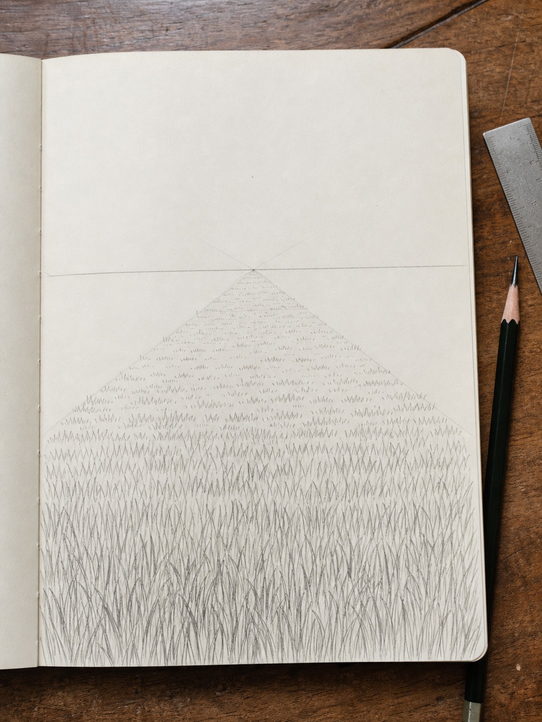
The mistake: texture strokes that don’t account for the actual angle and perspective of the ground they’re supposedly growing from – grass drawn as if viewed straight-on even when the rest of the scene is clearly at an angle or receding into distance. The fix: as the ground plane recedes toward a horizon or vanishing point, your grass strokes need to compress and flatten with it – shorter, denser, and more horizontal the further back they sit in the composition, exactly the way any other texture foreshortens with distance.
Drawing grass behind a subject
This comes up constantly and rarely gets addressed directly: how do you draw grass behind a cat, a person, a bench, anything that’s actually the subject of the piece, without the grass either disappearing into nothing or fighting the subject for attention?
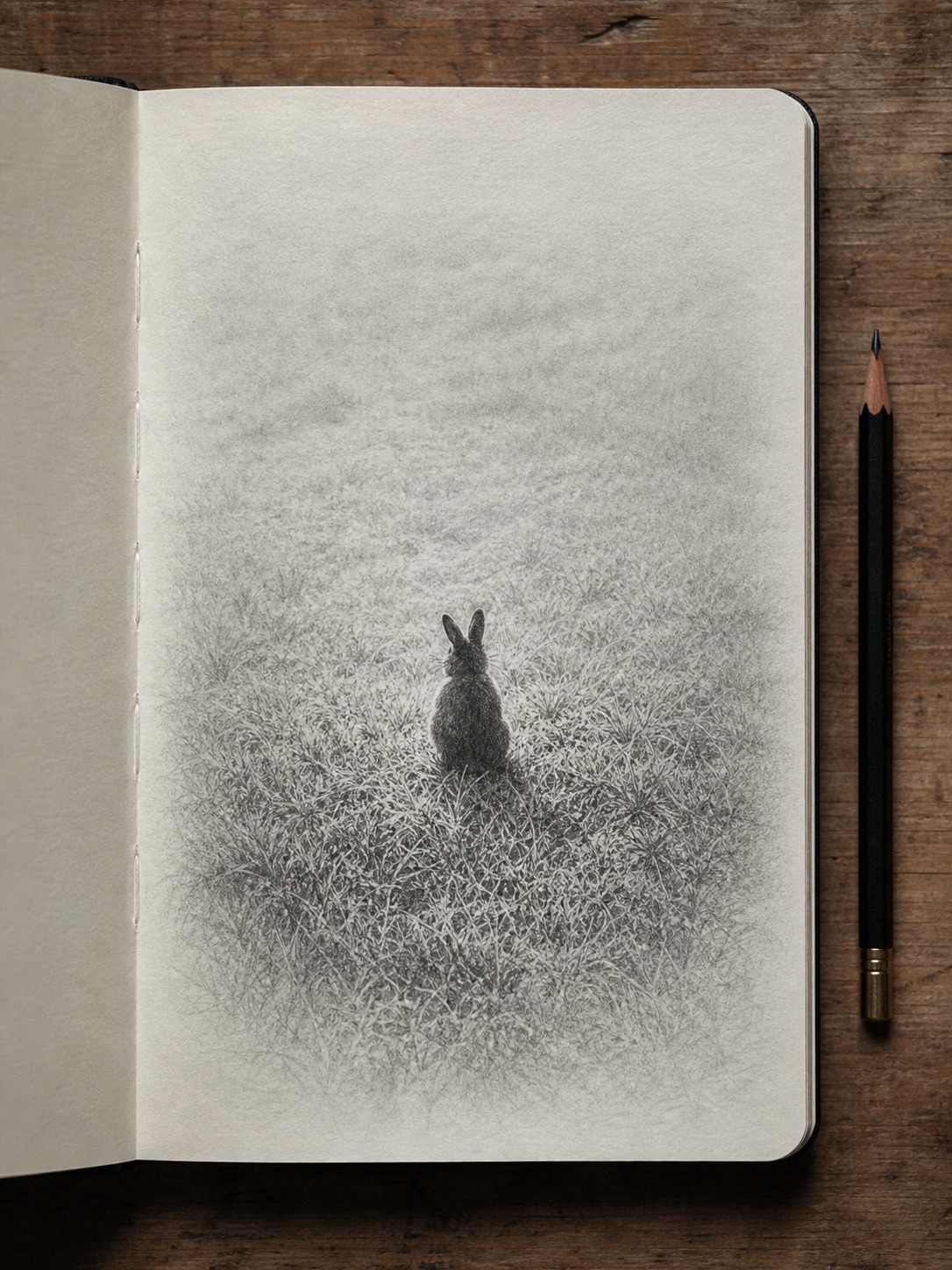
Foreground vs. background grass – how detail should drop off
The answer is the same value-and-detail logic that governs any background element, just applied specifically to grass. Grass closest to the viewer (or closest to your subject, if it’s sitting in the grass) gets the fullest treatment – full value structure, negative-space edges, varied directional texture. As grass recedes further from the subject and toward the background, every part of that process should simplify: less value contrast, less individual stroke variation, eventually dissolving into little more than a soft, textured value shape with barely any individual marks at all.
The mistake I see most often here is applying uniform detail everywhere – treating background grass exactly like foreground grass, which pulls the eye away from the actual subject and flattens the sense of depth in the whole piece. A subject sitting in grass should have crisp, detailed texture immediately around and slightly in front of it, with everything else receding in both value contrast and stroke specificity the further it sits from that focal point. This is really just atmospheric perspective applied at a small scale, and it solves the exact problem that gets asked about directly in forums and comment sections more than almost anything else in this guide.
Materials that actually matter
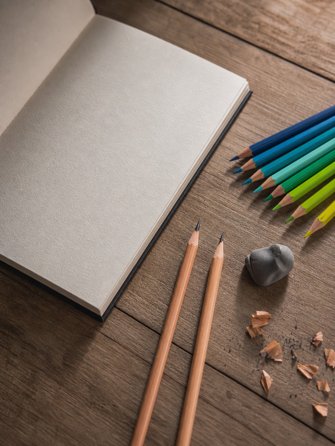
Fewer tools than you’d expect, but the range matters more than usual since this method depends on moving between a broad blocking tool and a fine detail tool within the same drawing.
Pencil grades and one colored-pencil set worth naming
For graphite work, a 2B covers the broad value-blocking in Step 2, and an HB handles the controlled directional texture in Step 4 – the same two-pencil approach that’s worked for the coconut husk texture in my coconut drawing guide and the fur shading in my bunny drawing guide. For colored pencil, I’d point beginners toward a set that includes at least two distinct greens (a cool blue-green and a warm yellow-green) rather than relying on a single “grass green” – real grass never reads convincingly from one pigment alone, and having the temperature range built into your pencil set from the start saves a lot of frustrated color-mixing later.
Final Thoughts
Mass and value first, marks last – that’s the whole method, and it’s the same principle that’s run through every drawing guide on this site so far: a rabbit’s gesture line before its outline, a coconut’s fiber direction before its shading, and now a grass patch’s value structure before a single blade stroke. Once that order is second nature, it stops being a grass-specific technique and starts being how you approach any textured surface.
Try blocking the value structure on your next drawing before adding a single texture stroke, even if it feels like you’re wasting time on something that barely looks like anything yet. That’s the step doing the real work.
Frequently Asked Questions
What’s the easiest way to draw grass?
Block a rough, uneven mass shape first and decide your light direction before drawing any texture. Add a simple value structure – a lit zone and a shadowed zone – then finish with short, varied directional strokes on top. Skipping straight to individual blade marks is actually the harder path, since there’s nothing underneath to guide where the strokes should go.
What are common mistakes when drawing grass?
The three biggest are uniform blade height and spacing (everything looks the same length and angle), flat single-tone green with no value structure underneath, and grass that ignores the ground plane’s perspective as it recedes into the distance. All three trace back to skipping the mass-and-value blocking stage and jumping straight to texture strokes.
How do you draw realistic grass with a pencil?
Use a 2B pencil on its side to block broad value zones first, then switch to a sharper HB for varied directional texture strokes. Try the negative-space technique for the edges – draw the dark gaps between where blades will sit rather than outlining the blades themselves; it produces more convincing, naturally irregular edges than direct blade-outlining.
How is drawing wild grass different from a mowed lawn?
Wild grass uses long, sweeping, genuinely varied strokes with real height differences between clusters, often in loose bundles of three or four radiating from a shared base. A mowed lawn uses short, dense, much more uniform strokes following one dominant direction, since a mower enforces that consistency mechanically. The underlying value structure stays the same for both – only the texture pass changes.
How do you draw grass with colored pencils?
Build value in thin, light layers using at least two greens – a cooler blue-green for shadow zones and a warmer yellow-green for lit zones – rather than pressing hard with one color immediately. Heavy early pressure locks in a flat, waxy layer that resists texture work later. Finish with darker strokes in the deepest shadows and a few pale yellow-green or white highlight strokes on top.
How do you draw grass behind a subject without it looking flat?
Apply full detail and value contrast only to the grass closest to your subject, then simplify progressively as the grass recedes into the background – less contrast, less stroke variation, eventually dissolving into a soft textured shape with barely any individual marks. Uniform detail everywhere flattens the sense of depth and pulls attention away from the actual subject.
What’s the negative-space technique for drawing grass?
Instead of drawing individual grass blades as solid outlined shapes, you draw the dark gaps between where the blades will sit, leaving the paper or a lighter value untouched for the blades themselves. Your eye reads those irregular negative shapes as grass blades even though no blade was ever directly outlined, which produces more naturally varied, convincing edges than hand-drawn blade silhouettes.
- 4.6Kshares
- Facebook0
- Pinterest4.6K
- Twitter6
- Reddit0