I still remember a life-drawing critique where our instructor stopped in front of a student’s rabbit sketch, tapped the page, and said: “This is two circles wearing ears.” He wasn’t being cruel. He was right. Most bunny drawings — mine included, for years — start and end with that same shortcut: one circle for the head, one bigger oval for the body, done.
- Why most bunny drawings look flat
- How to draw a bunny step by step (gesture to finished sketch)
- Realistic bunny vs. cute/kawaii bunny — same skeleton, different surface
- Common bunny-drawing mistakes (and the fix)
- Materials that actually matter for this drawing
- Drawing a bunny face close-up (when you don't need the full body)
- Why this proportion sense carries over to everything else you draw
- Frequently asked questions
- What's the easiest way to draw a bunny for beginners?
- How do you make a bunny drawing look realistic instead of cartoonish?
- What's the best way to draw bunny ears so they don't look flat?
- Do you need reference photos to draw a rabbit accurately?
- What pencil is best for a realistic bunny drawing?
- How is drawing a cute or kawaii bunny different from a realistic one?
- What's the most common mistake people make drawing rabbits?
The problem is a rabbit’s body doesn’t actually work that way. The spine curves. The hind legs sit higher and further back than people expect, built for that explosive kick-off. The ears aren’t flat ovals — they’re cartilage structures with real thickness and a subtle twist. Skip that, and you get a drawing that looks correct at a glance but reads as stiff the second you compare it to a photo.
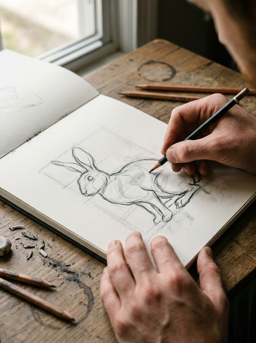
This guide walks through the same gesture-first method I’d use for any animal study, applied to a rabbit — realistic or kawaii, the skeleton underneath doesn’t change.
Why most bunny drawings look flat
Open any “how to draw a bunny” tutorial and you’ll see the same four steps: circle, oval, ears, done. It works, technically — you end up with something recognizably bunny-shaped. But hold that result next to a photo of an actual rabbit and the difference jumps out immediately. The template version has no weight to it. It could float.
The two-circle problem
Two circles describe an outline, not a structure. A rabbit isn’t a head-blob stuck to a body-blob — it’s a spine, a ribcage, a pelvis, and four limbs attached at specific points, all wrapped in fur that hides the mechanics but doesn’t erase them. When you skip straight to the outline, you’re drawing the silhouette of a rabbit without ever deciding where the actual animal is underneath it. That’s why so many bunny sketches look like they’re facing forward no matter which way you turn the page — there’s no committed pose driving the shape.
What rabbit anatomy actually does
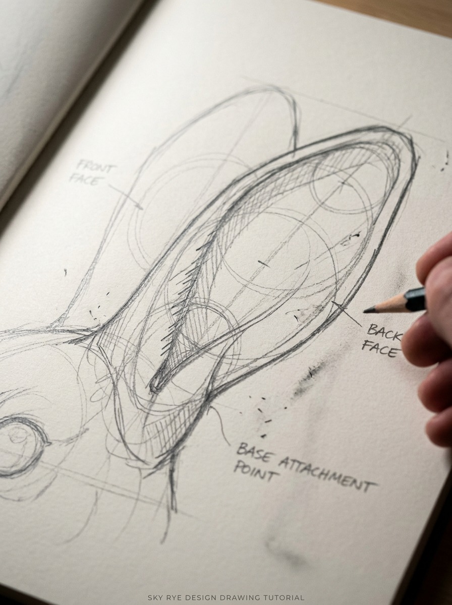
A few things matter more than people expect. First, the spine isn’t straight — it curves in a soft C or S depending on the pose, and that curve is what gives a crouching rabbit its coiled, ready-to-move feel. Second, the hind legs sit higher on the body than the front legs and fold into a compact zigzag when at rest, which is exactly what lets a rabbit launch forward so fast (I’ve sketched enough live rabbits at a local shelter’s open-drawing sessions to know this trips up almost everyone the first time). Third, the ears have real thickness. They’re not flat almond shapes glued to the skull — they’re cartilage cones with a front face, a back face, and a slight forward or backward tilt depending on the animal’s mood.
Get those three things roughly right in your construction lines, and the “cute” surface details you add later — fur texture, whiskers, a soft eye — will sit on top of something that actually holds up structurally.
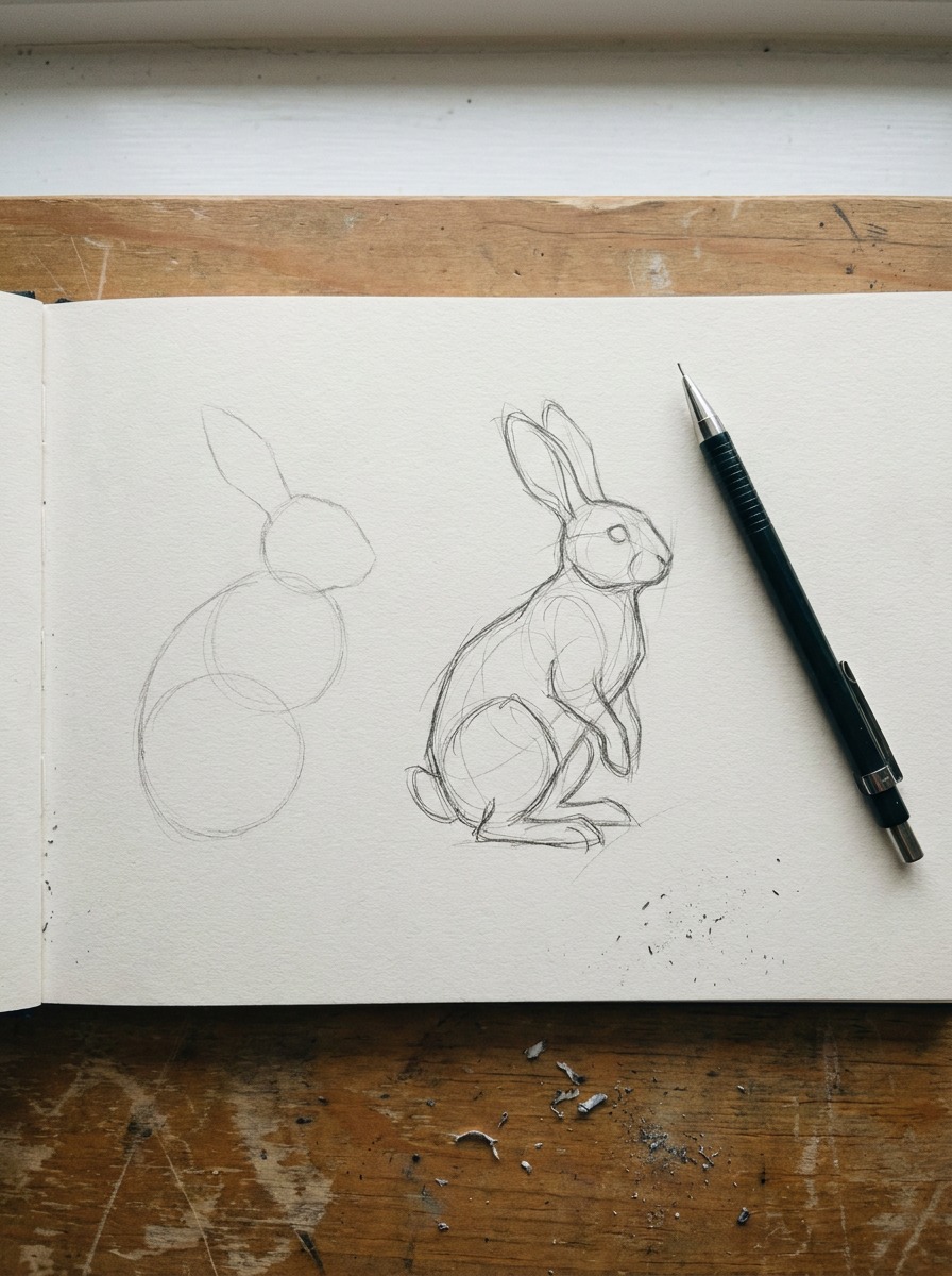
How to draw a bunny step by step (gesture to finished sketch)
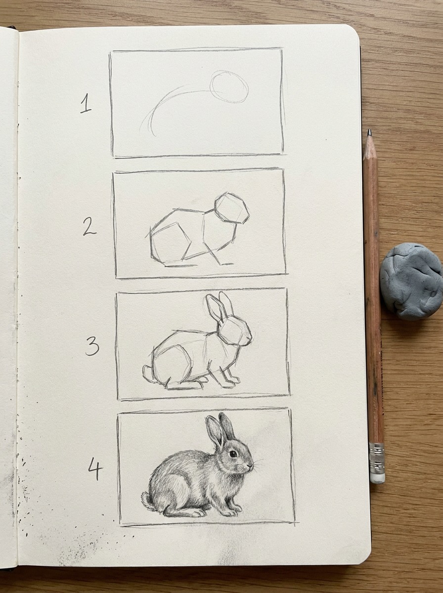
This is the part that actually replaces the two-circle method. Four steps, same order every time, whether you’re going for realistic fur or a stylized kawaii face later.
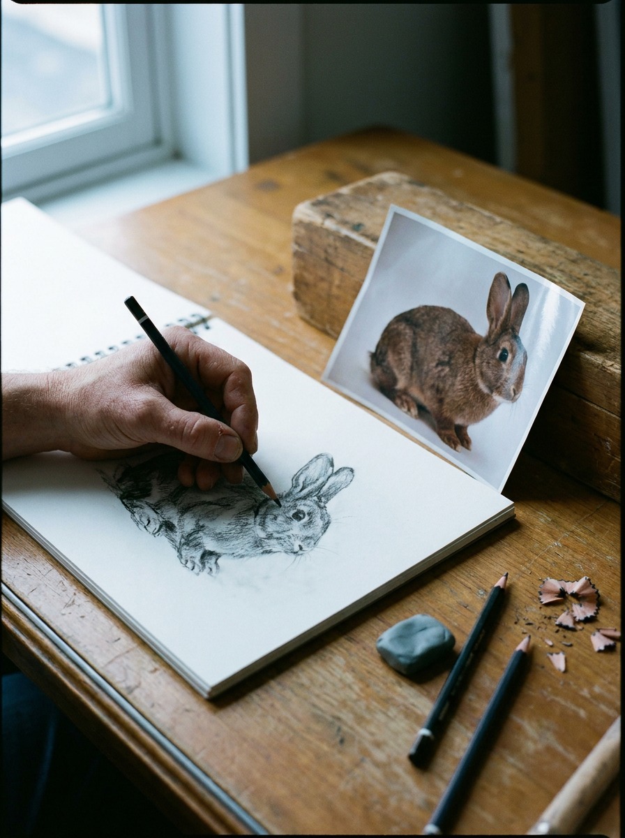
Step 1 — gesture line and pose
Before any shapes, draw one flowing line that captures the pose — think of it as the rabbit’s spine bending through space. Is it crouched and alert, mid-hop, or relaxed with legs tucked? That single line decides everything that follows, so spend more time here than feels necessary. I usually do five or six of these gesture lines fast, thirty seconds each, before picking the one with the most life in it. It’s the same warm-up I’d use sketching a car’s roofline before committing to a full side profile — you’re chasing movement first, accuracy second.
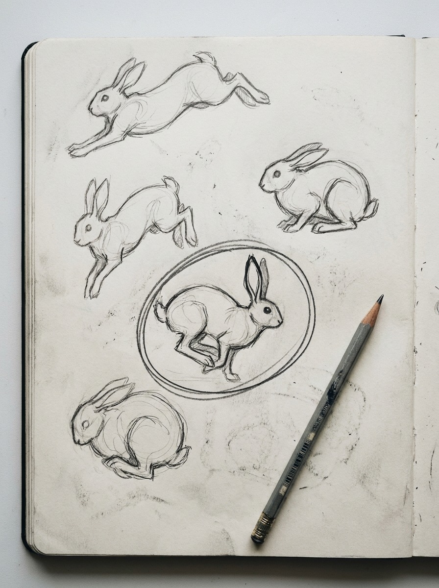
Step 2 — blocking the mass
Now hang three simple volumes off that gesture line: an egg-shaped mass for the ribcage (bigger, toward the front), a rounder mass for the hips (surprisingly large on a rabbit — that’s where the jump power lives), and a smaller sphere for the head. Don’t connect them smoothly yet. Let them overlap like three separate objects, because that’s closer to how the actual skeleton stacks together. This is where the two-circle method and this method really diverge — you’re building a body with depth, not tracing an outline.
Step 3 — ears, legs, and where they actually connect
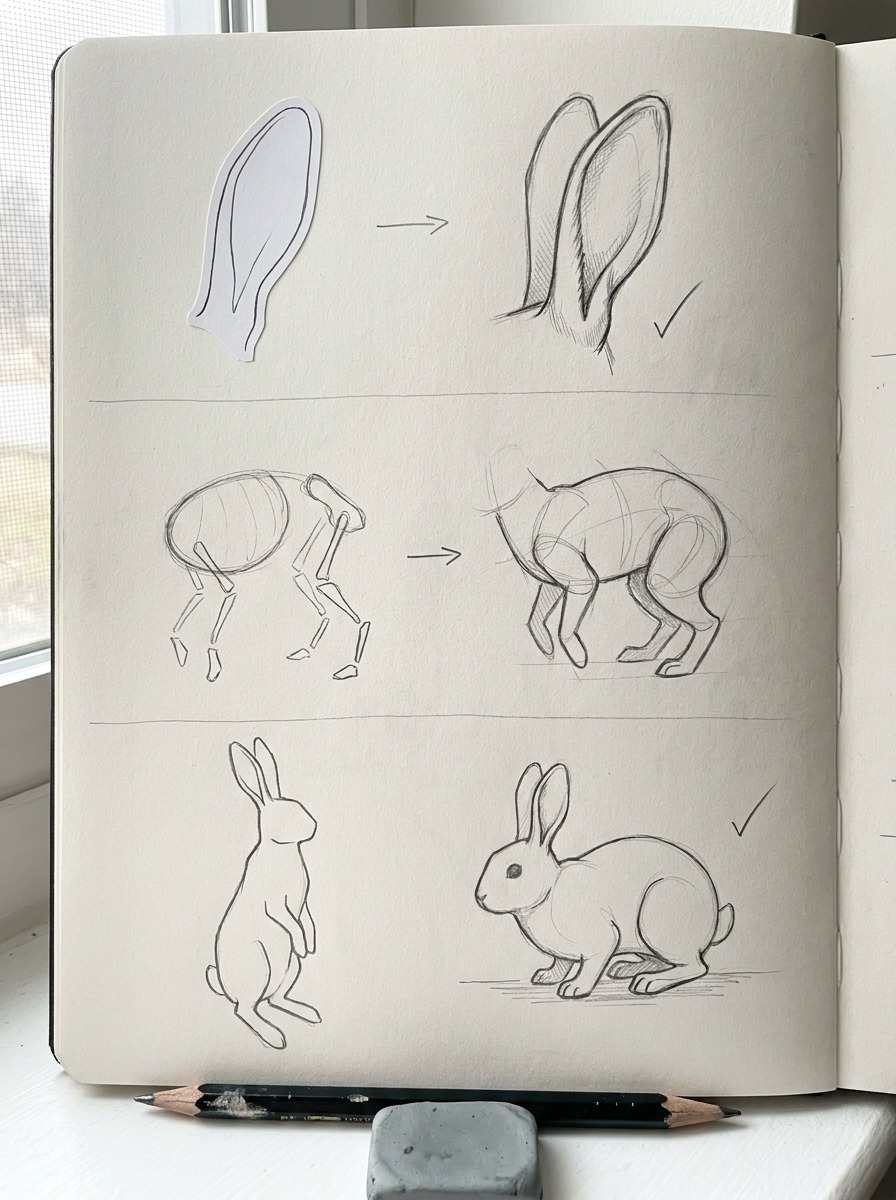
Legs first. The front legs attach near the top of the ribcage mass and are thin and straight when standing. The hind legs attach to the hip mass, and at rest they fold into that tucked zigzag shape — hip, knee, ankle, all stacked close together rather than stretched out. Get the attachment points right and the pose reads as stable instead of pasted-on.
Ears next. Draw them as cones, not flat shapes — give each one a front edge and a back edge, even if you’ll erase the back edge later. Angle them slightly forward if the rabbit looks alert, back and to the sides if it’s relaxed. That small tilt does more to convey mood than anything you’ll add in the detail pass.
Step 4 — contour, fur direction, and shading
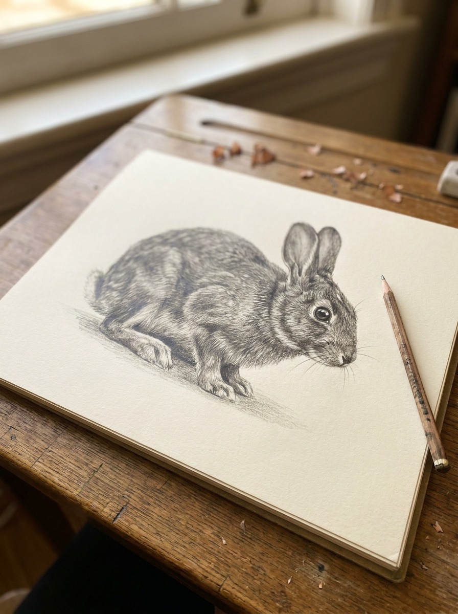
Only now do you clean up the construction lines into a confident final contour. When you shade, work with the fur’s growth direction rather than against it — fur generally flows from the spine outward and down the legs, with a slight upward sweep around the cheeks and chest. A 2B pencil for the base tone and a sharper HB for individual fur strokes at the edges (ears, chin, paw tips) gives you contrast without overworking the whole drawing. Leave the eye’s catchlight untouched — it’s a small thing, but it’s what makes the drawing feel alive instead of taxidermied.
Tip: Resist the urge to add fur texture everywhere evenly. Real fur reads as fur because of where the detail concentrates — edges, joints, the chest — not because every square inch is scribbled over.
Realistic bunny vs. cute/kawaii bunny — same skeleton, different surface
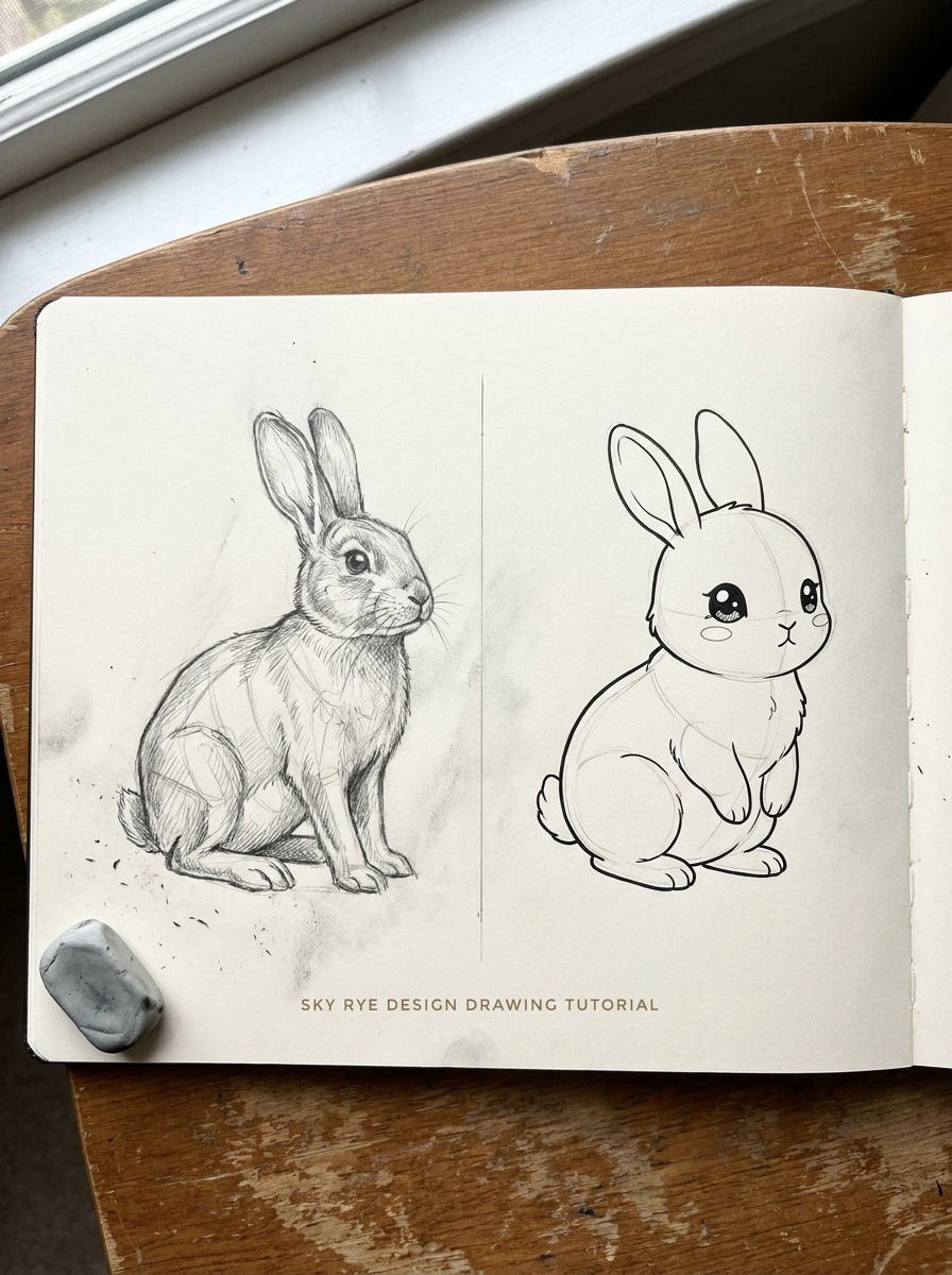
Once the gesture-and-mass method clicks, something useful happens: you can push the same underlying structure toward completely different finished styles without starting over. This is where a lot of tutorials quietly split into two separate audiences — realistic drawers and kawaii/cute drawers — as if they need different skills. They don’t. They need the same skeleton, dressed differently.
What changes when you go kawaii
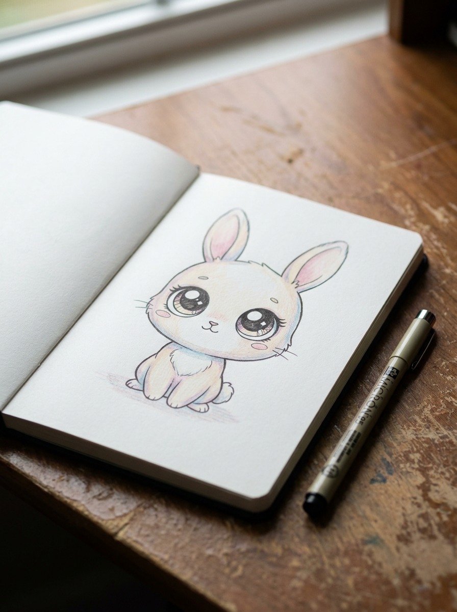
Proportion shifts are the whole game here. Shrink the ribcage-and-hip masses relative to the head, and you’re already halfway to a kawaii bunny — that oversized-head, undersized-body ratio is what reads as “cute” to most people, and it’s the same trick that makes puppies and human toddlers look adorable (there’s actual proportion psychology behind it, not just style preference). Push the eyes larger and lower on the face, simplify the ear cartilage detail into a clean, thick outline instead of the layered front/back structure, and flatten the line weight so everything reads as smooth and rounded rather than textured. I use a fine-liner instead of a pencil for this pass, since kawaii work lives or dies on clean, confident line weight — hesitant lines undercut the whole style.
What stays the same
The gesture line. The three mass shapes. The leg attachment points. Every one of those decisions from Section 2 still applies — you’re just rendering the surface differently on top of them. This is honestly the part that surprised me most when I started teaching this method: students who’d been stuck drawing stiff, front-facing kawaii bunnies for months would suddenly get dynamic poses the moment they added a real gesture line underneath, even though nothing about the “cute” style itself changed. The pose problem was never a style problem. It was a construction problem.
Try this: take one gesture-and-mass sketch and render it twice — once with realistic proportions and fur shading, once pushed toward kawaii with the head enlarged and details simplified. Same bones, two completely different finished drawings.
Common bunny-drawing mistakes (and the fix)
Even with the gesture-and-mass method, a few habits sneak back in from years of drawing the template way. Here’s what I see most often when I look over student sketches, and the quick fix for each.
Flat, pancake ears
The mistake: drawing ears as a single flat shape, like two almond-shaped stickers pasted on the head. It happens because the template method never asks you to think about ear thickness in the first place. The fix: always draw the front face and back face of the ear as two slightly offset lines, even if you erase the back edge later. That tiny gap is what your brain reads as “this has volume,” and it takes about two extra seconds per ear.
Legs that don’t connect to a ribcage
The mistake: legs drawn as separate sticks tacked onto the bottom of the body shape, with no sense of where they actually attach to bone. You’ll see this most on the front legs, which often float slightly away from the ribcage instead of emerging from it. The fix: go back to Step 3 and check your attachment points before you refine anything. If a leg looks disconnected in the construction phase, it will look disconnected in the finished drawing — no amount of shading fixes a structural gap.
No weight in the pose
The mistake: a rabbit that looks like it’s floating rather than sitting, crouching, or mid-hop. This almost always traces back to skipping the gesture line in Step 1 and jumping straight to shapes. A gesture-free sketch has no decision behind it about where the weight sits, so it reads as neutral and lifeless by default. The fix is the least fun one: if the final drawing feels stiff, the problem isn’t in the details you’re tempted to fix — it’s back in step one, and the gesture line needs redoing.
Materials that actually matter for this drawing
You don’t need a full graphite set to draw a good rabbit. You need three pencils and one habit worth building.
Pencil grades for gesture vs. detail work
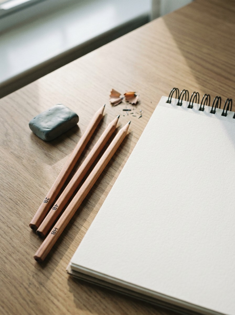
For the gesture line and mass blocking in Steps 1 and 2, grab a soft pencil — a 2B or 4B. You want it to glide with minimal pressure, because gesture drawing is fast and loose by design; a hard pencil forces you to press harder, which locks your hand and kills the fluid line you’re after. Switch to an HB for Step 3, where you’re refining leg attachments and ear structure and actually need control. Save a sharpened 2B for the final shading pass in Step 4 — it gives you rich, dark tones for the shadow areas without the waxy build-up you get from pressing a hard pencil too hard trying to get the same darkness.
One sketchbook worth naming
I’ve gone through a lot of sketchbooks over the years, and the one I keep coming back to for animal studies is a mixed-media pad with at least 98lb paper — anything lighter and the paper buckles under repeated erasing, which happens constantly when you’re hunting for the right gesture line. A spiral-bound pad also matters more than people expect; it lets the page lie flat while you work at that overhead angle from the reference photos.
If you haven’t settled on your pencil kit yet, I go through the full breakdown of grades and use cases in my pencil drawing ideas guide — worth a look before you invest in a full set you don’t need.
Drawing a bunny face close-up (when you don’t need the full body)
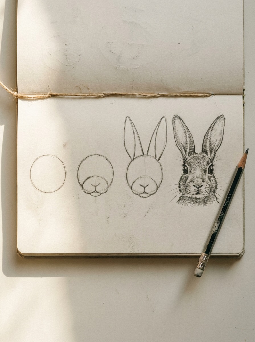
Sometimes you don’t need the full construction sequence — a bunny face on its own, for a card, a sticker sheet, or just a quick warm-up sketch. The good news: the same logic scales down cleanly, minus the ribcage-and-hip masses.
Simplified head construction
Start with one circle for the skull, then drop a slightly smaller oval below and overlapping it for the muzzle — not centered, but sitting a touch lower and forward, the way a rabbit’s actual face structure works. This is the one place where the “two shapes” method genuinely holds up, because a head-only drawing doesn’t need the full skeleton logic to read correctly. Add the ears using the same cone-with-front-and-back-face approach from Step 3 — that detail matters just as much here, since the ears are doing most of the visual work when there’s no body to balance them.
Where beginners overcomplicate it
The mistake I see constantly with face-only sketches is over-detailing the eyes before the proportions are locked. People jump straight to eyelashes and catchlights on a skull shape that’s still wrong, then wonder why the whole face feels off no matter how much they polish the eye. Lock the muzzle position and ear angle first — genuinely, get those two things right before you touch the eyes at all. The eyes are maybe 10% of what makes a bunny face convincing; the muzzle-to-skull relationship is closer to 60%.
One more thing worth knowing: a face-only bunny reads as more “kawaii” by default, simply because removing the body strips out most of the anatomical cues that signal realism. If you’re going for a genuinely realistic face study rather than a cute character sketch, keep a faint suggestion of the neck and shoulder line at the bottom of the frame — it anchors the head to a body the viewer’s brain fills in automatically, and it’s the difference between “study” and “sticker.”
Why this proportion sense carries over to everything else you draw
Here’s the part I didn’t expect when I started teaching gesture-and-mass construction: it’s not really a rabbit-drawing technique. It’s the same logic I used studying surface language on the Jaguar F-Pace project — read the mass and volume first, decide where the weight sits, and only then start refining the surface detail on top of it. A rabbit’s ribcage-and-hip relationship isn’t so different from thinking through where a car’s cabin volume sits relative to its wheelbase before you ever touch a crease line.
That’s not a stretch or a forced metaphor. It’s the actual habit: block the big decisions first, commit to them, then let every smaller detail — fur direction, an ear’s tilt, a headlight’s angle — answer to a structure that’s already settled. Skip that order and you’re polishing details on top of an undecided foundation, which is exactly what a flat, two-circle bunny is doing wrong.
So if you finish this and the rabbit still isn’t quite working, don’t reach for a better eraser or a finer pencil. Go back to the gesture line. That’s true for a rabbit, and it’s true for basically anything else you’ll ever draw.
Frequently asked questions
What’s the easiest way to draw a bunny for beginners?
Skip straight to the two-circle method if you just want something quick, but if you want it to actually look right, start with a single gesture line for the pose, then block three overlapping shapes for the ribcage, hips, and head. It takes maybe thirty extra seconds and it’s the difference between a bunny that looks alive and one that looks pasted onto the page. Beginners who add this one step see the biggest jump in quality of anything in this guide.
How do you make a bunny drawing look realistic instead of cartoonish?
Keep the proportions closer to true anatomy — smaller head relative to the body, hind legs sitting higher and further back, ears built with visible thickness rather than flat shapes. Shade with the fur’s actual growth direction, concentrating detail at the edges, joints, and chest rather than spreading it evenly. Realism comes from proportion and construction choices, not from adding more lines.
What’s the best way to draw bunny ears so they don’t look flat?
Draw each ear as a cone with a front face and a back face, even if you erase the back edge in the final pass. That small offset is what reads as three-dimensional volume instead of a flat sticker shape. Angling the ears slightly forward or back also does a lot of work for conveying mood — forward for alert, back and to the sides for relaxed.
Do you need reference photos to draw a rabbit accurately?
They help, especially for leg attachment points and ear angle, but they’re not required if you understand the underlying construction — gesture line, three mass shapes, then detail. Keep one or two reference photos open while you work through the four-step sequence the first few times, just to check your proportions against something real before you’re doing it from memory.
What pencil is best for a realistic bunny drawing?
A 2B or 4B for the loose gesture and mass-blocking stages, an HB when you switch to refining leg attachments and ear structure, and a sharpened 2B for the final shading pass. Three pencils cover the whole process — you don’t need a full graphite set for this.
How is drawing a cute or kawaii bunny different from a realistic one?
The skeleton underneath doesn’t change — same gesture line, same three mass shapes. What shifts is proportion and surface treatment: enlarge the head relative to the body, push the eyes bigger and lower, simplify the ear structure into a clean outline, and flatten the line weight. It’s a rendering choice on top of the same construction, not a separate skill.
What’s the most common mistake people make drawing rabbits?
Skipping the gesture line and jumping straight to shapes. Without it, there’s no decision made about where the rabbit’s weight sits, so the finished drawing reads as stiff or floating no matter how much detail gets added afterward. If a finished sketch still feels off, the fix is almost always back at step one, not in the shading.
- 929shares
- Facebook0
- Pinterest926
- Twitter3
- Reddit0