I remember a still-life session years ago where half the class was rendering a coconut for the first time, and almost everyone reached for the same shortcut: draw an oval, scratch in a few curved lines for “texture,” done. The results looked like rocks. Smooth, egg-shaped rocks with some scribbles on them — nothing like the actual object sitting on the table in front of us.
- Why most coconut drawings look flat
- How to draw a coconut step by step
- Rendering the husk — a coir texture study
- Coconut cross-section — what's inside
- Drawing a coconut drink (the simple version)
- Drawing a coconut palm — the quick version
- Materials that actually matter for this drawing
- Final Thoughts
- Frequently Asked Questions
- What's the easiest way to draw a coconut?
- How do you draw a realistic coconut husk texture?
- What's inside a coconut when you draw a cross-section?
- How do you draw a coconut palm tree quickly?
- What's the best pencil for texture work like a coconut husk?
- How do you draw a simple coconut drink?
- What's the difference between a young green coconut and a mature one?
A coconut’s husk isn’t a texture you can fake with a few random lines. It’s fibrous, coir material that grows in a specific direction, with real depth between the ridges. Skip that, and the rest of the drawing doesn’t matter — flat proportions with good shading still read as flat if the surface itself is wrong.
This guide covers the actual coconut fruit — husk texture, the three eyes at the base, even a cross-section — plus a simplified coconut-drink version and a quick palm tree companion sketch. The husk-rendering method is the part that’ll actually change how your drawing looks.
Why most coconut drawings look flat
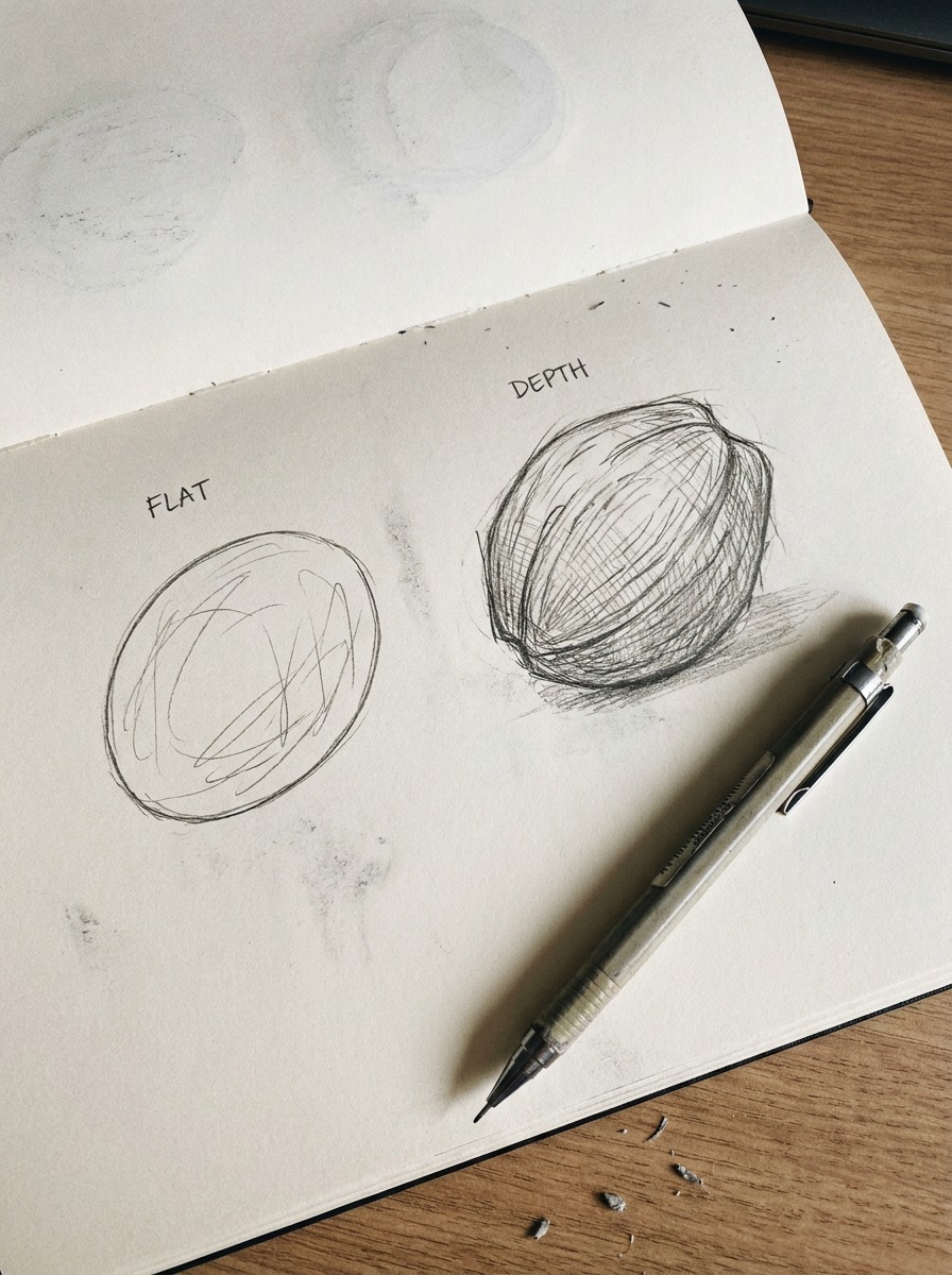
Search “how to draw a coconut” and you’ll get the same result over and over: an oval, a handful of curved scribble-marks, maybe a couple of dots for the eyes. It’s fast, it’s beginner-friendly, and it produces something that reads as “vaguely coconut-shaped” — which is exactly the problem.
The oval-and-scribble problem
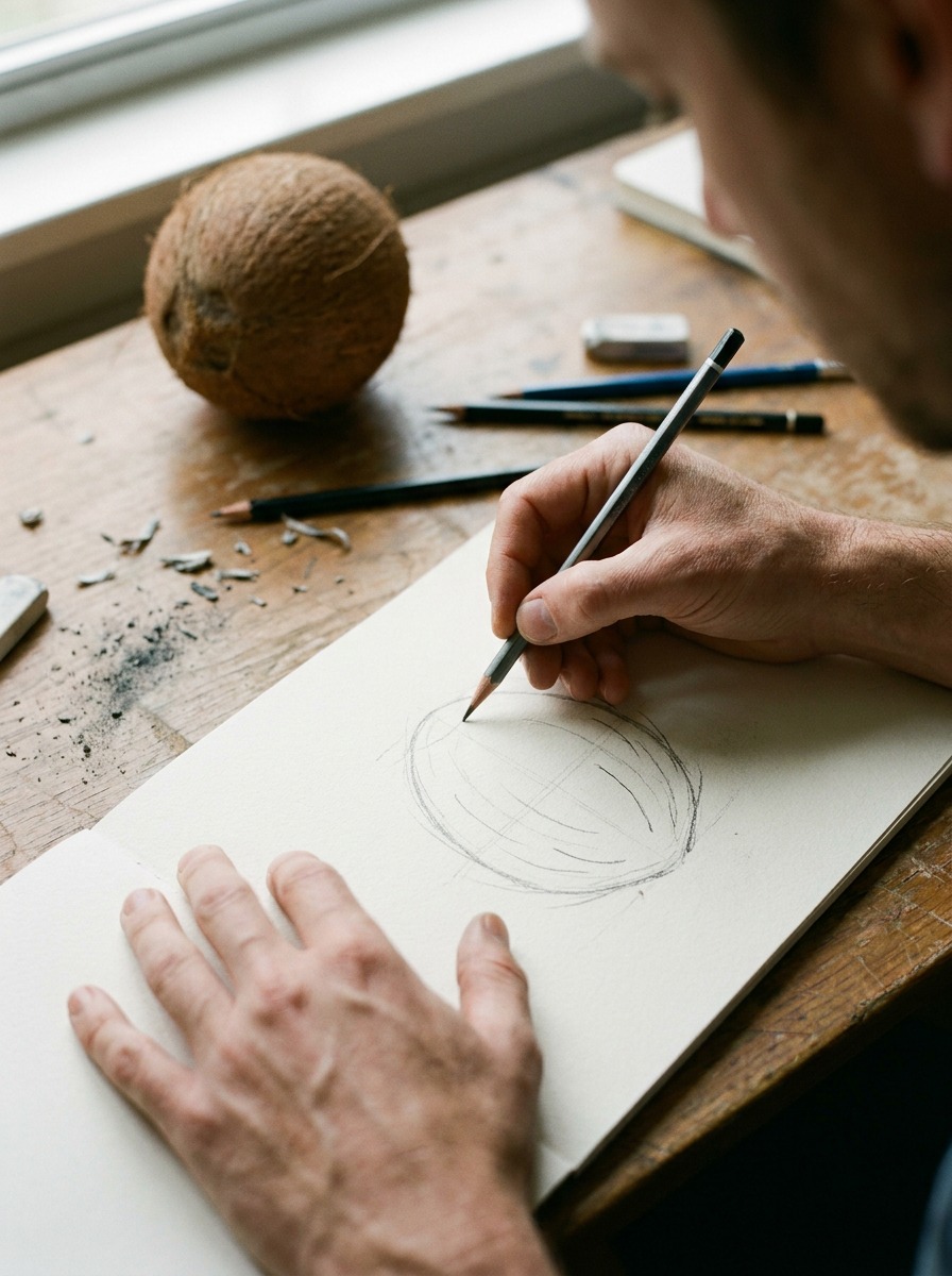
An oval with random texture marks is describing a shape, not a material. The scribbles don’t follow any logic — they’re just filler, the same way a two-circle bunny sketch is just an outline with nothing underneath it. Your eye can tell the difference between “texture drawn to look busy” and “texture drawn because that’s actually how the fibers lie,” even if you can’t immediately say why. That gap is almost always what separates a coconut drawing that reads as flat from one that reads as real.
What a coconut’s surface actually does
A husked coconut’s coir fibers run roughly lengthwise, from the stem end down toward the base, though they twist and cross rather than lying perfectly parallel — closer to loosely woven rope than straight hatching. The base has three small, slightly recessed marks called the eyes (one is usually softer and easier to pierce than the other two, which is actually how you’d open one). And the overall form isn’t a true oval — it’s slightly asymmetrical, a little flatter on one side, with a subtle taper toward the base where the eyes sit.
Get the fiber direction and that asymmetry roughly right, and the texture work you add afterward has something real to sit on top of.
How to draw a coconut step by step
Four steps, same order every time — this is the sequence that actually replaces the oval-and-scribble method.
Step 1 — basic form and proportion
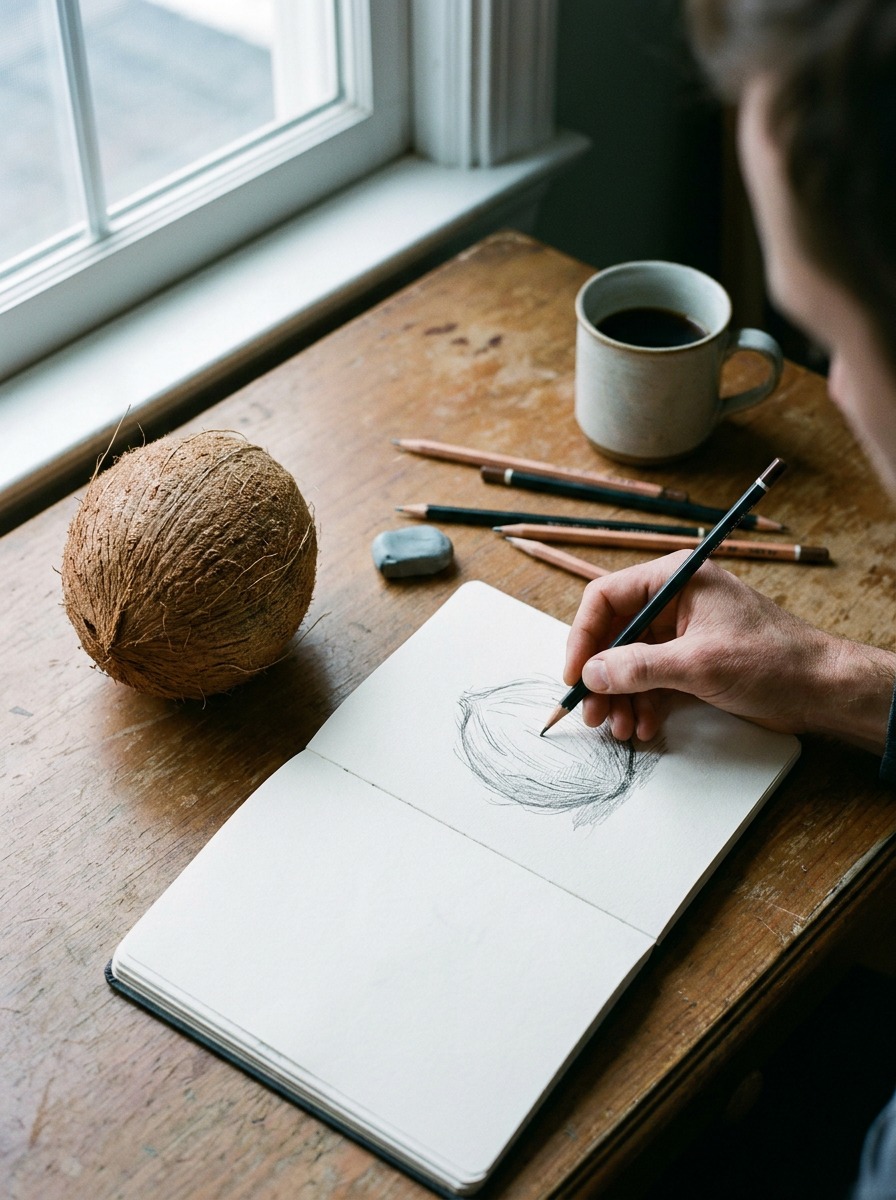
Start with a rough egg shape, but resist making it a true oval. Flatten one side slightly and taper the bottom a touch more than the top — that small asymmetry is most of what separates a real coconut silhouette from a generic egg shape. If you’re working from a reference photo (and you should be, at least for your first few attempts), spend a moment just looking at where the widest point actually sits before you commit to the outline. It’s usually a little higher than people expect, closer to the upper third than dead center.
Step 2 — placing the eyes and base
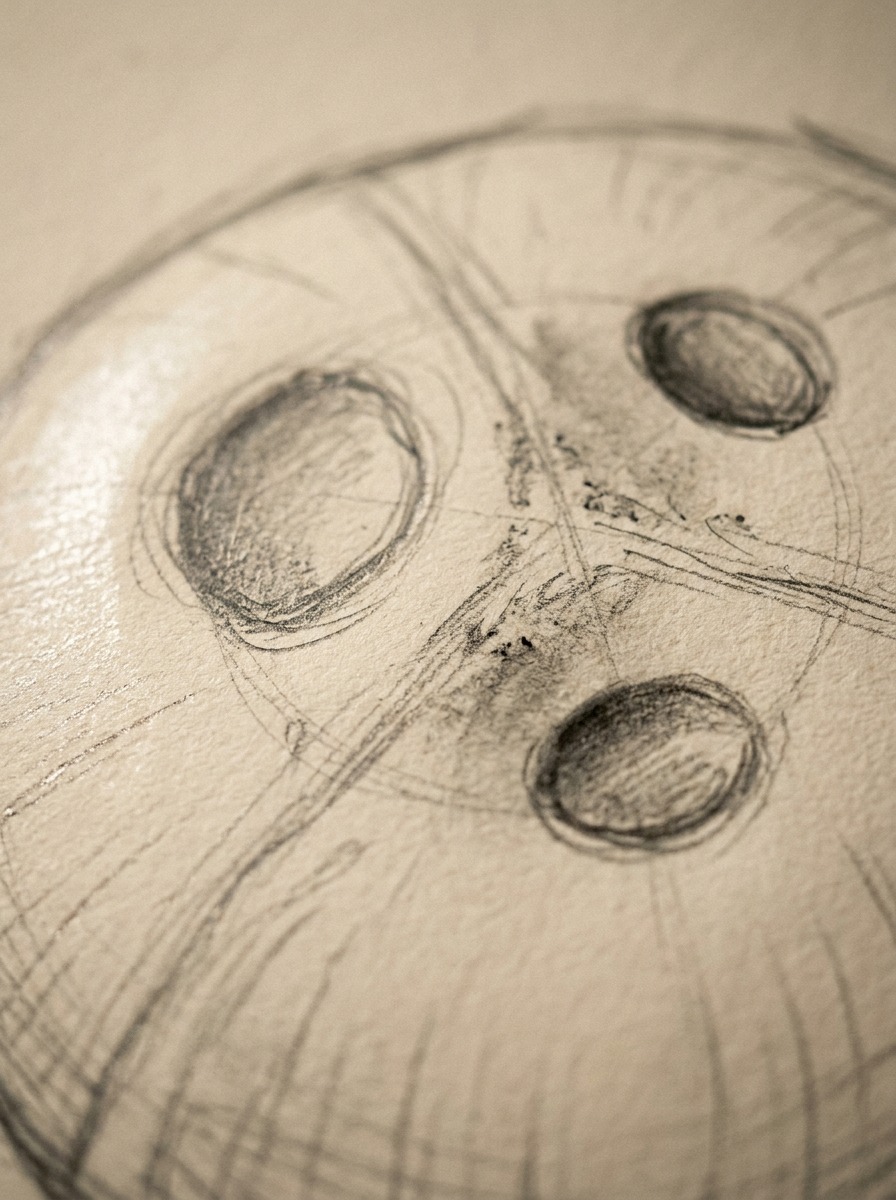
At the narrower end, mark three small circles close together — the eyes. They’re not evenly spaced or identical in size; one is typically a bit larger and softer-looking than the other two. This is a small detail, but it’s one of the fastest ways to make a coconut read as observed rather than invented, the same way getting a rabbit’s ear thickness right does more work than any amount of fur shading. Skip this step and even a well-shaded coconut can end up looking like a generic brown ball.
Step 3 — blocking coir fiber direction
Before any real texture, lay down loose directional guide lines running roughly from the stem area down toward the base — not perfectly straight, more like they’re following the curve of the form. Think of these as the same kind of gesture line you’d use for an animal’s pose, except here it’s describing how the material lies rather than how a body moves. This step is genuinely the one most tutorials skip entirely, and it’s the single biggest reason their finished coconuts look flat no matter how much shading gets piled on afterward.
Step 4 — shading and final texture pass
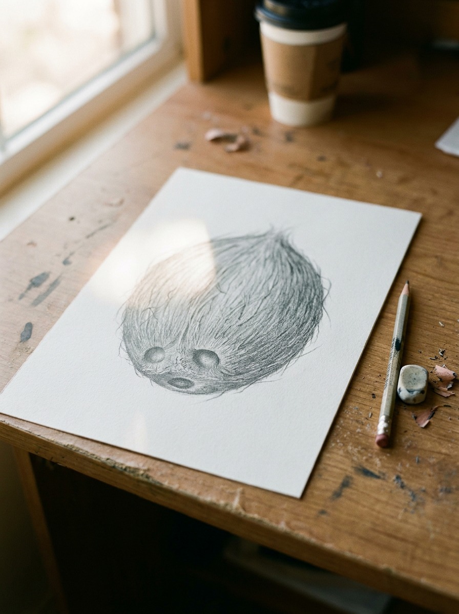
Now build the actual coir texture on top of those guide lines. Short, slightly irregular marks following the fiber direction, varying in length and pressure — real coir isn’t uniform, so texture that’s too even ends up looking like a pattern instead of a material. Darken the recessed areas around the eyes and along the base where the form curves away from the light. Leave a few lighter patches where the fiber catches highlight; total even coverage flattens the whole thing back out, which is the exact mistake this method is designed to avoid.

Tip: This texture work takes real time, more than most people expect for something that looks this simple in the reference photo. Rushing the fiber-direction pass in Step 3 is where almost every flat-looking finished coconut actually goes wrong, even though the problem doesn’t show up until Step 4.
Rendering the husk — a coir texture study
This is worth its own section because the coir texture pass in Step 4 is doing almost all the work of making a coconut read as real, and “follow the fiber direction” undersells how specific that technique actually is.
How coir fiber actually grows and lies
Coconut coir isn’t smooth hair-like fiber running in one clean direction — it’s coarse, semi-woven material, closer in structure to loosely braided rope than to fur or grass. Individual strands cross over each other at slight angles rather than lying perfectly parallel, and the fiber bunches unevenly, thicker in some patches and thinner in others where the husk shows through. If you’ve ever drawn rope or woven fabric in a still-life study, the underlying logic transfers almost directly here — you’re rendering overlap and cross-direction, not a single consistent stroke pattern repeated across the whole surface.
Cross-hatching vs. directional scribbling
Pure directional scribbling — short marks all angled the same way — reads as texture but flattens out fast, because it has no depth variation. True cross-hatching, where a second, lighter layer of marks crosses the first at a slight angle, is what actually builds the sense of coarse, overlapping fiber. I’d use a 2B for the first directional layer, then a sharper HB for the crossing layer on top, keeping the second pass lighter in pressure so it reads as texture sitting within the first layer rather than competing with it.
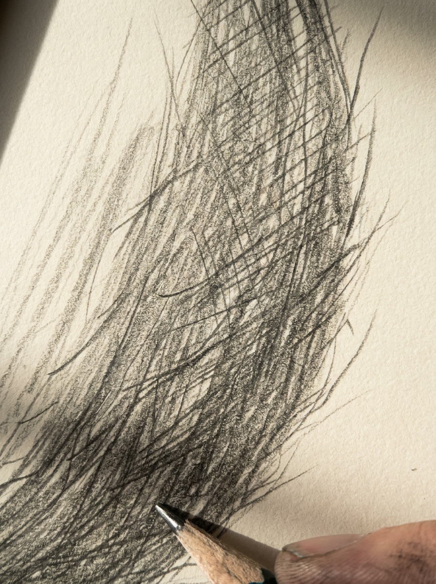
The mistake I see most often here is treating the whole husk surface with identical density. Real coir has visual rhythm — denser, darker clustering in the recessed areas and near the base, looser and lighter where the form catches more light, especially near the widest point of the coconut. Vary your hatching density across the surface the way you’d vary shading intensity on any curved form, and the texture starts doing double duty: describing both the material and the form’s volume at the same time.
Coconut cross-section — what’s inside
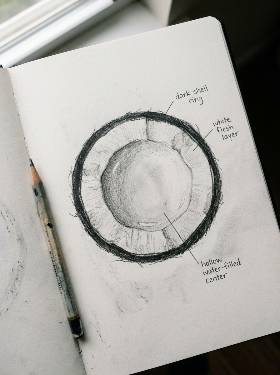
Almost nothing in the current search results shows a coconut cross-section, which is strange, because it’s one of the more visually interesting things you can draw from this subject — three distinct materials, three completely different rendering techniques, all in one image.
Shell, flesh, and water proportions
Working from the outside in: a thin, hard brown shell ring, then a noticeably thicker layer of white flesh, then a hollow center holding the water. Get the proportions roughly right and the cross-section reads correctly at a glance — the flesh layer should be substantially thicker than the shell, usually somewhere around three or four times its width, and the hollow center varies a lot depending on how mature the coconut is (a younger coconut holds more water and has thinner flesh; a fully mature one is nearly the opposite).
Each layer needs a different rendering approach. The shell stays dark and relatively smooth with a hard edge against the flesh. The white flesh benefits from soft, closely-spaced shading to suggest its slightly waxy, fibrous texture — not perfectly smooth, but nowhere near as coarse as the outer husk. The water, if you’re showing any pooled at the bottom of a cut coconut, just needs a few careful highlight lines and a touch of reflected light; resist the urge to over-render liquid, since a little suggestion goes further than trying to fully shade something transparent.
Common mistakes in cross-section drawings
The most frequent issue is a flesh layer that’s too thin, which throws off the whole proportion and makes the drawing read as a diagram rather than an actual cut fruit. The second is a shell that’s rendered too smoothly on its inner edge — the boundary between shell and flesh isn’t a clean, sharp line in most coconuts; it’s slightly uneven, almost textured, where the flesh has grown against the shell’s interior surface. Getting that boundary right is a small detail, but it’s the difference between a cross-section that looks studied from a real reference and one that looks guessed at.
Drawing a coconut drink (the simple version)
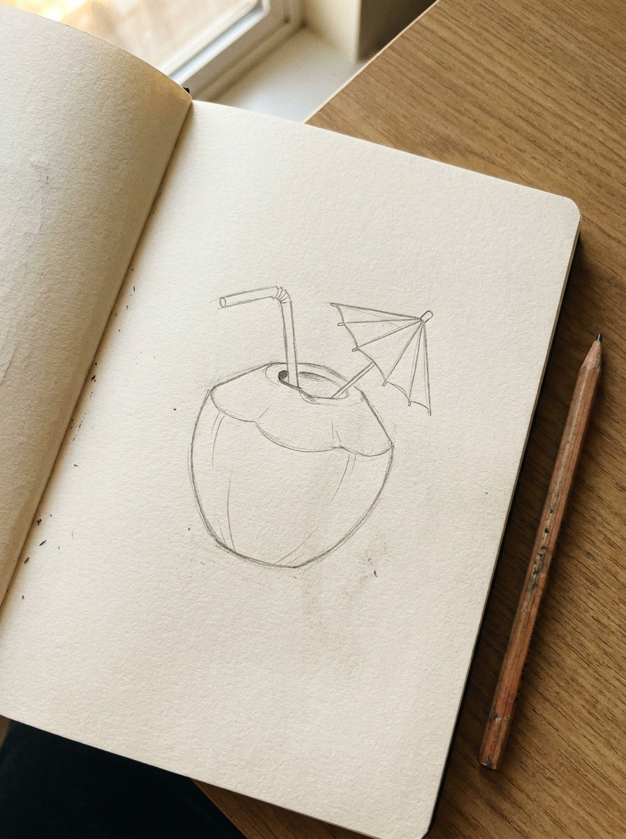
Worth including on its own, since a real chunk of the search traffic around this topic isn’t for the fruit at all — it’s for the tropical drink version, straw and little umbrella included. That’s a completely different, much simpler drawing, and it’s fine for it to stay simple.
Simplified husked coconut with a straw
Start with the same basic egg-shaped form from Step 1, but skip the fiber-direction texture work entirely — this version doesn’t need it. A husked coconut for a drink illustration is usually shown smooth or with just a few light curved lines suggesting texture, since the whole point of this style is quick and approachable rather than materially accurate. Add a straw as a simple bent line emerging from the top, and if you want the classic tropical-drink look, a small triangular umbrella beside it.
Where to keep it simple vs. detailed
This is really a judgment call about audience and purpose. If you’re drawing this for a menu illustration, a kids’ activity page, or just a quick sketch, the simplified version is the right call — piling on realistic coir texture here would actually work against the drawing’s purpose, the same way over-rendering a logo defeats the point of a logo. Save the full husk-texture technique from Sections 2 and 3 for when you’re drawing the coconut as the actual subject rather than as a supporting element in a lighter illustration.
Drawing a coconut palm — the quick version
Sometimes you just need a tree in the background — behind the cross-section illustration, in a beach-scene composition, wherever — without turning it into its own full tutorial.
When you just need a tree in the background
For a quick coconut palm, simplify hard: a single curved trunk line (coconut palms lean more than people expect, rarely growing perfectly straight), a small cluster of long, drooping frond lines fanning out from the top, and a few small round shapes tucked near the base of the fronds to suggest coconuts still on the tree. That’s genuinely enough for a background element — the goal here is suggestion, not a full botanical study.
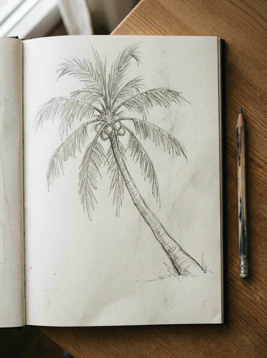
If you want the complete trunk-texture, frond-anatomy, and fan-versus-feather-palm breakdown, I’ve already covered that in full in my palm tree drawing guide — that’s the place to go if the tree itself is the subject rather than a supporting element.
Materials that actually matter for this drawing
You need fewer tools than you’d think for this one, but the pencil choice actually matters more than usual, since the whole method hinges on texture layering.
Pencil grades for texture work
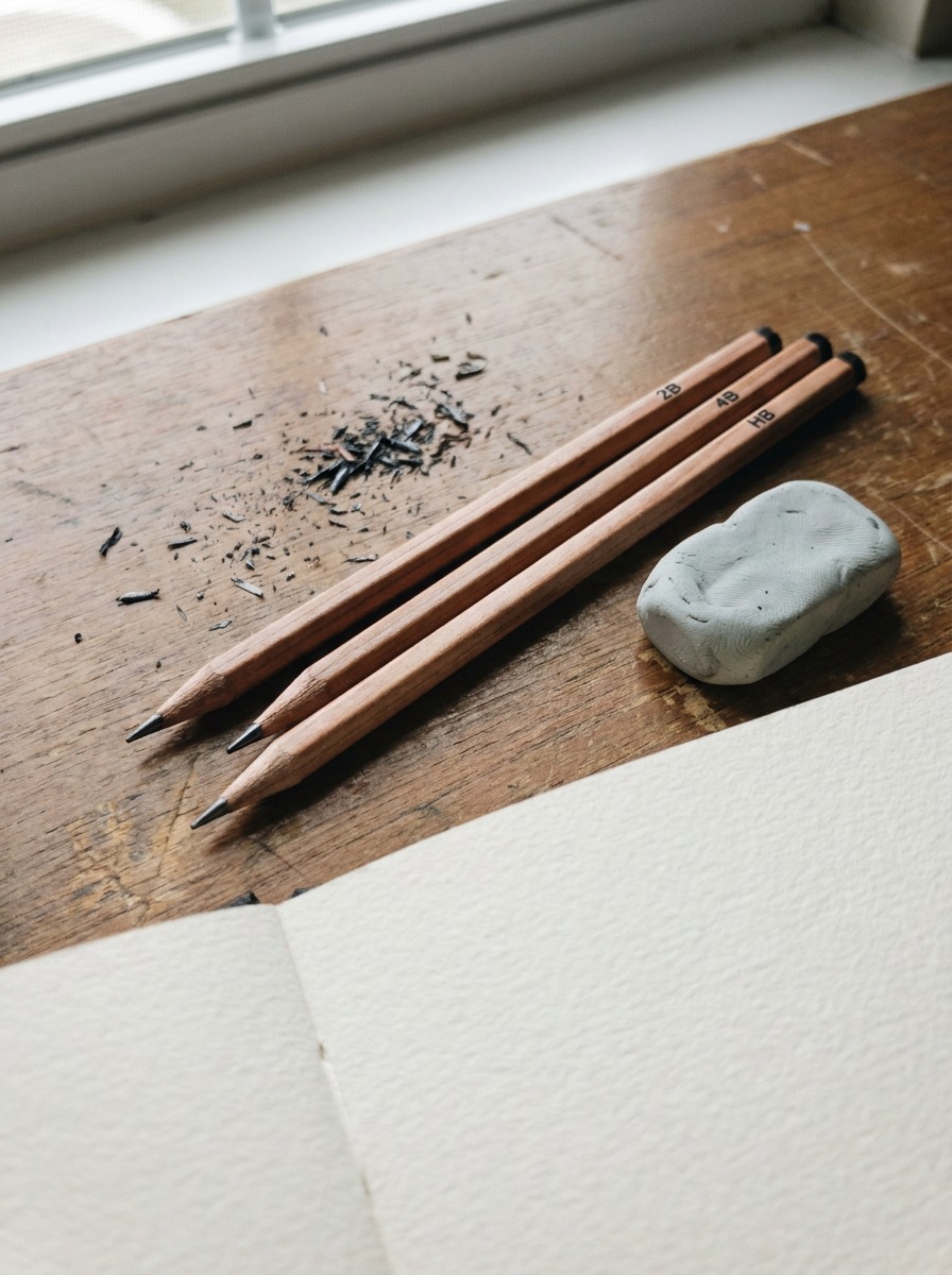
Use a 2B for the initial fiber-direction guide lines in Step 3 and the first coir layer in Step 4 — it’s soft enough to lay down texture quickly without pressing hard, which matters when you’re covering a whole husk surface. Switch to a sharper HB for the crossing cross-hatch layer described in the coir section; you want that second pass to stay lighter and more controlled than the first, and a harder pencil naturally does that without extra effort. For the cross-section illustration, keep a 4B on hand specifically for the dark shell ring — that layer benefits from real depth of tone that a 2B struggles to reach without heavy build-up.
One paper note worth knowing
Texture-heavy subjects like this one are genuinely rougher on paper than most drawing subjects, since you’re doing repeated layered hatching over the same areas. A paper with real tooth — enough surface grain to hold graphite without smoothing out under repeated passes — makes a noticeable difference here. Smooth, low-tooth paper tends to get shiny and slick after two or three layers of hatching, which actually works against the coarse, matte look coir texture needs.
Final Thoughts
The outline was never really the problem. An oval is a perfectly fine coconut silhouette — what makes a coconut drawing flat is texture applied without any reasoning behind it. Once you’re laying down fiber direction before shading, varying hatching density instead of covering the surface evenly, and treating the husk as an actual material rather than a pattern, that same logic carries over to anything fibrous or woven you draw next: rope, wicker, coarse fabric, tree bark.
Try the four-step sequence with a real coconut in front of you, or at minimum a clear reference photo, before you add any texture. The proportion and eye-placement work goes fast. The coir texture pass is where the actual skill-building happens, so give it the time the rest of the drawing doesn’t need.
Frequently Asked Questions
What’s the easiest way to draw a coconut?
For a quick, simple version, draw an egg shape slightly flattened on one side, mark three small circles at the base for the eyes, and add a few loose curved lines suggesting texture — no need for full coir rendering. For a version that actually looks like a coconut rather than a smooth rock, spend the extra time laying down fiber-direction guide lines before you shade, since that single step does most of the work.
How do you draw a realistic coconut husk texture?
Lay down loose directional guide lines running from the stem area toward the base, following the coconut’s curve rather than straight lines. Build texture in two layers — a soft 2B pass following the fiber direction, then a lighter, sharper HB layer crossing it at a slight angle to suggest the coarse, semi-woven structure of real coir. Vary the density across the surface rather than covering it evenly.
What’s inside a coconut when you draw a cross-section?
Three distinct layers: a thin, hard brown shell, a noticeably thicker white flesh layer (usually three to four times the shell’s width), and a hollow center holding the water. Each layer needs different rendering — the shell dark and smooth, the flesh softly shaded to suggest a slightly waxy texture, and the water shown with just a few highlight lines rather than fully rendered.
How do you draw a coconut palm tree quickly?
Simplify to a single curved trunk (coconut palms lean, rarely growing straight), a small cluster of long drooping fronds fanning from the top, and a few round shapes near the frond base suggesting coconuts on the tree. This works fine as a background element. For a full trunk-texture and frond-anatomy breakdown, a dedicated palm tree guide covers that in depth.
What’s the best pencil for texture work like a coconut husk?
A 2B for the initial fiber-direction layer and first texture pass, an HB for the lighter cross-hatch layer on top, and a 4B on hand if you’re also drawing a cross-section, for the dark shell ring specifically. Paper with real tooth matters more than usual here, since smooth paper gets shiny after repeated hatching layers.
How do you draw a simple coconut drink?
Use the same basic egg-shaped form as a full coconut drawing, but skip the fiber-texture work — a few light curved lines are enough. Add a bent straw line from the top and a small triangular umbrella beside it for the classic tropical-drink look. This simplified style suits menu illustrations, kids’ activities, or any quick decorative sketch better than full husk realism would.
What’s the difference between a young green coconut and a mature one?
A young coconut has a smoother, green or yellowish husk, holds more water, and has a thinner, softer layer of flesh inside. A mature coconut has the familiar brown, fibrous husk, less water, and a thicker, firmer flesh layer. If you’re drawing the husk texture in detail, a mature coconut is the more interesting subject — the coir fiber is more pronounced and easier to render convincingly.
- 63shares
- Facebook0
- Pinterest60
- Twitter3
- Reddit0