Introduction
Your forest looks like a row of lollipops stuck in the ground. Every tree identical — same height, same shape, same spacing. The background? Flat as a pancake. Zero depth, zero atmosphere, zero life.
I’ve been there. My early forest attempts looked like clip art from a 1990s screensaver. Rows of green triangles pretending to be pine trees. Embarrassing? Absolutely. But here’s what nobody told me: the problem wasn’t my drawing skills. It was my approach.
Forest drawing has exploded lately — from cozy video game aesthetics to the biophilic design movement sweeping architecture and interiors. There’s also growing research on nature sketching as a stress-relief practice. So you picked a good time to learn this.
- Why Forest Drawing Feels So Hard (And Why It's Actually Not)
- Essential Tools for Forest Drawing (Budget-Friendly Options)
- Understanding Forest Depth: The 3-Layer System
- How to Draw a Forest: 7-Step Process
- 5 Mistakes That Make Forest Drawings Look Flat (And How to Fix Them)
- Forest Drawing Inspiration: 3 Styles to Try
- FAQ: Forest Drawing Questions Answered
- Q: How long does it take to draw a forest?
- Q: What's the best pencil for drawing forests?
- How do I draw leaves without drawing every single leaf?
- Can I draw forests from imagination?
- How do I draw light rays shining through trees?
- What's the easiest type of forest to draw for beginners?
- Why does my forest look flat even when I add details?
- Conclusion
Here’s what you’ll walk away with: a simple 3-layer system that creates instant depth, a 7-step process you can follow today, and the five mistakes that keep beginners stuck (I made all of them). No art degree required. No fancy supplies. Just a pencil, paper, and about 30 minutes for your first attempt.
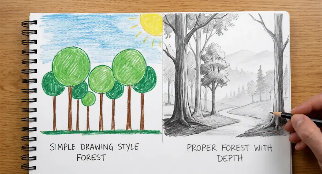
The secret? You’re not going to draw a forest. You’re going to draw shapes and values that your brain reads as a forest. That mindset shift changed everything for me — and it’ll change everything for you too.
Let’s start with why forests feel so intimidating, and why that fear is completely unfounded.
Why Forest Drawing Feels So Hard (And Why It’s Actually Not)
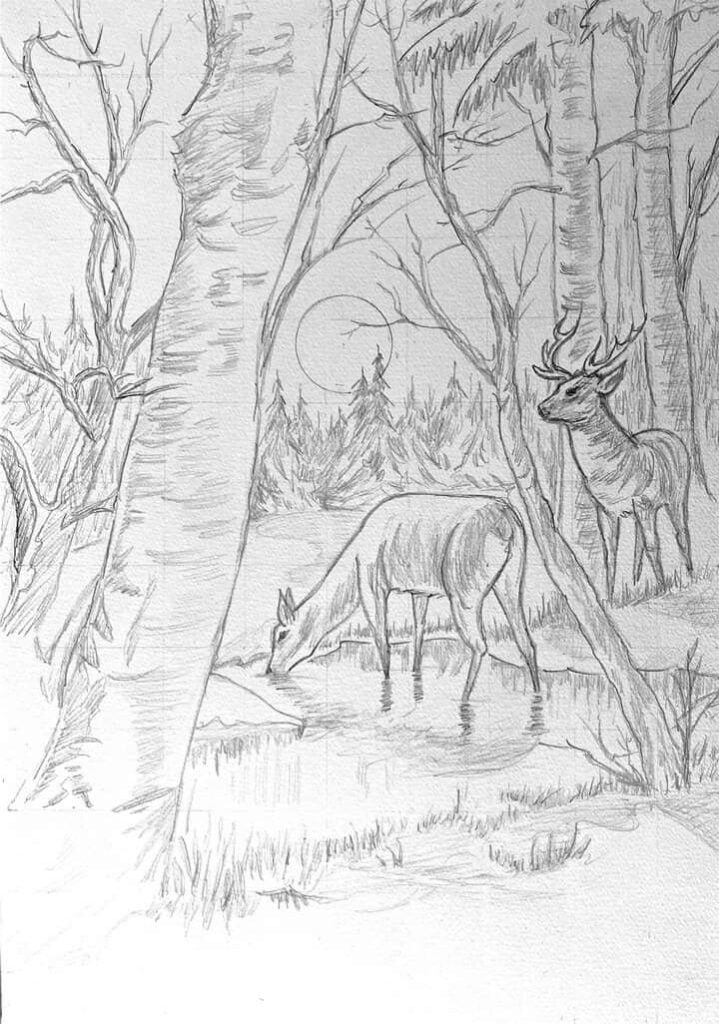
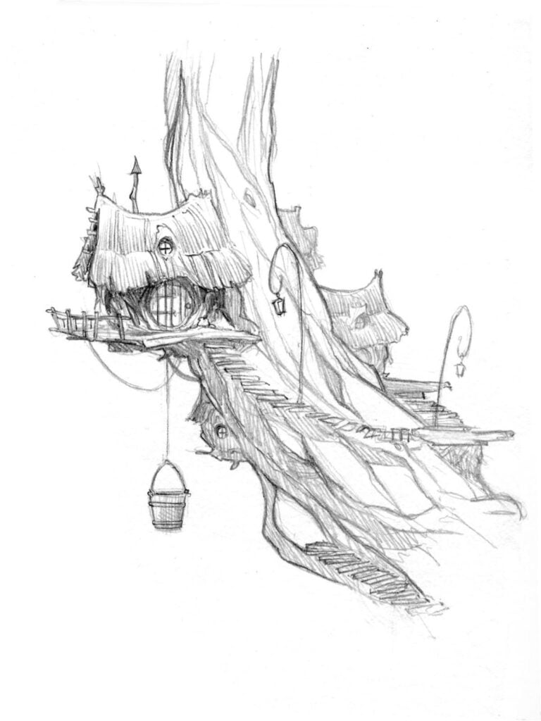
Stand in front of a real forest and count the leaves. Go ahead, I’ll wait.
Impossible, right? That’s exactly what your brain tries to do when you sit down to draw one. It sees thousands of branches, millions of leaves, endless complexity — and panics. So you default to the only thing that feels manageable: drawing one tree at a time, each one a careful copy of the last.
This is what I call the Detail Trap.
The Overwhelm Problem
Beginners approach forests like they’re assembling IKEA furniture — one piece at a time, following some imaginary instruction manual. Draw trunk. Add branches. Attach leaves. Repeat 47 times.
But here’s the thing: you don’t draw every brick when you sketch a building. You don’t draw every hair in a portrait. Why would forests be different?
The complexity is an illusion. From any normal viewing distance, you can’t actually see individual leaves. You see masses. Shapes. Patterns of light and dark.
The Mindset Shift That Changes Everything
Stop thinking “500 trees.” Start thinking “three shapes with texture.”
I wasted months drawing individual leaves until a James Gurney tutorial hit me like a brick: professional artists squint at their subjects on purpose. Squinting blurs details and reveals the underlying value structure — the dark masses, the light masses, the shapes in between.
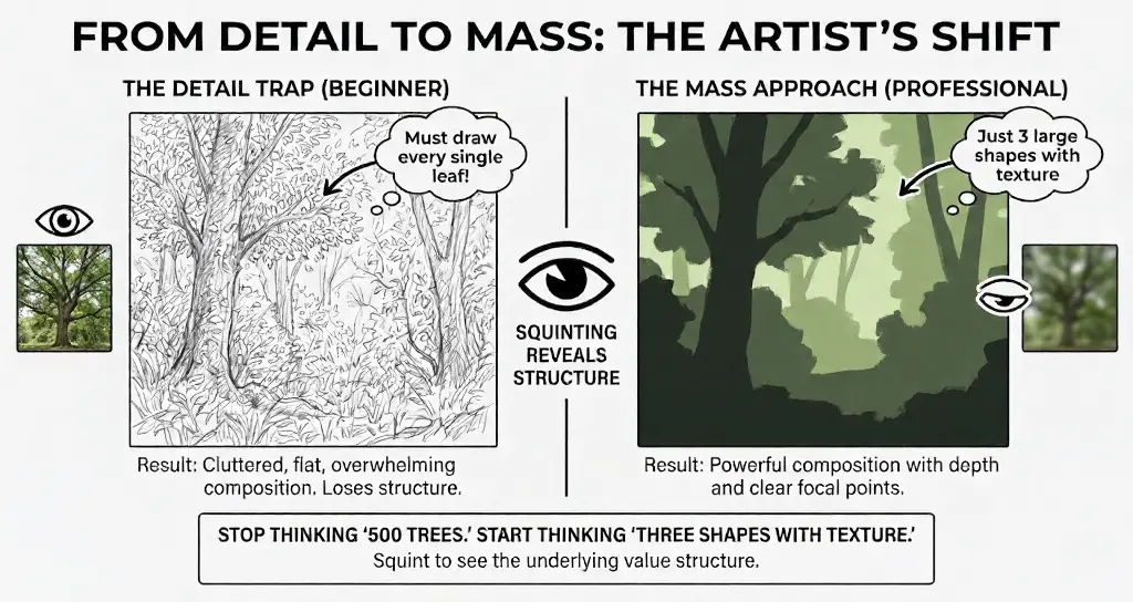
Try it now. Squint at any tree photo. Those thousands of leaves? They become maybe five or six simple shapes.
That’s what we’re actually drawing.
Essential Tools for Forest Drawing (Budget-Friendly Options)
Let me guess — you’re about to spend $200 on art supplies you don’t need. I did the same thing. Bought a 48-pencil set, three types of blending stumps, fancy imported paper from Japan. Used maybe five of those pencils. Once.
Here’s the truth: better tools won’t fix bad technique. But the right tools make learning easier. Let’s keep it simple.
The $20 Starter Kit
This is all you actually need:

Pencils: Get three — a 2B, 4B, and 6B. The Staedtler Mars Lumograph set (around $12 for six pencils) has been my workhorse for years. Faber-Castell 9000 is equally good. Skip the fancy Japanese brands for now.
Paper: Strathmore 400 Series sketch pad, 9×12 inches, roughly $8. The slight tooth grabs graphite beautifully for forest textures. Anything 80lb or heavier works fine.
Erasers: A kneaded eraser (for lifting highlights and creating light rays) plus a Tombow Mono Zero for precision. Together, about $6.
That’s it. Twenty bucks, and you’re set for months.
The Digital Alternative
Prefer screens? An iPad with Apple Pencil plus Procreate ($13 one-time purchase) gives you unlimited paper and an undo button — perfect for experimentation. On a tighter budget, Krita is free and runs on any tablet or computer.
For brushes, MaxPacks offers fantastic nature sets. Or grab Kyle T. Webster’s free brush pack that comes with Photoshop — his charcoal brushes mimic traditional pencil surprisingly well.
What You DON’T Need
Skip the blending stumps (your finger or tissue works fine). Skip the 24-pencil sets (you’ll use three). Skip “special forest drawing” tutorials selling proprietary tools — that’s marketing, not art education.
The best artists I know work with embarrassingly simple setups. Nathan Fowkes does museum-worthy forest studies with a single Blackwing pencil and printer paper.
Start cheap. Upgrade later when you know what you actually want.
Understanding Forest Depth: The 3-Layer System
Here’s a question that stumped me for years: why do my forests look like cardboard cutouts while professional artists create scenes you could walk into?
The answer fits on a napkin. Literally — I sketched it at a coffee shop after finally cracking the code. It’s called the 3-Layer System, and once you see it, you can’t unsee it.
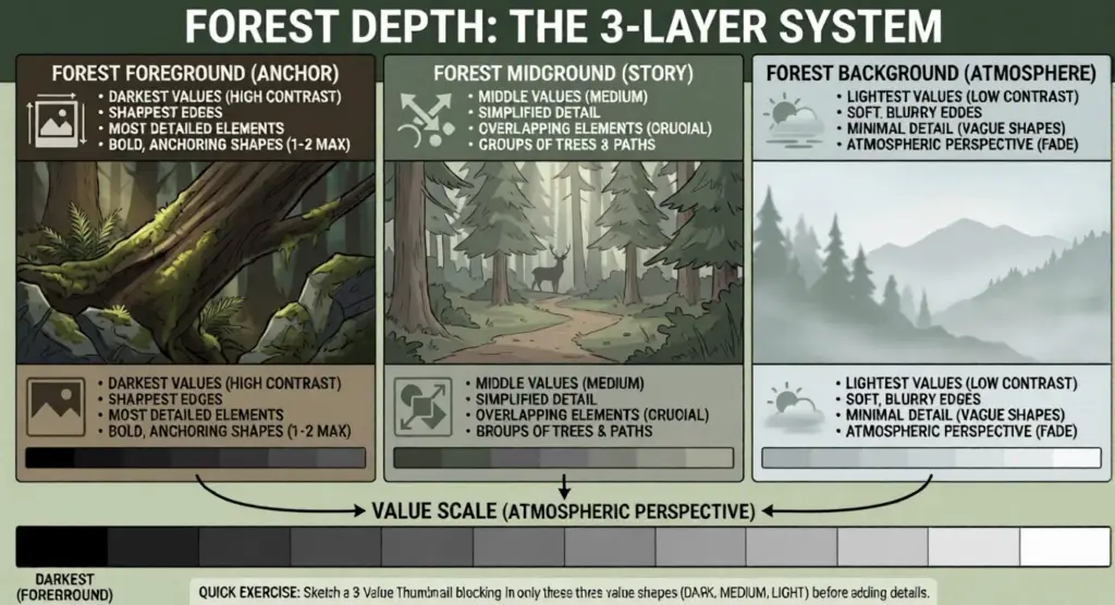
Every convincing forest drawing has three distinct zones: foreground, midground, and background. Each layer has different values, different detail levels, and different edge qualities. Miss one, and your forest falls flat.
Foreground — Your Anchor
This is the bottom third of your composition. It’s your darkest values, your sharpest edges, your most detailed elements.
Think of foreground as a picture frame. Maybe it’s a large tree trunk cutting into the scene. Some ferns catching light. A mossy rock. Whatever you choose, make it bold — this layer grounds your entire drawing.
I usually pick one or two elements maximum. More than that, and you’re competing with your own focal point.
Midground — Where the Magic Happens
Middle values. Simplified details. Groups of trees instead of individuals.
This is where your forest actually lives. Paths wind through here. Light filters down. A deer might stand between the trunks. The midground carries your story.
The golden rule? Overlap everything. Trees cutting in front of other trees is the single fastest way to create depth. No overlapping, no depth — it’s that simple.
Background — The Atmospheric Fade
Lightest values. Minimal detail. Soft, almost blurry edges.
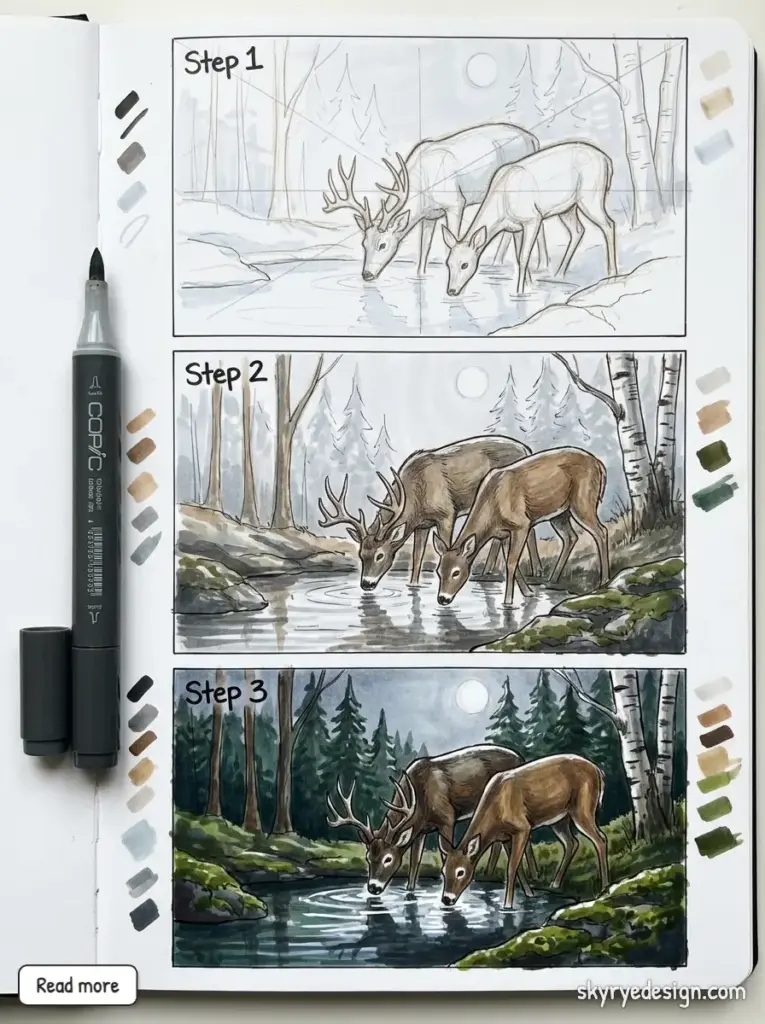
Here’s where atmospheric perspective does the heavy lifting. In real life, distant objects appear lighter and slightly blue-ish because of particles in the air. Your background trees should be 2-3 value steps lighter than your midground — sometimes just faint silhouettes disappearing into mist.
I keep backgrounds deliberately vague. The less you define, the more distance your viewer perceives.
Quick Exercise: The 3-Value Thumbnail
Before your next forest drawing, try this: grab scrap paper and draw a small rectangle, maybe 2×3 inches. Block in only three values — dark foreground, medium midground, light background. No trees, no details, just shapes.
Five minutes. That tiny thumbnail will save you hours of frustration on the full drawing.
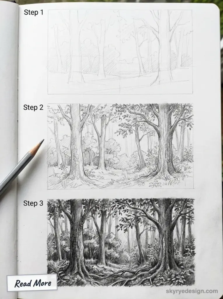
How to Draw a Forest: 7-Step Process
Theory is nice. But you came here to actually draw something.
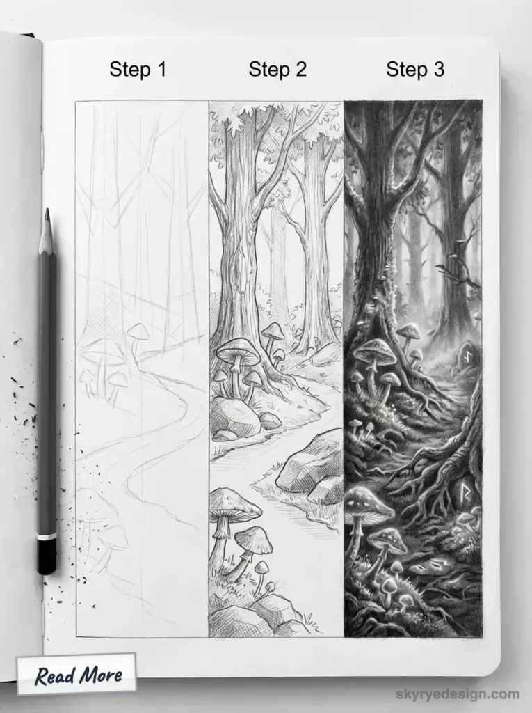
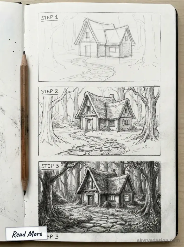
This is the exact process I use for every forest sketch — whether it’s a quick 20-minute study or a detailed piece I’ll spend hours on. The steps stay the same. Only the time changes.
Grab your pencils. Let’s do this.
Find Your Reference (Don’t Skip This)
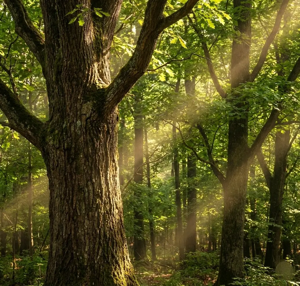
“But I want to draw from imagination!” I hear you. And you will — eventually. But even Nathan Fowkes, who’s painted forests for DreamWorks and Disney, works from references. If it’s good enough for him, it’s good enough for us.
Head to Unsplash or Pinterest and search “misty forest” or “forest path.” Look for images with clear separation between foreground, midground, and background. Foggy scenes work great for beginners because nature already did the atmospheric perspective for you.
Pro tip: squint at your reference before starting. If you can’t see three distinct value zones while squinting, pick a different photo.
Sketch the Big Shapes (2 Minutes Max)
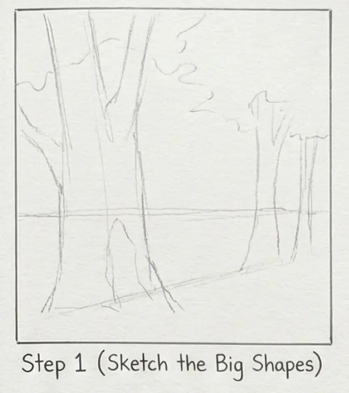
Resist the urge to draw trees. Not yet.
Using your 2B pencil with light pressure, block in the three layers as abstract shapes. Foreground mass at the bottom. Midground mass in the middle. Background shape at the top. Think clouds, not trees.
This should look like a blurry mess. That’s perfect. You’re building the skeleton — details come later.
Establish Your Darkest Darks
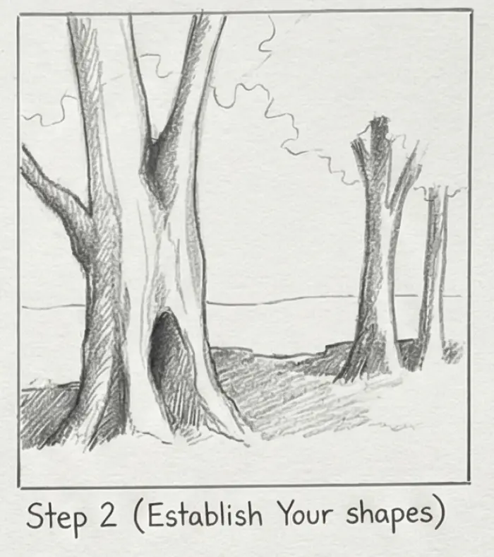
Now grab your 6B. Find the darkest spot in your reference — usually foreground shadows, the base of tree trunks, or dense foliage clusters.
Go bold. Like, bolder than feels comfortable.
Beginners consistently make the same mistake: timid values. Your darks aren’t dark enough, so your lights can’t be light enough, and everything turns muddy gray. I ruined dozens of drawings before learning to commit to my darks early.
Plant those deep shadows in the foreground. Anchor the scene.
Build the Midground Mass
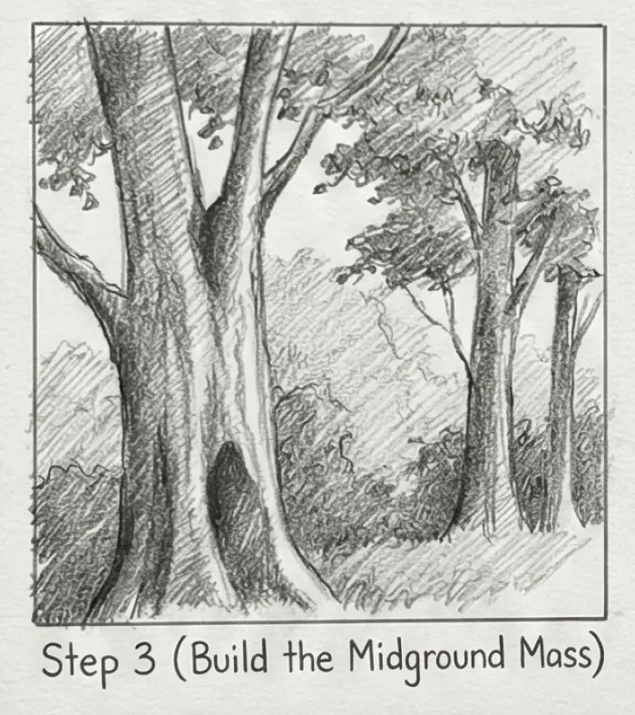
Switch to your 4B. Medium pressure, medium values.
Here’s where you finally suggest actual trees — but as a GROUP, not individuals. Create a connected mass of trunk shapes and foliage. Some trunks darker, some lighter. Some thicker, some thinner. Variety is your friend.
And remember the golden rule from the 3-Layer System: overlap, overlap, overlap. Every tree should cut in front of something behind it.
Fade the Background
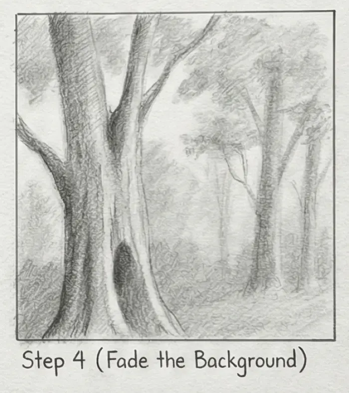
Your 2B pencil again, barely touching the paper.
Background trees are ghosts. Suggestions. Faint vertical strokes that hint at distant trunks. Soft masses that might be foliage — or might be mist. Leave some areas almost pure white.
The less you do here, the better. I’ve salvaged mediocre drawings just by erasing half my background and letting it breathe.
Add Selective Detail
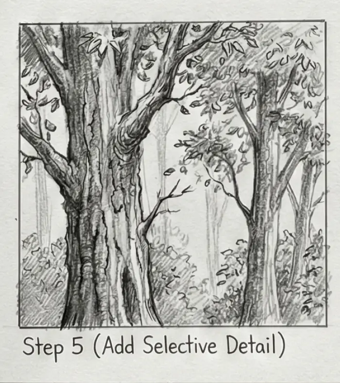
Here’s where beginners go wrong: they detail everything. Don’t.
Detail is a spotlight. Use it only where you want eyes to land — your foreground.
Pick one or two trees and give them bark texture. Add some individual leaves or pine needles at the silhouette edges. Throw in ground cover: ferns, fallen branches, maybe a mushroom on a log. These small specifics make the whole scene feel observed from life, not assembled from imagination.
The midground gets minimal detail. The background gets almost none.
Final Touches: Light and Atmosphere
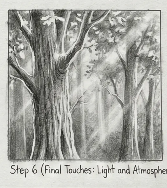
Step back. Squint at your drawing. How’s the value structure holding up?
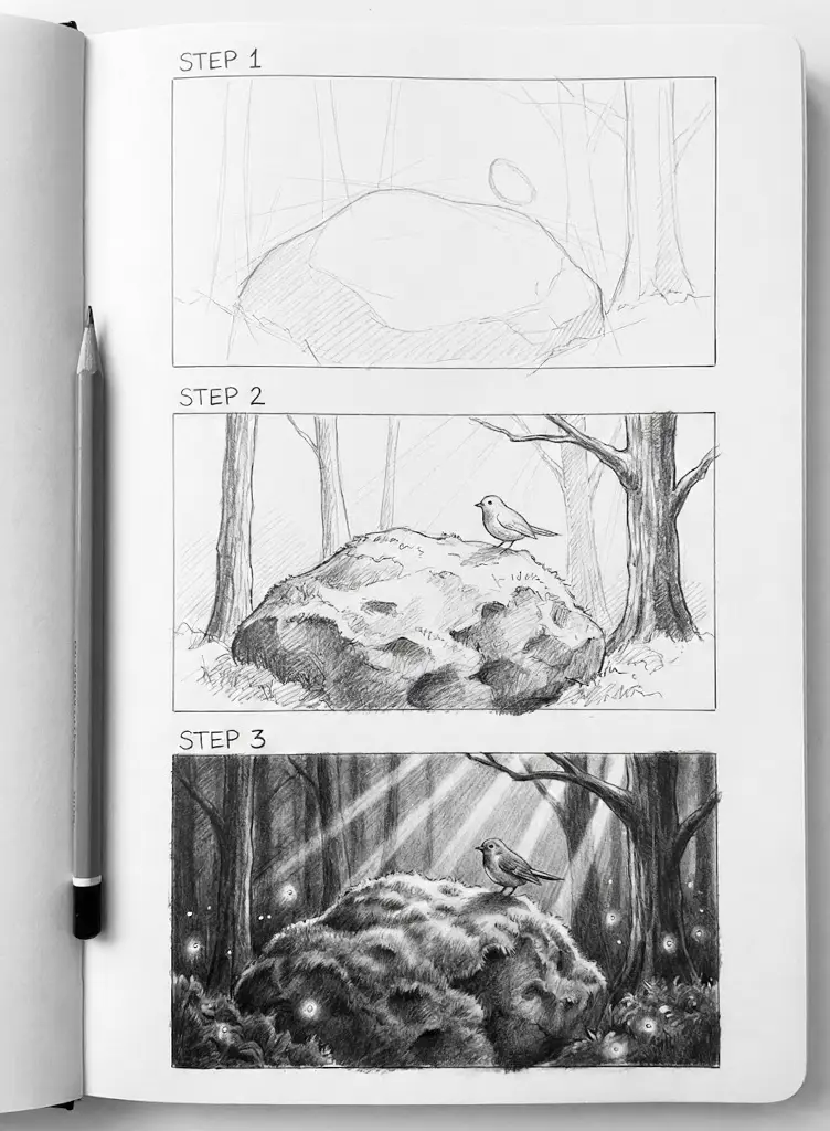
Now for the magic: light rays. Take your kneaded eraser, shape it into a thin edge, and “carve” diagonal streaks from upper corners down through your midground. Instant forest atmosphere. This technique saved more of my drawings than I’d like to admit.
Soften any background edges that feel too sharp. Darken any foreground shadows that got lost. Check your value range one more time — you should see clear separation between all three layers.
Sign it. You just drew a forest.
5 Mistakes That Make Forest Drawings Look Flat (And How to Fix Them)
You followed all the steps. Your forest still looks wrong. Something’s off, but you can’t pinpoint what.
I’ve been there more times than I can count. After years of diagnosing my own failed drawings — and helping other artists troubleshoot theirs — I’ve noticed the same five culprits showing up again and again.
Let’s play art doctor.
Mistake #1 — The Clone Army
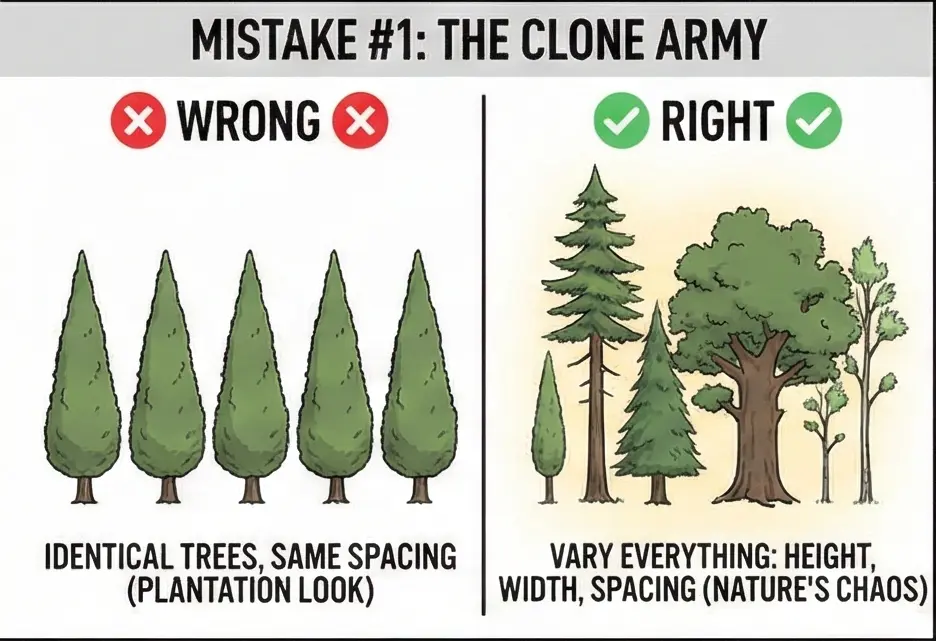
Every tree identical. Same height, same width, same spacing. Your forest looks like a plantation, not a wild wood.
The fix: Chaos is your friend. Vary everything. One thick trunk next to two skinny ones. A tall pine beside a stunted oak. Uneven gaps — some trees clustered tight, others standing alone. Nature doesn’t do symmetry.
Mistake #2 — The Floating Trees
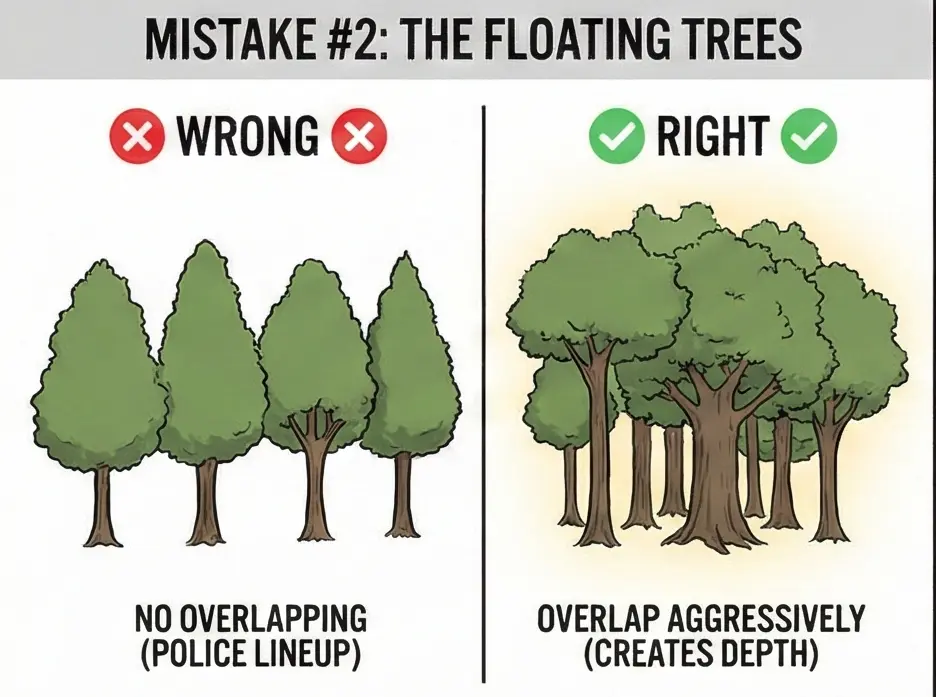
Trees standing side by side, none overlapping. It reads like a police lineup, not a forest.
The fix: Overlap aggressively. At least 60% of your midground trees should be partially hidden behind other trees. That front trunk cuts off the one behind it. That branch crosses over three distant silhouettes. Overlapping is depth. No overlapping, no depth.
Mistake #3 — The Gray Wash
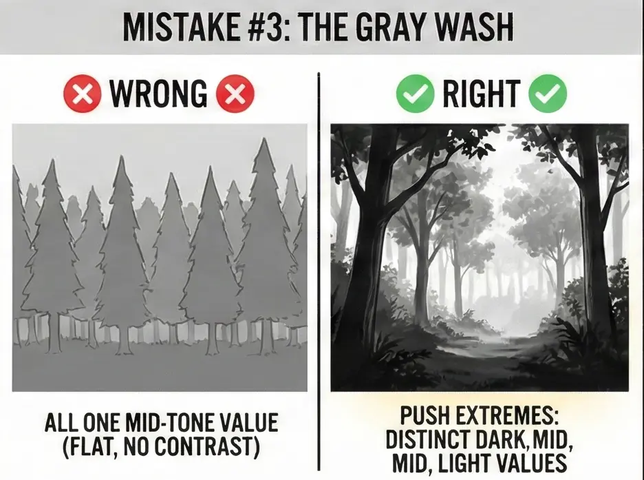
Everything sits in the same mid-tone range. No real darks, no real lights. Just… gray.
The fix: Squint at your drawing. Can you clearly see three distinct values? If it all blurs into one flat tone, you need to push your extremes. Darken the darks. Lighten the lights. I sometimes cover my foreground shadows twice to really punch them up.
Mistake #4 — The Outline Obsession
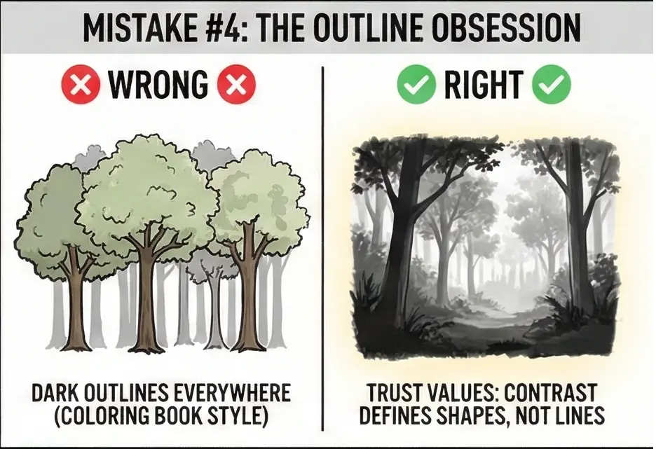
Every tree has a dark line around it, like a coloring book waiting to be filled in.
The fix: Real forests don’t have outlines. Trees separate from backgrounds through value contrast, not lines. A dark trunk against lighter foliage. A bright birch against shadowy pines. Delete your outlines and trust your values. Study any James Gurney forest painting — you won’t find a single outline.
Mistake #5 — The Floating Forest
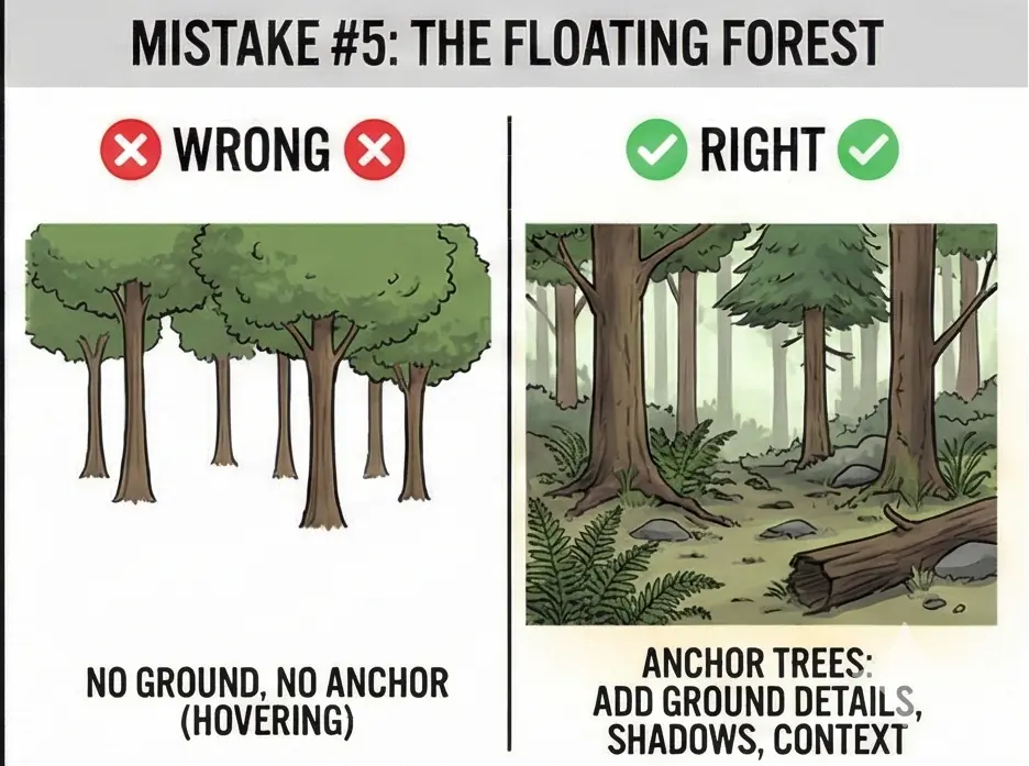
Trees spring directly from the bottom edge of your paper. No ground, no roots, no context. They’re hovering in white void.
The fix: Anchor your trees. Add ground vegetation — ferns, grass, fallen leaves, moss-covered rocks. Include cast shadows where trunks meet earth. A single fallen log in the foreground can transform a floating forest into a believable place.
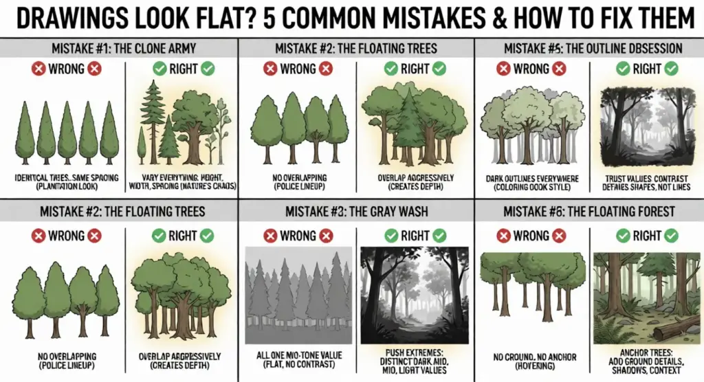
Chances are, one of these hit home. Don’t worry — recognizing the problem is 80% of solving it.
Forest Drawing Inspiration: 3 Styles to Try
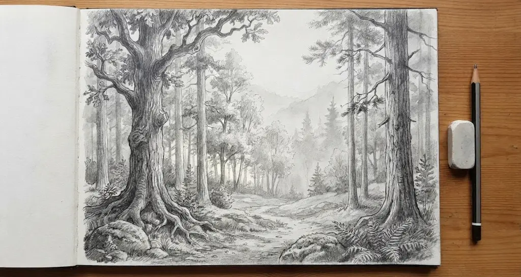
You’ve learned the fundamentals. Now comes the fun part: finding your voice.
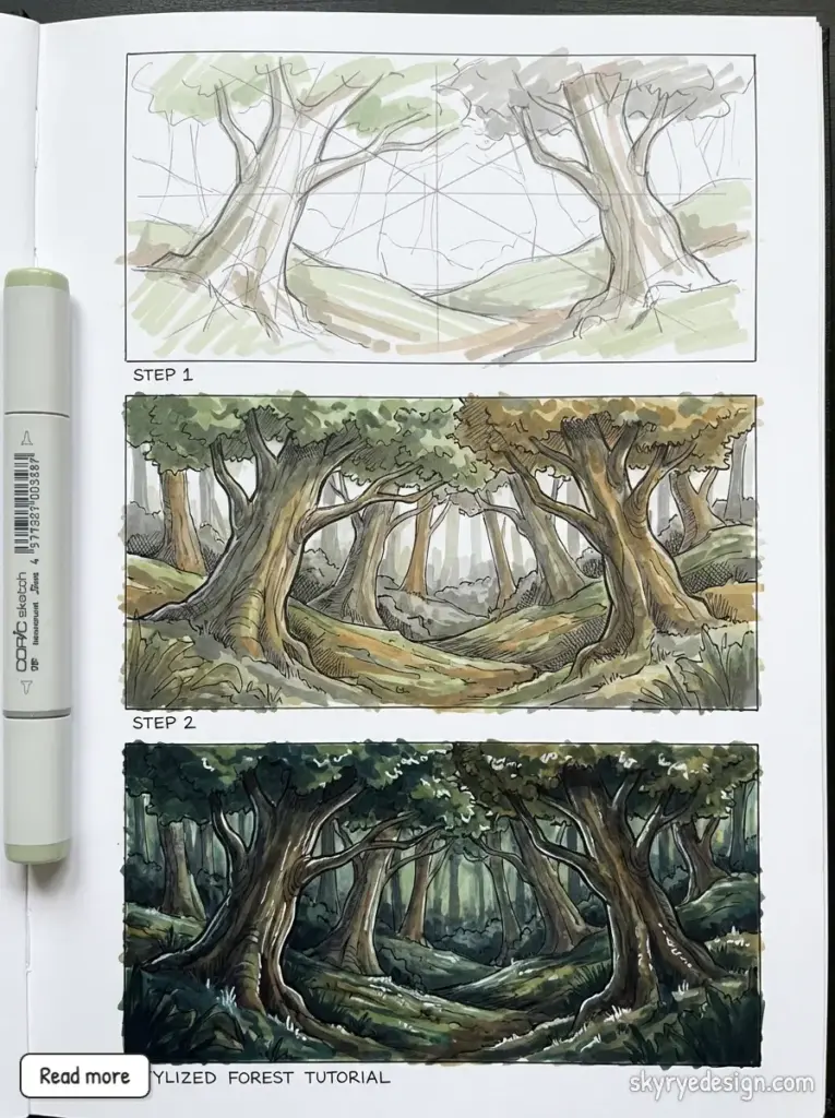
Forest drawing isn’t one-size-fits-all. Some artists chase photorealism. Others simplify everything into bold shapes. Some sketch loose and fast, capturing mood over accuracy. All three approaches are valid — and trying each one taught me more about my own preferences than any tutorial ever could.
Here’s a quick tour of three paths you might explore.
Realistic/Naturalistic
This is the “wow, is that a photograph?” approach. Tight rendering, accurate values, meticulous foreground detail.
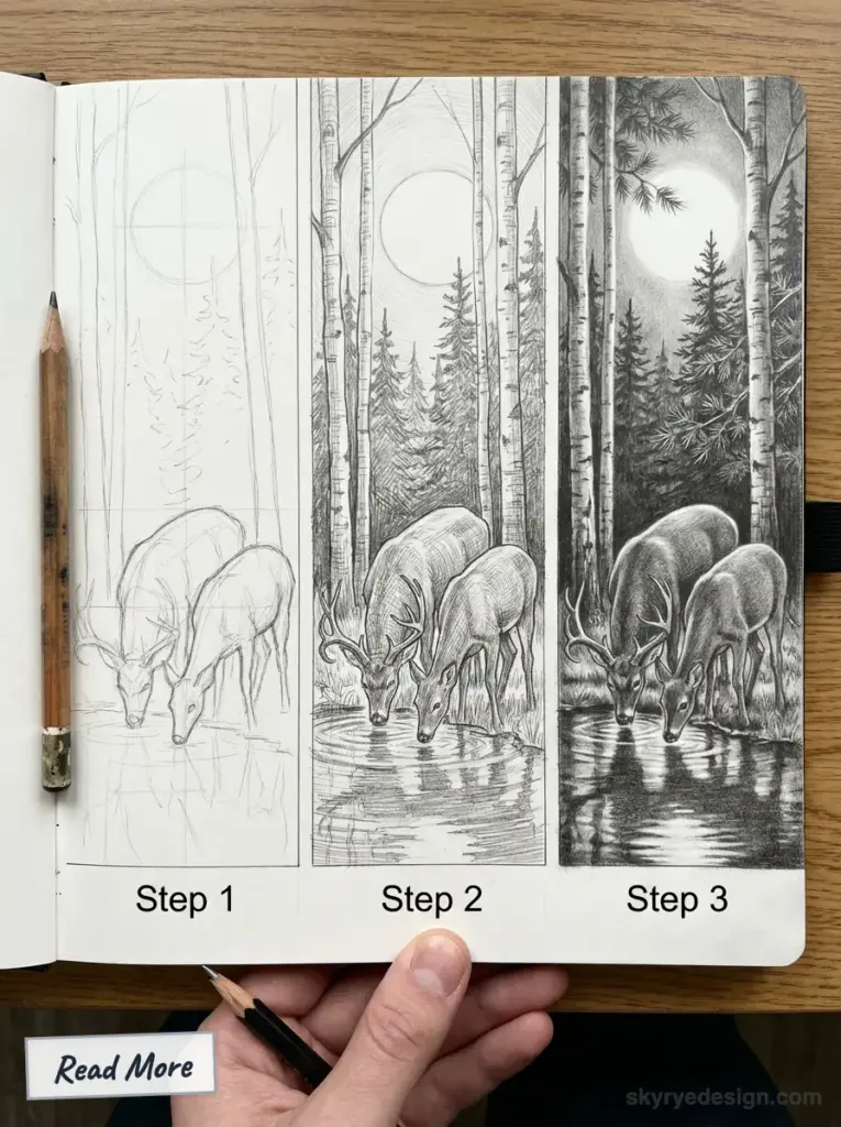
Artists to study: Nathan Fowkes for his gouache forest studies. The concept art team at DICE — their Battlefront environments are masterclasses in realistic foliage. Thomas Moran’s 19th-century oil paintings if you want old-school inspiration.
Best for: Concept art, editorial illustration, serious portfolio pieces.
The catch: Time-intensive. A single piece might take 10-20 hours.
Stylized/Illustrative
Simplified shapes, exaggerated values, graphic punch. Reality filtered through design sensibility.
Artists to study: Eyvind Earle, the genius behind Sleeping Beauty’s iconic backgrounds — those angular pines changed animation forever. Samantha Mash for modern illustrative forests. Clémence Monnet’s children’s book work.
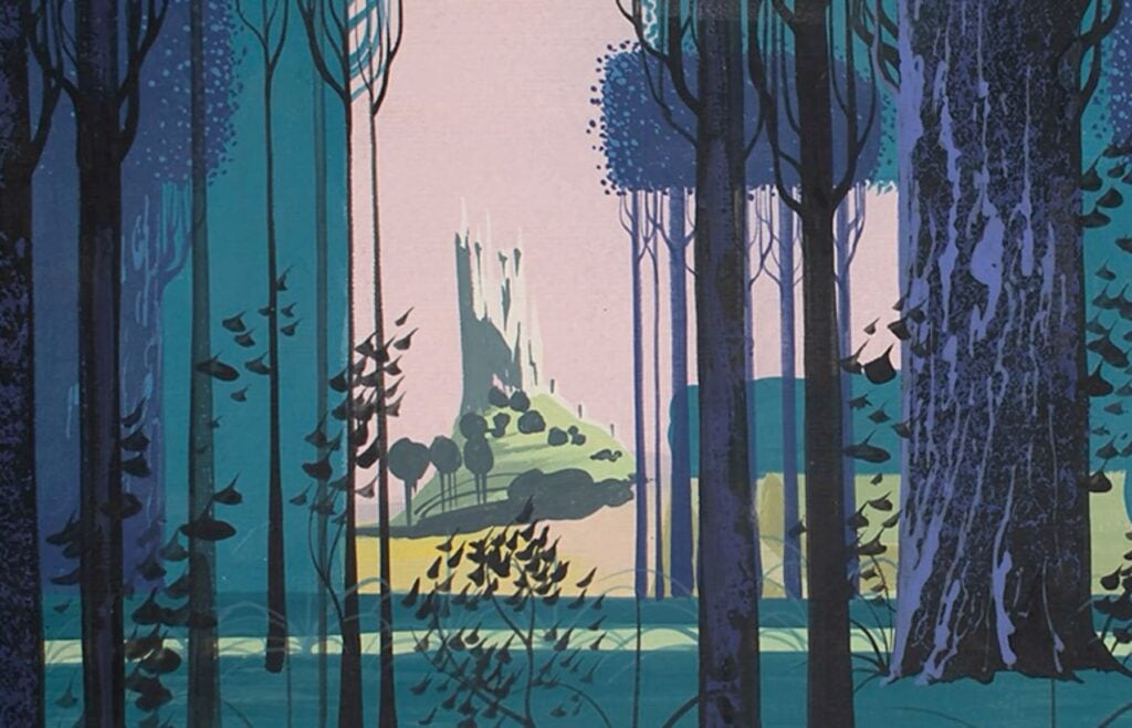
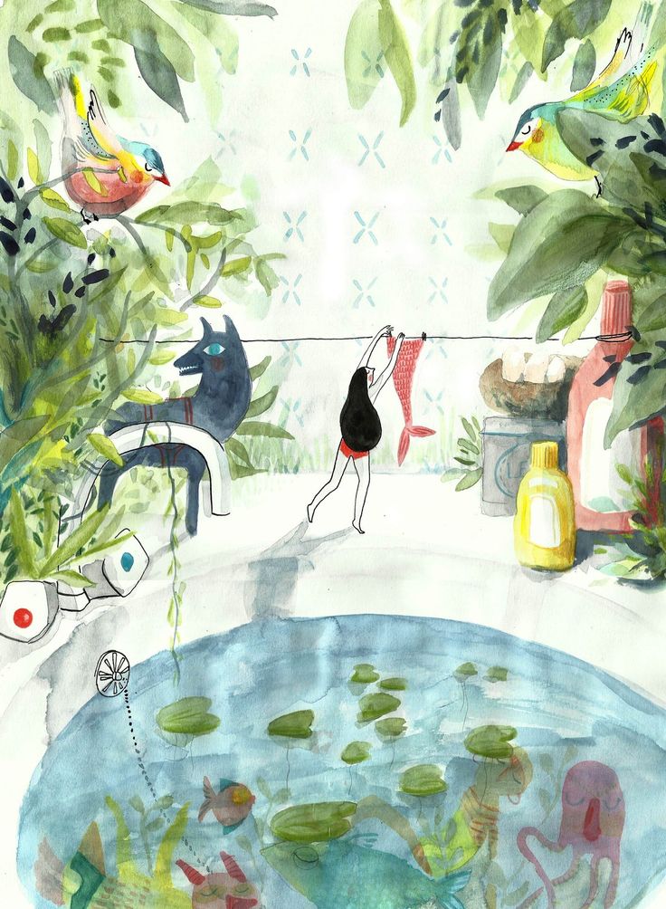
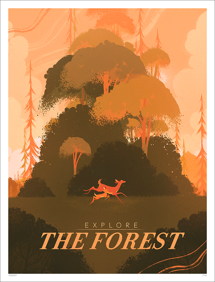
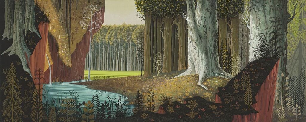
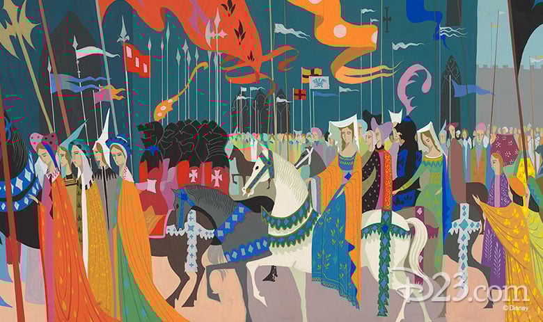
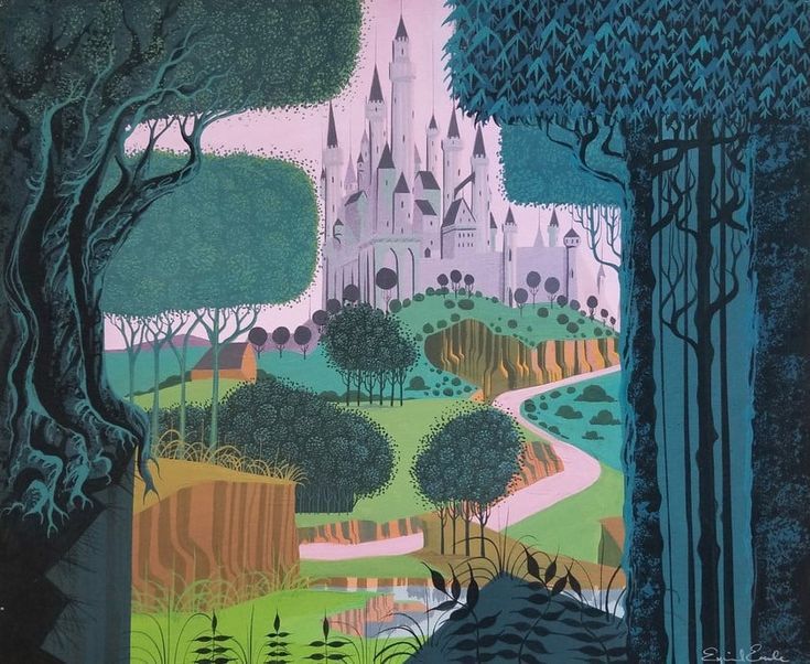
Best for: Picture books, animation backgrounds, prints and merchandise.
The catch: Looks simple but requires strong design fundamentals. Every shape must be intentional.
Loose/Impressionistic
Fast, gestural, expressive. Capturing the feeling of a forest in fifteen minutes flat.
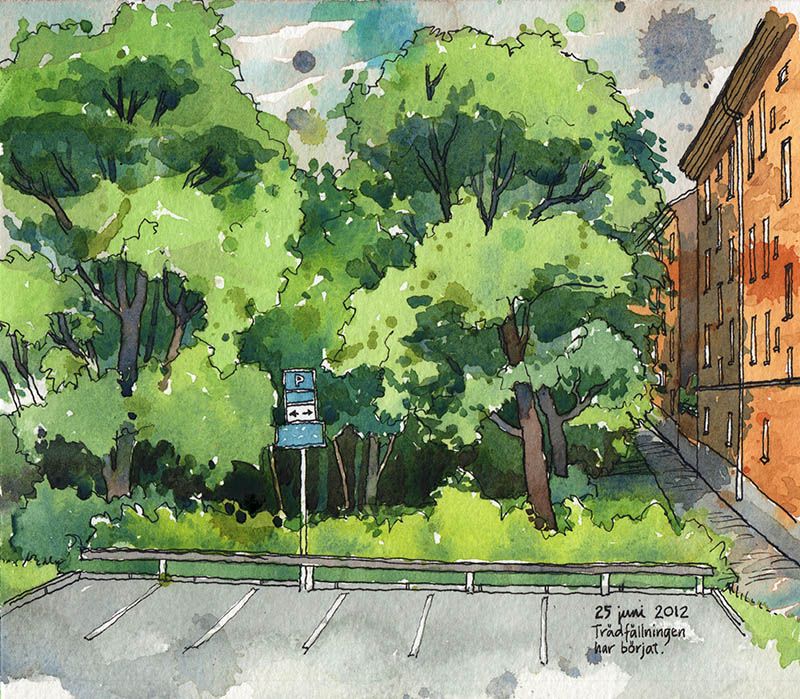
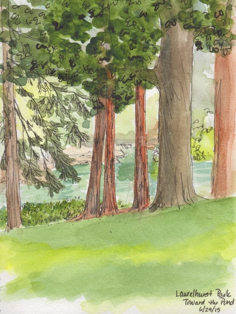
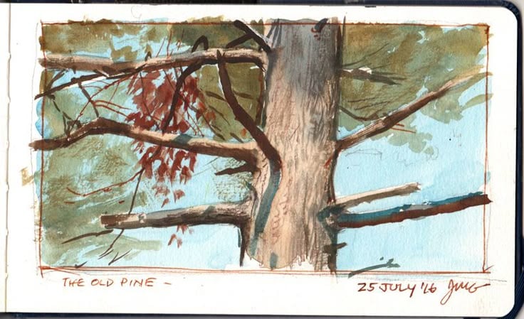
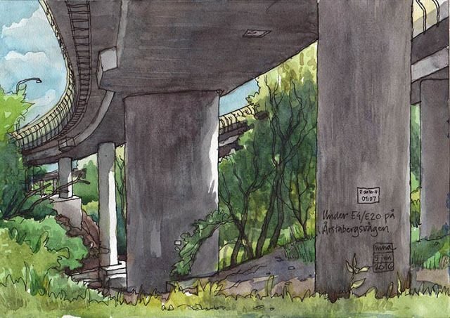
Artists to study: James Gurney’s plein air sketchbook posts — messy, alive, immediate. The Urban Sketchers community on Instagram. Felix Scheinberger’s travel journals.
Best for: Sketchbooks, location drawing, warming up before bigger pieces.
The catch: Letting go of control is harder than it sounds. Perfectionism will fight you.
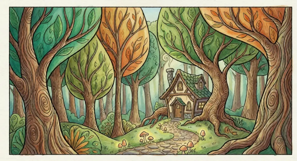
My journey went realistic → frustrated → loose → finally settled somewhere between stylized and impressionistic. Yours will be different. Try all three. Your hand will eventually tell you where it wants to go.
FAQ: Forest Drawing Questions Answered
Q: How long does it take to draw a forest?
A: Depends on your goal. A loose thumbnail sketch takes 5-10 minutes. A decent study with clear depth runs 30-60 minutes. Detailed, portfolio-ready work? Anywhere from 3-8 hours. My advice: start with 20-minute speed studies. You’ll learn faster from ten quick drawings than one overworked piece.
Q: What’s the best pencil for drawing forests?
A: A 4B handles 80% of the work — dark enough for shadows, light enough for midtones. Add a 2B for backgrounds and a 6B for punchy darks. Staedtler Mars Lumograph or Faber-Castell 9000 are both excellent and cost under $15 for a full set. Don’t overthink it.
How do I draw leaves without drawing every single leaf?
You don’t draw leaves — you draw leaf masses. Scribble irregular, organic shapes. Vary the edges: some sharp, some soft. Add individual leaves only at the silhouette edges where they catch light. From three feet away, nobody sees single leaves anyway. They see clusters.
Can I draw forests from imagination?
Eventually, yes. But build your visual library first. Even pros use references — Nathan Fowkes, James Gurney, every concept artist at major studios. Spend six months drawing from photos. Your “imagination” will be packed with real observation by then.
How do I draw light rays shining through trees?
Draw the forest first, then carve light rays out with an eraser. Shape your kneaded eraser into a thin edge and stroke diagonally from the canopy down. Work in the same direction — light rays are parallel. For softer rays, dab gently instead of wiping.
What’s the easiest type of forest to draw for beginners?
Misty pine forests. The fog creates natural atmospheric perspective — backgrounds fade automatically. Pine trees have simpler silhouettes than oaks or maples, so you’re not wrestling with complex leaf shapes. Search “foggy pine forest” on Unsplash and thank me later.
Why does my forest look flat even when I add details?
Details don’t create depth — values do. You probably have similar tones across all three layers. Squint at your drawing. If foreground, midground, and background blur into one gray mass, push your contrasts harder. Darker darks in front, lighter values in back. Details are decoration. Values are structure.
Conclusion
Forest drawing isn’t about capturing every leaf, branch, and shadow. It’s about understanding three simple layers, trusting your values, and knowing when to stop.
Let’s recap what actually matters: think in masses, not details. Nail your foreground-midground-background separation. Overlap everything in the midground. Push your darks darker than feels comfortable. And for the love of art — use references without guilt.
Your first forest will look rough. Mine certainly did. But your fifth attempt will surprise you, and by your twentieth, you’ll wonder why this ever felt impossible.
Here’s your homework: find a misty forest photo on Unsplash, set a 20-minute timer, and apply the 7-step process. Don’t aim for perfection — aim for completion. Post your result and tag @skyryedesign. I genuinely want to see what you create.
Now stop reading. Start drawing.
- 3.0Kshares
- Facebook0
- Pinterest3.0K
- Twitter0
- Reddit0


