In today’s digital landscape, effective web design can significantly impact user experience and engagement. Discovering top sources of inspiration is essential for creating visually appealing and functional websites that resonate with your audience. This article will explore five outstanding examples that can spark creativity and guide your design process.
By examining these examples, you can find new ideas and approaches that may enhance your own projects. Each featured design showcases unique elements that set them apart, offering insights into current trends and effective strategies in web design. Embrace the potential of these inspirations to elevate your design work.
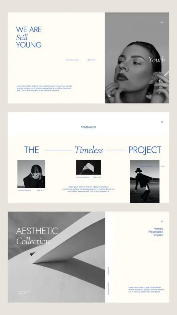
1) Minimalist Portfolio Concepts
Minimalist portfolio concepts emphasize simplicity and clarity. You can focus on essential elements to showcase your work without distractions.
Use ample white space to create balance. It draws attention to your projects while making the design feel open and inviting.
Choose a limited color palette. Soft, neutral tones can enhance readability and provide a sophisticated backdrop for your work.
Incorporate concise project descriptions. Aim for short, impactful statements that convey your role and the project’s significance.
Utilize clean typography. Select modern typefaces that complement your design, ensuring that text is easy to read and aesthetically pleasing.
By prioritizing user experience, you guide visitors seamlessly through your portfolio. This approach not only highlights your skills but also leaves a lasting impression.

2) Vibrant Color Schemes
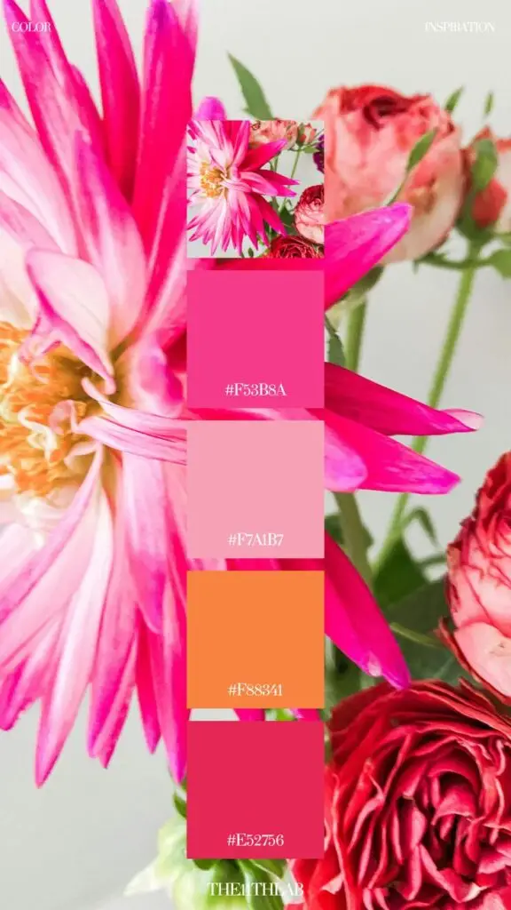
Vibrant color schemes can significantly enhance the visual appeal of your web design. They attract attention and create an engaging user experience.
Using bold and bright colors can set a website apart from competitors. It can convey energy, creativity, and a sense of modernity. Think about how color combinations can evoke different emotions.
Consider using complementary colors to create striking contrasts. This approach can help key elements stand out, guiding users’ focus to important areas.
You can also explore gradients and color overlays. These techniques add depth and dimension, making your design feel more dynamic.
Keep in mind the psychology of colors in your selection. Colors can influence how users perceive your brand. For example, blue conveys trust, while yellow can invoke happiness.
Experiment with different palettes to find what resonates best with your audience. Tools like Adobe Color or Coolors can help generate colorful schemes tailored to your brand’s personality.

3) Micro-Interactions
Micro-interactions are subtle design elements that enhance user experience. They are the small moments of feedback that occur when you complete a task on a website.
These include actions like button hover effects, notifications, and loading indicators. Each interaction provides users with immediate feedback.
You can leverage micro-interactions to make your site feel more responsive. Users appreciate clarity in their actions, and these subtle cues can guide them effectively.
For example, when you fill out a form, the small animations or color changes can indicate whether the input is valid. This confirmation builds trust and reduces frustration.
Consider integrating these elements thoughtfully. Well-designed micro-interactions can elevate your website’s overall aesthetic and usability.
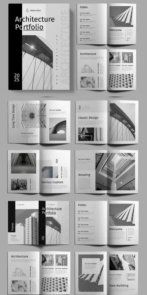
4) Asymmetrical Layouts
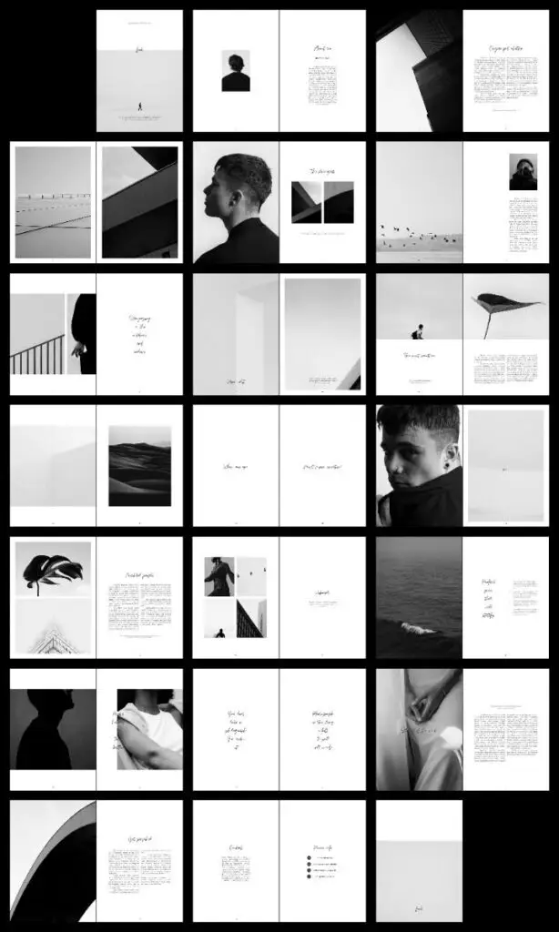
Asymmetrical layouts break the conventional balance found in traditional design. They create visual interest by distributing elements unevenly across the canvas.
This style can guide the viewer’s eye through a website, emphasizing specific content. You might use different shapes, sizes, and colors to achieve this effect.
Asymmetrical designs foster creativity and can make a website feel modern and dynamic. They encourage experimentation while maintaining a functional hierarchy.
Using whitespace effectively is crucial in asymmetrical layouts. It helps to separate the elements, allowing each section to breathe and stand out more.
Implementing this layout can make your design memorable. It invites interaction and exploration, helping your site stand apart from competitors.

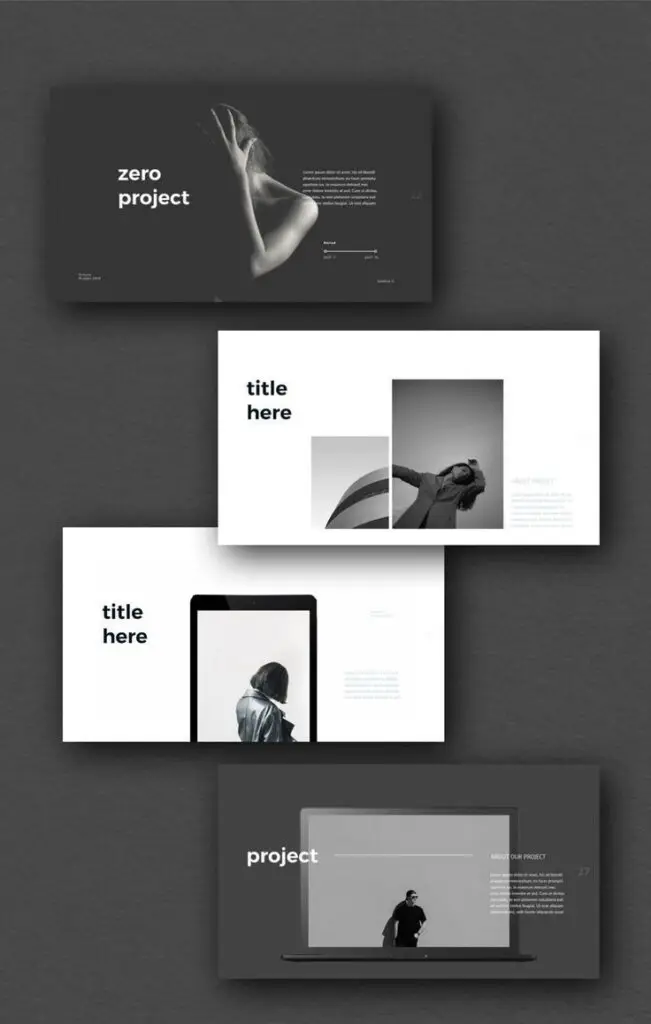
5) Dark Mode Designs
Dark mode designs have gained significant popularity due to their aesthetic appeal and functionality. Many users appreciate the comfort that dark backgrounds can provide, especially in low-light environments.
This design style typically features a dark background with light text. This contrast can reduce eye strain and improve readability for some users.
You can find dark mode options on various platforms, including websites and applications. When implementing dark mode, consider color schemes that enhance readability without compromising on design.
Incorporating elements like shadows and gradients can add depth to dark mode designs. Balancing these features is essential to maintain a visually appealing interface.
Using dark mode also gives you the flexibility to highlight specific content. Bright accents can draw attention and create an engaging user experience.

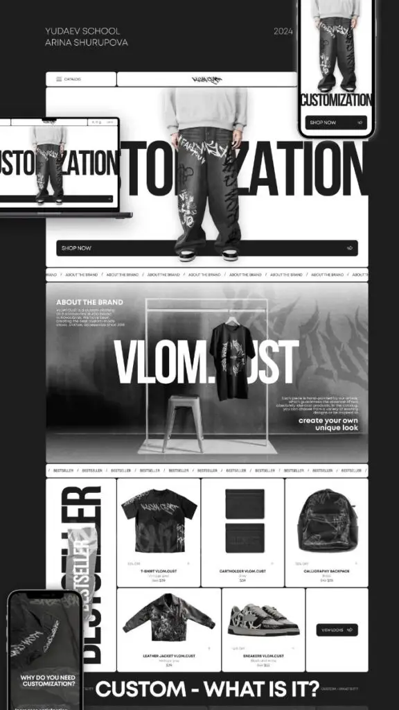
Understanding Web Design Trends
Staying informed about current web design trends is crucial for creating effective and engaging websites. Key aspects include visual hierarchy and the embrace of minimalism, both of which significantly influence user experience.
Impact of Visual Hierarchy
Visual hierarchy helps guide users through your website by organizing content in a way that intuitively leads their focus. Effective use of size, color, and spacing can direct attention to essential elements like headlines or calls to action.
- Font Size: Larger fonts typically catch the eye first.
- Color Contrast: Bold colors can highlight key areas.
- Content Layout: Place important information at the top or center for visibility.
This structure not only improves readability but also enhances the overall navigation experience, encouraging users to engage with your site longer.
The Role of Minimalism
Minimalism emphasizes simplicity, reducing clutter to enhance usability. By focusing on core elements, you provide users with a smoother interaction.
- White Space: Adequate spacing creates balance and draws attention to significant components.
- Limited Color Palette: A few colors can promote brand identity without overwhelming the visitor.
- Essential Elements Only: Remove non-essential content to streamline navigation.
This approach fosters a sense of calm and clarity, allowing users to find what they need without distraction, ultimately leading to higher conversion rates.
Integrating User Experience in Design
User experience (UX) plays a critical role in web design. Integrating effective UX strategies can enhance user satisfaction and engagement, leading to better overall performance of websites. Focusing on user needs informs design decisions and shapes functionality.
Importance of Mobile Responsiveness
Mobile responsiveness is essential in today’s digital landscape. With a significant portion of web traffic coming from mobile devices, your design must adapt seamlessly across various screen sizes and resolutions.
Responsive design ensures that users have a consistent experience, regardless of their device. This includes flexible layouts, scalable images, and adjustable navigation.
Key aspects to consider:
- Fluid Grids: Use percentage-based widths to allow for adaptable layouts.
- Media Queries: Implement CSS rules to target different devices.
- Touch-Friendly Elements: Ensure buttons and links are easy to access on touchscreens.
Adopting these practices will enhance usability and accessibility, encouraging users to engage more with your content.
- 11shares
- Facebook0
- Pinterest11
- Twitter0
