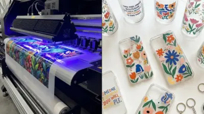
Graphic design ideas shape how you communicate visually, whether you’re building a brand, creating digital content, or experimenting with new styles. The best graphic design ideas give you practical ways to combine creativity with clear communication, so your work stands out and connects with the right audience. By exploring different approaches, you can find inspiration that fits both your goals and your style.
You can draw from classic design principles or experiment with current trends like bold typography, retro-inspired layouts, or AI-assisted visuals. Each idea offers a chance to refine your skills and produce work that feels both modern and functional. The more you explore, the easier it becomes to adapt these ideas into projects that feel fresh and purposeful.
Graphic design isn’t limited to logos or posters—it extends into digital media, packaging, and even interactive experiences. By testing out new techniques and tools, you can turn simple concepts into impactful visuals that leave a lasting impression.
Key Takeaways
- Strong design ideas balance creativity with clarity
- Exploring styles and techniques expands your creative range
- Applying ideas across formats builds lasting impact
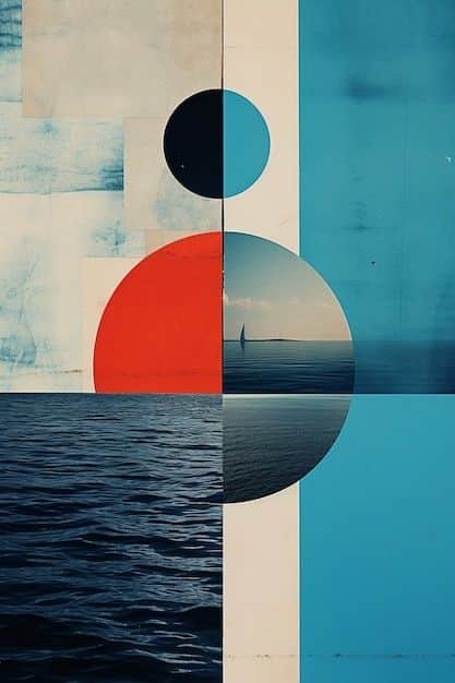
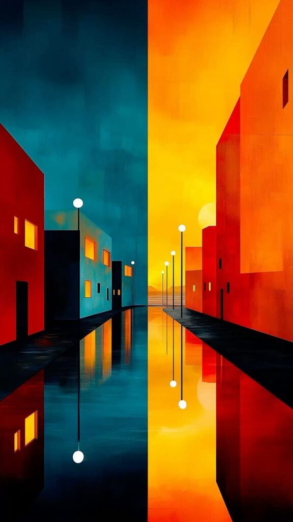
Core Principles of Graphic Design
Strong design depends on how clearly you communicate ideas, how effectively you arrange elements, and how well you use type to guide attention. Each of these areas shapes how your audience understands and responds to your work.
Visual Communication Fundamentals
Graphic design is built on the ability to convey messages visually. You use color, shape, line, texture, and space to create meaning without relying only on words. These elements act as the building blocks of clear communication.
Consistency matters. Repeating colors or shapes creates unity, while contrast ensures important details stand out. For example, a light background with dark text improves readability, while complementary colors can highlight key points.
Balance also plays a role in how viewers process information. Symmetrical balance creates stability, while asymmetrical balance adds energy and movement. Choosing the right approach depends on the tone you want to set.
When you think about visual communication, focus on clarity first. Avoid clutter, prioritize essential elements, and use alignment to create order. This ensures your audience absorbs your message quickly and accurately.
Understanding Visual Hierarchy
Visual hierarchy determines the order in which people notice elements on a page. You guide attention by adjusting size, weight, position, and spacing. Larger or bolder elements naturally draw the eye first.
For example, a headline at the top of a poster should be larger than supporting text. Subheadings, icons, and images then follow in a structured order. This sequence helps viewers scan content efficiently.
You can also use contrast to establish hierarchy. A bright accent color on a call-to-action button makes it more noticeable than surrounding text. Similarly, white space around an element can make it stand out without adding extra decoration.
Hierarchy is less about decoration and more about function. When you apply it correctly, your design will guide the viewer through information in a logical and intentional way.
The Role of Typography in Design
Typography affects both readability and tone. The typefaces you choose communicate personality—serif fonts often feel traditional, while sans-serif fonts appear modern and clean.
Legibility should always come first. Use appropriate font sizes for body text, avoid overly decorative fonts in long passages, and maintain consistent spacing between lines and letters. These adjustments improve how easily your audience reads your content.
Typography also contributes to hierarchy. Headlines can use bold weights or larger sizes, while captions and secondary text remain lighter. This creates a clear distinction between levels of information.
Beyond function, typography adds character. Pairing two complementary fonts can create contrast without confusion. For example, a serif headline with a sans-serif body text often provides both clarity and visual interest.
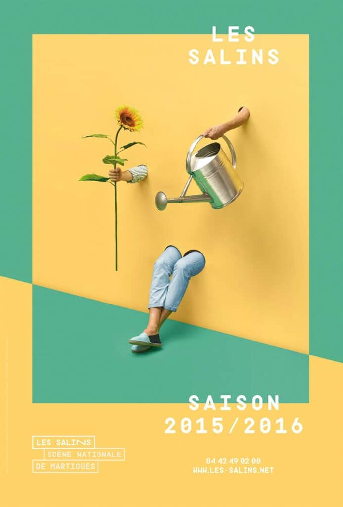
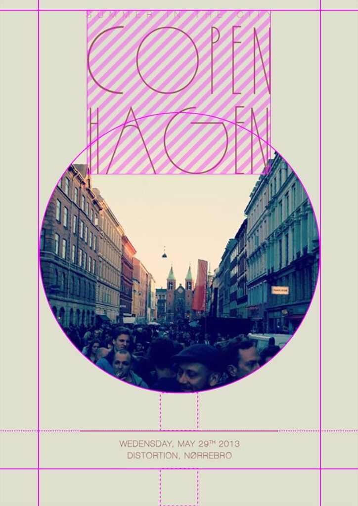
Popular Graphic Design Styles and Trends
Designers in 2025 continue to experiment with contrasting approaches, from stripped-down simplicity to bold, chaotic visuals. You also see strong interest in structured geometry, which provides balance and clarity across digital and print projects.
Minimalist and Maximalist Approaches
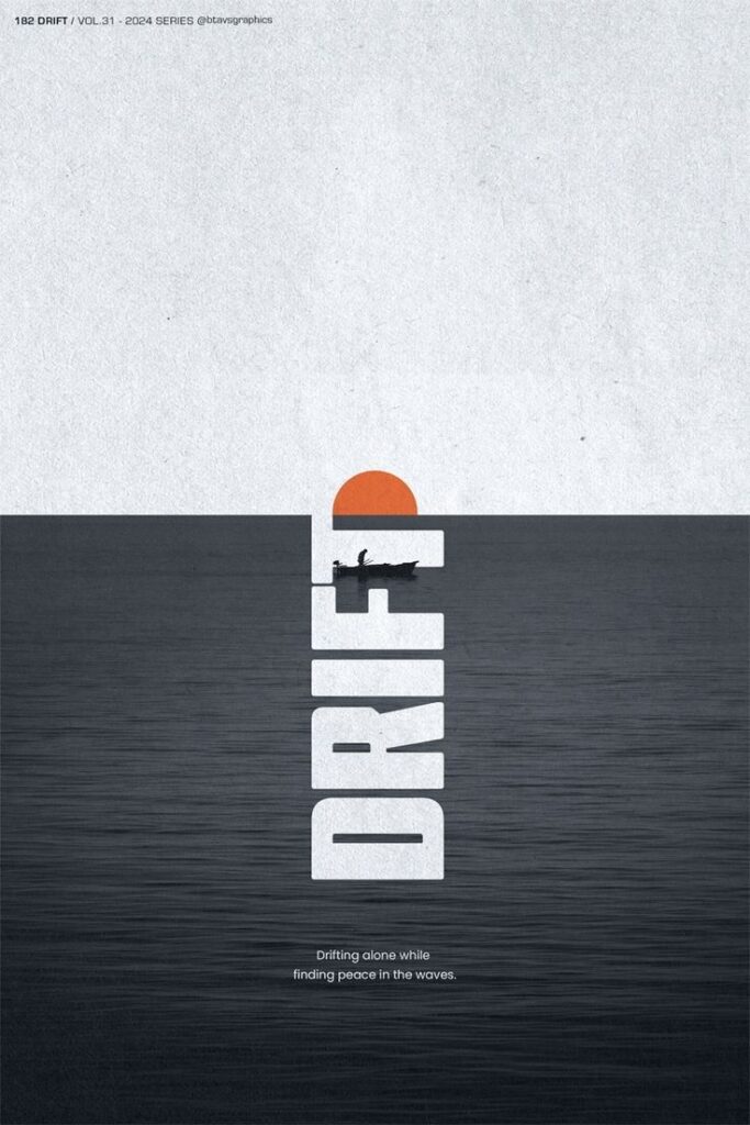
Minimalism emphasizes clarity, space, and restraint. You often work with limited color palettes, clean typography, and simple layouts to highlight the essentials. This style remains popular in branding because it communicates professionalism and avoids visual clutter.
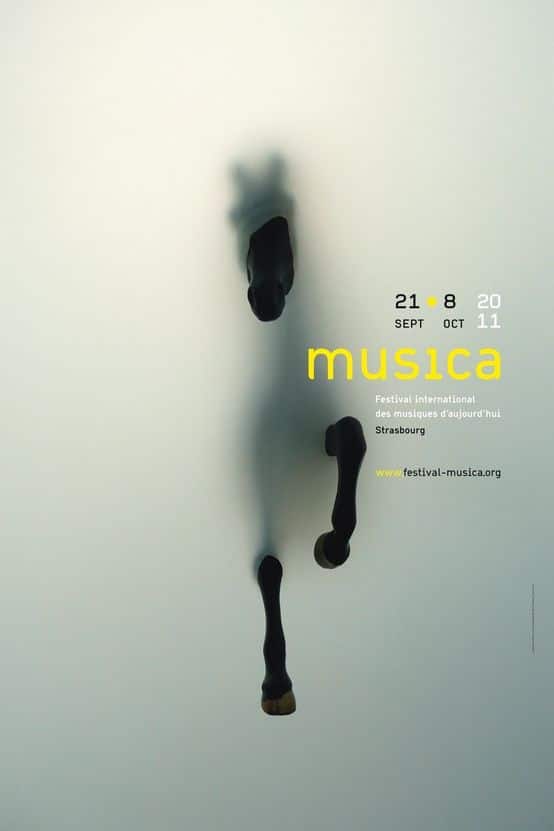
Maximalism takes the opposite route. Instead of restraint, you layer bold colors, dense patterns, and expressive typography. This style works well when you want to create energy, personality, or a strong cultural reference in your design.
You may also notice hybrid approaches. Some projects pair minimalist layouts with bursts of maximalist elements, such as oversized text or vibrant accents. This balance lets you keep usability intact while still catching attention.
Key differences:
| Style | Characteristics | Best Use Case |
|---|---|---|
| Minimalist | Clean lines, muted colors, open space | Branding, tech, corporate design |
| Maximalist | Bright palettes, layered visuals, detail | Entertainment, fashion, creative ads |
Psychedelic and Anti-Design Movements
Psychedelic design draws from 1960s and 70s aesthetics. You see swirling patterns, vibrant gradients, and distorted typography. This style often appears in music, fashion, and event branding because it creates a sense of movement and visual intensity.
Anti-design rejects conventional rules. Instead of symmetry, balance, or readability, it embraces irregular layouts, clashing colors, and raw textures. You might use it for projects that aim to disrupt expectations or appeal to audiences tired of polished visuals.
Both movements challenge traditional design logic. While psychedelic design leans on nostalgia and sensory impact, anti-design pushes against order itself. You should consider them carefully, since they can energize your work but may also reduce clarity if overused.
Geometric Shapes in Modern Design
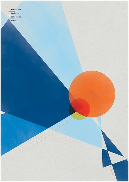
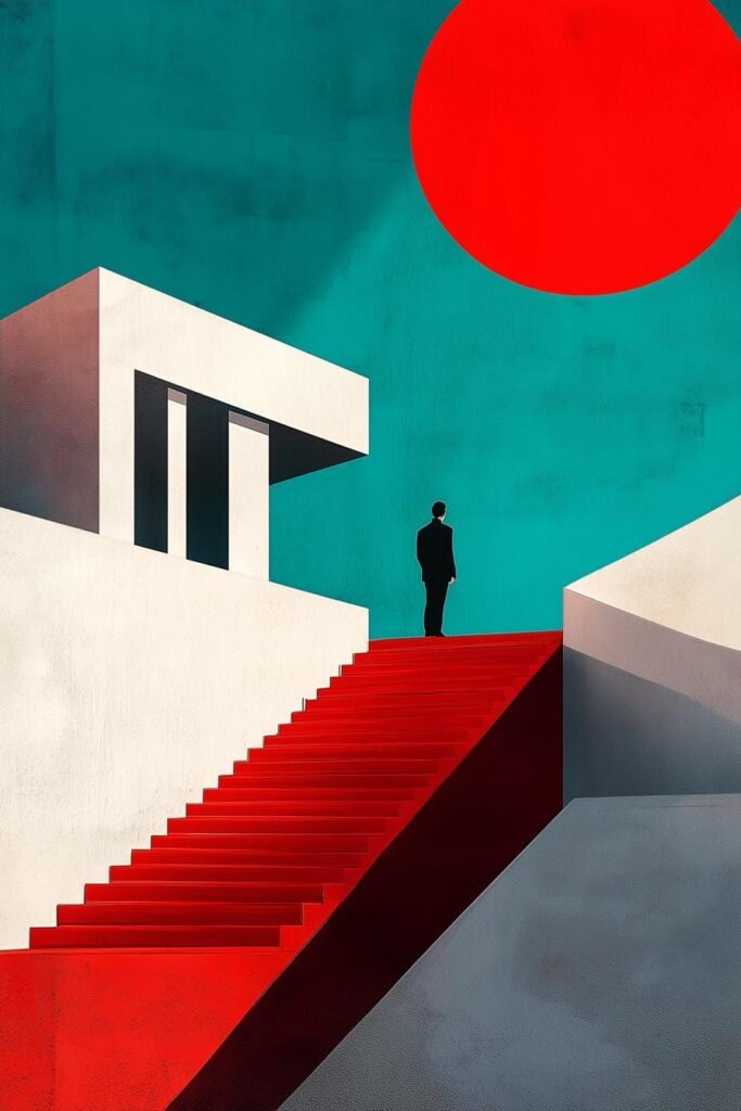
Geometric shapes remain a reliable tool because they bring structure and consistency. You often see circles, triangles, and grids used to frame layouts, build icons, or guide the eye across a page.
This approach works well in digital interfaces, where geometry helps create intuitive navigation. For example, square modules in web design make responsive layouts predictable and easy to scale.
Designers also combine geometry with gradients, textures, or motion graphics. This mix keeps the look modern while avoiding rigidity. You can use geometric patterns to create brand recognition, especially when paired with consistent color schemes and typography.
Practical uses include:
- Logos that rely on simple, memorable shapes
- Posters with abstract geometric patterns
- UI elements built on grid-based layouts
Inspiring Graphic Design Project Ideas
Strong design projects let you practice skills in branding, communication, and visual storytelling. You can focus on identity systems, packaging, posters, data-driven graphics, or illustration to develop a versatile portfolio and refine your creative process.
Logo and Brand Identity Projects
Logo design and brand identity projects help you learn how to create consistent visuals that communicate values clearly. A good exercise is to design a complete identity for a fictional company, including a logo, color palette, and typography system.
You can also practice by rebranding an existing business. Redesigning logos for local shops or non-profits gives you real-world context while testing your ability to balance creativity with functionality.
Consider building brand guidelines as part of the project. A simple table outlining logo usage, font hierarchy, and color codes not only strengthens your work but also mirrors professional standards.
Packaging and Poster Design Concepts
Packaging design projects let you explore how form and graphics influence consumer choices. You can design labels for products like coffee bags, skincare bottles, or snack boxes, focusing on clarity, legibility, and shelf appeal.
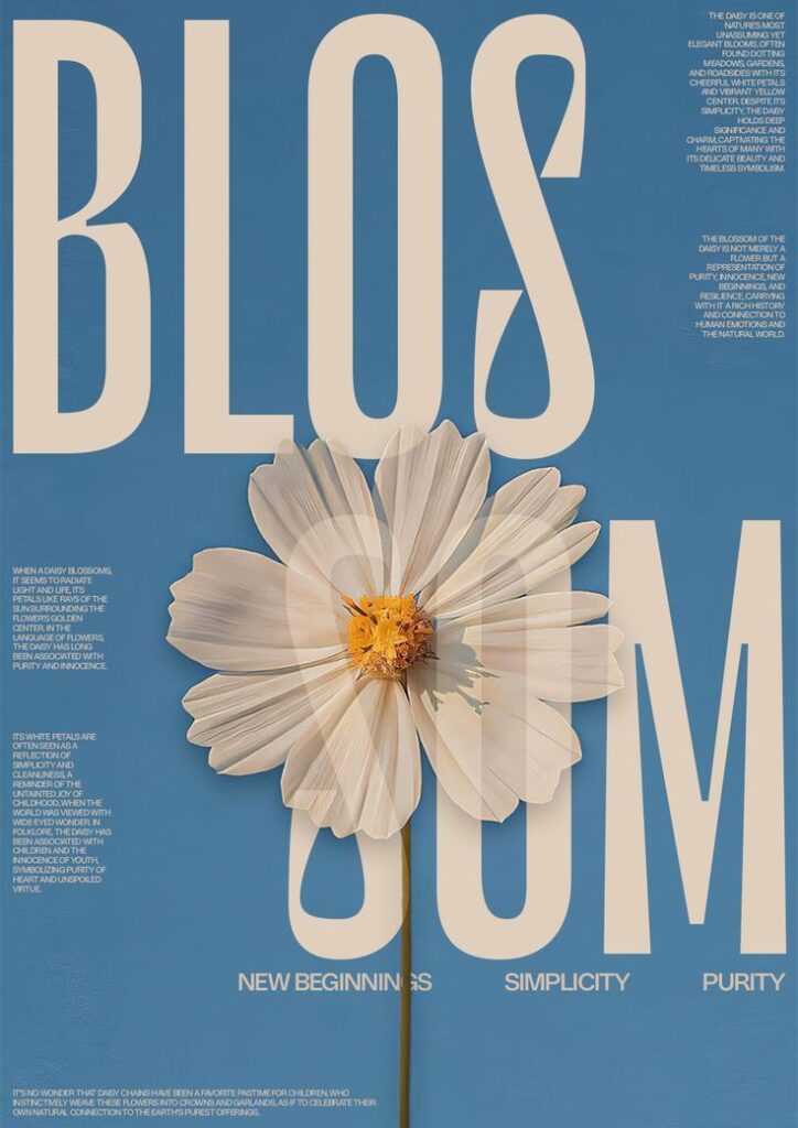
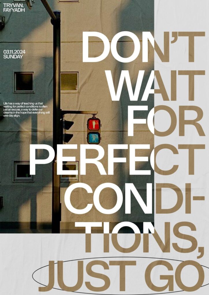
Poster design offers a chance to experiment with scale and layout. Try creating posters for events such as concerts, film festivals, or community workshops. This type of project emphasizes hierarchy, typography, and visual balance.
A useful approach is to design a set where the packaging and poster share a unified style. This teaches you how to extend a brand identity across multiple formats while keeping designs cohesive.
Infographic and Data Visualization Ideas
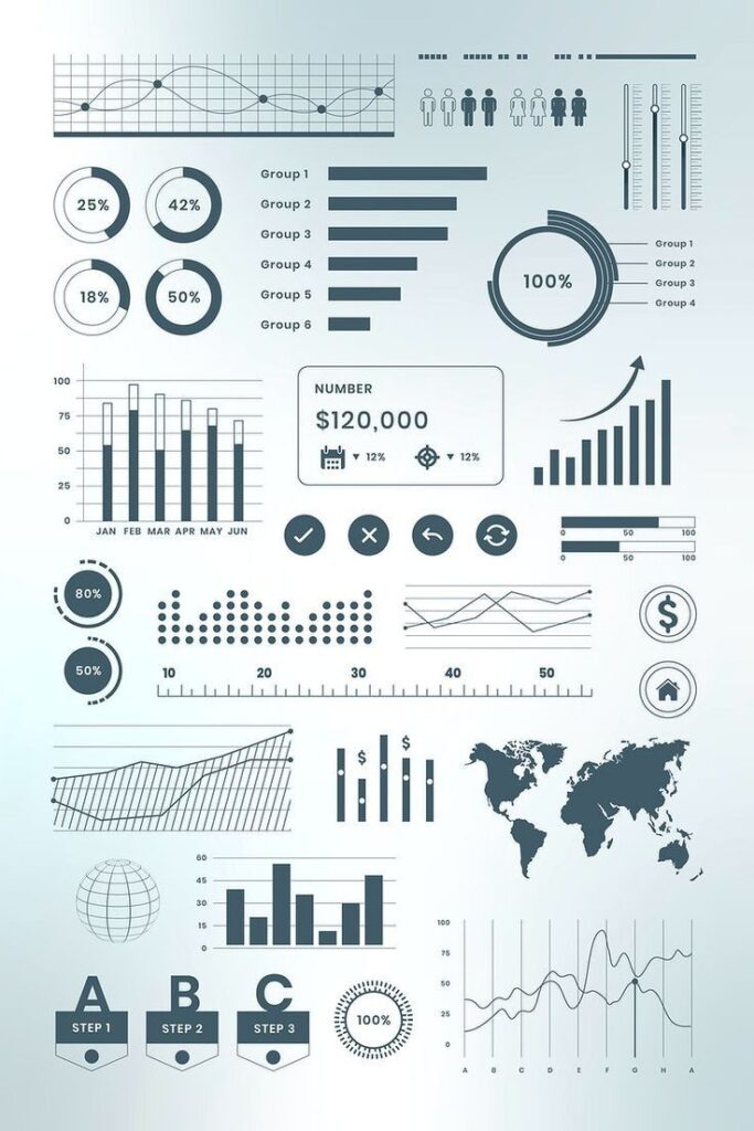
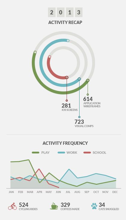
Infographic design challenges you to present complex information in a way that is easy to understand. You can start by collecting data on a topic you find interesting, such as environmental statistics, sports results, or tech trends.
Focus on clarity and accuracy rather than decoration. Use charts, icons, and color coding to highlight comparisons and patterns. A well-structured infographic should let someone grasp key points within seconds.
For practice, create both static and interactive versions. A static infographic works well for print or social media, while an interactive version can include hover effects or animations for web use.
Hand-Drawn Illustration Applications
Hand-drawn illustration projects allow you to add a personal touch to design work. You can create custom illustrations for book covers, editorial spreads, or digital stickers.
This approach works well when you want to avoid generic stock imagery. A hand-drawn element can make a brand identity or poster design feel more approachable and unique.
Experiment with combining illustration and typography. For example, illustrated letterforms or decorative borders can give a project a distinctive character while still supporting readability and function.
Digital Media and Social Graphics
Strong digital design connects your brand with audiences across multiple platforms. Clear UI design, engaging social media graphics, and purposeful digital art all support consistent communication and effective content marketing.
Website and UI Design Inspiration
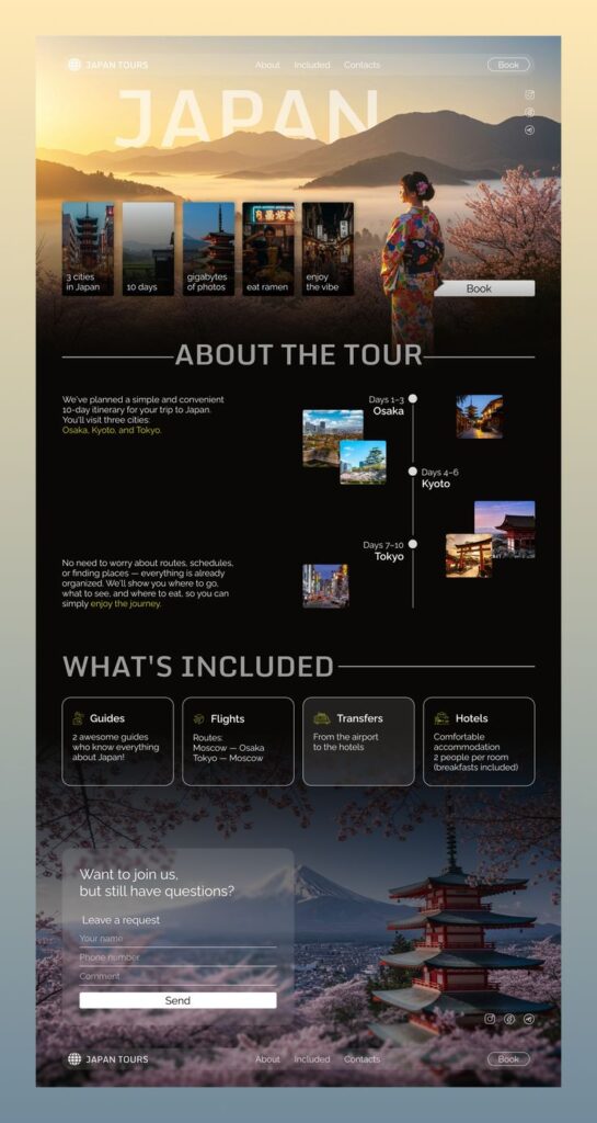
Your website design and UI design set the tone for how users interact with your brand. Navigation, layout, and readability matter as much as visuals. A cluttered interface frustrates visitors, while a clean structure improves trust.
Focus on responsive design so your site looks consistent on desktop, tablet, and mobile. Use grid systems, balanced spacing, and a clear hierarchy of headings to guide attention. Typography and color choices should enhance readability and reflect your brand identity.
Consider adding micro-interactions such as hover effects or animated buttons. These subtle details improve usability without overwhelming visitors. Studying modern web design examples can help you identify patterns that align with your goals.
Social Media Graphics Strategies
Social media graphics need to capture attention quickly. Platforms like Instagram, TikTok, and LinkedIn each favor different formats, so you should adapt your designs accordingly. Motion graphics, AI-generated visuals, and minimal branding are trending in 2025 and can help your posts stand out.
Use templates to maintain consistency while saving time. A consistent color palette and typography strengthen recognition across platforms. Infographics, carousel posts, and short video loops are effective formats for delivering information in a concise way.
To increase engagement, test variations of graphics and analyze performance data. A/B testing helps you understand what resonates with your audience. Also, consider accessibility by using readable fonts, alt text, and high-contrast colors.
Digital Art and Content Marketing
Digital art plays a growing role in content marketing by adding unique visuals that go beyond stock images. Custom illustrations, glitch effects, and AR filters provide fresh ways to connect with audiences. These elements can also highlight creativity and authenticity within your brand.
When used in campaigns, digital art should support your messaging rather than distract from it. Align each visual with the tone of your content marketing strategy. For example:
- Illustrations work well for explainer content.
- Motion graphics simplify complex topics.
- AR filters encourage user interaction.
Integrating digital art into your digital media strategy helps you create memorable experiences. By combining design with storytelling, you make your content more engaging and adaptable across multiple channels.

Tools and Techniques for Creative Design
You can expand your design process by combining digital platforms with traditional methods. Practical use of AI software, quick prototyping tools, and hands-on sketching or crafting can help you generate ideas, refine layouts, and present visuals more effectively.
Leveraging AI Tools in Design
AI tools now play a direct role in design workflows. You can use them to generate layout suggestions, color palettes, or even create variations of a single concept in seconds. This reduces repetitive tasks and frees up time for refining the creative direction.
Some platforms integrate AI-driven image enhancement, background removal, or automatic resizing for multiple formats. These features help you prepare designs for print, web, and social media without starting from scratch.
You should also explore AI-powered mockup generators. They allow you to test how a logo, poster, or packaging design looks in real-world settings. While these tools accelerate production, they work best when you guide them with clear inputs and adjust the results to match your vision.
Using Canva for Quick Prototyping
Canva gives you a fast way to turn ideas into shareable visuals. With drag-and-drop templates, you can build prototypes for posters, presentations, or social media campaigns without advanced design software. This makes it useful for testing concepts before committing to more complex tools.
You can adjust fonts, colors, and layouts quickly, which helps you evaluate multiple design directions in a short time. The platform also supports collaboration features, letting team members comment or edit in real time.
For quick brand mockups, you can upload custom logos, palettes, and typography. This ensures consistency across different prototypes. While Canva has limitations compared to professional suites, it offers speed and accessibility when you need to validate ideas early in the process.
Arts and Crafts Techniques
Traditional arts and crafts remain valuable for sparking creativity. Sketching with pencils, markers, or ink helps you explore shapes and layouts before moving to digital platforms. You can also create mood boards with cutouts, textures, and printed materials to visualize style directions.
Working with physical materials often reveals design possibilities you might overlook on a screen. For example, experimenting with paper folding, collage, or layering colors can inspire unique digital treatments later.
Keeping a dedicated notebook for sketches ensures you capture ideas as they come. By combining analog exploration with digital refinement, you strengthen both the originality and clarity of your designs.

Designing for Impact and Audience
Design choices influence how people understand your message, interact with your work, and decide whether to engage further. Clear communication, usability, and visual appeal determine whether your design connects with the right people and achieves its purpose.
Building a Strong Target Audience Connection
You need to understand who you are designing for before you start working on visuals. Defining your target audience helps you choose the right style, tone, and visual elements that resonate with their preferences and expectations.
Research methods such as surveys, interviews, and analytics give you insight into demographics, interests, and behaviors. This information allows you to tailor your design so it feels relevant and personal.
Consider how color, typography, and imagery influence perception. For example:
- Younger audiences may respond to bold colors and playful fonts.
- Professional audiences may prefer clean layouts and muted tones.
When you align visuals with audience psychology, your design communicates more effectively and encourages stronger engagement.
Enhancing User Experience
User experience (UX) in graphic design focuses on how easy and enjoyable it is for someone to interact with your work. A design that looks appealing but confuses the user will fail to make a lasting impact.
You should prioritize clarity, readability, and accessibility. This means using legible fonts, consistent spacing, and layouts that guide the eye naturally. Visual hierarchy—such as larger headings, contrasting colors, and well-placed images—helps people process information quickly.
Testing your design with real users is valuable. Feedback highlights whether navigation feels intuitive, whether text is easy to read, and whether the message comes across as intended. Iterating based on this feedback ensures the design works for its intended audience.
Effective Book Cover Design
A book cover must capture attention, communicate genre, and give a sense of tone within seconds. Since readers often decide based on first impressions, your design should balance creativity with clarity.
Focus on three core elements:
- Typography that reflects the book’s style.
- Imagery or illustration that conveys theme or subject.
- Color palette that signals mood and genre.
For example, a mystery novel may use darker tones and sharp typefaces, while a children’s book often relies on bright colors and playful illustrations. By aligning these choices with reader expectations, you create a cover that stands out while accurately representing the content.
- 0shares
- Facebook0
- Pinterest0
- Twitter0
- Reddit0


