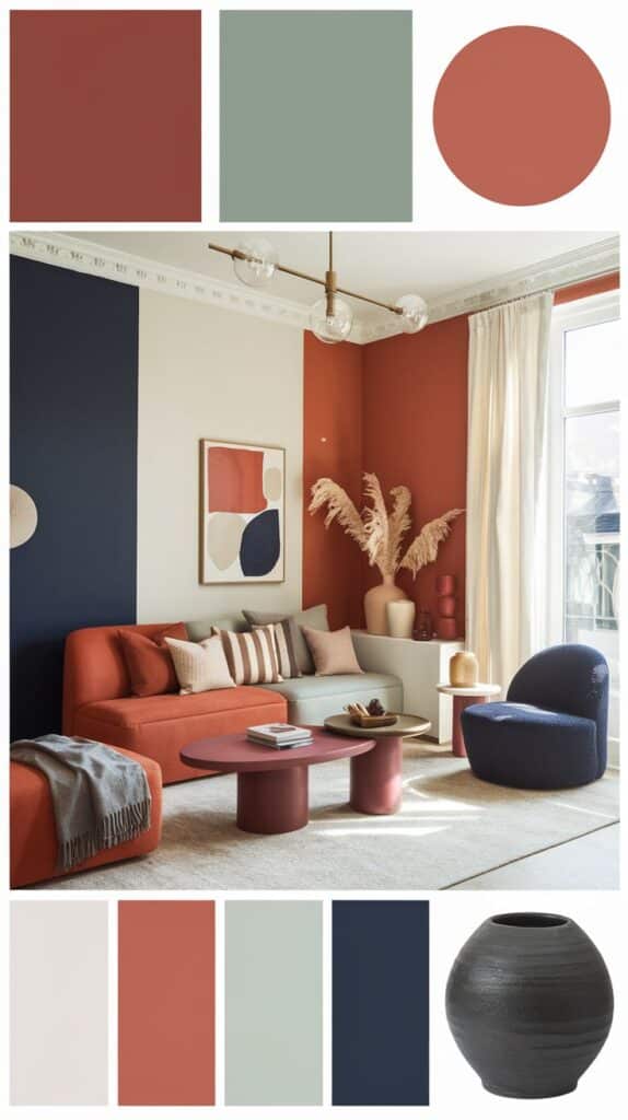
Color can change the mood and style of any room. Knowing the latest trends helps people make smart choices when updating their homes. The top 10 interior design color trends combine natural shades, bold accents, and timeless hues that fit many styles.
These trends reflect a balance between calm, earthy tones and energetic, bright colors. They also show how sustainability and global influences shape modern interiors. Readers will find easy ways to use these colors thoughtfully in different spaces.
Key Takeaways
- Current color trends mix natural shades with vibrant highlights.
- Choosing colors depends on balancing lasting style with fresh looks.
- Practical tips help apply trends in different rooms and settings.
Overview of Current Interior Design Color Trends
Interior design color trends change based on many reasons. These trends involve how people pick colors and how those choices shift over time. Understanding what shapes these trends can help when planning a room’s look.
Defining Color Trends in Interior Design
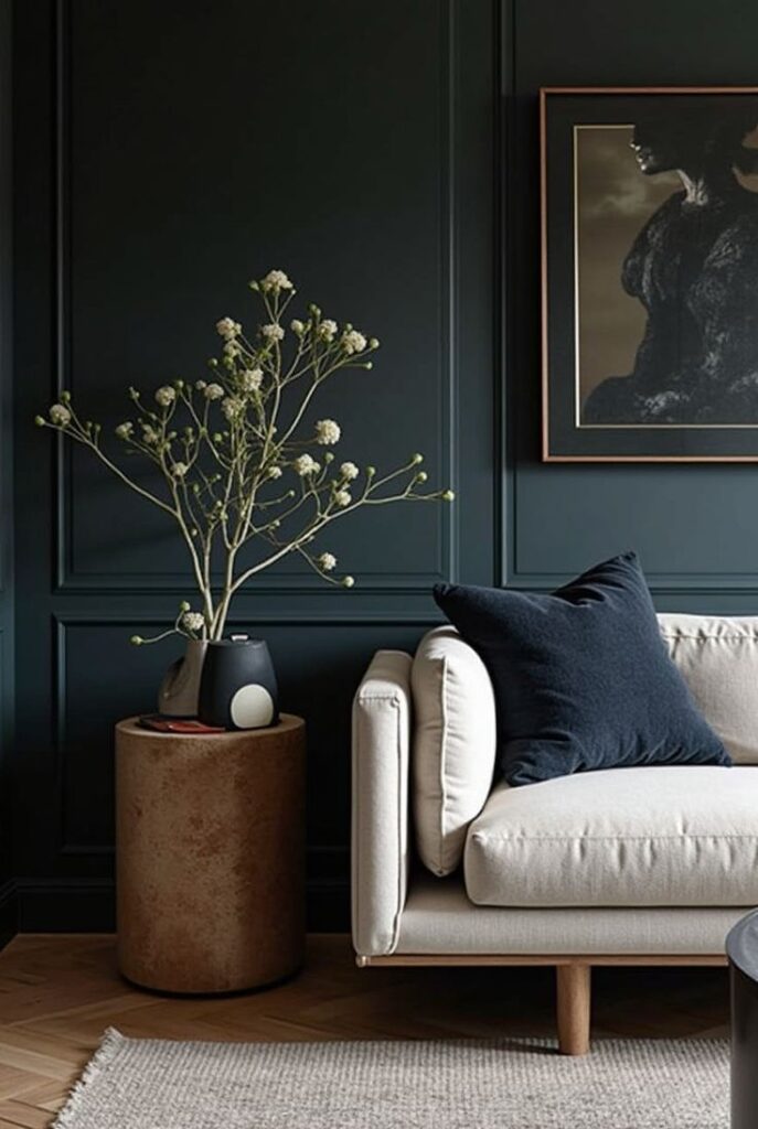
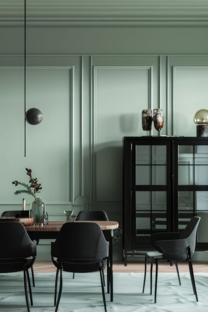
Color trends in interior design refer to popular hues and palettes used in homes and businesses. These are not random but often reflect what is stylish or appealing at a certain time.
Trends can include bold colors like deep blues or soft pastels such as muted pinks. Designers look at how colors work together, choosing ones that create the mood people want in a space.
Colors can also signal specific styles, like earth tones for natural themes or bright colors for modern, energetic rooms.
Factors Influencing Color Trends
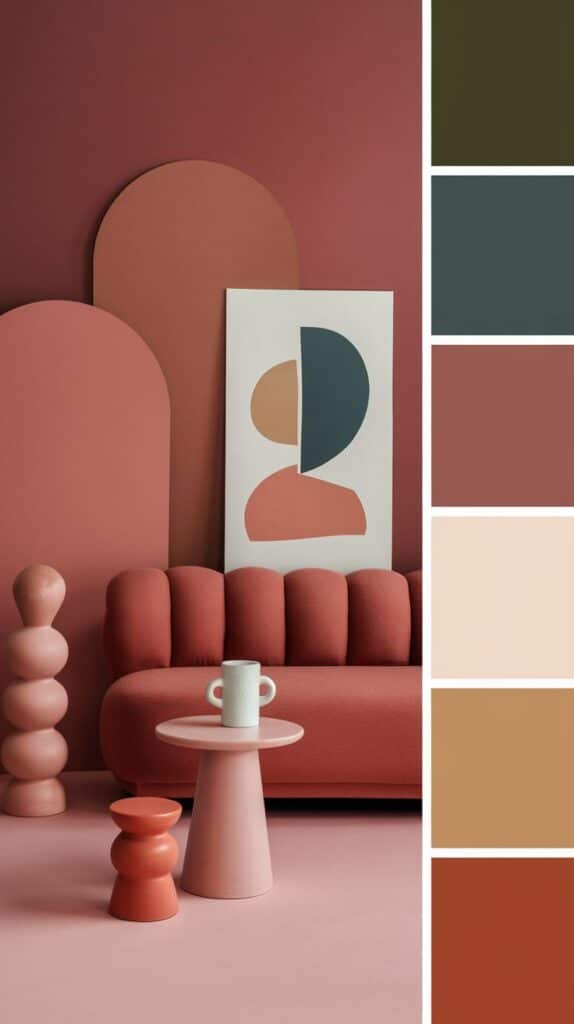
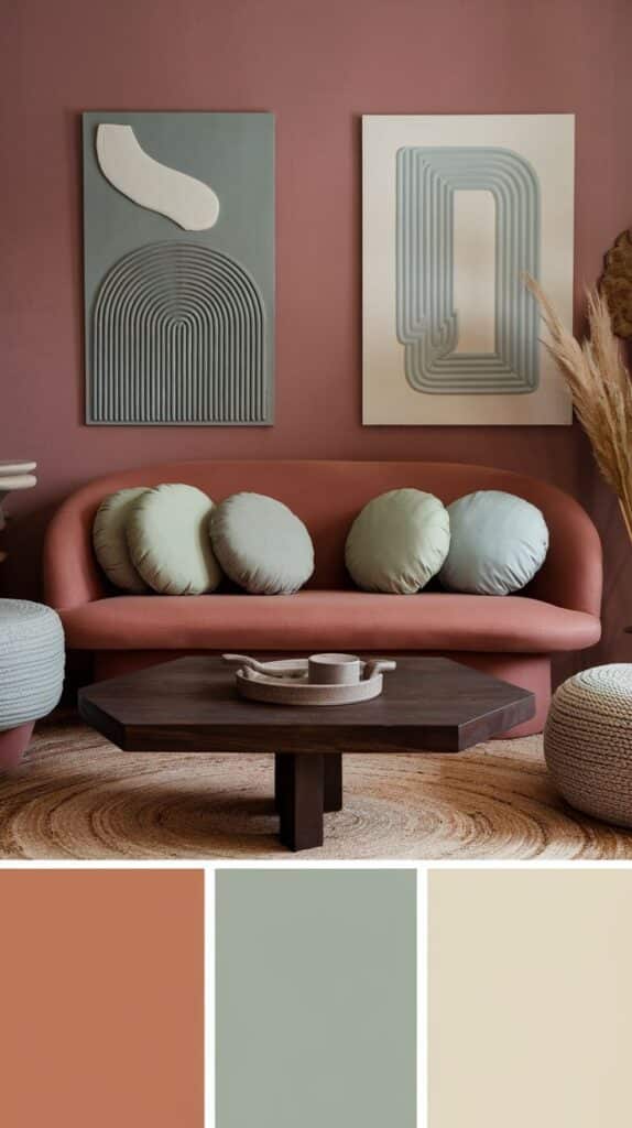
Several factors affect which colors become popular. Cultural events, social moods, and technology all play a role.
For example, during tough economic times, people might prefer calm, neutral colors to feel more grounded. Advances in paint technology can introduce new finishes, like matte or metallic, changing how colors are used.
Media and celebrity homes also influence what colors catch on. People often want to copy styles they see in magazines or online platforms.
Color Trend Cycles and Evolution
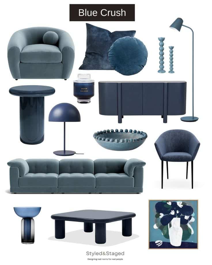
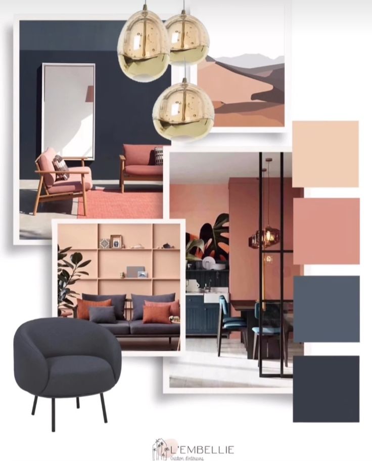
Color trends often follow a cycle of introduction, growth, peak, and decline. A new color appears slowly, then gains popularity quickly before becoming overused.
Over time, trends evolve as designers mix old ideas with new influences. For example, a bright shade from one year might become softer and more subtle the next.
Some colors never fully go away but change in how they are combined or highlighted in interiors. This keeps the color world fresh while respecting past favorites.
Top 10 Emerging Color Trends for Interiors
Certain colors are gaining popularity for their ability to create mood and style in a space. These trends include subtle natural shades, rich deep hues, gentle soft colors, and adventurous single-color designs. Each trend suits different tastes and room types.
Earthy Neutrals
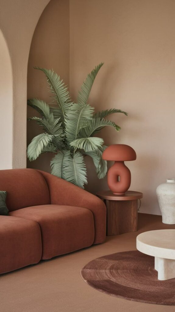
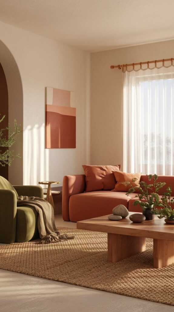
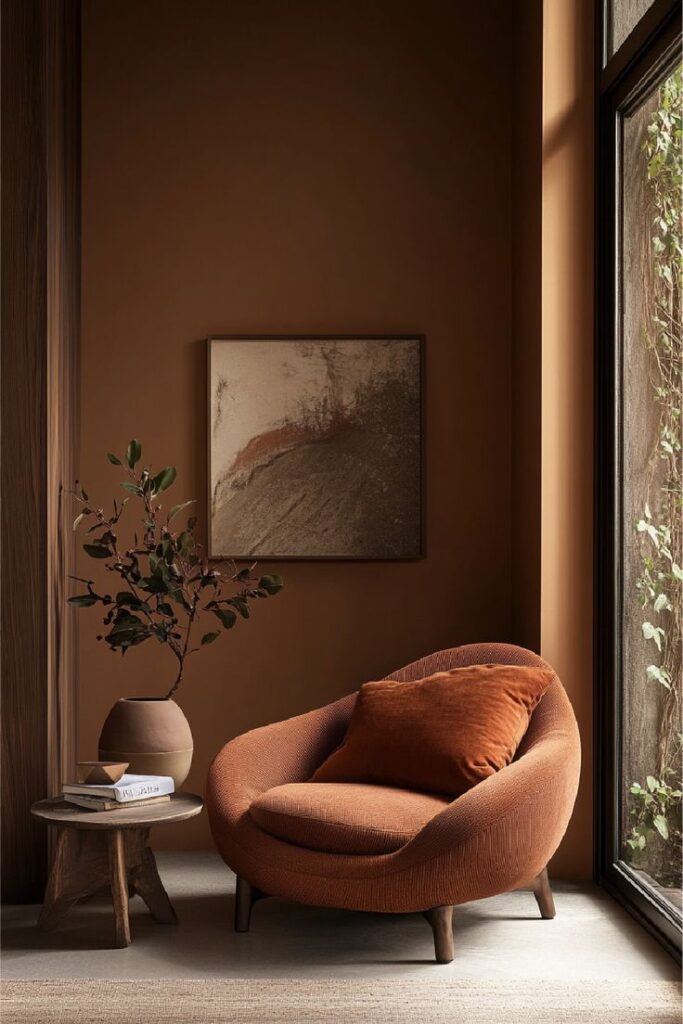
Earthy neutrals are warm tones inspired by nature, such as clay, terracotta, beige, and muted greens. They bring a calming, grounded feeling to interiors. These colors pair well with natural materials like wood, leather, and stone.
They work especially well in living rooms and bedrooms, creating a cozy and inviting space. Earthy neutrals also adapt easily to different styles, from rustic to modern minimalism. Using multiple shades of these tones adds depth without clutter.
Moody Jewel Tones
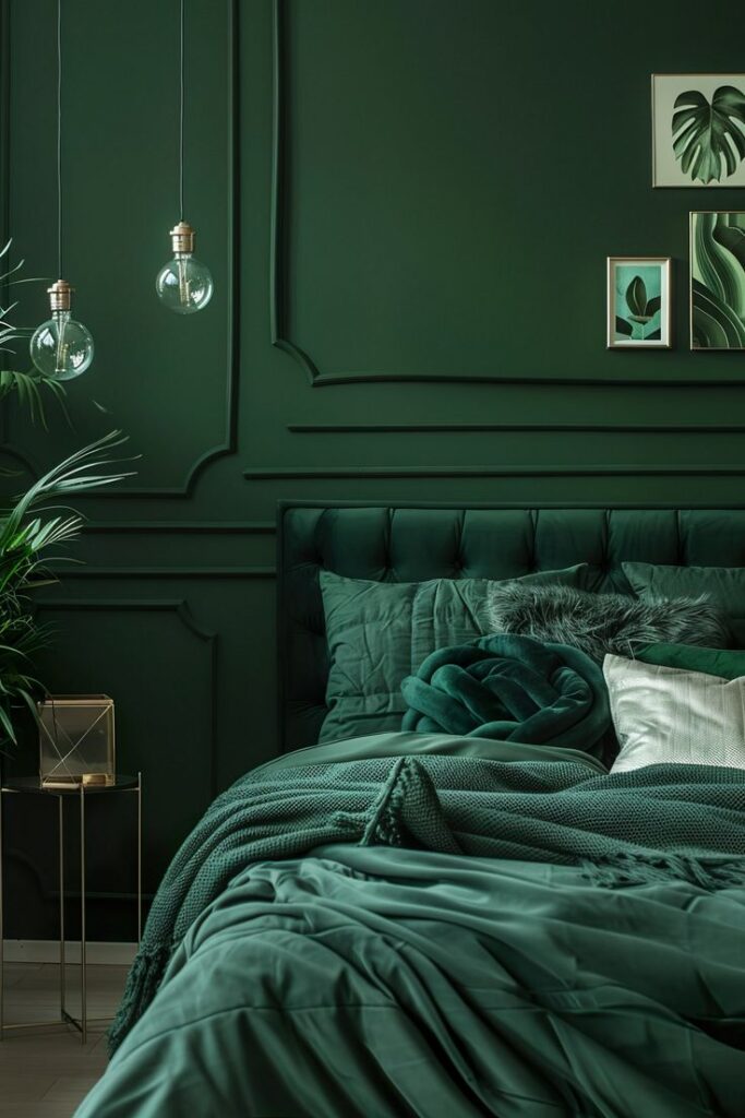
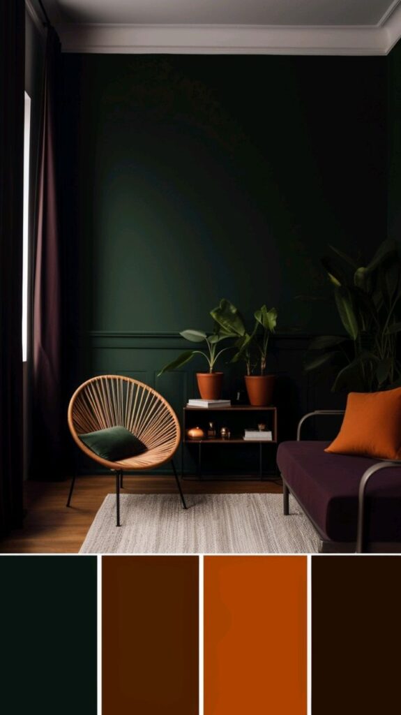
Moody jewel tones include deep colors like emerald green, sapphire blue, and amethyst purple. These colors add richness and drama to a room without overwhelming it. They often appear on accent walls, furniture, or decorative pieces.
Jewel tones work best in dining rooms and studies where a more intense, formal mood is desired. They pair well with gold or brass accents, adding a touch of sophistication. Proper lighting is important to keep these colors from feeling too dark.
Soft Pastels
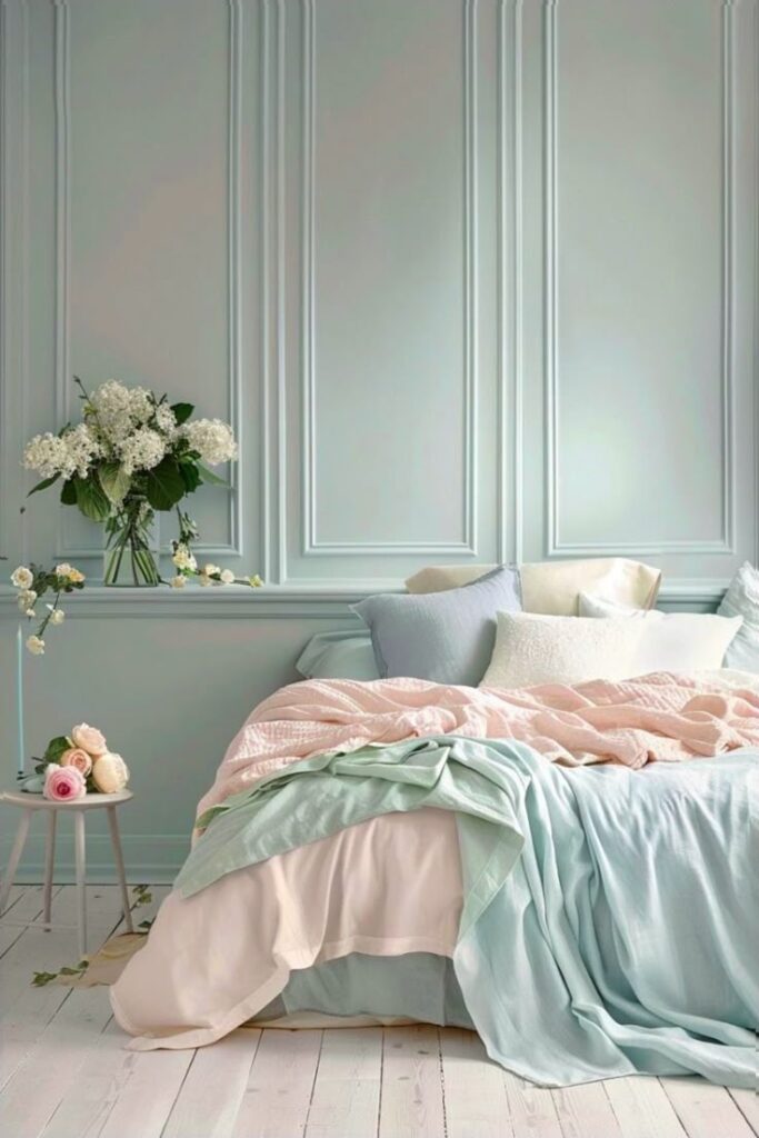
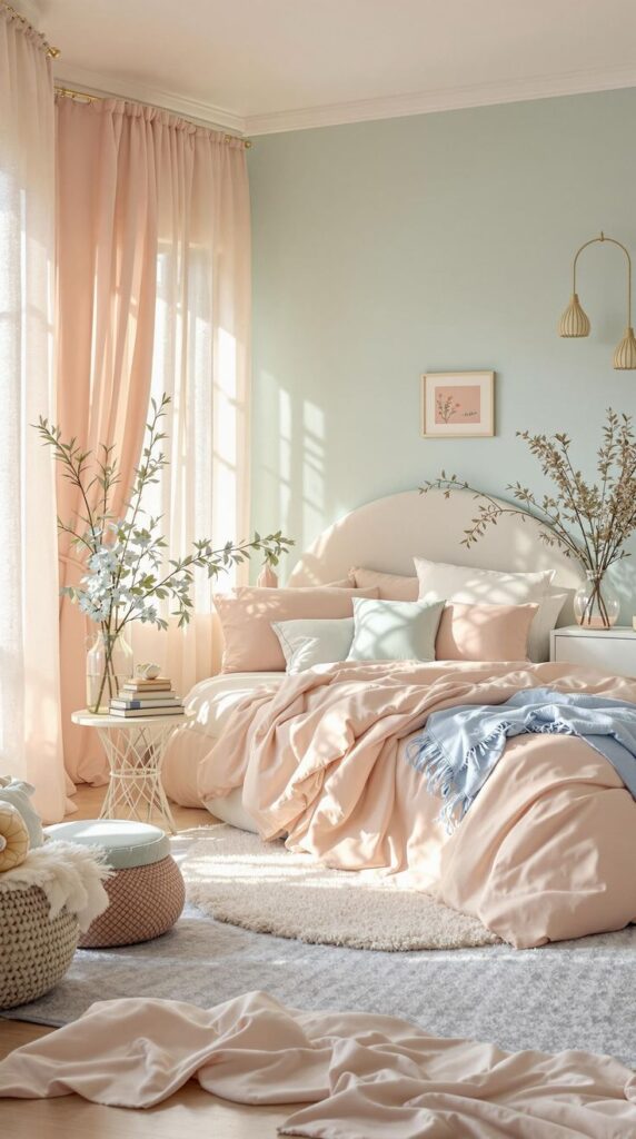
Soft pastels are light, muted colors such as pale pink, baby blue, lavender, and mint green. They provide a fresh, airy atmosphere that makes rooms feel open and bright. These colors are popular in bedrooms, nurseries, and kitchens.
Pastels blend well with whites and light woods for a Scandinavian or coastal look. Using pastels in a monochrome or gentle mix keeps the space peaceful and simple. They also soften harsh natural light without dulling the room.
Bold Monochromatic Schemes
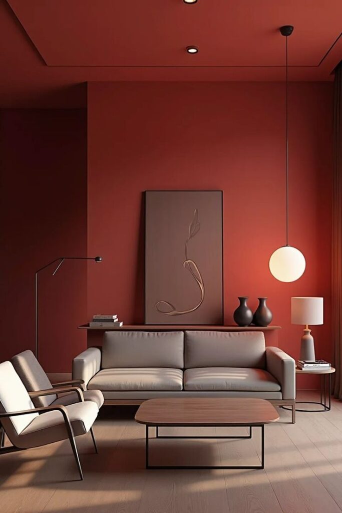
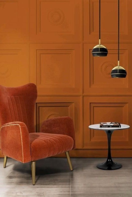
Bold monochromatic schemes use different shades and tints of a single color throughout the space. This approach creates a strong visual impact while maintaining harmony. Shades can range from very light to very dark within the same hue.
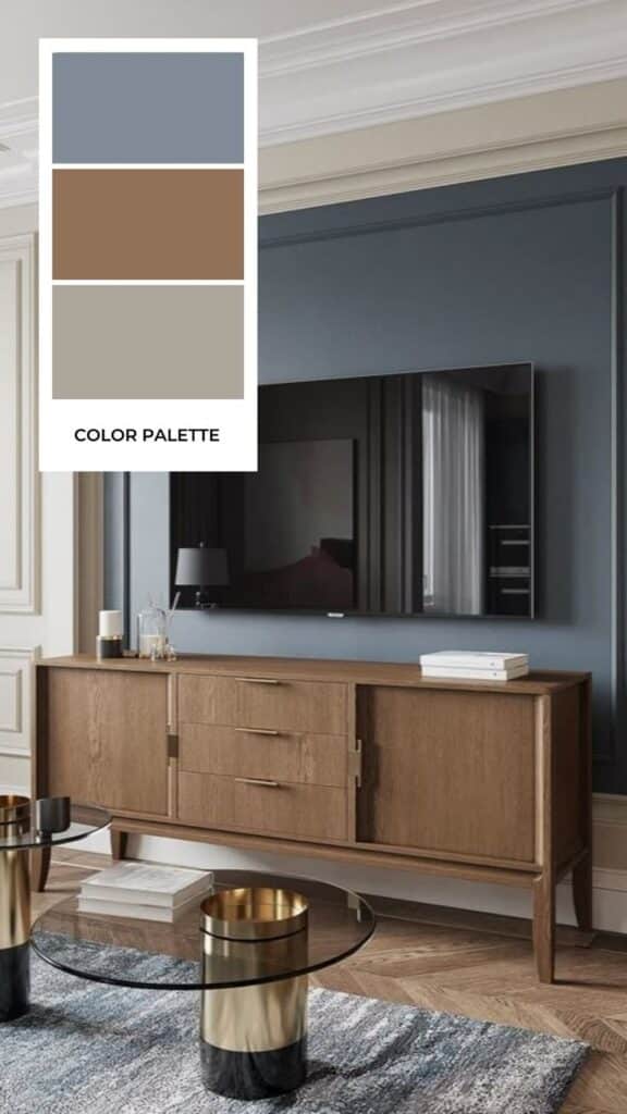
This trend works well with colors like deep blue or rich gray, emphasizing texture and shape to keep interest. It’s popular in modern and contemporary homes. A monochromatic design simplifies choices for furniture and decor but requires careful balance to avoid monotony.
Natural and Organic Color Palettes
Natural color palettes focus on tones found in nature. These colors create calm and welcoming spaces by using earth-inspired shades. They offer warmth, freshness, and a grounded feel to interiors.
Warm Terracottas
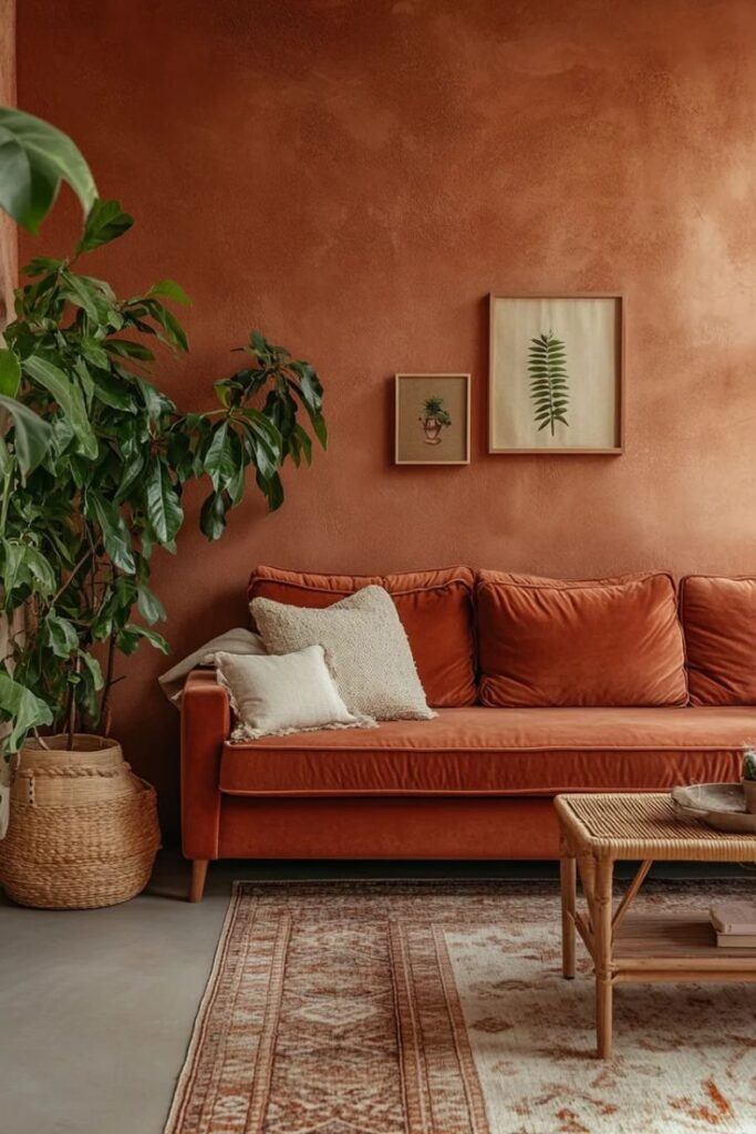
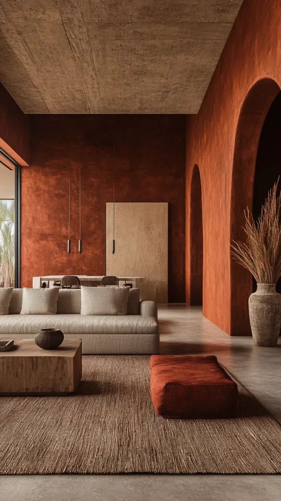
Warm terracotta shades bring a rich, earthy quality to rooms. These colors range from deep reds to soft oranges and create a strong, cozy backdrop. Terracotta works well on walls or accent pieces like pillows and pottery.
This color helps add warmth without feeling too bright or overwhelming. It pairs nicely with natural wood or stone textures. Terracotta shades also complement metals such as bronze or copper, enhancing the organic vibe.
Sage Green and Botanical Shades
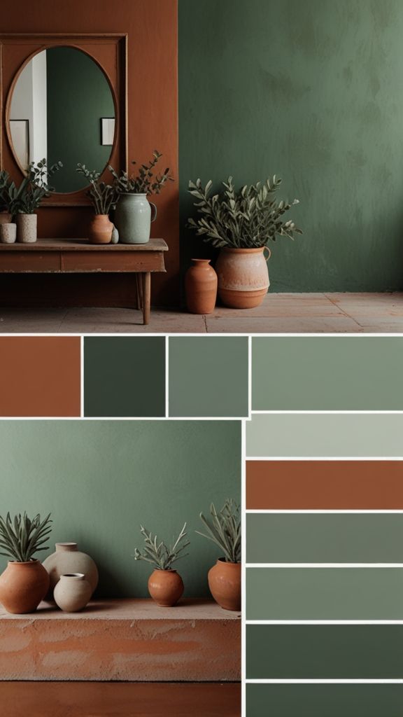
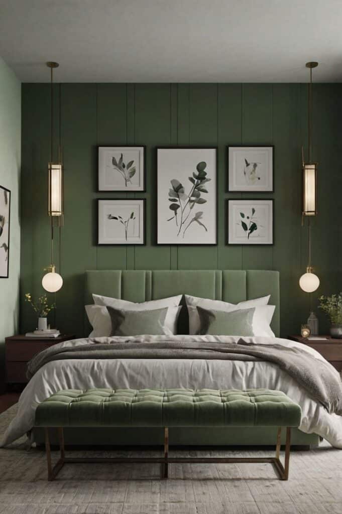
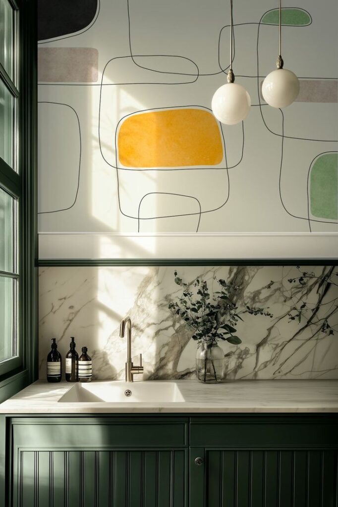
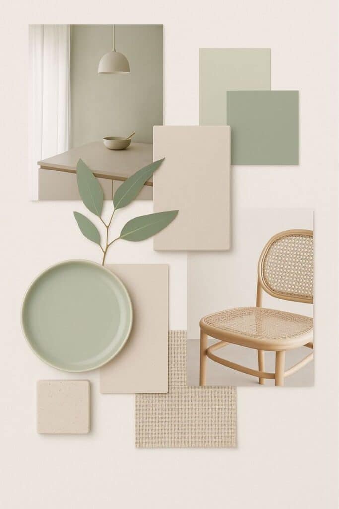
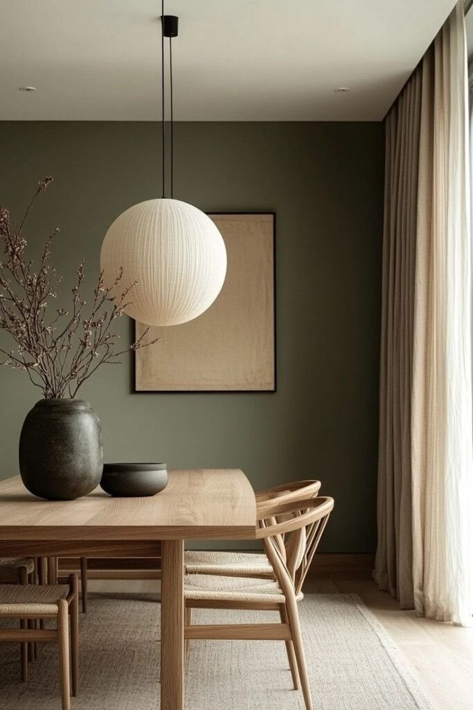
Sage green is soft and muted, making it a popular choice for natural interiors. It blends well with other plant-inspired greens and neutral tones. Sage green creates a peaceful, refreshing atmosphere often used in living rooms and bedrooms.
Botanical shades include olive, moss, and fern greens, giving layers to the palette. These colors connect indoor spaces to the outdoors. They work well in fabrics, walls, and decor to bring a subtle nature element inside.
Sandy and Clay Hues
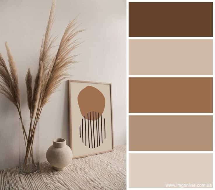
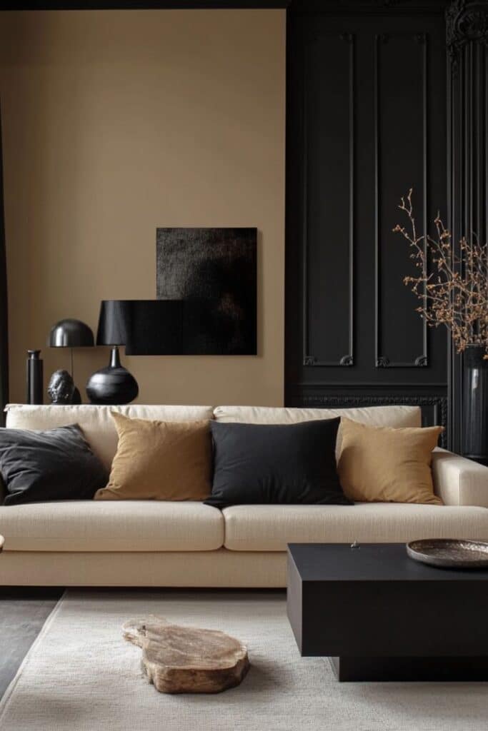
Sandy and clay colors reflect the earth’s neutral tones. These include beige, taupe, and muted browns. They offer a soothing background that balances bolder colors like terracotta or green.
These hues are versatile for walls, furniture, and flooring. They help create a relaxed and grounded space without drawing too much attention. Using sandy and clay shades is ideal for those wanting a neutral but warm interior.
Vibrant and Playful Color Accents
This style uses bold colors to bring energy into spaces. It highlights simple ways to add life with bright touches and surprising combos that catch the eye. Bright colors are applied in focused spots or with mixes that feel fresh and upbeat.
Primary Color Pops
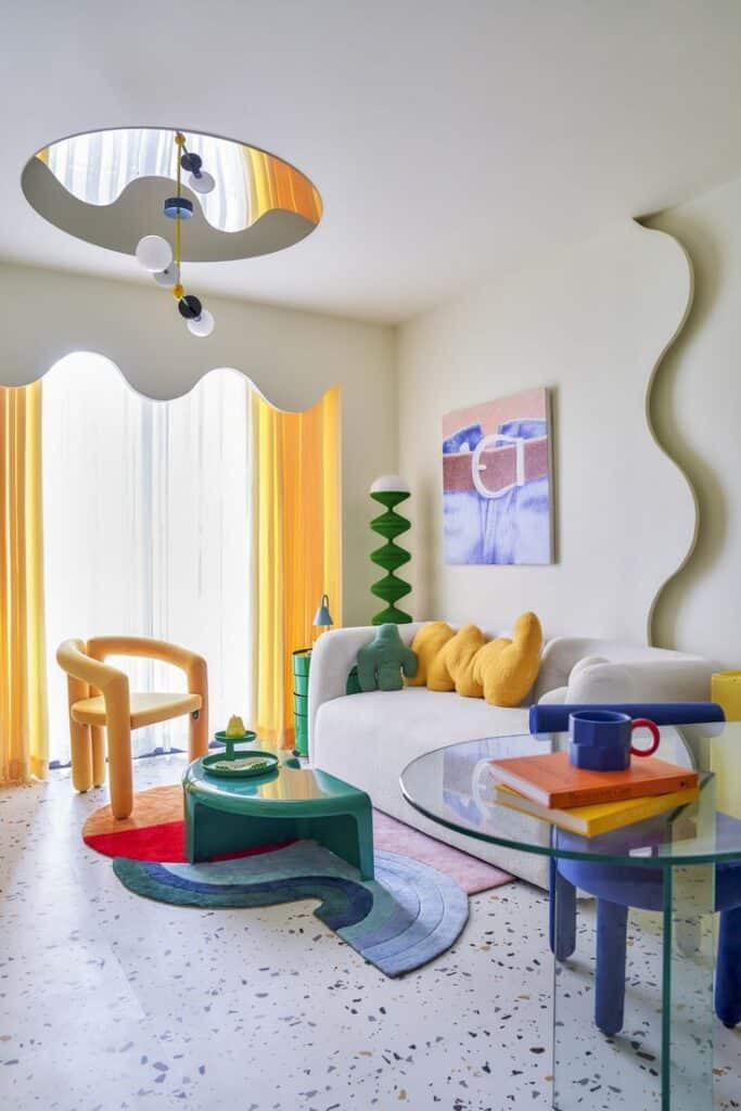
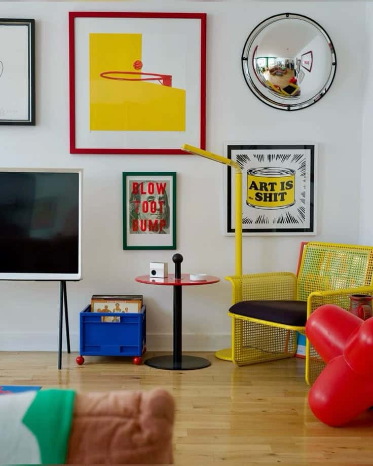
Using clear primary colors like red, blue, and yellow creates sharp, confident looks. These colors often appear in cushions, rugs, or artwork to make plain rooms feel lively. They work best on small pieces rather than large walls to avoid overwhelming the space.
Primary color pops fit well with neutral backgrounds such as white or gray. Adding a bright red chair or blue lampshade can instantly draw attention. It’s a simple trick to add energy without needing a full room makeover.
90s-Inspired Brights
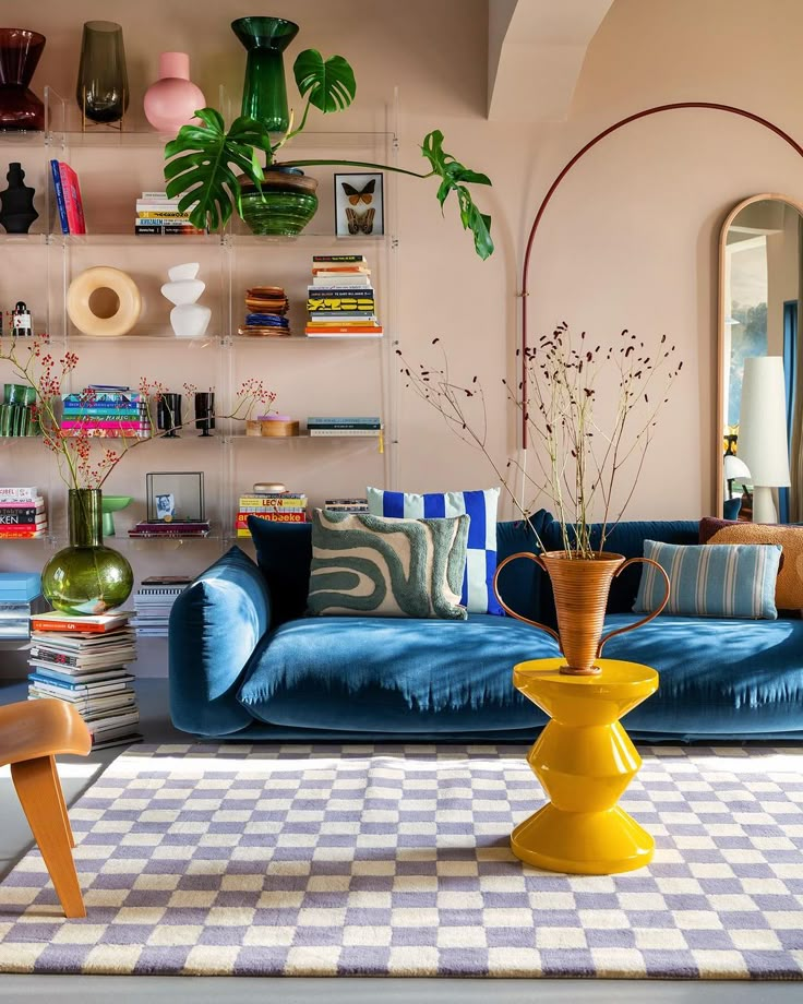
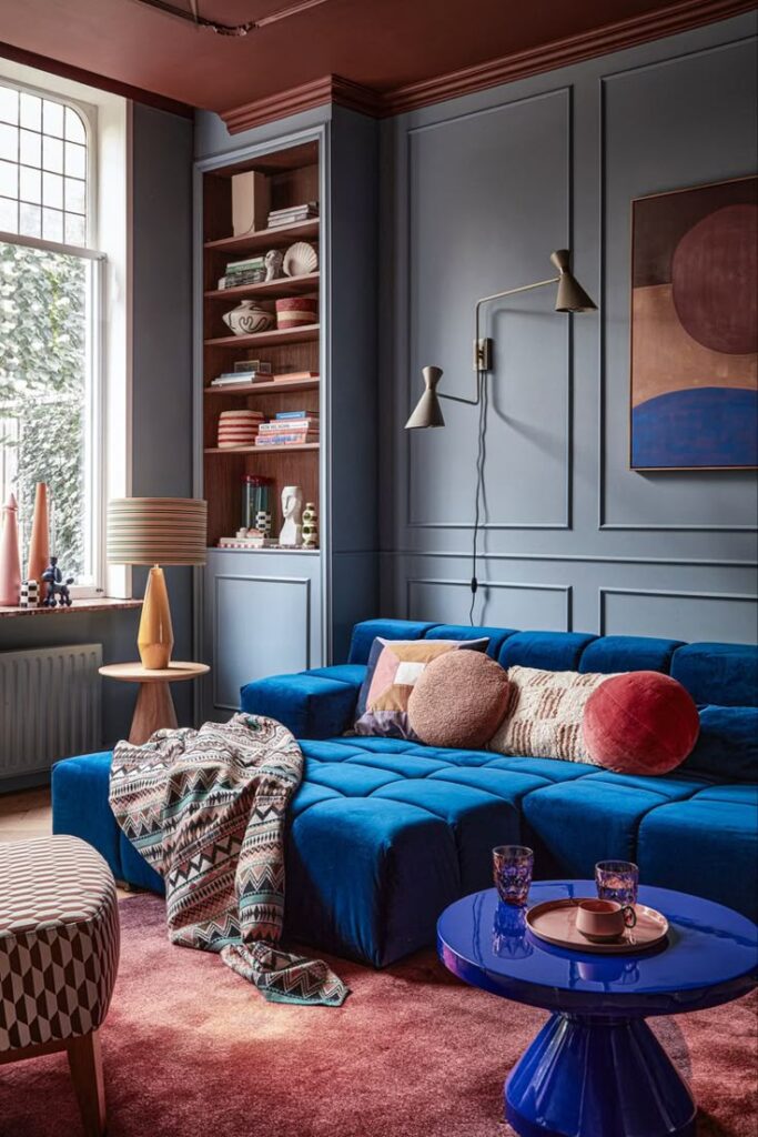
Bright pinks, neon greens, and electric oranges reflect the 1990s style making a comeback. These colors are fun and playful, adding youthfulness to rooms. They appear in decor items like vases, throw blankets, or wall art.
These brights work well in creative spaces or kid’s rooms. Pairing them with black or white can help balance the brightness. Using these colors in moderation keeps the look trendy, not overwhelming.
Unexpected Color Pairings
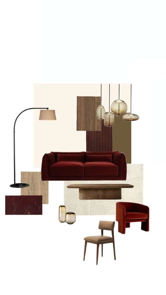

Combining colors that don’t usually go together creates surprising and fresh vibes. For example, bright teal with mustard yellow or hot pink with lime green breaks traditional rules but looks dynamic.
This trend encourages mixing textures too, like glossy with matte finishes, to add depth. It’s a way to personalize rooms and show creativity by breaking away from typical color schemes.
Timeless Versus Trendy: Balancing Color Adoption
Choosing colors in interior design means deciding between long-lasting styles and the latest fashions. It is important to mix steady colors with modern shades to keep rooms fresh but not outdated.
Incorporating Trends in Classic Interiors
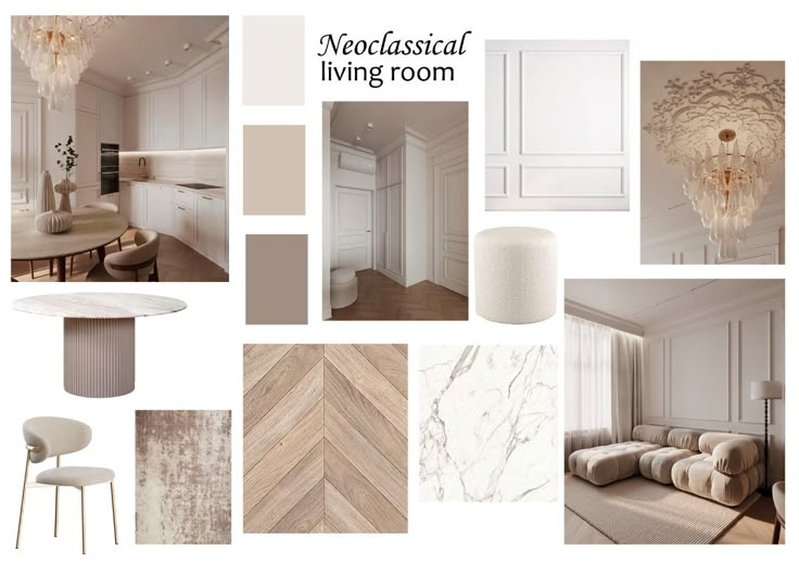
Trendy colors can update a classic interior without overwhelming it. Small elements like cushions, vases, or artwork are easy ways to add current colors. This method avoids costly changes and keeps the core design stable.
Using trendier shades in accessories allows a home to feel modern while preserving timeless furniture and wall colors. This gives a balanced look that respects tradition and current style.
Choosing Versatile Colors
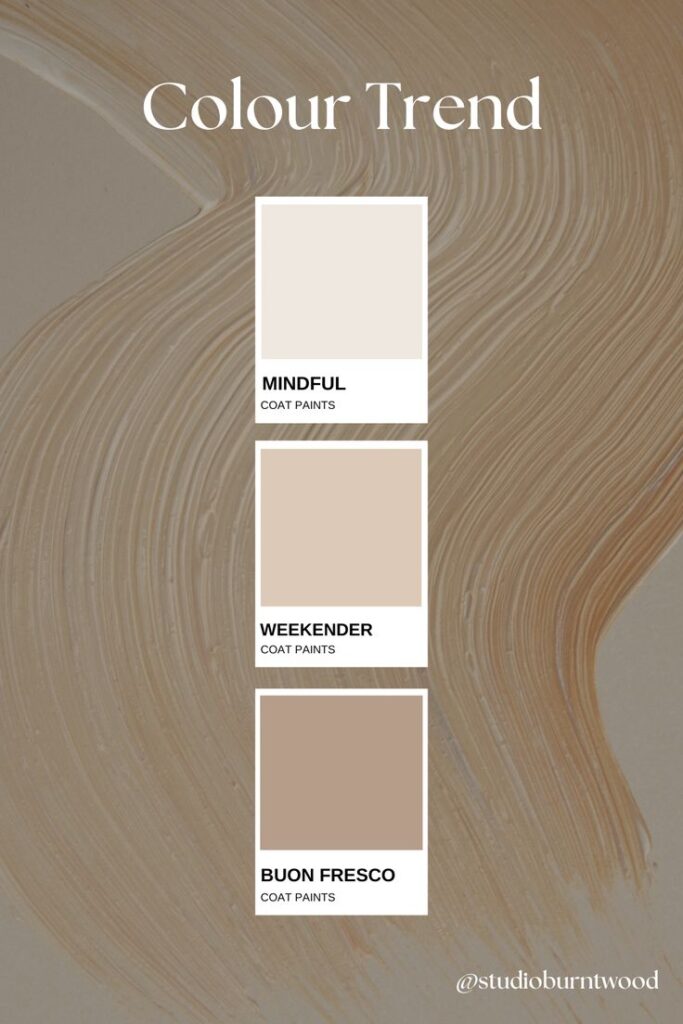
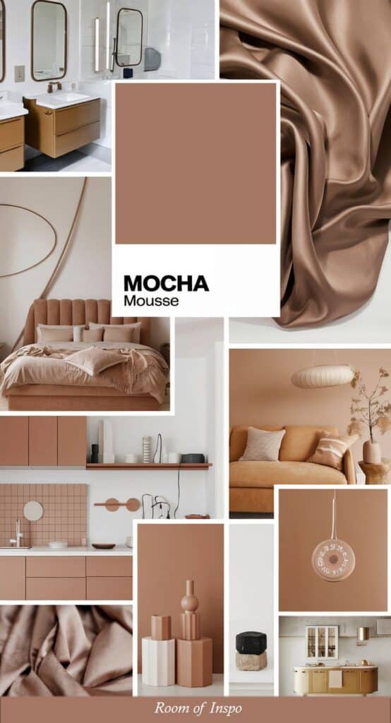
Versatile colors are those that work in many lighting conditions and with different furniture styles. Neutral tones like beige, gray, and soft white are popular because they blend easily with bolder or changing color choices.
Choosing colors that adjust well to both cool and warm lighting helps a room maintain a pleasant feel throughout the day. Versatile colors provide a reliable base for adding new trend colors later.
Longevity of Popular Shades
Some colors remain popular for decades because they suit many tastes and settings. Blue, especially in muted or navy forms, often lasts because it conveys calm and looks good with most materials.
Earth tones are also long-lasting thanks to their natural feel and ability to match wood, metal, and stone finishes. Picking colors with a history of staying in style reduces the risk of quick replacements.
Practical Tips for Applying Color Trends
Choosing where and how to add trendy colors makes a big difference in a room’s look. Using color in walls, furniture, and fabrics can help balance a space and keep it from feeling too busy or dull.
Accent Walls and Statement Pieces
An accent wall uses a bold or trendy color on one wall to draw attention. It works best in larger rooms where it can stand out without overwhelming the space.
Choosing the right wall is important. The wall behind a piece of furniture or facing the room entry usually works well. Avoid small spaces or rooms with many windows for accent walls, as color can clash or feel crowded.
Statement pieces like colorful chairs or art can add trend colors without a big commitment. They are easy to change when trends shift. Combining an accent wall with statement furniture can create a balanced and modern look.
Layering With Textiles
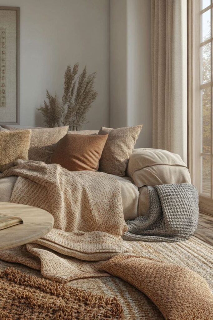
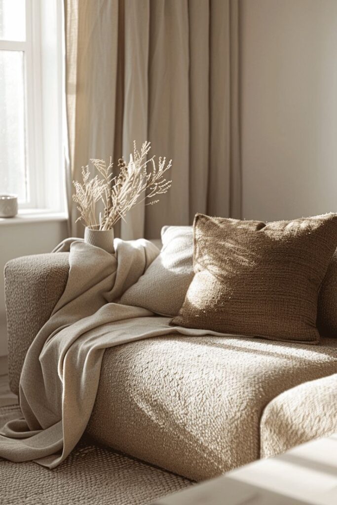
Textiles like pillows, rugs, and curtains are the easiest way to try new colors. They add softness and comfort while bringing in trends in small doses. Mixing different textures can make a color feel more natural and less flat.
Choose textiles in various shades or patterns to create depth. For example, a velvet pillow in a trendy color paired with a patterned rug can soften the overall effect. Layering allows the color to be adjusted seasonally or with changing trends.
Balancing Light and Dark Tones
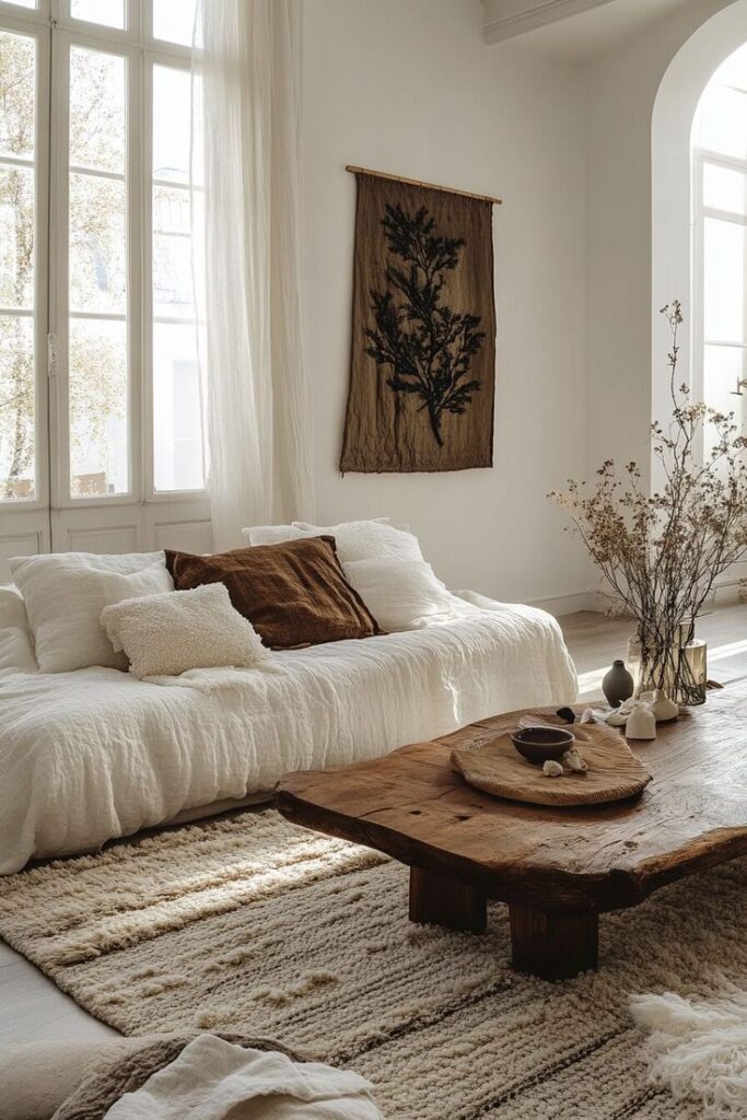
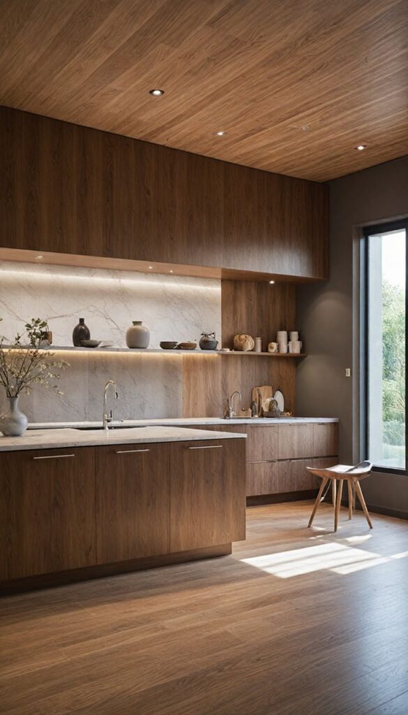
Light and dark tones need to be balanced to avoid a room feeling too heavy or washed out. When using trendy dark colors, balance them with lighter walls or furniture to keep a space open.
For rooms with less natural light, using too many dark shades can make it feel smaller. Try pairing dark trendy colors with light woods, mirrors, or white trim to reflect light. If a color is very bright, mix it with neutral shades to soften the impact.
Color Trends by Room Type
Different rooms benefit from specific color choices that enhance their purpose and mood. These trends focus on practical colors that offer comfort, style, and freshness, tailored to each space.
Living Room Color Directions
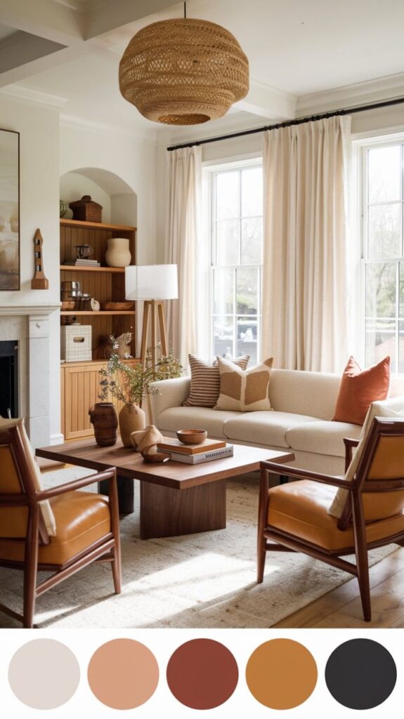
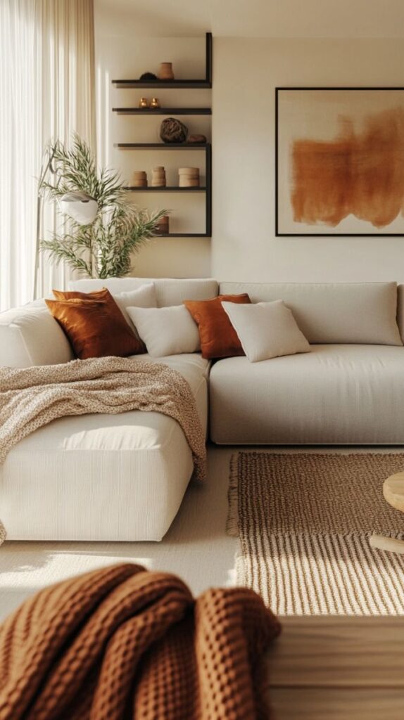
Living rooms today favor warm neutral tones like soft taupe, beige, and creamy whites. These colors create a calm setting for relaxing and socializing.
Accents in deep greens or burnt orange add character without feeling overwhelming. Many designers recommend pairing these shades with natural materials like wood and linen to keep the room inviting.
Bold choices such as navy blue or charcoal gray are also popular for larger pieces like sofas or rugs. These darker colors ground the space and work well with lighter walls.
Bedroom Palette Innovations
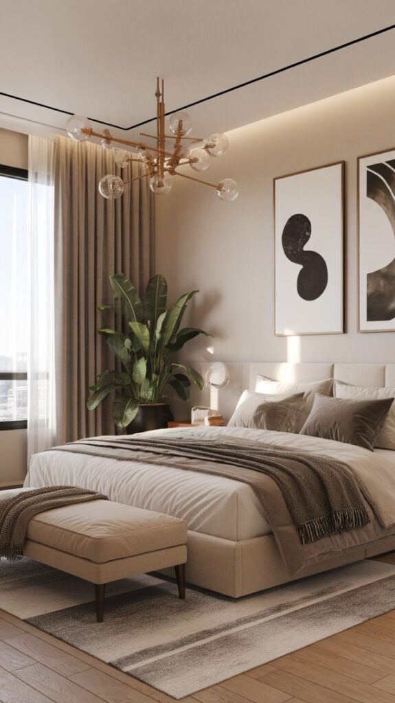
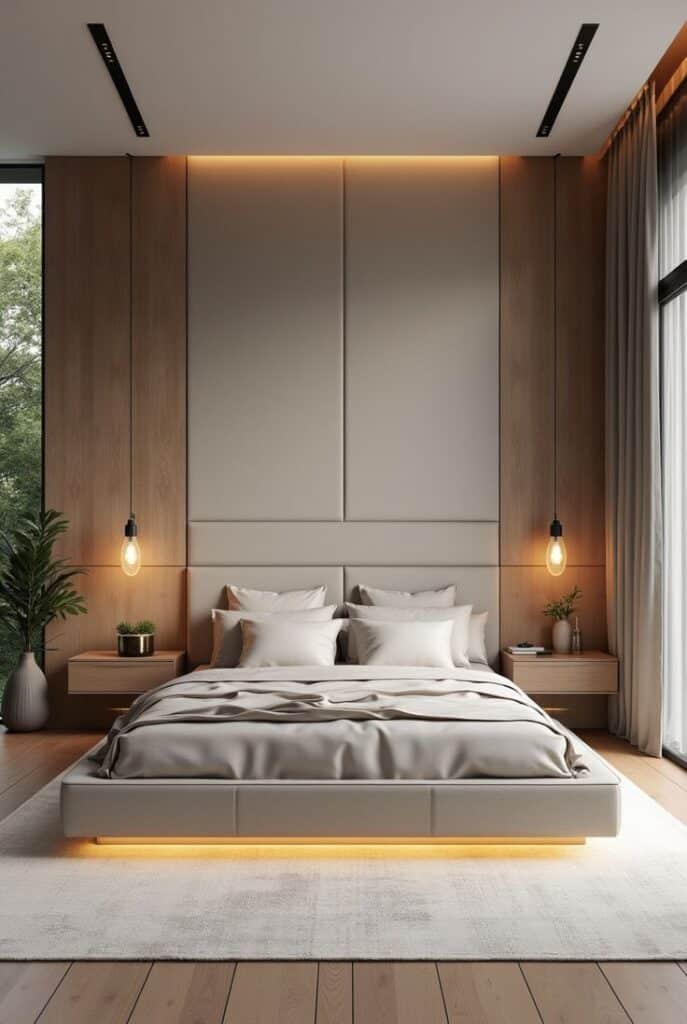
Bedrooms focus on soft, soothing colors that promote restfulness. Muted blues, dusty pinks, and gentle lavenders remain key choices to help people unwind.
More people are choosing earth tones such as terracotta or moss green to bring nature indoors. These colors pair well with textured fabrics and simple décor.
Neutrals like beige or light gray offer a timeless base. Adding touches of metallics like brushed gold through lamps or drawer pulls adds subtle elegance without disrupting the calm.
Kitchens and Dining Spaces
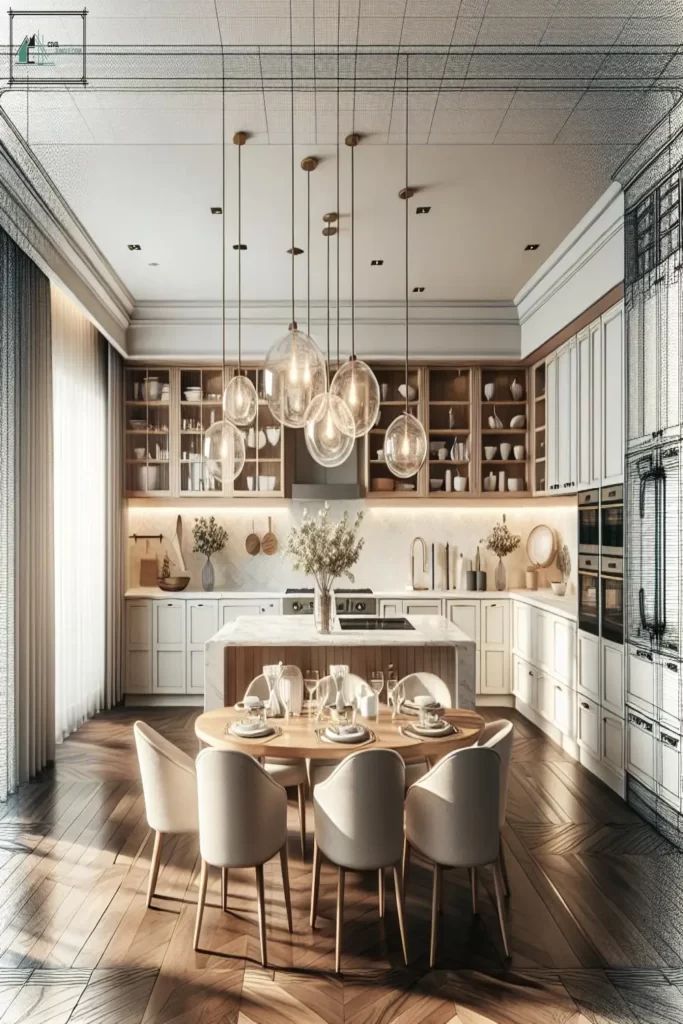
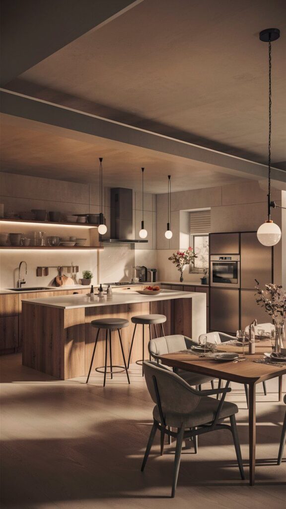
In kitchens, cool tones like blue and green dominate because they create a fresh, clean feel. These colors work well on cabinets or backsplash tiles.
White remains a staple but is often warmed with soft beige or warm gray for a cozier look. Paired with natural wood countertops or accents, these shades feel modern yet approachable.
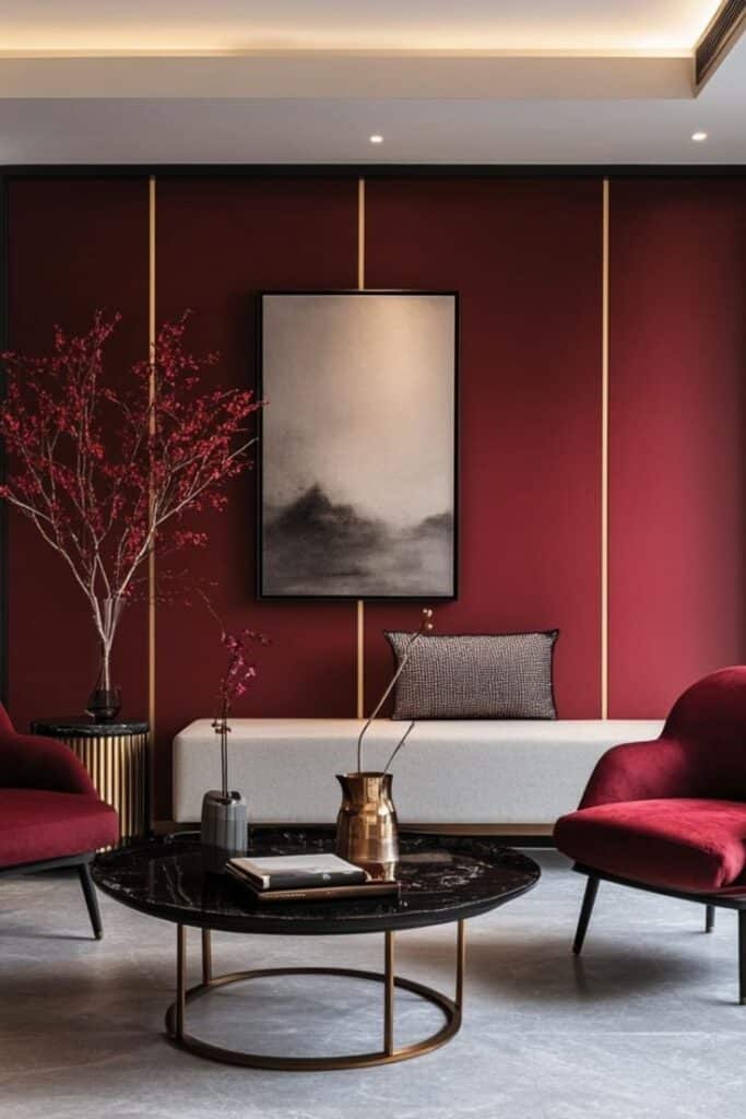
For dining areas, rich colors like deep red, olive green, or navy add warmth and invite conversation. Using these as accent walls or in furnishings can make the space feel welcoming and stylish.
Sustainable and Eco-Friendly Color Choices
Choosing colors that are better for the environment means looking closely at the types of paint and pigments used. It also involves understanding how the materials holding these colors affect their sustainability.
Low-VOC Paints and Dyes
Low-VOC paints have fewer volatile organic compounds, which reduces harmful fumes inside homes. These paints improve indoor air quality and are safer for people and pets.
They still offer strong color options and durability like traditional paints. Many brands now certify their products as low-VOC, making it easier to find eco-friendly choices.
Dyes with low-VOC content are less common but are growing in availability. When selecting fabric or wall coverings, choosing low-VOC dyed materials can reduce environmental impact while maintaining color quality.
Natural Pigments
Natural pigments come from minerals, plants, and other organic sources. They avoid synthetic chemicals and can provide earthy, muted tones like ochre, sienna, and indigo.
These pigments often degrade more slowly and break into non-toxic elements over time. Some natural pigments can fade faster than synthetic ones, so understanding their durability in specific uses is important.
Using natural pigments supports traditional methods and reduces reliance on petrochemicals. They can be combined with eco-friendly binders to create fully sustainable color products.
Impact of Materials on Color
The base materials used in paints and dyes influence how sustainable the color choice is. For example, paints made from water rather than solvent have a lower environmental footprint.
Some materials require less energy to produce or come from renewable sources. Sustainable materials often mean fewer pollutants during manufacturing.
Recyclable or biodegradable materials in color products help reduce waste once the product is no longer needed. Knowing the source of materials can guide better environmental decisions with color selection.
Global Influences on Interior Color Trends
Different cultures influence color choices in interior design. Their unique palettes and styles shape how colors are used in homes around the world.
Mediterranean Inspired Hues
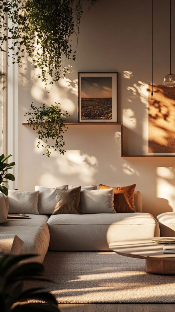
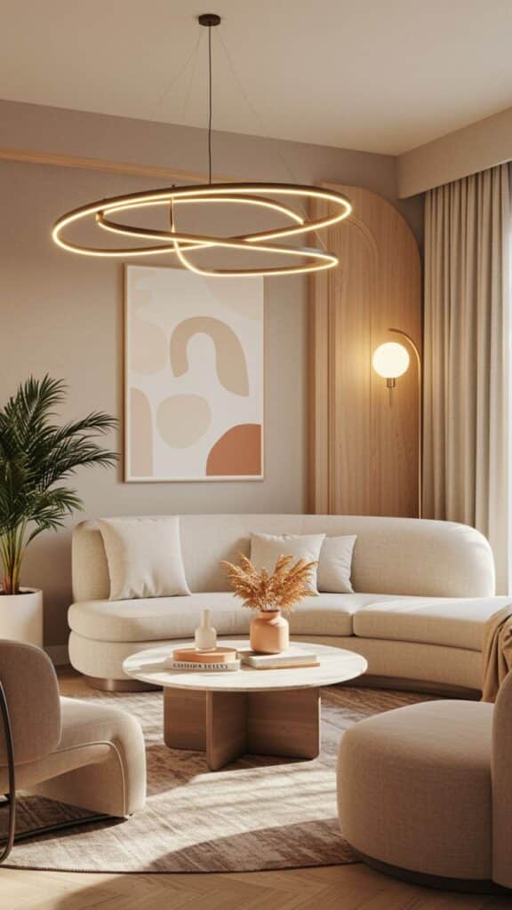
Mediterranean color trends are warm and earthy. They use colors like terracotta, deep blues, and sandy beiges. These colors reflect the sea, earth, and sun found in countries like Italy, Greece, and Spain.
Designers often combine rust orange with sky blue to create a lively yet cozy atmosphere. Olive green and soft yellows bring a natural, relaxed feel indoors.
This style emphasizes natural materials paired with these hues, giving rooms a timeless and grounded look that works especially well in living and dining spaces.
Nordic Minimalism
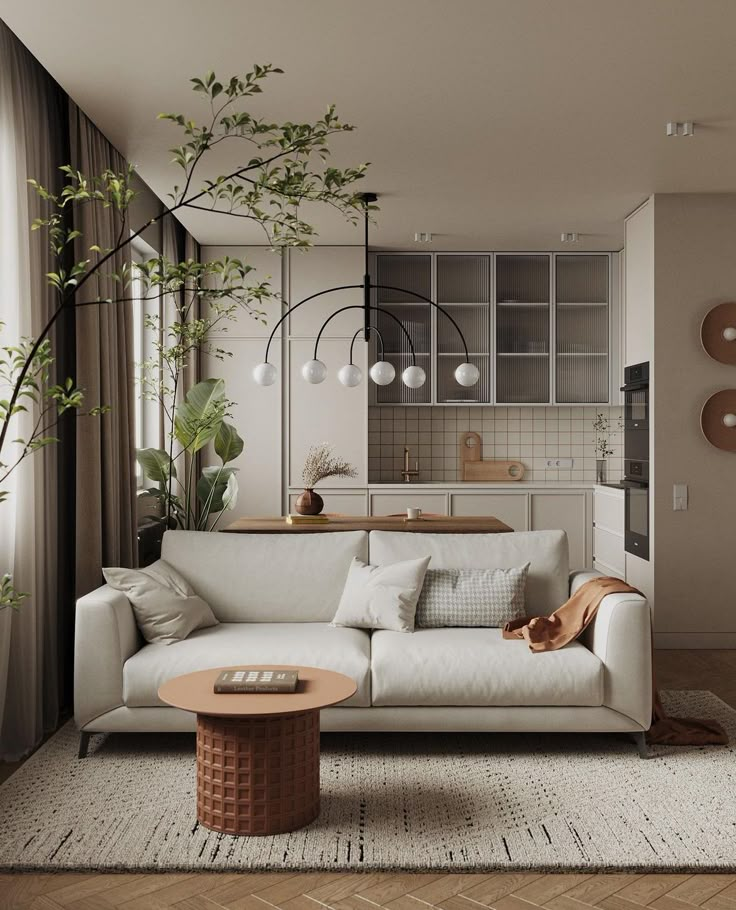
Nordic design favors cool and muted tones. Whites, light grays, and soft blues dominate this trend. These colors help create a bright, clean, and open feeling.
The focus is on simplicity and function. Subtle color contrasts highlight natural light and clean lines in interiors.
Warm accents such as dusty pink or pale green may be added but kept minimal. This keeps rooms calm and uncluttered, perfect for small or modern spaces.
Asian-Inspired Color Schemes
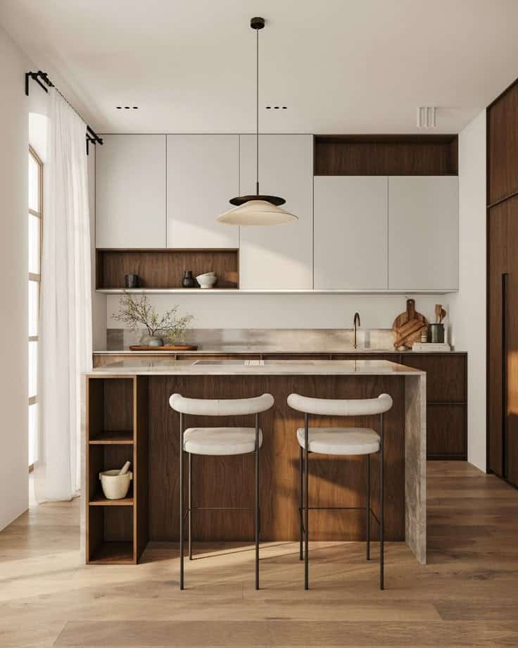
Asian interior colors often reflect nature and spirituality. Rich reds and golds are popular, symbolizing luck and prosperity in cultures like Chinese and Indian.
Soft hues like jade green and bamboo brown bring a sense of calm and balance here. These colors are often paired with natural wood and stone elements.
The use of bold accent colors combined with neutral bases helps create harmony and a peaceful atmosphere in various rooms.
Future Directions in Interior Design Colors
New tools and personal choices are changing how colors are picked for homes. These changes focus on using data and personalization to make color choices more accurate and unique.
Technology’s Role in Color Forecasting
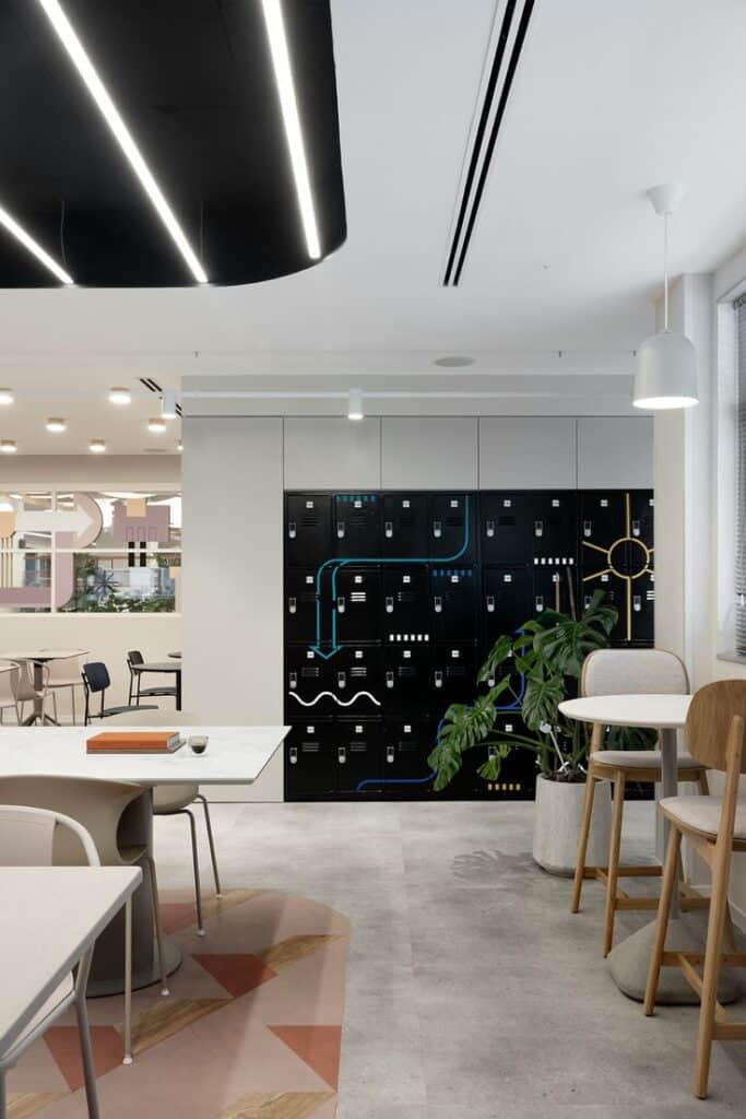
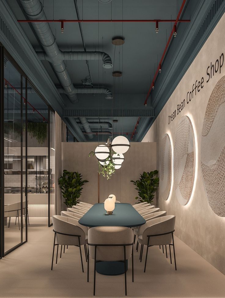
Technology is helping designers predict popular colors more accurately. Advanced software analyzes social media, fashion, and cultural trends to find emerging color palettes.
AI tools can generate new color combinations based on this data. This helps designers and homeowners select colors that match future trends.
Digital apps also allow users to test colors on virtual rooms before painting. This reduces mistakes and saves time and money by showing how colors look in different lights.
Personalization and Custom Color Trends
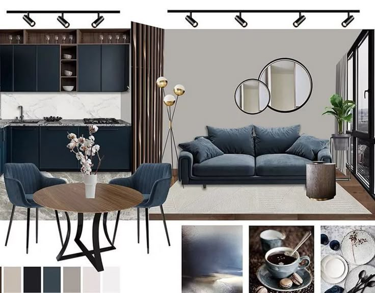
People want colors that fit their personal style and mood. Custom color mixing and digital tools give homeowners the power to create unique shades.
Smart home systems can adjust lighting to change how colors appear, matching time of day or activity. This adds flexibility to design choices.
Color trends are moving away from one-size-fits-all. Instead, they focus on individual needs and emotions, letting people express themselves through their space in new ways.
Key developments include:
- Custom color creation through apps
- Lighting controls that alter color perception
- Increased focus on personal meaning in color choices
- 2.7Kshares
- Facebook0
- Pinterest2.7K
- Twitter3
- Reddit0

