In the digital world, website footers often receive less attention than they deserve. Despite being positioned at the bottom of web pages, footers serve crucial functions including navigation, brand reinforcement, and legal compliance. A well-designed footer can significantly enhance user experience by providing essential information and navigation options when visitors reach the end of your content.
The best website footer designs of 2025 balance functionality with aesthetic appeal. As you consider updating your website, examining innovative footer examples can provide valuable inspiration for your own design choices. From minimalist approaches to feature-rich implementations, the right footer design complements your overall website strategy while meeting your visitors’ needs at that critical endpoint of their scrolling journey.
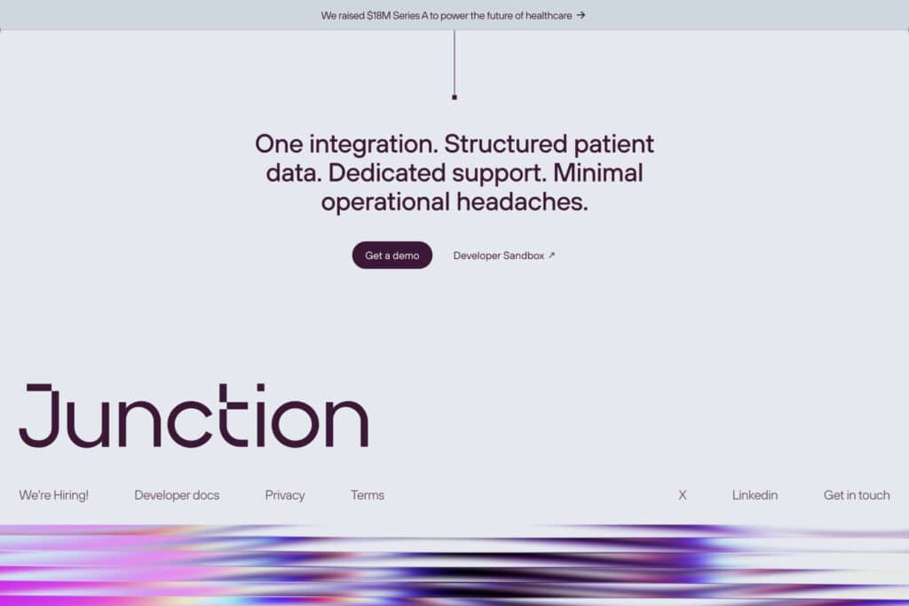
1) Minimalist footer with simple navigation links
Minimalist footers prioritize simplicity by including only essential navigation links and information. They typically feature clean typography, ample white space, and a restrained color palette that aligns with the website’s overall design aesthetic.
These streamlined footers help users quickly find important links without feeling overwhelmed. You’ll often see just the core navigation categories like About, Contact, Services, and Privacy Policy organized in a single horizontal row or a simple column.
The beauty of minimalist footers is their focus on functionality without sacrificing style. By eliminating unnecessary elements, they create a cleaner user experience and faster loading times.
When implementing a minimalist footer design, consider what links are truly essential for your visitors. Think about what information users might seek at the bottom of your page and include only those elements.
Companies like Apple and Google have mastered the minimalist footer approach. Their designs demonstrate how effective simplicity can be in guiding users to important information while maintaining visual harmony with the rest of the website.
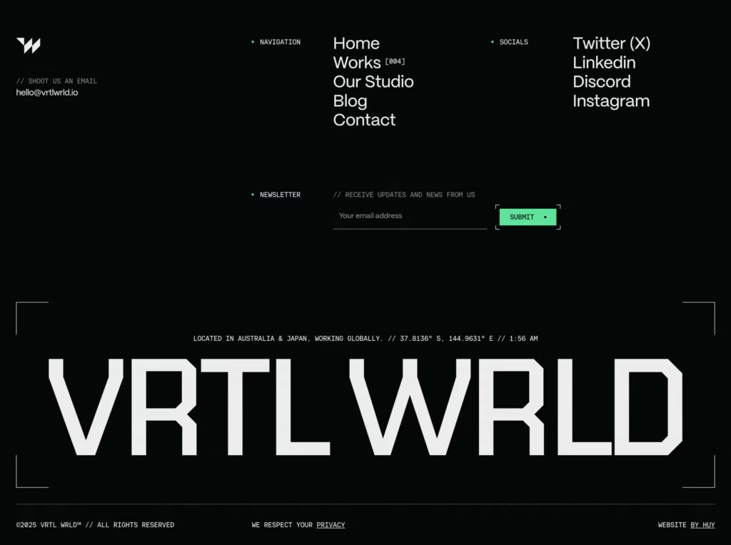
2) Footer with social media icons and newsletter signup
Social media icons and newsletter signup forms are powerful elements that can enhance your website footer’s functionality. They create engagement opportunities and help you stay connected with visitors even after they leave your site.
Adding social media icons allows users to easily find and follow your brand across different platforms. Choose icons that match your website’s visual style and include only the platforms where you’re actively present.
Newsletter signup forms in your footer can significantly boost your email subscriber list. Keep the form simple – typically just an email field and a submit button work best. A brief line explaining the value of subscribing can increase conversion rates.
Placement matters when combining these elements. Many effective designs place social icons and the newsletter form side by side, creating a compact engagement hub within the footer.
Consider adding a brief privacy statement near your signup form to address data concerns. This small addition builds trust with potential subscribers.
Mobile optimization is crucial as more users browse on smartphones. Ensure your social icons are properly sized for touch interaction and your form works smoothly on smaller screens.
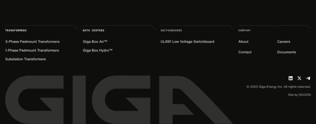
3) Sticky footer that remains visible on scroll
A sticky footer is designed to remain visible as users scroll through your website. Unlike standard footers that stay at the bottom of the content, sticky footers maintain their position at the bottom of the viewport, ensuring important information is always accessible.
To implement a sticky footer, you can use CSS position: fixed or position: sticky properties. The fixed position approach anchors the footer to the bottom of the screen regardless of scroll position, while sticky allows more natural behavior when reaching the end of content.
For proper implementation, consider z-index values to control how your footer interacts with other page elements. Your main content should have a higher z-index than the footer to prevent overlap issues.
Be mindful of accessibility concerns with sticky footers. Keyboard users expect standard scrolling behavior, so ensure your implementation doesn’t interfere with normal navigation patterns.
When designing your sticky footer, keep it slim and unobtrusive. A bulky footer can obscure too much content and frustrate users. Consider using transparency or collapse options to minimize disruption to the user experience.

4) Multi-column footer for organized information
Multi-column footers offer an elegant solution for websites with extensive information to share. By dividing content into distinct columns, you create visual separation that helps visitors quickly locate what they need.
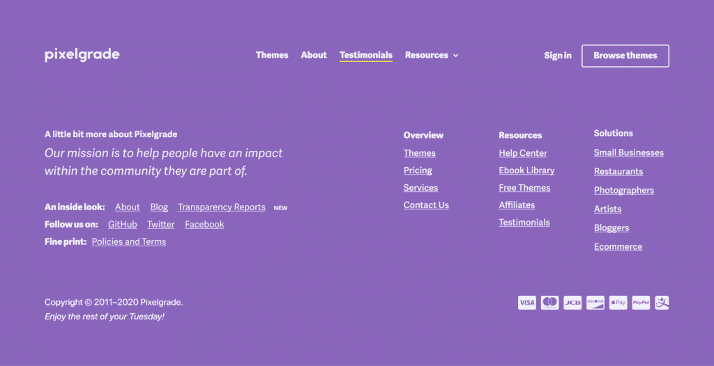
Companies like Buffer and Wine Club of the Month effectively use this approach to categorize their footer content. Each column typically represents a different category such as company information, products, resources, or contact details.
This organizational structure prevents your footer from appearing cluttered or overwhelming. Users can scan horizontally across columns to get a complete overview or focus vertically on a specific category of interest.
When designing a multi-column footer, maintain consistent spacing between columns and align headers properly. Limit each column to 4-7 links to avoid overwhelming visitors with too many options.
Consider using subtle visual dividers or different background shading to further distinguish between columns. This creates a clean, organized appearance that enhances user experience.
For mobile responsiveness, these columns should stack neatly when viewed on smaller screens. This maintains the organizational benefits while ensuring your footer remains functional across all devices.
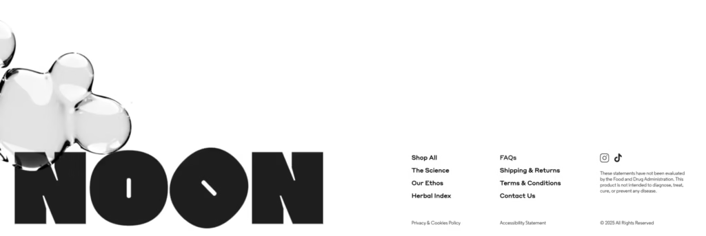
5) Footer featuring a small site map
A small site map in your footer provides visitors with a quick overview of your website’s structure. It helps users navigate to important pages without scrolling back to the top menu or using the search function.
Many effective site map footers organize links by category, making it easier for users to find exactly what they need. You might group links under headings like “Products,” “Resources,” or “Support” to create a logical structure.
Keep your footer site map concise by including only the most important pages. Too many links can overwhelm visitors and defeat the purpose of providing quick navigation.
Consider using a three or four-column layout to make your site map visually organized and scannable. This approach works particularly well on desktop views while still allowing for responsive design on mobile devices.
The typography in your site map footer should be clean and legible. Many designers use a slightly smaller font size than the main content, but ensure it remains readable for all users.
A well-designed site map footer not only improves navigation but also boosts SEO by creating additional internal linking throughout your website.
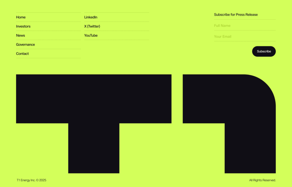
6) Footer with brand logo and tagline
Including your brand logo and tagline in your website footer helps reinforce brand identity even as visitors reach the bottom of your page. This design approach maintains consistency and reminds users who you are and what you stand for.
A well-designed logo placement in the footer serves as a subtle yet effective branding element. You can position it centrally or aligned to one side, depending on your overall footer layout.
Your tagline should complement the logo and clearly communicate your brand’s core message or value proposition. Keep it concise and impactful to make a lasting impression.
This footer style works particularly well for businesses focused on building brand recognition. It creates a cohesive experience from header to footer, strengthening your visual identity throughout the entire user journey.
Consider adding a small amount of white space around your logo and tagline to help them stand out. This prevents them from getting lost among other footer elements like navigation links or contact information.
For maximum effectiveness, ensure your logo is properly sized and your tagline remains legible even at smaller dimensions. A clean, uncluttered presentation will yield the best results.

7) Dark mode footer with contrasting text
Dark mode footers have become increasingly popular as they reduce eye strain and create a modern, sophisticated look for your website. The key to an effective dark mode footer is using high-contrast text that ensures readability against the darker background.
Many websites implement dark footers with white or light gray text to achieve maximum contrast. This approach not only looks sleek but also improves accessibility for users with visual impairments.
Consider adding vibrant accent colors for interactive elements like links and buttons. These pops of color can guide your visitors toward important actions while maintaining the overall dark aesthetic.
Typography plays a crucial role in dark mode footers. Choose fonts that remain legible at smaller sizes and maintain their form against dark backgrounds.
You can enhance your dark footer with subtle design elements like gradient overlays or minimalist icons. These additions create visual interest without overwhelming the space or reducing contrast.
When implementing a dark mode footer, ensure it transitions smoothly from the rest of your page content. A jarring switch between light and dark sections can disrupt the user experience.
Key Elements of Effective Website Footers
A well-designed footer serves as the backbone of website navigation and user experience. Certain elements are crucial for functionality, legal compliance, and helping visitors find what they need quickly.
Navigation and Site Structure
Effective footers include streamlined navigation that complements your main menu. A sitemap or organized links help users quickly locate content without scrolling back to the top.
Consider organizing footer navigation into clear categories. Group related links under descriptive headings like “Products,” “Support,” or “Resources” to enhance scannability.
Your footer should include links to your most important pages. These typically include:
- Home page
- About us
- Products/Services
- Blog/News
- FAQ/Help center
- Contact page
For larger websites, a condensed sitemap in the footer helps users understand your site structure at a glance. This also benefits SEO by establishing clear page hierarchies.
Contact Information and Social Links
Your footer should display essential contact details prominently. Include your business phone number, email address, and physical location if applicable.
A mini contact form can increase engagement by allowing users to reach out without navigating to a separate page. Keep it simple with just name, email, and message fields.
Social media icons should be easily recognizable and properly sized. Place them where they’re visible but not distracting from more critical information.
Consider adding:
- Business hours
- Customer service response times
- Multiple contact methods for different departments
- Location map for physical businesses
For businesses serving multiple regions, include region-specific contact information to improve customer service efficiency.
Legal and Compliance Content
Every footer needs essential legal elements. Include copyright information with the current year (© 2025) to protect your intellectual property.
Privacy policies and terms of service links are mandatory for compliance with regulations like GDPR and CCPA. Make these links clearly visible rather than hiding them in tiny text.
Cookie notices inform users about data collection practices. Your footer should link to detailed information about how you handle user data.
Other important legal elements include:
- Disclaimers
- Accessibility statements
- Licensing information
- Industry-specific compliance notices
Update these documents regularly to reflect current laws and your business practices. Outdated legal information creates liability risks and damages trust.
Best Practices for Optimizing Footer Design
A well-designed footer serves as a valuable navigation tool that enhances user experience and supports your website’s goals. Effective footers maintain a balance between functionality and aesthetics while ensuring all visitors can access important information.
Responsive and Accessible Layouts
Ensure your footer adapts to all screen sizes and devices. Use flexible grids that stack elements vertically on mobile screens to maintain readability.
Set minimum touch target sizes of 44×44 pixels for all clickable elements to accommodate touch navigation. This prevents frustrating mis-taps on smaller screens.
Implement proper heading hierarchy within your footer structure to help screen readers navigate content effectively.
Include proper ARIA labels for any non-text elements like social media icons to improve accessibility for visitors using assistive technologies.
Test your footer’s responsiveness across multiple devices and browsers to identify and fix any layout issues before launch.
Color contrast ratios between text and background should meet WCAG standards (minimum 4.5:1 for normal text) to ensure readability for all users.
Visual Hierarchy and Readability
Organize footer content in clear sections with consistent spacing to create visual separation between different information types.
Font considerations:
- Maintain consistent font styles with your main content
- Use appropriate sizing (minimum 14px for most text)
- Avoid using more than 2-3 font variations
Group related links together under descriptive headings to help visitors quickly find what they need. For example, separate “Company Information,” “Resources,” and “Contact” into distinct columns.
Use white space strategically to prevent your footer from appearing cluttered. This breathing room improves scannability and focus.
Highlight important calls-to-action with subtle design elements like buttons or color variations without overwhelming the overall design.
Limit your footer to essential information only. Overloading this area can create confusion and diminish its effectiveness as a navigation tool.
- 8shares
- Facebook0
- Pinterest5
- Twitter3
- Reddit0

