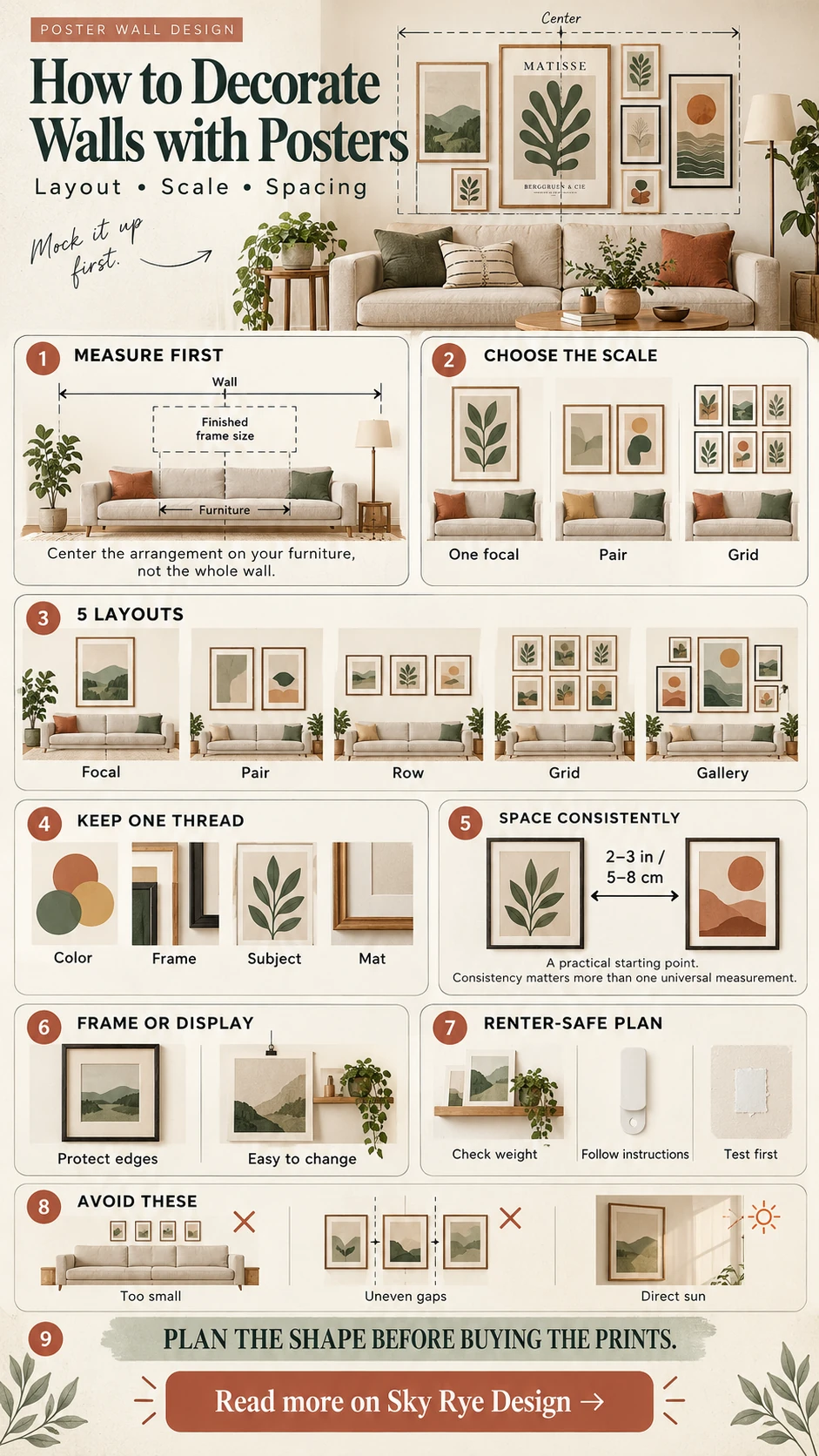
To decorate walls with posters, plan the composition before choosing the final prints. Measure the wall and nearby furniture, choose one focal poster or a clear layout, repeat a color or frame finish, and test the arrangement with paper templates. A poster wall looks intentional when scale, spacing, and visual rhythm work together; the price of the artwork matters far less.
This guide treats posters as part of the room rather than as objects added at the end. You will find practical layouts for a single print, pairs, rows, grids, and mixed gallery walls, plus advice for framing, renter-friendly mounting, and protecting paper from light.

A quick poster-wall plan
| Wall situation | Layout to try | What creates order |
|---|---|---|
| Above a sofa or bed | One large poster, a pair, or a row of three | Center the group on the furniture |
| Above a desk or console | Grid or one anchor with smaller companions | Repeat frame finish or mat color |
| Long hallway | Level row or center-line arrangement | Keep one consistent gap |
| Narrow wall | Vertical stack of two to four posters | Align the outer frame edges |
| Large blank wall | Mixed gallery wall | Build inside one imaginary rectangle |
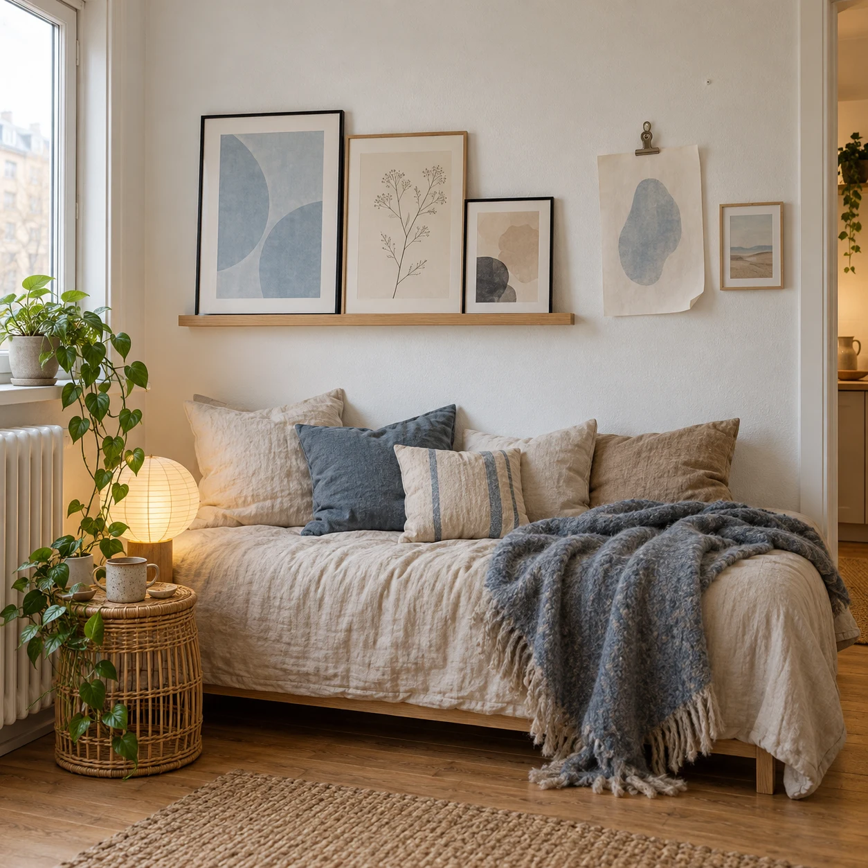
| Rental or changing collection | Picture ledge or leaning frames | Overlap lightly and vary heights |
The table is a starting point, not a set of fixed rules. A wall seen mainly from a seated position may need a lower composition than a hallway. A dark room may need lighter mats and fewer dense images. Always judge the mockup from the doorway and from the seat you use most.
Measure the wall and the furniture first
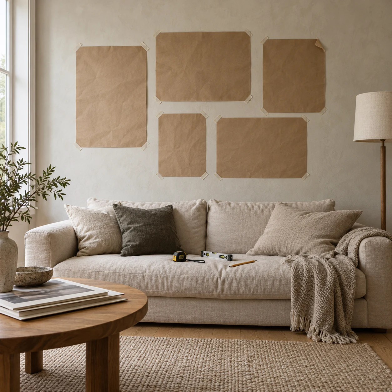
Measure the open wall area, then record the width of the sofa, bed, desk, or console beneath it. Do not size the composition against the entire wall if the furniture is the visual anchor. Tape the proposed outside boundary on the wall and step back. If the group feels like a small island floating above a wide sofa, increase the overall width or use fewer, larger posters.
Use the outside dimensions of finished frames, not the printed paper size. A poster sold as 18 × 24 inches becomes wider and taller after adding a mat and frame. For a group, calculate the total width of every frame plus every gap. This simple check prevents the last frame from drifting past the edge of the furniture.
Choose scale before subject matter
Large walls usually need visual mass, not a scatter of tiny prints. One oversized poster can hold a minimalist room together, while a six-piece grid can give the same wall more detail without losing structure. Small posters are better for a narrow column, a desk corner, or a dense salon-style group where they support a larger anchor piece.
When I test a poster arrangement, I photograph the wall straight on and place simple rectangles over the image. Silhouettes reveal scale faster than browsing individual artwork. If the group reads clearly as one shape at thumbnail size, the composition usually has enough hierarchy to work in the room.
Build a color and subject connection
A poster does not have to match the sofa exactly. It needs a relationship with the room. Pull one quiet color from a rug, cushion, lamp, or curtain and repeat it somewhere in the artwork. Then allow one stronger accent to create contrast. In a neutral room, a saturated poster can become the focal point; in a colorful room, black-and-white photography or restrained typography can provide visual rest.
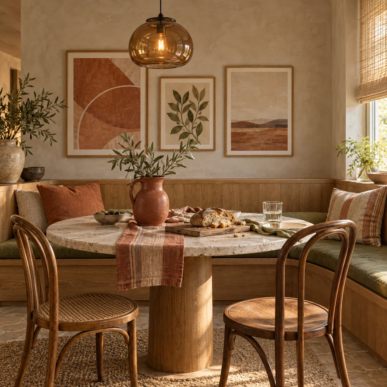
For a mixed wall, repeat one thread: subject, era, palette, frame profile, or mat color. Keeping everything identical can feel flat, but changing the art, frame, mat, color, and scale all at once usually produces noise. If you want to create rather than buy a print, the poster design guide covers hierarchy, typography, and composition. For a broader visual starting point, compare these poster design ideas.

Five poster layouts that solve different walls
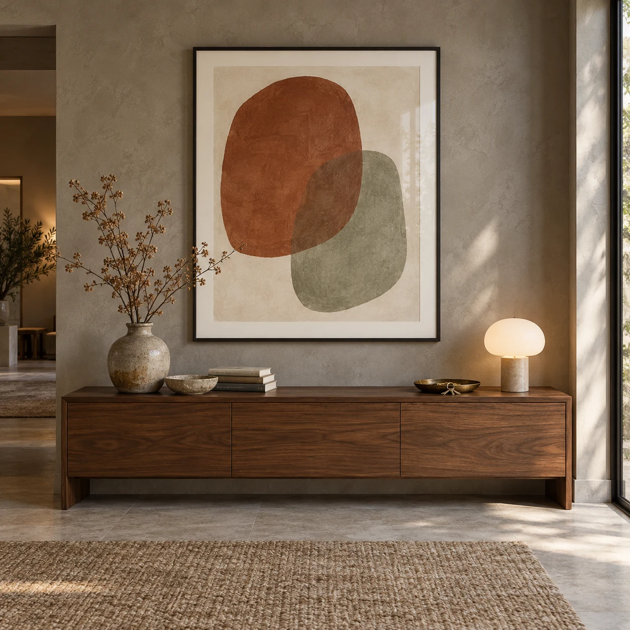
1. One focal poster
Use one large poster when the room already has strong furniture, shelving, or architectural detail. The image should be large enough to hold the wall from the normal viewing distance. A generous mat can give a modest print more presence without making the artwork itself feel stretched.
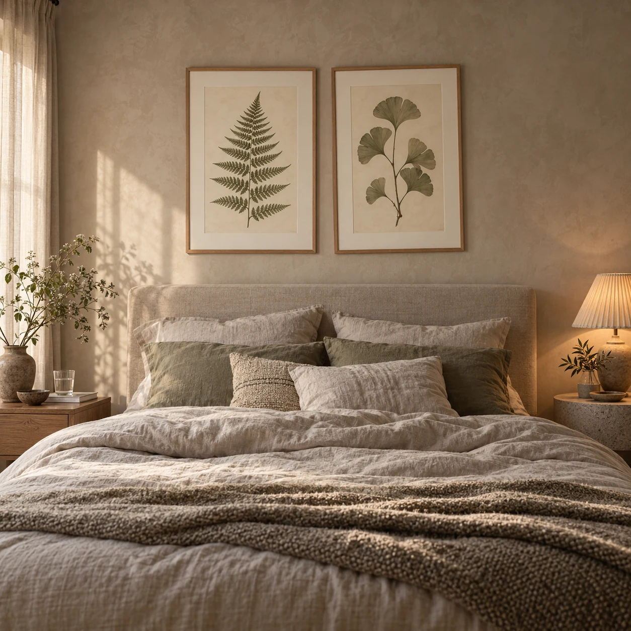
2. A balanced pair
Pairs suit bedside walls, narrow sofas, desks, and the spaces between windows. Match the outside frame dimensions and align the tops or centers. The images can differ if they share a palette, artist, photographic treatment, or subject.
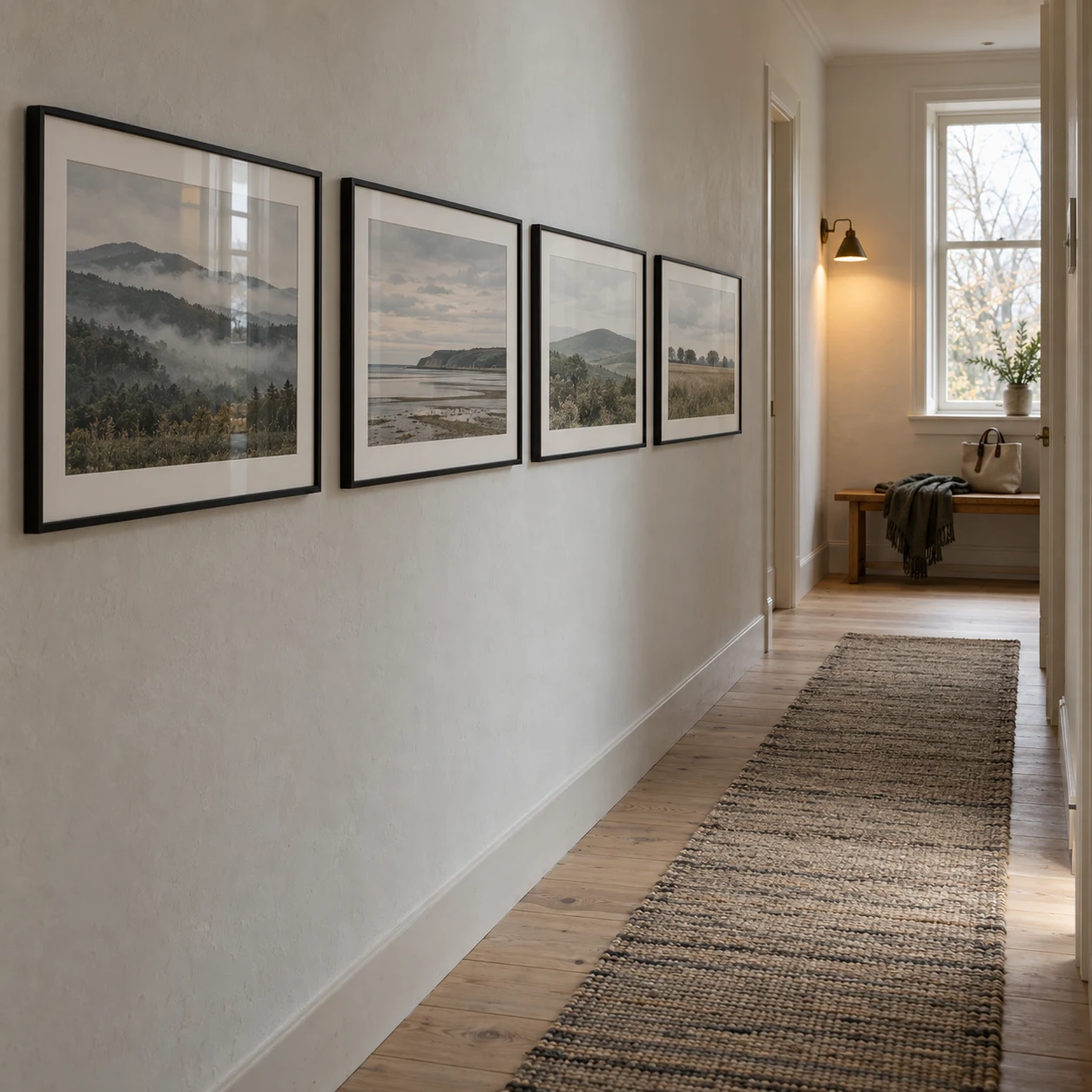
3. A row or vertical stack
A horizontal row follows long furniture and hallways; a vertical stack makes use of the strip beside a door or bookcase. Keep the frame sizes or center line consistent. A row looks accidental when one gap is visibly different, so use spacers or a paper template rather than measuring each frame independently.
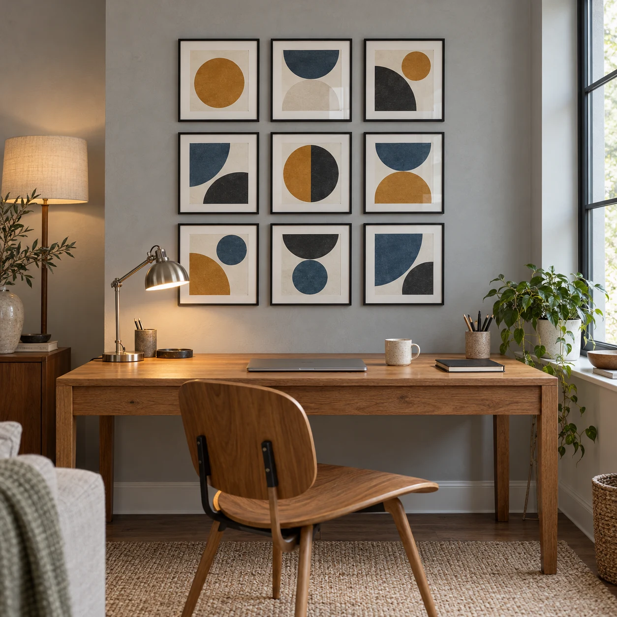
4. A strict grid
Four, six, or nine equal frames create a calm architectural block. This layout works well with a photo series, botanical set, or variations on one graphic theme. It is less forgiving of uneven spacing, so measure the entire grid first and use identical hanging points.
5. A mixed gallery wall
Start with the largest poster slightly off center, then add medium pieces and use small prints to resolve gaps. Keep the outer edge roughly rectangular and repeat one visual thread. Lay the whole arrangement on the floor, photograph it, and cut paper templates for the wall before installing hardware.
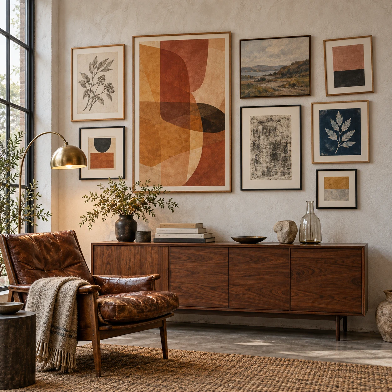
For more media and room styles, use the indexed collection of wall art design ideas. It covers the wider wall-art decision; this page stays focused on arranging posters as a composition.
Decide whether frames, mats, or clips fit the room
Thin black or natural-wood frames suit most mixed collections because they add structure without competing with the prints. White mats create breathing room around detailed artwork. A colored frame can work as the repeated accent, but test it beside the poster; a frame that looks subtle on a product page can dominate a pale print.
Clips, rails, and unframed mounting feel lighter and are easy to change, but exposed edges crease and collect dust. Use them for replaceable prints, studio references, or seasonal displays. Give valuable, sentimental, or limited-edition paper more protection and ask a qualified framer about conservation materials.
Plan the hanging method before the final layout
The wall material, paint condition, and finished frame weight determine the mounting method. Picture ledges are useful when the collection changes often. Removable strips may suit some rental walls, but their weight rating and surface instructions still matter. Ordinary tape can damage paint and paper, while a heavy frame needs hardware appropriate for the wall construction.
Mark the center and outside corners of the whole arrangement before marking individual hooks. Then hang the anchor piece first and work outward. The related wall art hanging guide explains placement for furniture, sightlines, and room types in more detail.
Protect posters from light and poor framing materials
Paper fades and weakens with prolonged light exposure. Keep important posters away from direct sunlight and intense heat, and avoid pressing the paper directly against glazing. The Library of Congress matting and framing guidance explains why stable matting, suitable hinges, glazing, and display location matter for works on paper. For a valuable original, display a reproduction and store the original properly.

Poster-wall mistakes and the practical fix
| Mistake | Practical fix |
|---|---|
| Buying prints before measuring | Choose the outside composition size first |
| Centering on the wall instead of the furniture | Use the sofa, bed, desk, or console as the anchor |
| Too many small pieces on a large wall | Add one large anchor or reduce the count |
| Every frame and color is different | Repeat one frame, mat, palette, or subject thread |
| Uneven gaps | Use templates and one chosen spacing value |
| Hanging before testing | Mock up on the floor and photograph the arrangement |
| Direct sunlight on paper | Move the display or use a reproduction |
Decorating walls with posters FAQ
How many posters should go on one wall?
Use one large poster for a clear focal point, two or three for a simple row, or four to nine for a grid or gallery wall. The right number depends on the available wall area and the furniture below it. Plan the outside boundary of the whole group before choosing the final count.
How much space should be left between posters?
A gap of about 2 to 3 inches (5 to 8 cm) is a useful starting point for framed posters. Smaller prints can sit slightly closer, while very large frames may need more breathing room. Consistency matters more than one exact measurement.
Should posters be framed?
Frames give posters more visual weight, protect the edges, and help a mixed collection feel related. Unframed posters can work in casual rooms, studios, or temporary displays, but use mounting methods suited to the wall and paper instead of ordinary tape.
How do you arrange posters without making the wall look cluttered?
Repeat at least one element across the group: a frame finish, a mat color, a subject, or a small set of colors. Keep the gaps consistent and treat the outside edge of the arrangement as one larger shape. A floor mockup or paper templates will expose weak spacing before anything is mounted.
How can renters hang posters without damaging the wall?
Use picture ledges, freestanding frames, or removable hanging products rated for the finished weight and approved for the wall surface. Follow the maker's preparation and removal instructions. Test an inconspicuous area first because paint condition and wall texture affect the result.
The designer’s takeaway
A strong poster wall starts as a shape, not a shopping list. Measure the furniture and wall, choose a layout, test the outside boundary, and then select prints that share one visual connection. Consistent gaps and clear hierarchy will do more for the result than matching every frame. Mock it up first, protect the paper where needed, and hang only after the composition works from the room’s real viewing points.
- 3shares
- Facebook0
- Pinterest3
- Twitter0
- Reddit0