Elegant lettering can transform your creative projects, adding a personal touch to anything from greeting cards to wall art. You can create stunning designs with just a few simple techniques, making elegant lettering accessible to everyone, regardless of skill level. By focusing on a few foundational principles, you can enhance your lettering skills quickly and effectively.
Start by exploring various styles and techniques that suit your taste. With practice, you will find it easier to incorporate elegant lettering into your work, allowing your creativity to shine. Whether you’re looking to impress friends or add flair to your next project, this guide will help you get started.

Key Takeaways
- Learn essential techniques to create elegant lettering easily.
- Explore styles that match your personal aesthetic.
- Incorporate your lettering skills into various creative projects.
Understanding the Basics of Elegant Lettering
To create elegant lettering, you need to grasp fundamental techniques and understand the materials essential for your art. Mastering different styles and knowing how to choose the right tools will enhance your lettering experience.
Lettering Style Fundamentals
Elegant lettering encompasses various styles, such as calligraphy and hand lettering. Each style has distinct characteristics, like the use of strokes and flourishes. Familiarize yourself with basic lettering techniques before exploring advanced styles.
Start with practice drills. Work on basic shapes and letter forms to develop muscle memory. Use guidelines to keep your letters consistent in size and alignment.
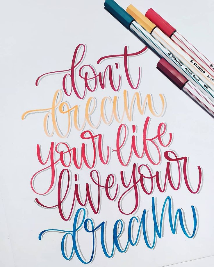
Experiment with different tools. A mechanical pencil allows for precision, while gel pens offer smooth ink flow. Try various fonts, from cursive to block letters, to find your unique style.
The Role of Paper and Pencils
Selecting the right paper is crucial for elegant lettering. Choose papers with smooth finishes to allow for clean strokes and minimize bleeding. Heavier paper can withstand various inks without warping.
Using a good pencil is equally important. A mechanical pencil provides a fine point for detailed work, while traditional pencils can be erased easily with an eraser. Consider a ruler for straight lines and uniform spacing.
Incorporate different papers to experiment with textures. Each type can significantly affect your final appearance. Take the time to test various combinations to find what works best for your lettering projects.
Developing Your Lettering Skills
Improving your lettering skills involves mastering basic strokes and experimenting with different styles. Focus on understanding letter construction to enhance your overall proficiency in elegant lettering.
Practicing Basic Strokes and Letters
Begin by practicing fundamental strokes, as they form the foundation of all lettering styles. Create five key strokes: upstrokes, downstrokes, curves, and crosses. Use a practice sheet where you can repeat each stroke several times.
Once comfortable with strokes, move on to individual letters. Focus on the following:
- Baseline: The imaginary line where letters sit.
- X-height: The height of lowercase letters, which affects readability.
- Ascender and Descender Lines: The lines that define how tall ascenders and descenders extend beyond the x-height.
Repetition leads to muscle memory, which is crucial for consistent results.
Experimenting with Cursive and Script Lettering
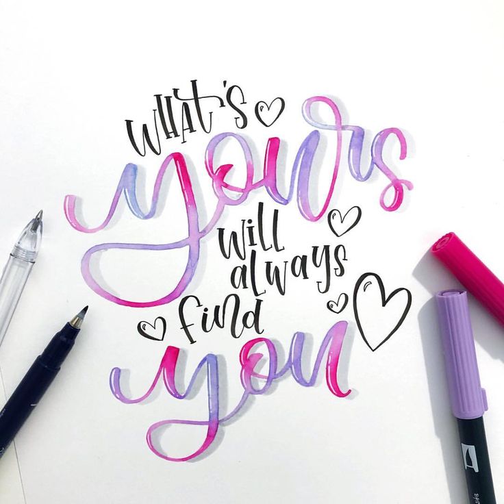
Cursive and script lettering offer a flowing style that can be both challenging and rewarding. Start by sketching letters connected in a smooth motion. Pay attention to the slant and curvature to maintain a consistent flow.
When experimenting, focus on configurations. For example:
- Loops: Use larger loops for a bold appearance or smaller for elegance.
- Connection Points: Ensure connections between letters are seamless to enhance fluidity.
Consider your pressure while practicing: applying more pressure during downstrokes and less during upstrokes helps create contrast. With time and practice, your cursive and script styles will develop into unique, elegant fonts.
Mastering Letter Designs and Effects
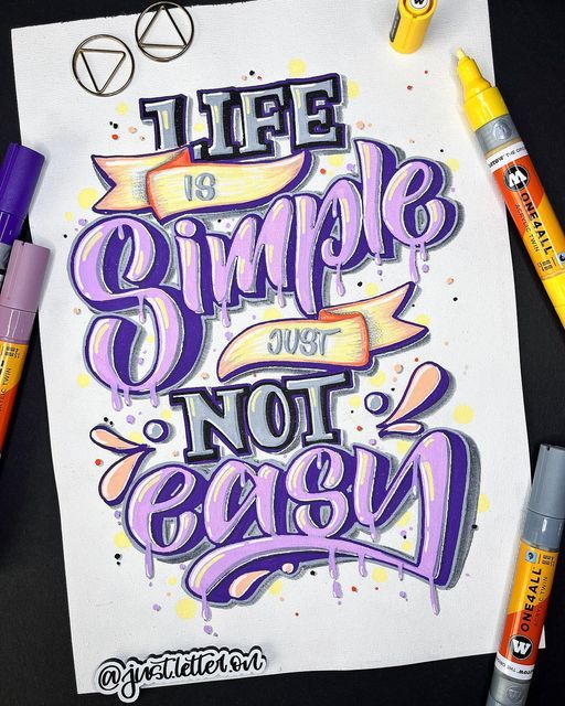
Creating visually appealing letters involves techniques that add dimension and character. Two essential methods include the use of drop shadows and highlights to create depth, as well as incorporating inlines and banners to enhance the overall design.
Creating Depth with Drop Shadows and Highlights
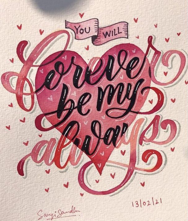
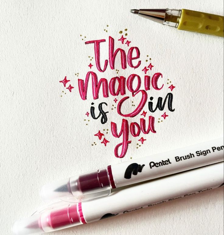
Drop shadows provide a three-dimensional effect, making letters stand out. To apply a drop shadow, choose a color darker than your letter’s body color and offset it slightly to create the illusion of depth. Adjust the opacity for a subtle effect, which can significantly enhance readability.
Key Tips:
- Use a consistent angle for shadows to maintain a cohesive look.
- Experiment with shadow sizes; larger shadows give a softer feel, while smaller ones seem sharper.
Highlights add light to your letters, making them pop. Use a lighter shade of your letter color, placed near the top or on one side. This technique mimics light sources and improves the letter’s visual impact.
Enhancing Letters with Inlines and Banners
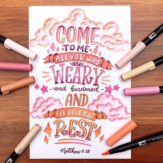
Inlines are an excellent way to add detail and texture. To create inlines, draw a second line just inside the edge of your letter. Choose a contrasting color or use a lighter/darker shade of the main color. This adds visual interest without overwhelming the design.
Banners can complement letters by incorporating them into a decorative element. Draw a curved or straight banner behind or entwined with your letters. Use colors that contrast with your text to help the banner stand out.
Considerations for Banners:
- Ensure the banner’s design does not detract from the letters.
- Use shapes that flow with the letterforms for a harmonious look.
Exploring Advanced Lettering Styles
Advanced lettering styles elevate your designs and can showcase your skills effectively. Two major categories include serif and sans serif lettering as well as block letters and faux calligraphy techniques. Each offers unique attributes and applications.
The Elegance of Serif and Sans Serif Lettering
Serif lettering features small lines or embellishments at the ends of letters, creating a classic and formal appearance. This style is commonly found in print and book designs, contributing to readability and a sense of tradition. Fonts like Times New Roman exemplify serif lettering.
Conversely, sans serif lettering lacks these embellishments, resulting in a more modern and minimalistic look. This style, represented by fonts like Arial or Helvetica, is popular for digital applications due to its clean and straightforward appearance. Serif and sans serif can work together to add contrast and depth to your projects.
Block Letters and Faux Calligraphy Techniques
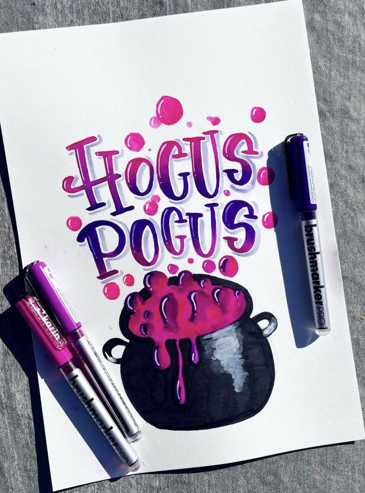
Block letters are characterized by their bold, clean shapes. They are easy to read and can be used effectively in signage or artistic projects. You can create block letters by using straight lines and simple shapes, simplifying complex designs.
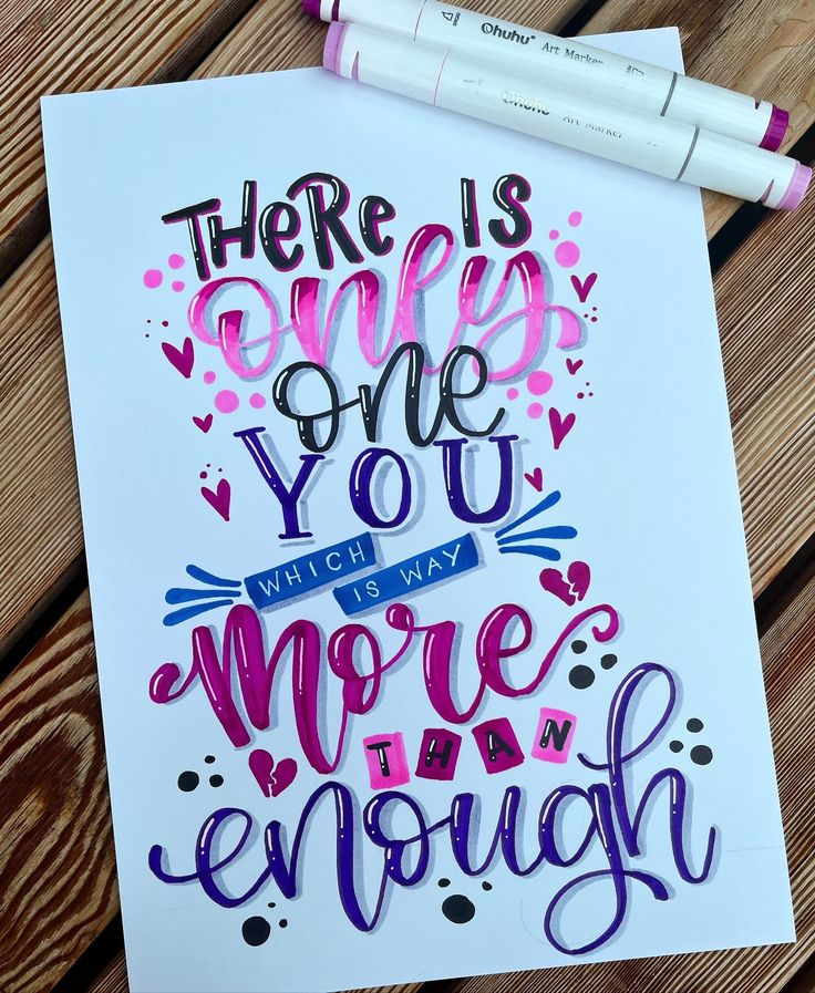
Faux calligraphy mimics the fluidity of traditional calligraphy without requiring specific tools. By adding thickness to downstrokes and maintaining a consistent style, you can create lettering that appears elegant. Combining both styles allows for versatility in your work and opens up creative possibilities.
Incorporating Lettering into Creative Projects
Lettering can enhance your creative projects by adding personal touches. You can easily integrate elegant lettering into various art forms, making your pieces stand out.
Art Journaling with Lettering
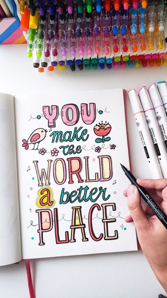
Art journaling provides a wonderful platform to explore your creativity. You can combine different styles of drawing letters with illustrations, creating unique pages.
Start by selecting a watercolor paper to add depth to your artwork. Use Tombow mono drawing pens for crisp lines when outlining your letters.
Consider using a variety of fonts—such as cursive and block letters—to create visual interest. Pair your lettering with doodles or watercolor backgrounds to build an engaging composition. This approach allows you to express emotions or document experiences in a fun way.
Bullet Journal Decorations and Watercolor Art
Incorporating lettering into your bullet journal can enhance its functionality and aesthetic appeal. Decorative headers or quotes can organize your entries effectively.
Utilize watercolor art practice to fill your layouts with color. You can create color washes as backgrounds, which serve as a backdrop for your lettering. Combine soft brush strokes with bold handwritten titles for contrast.
Use lists and bullet points with elegant lettering to emphasize important tasks or reflections. This not only organizes your information but also makes your journal visually appealing, encouraging regular use. By merging art and planning, you create a personalized tool that reflects your style.
- 4.9Kshares
- Facebook0
- Pinterest4.9K
- Twitter0
- Reddit0
