A motion design case study turns one portfolio interaction into a short clip a client can follow: what the user does, what visibly changes, and where they end up. With Kling 4.0, you can build that clip from the wireframes, user flows and comps you already have, provided you write the beats before you generate anything.
- What clients actually read in motion
- Choose one motion design case study before opening Kling 4.0
- Turn a user flow into motion beats
- Write a Kling 4.0 brief the model can follow
- Adapt the beat system to UI, spatial and brand work
- Keep the portfolio claim honest
- A one-afternoon build order and review checklist
- FAQ
- Start with one case study
Most portfolios skip this step. They show a hero shot of the app, three screens in a row, a brand board or a spatial render, and leave the interaction to the viewer’s imagination. The work looks polished, yet the thing the designer was hired to solve, how it feels to move through the product, never appears on the page.
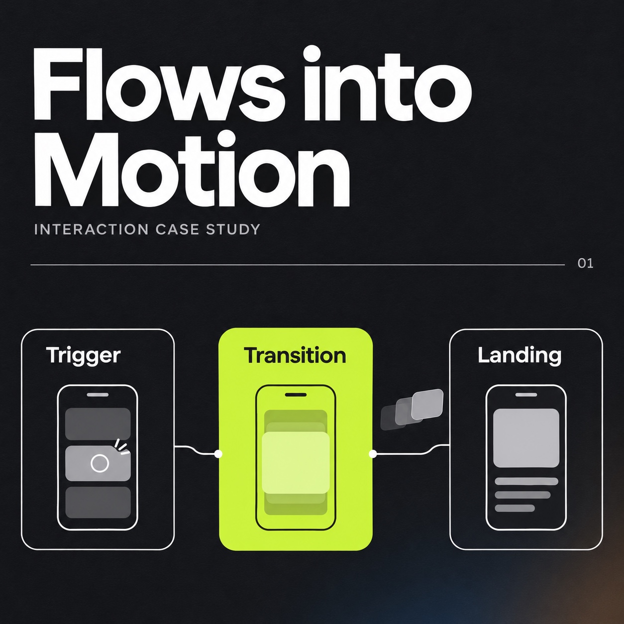
Interaction is motion, and a portfolio without motion asks the client to imagine the most important part. This brief shows how to turn an existing flow into readable beats using one reusable model: trigger, transition, landing. The focus is narrow: telling one interaction well, without showreel effects or decorative animation.
What clients actually read in motion
Clients don’t evaluate motion the way designers do, and few notice easing curves or frame rates. They follow sequence and consequence: I tap here, this happens, then I’m here. A portfolio clip works when a non-designer can narrate what just happened without guessing.
That makes the beat, not the effect, the basic unit of a good clip. A beat is one user action and its visible result. Tap a filter chip and the list reshuffles; walk past a lobby screen and the directory updates.
Three to five beats are usually enough for one clip. Strong portfolio case studies share a similar habit: they explain decisions in order instead of presenting isolated screens.
Choose one motion design case study before opening Kling 4.0
Start with your strongest project, ideally one where the flow itself was the design problem. A dashboard whose value lies in its data model makes a weak candidate, while a booking flow you cut from seven steps to four makes a strong one. Choose a single interaction per project rather than squeezing the whole case study into a showreel.
According to Kuaishou’s official Kling 4.0 launch announcement, Kling 4.0 officially launched on October 15, 2026. The Kling 4.0 for design portfolios lists support for generation up to 30 seconds, multiple keyframes, Omni Reference, up to 15 combined references and up to 10 keyframe inputs.
Treat those figures as planning limits rather than selling points. A three-to-five-beat flow fits within that duration, and your comps can act as references or keyframes for the states you need to hold steady.
Before generating anything, open the Kling 4.0 workspace and check the current plan, the credit cost per generation, the watermark policy and the commercial-use terms. Portfolio clips are client-facing, so settle licensing before the video goes on your site.
Turn a user flow into motion beats
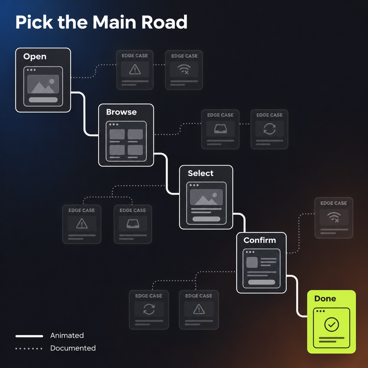
Wireframes, user flows and comps are essentially beat lists waiting to be read aloud. Pick the path that represents the core task, the main road through the product rather than its edge cases.
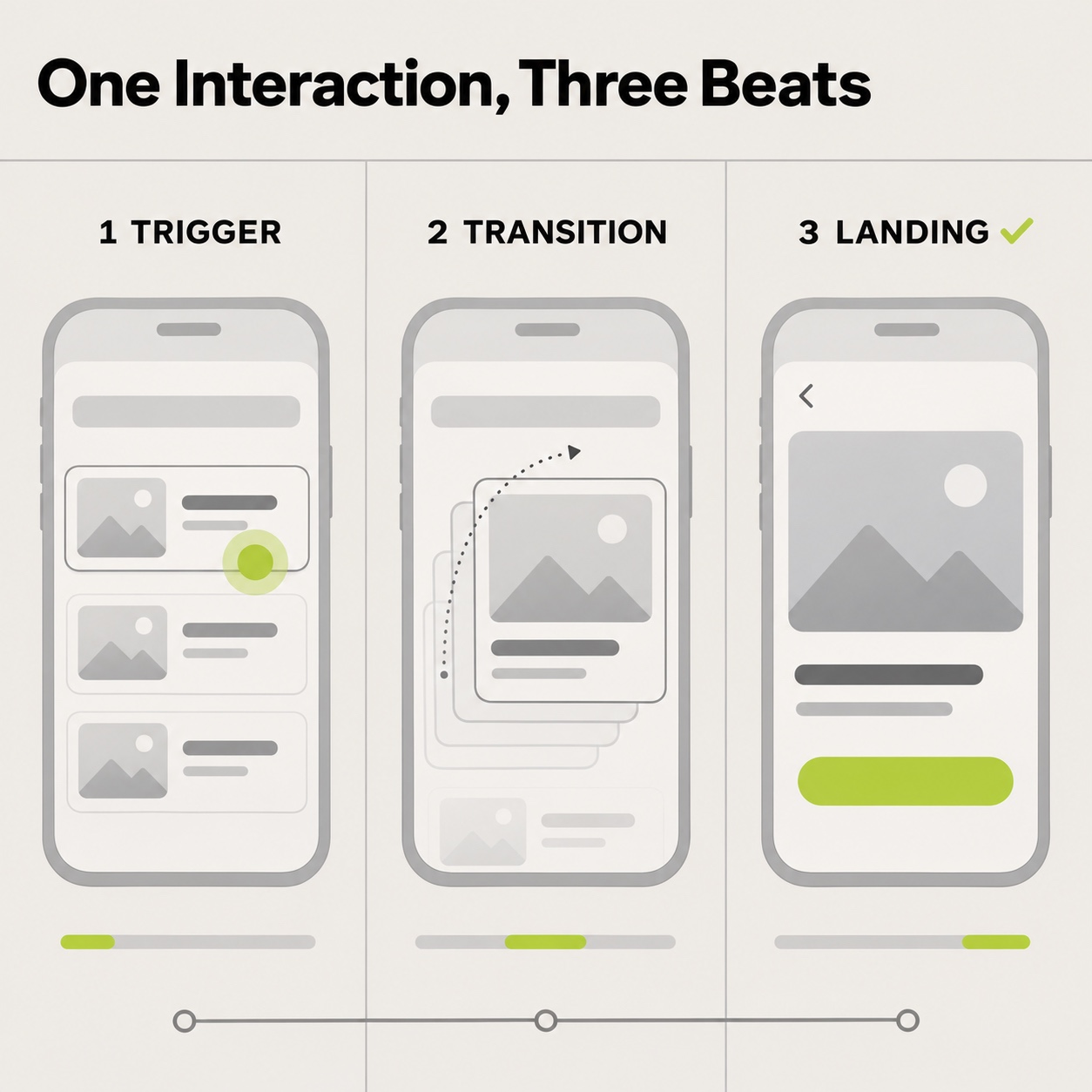
Trigger → transition → landing is a three-part model for describing a single interaction beat. The trigger is the user’s action, the transition is the visible change that action causes, and the landing is the resulting state the viewer pauses to read. Three to five of these beats, in order, make a portfolio interaction clip.
I trained in industrial design, and one habit from that discipline has stayed with me through 15-plus years of cross-disciplinary work. You learn to draw a product in use as a sequence: the hand approaches, acts, and the object responds. Interaction flows deserve the same treatment, because a still shows what the thing is while a sequence shows what it does.
Trigger
Start each beat with the user’s action, whether that’s a tap, a swipe, a step forward or a voice command. Write it as a plain sentence with a visible actor. “The visitor taps ‘Exhibitions'” works, while “User engages with navigation component” doesn’t, because nobody can picture it.
Transition
Next, name the moving element and its direction: the sheet slides up, the route line draws toward the gallery. If you can’t say what moves, the beat isn’t ready. Vague beats produce portfolio videos where things glide around beautifully while nothing actually happens.
Landing state
Finish with where the user ends up, the state the viewer needs time to read. It’s usually one of your existing comps, which also makes it a natural keyframe reference.
Here’s a reusable template, filled in with a museum wayfinding example:
| Beat | Trigger (user does) | Transition (what visibly changes) | Landing (end state) | Must stay fixed |
|---|---|---|---|---|
| 1 | Visitor taps “Exhibitions” | Floor plan fades in over the home screen | Floor plan with current gallery highlighted | Header, typeface, brand colors |
| 2 | Visitor taps the highlighted gallery | Gallery card rises from the bottom | Card with title, hours, route button | Card layout, label copy |
| 3 | Visitor taps “Route” | Route line draws from “You are here” to the gallery | Map with full route and walking time | Map style, icons |
| 4 | _Your trigger_ | _Your transition_ | _Your landing_ | _Your fixed elements_ |
Write a Kling 4.0 brief the model can follow
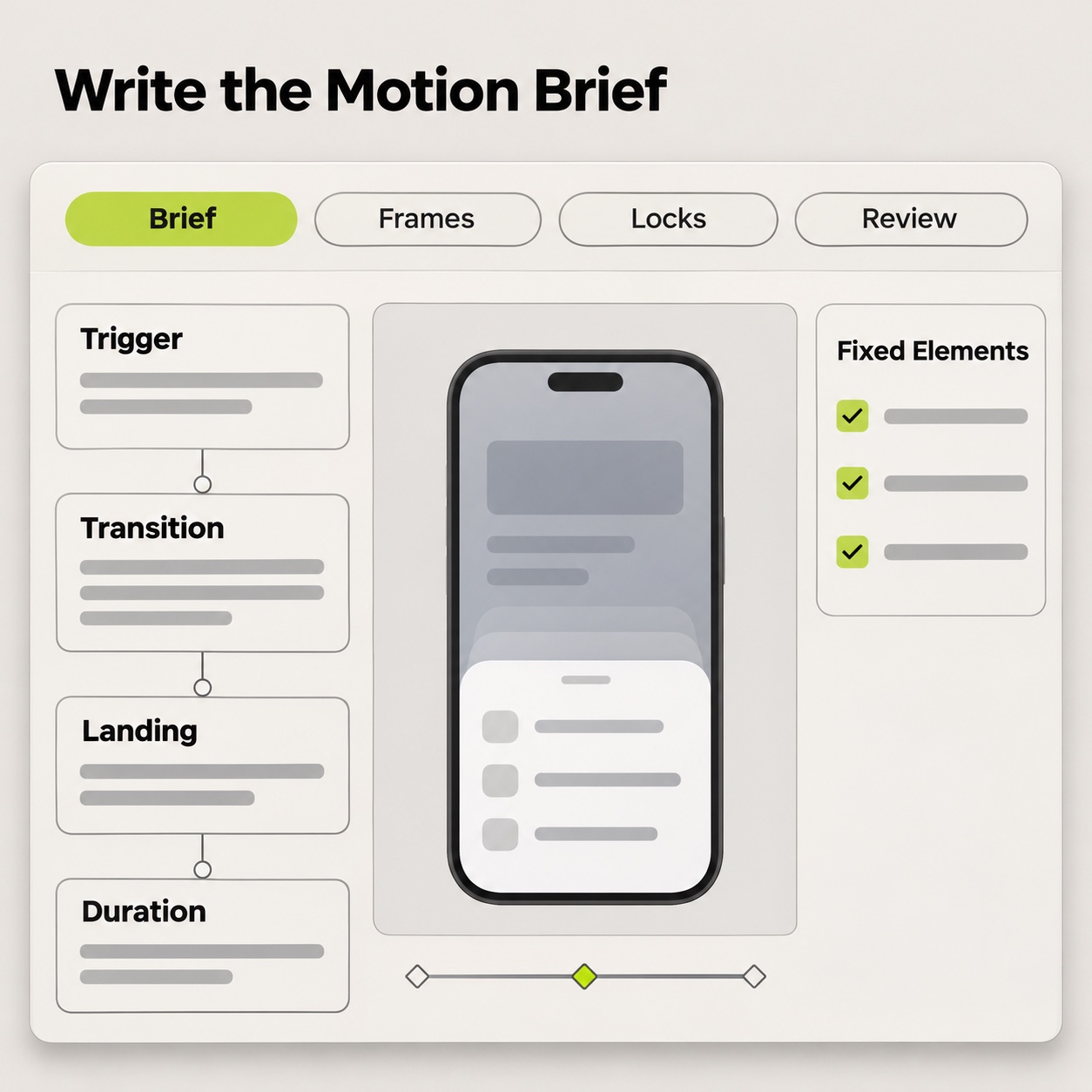
Your comp defines how the clip should look, and your written description defines how it should move. Keep both in one brief per beat so the notes never drift apart.
This sits inside a broader studio workflow for AI video generation for designers, but the brief here has one job: preserve the logic of a single interaction from first action to readable result.
Reference order and shot language
Kling 4.0 accepts multiple references, but your brief should still state which one defines the frame. For UI work, a sensible hierarchy puts the starting screen first, the landing screen second, and any device or hand reference after that. Record the order so every regeneration starts from the same setup.
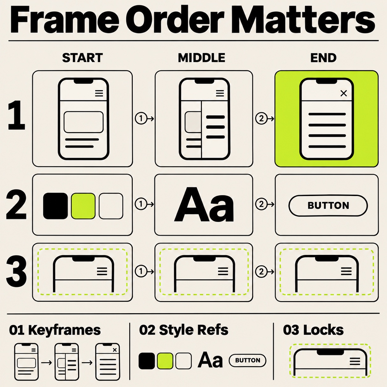
Then describe each shot in concrete visual language: “Overhead view of the phone screen; a thumb taps the date field; the calendar sheet slides up; the selected date highlights.” You’re writing for a generator rather than a developer, so use concrete nouns and visible actions and leave out component jargon.
What must remain fixed
List anything that cannot change, such as the typeface, brand colors, layout grid, device frame and on-screen copy. Generated video can alter small text and logos, so check every frame with visible type against the original comp. If a word changes, the beat fails, however good the motion looks.
Timing and review pauses
Give each beat a breath before the next one starts, because the pause on the landing state is where the client reads the result. If you assemble separate beat clips, keep that pause in the edit.
Adapt the beat system to UI, spatial and brand work
Beat structure shifts with the medium, and a good portfolio shows you understand the difference.
The same sequencing discipline appears in strong UI/UX design portfolio examples: decisions are presented in an order a client can follow, instead of as a gallery of disconnected screens.
In a UI interaction video, keep the camera still and let the interface move. Viewers need to track small changes, like a chip activating or a sheet rising. Moving the camera on a UI clip is like shaking the paper while someone reads it, so lock the frame and let each beat land.
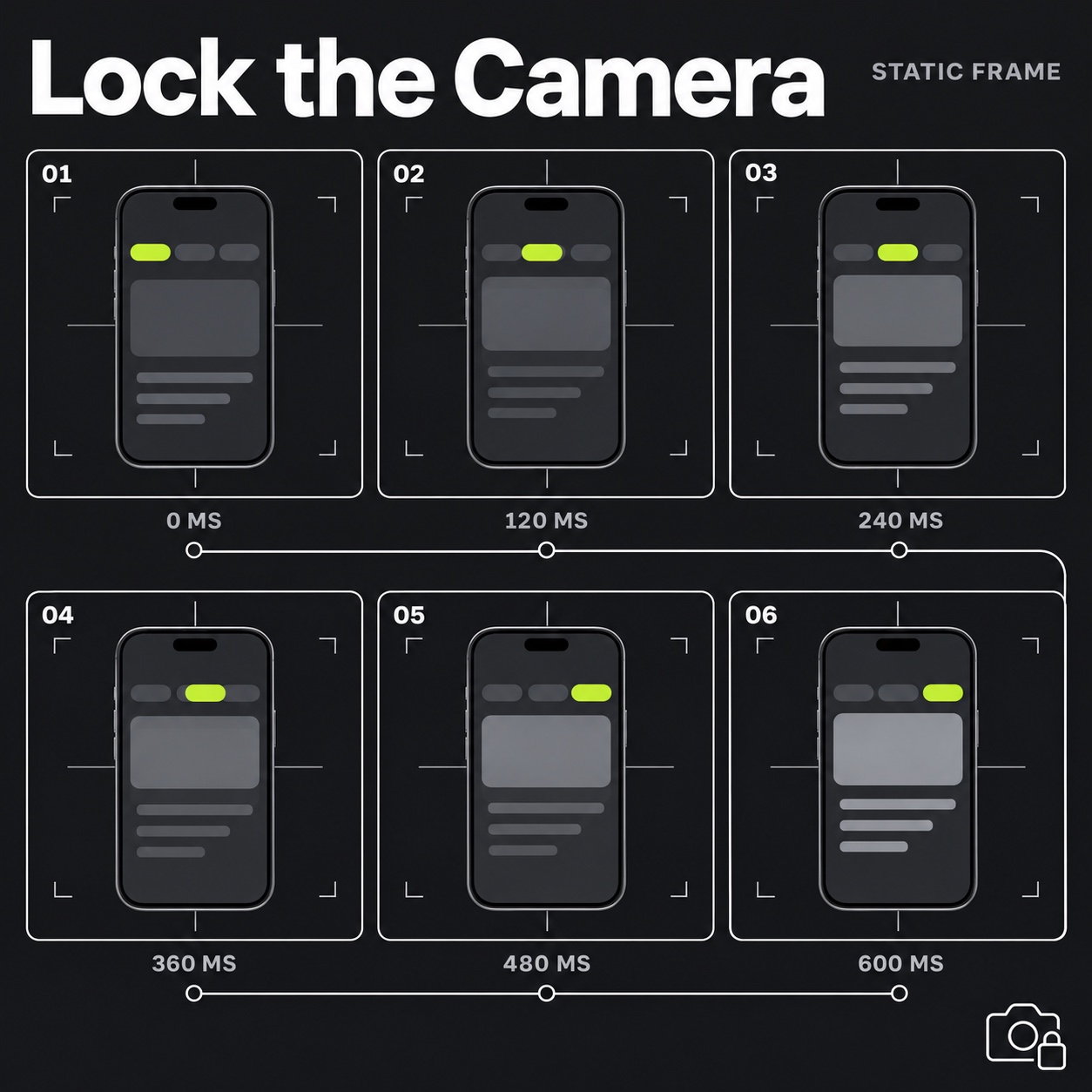
Spatial and environmental work calls for the opposite: move the camera through the space and let the interface respond. A wayfinding clip should feel like a walk, where you approach the directory, glance at the highlighted route and arrive at the gallery. Pace it at walking speed rather than trailer speed.
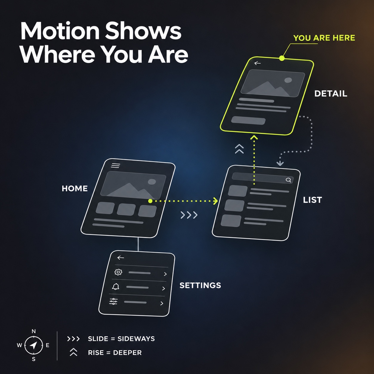
Brand interaction pieces, such as an identity that responds to touch, sound or time of day, are about character. Show the same mark behaving in a few contexts, perhaps quiet on the loading screen and more formal on the signage, so the client can see whether the identity holds together when it moves. Fixed visual anchors matter even more here, much as they do when turning a still illustration into motion.
Keep the portfolio claim honest
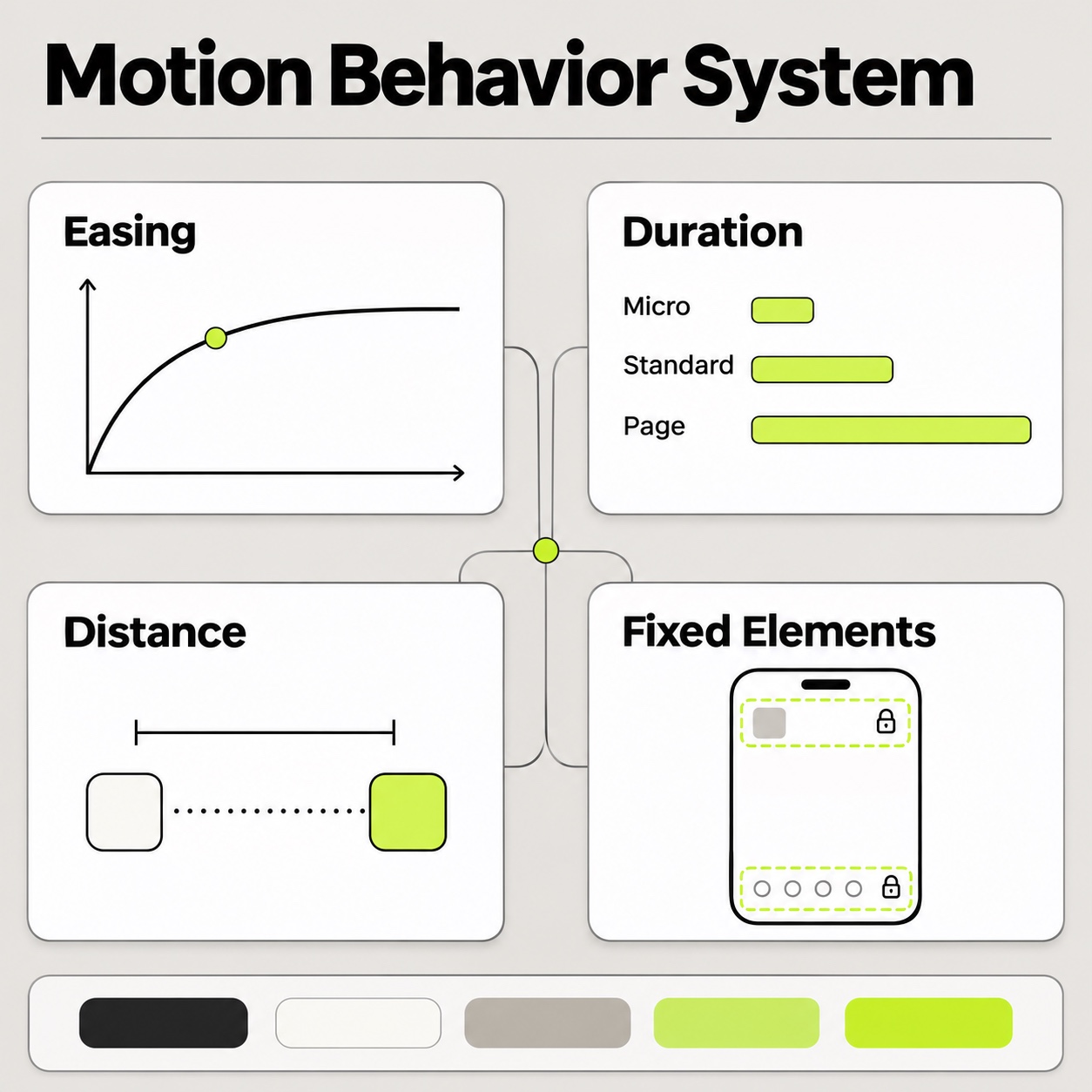
Motion makes portfolios persuasive, which is exactly why it needs rules. A clip should show the flow as designed, not a smoother or faster version of it. If the real checkout takes four steps, the clip shows four steps. Compressing a clunky flow into a slick fifteen seconds is misrepresentation, and it will surface the first time the client uses the product.
The same applies to loading, empty and error states. It’s tempting to show only the golden path, but one honest beat, such as the skeleton screen while content loads or the empty cart with its real message, tells the client you considered the whole experience. Honesty in the small beats is what sells the big ones.
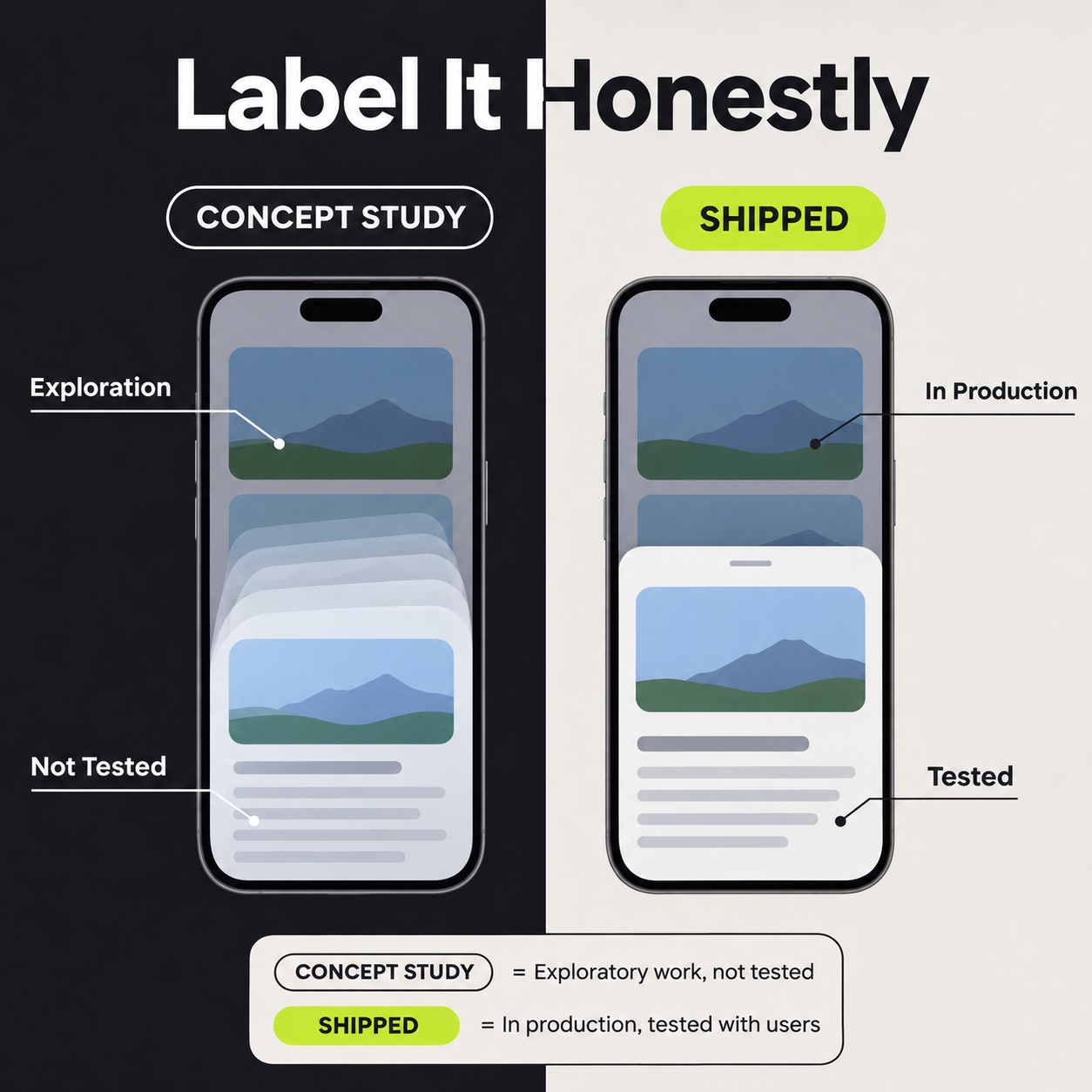
Be clear about what the clip is, too. “Concept motion study” and “shipped product flow” are different claims, so label which one the viewer is watching. Clients respect that distinction, and blurring it is a quick way to spend their trust.
A one-afternoon build order and review checklist
Scope the first version deliberately: one flow, three to five beats, no extended polish pass. At that size, an afternoon is a reasonable target; larger flows, revisions or client review rounds will take longer.
- Choose the core flow: the three-to-five-beat main road through the work.
- Write each beat as a trigger, transition and landing in plain sentences.
- Describe each shot with concrete nouns and visible actions, using the comps as visual reference.
- Generate the beats as short clips and assemble them in order, with a breath between each.
- Watch once as a non-designer. If you can’t narrate what happened without guessing, rewrite the beats rather than the visuals.
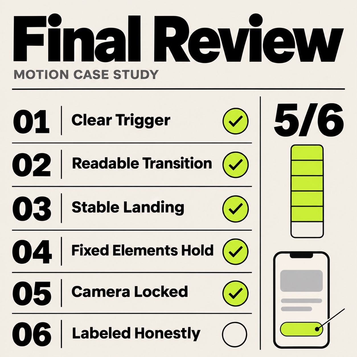
Before publishing, run this review:
- Narration: a non-designer can describe each beat in one sentence.
- Accuracy: every landing state matches a real screen, and the step count matches the real flow.
- Type and brand: copy, logos and colors match the comps frame by frame.
- Camera: still for UI, moving for spatial work, varied by context for brand pieces.
- State beat (optional): include a loading, empty or error state only where it’s relevant to the flow.
- Label: the clip says whether it’s a concept study or a shipped flow.
- Terms: plan, credit cost, watermark and commercial-use terms have been checked.
If warping, flicker or drifting detail remain, our image-to-video workflow and fixes covers the technical side. Get the story right first, then work on the pixels.
FAQ
What should a Kling 4.0 portfolio interaction brief describe?
Describe the trigger, transition and final state of one important interaction. Start with the user’s goal and the design decision your case study needs to explain. Keep screen references beside the written beats, and specify what changes after each action so a viewer can follow the flow without extra explanation.
Which interaction should you show first in a portfolio?
Show the interaction that best explains the problem you solved. Choose a flow with a clear starting point, one meaningful change and a visible result. Avoid leading with decorative movement when the project’s value lies in wayfinding, feedback or task completion, since the sequence should reveal your design reasoning to the client.
How do you review a portfolio interaction sequence?
Review it as someone who has never used the design. Watch without commentary and check whether the trigger, movement and destination remain understandable. Compare the sequence with the actual screens, remove invented behavior, and simplify any transition that hides the interaction your motion design case study is meant to demonstrate.
Start with one case study
Open your strongest project and fill in the beat table for its core flow, writing three to five rows with a trigger, a transition and a landing in plain sentences. Once every row reads clearly, open Kling 4.0 and generate the first beat.
- 0shares
- Facebook0
- Pinterest0
- Twitter0
- Reddit0