- Find the part of the illustration that cannot change
- Choose movement that belongs in the composition
- Prepare the reference before generating video
- Write a motion prompt in four layers
- Review the movement first, then inspect the drawing
- If the style drifts, remove something
- Finish the motion design in an editor
- Final approval checklist
- FAQ
The quickest way to ruin a good illustration is to animate everything in it.
A drawing may look simple, but its character often depends on a few precise choices: the weight of the outline, the gap between two shapes, a limited palette, or the amount of empty space around the subject. If those choices drift from frame to frame, the clip may still look polished, but it no longer feels like the same artwork.
Before opening Seedance 2.5, decide what the motion is supposed to add. A gentle shift in balance? A clearer focal point? A quiet sense of atmosphere? For a first test, one well-chosen movement is usually enough.
Find the part of the illustration that cannot change
I am picky about silhouettes. Years of working across industrial design, drawing, and visual communication taught me that if the outer shape changes, texture and color rarely save the design. The same rule applies here.
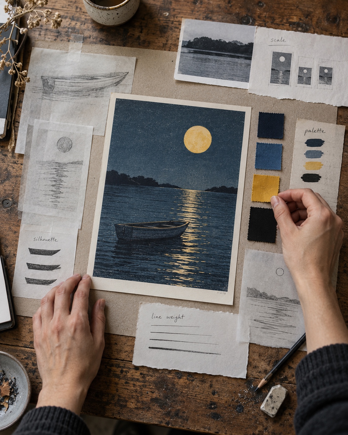
Look at the illustration and identify the two or three decisions that make it recognizable. It might be a thick ink contour, a flat block of warm gray, rough pencil shading, unusual proportions, or an off-center composition. Write them down in plain language before generating the clip.
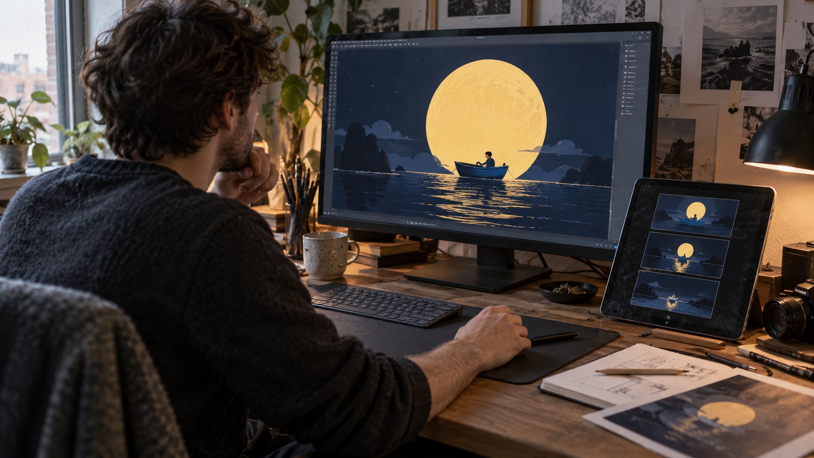
Take a simple scene: a small blue boat under an oversized yellow moon, drawn with black outlines against a flat navy background. Its preservation note could read:
- Keep the boat small and preserve its exact silhouette.
- Keep the moon large, round, and still.
- Use only navy, blue, yellow, and black.
- Retain the flat fills and hand-drawn line weight.
- Do not add reflections, realistic water, fog, or new objects.
That note gives you something concrete to inspect. “Keep the original style” sounds reasonable, but it does not tell you what to reject when the hull becomes rounder or the navy background starts to glow.
Save an untouched copy of the source image in the project folder and keep it open during review. Memory is surprisingly forgiving; a side-by-side comparison is not.
Choose movement that belongs in the composition
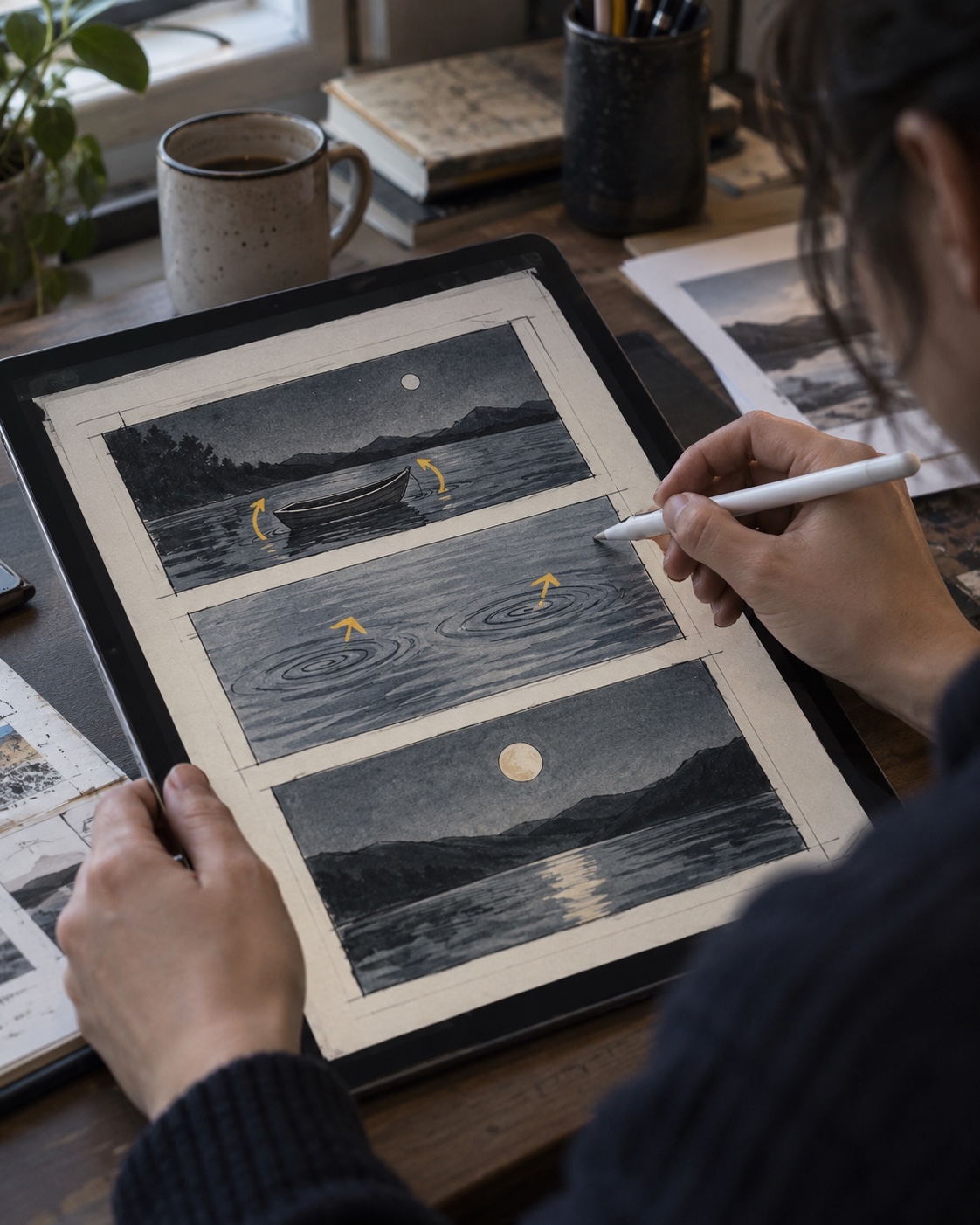
Start with an action the still image already suggests. The boat can rock by a few degrees. Two drawn ripples can slide under the hull. The moon does not need to move at all.
This is where many first tests become overloaded. Wind appears, clouds drift in, the camera rotates, the water turns reflective, and a calm illustration becomes a completely different scene. Each extra request gives the model another part of the image to reinterpret.
The pace should fit the final placement. A portfolio loop can afford a short pause before the boat moves. A social opening needs the action to register sooner. Either way, decide what the eye should notice first and build the timing around that.
For the first version, I would keep the setup deliberately narrow:
- Lock the camera.
- Move one main subject.
- Allow one small secondary action.
- Keep one large element completely still.
Once that version holds together, try something bolder. You will have a clean baseline for comparison instead of guessing which change caused the image to drift.
Prepare the reference before generating video
Use the original file or an authorized high-quality export with clean edges and accurate color. The main subject should be large enough to read, but do not crop away the space that gives the composition its balance. Check the service’s current file, resolution, and aspect-ratio requirements before uploading because those details can change.
It is better to solve the crop now than ask the model to solve it later. Turning a horizontal illustration into a vertical clip may cut off an important detail. Extending the canvas creates the opposite problem: the model has to invent scenery that was never part of the drawing.
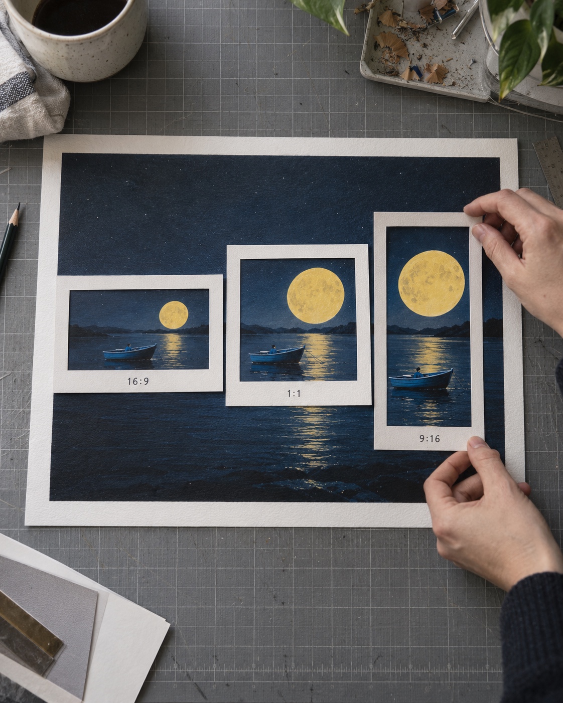
Prepare the image for its actual destination:
- Use 16:9 for a website hero or presentation.
- Use 9:16 for a Short, Reel, or Story.
- Use 1:1 or 4:5 for a compact feed post.
Preserve meaningful negative space. In the example, the boat feels small because the moon and dark sky dominate the frame. Enlarging the boat to fill a vertical crop would weaken the idea before the animation even begins.
Only animate work you created or have permission to use. Keep the source file and any license or commission terms with the project archive, especially if the final clip will be published commercially.
Write a motion prompt in four layers
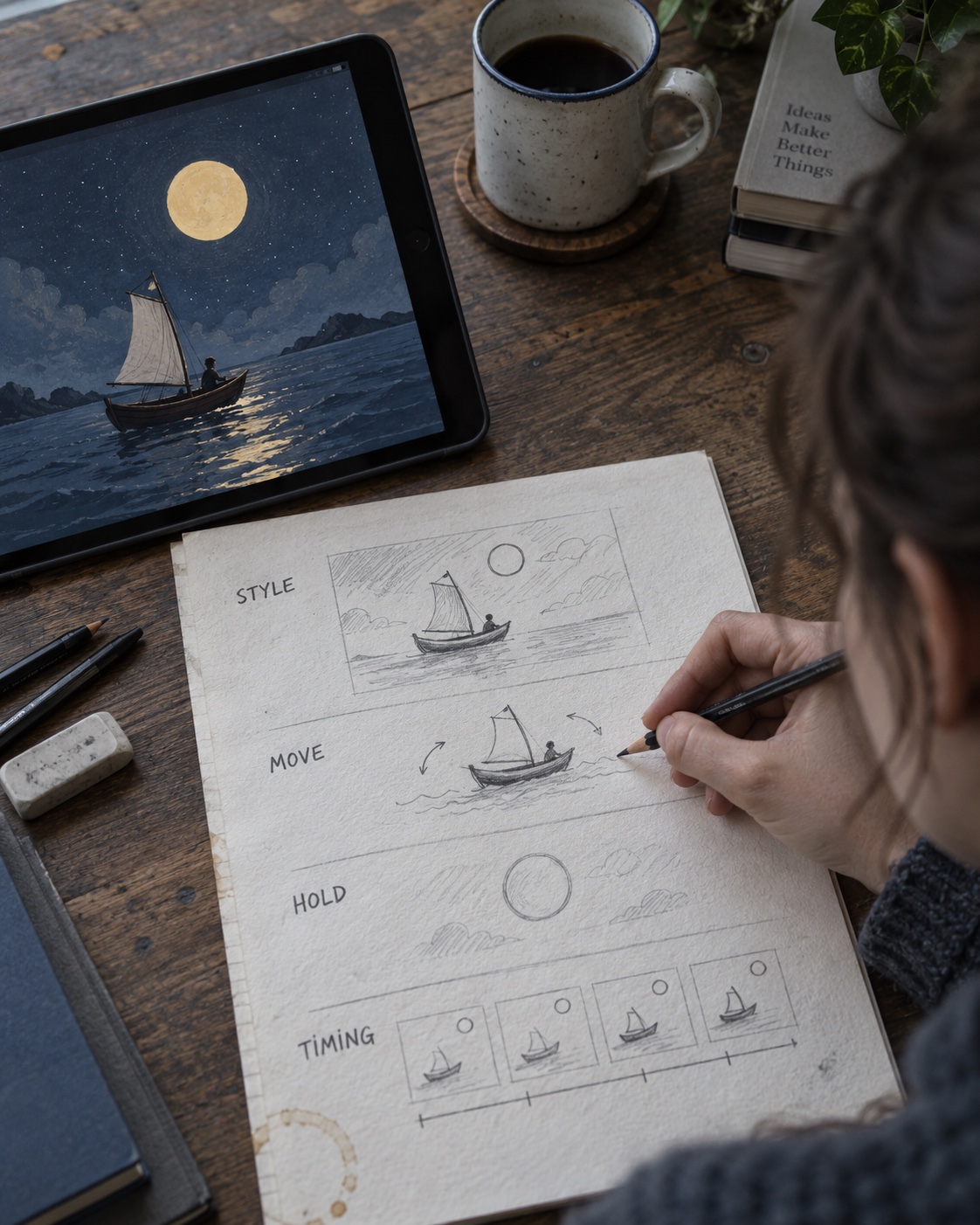
The cleanest motion directions answer four questions: What is the image? What moves? What stays still? How does the action begin and end?
For the boat scene, I would write:
Preserve the original flat illustration: a small blue boat with black hand-drawn outlines beneath a large yellow moon on a solid navy background. Rock the boat very gently from side to side while two simple drawn ripples shift beneath it. Keep the moon, background, colors, proportions, and camera fixed. Begin with a brief still moment, make one slow rocking movement, then settle close to the starting position. Do not add realistic water, reflections, texture, new objects, camera movement, or lighting changes.
The order helps. First, describe the visual language. Then name the action and the fixed elements. End with the few failure modes that would genuinely spoil the shot.
Avoid turning the negative instructions into a page-long list. Long prompts often hide the most important direction. Here, the fixed moon, locked camera, and flat water treatment matter more than a catalog of every object that should not appear.
Timing phrases such as “brief still moment” or “one slow rocking movement” describe a rhythm, not an exact frame count. Treat the output as footage that still needs selection and editing.
Review the movement first, then inspect the drawing
Watch the clip once at normal speed without pausing. Does the movement feel calm or nervous? Does it draw attention to the boat? Is there a clean moment where the shot could end?
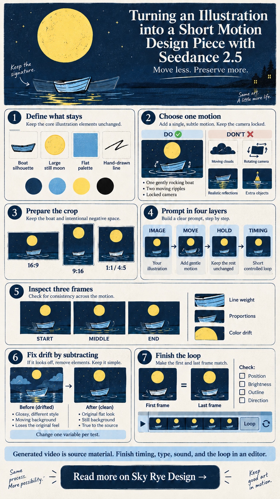
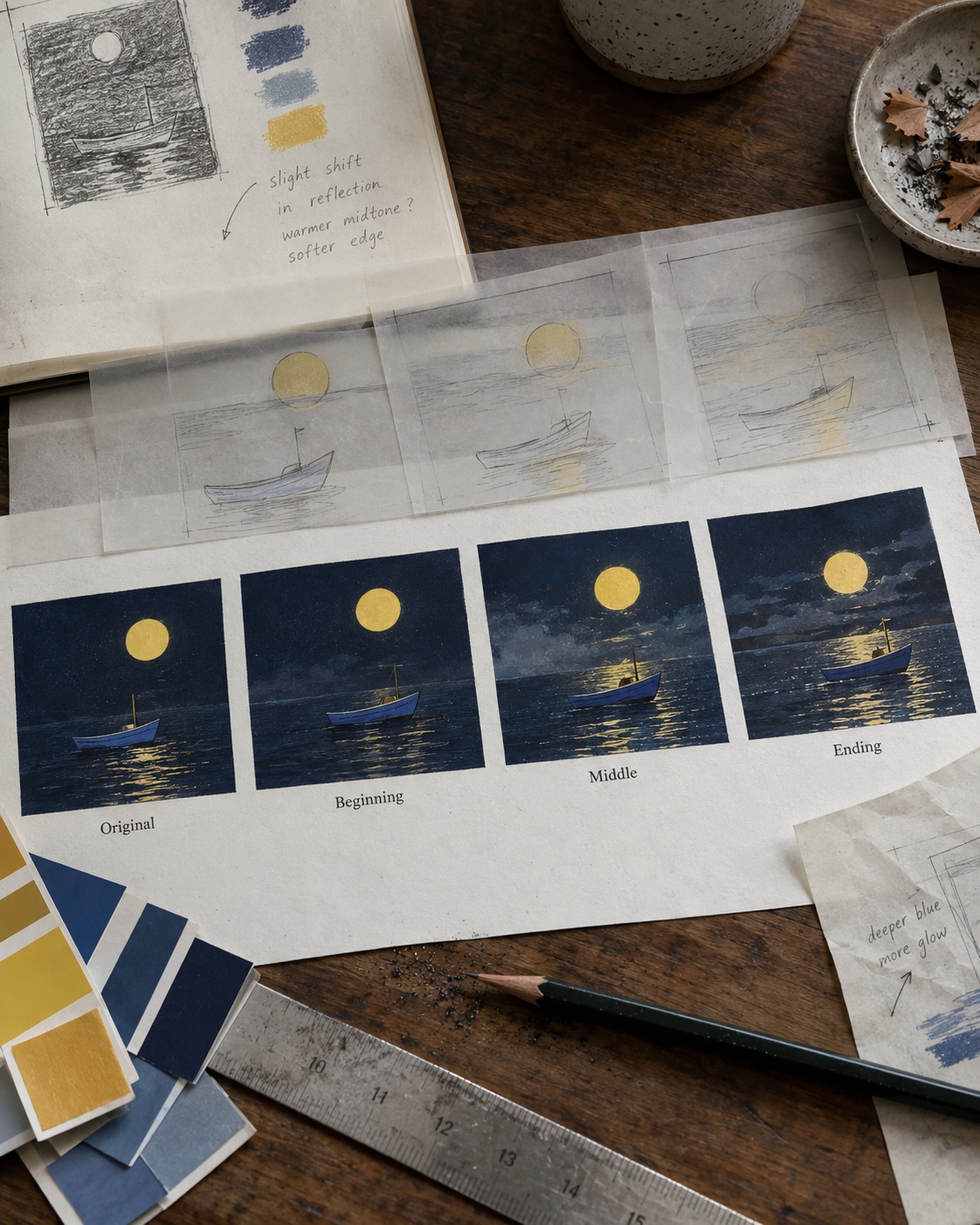
Now stop looking at the animation as animation. Pause near the beginning, middle, and end, and compare those frames with the source image. Check:
- The thickness and continuity of the black outline.
- The boat’s width, height, and angle.
- The size and position of the moon.
- The hue and density of the navy background.
- The point where the hull meets the water.
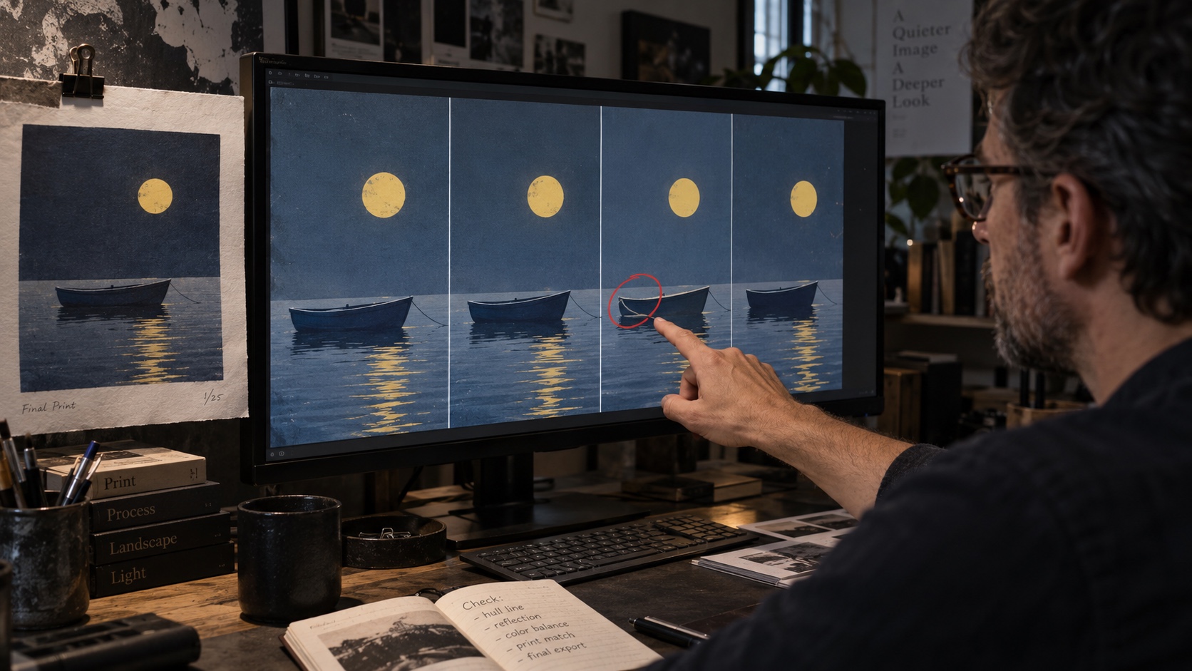
That last area is easy to miss. The model may add a glossy reflection, soften the lower contour, or turn two flat ripple marks into realistic waves. None of those changes is dramatic on its own, yet together they pull the scene away from the original drawing.
My preferred check is a four-image contact sheet: the source, an early frame, a middle frame, and a late frame. Viewed side by side, a changing moon or swelling hull is obvious. Scrubbing back and forth through the clip makes those shifts much harder to judge.
If the style drifts, remove something
The first instinct is often to add more wording to the prompt. Try subtraction first.
If the framing moves, lock the camera. If the outline bends, reduce the rocking angle. If the background changes color, freeze it and remove lighting instructions. If the boat loses its shape near the end, shorten the action. Secondary motion should be the first thing to go.
Change one variable per attempt. Adjusting the prompt, crop, action, and duration at the same time may produce a better result, but you will not know why it improved. That makes the next revision slower.
Keep a small version log with the reference image, prompt, change made, and reason for rejection or approval. It does not need to be formal. Four short lines can prevent the team from repeating the same unsuccessful test.
Finish the motion design in an editor
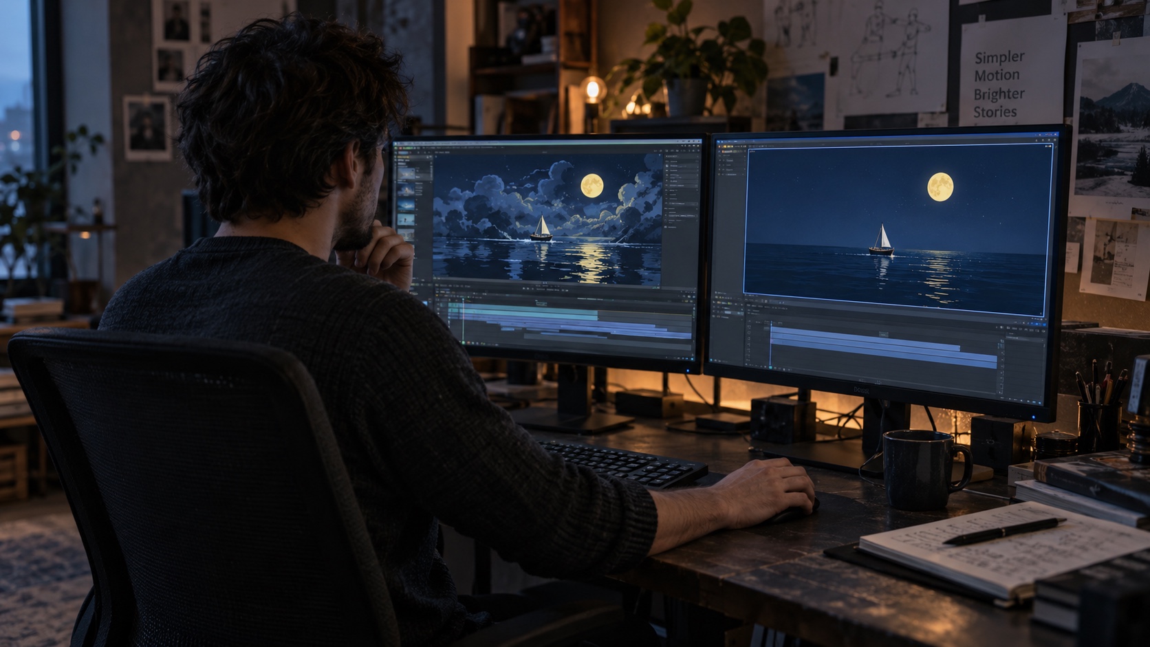
Generated video is source material. The final timing, typography, sound, and branding still belong in an editor, where they can be adjusted without asking the image model to redraw the scene.
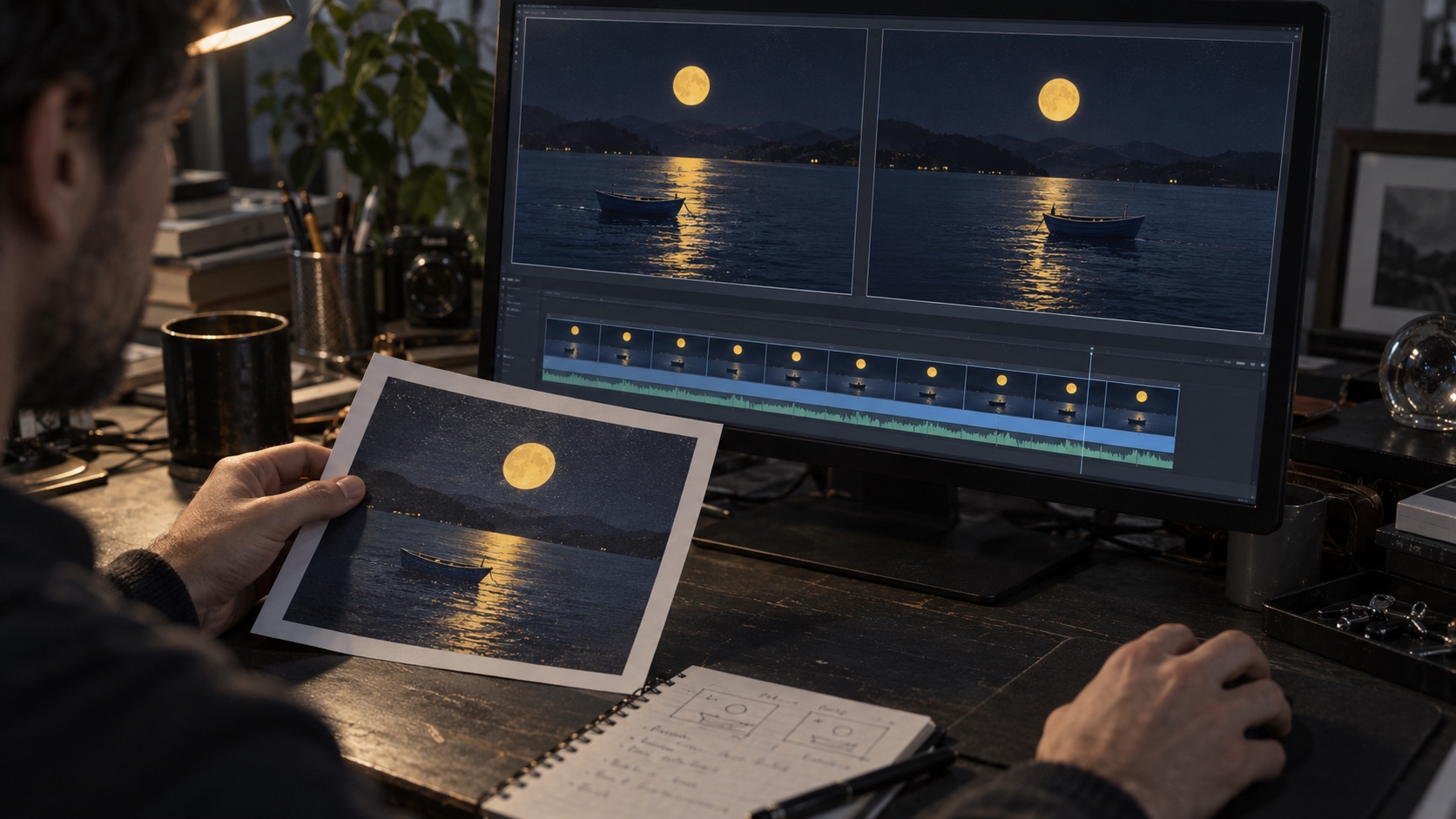
Trim the strongest section rather than keeping the full output by default. For a loop, compare the first and last frames for position, brightness, outline shape, and direction of travel. A clip can look smooth once and still jump badly when it repeats.
Let the loop run at least three times. The first repeat may feel fine because you are watching the subject. By the third, a small brightness pulse or change in the boat’s angle becomes difficult to ignore.
Finally, view the export where it will actually appear. A subtle rocking motion that works on a large monitor may be almost invisible in a phone feed. Keep the original illustration beside the final clip during approval. You should be able to explain what the movement adds without having to excuse changes to the drawing.
Final approval checklist
- You have permission to animate and publish the source artwork.
- The main silhouette still matches the original.
- Key colors do not shift during the clip.
- Fixed elements stay fixed instead of pulsing or drifting.
- The motion supports the original focal point.
- No unwanted objects, reflections, textures, or lighting effects appear.
- The crop suits the intended platform.
- The first and last frames provide a clean edit or believable loop.
- Titles, sound, and branding were added separately.
- The final export was checked beside the source illustration.
FAQ
How much movement should I add to a still illustration?
Begin with one main action and one small supporting action at most. Strong silhouettes and limited palettes tend to hold up better when the movement stays restrained.
What should remain still in an image-to-video clip?
Choose one clear anchor: the background, horizon, moon, or camera. A fixed element makes the intended action easier to read and exposes unwanted drift.
How can I stop the generated video from changing the art style?
Describe the important visual rules in specific terms, lock the viewpoint, and state what must remain still. If the style still changes, reduce the movement range or shorten the clip before adding more prompt detail.
Should text be included in the generated video?
Add titles, captions, logos, and calls to action in an editor. The type will stay sharp and editable, and you can match the spacing and weight to the rest of the design.
How do I know whether a loop is seamless?
Compare the first and last frames, then watch the clip repeat several times. Look for a jump in position, brightness, outline shape, or movement direction. If you spot one, choose different edit points or build a short transition.
Is a longer generation always better?
No. A longer clip gives outlines, proportions, colors, and background details more time to drift. A short controlled action is often easier to edit and more faithful to the original artwork.
- 1share
- Facebook0
- Pinterest1
- Twitter0
- Reddit0