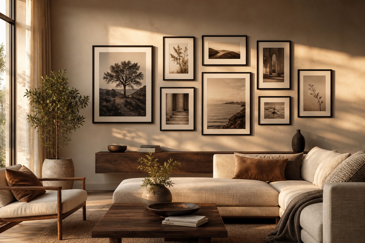
A gallery wall is a composition problem before it’s a decorating problem, and treating it that way changes almost everything about how you approach it. In my design work — whether it’s a brand identity system, a page layout, or a wall of framed art — the same underlying question always comes first: what’s the visual structure holding these individual elements together?
Skip that question with a gallery wall and you get exactly what most people end up with: a collection of nice pieces that never quite reads as one thing.
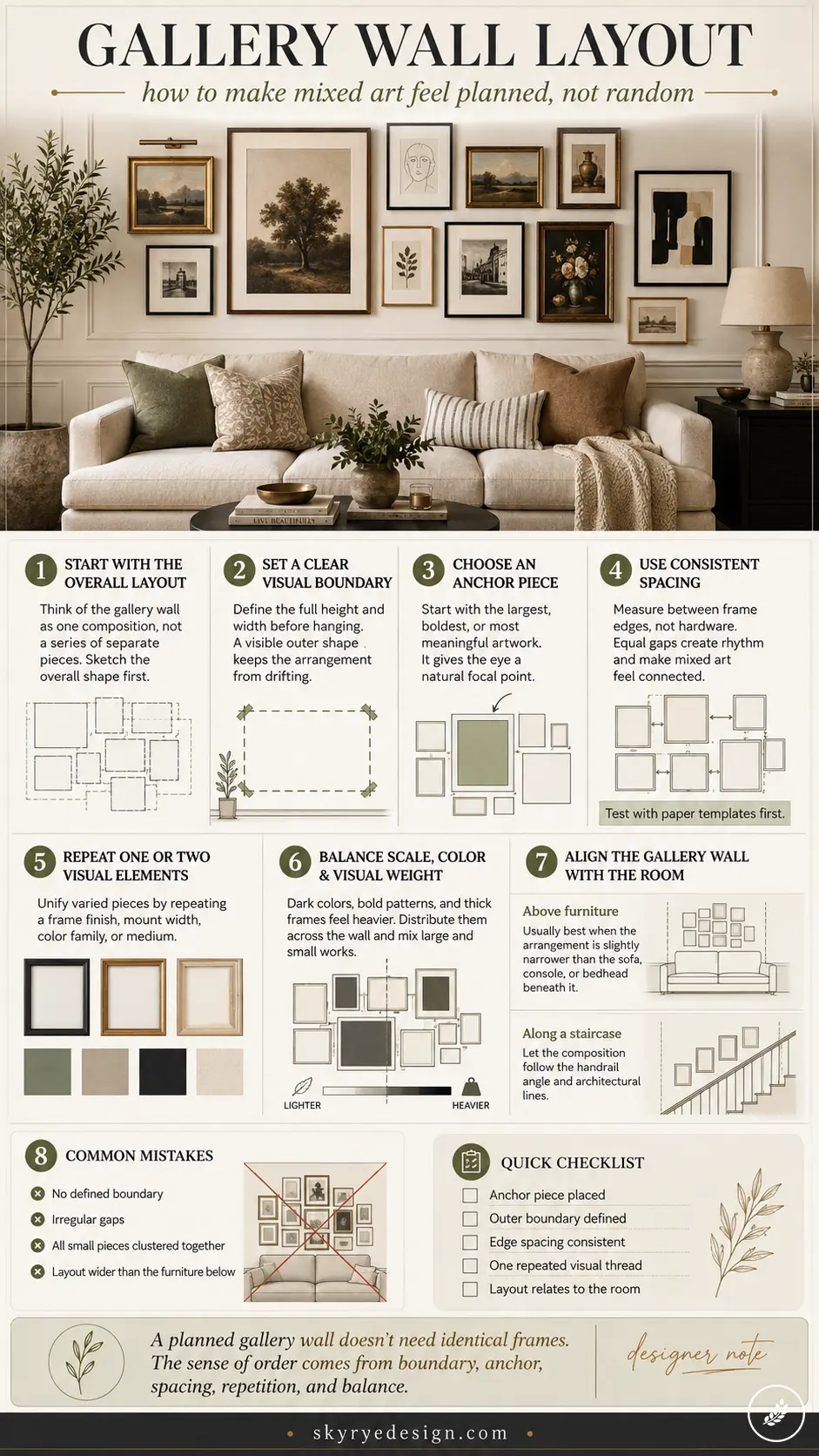
- Start With the Overall Gallery Wall Layout
- Set a Clear Visual Boundary Before Hanging Art
- Choose an Anchor Piece for the Composition
- Use Consistent Gallery Wall Spacing
- Repeat One or Two Visual Elements
- Balance Scale, Color, and Visual Weight
- Align the Gallery Wall With the Room
- When Professional Artwork Hanging Helps
- Final Thoughts
- Frequently Asked Questions
This guide breaks down that structure directly — boundary, anchor, spacing, repetition, and how the whole arrangement should relate to the room it’s in. Get those five decisions right and the individual pieces can vary as much as you want. They’ll still read as planned.
Start With the Overall Gallery Wall Layout
Before touching a single frame, think of the gallery wall as one large composition rather than a collection of individual decisions made one at a time. That’s the mental shift that separates a planned arrangement from a random one — every frame placement is a decision about the whole, not just about that one piece.
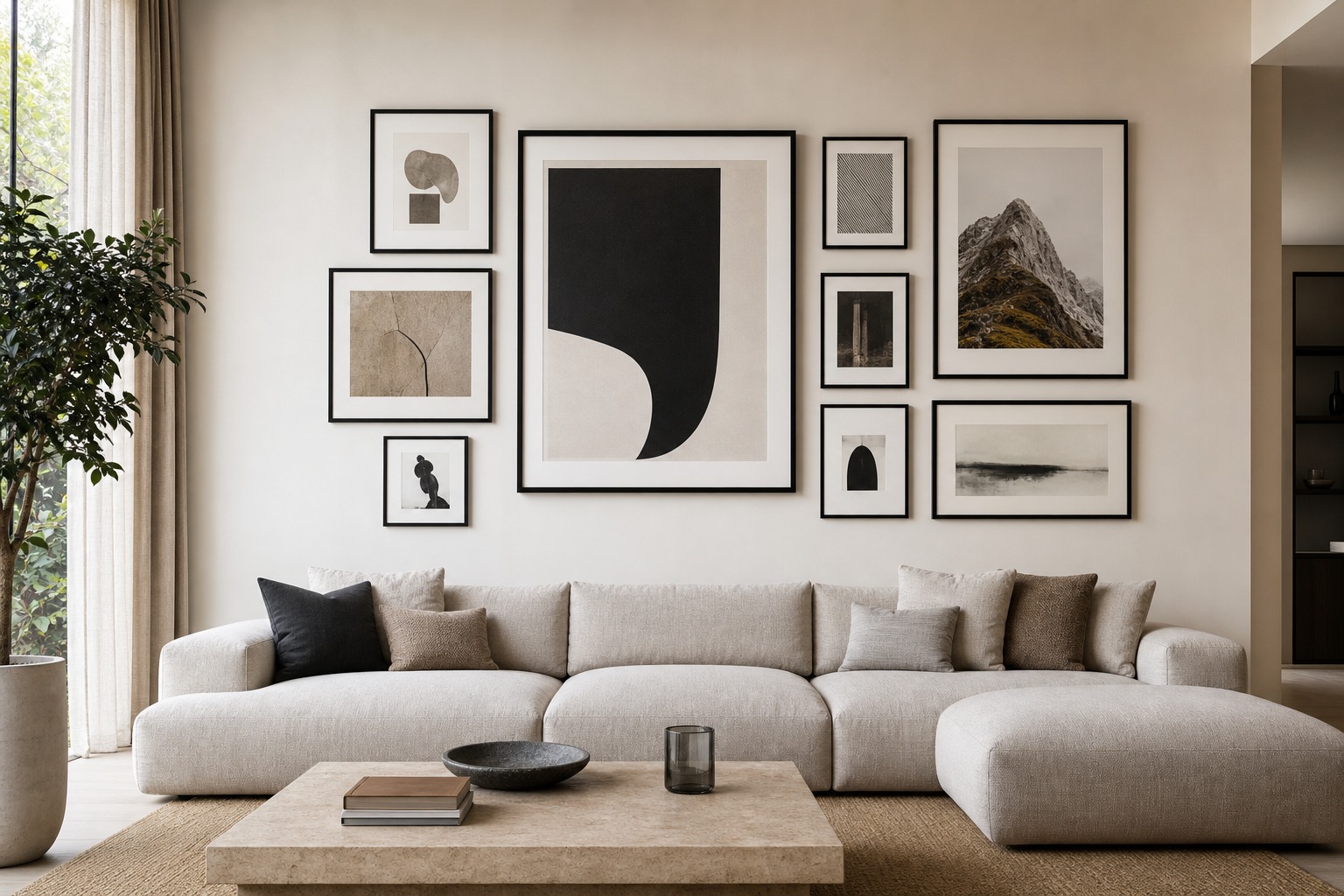
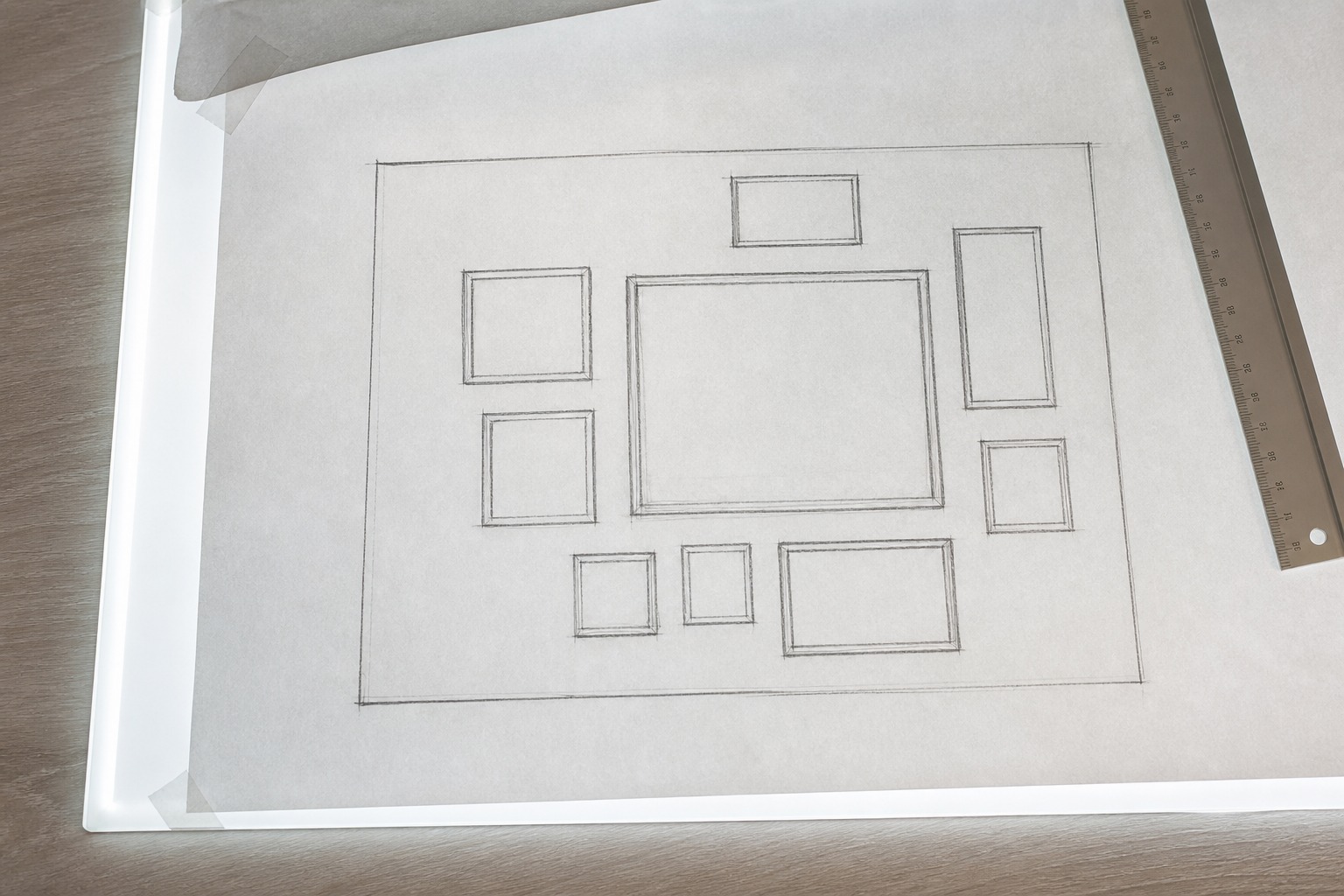
I’d go further than most decorating advice here: sketch the overall shape roughly before you even pick which pieces go where, the same way I’d rough out a composition’s overall structure before committing to any single element’s final detail.
If you want a broader look at wall art approaches beyond gallery-specific layouts, I’ve covered more general options in my wall art ideas guide.
Set a Clear Visual Boundary Before Hanging Art
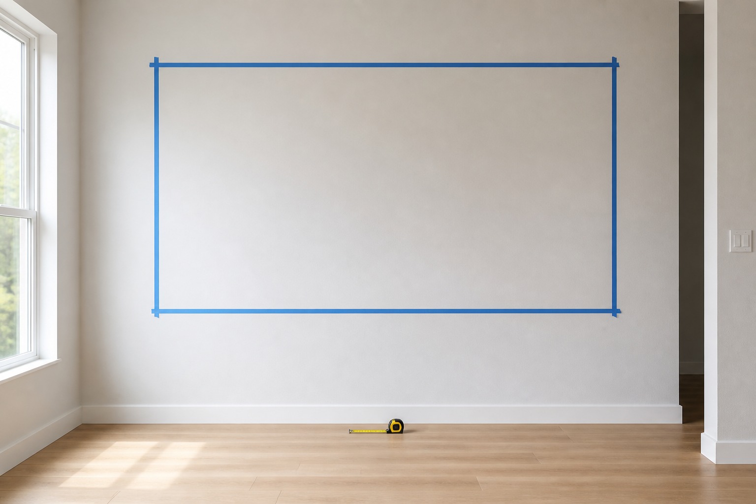
Define the approximate height and width of the complete arrangement before positioning individual pieces. Treating the gallery wall as one bounded shape prevents artwork from drifting apart or spreading without purpose — the outer edges don’t need to form a perfect rectangle, but they should create a boundary your eye can actually identify at a glance.
This matters more than people expect above furniture, along staircases, or across large feature walls, where the temptation to just start hanging pieces and see how it goes tends to produce exactly the scattered, undefined result you’re trying to avoid.
Establishing dependable fixing points early also saves you from unnecessary holes and repeated adjustments later — genuinely one of the more practical reasons to plan the boundary on paper before it’s on the wall. If you want the technical side of getting pieces onto the wall cleanly once the layout’s decided, I go into that separately in my wall art hanging guide.
Choose an Anchor Piece for the Composition
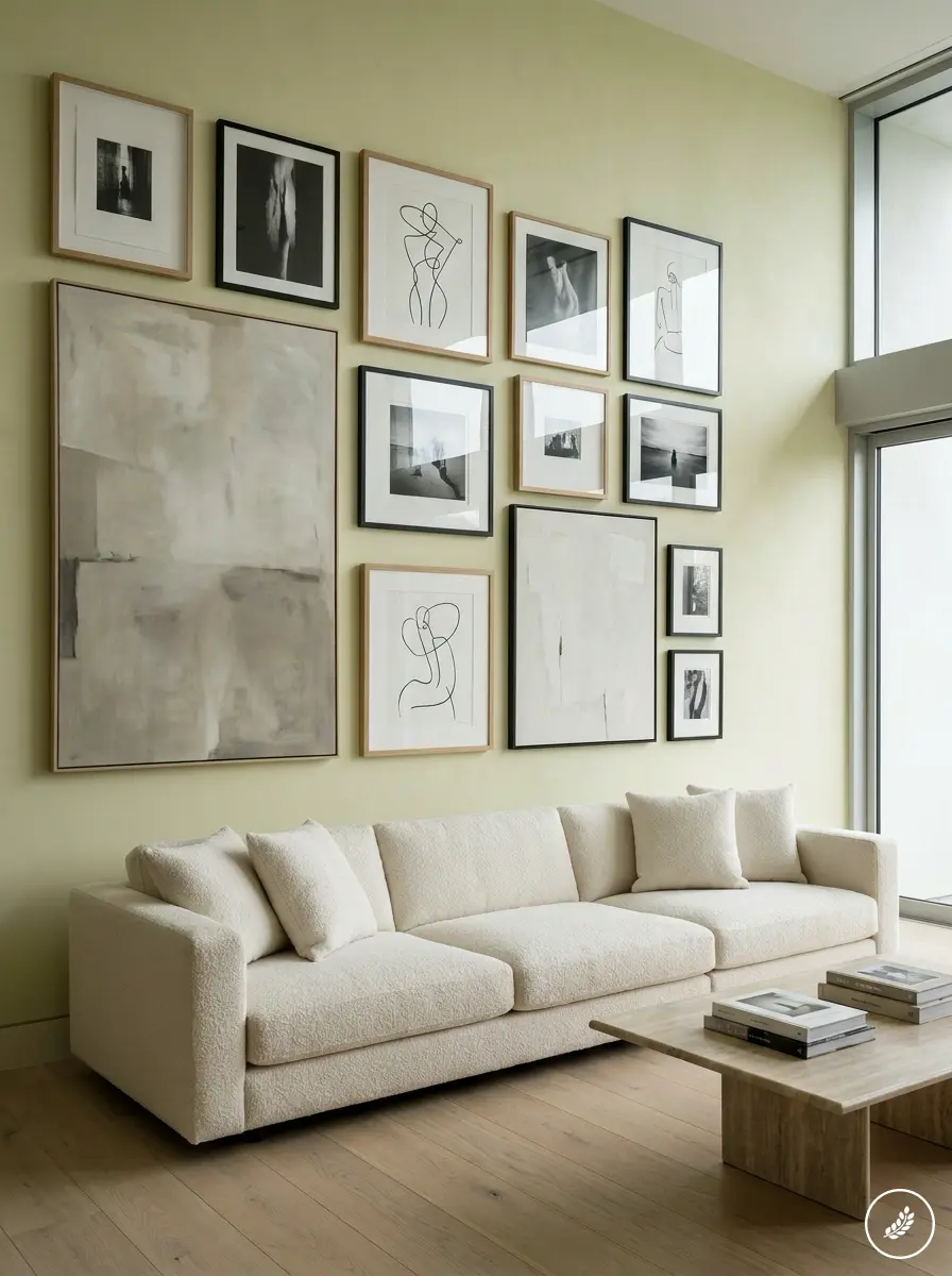
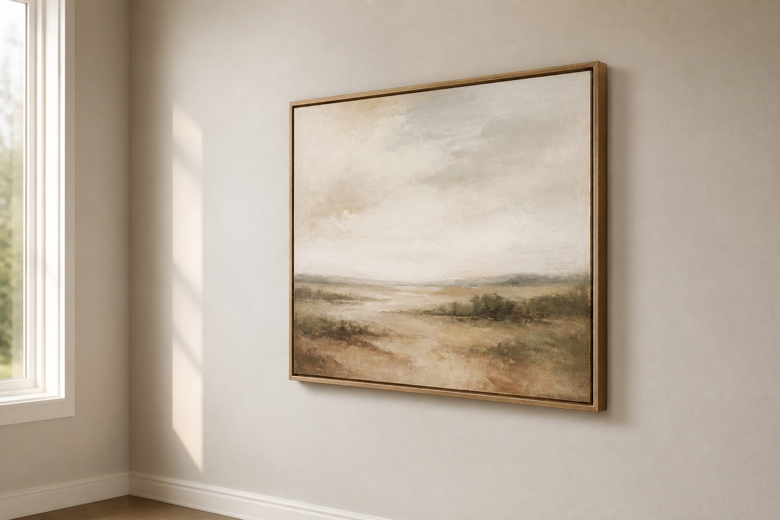
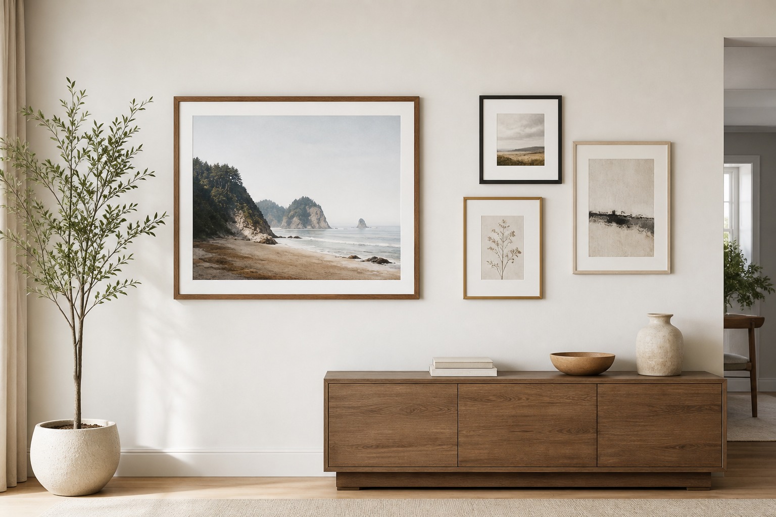
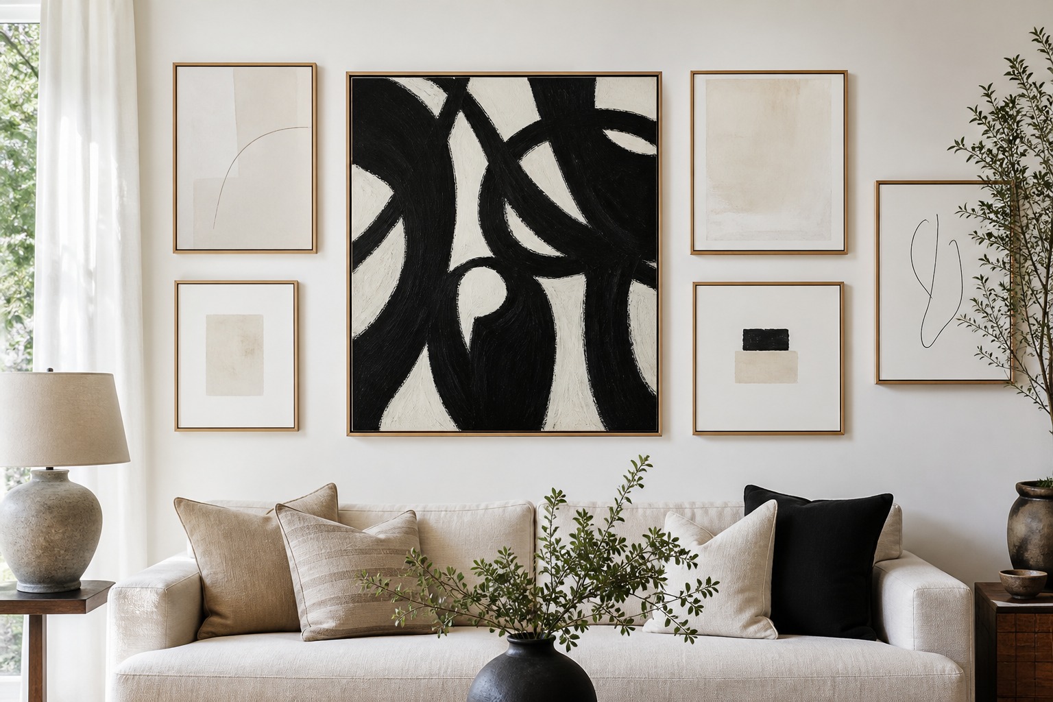
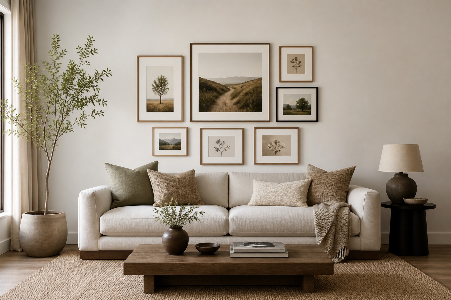
An anchor piece gives the eye a natural starting point — usually the largest, boldest, or most personally significant artwork in the collection. Placing it first makes everything else easier, because you’re now organizing smaller pieces around a fixed center of visual interest rather than trying to balance everything simultaneously with no reference point.
The anchor doesn’t need to sit in the physical center of the arrangement. An asymmetrical composition can feel just as deliberate when several smaller works on the opposite side balance the anchor’s visual weight — this is really just compositional balance, the same principle that governs where you’d place a focal point in any piece of visual design, whether that’s a poster layout or a room.
Its exact position should respond to the surrounding architecture: nearby furniture, doorways, windows, and ceiling height all inform where the anchor actually belongs, not just where there happens to be open wall space. If you’re still choosing which piece deserves that role, scale and color are usually the deciding factors — I break both down in more depth in my canvas wall art guide.
Use Consistent Gallery Wall Spacing
Consistent spacing is one of the simplest, most effective ways to make different artworks read as connected. Equal gaps create rhythm and signal that the pieces belong to the same arrangement, even when their frames and subjects vary considerably. In most residential settings, relatively narrow, consistent gaps help the whole collection read as a single unified display rather than a loose scatter of individual pieces.
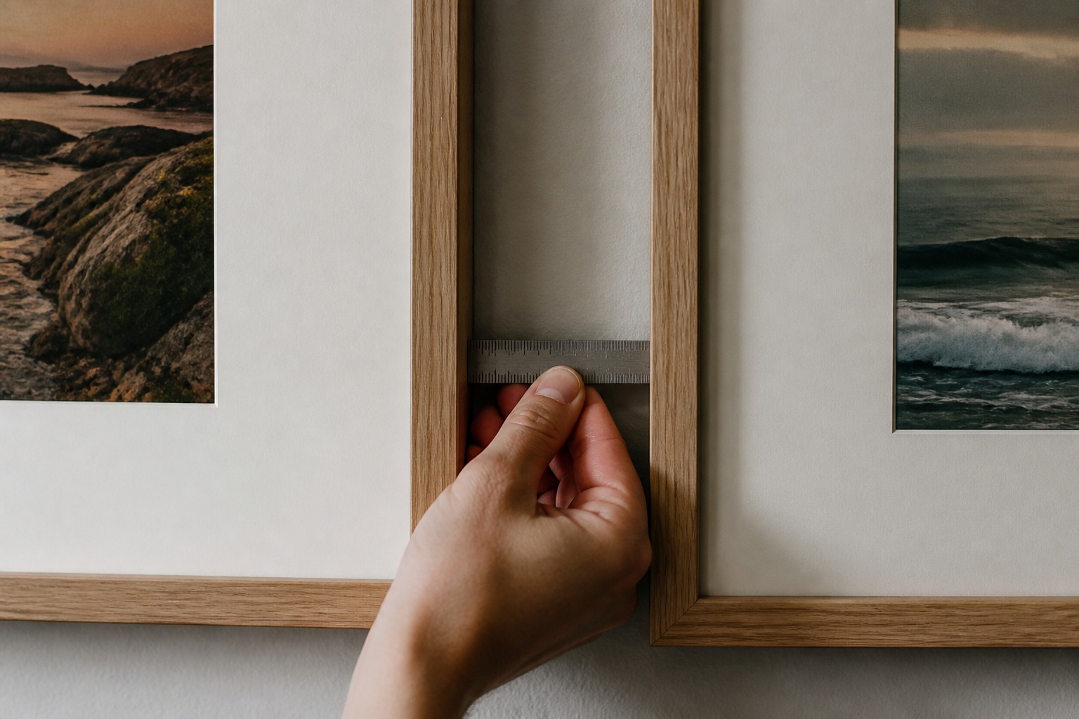
Measure Between Frame Edges
Spacing should be measured between frame edges, not from hanging hardware or nail placement, which is a subtle but important distinction — hardware position varies by frame in ways that have nothing to do with how the finished arrangement will actually read on the wall. Consistent edge-to-edge spacing is what your eye actually registers as rhythm, so that’s the measurement that needs to stay uniform across the whole layout.
Test the Layout With Paper Templates
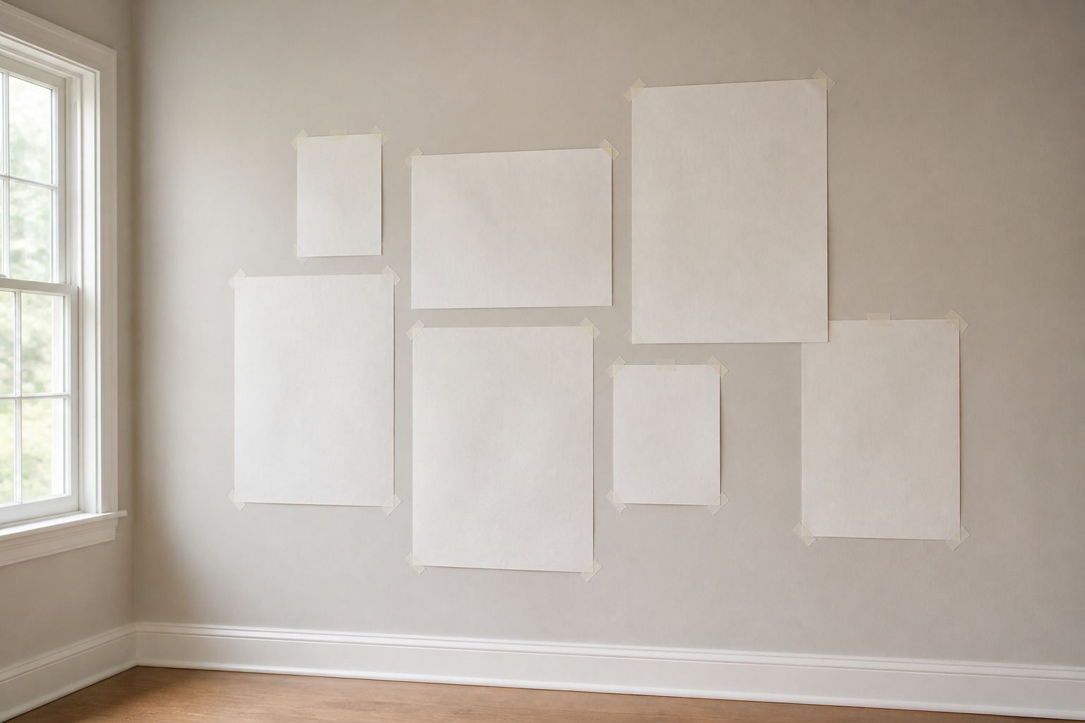
Cut paper templates to the exact dimensions of each frame and arrange them on the wall using low-tack tape before any actual installation. This lets you assess the full composition at true scale without guessing or repeatedly moving heavy framed pieces, which is both more accurate and considerably less frustrating than the alternative. I’d treat this step as non-negotiable for any arrangement with more than four or five pieces — the complexity of getting spacing and balance right by eye alone increases fast as piece count grows, and paper templates are the cheapest insurance against a wall full of unnecessary holes.
Repeat One or Two Visual Elements
A gallery wall doesn’t require identical frames, but some repetition helps establish real continuity across otherwise varied pieces. The goal is a visual thread running through the collection, not enforced uniformity that flattens each piece’s individual character.
Frame Finish, Mount Width, Color, or Medium
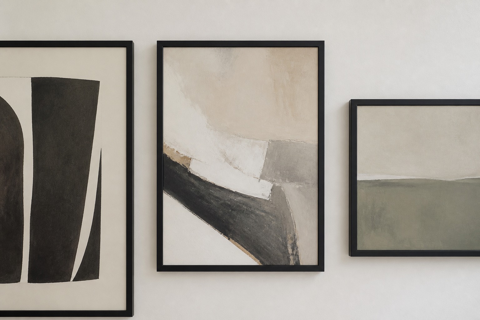
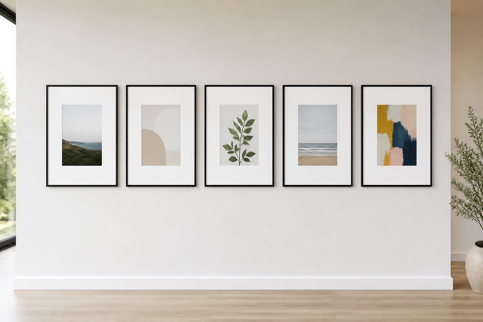
A recurring timber finish, a consistent frame color, a shared mount width, or a repeated frame profile can connect works that otherwise have nothing in common — different subjects, different sizes, different original mediums. Repetition can also come from the artworks themselves rather than the frames: similar tones, related subject matter, or a shared medium across a few pieces builds cohesion on its own.
When the collection is intentionally eclectic, repeating just one single element — black frames throughout, or generous white mounts on every piece — is often enough to hold the whole arrangement together without forcing any other kind of matching.
Balance Scale, Color, and Visual Weight
Size alone doesn’t determine an artwork’s prominence within the arrangement’s overall visual hierarchy — dark colors, bold patterns, thick frames, and high-contrast images all pull attention before pale or minimal pieces of comparable physical dimensions do. Distributing these visually heavier elements across the wall prevents one section from feeling crowded while another reads as empty, even if the actual frame sizes are evenly spread.
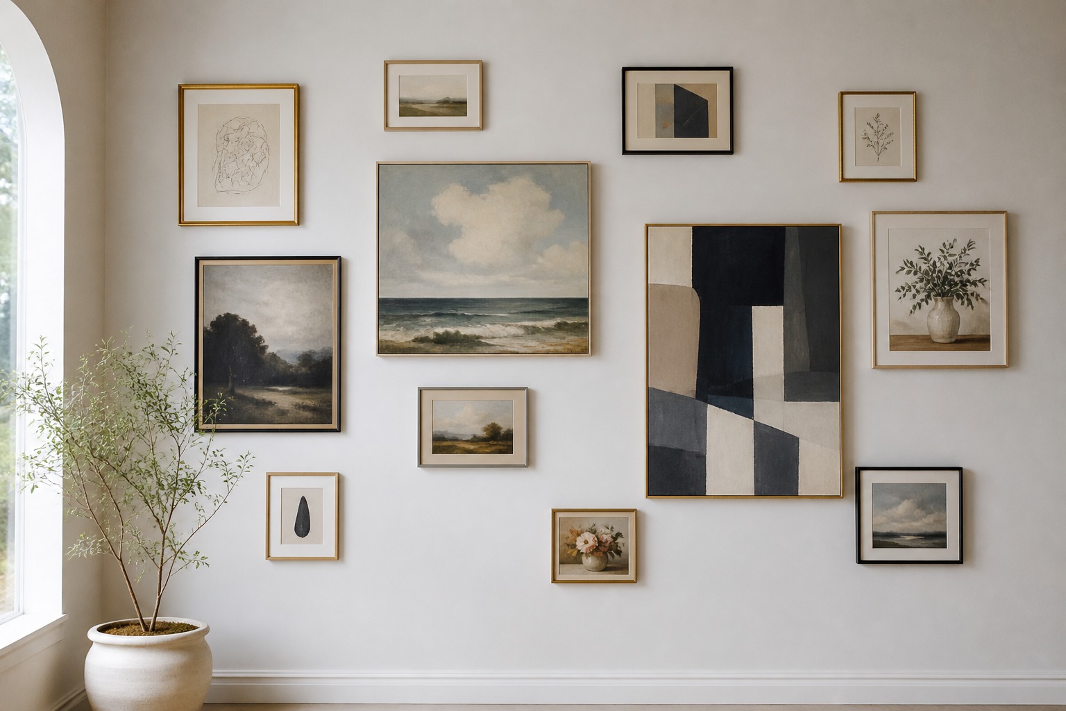
Large and small works also need thoughtful interspersing rather than grouping by size. Clustering every small frame together in one corner tends to make that cluster look disconnected from the larger pieces elsewhere on the wall, like two separate arrangements sharing one surface rather than a single composition.
Positioning smaller works beside, above, or below substantial frames creates genuine transitions in scale and gives the eye an actual route to follow through the display, rather than forcing it to jump between disconnected zones of similar-sized pieces.
Align the Gallery Wall With the Room
A gallery wall should relate directly to the room it’s in rather than exist as a completely isolated feature floating on an otherwise unconsidered wall. This is where a lot of technically well-composed arrangements still fall a little flat — the layout itself is fine, but it ignores everything around it.
Above a Sofa, Console, or Bedhead
Above a sofa, console, or bedhead, the arrangement usually feels more grounded when it’s somewhat narrower than the furniture beneath it, rather than spanning wider than the piece it’s meant to relate to.
The lower edge should sit close enough to the furniture to maintain a clear visual relationship without making the space between feel compressed or cramped — there’s a real middle ground here, and it’s worth testing with painter’s tape before committing. For more on how a gallery wall fits into a broader living room composition specifically, I go deeper into that relationship in my living room interior design guide.
Along a Staircase or Architectural Line
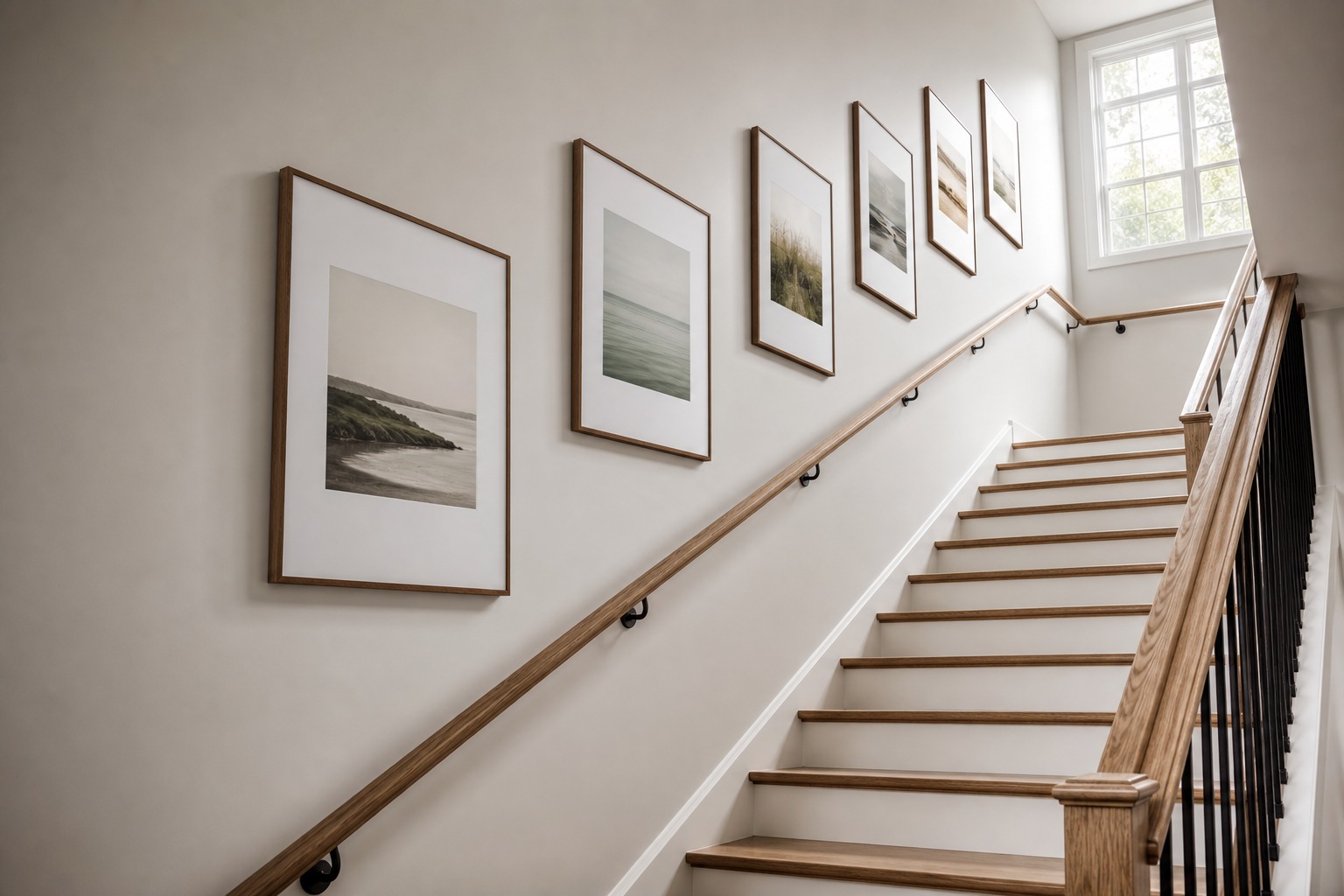
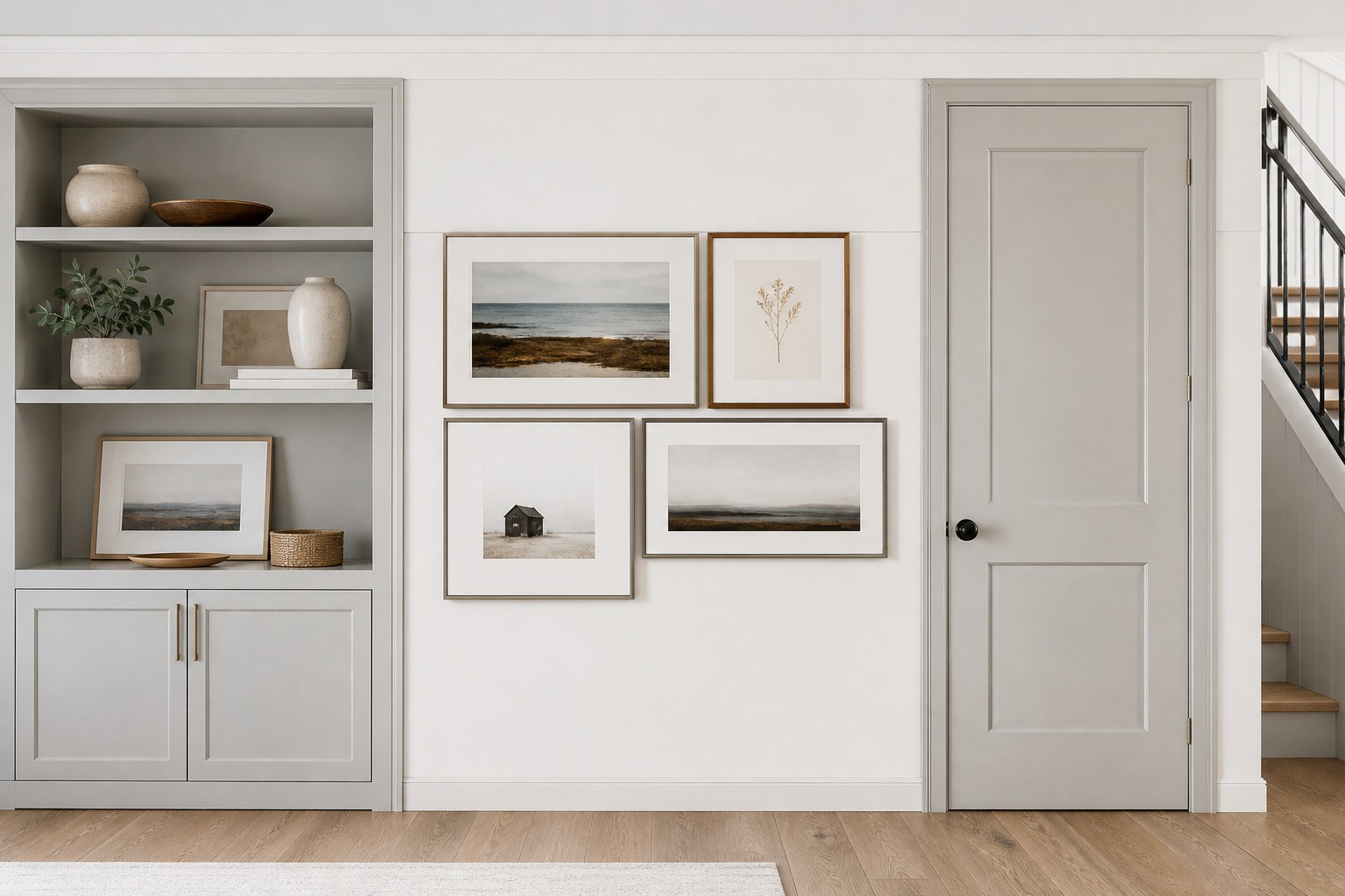
Architectural lines elsewhere in the room can guide the layout further — aligning selected frame edges with shelving, joinery, or nearby door and window openings creates a subtle sense of order that reinforces the boundary decision from earlier. Along a staircase specifically, following the angle of the handrail as the arrangement steps upward helps the display reflect the room’s actual movement and sightlines, while keeping a genuinely consistent viewing height for each piece relative to the stair tread beneath it — a detail that’s easy to get wrong and immediately obvious when it’s off.
When Professional Artwork Hanging Helps
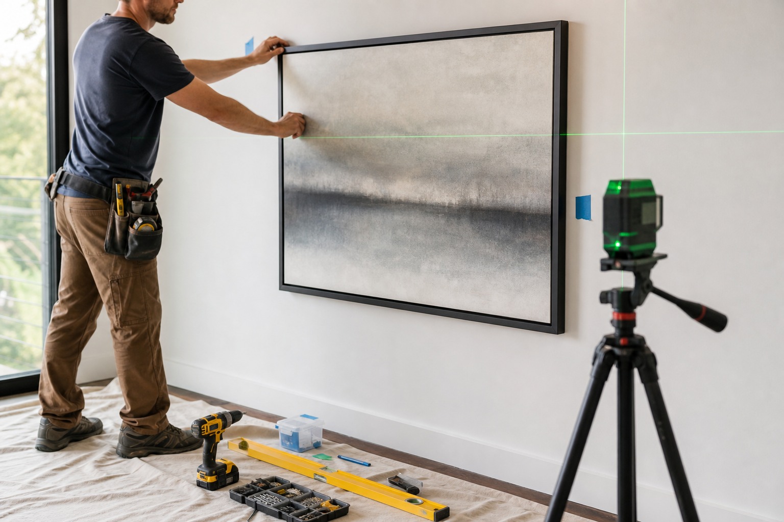
Some situations genuinely call for bringing in outside help rather than tackling installation entirely on your own — particularly arrangements involving valuable or fragile pieces, difficult wall materials like plaster, tile, or masonry that don’t take standard hardware well, or layouts where precise alignment across many frames needs to be right the first time with no room for repeated adjustment.
A professional artwork hanging service brings the leveling equipment, wall-material knowledge, and installation experience to execute a layout exactly as planned, which matters more than it might seem once you’re fifteen frames into a staircase wall and one measurement was off by a few millimeters.
This isn’t a requirement for every gallery wall — plenty of straightforward arrangements are entirely reasonable to hang yourself — but for anything genuinely complex or valuable, it’s worth treating professional installation as part of the plan from the start rather than a fallback after something’s gone wrong.
Final Thoughts
A planned gallery wall doesn’t need to look rigid or perfectly matched to read as intentional. The sense of order comes from the structural decisions — a defined boundary, an anchor piece, consistent spacing, and some thread of repetition — not from making every piece identical.
Once those decisions are settled, real variation in artwork, framing, and scale adds personality without ever making the finished display feel accidental.
Frequently Asked Questions
What is the best spacing for a gallery wall?
Relatively narrow, consistent gaps between frame edges — not hanging hardware — read as the most unified in most residential settings. The exact measurement matters less than consistency across every gap in the arrangement, since equal spacing is what actually signals to the eye that the pieces belong together.
Should a gallery wall be centered over furniture?
Not necessarily. The arrangement usually feels more grounded when it’s somewhat narrower than the furniture below it, with the lower edge close enough to maintain a clear visual connection. Centering matters more than exact width-matching — a slightly off-center anchor can still work if the composition’s visual weight is genuinely balanced.
How do you make different frames look cohesive?
Repeat one or two visual elements across the collection — a consistent frame finish, color, or mount width, or a shared quality in the artwork itself like tone or medium. You don’t need identical frames throughout; one consistent thread is usually enough to hold a genuinely varied collection together.
Can a gallery wall be asymmetrical?
Yes, and asymmetrical arrangements can feel just as deliberate as symmetrical ones when the visual weight is properly balanced — several smaller pieces on one side can offset a single larger anchor on the other. The composition still needs a defined boundary and consistent spacing; asymmetry describes the arrangement’s balance, not its structure.
- 244shares
- Facebook0
- Pinterest244
- Twitter0
- Reddit0